Mesh Padel Center
João Loureiro
About
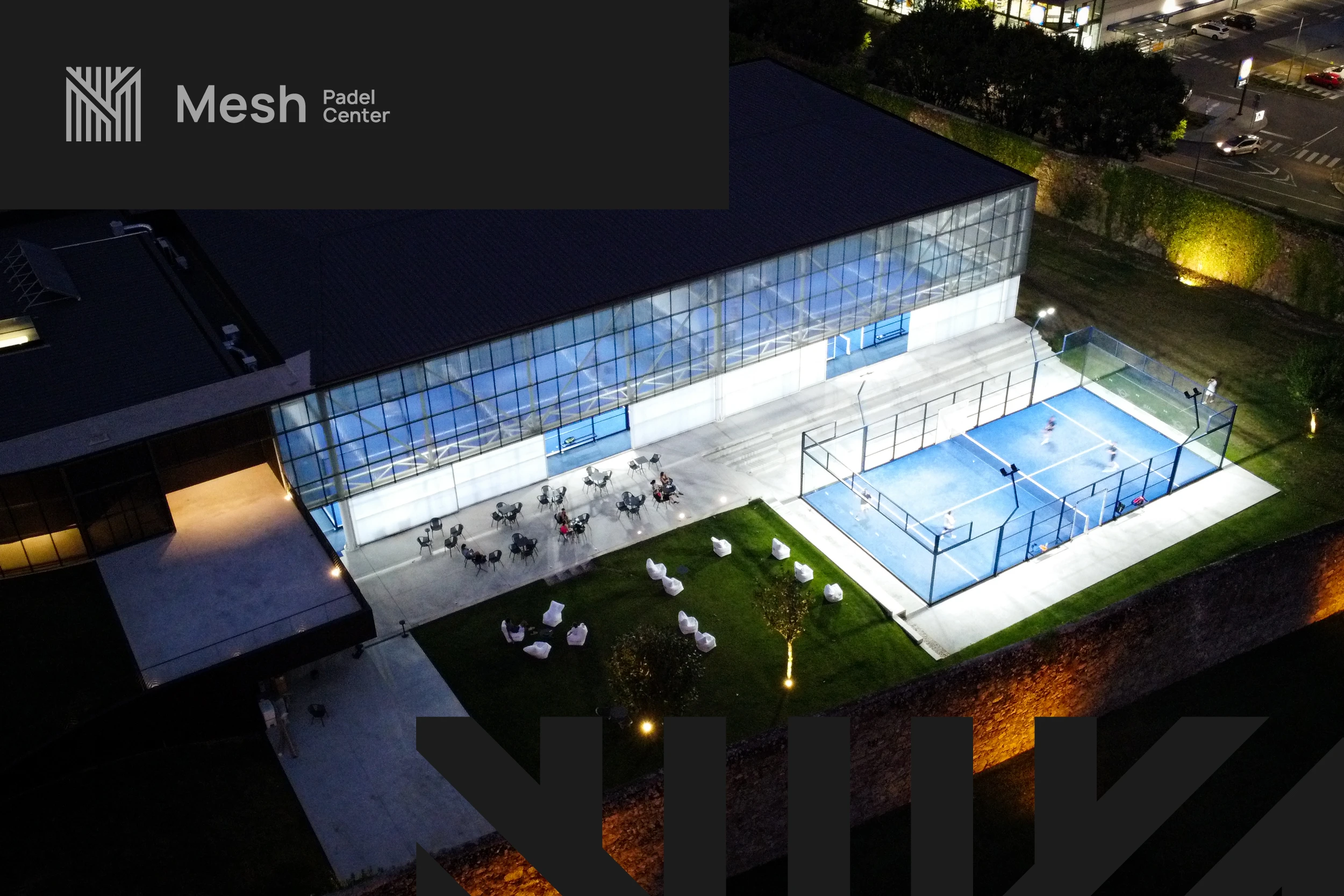
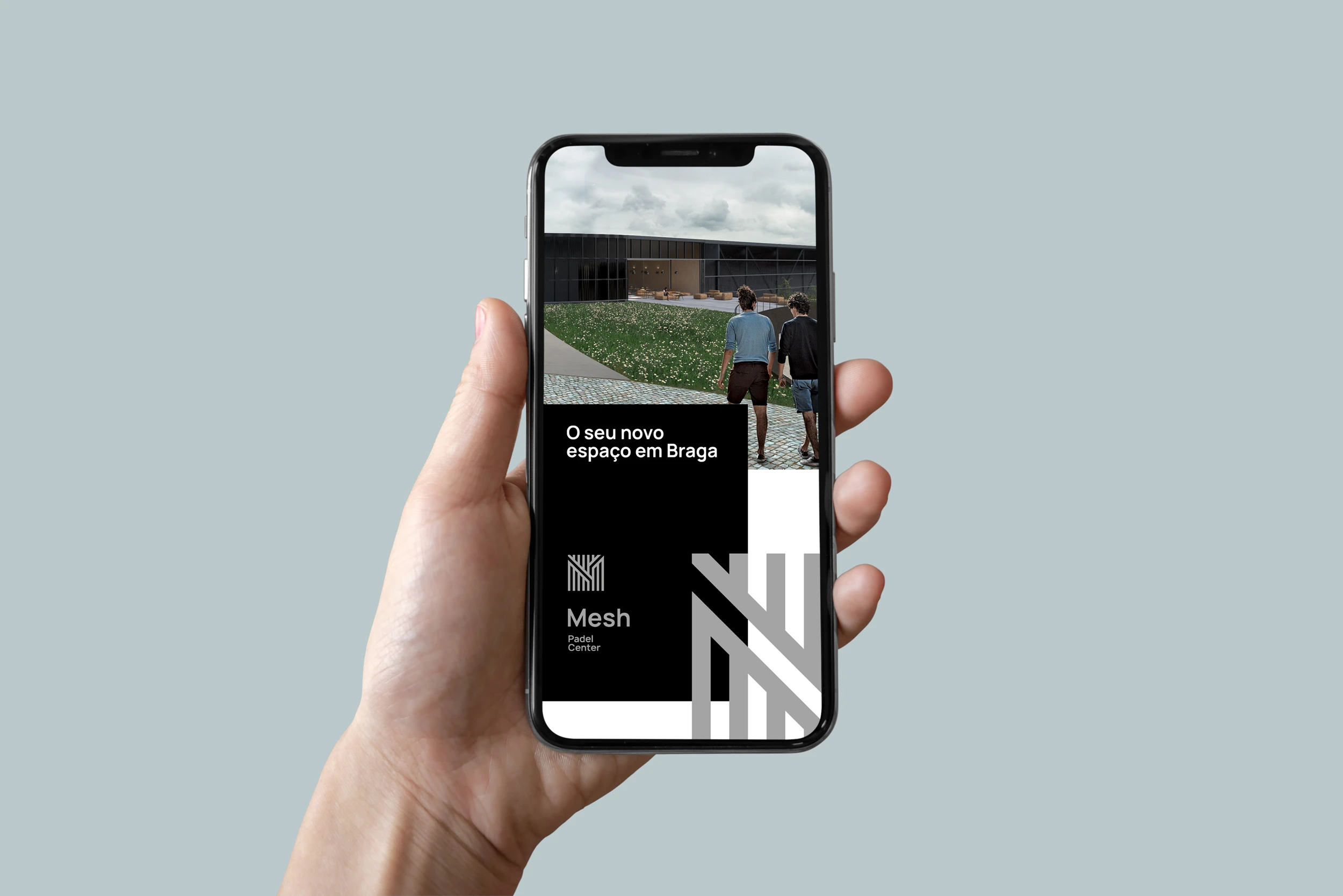
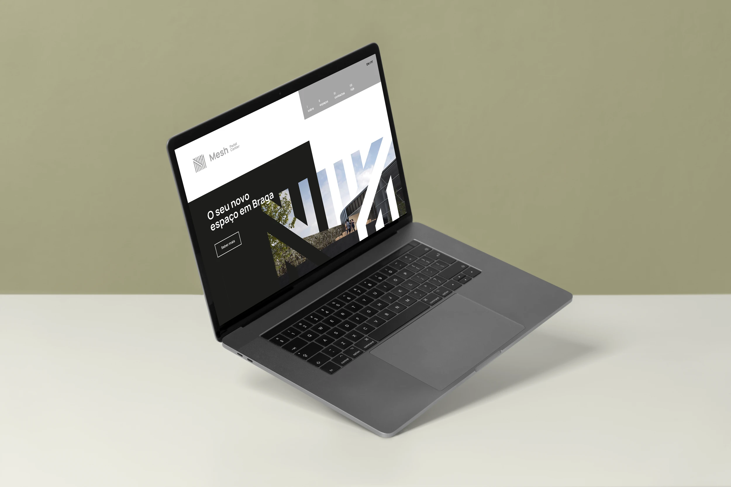
Mesh Padel Center is a new premium club in Braga, Portugal, designed to elevate both the sporting and social experience. I was invited to create the entire brand universe — from naming, visual identity, signage, and brand collateral, to the complete branding system for the space. The result is a contemporary and versatile brand, fully aligned with the project's architectural boldness and refined atmosphere.
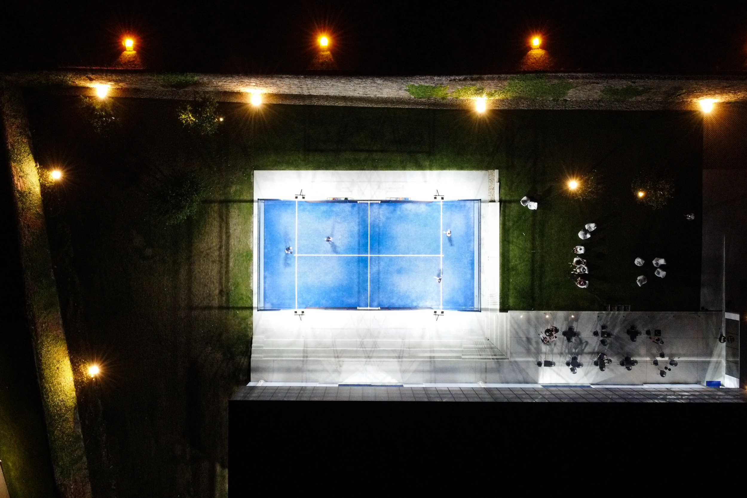
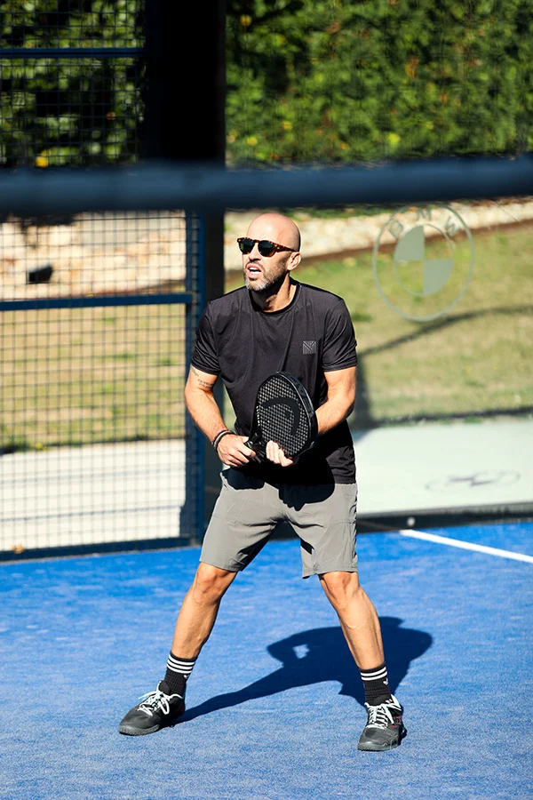
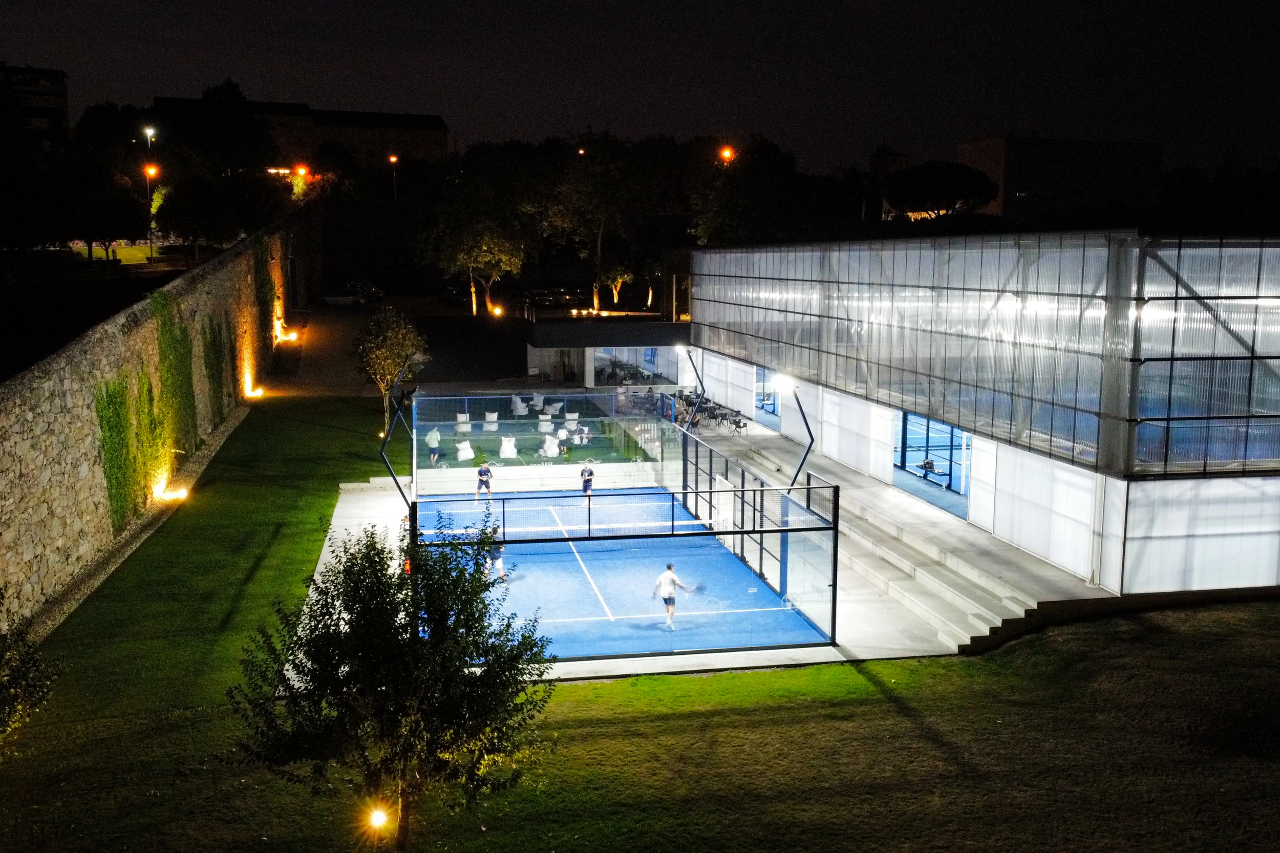
Mesh stands out for its bold architecture, clearly distinct from any other padel club. Located in the heart of Braga, the space offers a dynamic and sophisticated environment, enhanced by complementary services such as a padel shop, bar, gym, and more — reinforcing its multifunctional character.
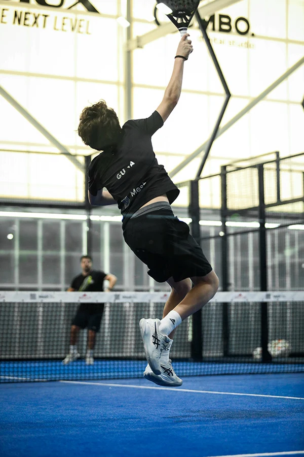
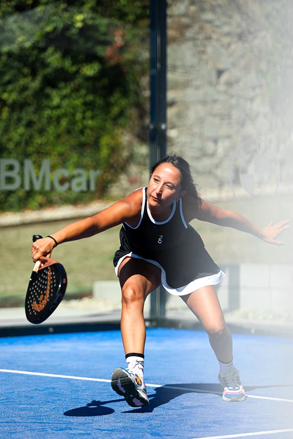
The name "MESH" emerged organically, reflecting the essence of the space. It draws inspiration from the concept of a mesh (as seen in the architectural structure), a network, and phonetically echoes the Portuguese word “mexe” (to move), reinforcing the idea of movement — the core of the brand.
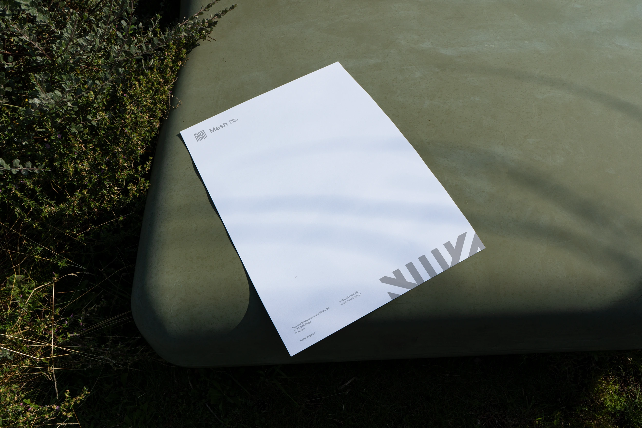
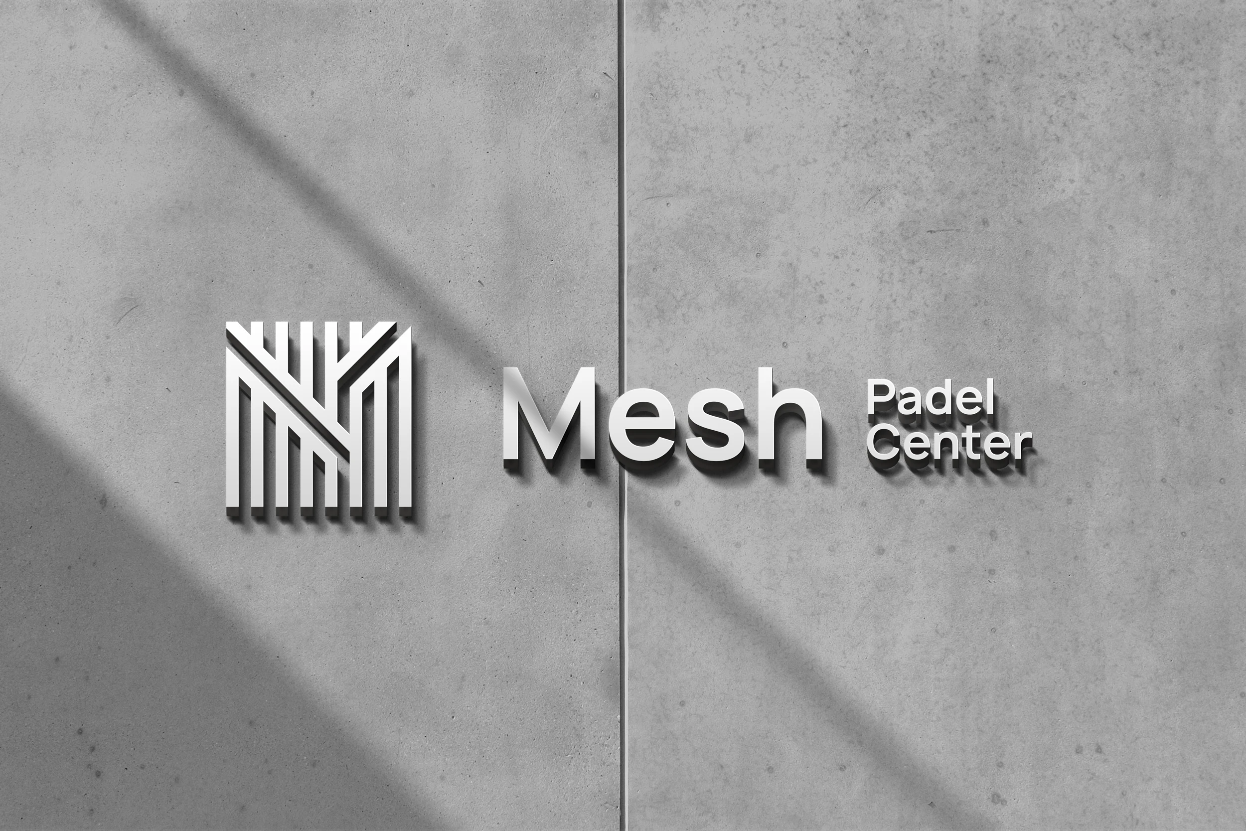
The logo stems directly from this mesh logic: built from a grid of structural lines, the “M” is drawn and becomes the central graphic element of the identity. This visual system — rooted in the repetition and variation of lines — not only ensures brand consistency, but also visually expresses the energy, fluidity, and modernity of the space.
Moodboard
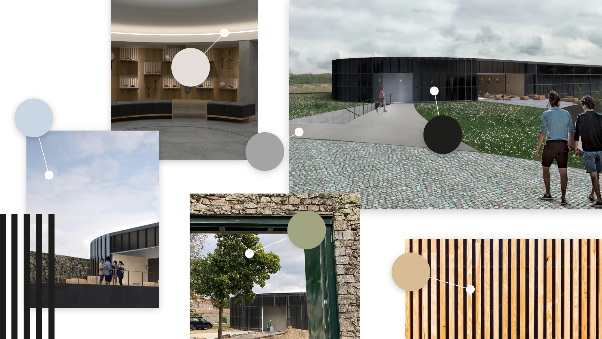
Project's Moodboard
Taking on the challenge of designing an identity for a space with such a strong concept and architectural presence required a thoughtful and immersive approach. I chose to explore and translate the space’s own elements into the brand identity. During the creative process, I selected lines as the foundational element — a visual motif present throughout the space — which became the conceptual base for the entire branding system and its extensions. This direction gives the brand a unique, original, and dynamic character. With clean and contemporary lines, the identity aligns seamlessly with the surrounding space.

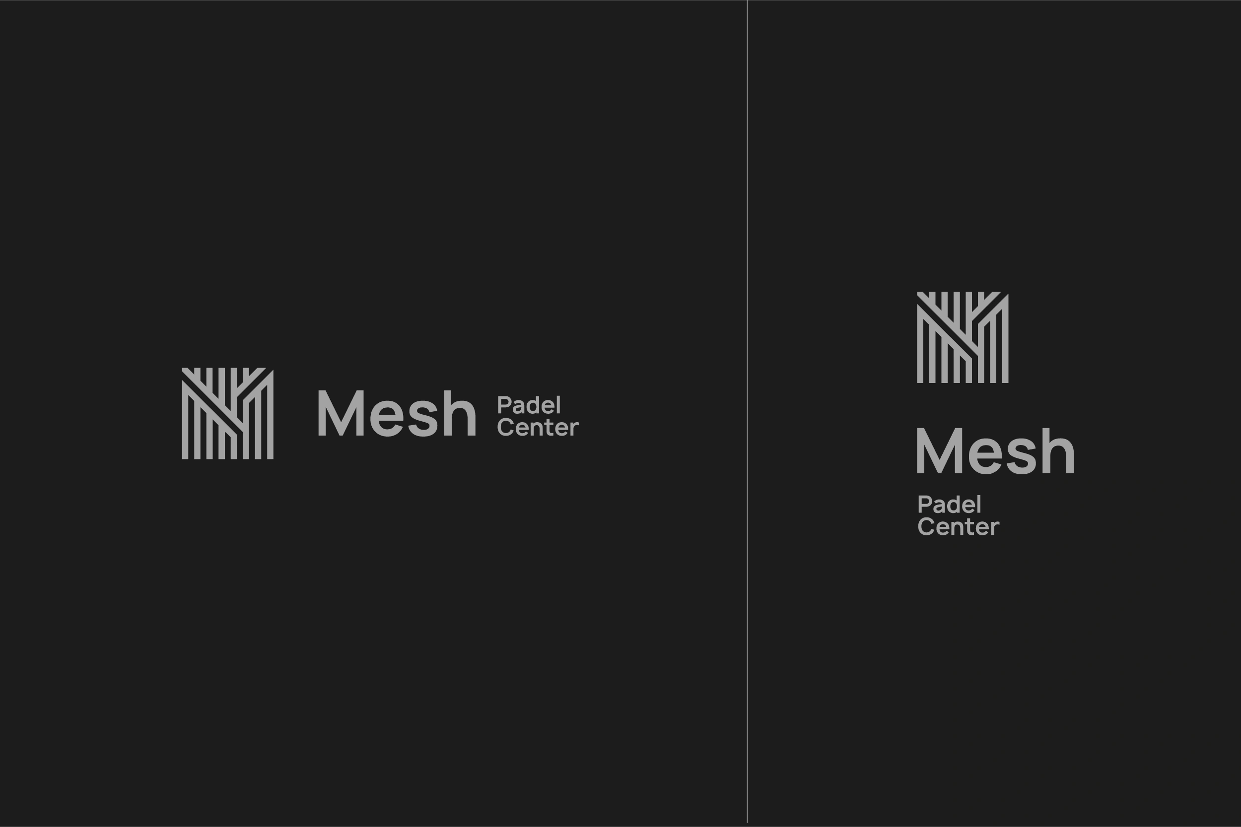
Logo Variations
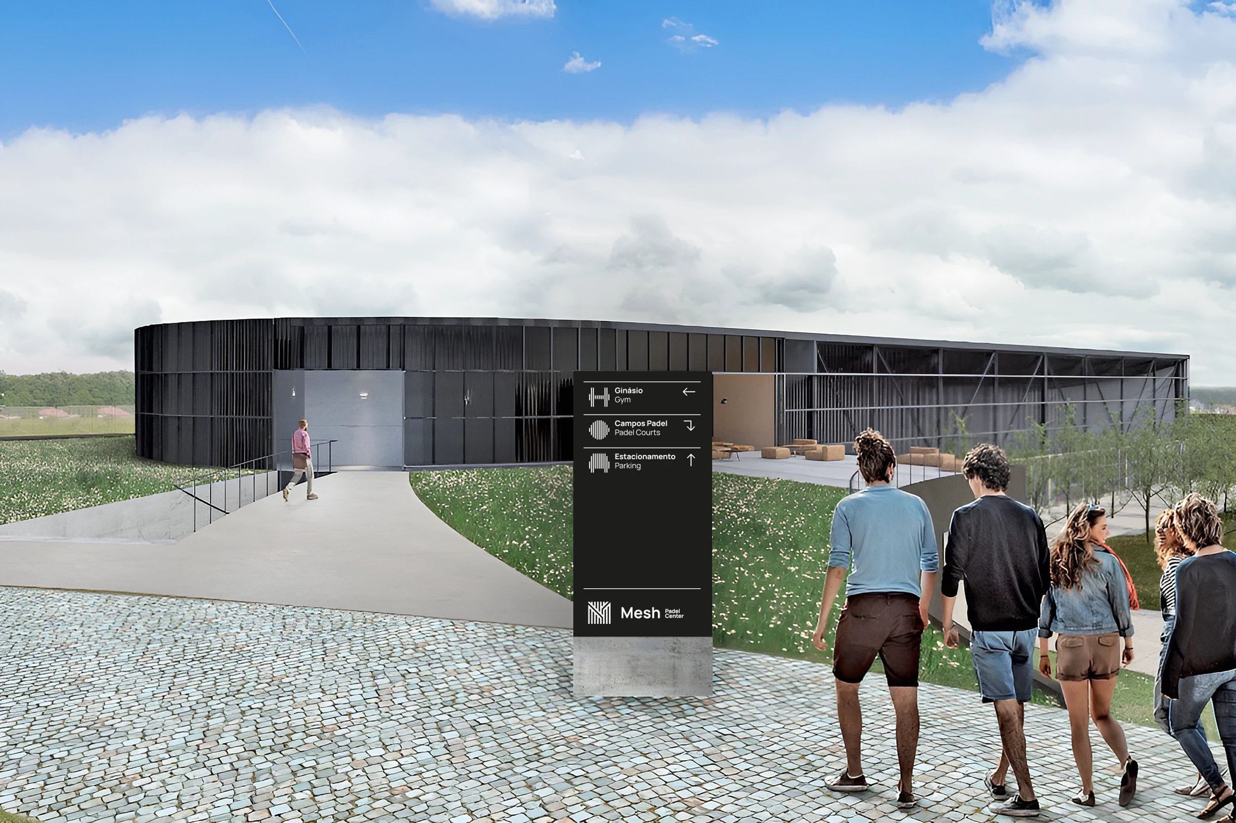
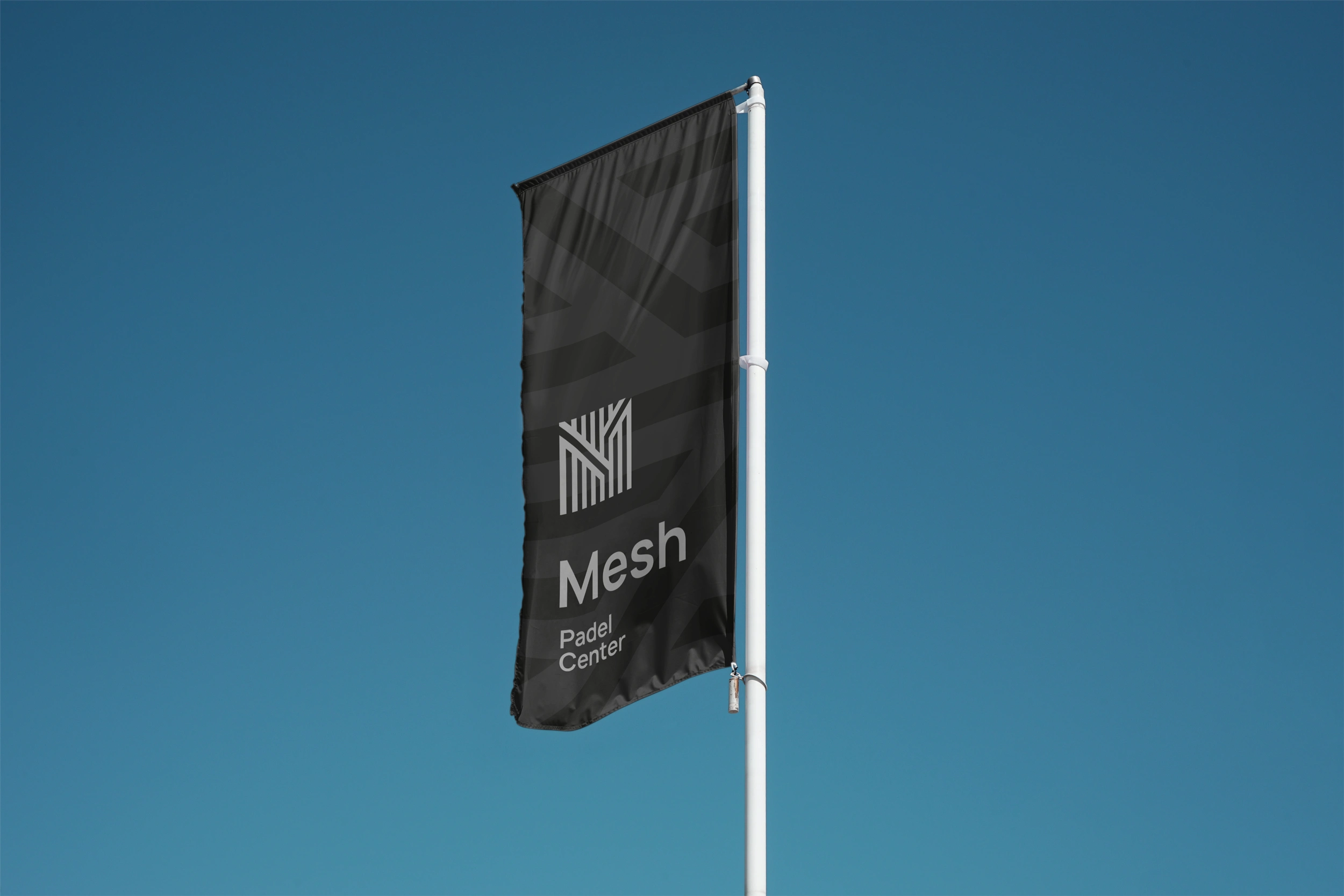
Signage
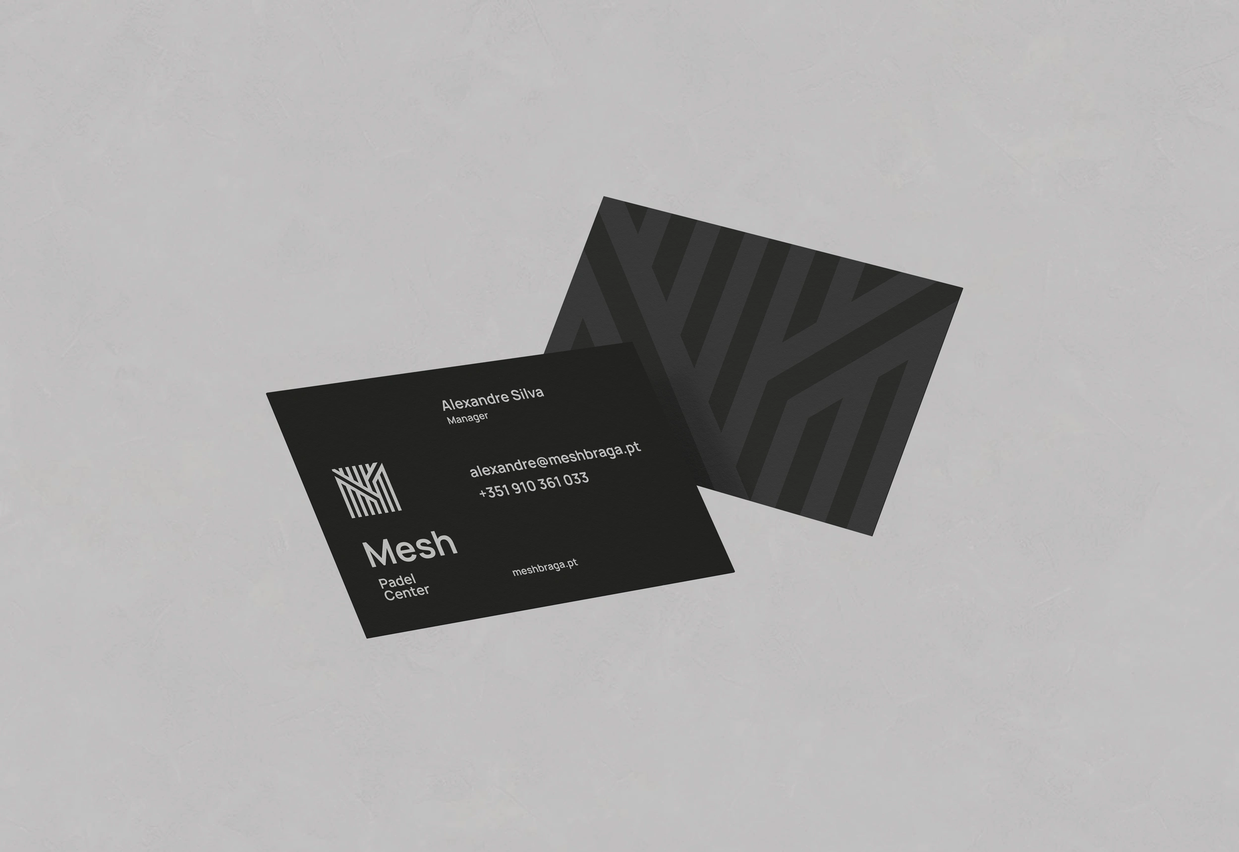
Business Cards
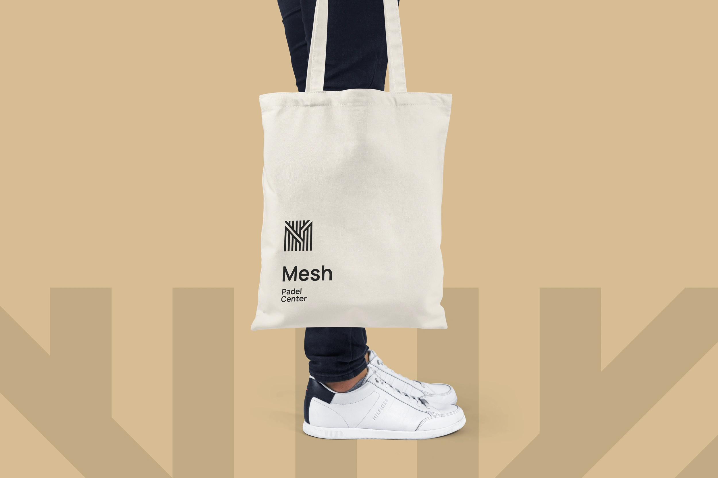
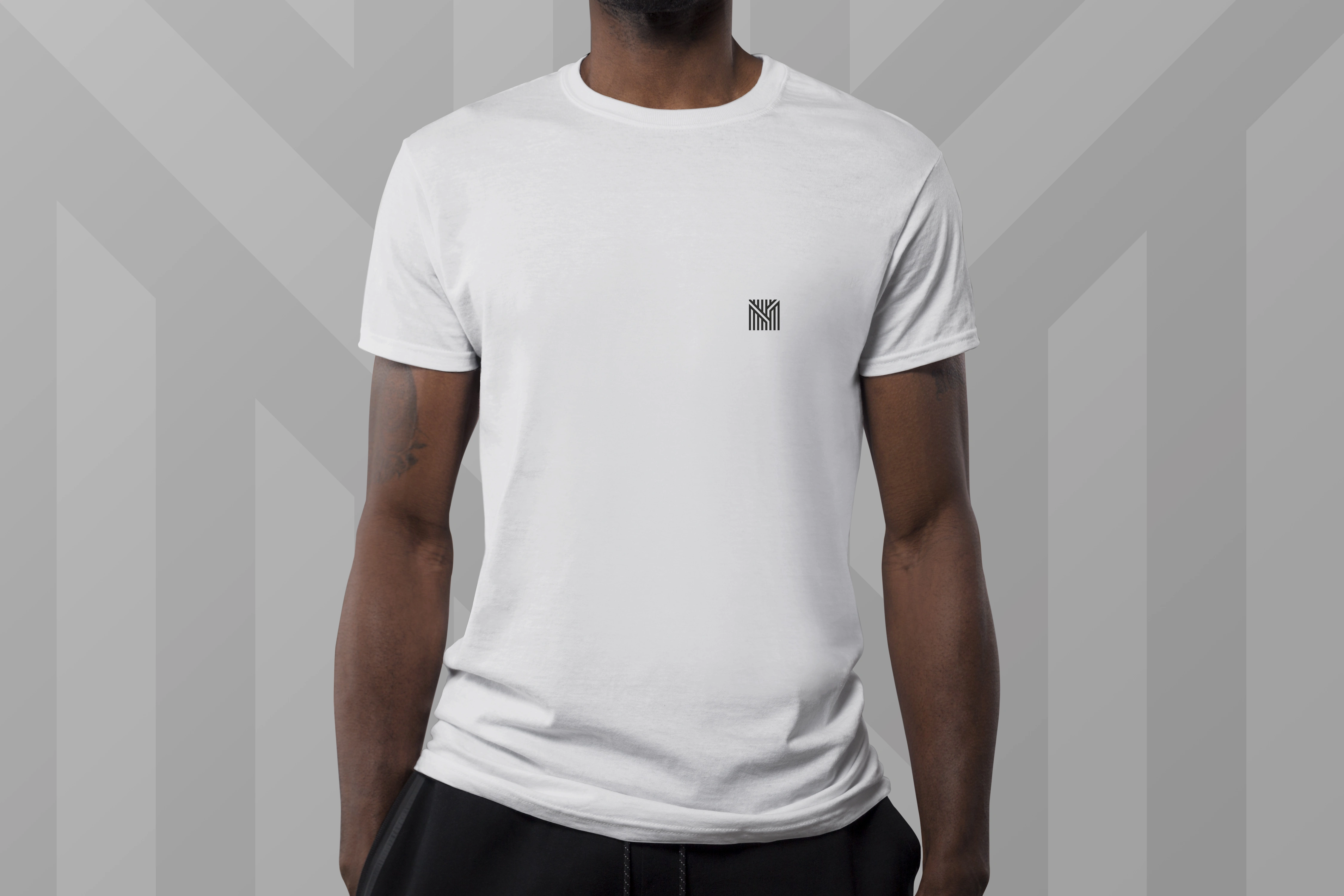
Merchandising
MESH
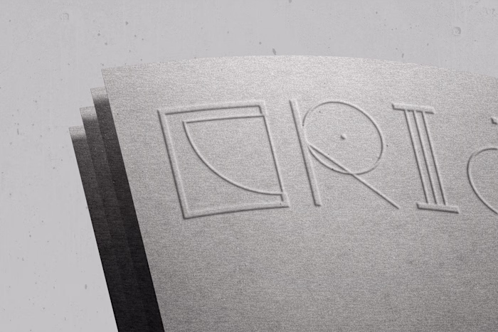
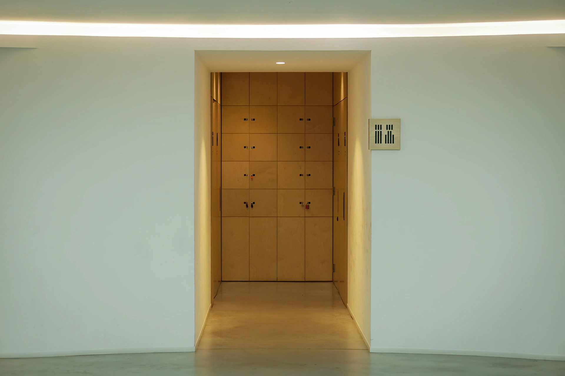
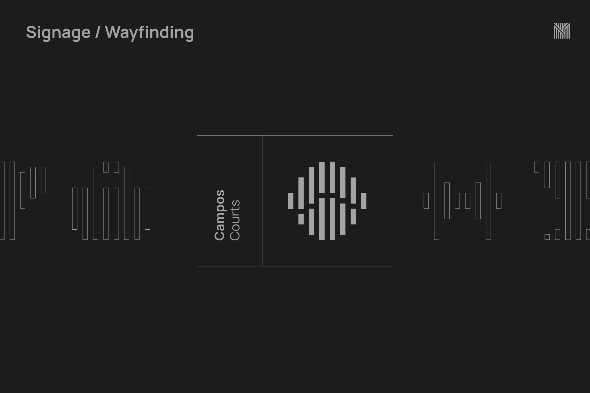
Custom Iconography / Signage
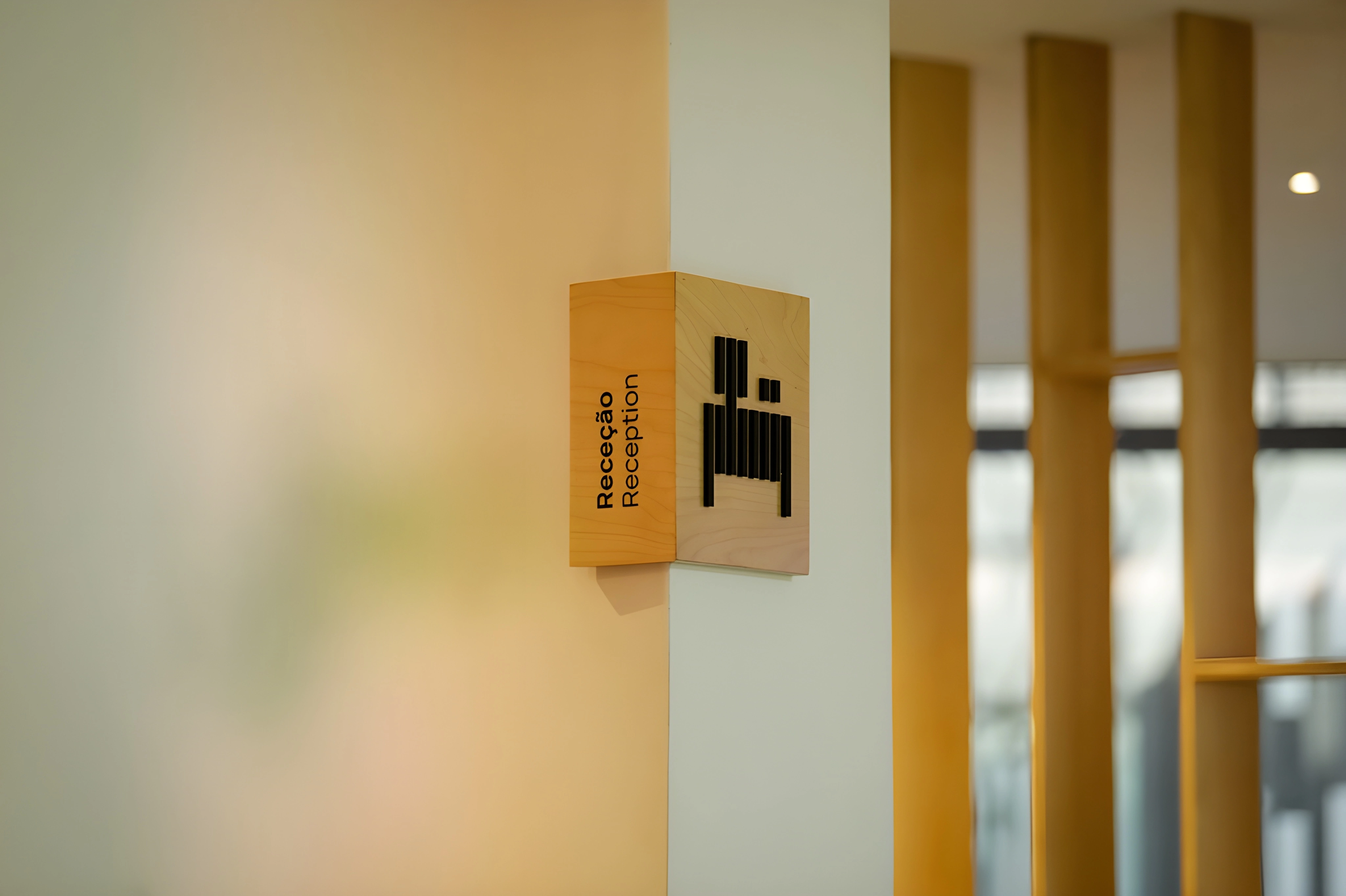
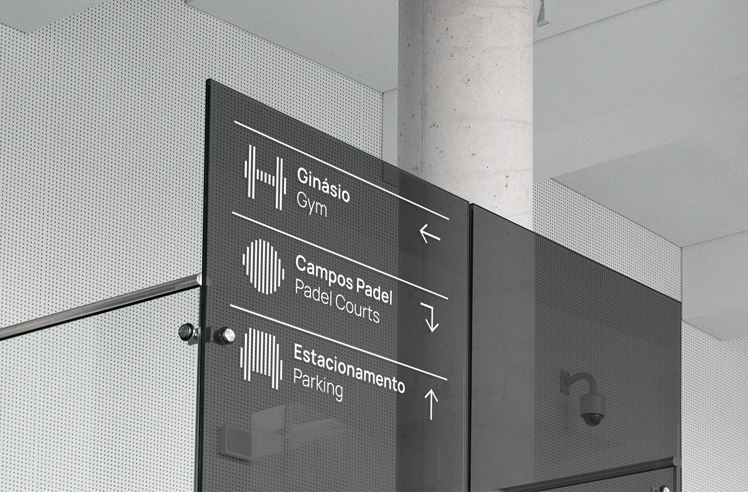
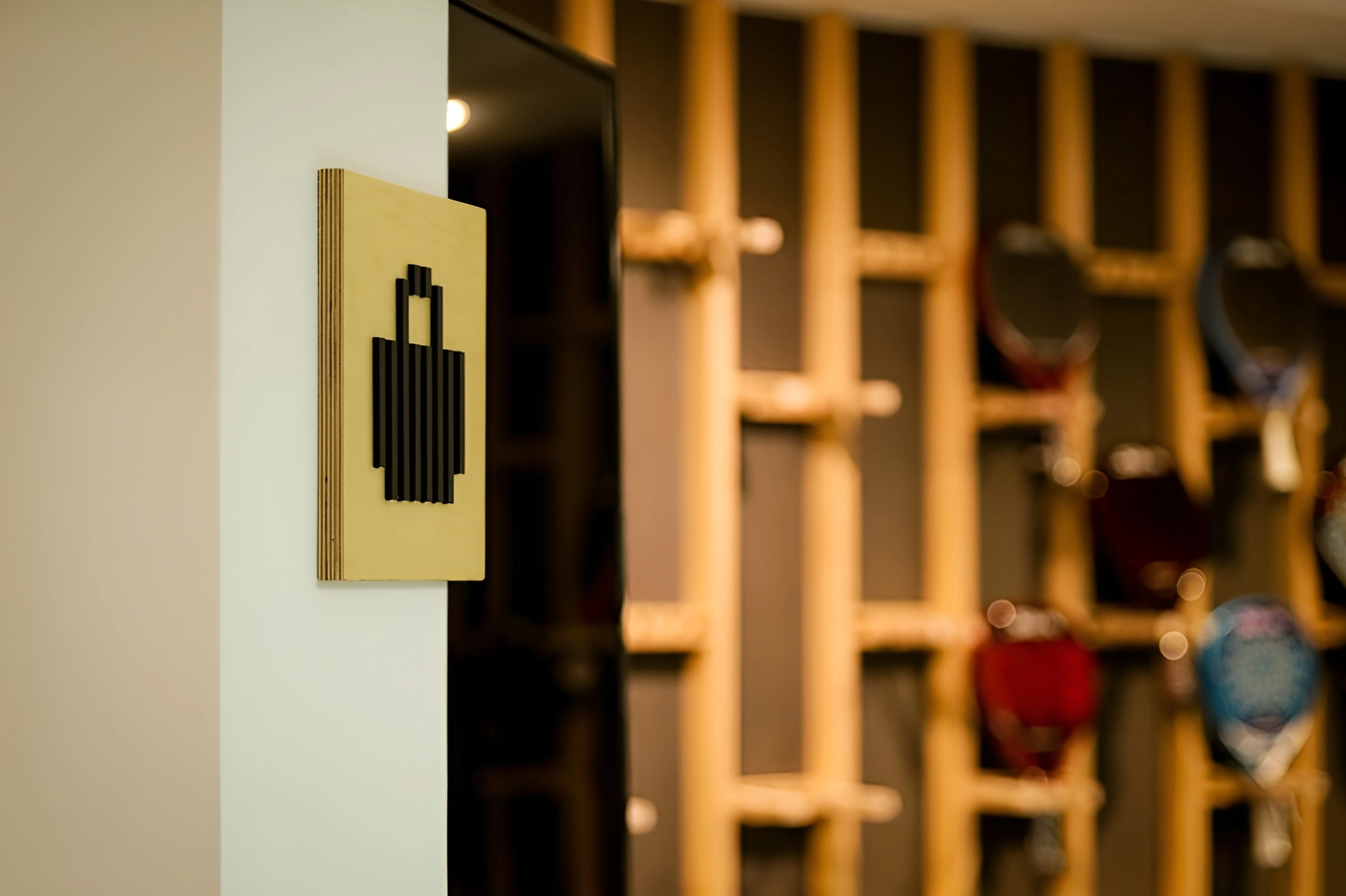
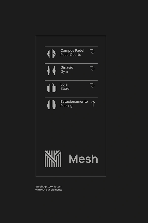
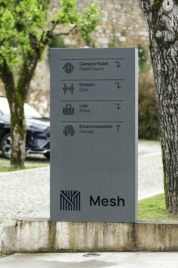
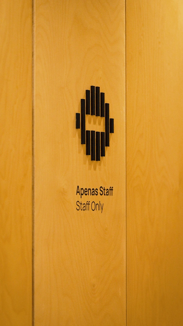
In such a distinctive project, where every detail was carefully considered, the signage system played a key role. To ensure a truly cohesive and bespoke identity, a custom icon set was developed — designed using the same geometric grid that informed the logo and the overall visual system. This approach resulted in a fully tailor-made visual language, where every element — from physical to digital, from spatial design to communication — flows seamlessly and consistently. The iconography not only serves a functional purpose, but also enhances the space aesthetically, reinforcing the brand’s original and sophisticated character. Every aspect was meticulously crafted: from the design of the icons to the choice of materials and finishes, ensuring that the signage integrates perfectly with the architecture and elevates the overall user experience.

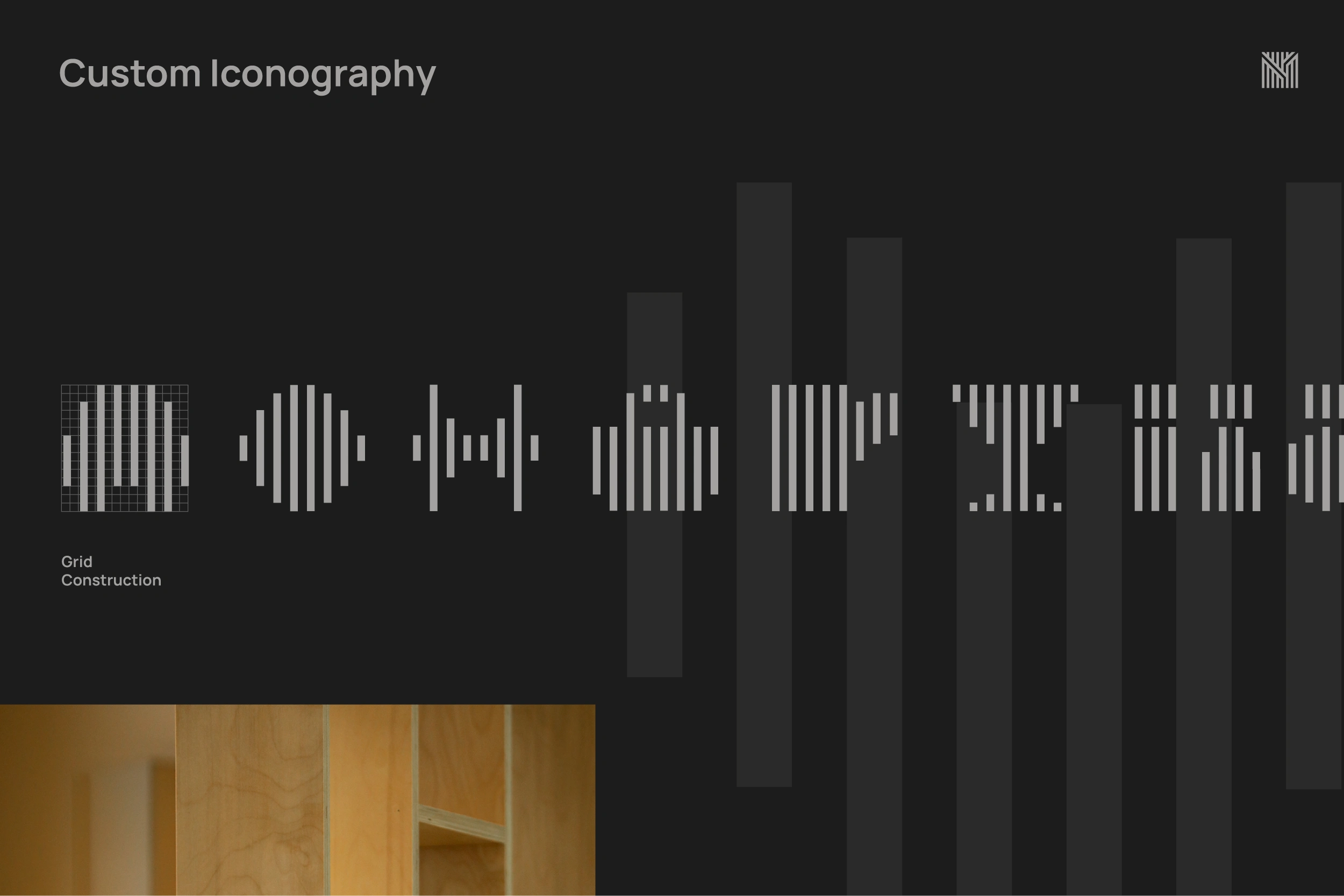
Custom Iconography
Signage Details
Signage System

Signage Details / Materials
Merchandising
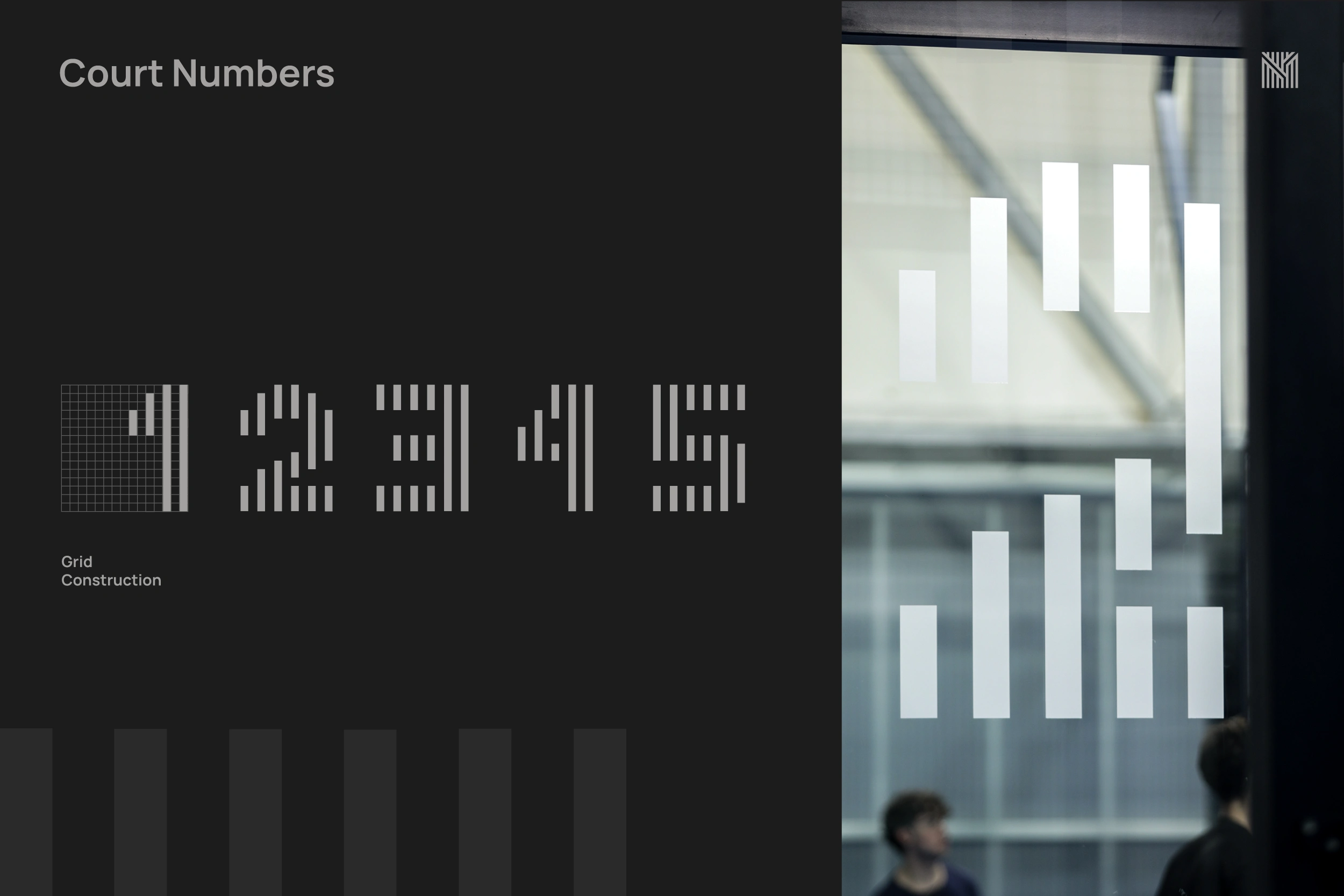
Court Custom Numbers (Signage)


Thank you.
Client: Mesh Padel Center
Year: 2022
Naming, Design & Art Direction: João Loureiro
Photo / Video: Combo Digital Studio
Like this project
Posted Jul 8, 2025
Branding, naming and signage for Mesh, a distinctive padel club in Braga, Portugal. A identity that captures the energy of the sport and the club’s spirit.
Likes
1
Views
13
Timeline
Oct 4, 2022 - Dec 20, 2022