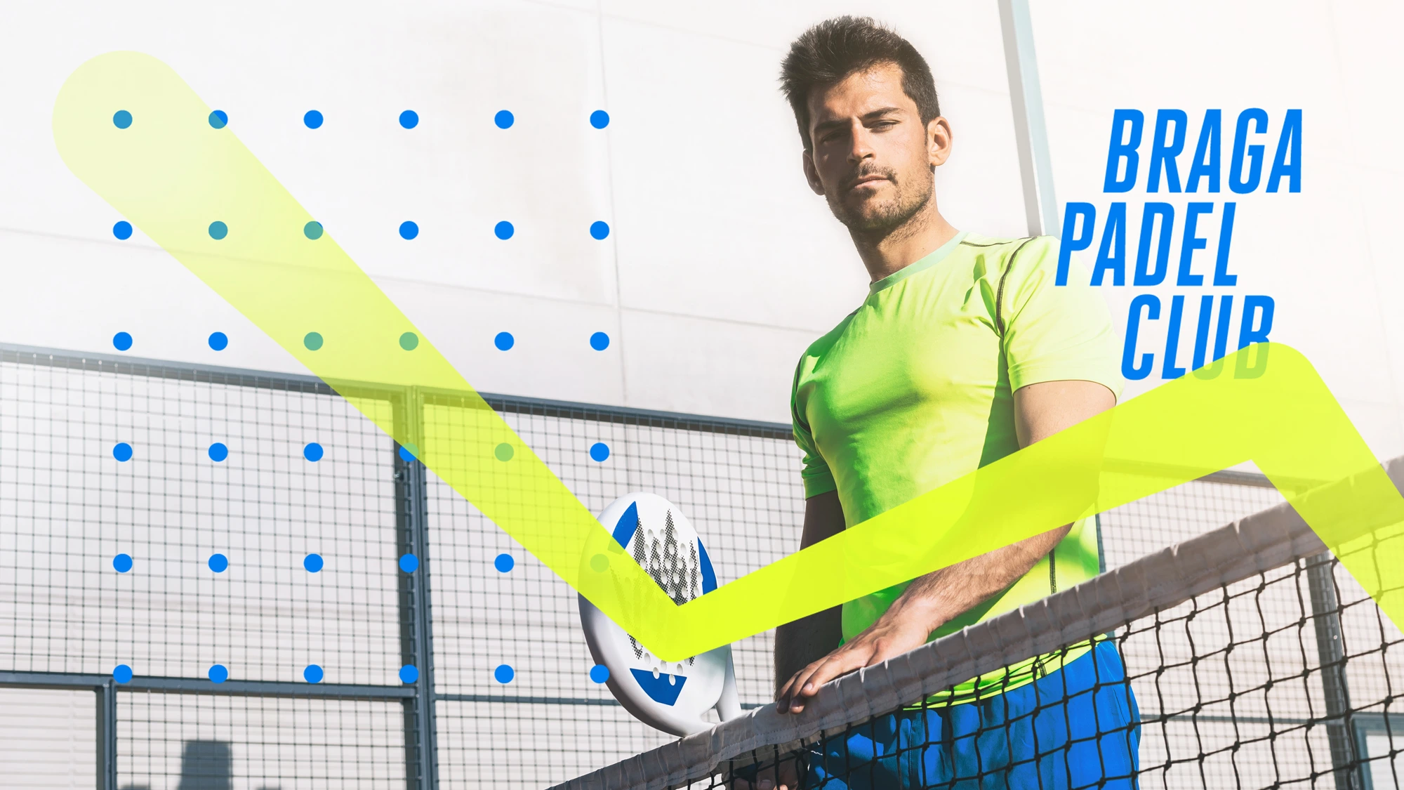
Braga Padel Club
João Loureiro
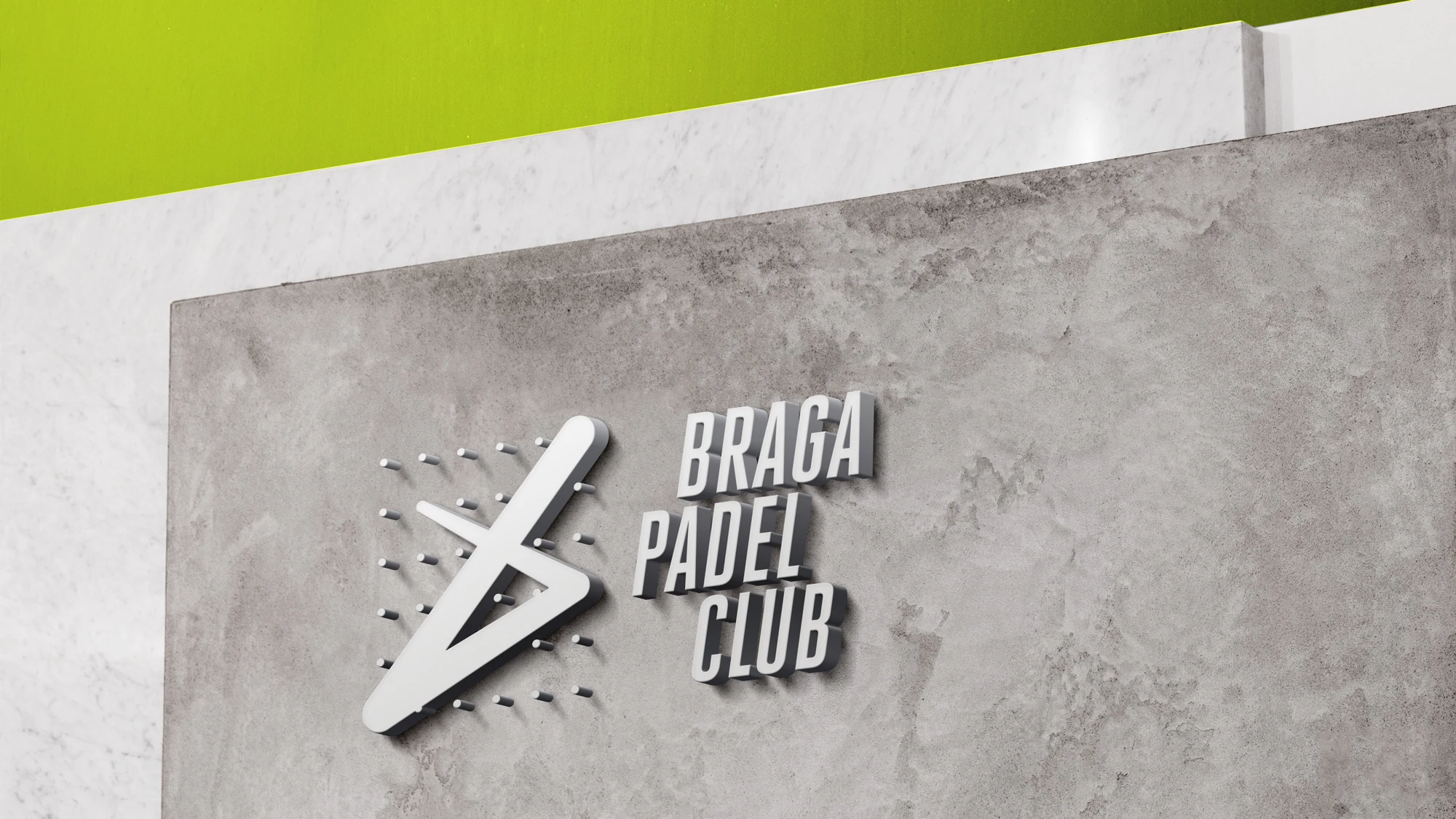
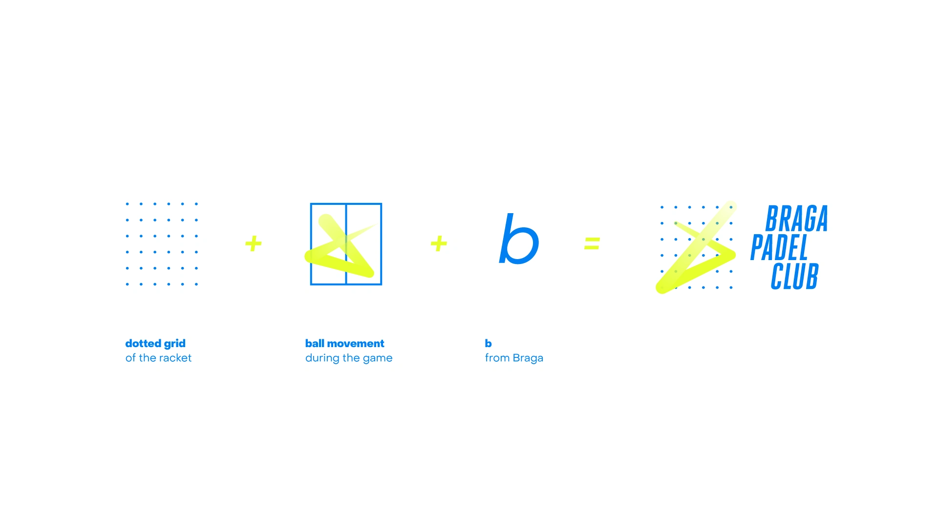
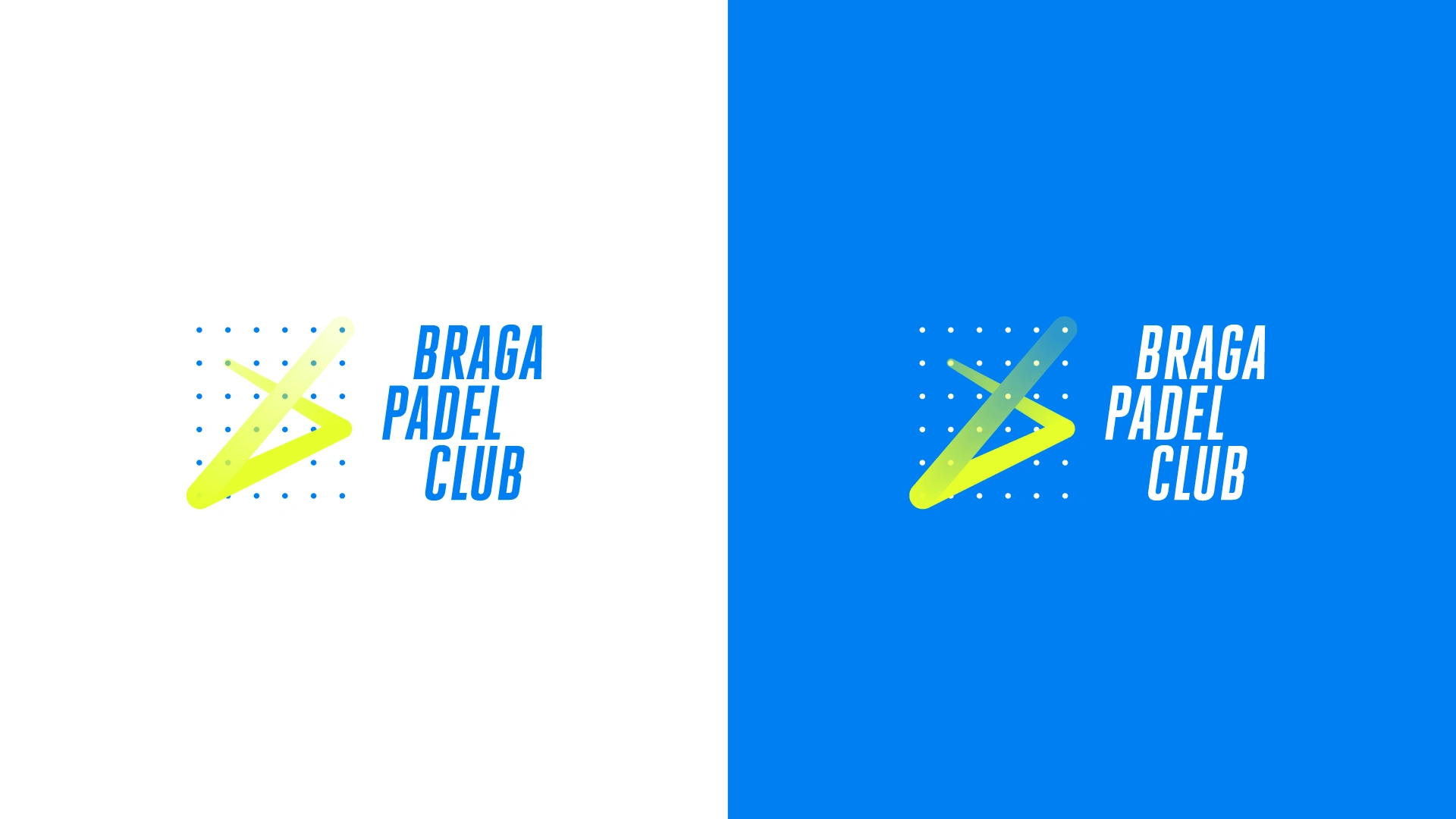
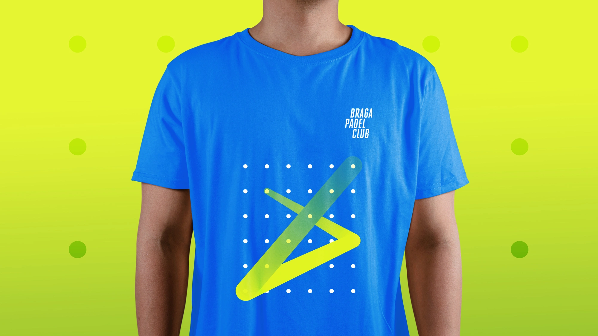
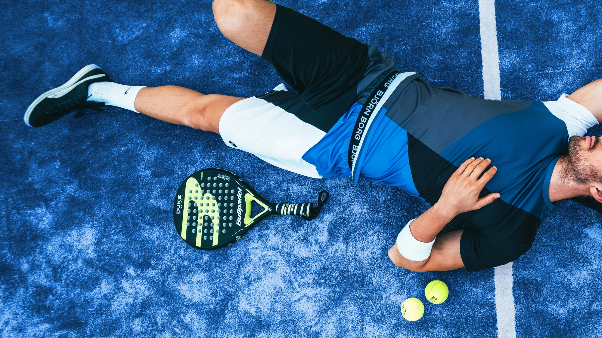
Regarding the briefing, I want to explore something fresh, new, and dynamic. With that in mind, I started to deconstruct the Padel symbols and elements, such as the racket and its dotted grid (pattern), the court (geometry), and how the game is played (movement). Also, they wanted to have that connection to the city where this sports complex will be born—Braga, Portugal—and tried to incorporate the "B" in the symbol as well. The result is a dynamic identity that can be adapted to any support—digital or print—and since it has a bright colour palette, once again inspired by the sport itself, it will be easily recognisable and will pop up as well.
2022 Update
This branding project was proudly featured in The Best Gradient Logo Designs (Logo Design Awards by Design Rush). Thank you all for the support!
Branding Proposal - Not in use
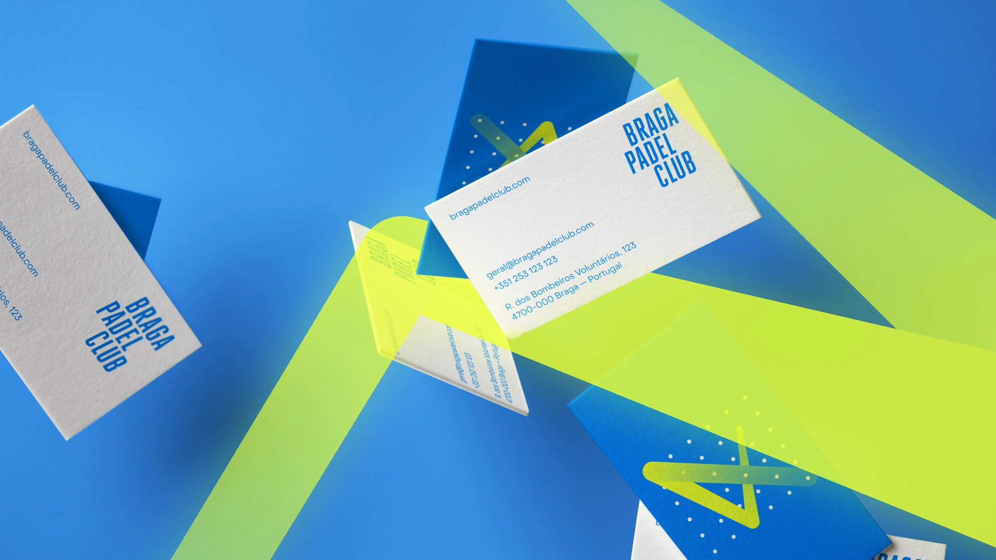
Client: Braga Padel Club
Year: 2020
Design & Art Direction: João Loureiro
Like this project
Posted Dec 22, 2025
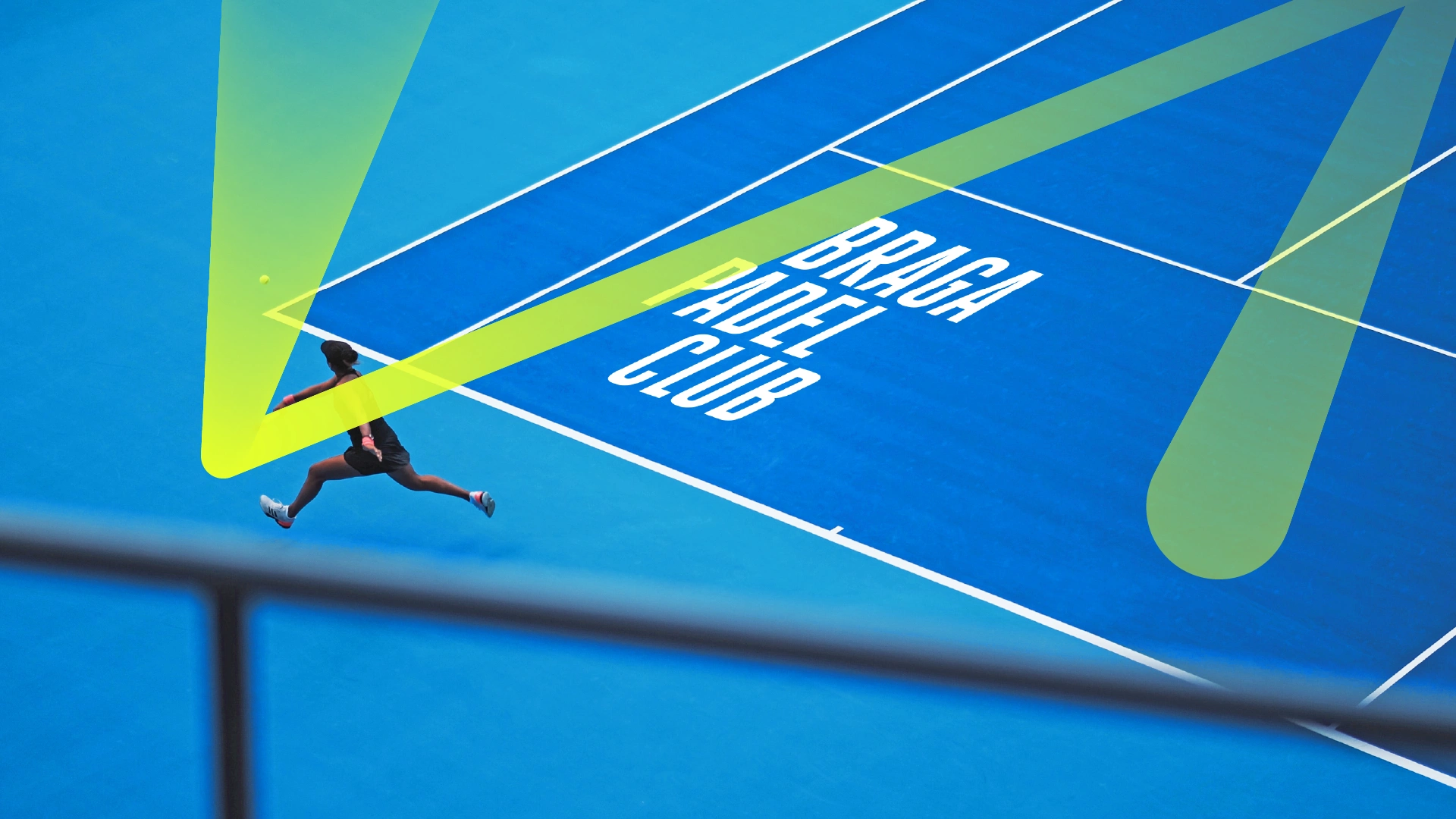
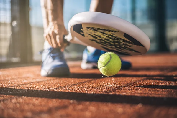
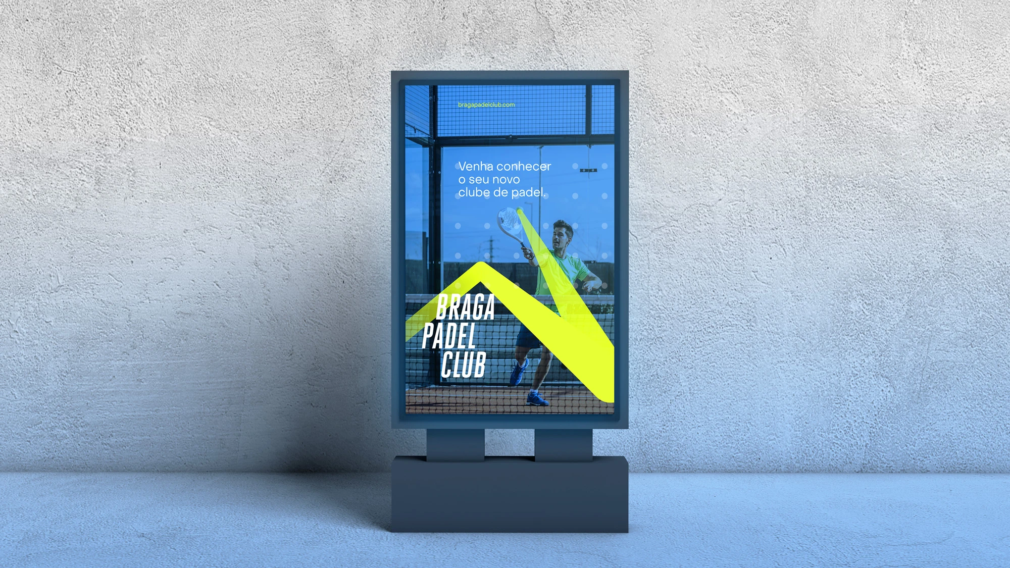
Branding Proposal for Braga Padel Club, a Padel Club in Braga, Portugal. Inspired by the sport color scheme and movement dymamics.
Likes
1
Views
3
Timeline
Jan 10, 2020 - Feb 10, 2020