Canadian Tire Login Experience Redesign
Pierrick Bernard

Canadian Tire - Login Experience Redesign
Role: UI / UX Designer Team: Independent
Duration: 1 week Tools: Figma & font ninja
Project Overview
Canadian Tire is a Canadian company specializing in the sale of various products, ranging from furniture to automotive parts. As part of a corporate group, platform identification is handled through a common identifier (Triangle ID). However, KPIs reveal a low account creation rate: → only 4%.
The problem
Users need to be able to sign in or create an account easily to continue their purchases and benefit from their loyalty points.
The objective is therefore to streamline this critical step in the user journey.
The goal
The objective is to continue customer retention by improving their user experience. By optimizing their login process. Here the main challenge is acquiring new sign-ups.
Design Process
Analysis
The interface features a minimalist design, but the user experience suffers from a high cognitive load.Based on Nielsen's 10 heuristics, several issues have been identified:
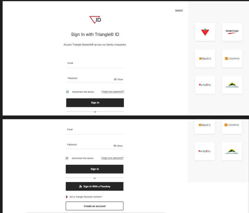
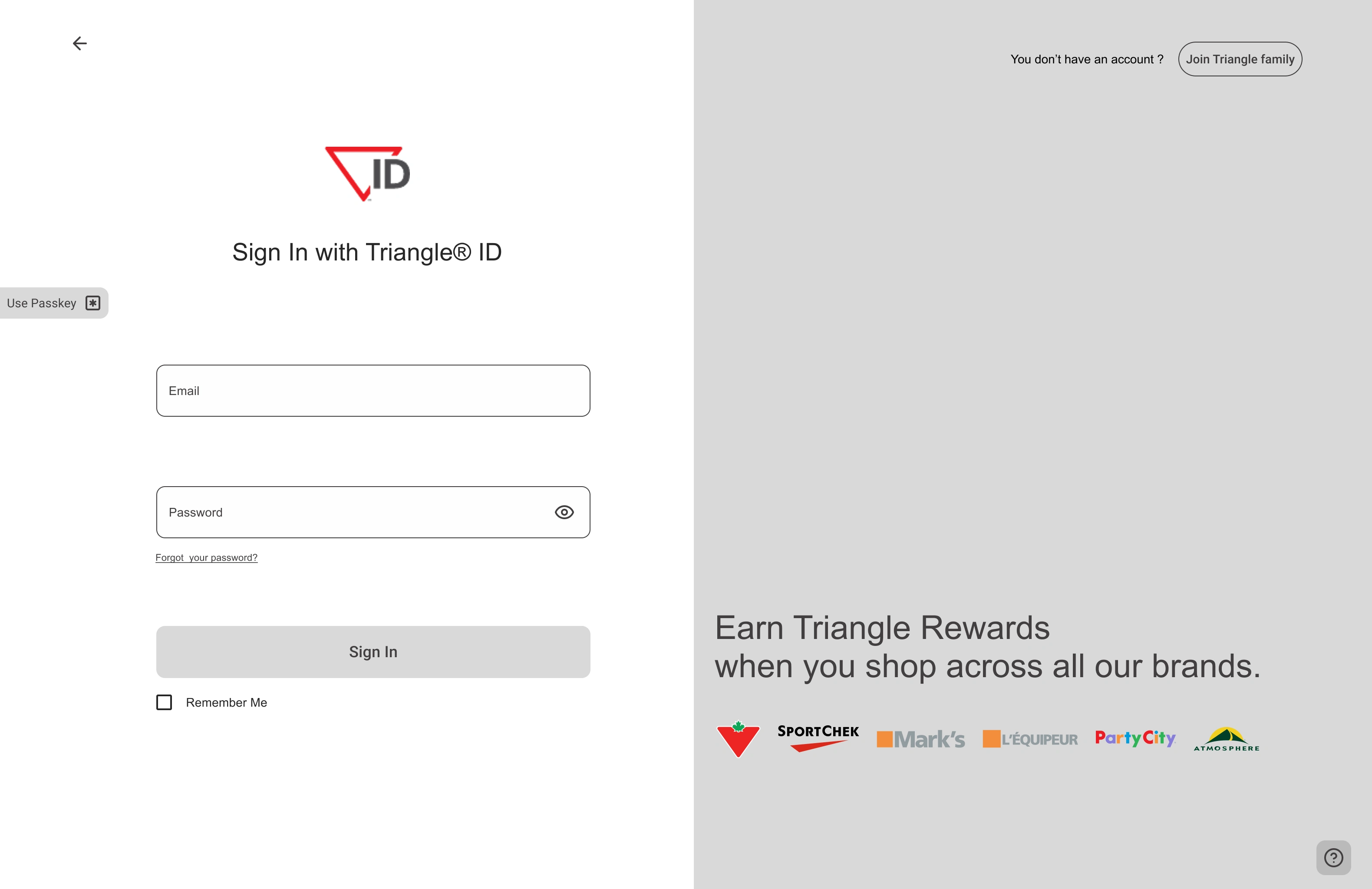
Old interface of triangle ID
Triangle ID login clarity: Users must understand on their own the connection between the group logos and explanatory text, which creates additional cognitive effort.
(Heuristic 2: Match between system and the real world)
Account creation discoverability: Users without an account have to scroll down the page to find the creation option.
(Heuristic 6: Recognition rather than recall)
Login methods hierarchy: Two main CTAs are offered for signing in, which creates confusion in the visual hierarchy.. (Heuristic 7: Flexibility and efficiency of use)
Support access: The "Support" button is barely identifiable: it contains only one word without an icon. Users generally expect to find a headset icon or question mark at the bottom of the page.
(Heuristic 4: Consistency and standards)
Input fields accessibility: Input fields have no background or marked outline, making their visibility difficult for some users.
(Heuristic 8: Aesthetic and minimalist design – be careful not to harm readability)
Dead-end page: Users cannot go back and have no other option besides creating an account or signing in.
(Heuristic 3: User control and freedom)
The ideation
The ideation Once the existing interface was analyzed and business objectives taken into account, I was able to start sketching my idea with the following guidelines:
Make an interface quickly understandable by users
Offer flexibility to users in their actions
Make it more emotionally engaging to generate more engagement and retain existing customers
After thinking about the problem and how to integrate the necessary elements for users, I arrived at this version.
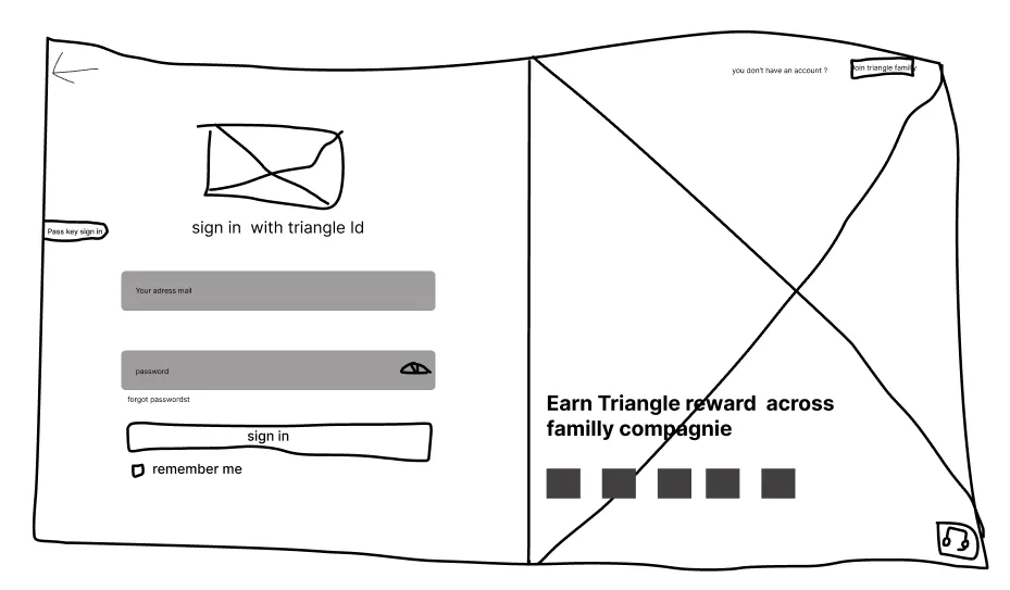
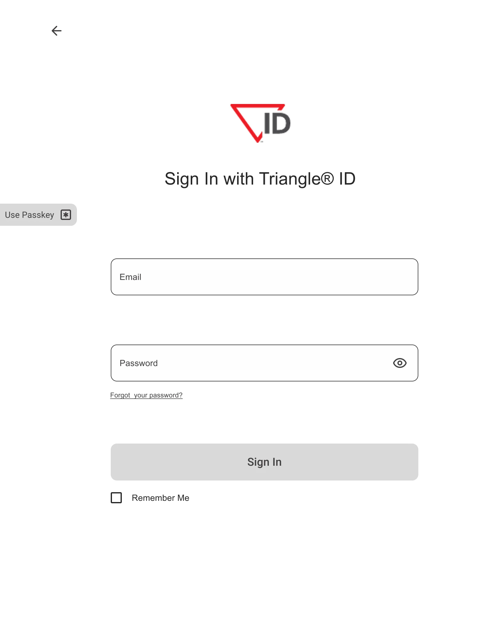
LoFi version
The interface allows for an easy-to-use interface by integrating all crucial elements such as: the support button, clear explanation of the loyalty system, login options, account creation option and going back.
Following this idea, I created a mid-fi version to quickly obtain a result resembling the final one, to accelerate progress by using design systems like Material 3 and Tailwind CSS to avoid designing buttons, inputs, checkboxes or creating a spacing system from scratch.
I also used the font-ninja extension to get the different font sizes and fonts used on the page.
Mid-Fi version
These improvements aim to:
Strengthen customer relationships through a smoother journey
Increase sign-up conversion rate
Contribute to loyalty program growth
Ux choices
Left part
On the left side, we find several important elements for login:
The back button that allows users to maintain control -- placed at the top according to expected standards
Enlarged logo and explicit H1 about connecting with Triangle ID
On the interface edge, I chose to put the passkey login shortcut on the side, allowing the most hurried users to directly see the option without searching for it, with the wording "Use Passkey" which is short and effective with its icon.
I had opted for "Sign in with pass key" but finally chose the shorter version while remaining explicit about the button's action
The inputs with a slightly different background from the page for better accessibility, as well as an eye icon and simple wording below "Forgot your password?" which are expected standards for privacy or password recovery
At the bottom a simple CTA labeled "Sign In" accompanied by a "Remember Me" option simplifies the user's future logins.
Right part
At the top, text allowing users to understand and guide them if they don't have an account, and next to it a button with the wording "Join Triangle family" to reinforce the community aspect of the loyalty program. Generally speaking, humans like to have a sense of belonging - this wording activates exactly this psychology
An image as background for the right part to reinforce the human side of the group and the wording for account creation. With this image, users already project themselves with their future purchases to experience moments like on the screen
Users can now understand the connection between the loyalty program offered to them and the logos of the stores where they can obtain it. By doing this, users are clearly guided and have visibility on the stores available in this program
The contact support button is a simple question mark icon placed at the bottom, which meets the expected standards for getting help
With this new design, users will be able to better navigate and understand how to interact with it, which will have a beneficial impact on new customer acquisition expectations. Once the hi-fi prototype version is finished, user testing will need to be conducted to ensure whether the solution is viable or not.
Hi-fi prototype
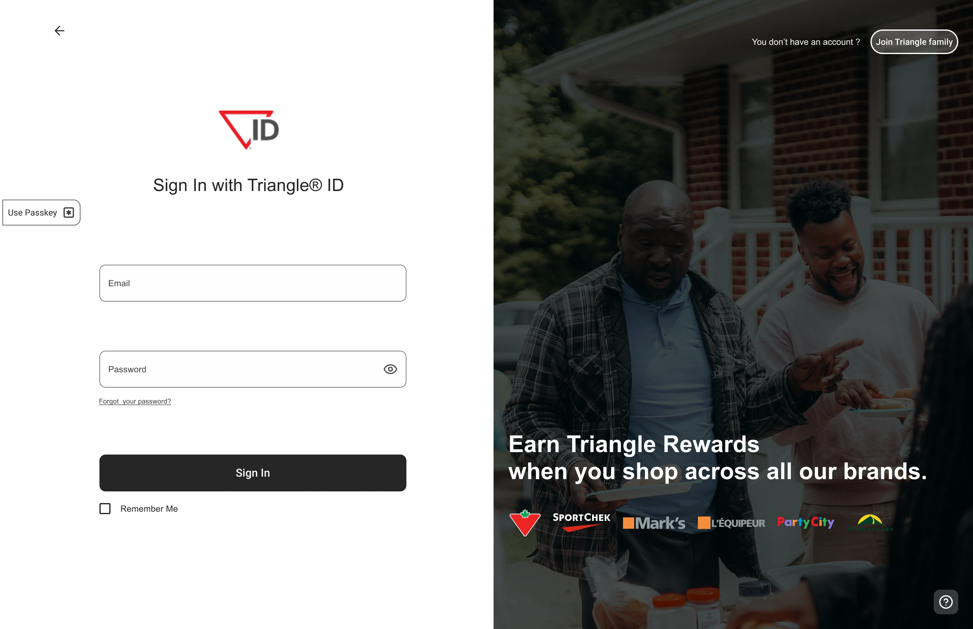
For the final hi-fi version, I opted for rounded corners on buttons to give a less harsh aspect to the interface.
For the Left part, I kept the base CTA color, as it's quite effective and elegant. The biggest challenge on this part was the "Use Passkey" button.
At first, I wanted to make it the same color as the main CTA, but that would have created the same problem as initially. I also considered coloring it with the brand color, but that would have been too flashy and would have distracted users from their objective.
→ I therefore opted for a button with only a darker border than the input fields, in order to clearly differentiate them and not create confusion for users.
The Right part was simpler in terms of choices. It needed something visible without being distracting. I played with a filter to darken the image enough so that it could be perceived without the text, logos and buttons losing their visual priority.
→ I chose pure white to make the important elements stand out and I used opacity for the fill.
A/B test
Ab/test guide
The objective of this A/B test is to verify whether the modifications made are truly beneficial or not.
The test will be conducted with 6 users:
3 will start with version A (old interface), then test version B (challenger)
The other 3 will do the reverse, first version B, then version A
Users will have to complete a series of tasks → the goal being to measure if the experience is coherent for users and represents no form of frustration or doubt.
Create an account
Sign in via passkey
Ask for help
Return to the previous page
As well as two questions:
How do you feel about interface B?
How do you feel about interface A?
Hypothesis However, if the test results are not conclusive, interface B option will remain viable, as it brings an interesting redesign with iteration potential.
User test conclusion Users overwhelmingly preferred interface B, which inspired confidence and admitted they felt much more likely to convert with this familiar interface rather than the old interface which had a colder and unfinished feel. Tests showed that interface B allowed users to find elements faster with better visual guidance, while interface A required significantly more effort for basic tasks.
Conclusion
We can conclude that the design choices were relevant in solving this problem, although still open to iteration. The page now has an appearance that inspires greater trust from users and allows us to project growth in the acquisition of new customers.
→ +25% new sign-ups expected over the next 3 months
Learning
This design sprint made me realize how important it is, both for user experience and business, to provide effective sign-up pages. They serve as the connection between a potential buyer and a customer.
Like this project
Posted Jun 29, 2025
Redesigned Canadian Tire's login experience to improve user sign-ups.
Likes
0
Views
1
Timeline
May 1, 2023 - May 5, 2023