Designing Spotify's AI Playlist Feature
Pierrick Bernard

Designing Spotify's AI Playlist Feature
Role : Product designer / UX researcher Team : Independent
Duration : 4 weeks Tools : Figma, Font Ninja, Miro, ColorZilla
Preface
This project stems from an old idea: creating a SaaS to generate event playlists. As my career evolved toward UX, I wanted to use this idea to improve a product I use daily — music being one of my passions.
Spotify launched their version two months after mine. This timing could have thrown me off, but I chose to turn it into a strength. I tell the whole story in my Medium article.
Project Overview
project summary
Spotify, the global leader in music streaming with over 600M+ users, must constantly improve its product in terms of user experience and features to maintain its competitive edge.
The goal
The objective is to integrate AI to assist users in playlist creation, saving them time for what matters to them: listening to music.
Design Process
Competitive Analysis
The competitive analysis helps understand whether this implementation is viable:

Key Insights:
2 out of 3 analyzed competitors have adopted this feature
They are in closed beta, only in specific geographical areas or accessible to few users (<5% for Deezer)
Opportunity: Unlike Spotify, Amazon Music isn't considered a premium listening platform and Deezer suffers from its second-place position. Spotify had already implemented playlist creation based on our listening habits.
In this specific case, Spotify benefits from its competitors' moves to learn and analyze potential improvements and frictions to avoid when enhancing its product by adopting ideas (example: mood carousel, prompts with only emojis).
Survey
Following this analysis, I launched a survey to gather Spotify users' opinions (my network and friends, all Spotify users) to determine whether this feature is missing from the product despite the competitive analysis indicating global adoption by competitors.
The survey was relatively simple (3 questions max on a 1-to-10 scale), based on the spark effect, ensuring participants wouldn't feel overwhelmed by the effort. (number of participants: 10)
On time wasted in playlist creation
On satisfaction with playlists created through search
On the relevance of AI assistance for playlist creation
Key insights:
8/10 users admit feeling overwhelmed by playlist creation
6/10 users feel satisfied with playlists created through search and would want more personalization
8/10 users wouldn't be against AI-assisted playlist creation
Conclusion: The majority of users would welcome this feature although some participants mentioned they never create playlists or simply listen to audiobooks/podcasts.
User interview
To confirm the insights obtained from the survey and learn more about users' motivations, I invited survey participants for interviews (5 people).
Key insights:
Motivation – create a playlist that matches the desired mood/or location
Pain Point – abandons if playlist creation and adjustment becomes time-consuming
Goal – have a playlist that's coherent with the intended event or emotion
After gathering these testimonials, I sorted the insights on Miro and used the JTBD framework to define user motivations and needs for this feature:
Control — the user wants to know they can modify the AI-generated playlist
Time saving — the user thinks about the considerable time saved during playlist creation
Emotion — the user wants to be sure the AI will understand the emotion or vibe desired during creation
User flow Analyse
Before any feature ideation, the question I asked myself was:
But how am I going to implement this feature in this UX?
I had to consider several things like implementation within an existing UX and also making it easier for the development team during implementation, while also introducing the feature to users.
After reflection and observation, it made sense to place AI-assisted playlist creation in the same location as regular playlist creation.
→ logical implementation with good discoverability
→ benefits from the visibility of the basic playlist creation option
→ the user expects to find creation options in this location
Next, I proceeded with ideating the user flow during their journey with the feature, making sure the user could cancel at any time while being guided through the new feature with an explanatory onboarding during their first visit to the feature.

user flow
Ideation
Once the question of where the feature would be implemented was resolved, I was able to begin ideation based on user needs:
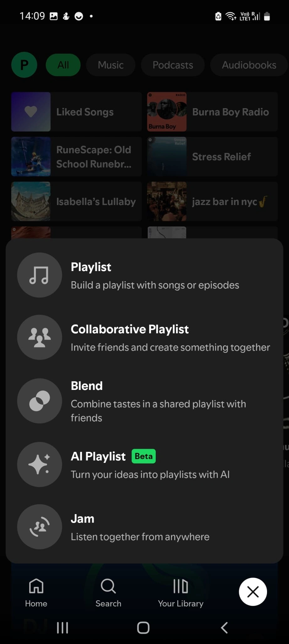
Pop up creation
Robot icon to emphasize the AI aspect of the feature, with the wording "Create your own mood in two clicks" to highlight the time-saving benefit for users

Pop up create playlist
Onboarding
Back button placed at the top according to expected standards for going back

Step 1
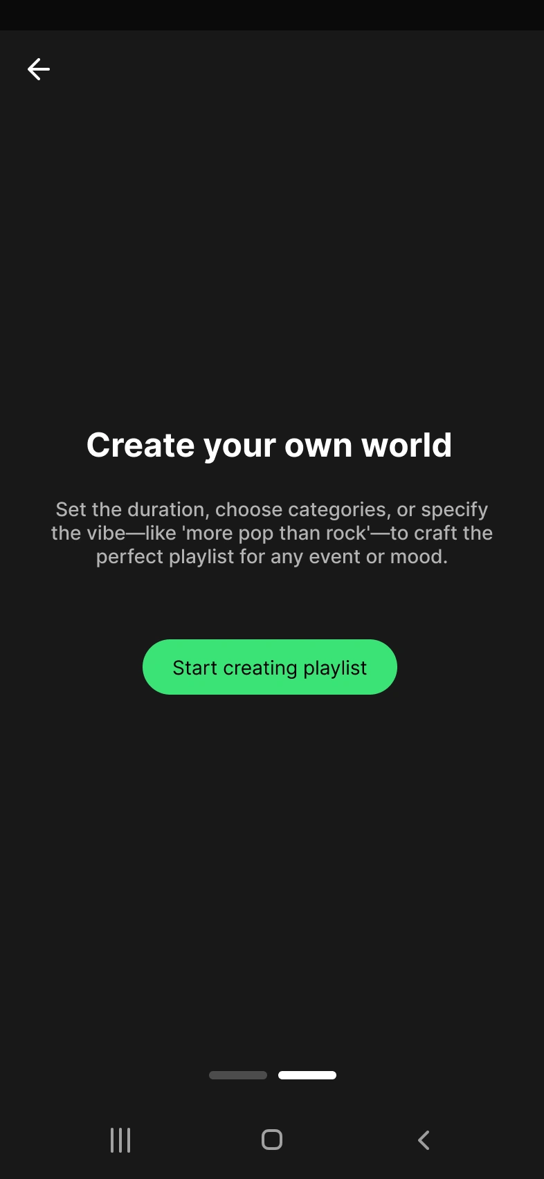
Step 2
An indicator showing the onboarding length (two steps in this case) with the possibility to skip directly to the final step
A header that lets the user know they're saving time while creating their universe
Text below the header that reinforces the explanation and functionality, such as choosing duration and vibe
Playlist Creation I chose to keep Spotify's existing mechanics to save time. After the onboarding ends, the user finds the same basic screen where they need to enter the playlist name to start creating it.
→ Time-saving because they already know the mechanic
Then, I also reused the playlist screen but added a "Create with AI" CTA to start playlist creation.
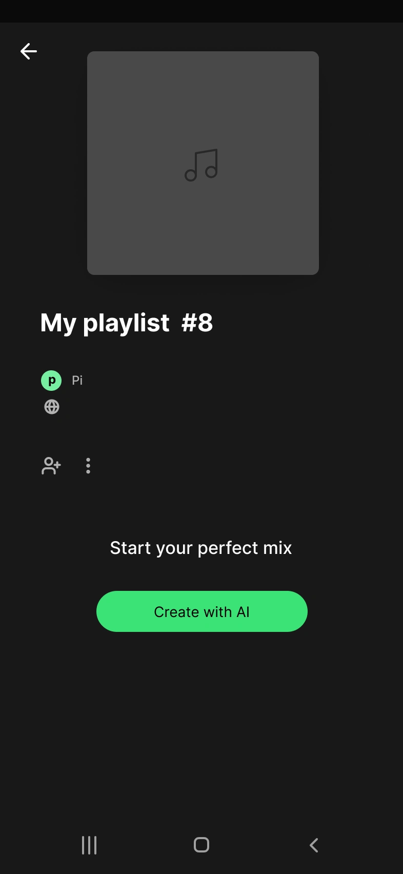
This opens a pop-up that contains:
A carousel of predefined moods (happy, birthday, relax, etc.) to reinforce the playlist's mood and guide the AI in song selection

A second carousel allowing users to choose the average playlist duration, ideal for programming sessions or events with a specific timeframe
A text area with placeholder wording "I want a pop vibe" to inspire and guide the user on what they can ask the assistant
An explicit "Create my playlist" CTA at the bottom of the page for confirmation and playlist creation
Hi-Fi
To quickly enhance the prototype’s fidelity, I opted for a hi-fi version to simulate a realistic user experience during testing.
I leveraged web plugins like ColorZilla and Font Ninja to efficiently capture Spotify’s colors and fonts.
Instead of recreating the home screen from scratch, I simply used a screenshot and layered interactive elements on top.
→ This approach saved time while providing users with a coherent and authentic testing experience.
Findings and Comparison
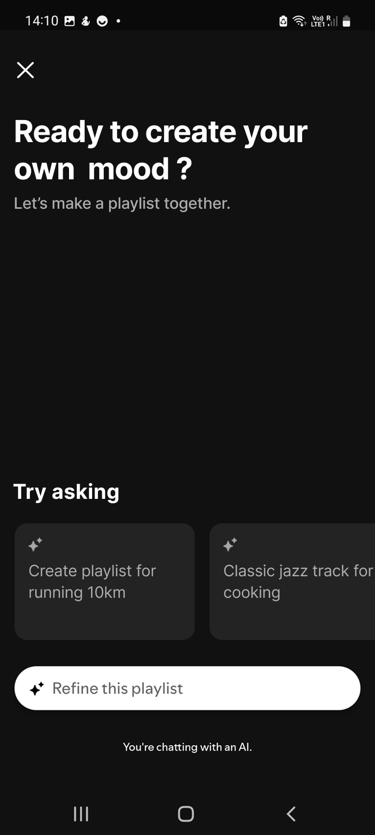
In the first version of the case study, users liked the feature — a nice happy ending. However, with the later release as mentioned in the preface, I had to verify if my UX hypotheses were correct and potentially iterate.
The option is currently only available on mobile. Previously, I had also made a desktop version but I find it more relevant to compare two products on a similar device.
My intuition to implement the feature in the same place as creation was therefore correct
→ logical, but reinforced by Spotify's product itself
Here Spotify puts the playlist creation tool quickly in the user's hands without onboarding unlike mine, which saves the user even more time.
Strengths:
Allows for more advanced prompt suggestions compared to my version
More practical than a popup for creation
More elegant and better integrated input
Mentions that the user is talking with AI
Weaknesses: The product is in beta but would need to have prompt suggestions and more engaging wording using the framing effect.
Personal insights: → Currently as a Spotify consumer, I don't recognize my tastes in what is suggested → Slightly more engaging wording than a simple "What do you want to hear today?" As a user, I didn't wait for AI to know what I want to listen to. When we create a playlist it's to have a specific mood or event/activity.
Testing the creation of a playlist for a pizza night let's say but with a simple "🍕" to spice things up.

Unlike my version of the feature, Spotify's allows direct modification after AI suggestion and allows refining the playlist (the AI showed patience after my iteration attempt "🍕 + 🌯").

Personal note: The music for a pizza night are all songs from my playlist or not very relevant to the theme. As specified it's a beta version and the prompt wasn't very explicit.

Spotify has placed an option to refine from the playlist, practical for iterating and avoiding frozen playlists during creation.
Following this I wanted to do a MoSCoW sort to decide what I wanted to keep or not, but after a moment of clarity this step would have no interest.
Key insights:
Spotify already allows creating playlists with simple emojis
Offers playlists without fixed duration that are iterable and scalable
Iteration on real product
The objective is therefore to take Spotify's work as a base and merge my ideas with it (like venom).
At this stage the only options were to rework the headers and UX writing using framing to be more engaging.

The headers become "Ready to create your own mood" which is more emotionally engaging with the user → this allows them to project onto their desires or according to their state of mind (happy, bad day etc..) This reinforces the word "together" already present in the base text which emphasizes the assistance aspect of the feature.
The carousel texts are now more aligned with the needs found in my previous research, they express a desire or energy wanted for a specific moment.
→ Spotify users and humans in general are often interested in listening to music for discovery, or to immerse themselves in an activity or comfort an emotional state.
A/B Testing
B
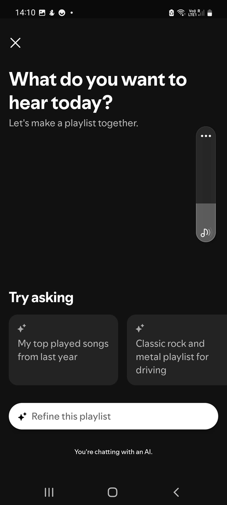
A
The objective of this A/B test is to test which of the two interfaces engages users the most to create.
For this test I recruited 4 Spotify users (from my circle), the test consists of asking them a series of questions while showing them both versions without telling them which one is Spotify's (version A):
What do you feel when faced with interface A?
What do you feel when faced with interface B?
Which interface do you prefer for creating a playlist? And why?
What do you feel with the suggested prompts in B compared to A?
Which interface is Spotify's?
Results:
3/4 users feel less desire to create a playlist on interface A because they're looking for an ambiance rather than a specific artist or style
3/4 find that interface B is more engaging, the "Mood" text allows them to better appropriate the tool and open their mind to what they want
4/4 find that the suggested prompts in interface B have more context which allows identifying what the user could ask for, unlike A which seems generic
4/4 users had the right intuition by indicating that interface A was Spotify's
Conclusion: My improvements make the users feel more concerned by the creation. → But overall Spotify's version is more solid because it's accessible to the general public and direct.
Conclusion
Spotify indirectly validated the needs I had identified for their product by releasing their version.
Through this I learned that it's not the idea that counts, it's how you develop it and iterate the product to validate new business objectives.
Not having real KPIs, I hypothesize that if the feature has the expected success on mobile, it would be relevant to port it to the desktop version.
Learning
Beyond Spotify's validation and the fact that I cannot compete with a team of experts, this pushes me to always want to improve my skills (research, UX writing, prototyping) and to always seek innovation to increase business objectives or iterate competitors' ideas in the market.
Like this project
Posted Jun 30, 2025
Designed AI playlist feature for Spotify, enhancing user experience with AI-assisted playlist creation.
Likes
0
Views
4
Timeline
Mar 1, 2023 - May 27, 2023
Clients
Spotify