Bentley Online Purchase UX Enhancement
Pierrick Bernard
Bentley Onboarding Drop-Off
Role: UX Designer / UX Researcher Team: Independent
Duration: 4 weeks Tools: Figma, Google Sheets, Miro
Project Overview
project summary
Bentley, a luxury car manufacturer, was facing a critical issue: a retention rate of only 0.2% at the final step of its online purchase journey.
Through in-depth user research, I was able to identify the key pain points and simplify the overall experience to improve user retention.
The problem
The main issue for users came from an outdated interface that no longer met modern UX standards.
The experience was overloaded — too much information and too many options displayed at once — which created cognitive fatigue and confusion, ultimately leading users to abandon the process before completing it.
The Goal
Users expect a personalized vehicle configuration experience that reflects their success and identity.
Their goal is to easily complete the form in order to be contacted about acquiring a premium car.
From a business perspective, the goal was to optimize the user experience to increase the click-through rate on the “Submit” button, and ultimately improve the overall conversion rate.
Design Process
Hypotheses
These initial hypotheses were based on a UX audit of the current configurator interface, using Nielsen's 10 heuristics:
Users feel the interface is not intuitive – Based on Heuristic #8 (Aesthetic and minimalist design”), the lack of clarity contributes heavily to the poor usability.
The information structure causes users to drop off – Heuristic #4 (“Consistency and standards”) revealed that the interface lacks intuitive visual and interaction patterns.
Some users are just browsing out of curiosity – It’s human nature. Not every visitor is a potential buyer, and that needs to be acknowledged realistically.
Survey
To validate (or no ) the hypotheses, I conducted a short quantitative survey using a simple 1-to-5 rating scale (5 being the best).
The survey was intentionally designed to be quick and easy — applying the “spark effect” logic: the less effort required, the higher the response rate.
It was distributed through general car enthusiast forums and Bentley-specific communities.
Key insights
70% of users found the interface less intuitive compared to other premium car configurators.
80% said information was hard to find or poorly highlighted.
Ideation
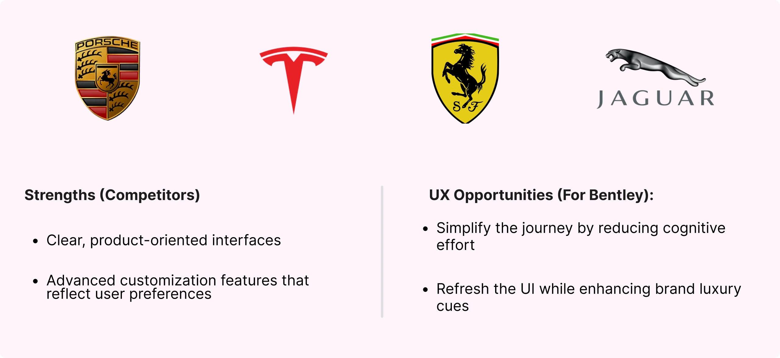
After reviewing the survey results, I conducted a competitive analysis of both direct and indirect competitors.
This analysis raised a few key questions for me:
What are the specific expectations and needs for this type of configurator interface?
How can Bentley improve its UX while staying true to its brand heritage?
Key insight:
Competitor interfaces intentionally focus on intuitiveness and low cognitive load, putting the product at the center of the experience — unlike Bentley’s current approach.
User interview
To confirm my hypotheses, I interviewed 5 participants and asked targeted questions based on my initial research findings.
Key insight:
Motivation – Reinforce their sense of professional success
Paint Point – A rigid interface that’s hard to understand
Goal – Receive smart customization suggestions to guide their choices
After these interviews, I mapped the main insights in Miro and used the Jobs-To-Be-Done (JTBD) framework to define the core user goals:
Interface control – Feel in control throughout the configuration process
Customization guidance – Ensure the final result is coherent and matches their style
Smooth experience – Enjoy a seamless, frustration-free customization journey
Ideation & User Testing
The main guideline for this first design phase was to create a low cognitive load experience that feels simple and easy to use.
Once the lo-fi prototype was ready, the goal was to test early with users in order to gather feedback and identify possible iterations.
The sample group consisted of 5 remote testers (via Zoom), with the following tasks:
Trigger the confirmation pop-up after submitting the form
Find how to retrieve their configuration code
Access the overview PDF of their configuration
Key insights :
Bidirectional dropdown menu → Confused users
Configuration retrieval process → Major pain point
Form perceived as too heavy → High cognitive load
Scrolling through options unclear → Discoverability issue
These tests helped me validate whether the proposed interface provided a satisfying user experience.
Hi-Fi UI Design & Iteration
Based on the feedback gathered during testing, I implemented several key improvements:
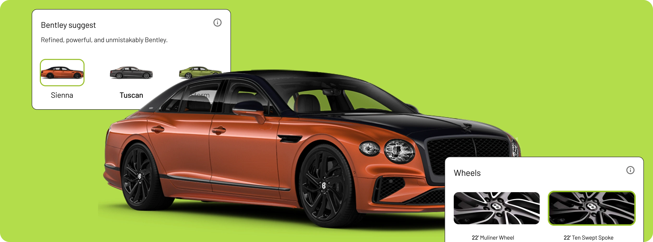
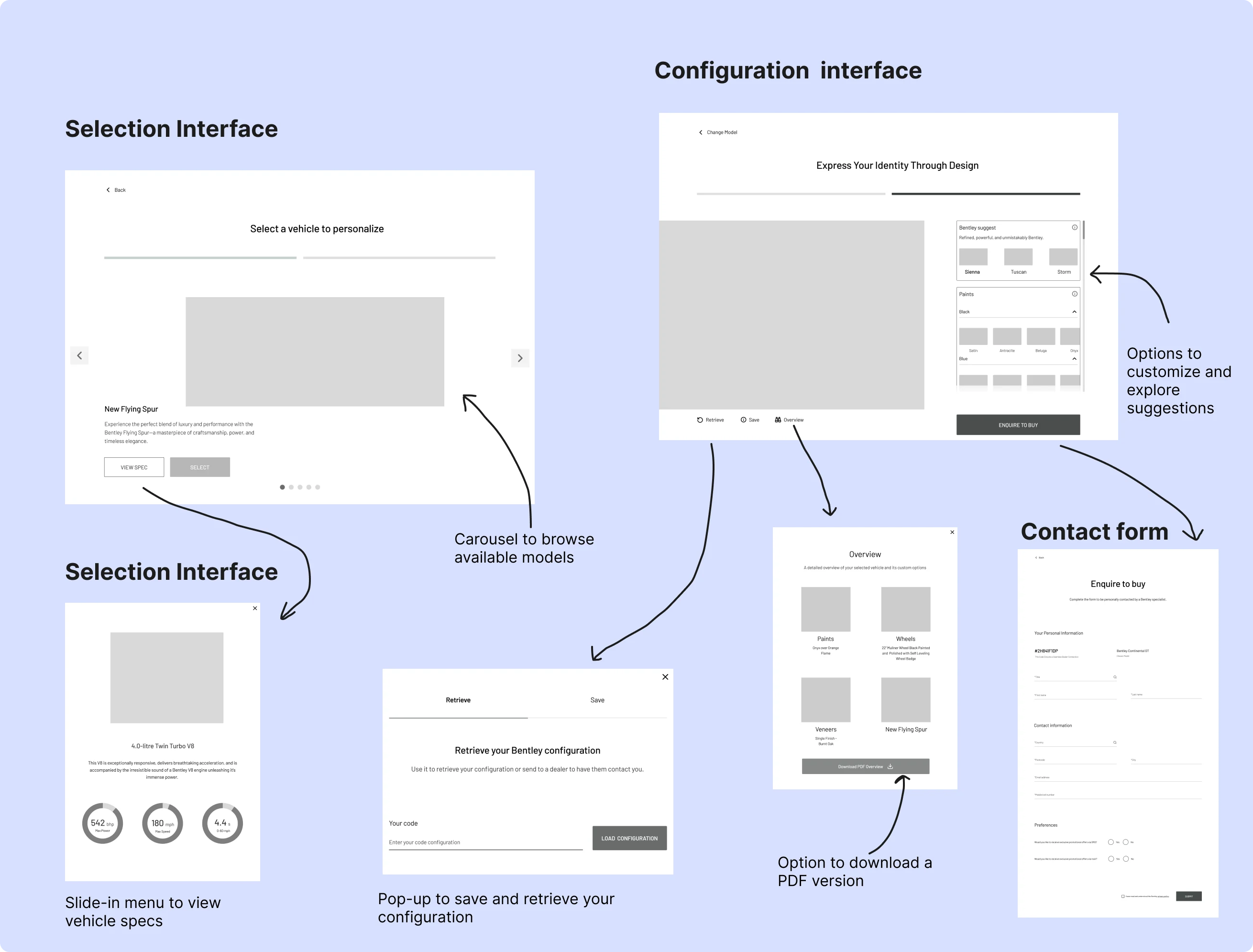
Selection Interface
The product is now placed at the center of the screen to guide user focus, with a carousel indicator below it. The progress bar was removed, and both the vehicle name and description were enlarged for better readability.
Configuration Interface
Users now have full visual access to their configured vehicle, with scrollable views below. The configuration panel has been redesigned — dropdowns removed and more space, rounded corners added for a softer look.
A new direct-access "Retrieve" button was added, clearly indicating how to recover a configuration.
Bottom of the Configuration Interface
At the bottom of the interface, I introduced a fixed navigation bar containing the vehicle name and a button that leads to the options.
This subtle addition helped users realize that more content was scrollable below.
Before this change, the scrollable section was hidden by the bottom nav — now users clearly understand that they can scroll to access additional options.
Slide-In Menu
All actions are now grouped in a slide-in panel. The interface is simplified with one main CTA — “Enquire to buy” — leading to a lightweight form designed to trigger the spark effect (the less effort it feels like, the more likely users are to complete it).
Two secondary CTAs are available:
Overview: A summary of the configuration, with PDF download option
Get my code: A pop-up with the configuration code, which users can copy or send by email
With these changes, the interface is now clearer and structured in a way that significantly reduces cognitive load.
To validate the impact of these improvements, an A/B testing phase would be the next logical step.
A/B Testing
The goal was to test both the hi-fi prototype and the old version with 4 new users, using a reversed sequence: 2 testers tried interface A first, then B — the other 2 started with B then moved to A.
The tasks and process were the same as the first test. This time, the goal was to see which interface had the highest completion rate. If results were inconclusive, version B would be prioritized, as it addresses the main user pain points more directly.
Results
Users testing with this sequence had more difficulties with interface A compared to interface B.
Key Insights:
Interface B required significantly less effort and thinking.
Tasks were easier to complete in version B: users in the AB sequence found it smoother, while BA testers struggled when switching back to interface A.
The centralization of menus and options reduced frustration and helped users understand what they needed to do without any extra effort.
Conclusion & Learnings
The goal of this research was to reduce the drop-off rate and propose a better user experience to drive more interactions and improve retention within the configurator.
With these major changes to the interface and a better understanding of user needs, the retention rate will increase significantly.
The objective is to reach 25% over the next 6 months.
Learning
I was able to better understand the importance not only of testing with users, but above all of aligning user needs with business goals.
Like this project
Posted Jun 30, 2025
Enhanced Bentley's online purchase UX, boosting retention and conversion rates.
Likes
0
Views
2
Timeline
Feb 2, 2025 - Feb 28, 2025