Terre Studio - fitness club visual identity
Žaklīna Linkeviča
Overview
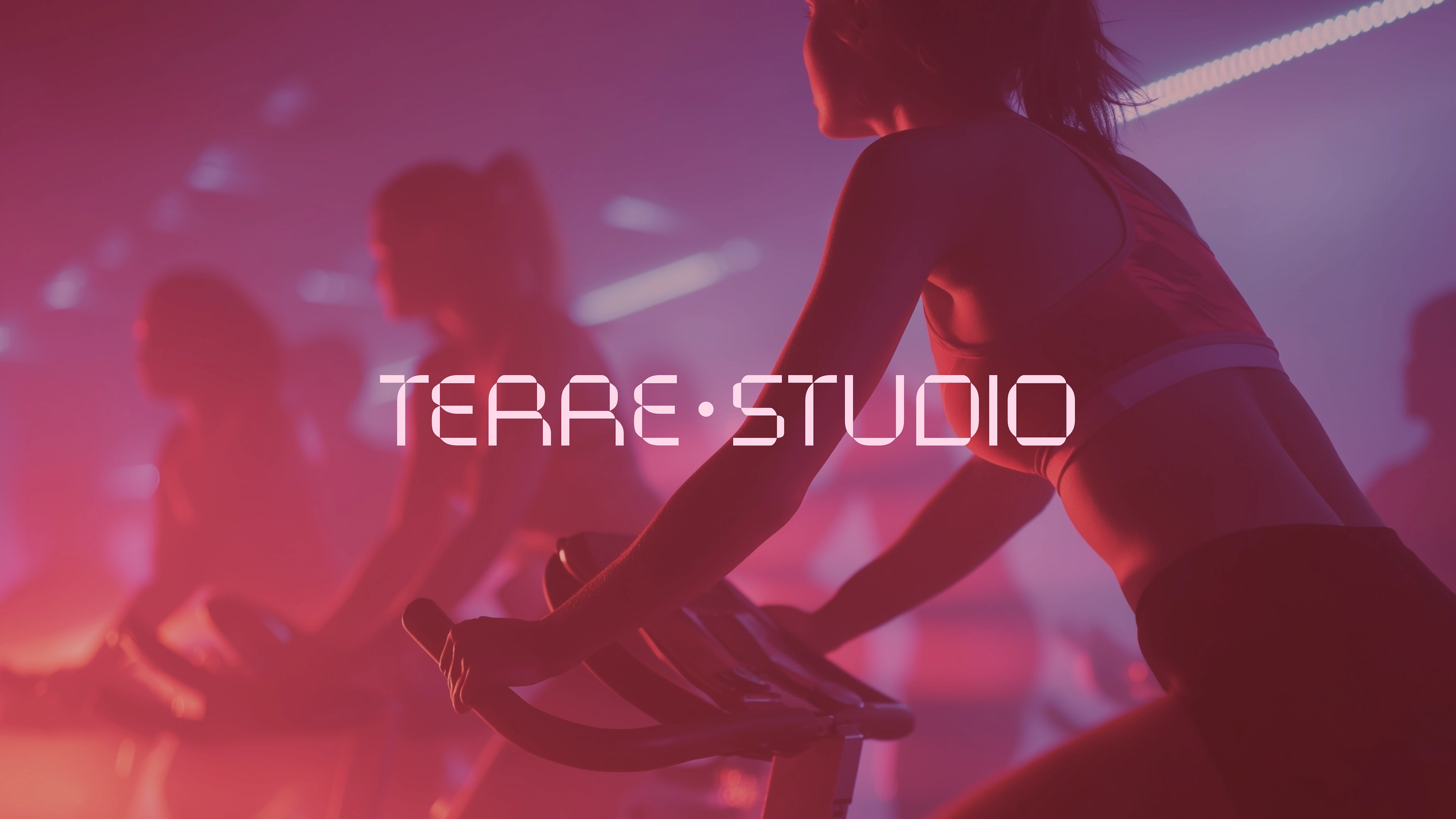
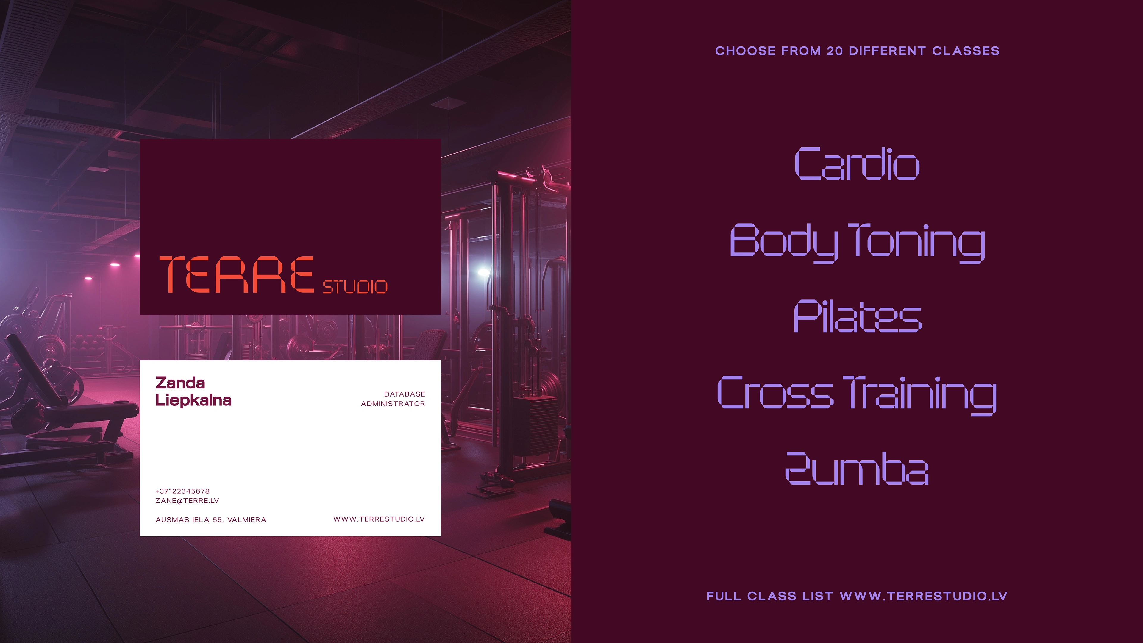
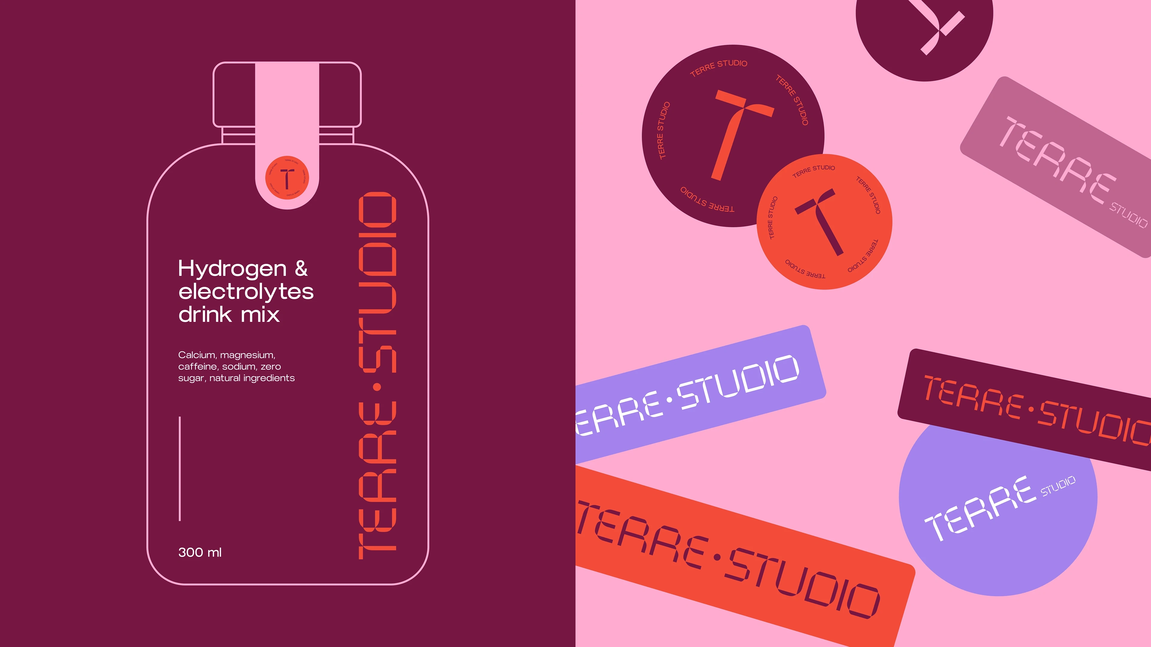
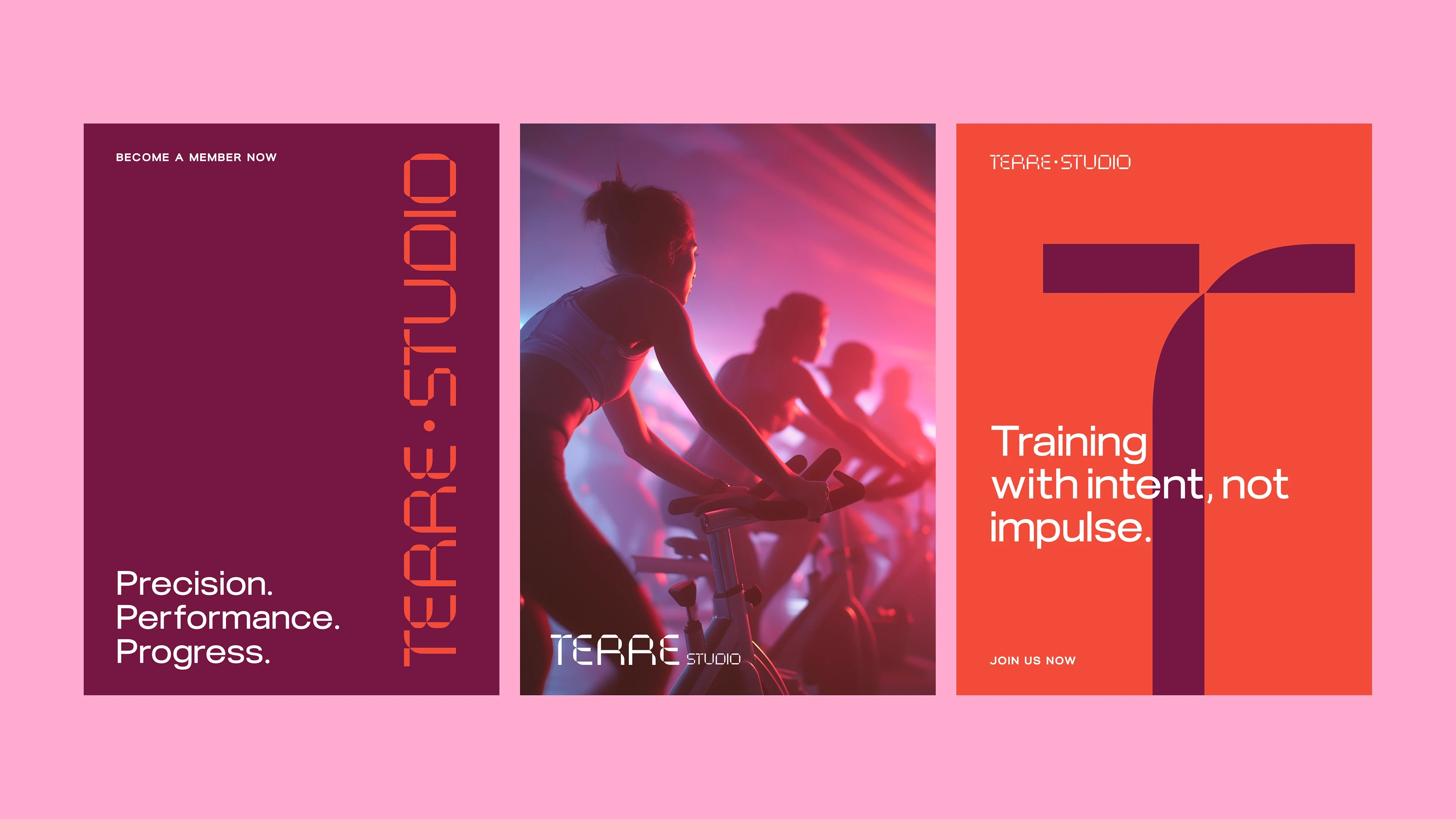
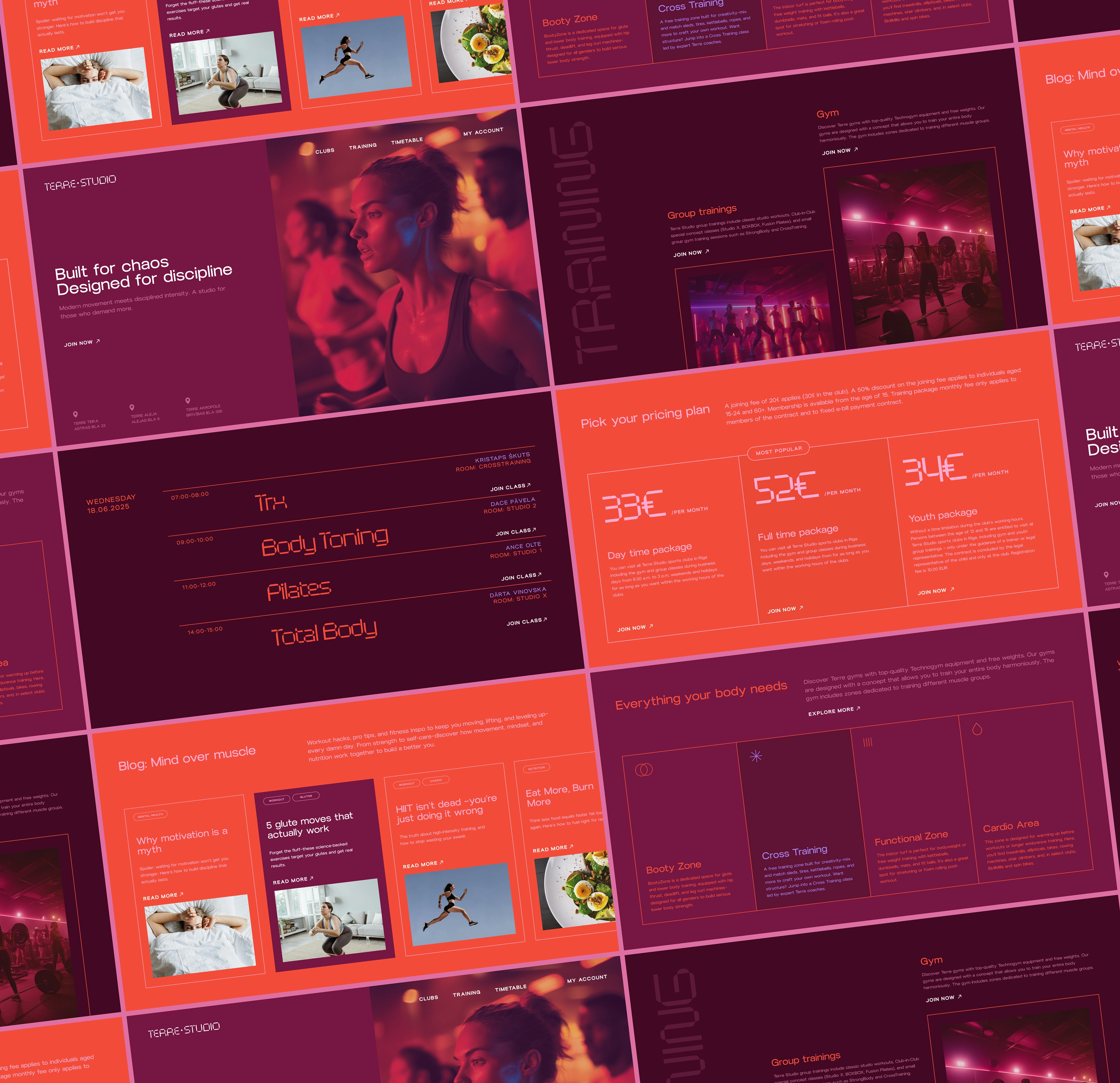
Terre Studio is a new fitness club based in Riga, Latvia — designed for those who value strength, movement, and modern aesthetics in equal measure. Unlike traditional gyms, Terre Studio aims to build a fitness culture rooted in empowerment, self-discipline, and elevated design. It’s more than a place to work out — it’s a space to show up for yourself. To reflect this bold positioning, Terre Studio needed a brand identity that felt fresh, intentional, and aligned with its vision: minimal, urban, and unapologetically strong.
Creative Direction & Strategy
The goal was to craft an identity that broke away from the clichés of the fitness industry. Too often, gym branding falls into extremes — overly aggressive or generically "wellness-y." Terre Studio needed to exist in its own lane: confident without being macho, stylish without losing grit.
Our creative direction focused on three core themes:
Discipline – A visual system that evokes structure, balance, and strength through clean lines and a grid-informed layout.
Intensity – A monochromatic color palette with sharp contrasts to reflect the brand’s bold energy and focus.
Modernity – A typographic approach that feels architectural and progressive, creating a sense of place and culture.
The resulting identity features a custom logotype that’s both minimalist and powerful, supported by a modular layout system and bold editorial typography. The brand’s visual language is stripped down yet striking, echoing the physical and mental clarity that comes from movement. Designed to be applied seamlessly across digital, print, and spatial environments, Terre Studio’s identity sets the tone for a new kind of fitness experience — one that’s rooted in purpose and designed with intention.
Like this project
Posted Jun 21, 2025
UI/UX, Web Design, Graphic Design, Figma
Likes
13
Views
64