Green energy concept brand identity
Overview
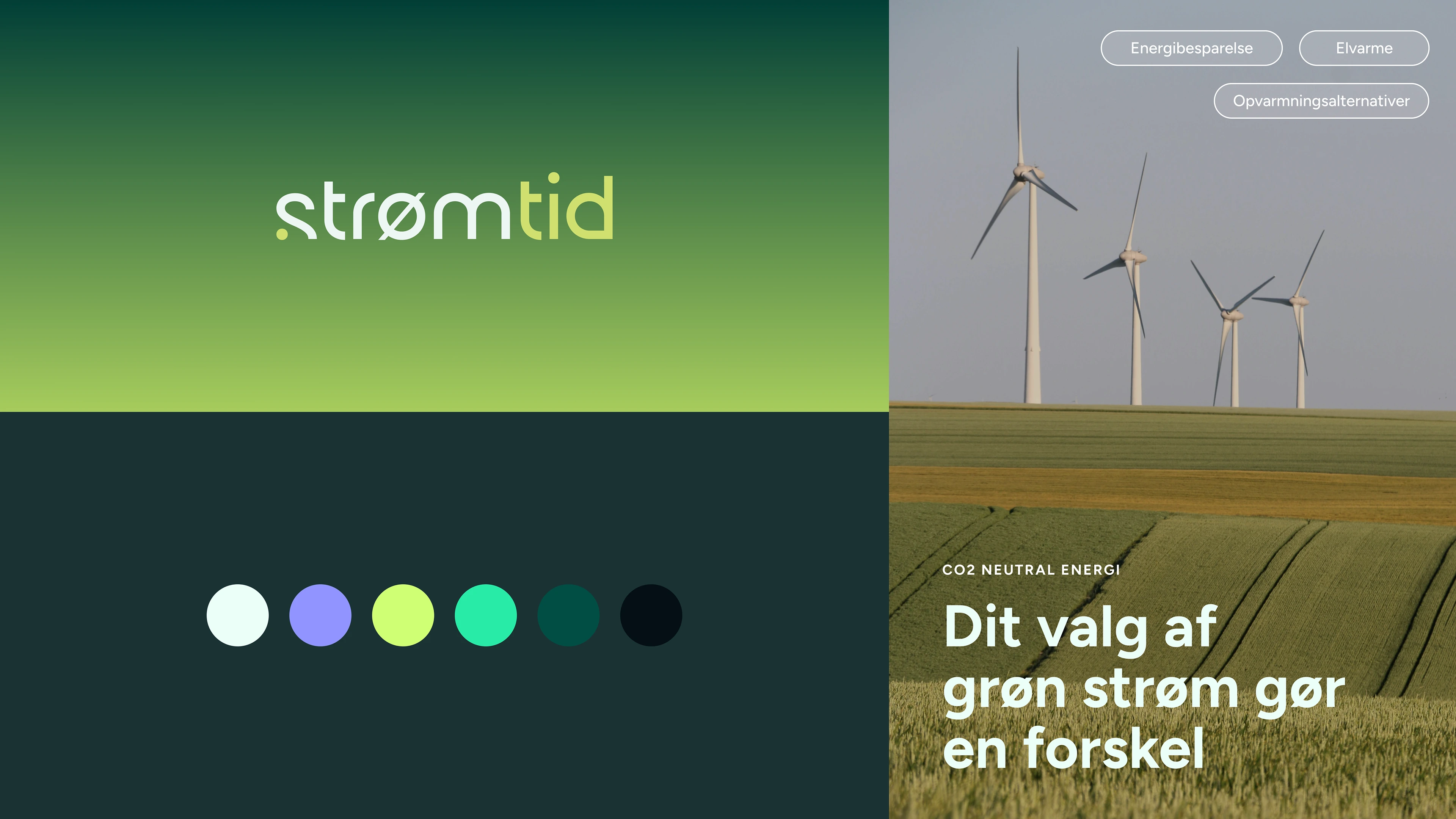
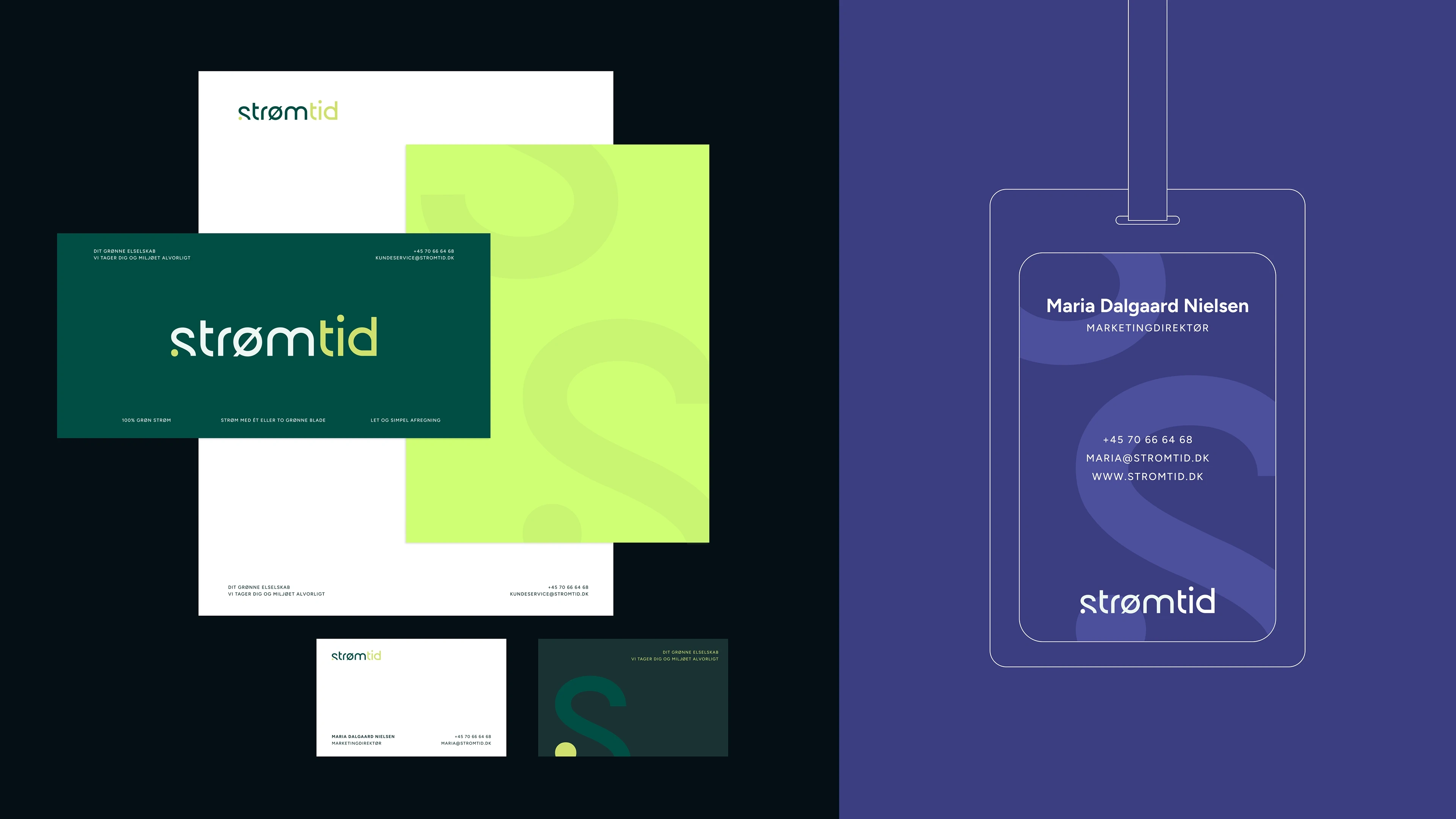
Strømtid is a Danish energy company focused on making green energy feel accessible, transparent, and human. While the original brand served its functional purpose, it lacked a unique perspective and emotional connection. The visual identity was generic, overly corporate, and didn’t reflect the company's progressive mission or the growing cultural momentum around sustainability.
Goal
The challenge was to reposition Strømtid as more than just an energy provider. The new brand needed to communicate clarity, optimism, and purpose—without falling into greenwashing clichés. It had to speak to modern consumers: environmentally conscious, design-aware, and seeking brands they can trust and relate to.
Visual and Emotional Impact
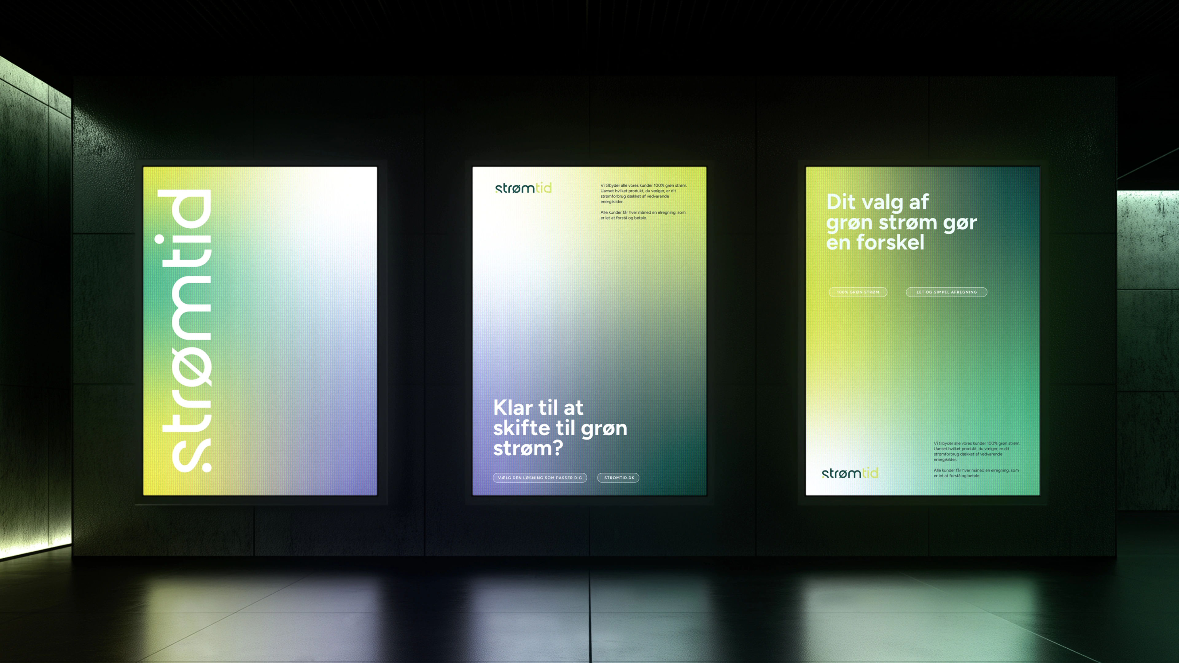
This wasn’t just a logo refresh—it was a complete shift in tone. Strømtid needed to feel calm, contemporary, and credible. The identity had to break through a crowded sustainability space, but in a quiet, confident way. We wanted the brand to feel like a breath of fresh air: grounded in nature, but built for a digital-first world.
We built the new brand identity around three core themes:
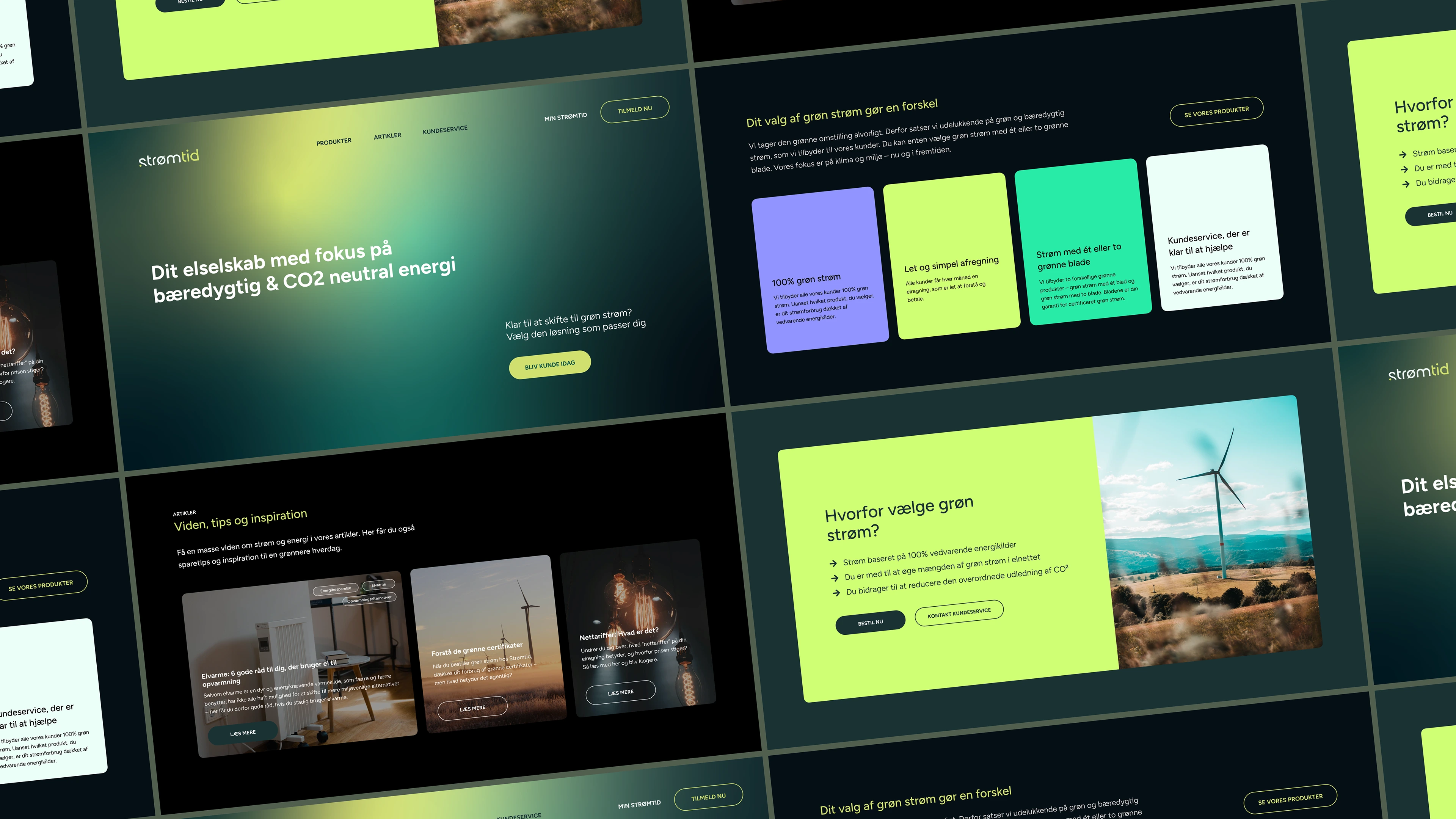
Scandinavian Clarity – A minimalist, spacious design system rooted in Danish design principles. Soft neutrals and cool tones communicate ease and trust.
Organic Structure – A layout system and grid inspired by natural flow and balance, reflecting the harmony between technology and the environment.
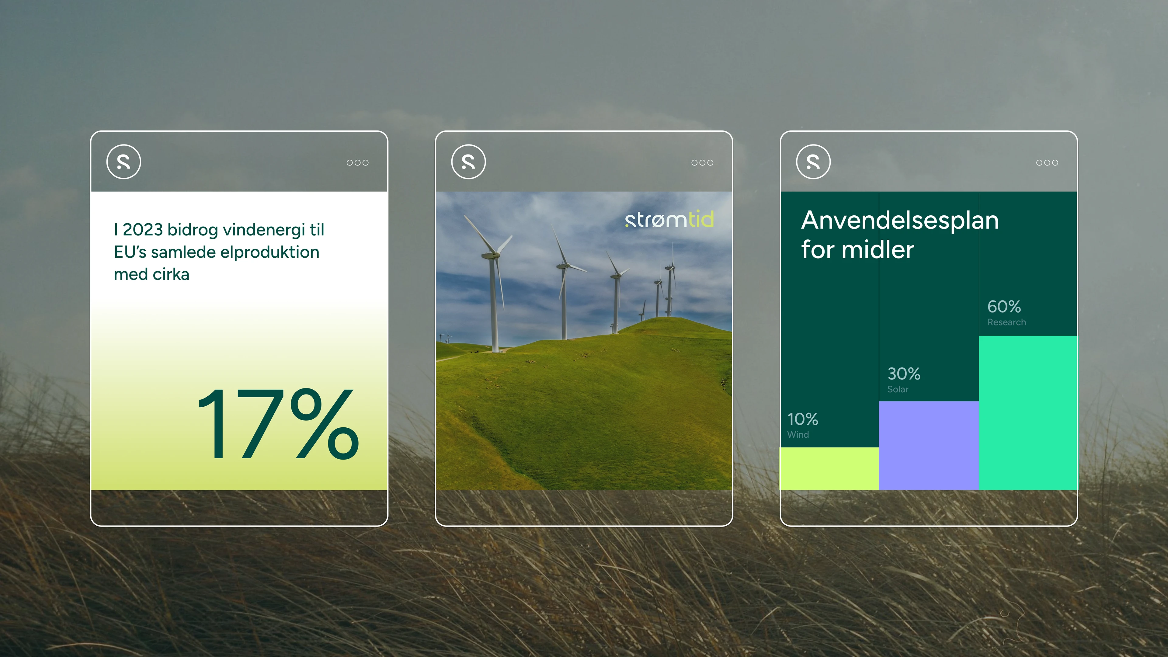
Human-Centric Warmth – A logo mark and icon set that feel tactile and welcoming, supported by warm imagery and gentle motion.
From typography to motion design, every element was carefully considered to support a brand that’s honest, modern, and quietly powerful. The result is a refined identity that positions Strømtid as a new kind of energy company—one that’s future-focused, deeply human, and designed to last.
Like this project
Posted Jun 12, 2025
Graphic Design, Web Design, Branding, Figma, Adobe Photoshop, Adobe Illustrator

