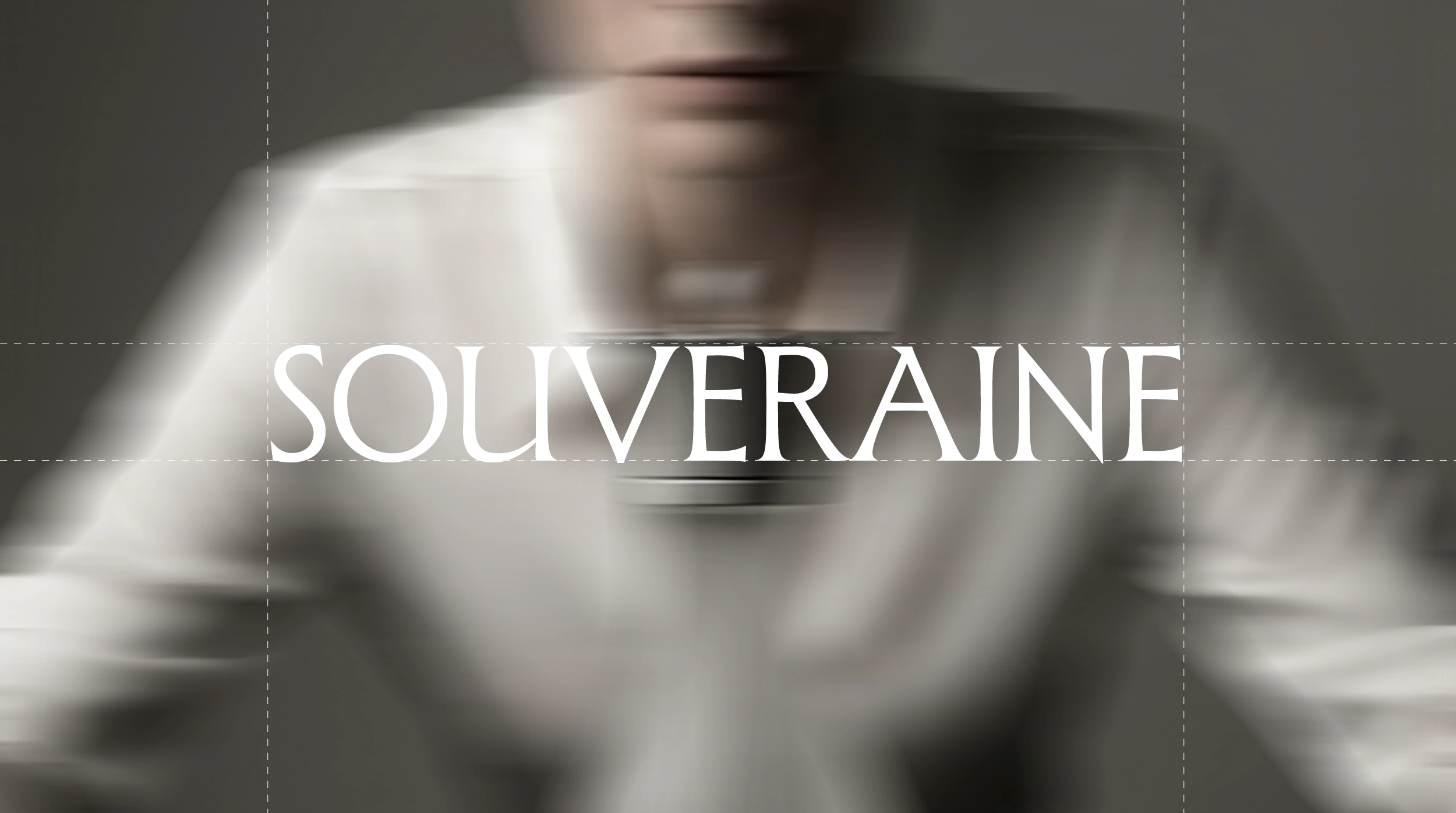
SOUVERAINE — Perfume Bottle Design & Brand Identity

Elodie Fontaine


About the Project
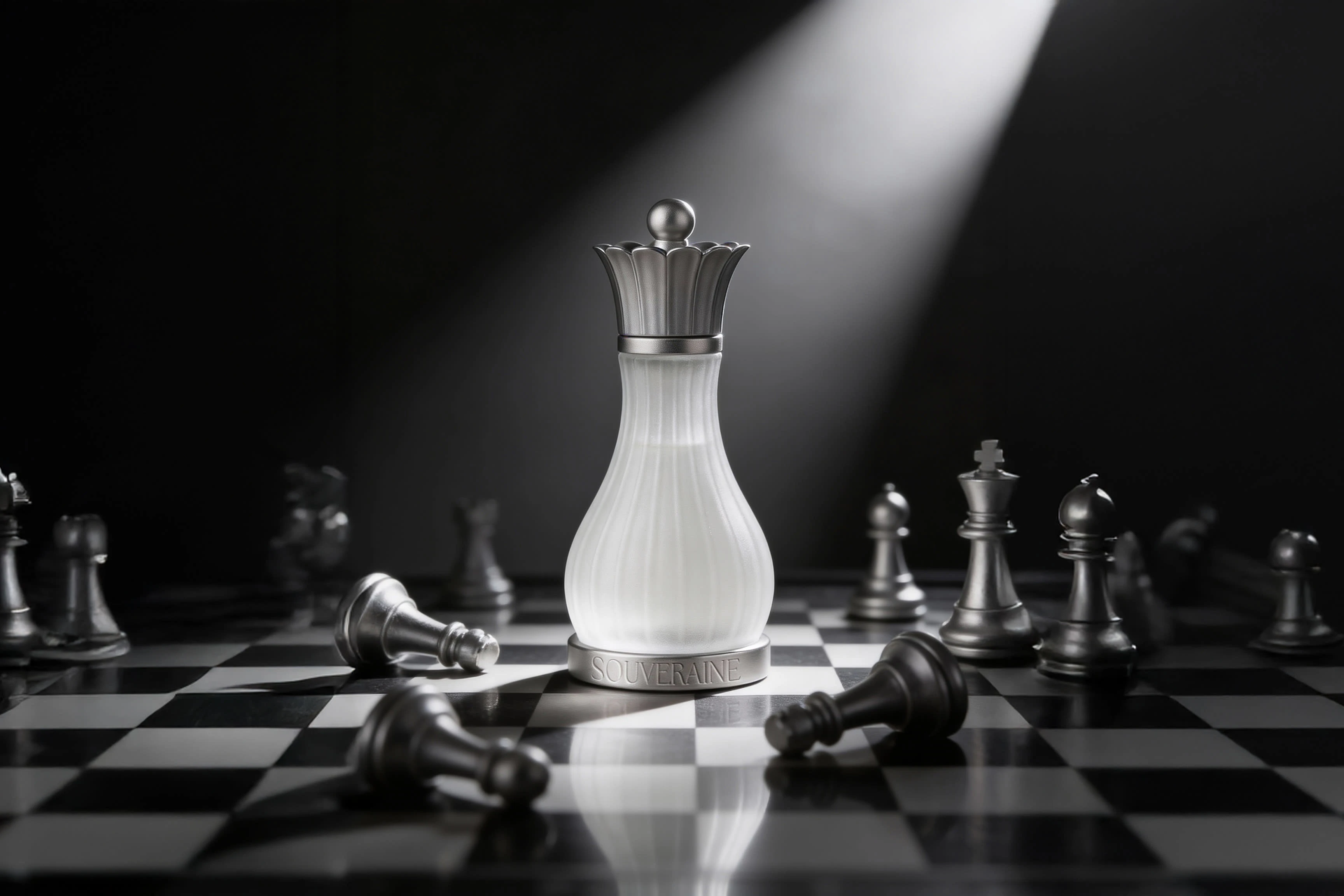
Souveraine is a conceptual luxury perfume project for Maison Lenoir, a fictional French perfume house. The central idea: power as the ultimate femininity. The project covers bottle design, packaging, brand identity, and campaign art direction — all built around one referent. The queen in chess.
The Challenge
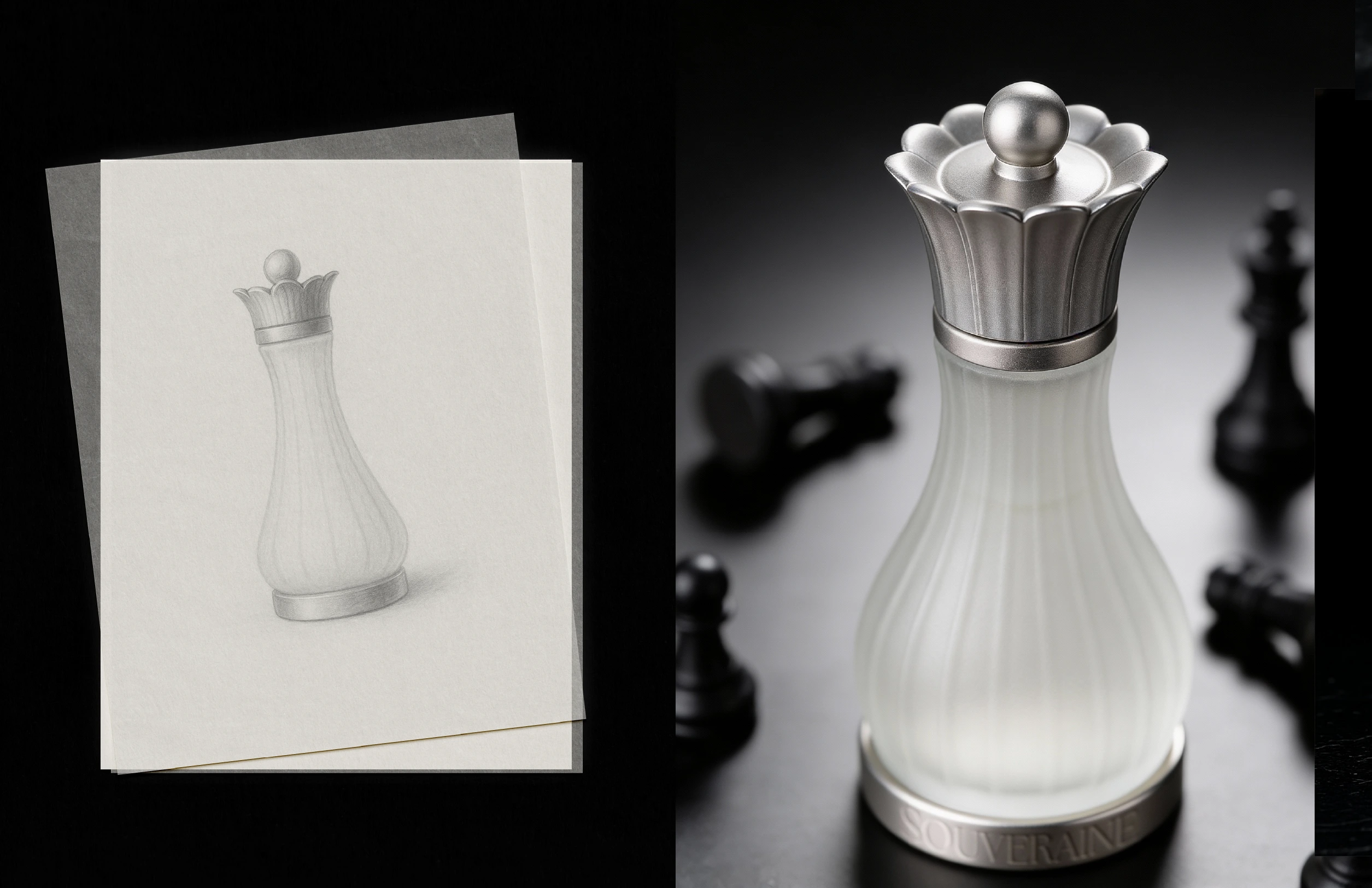
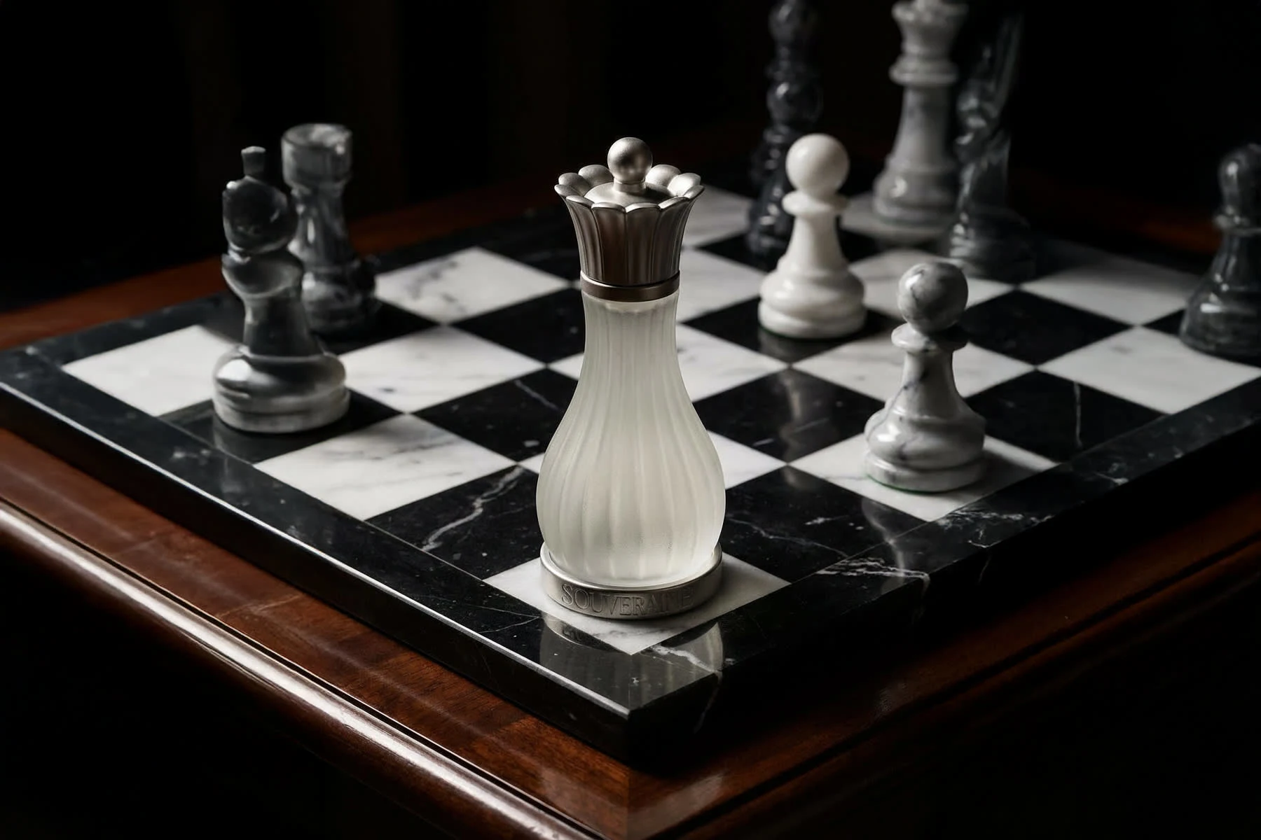
A fragrance bottle is first and foremost a container. Most brands resolve this by decorating the surface. The vision here was different: to create an object that embodies the concept, not one that illustrates it. The queen had to become a bottle — completely, without compromise — and work as sculpture, as product, and as campaign image all at once.
My Approach
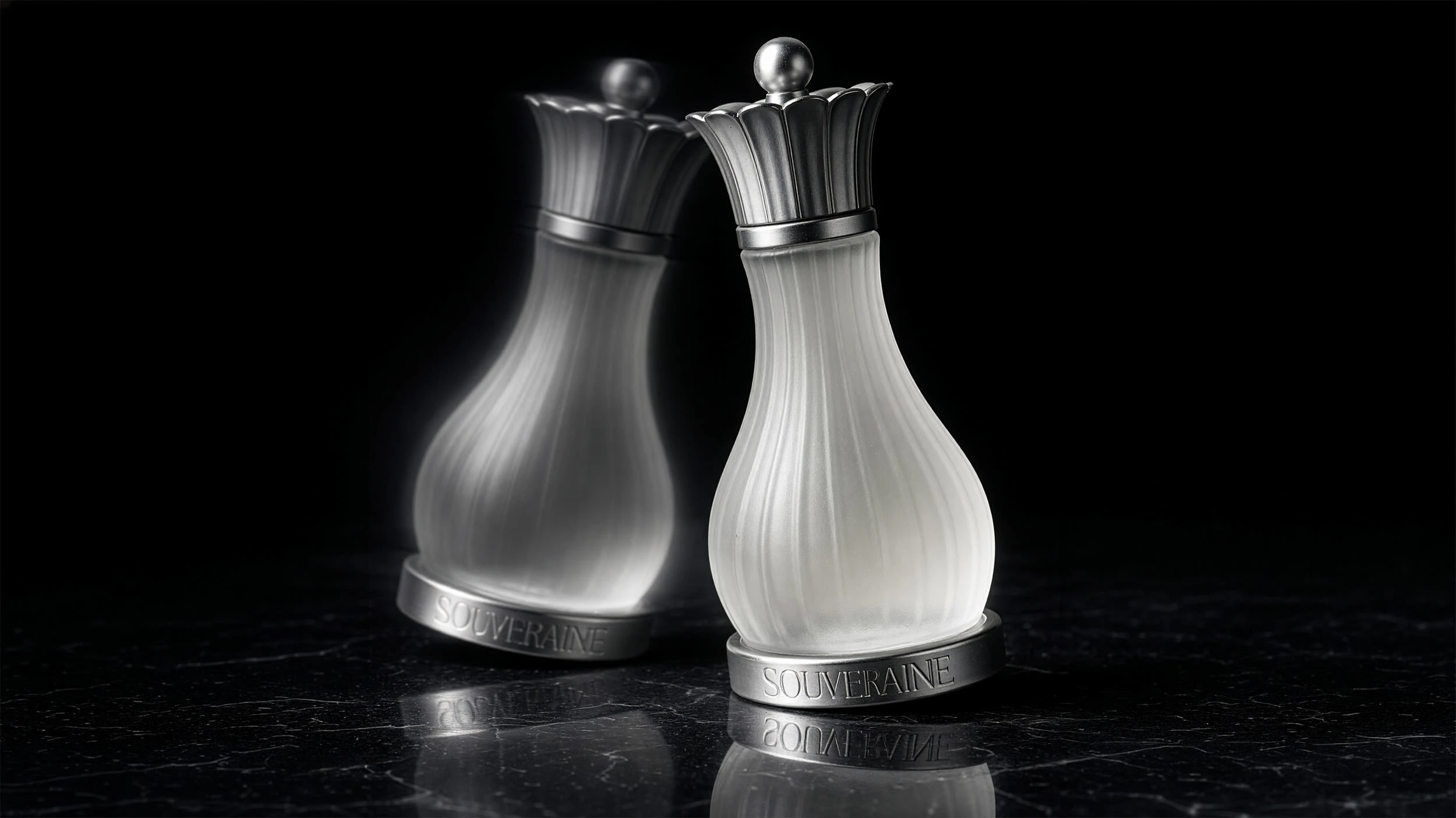
The silhouette was developed through sketching, finding the right proportions between chess piece and object to hold. Frosted ribbed glass body, silver crown cap, engraved base collar — no superfluous decoration. Every detail has a function.
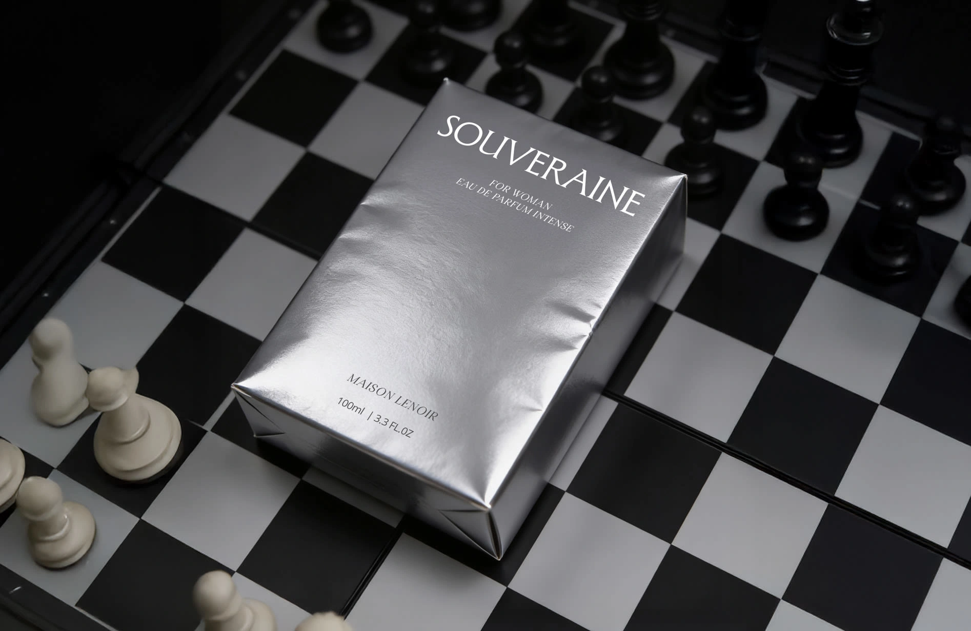
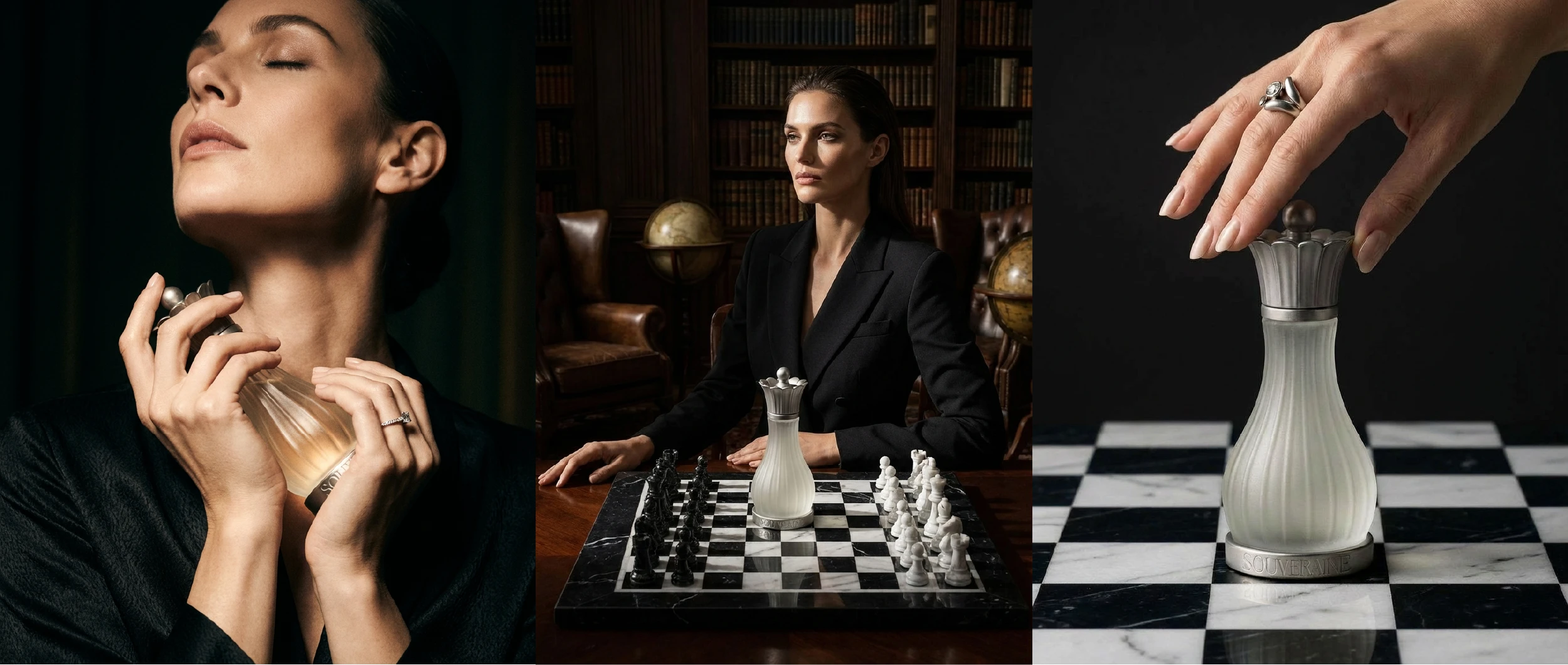
The packaging follows the same logic: rigid silver carton, classical serif typography, nothing else. The campaign plays across three registers — intimate, strategic, tactile — building toward one image: the bottle at the centre of the chessboard, every other piece fallen around it.
Like this project
Posted Mar 17, 2026
Bottle design, packaging & brand identity for a luxury perfume house. The queen chess piece as object of power and desire.