Brand Identity Design for Mingle Cocktail Bar
Elodie Fontaine
About the Brand
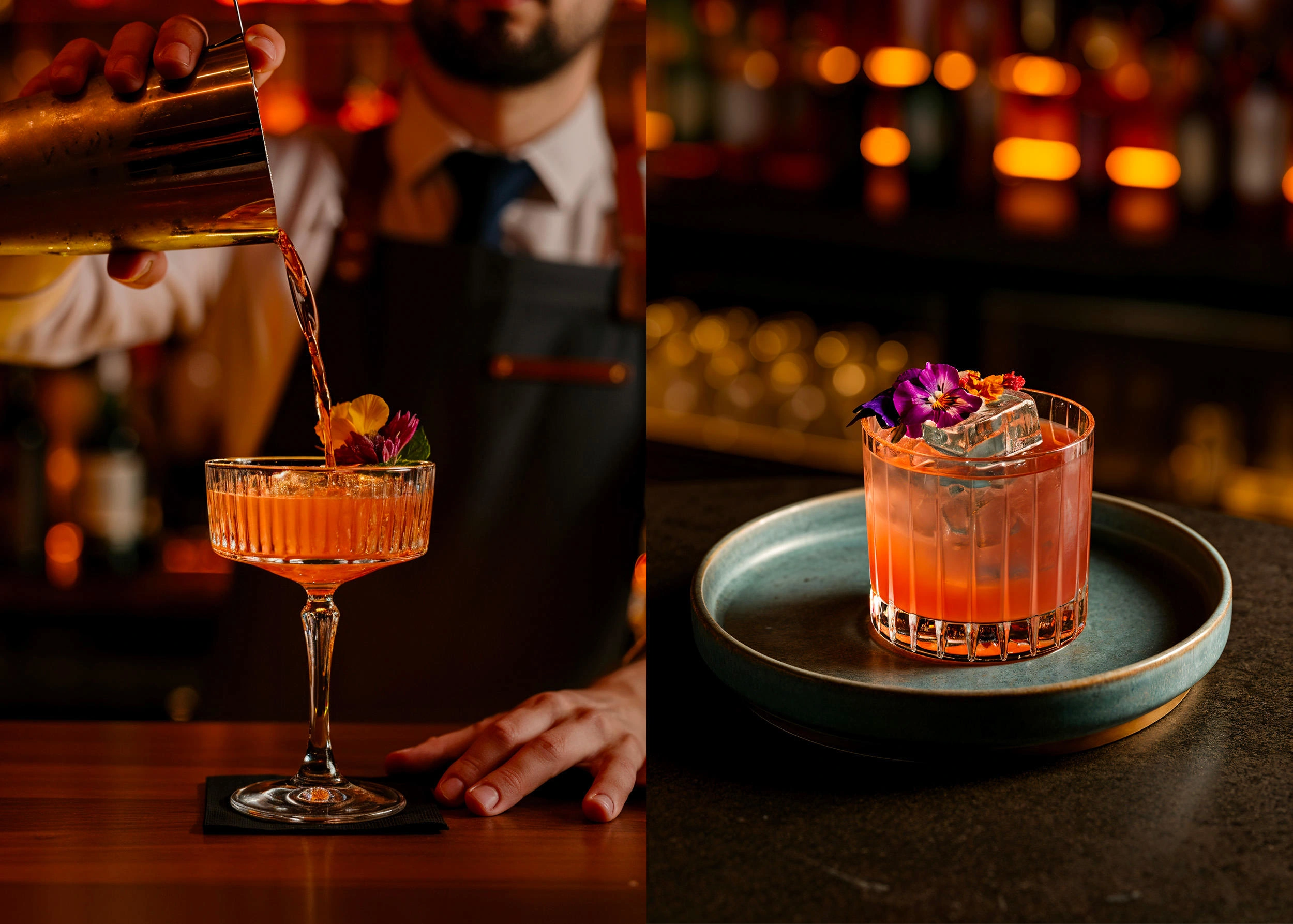
Mingle is a lifestyle hospitality concept designed to bring people together through shared experiences of food, design, and culture. More than a dining destination, Mingle positions itself as a modern gathering space where connection happens naturally; through thoughtful curation, vibrant atmospheres, and meaningful interactions. The brand seeks to create moments that feel both elevated and approachable, offering guests an experience rooted in authenticity and contemporary living.
The Challenge
Mingle came to us with an ambitious vision: to create a hospitality brand that could stand out in an oversaturated market while remaining genuine and inviting. The challenge was to craft an identity that felt fresh and energetic without sacrificing sophistication; something that could translate seamlessly across physical spaces, printed materials, and digital platforms. The brand needed to evoke warmth and connection while maintaining a refined, editorial sensibility that would resonate with a design-conscious, culturally engaged audience.
My Approach
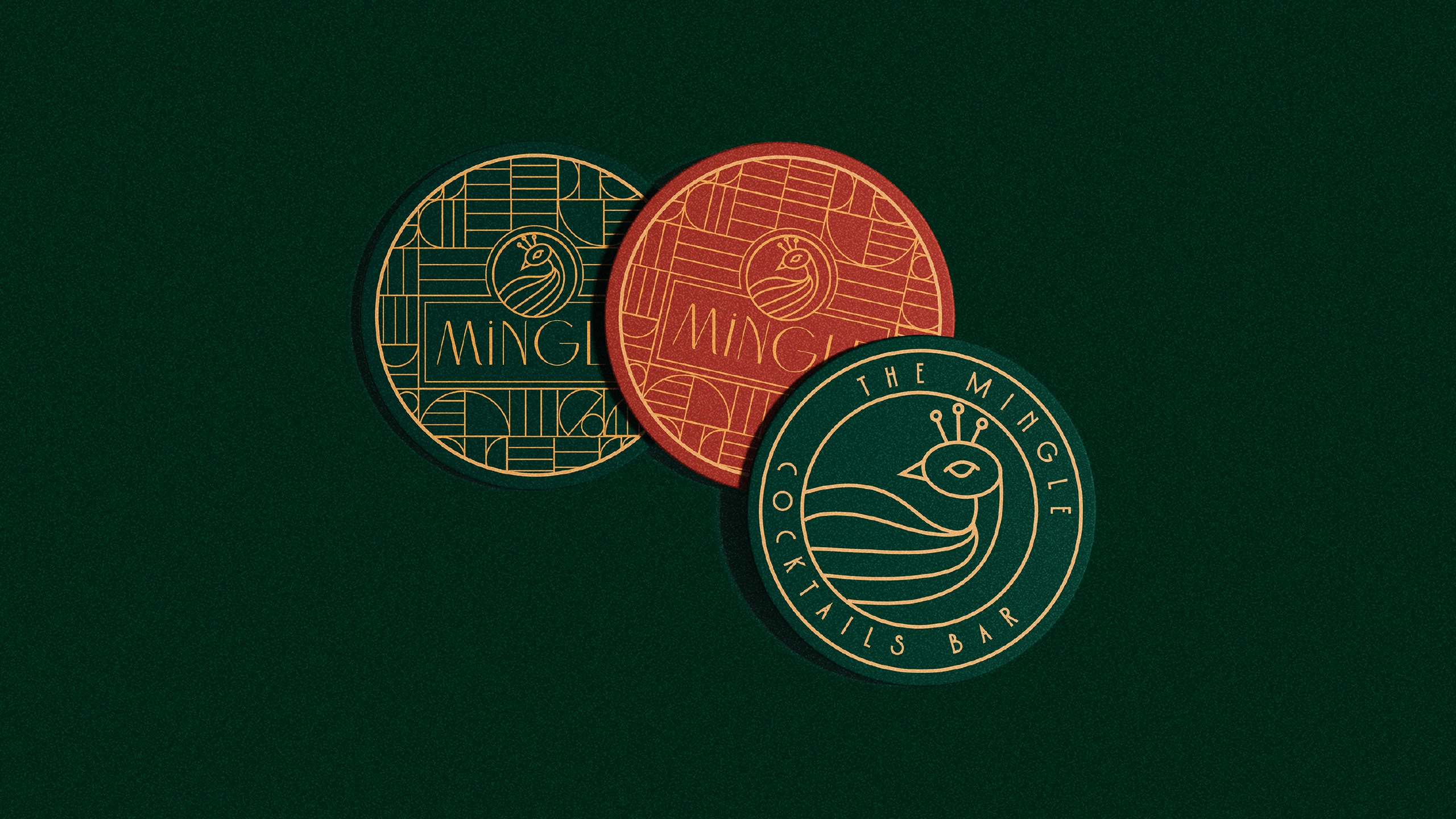
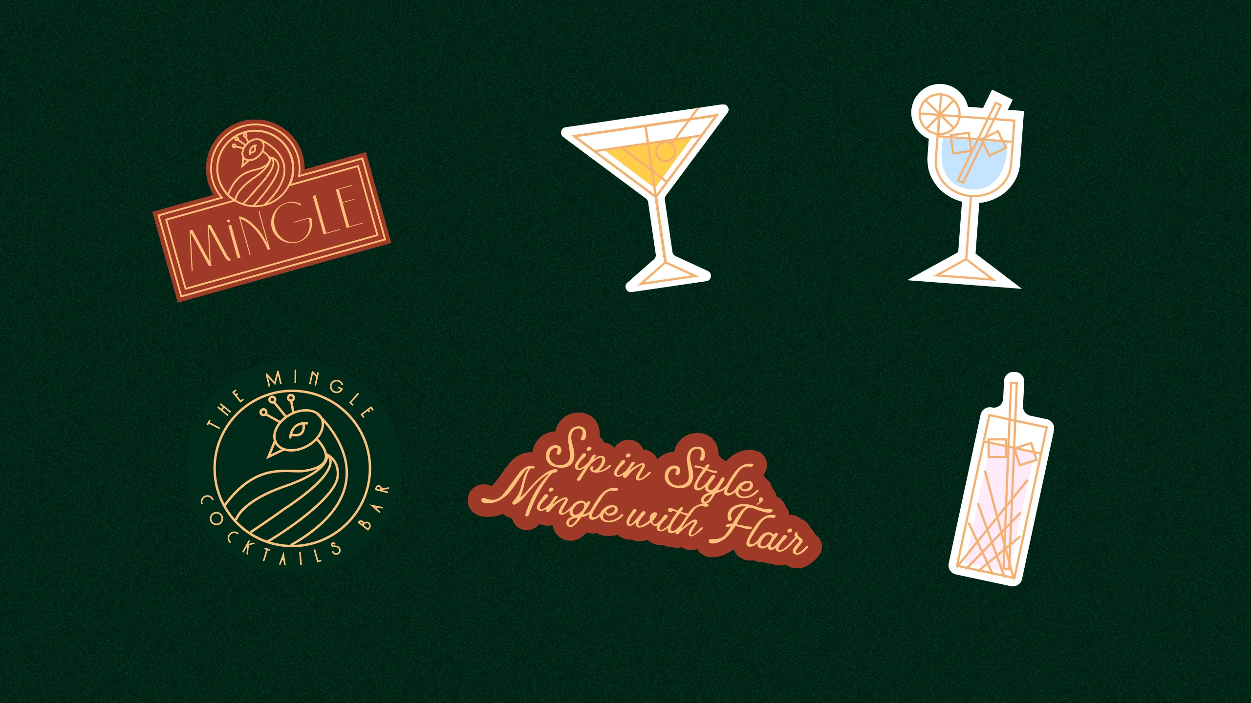
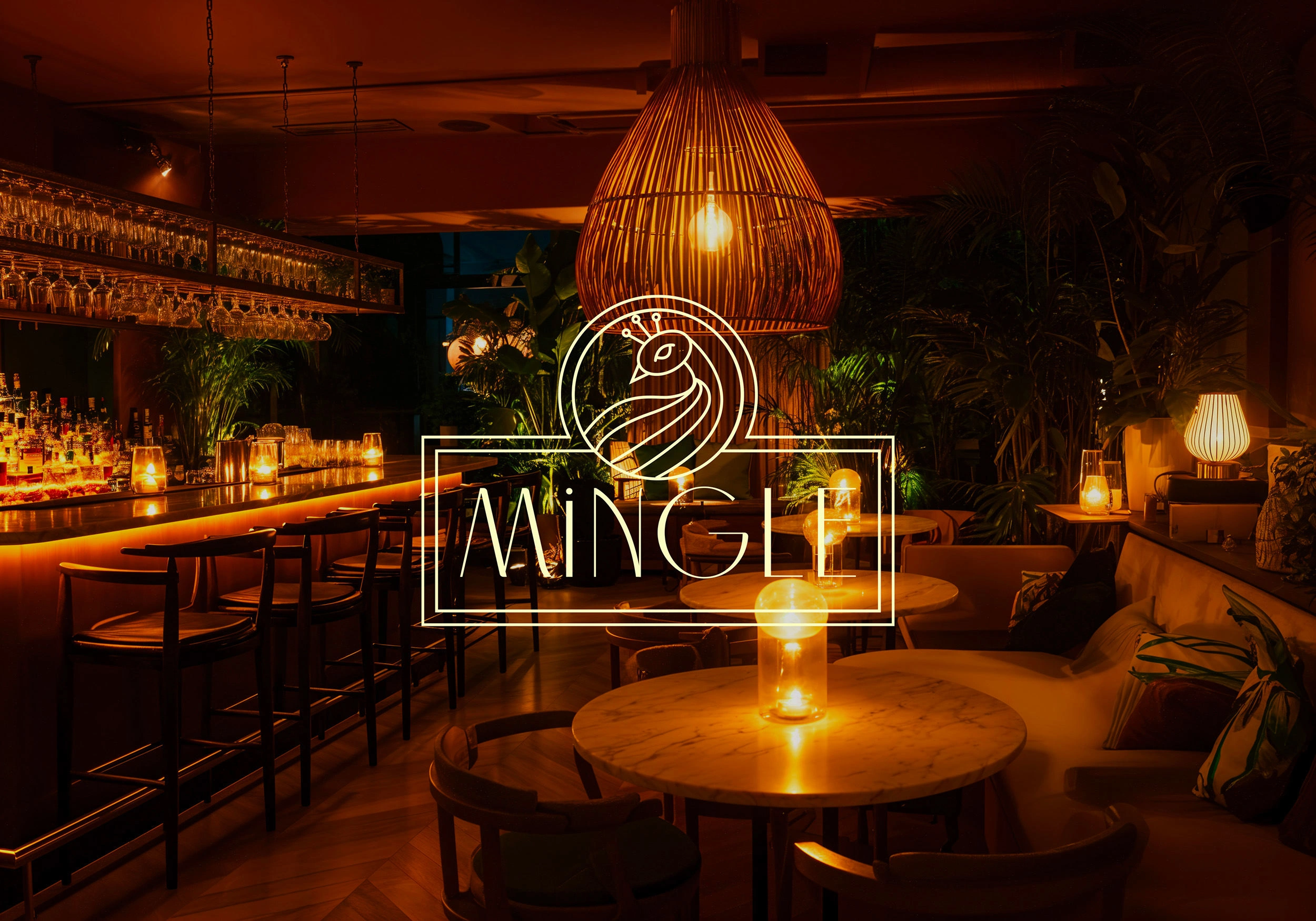
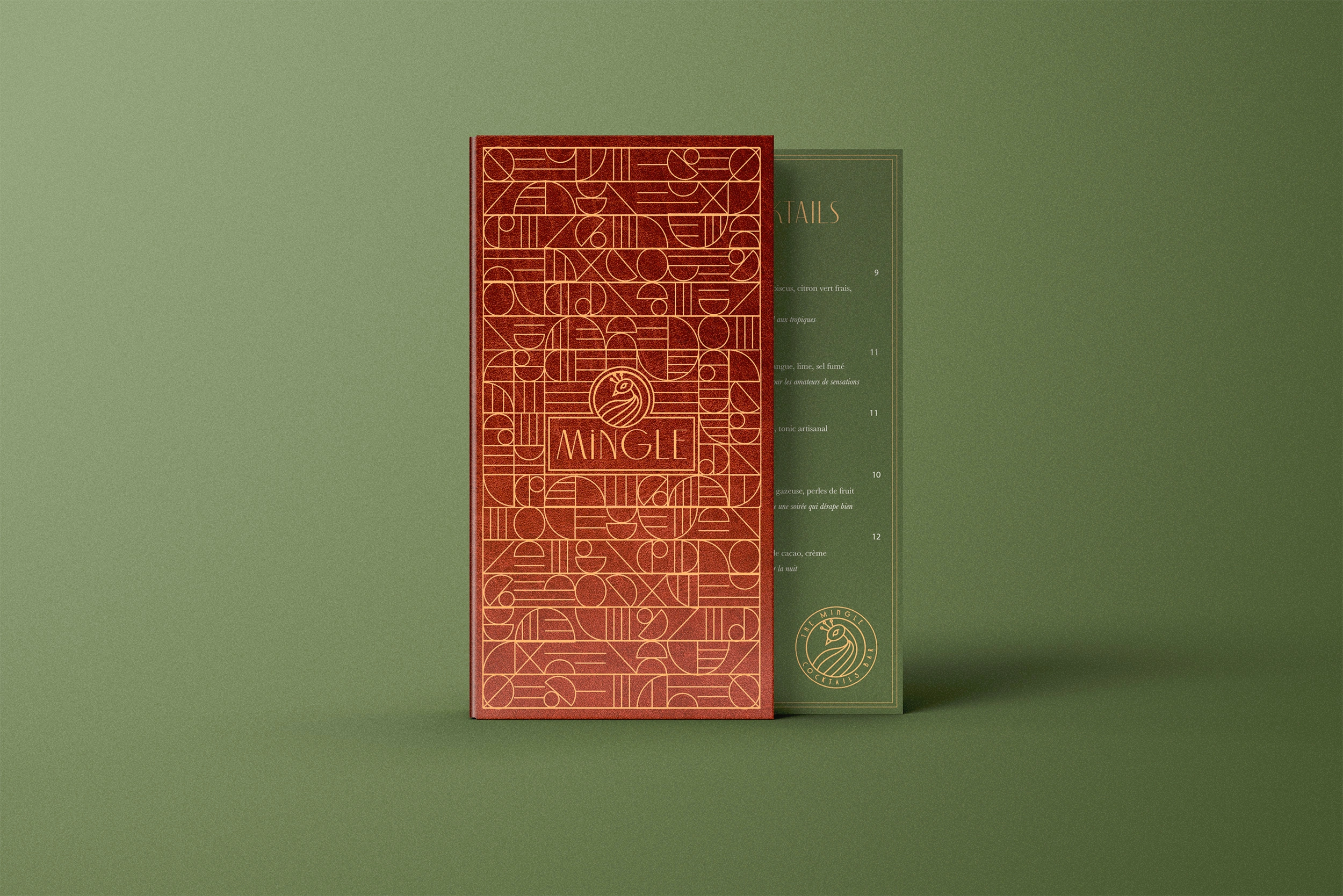
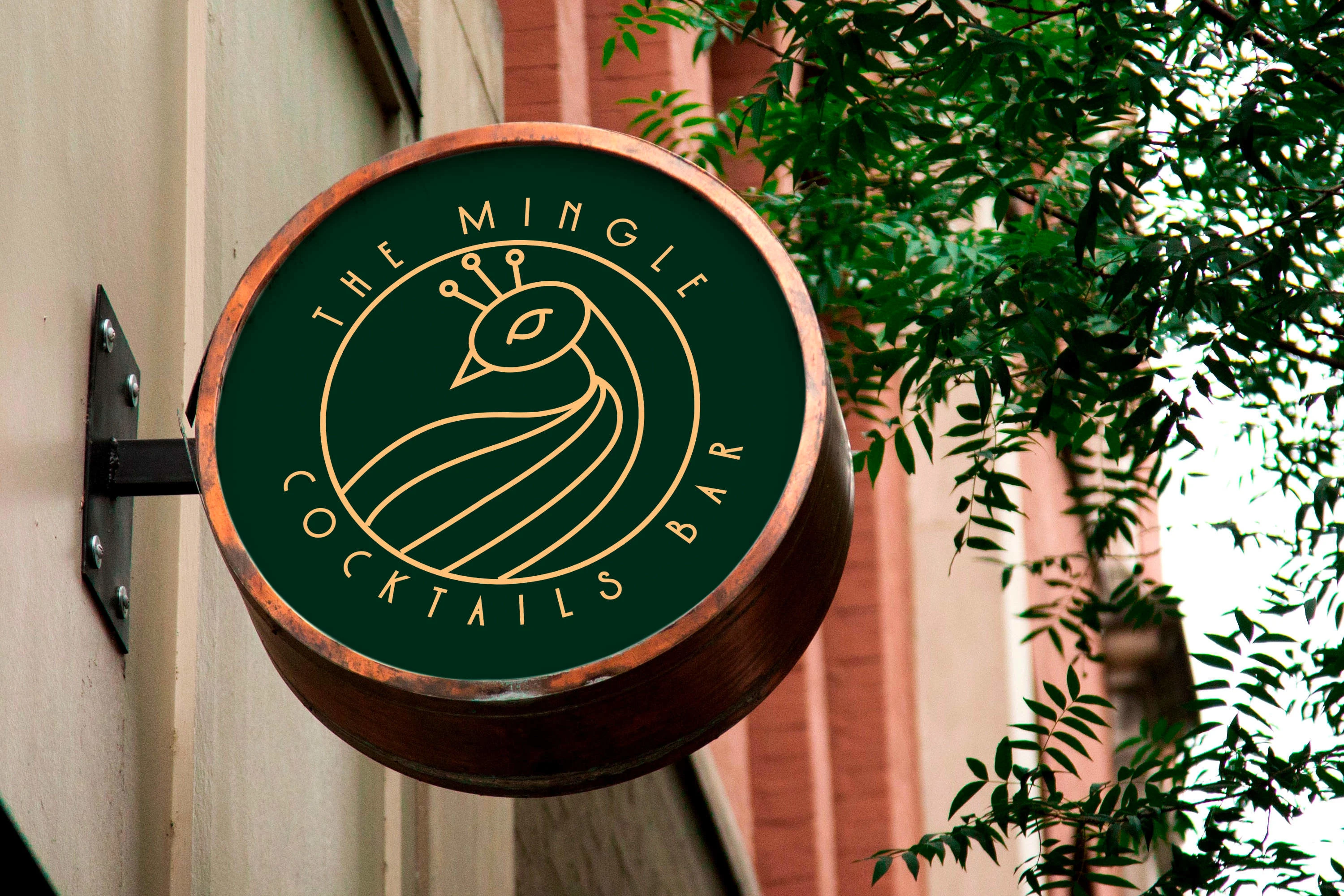
We began with the name itself: Mingle, a word that captures connection, movement, and ease. From there, we built a visual identity around a bold yet elegant logotype, paired with a fresh palette of modern neutrals and subtle accents. Typography was chosen to bring clarity and sophistication, while flexible graphic elements allowed the brand to adapt fluidly across menus, signage, and digital content.
The design system was conceived to feel editorial and minimal in tone, yet full of energy in its application. Every touchpoint, from print to space to screen, was designed to reinforce the same idea: Mingle is a brand world where people come together with intention. The result is an identity that feels modern, stylish, and coherent, offering guests an experience that is both welcoming and visually compelling.
Like this project
Posted Jan 22, 2026
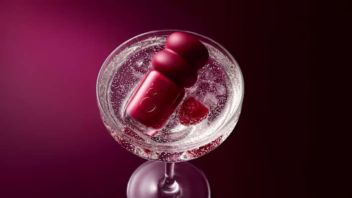
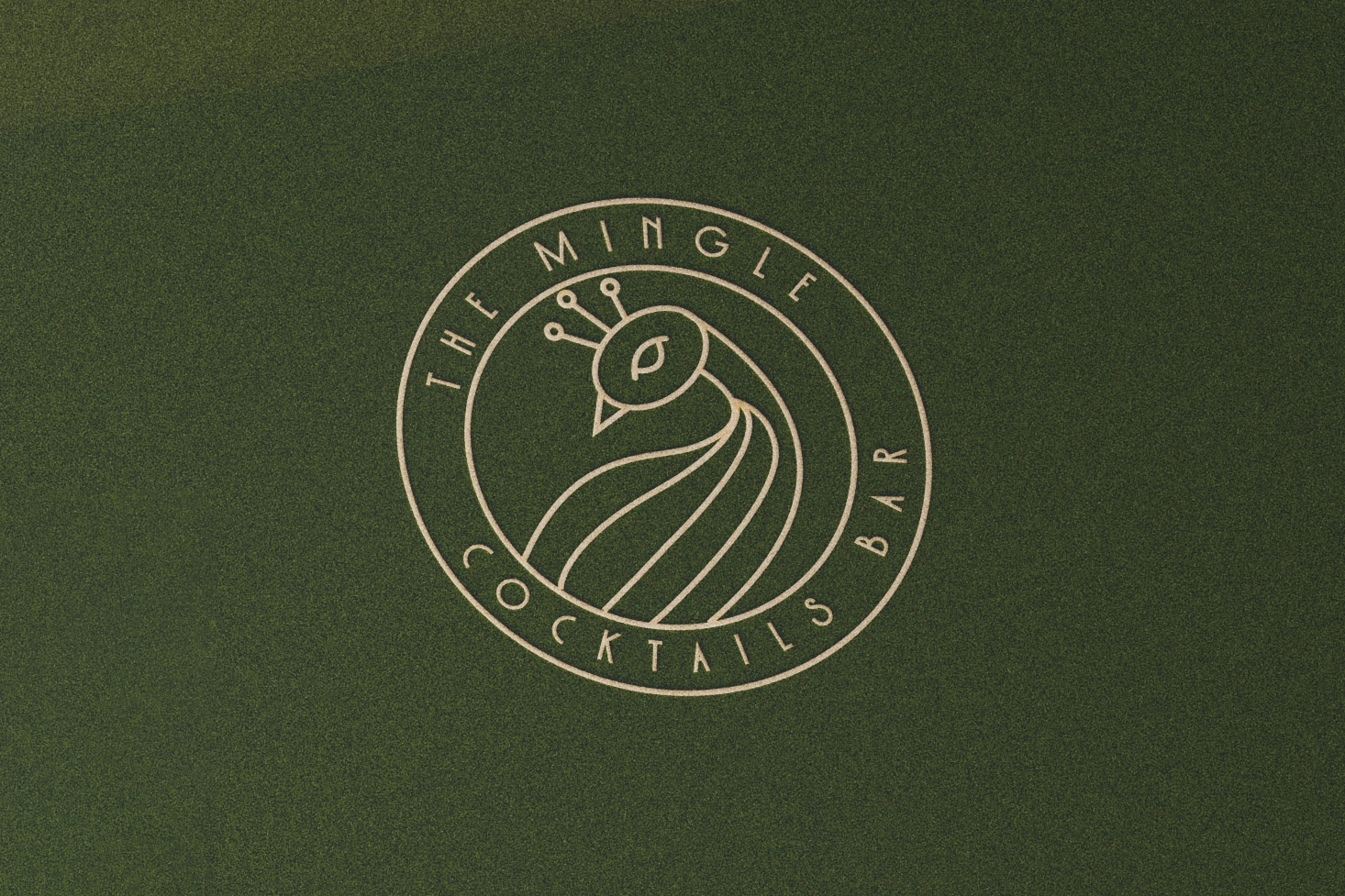
Mingle is a cocktail bar envisioned as a modern, stylish social venue. The identity draws inspiration from classic bar culture to reflect a timeless atmosphere.
Likes
5
Views
36
Clients
Mingle