SOLÈNE Packaging Identity for Face, Hair & Body

Victor Abayomi


SOLÈNE — Face, Hair & Body Packaging Identity
A secret to glowing skin.
The Brief
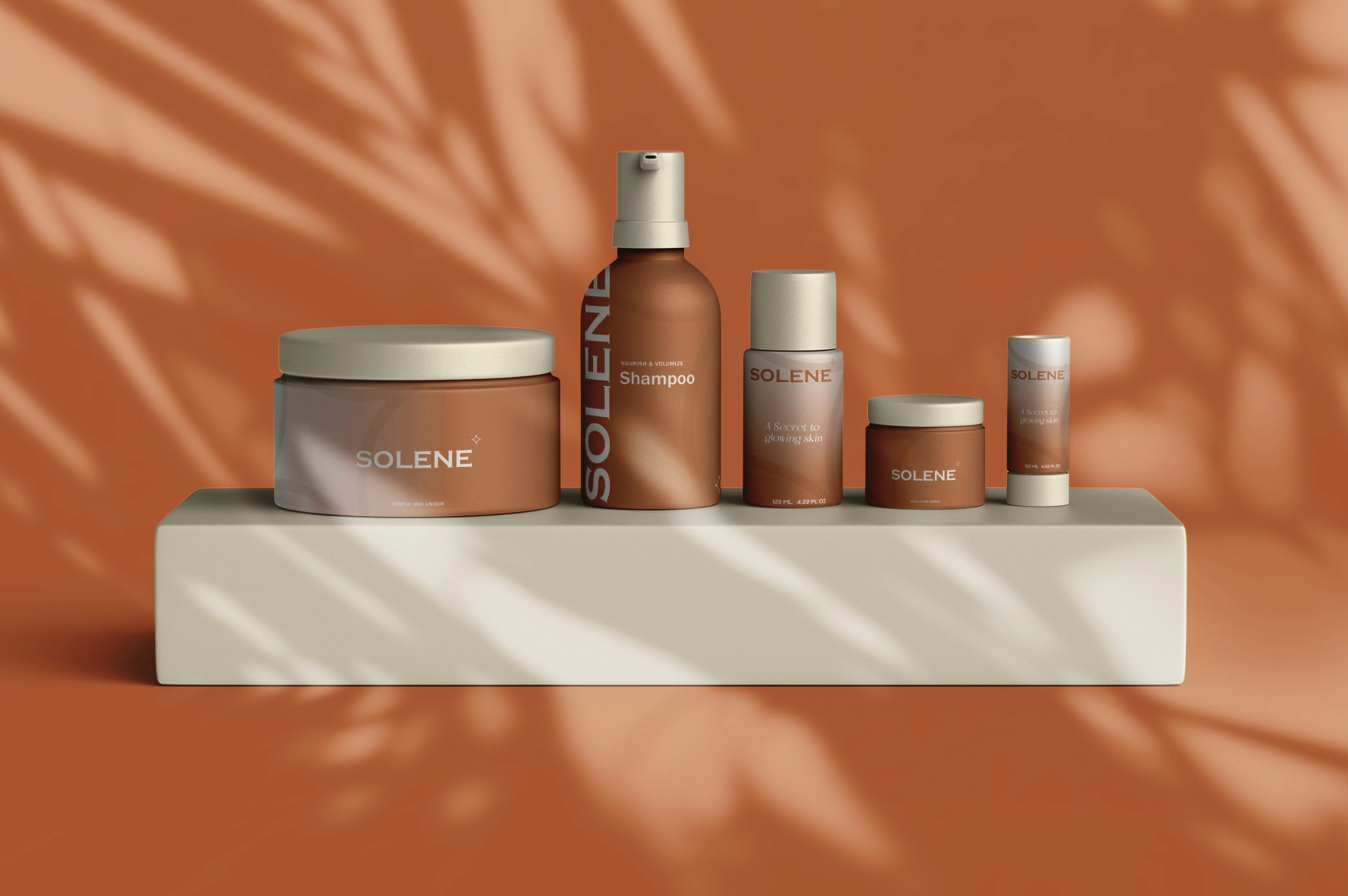
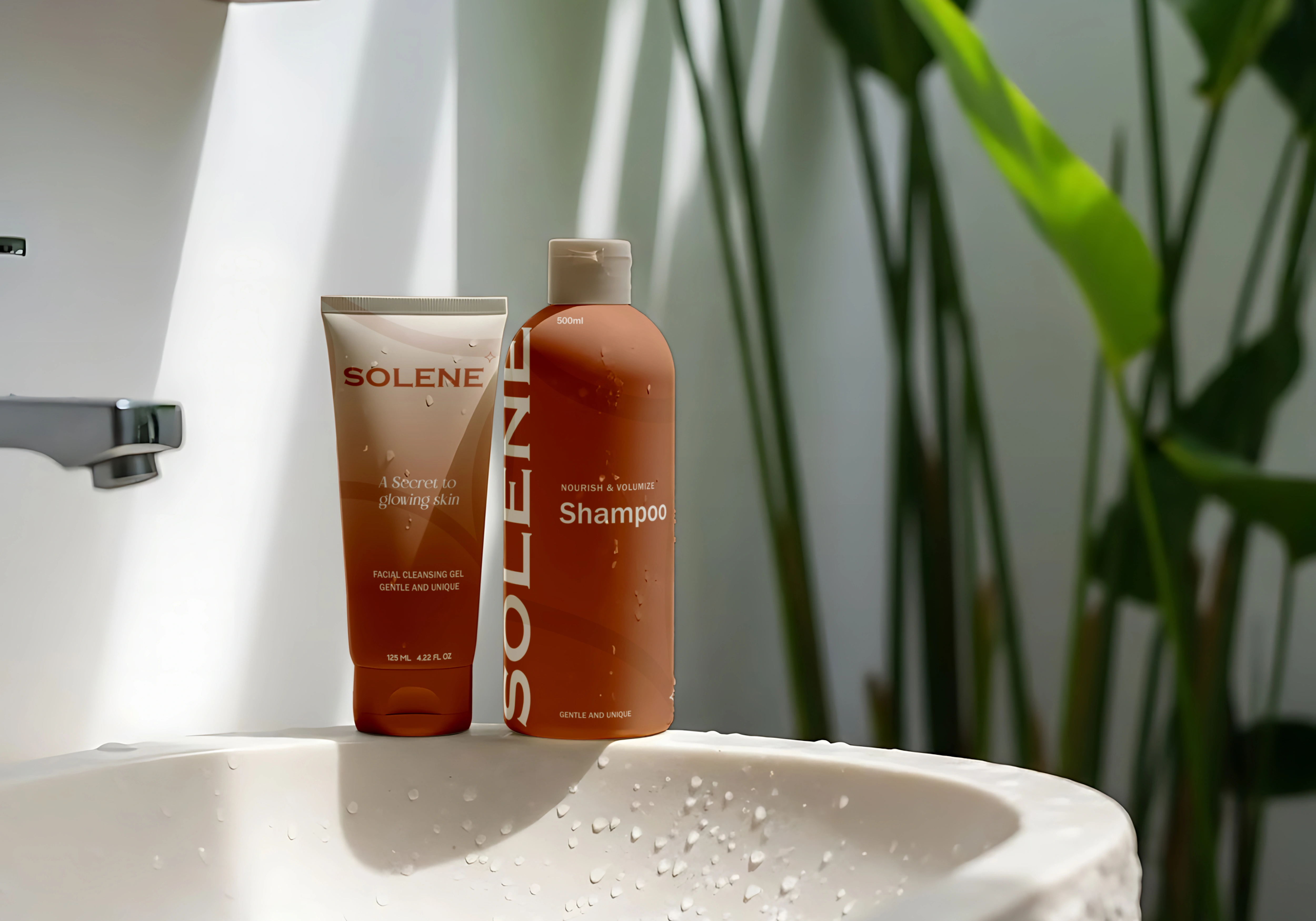
Personal care ranges usually splinter across formats — the tube looks like one brand, the jar looks like another, the pump bottle looks like a third. The goal with Solène was to build one system disciplined enough to hold a full face, hair, and body line together: cleansing gel, shampoo, body cream, lotion, mini jar, and stick, all reading as unmistakably one brand.
The Strategy
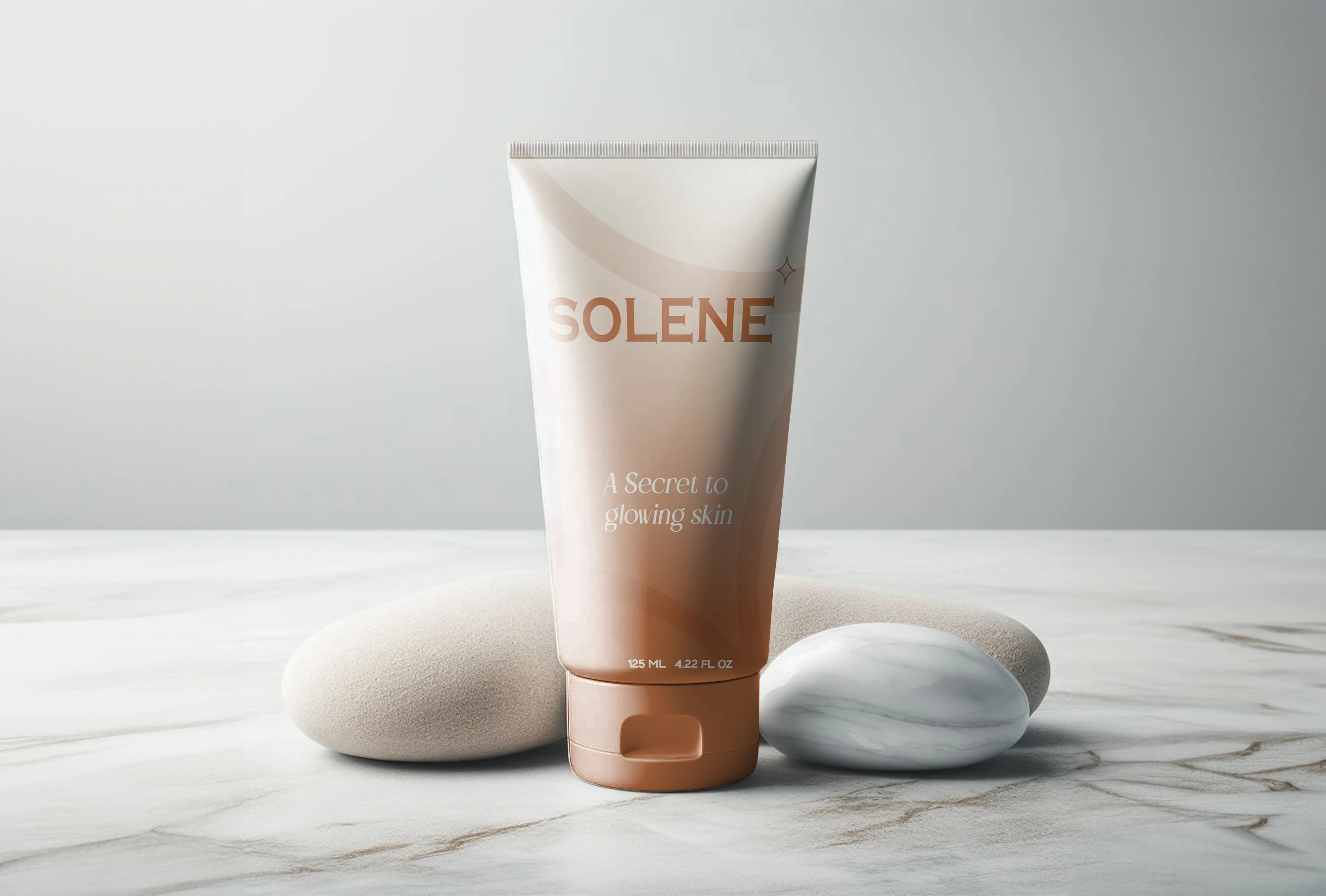
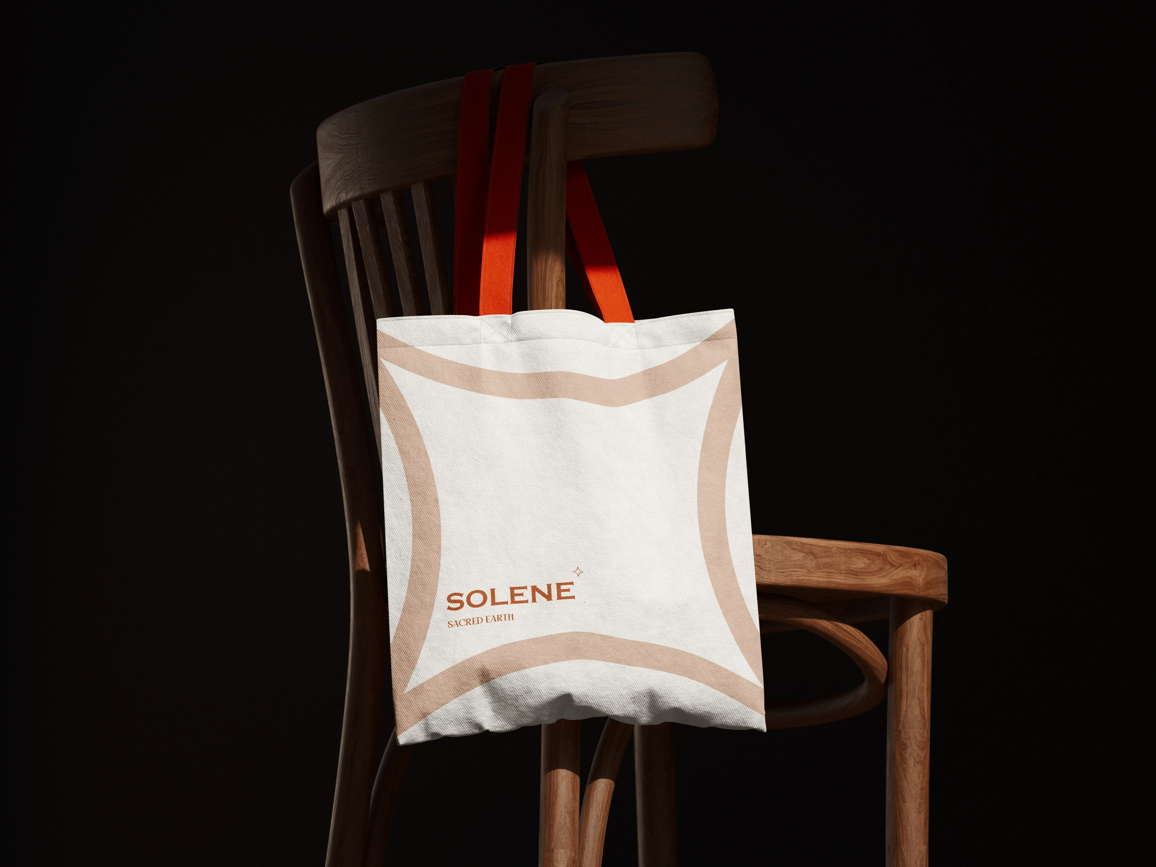
Rather than lean on a single hero color or pattern, the system is built around a warm terracotta gradient that shifts subtly by product but never breaks the family resemblance. A serif/sans wordmark pairing keeps the name legible at pump-bottle scale and jar-lid scale alike, and a small diamond mark does the "quiet premium" signaling most beauty brands overdo with foil and gloss. "Gentle and unique" sits on-pack as the functional promise; "a secret to glowing skin" carries the emotional one.
The System
Logo & wordmark
Full packaging suite across 6 SKUs (tube, bottle, jar, pump, mini jar, stick)
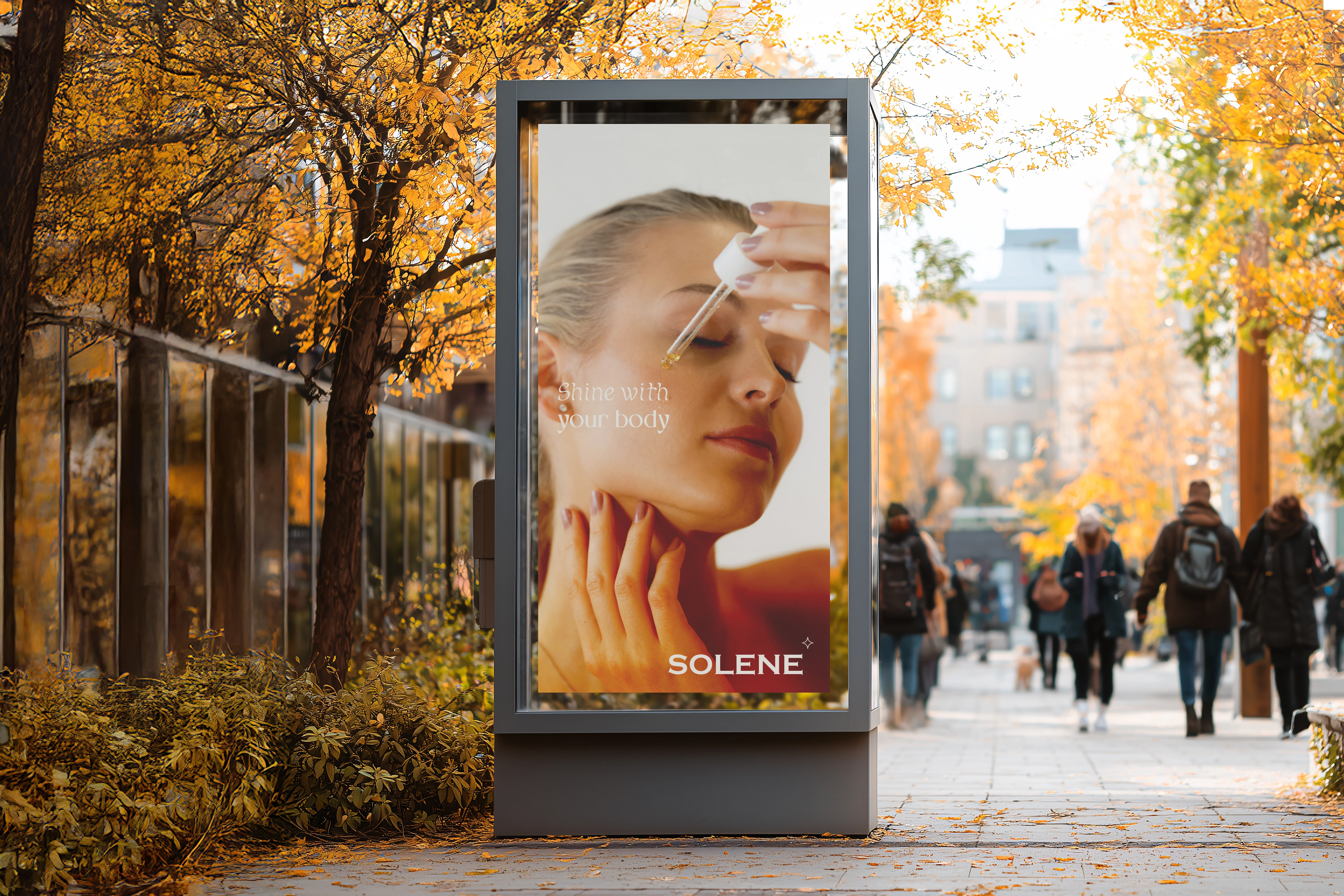
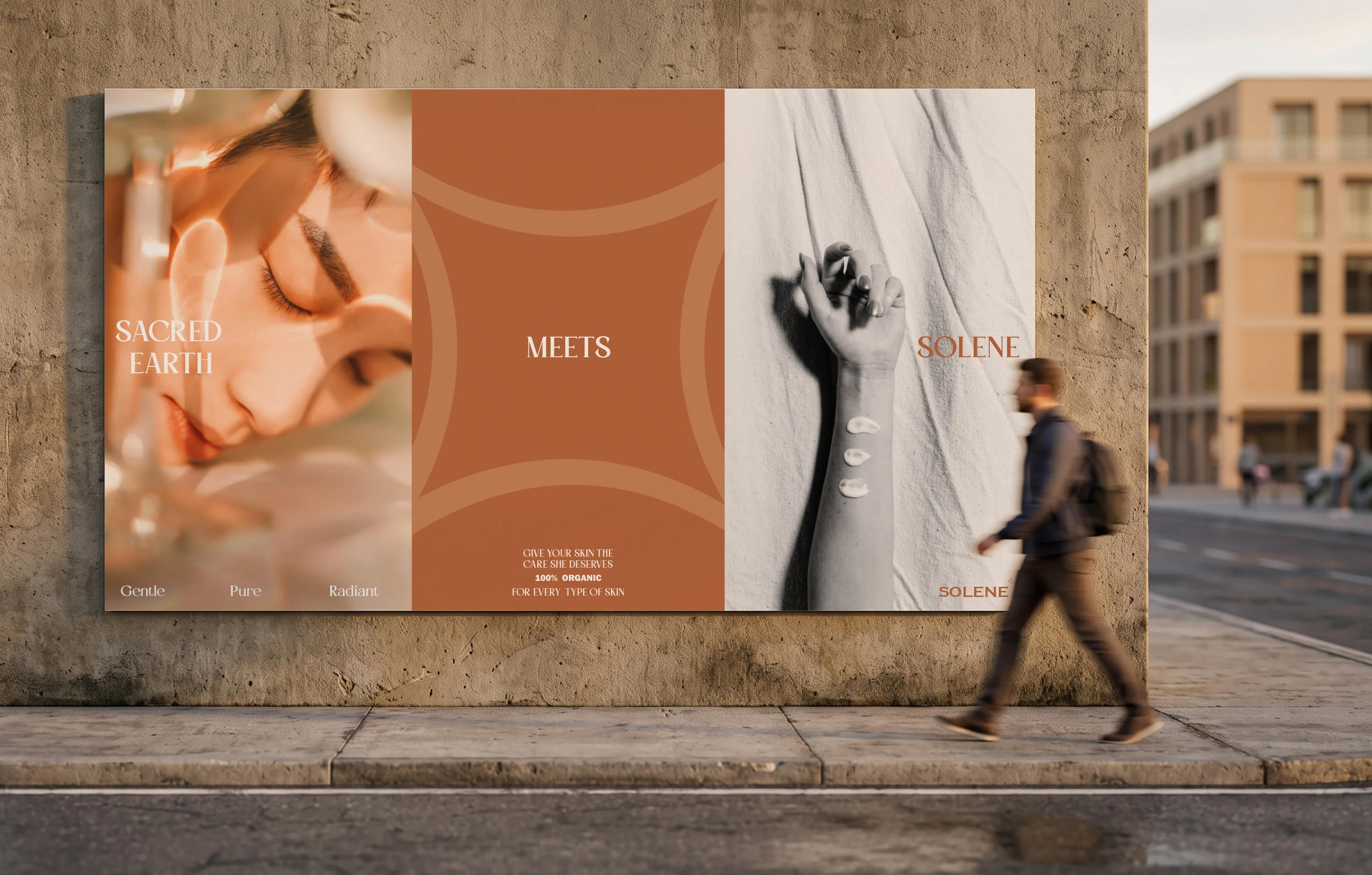
OOH citylight ad concept
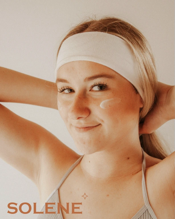
Lifestyle and shelf photography mockups

Like this project
Posted Jul 24, 2026
A packaging identity for a 6-SKU personal care line — one terracotta gradient system carried across tube, bottle and jar so every format reads as one brand.