ALTURA | Luxury Real Estate Brand Identity & Design System
Victor Abayomi
ALTURA
Brand Identity & Packaging Design
OVERVIEW
ALTURA needed to stop looking like a regional business and start feeling like a global brand. That's a specific design problem — not just "make it look premium," but "make it look like it belongs in markets it hasn't entered yet." The identity had to carry international authority without losing the warmth that made the brand recognizable to the people who already knew it.
THE BRIEF
Develop a brand identity for ALTURA that positions it as a premium international brand. The visual system needed to communicate professional authority, global presence, and considered quality — working across English and international market contexts without any visual element that reads as regional or limited in scope.
THE CHALLENGE
Most premium branding advice points in one direction: go minimal, go dark, go authoritative. The risk is landing in a sea of identical "premium" identities — navy, gold, and an expensive serif — that communicate professional without communicating memorable. ALTURA needed to be both. The goal was a brand with a clear visual signature, not just a quality signal.


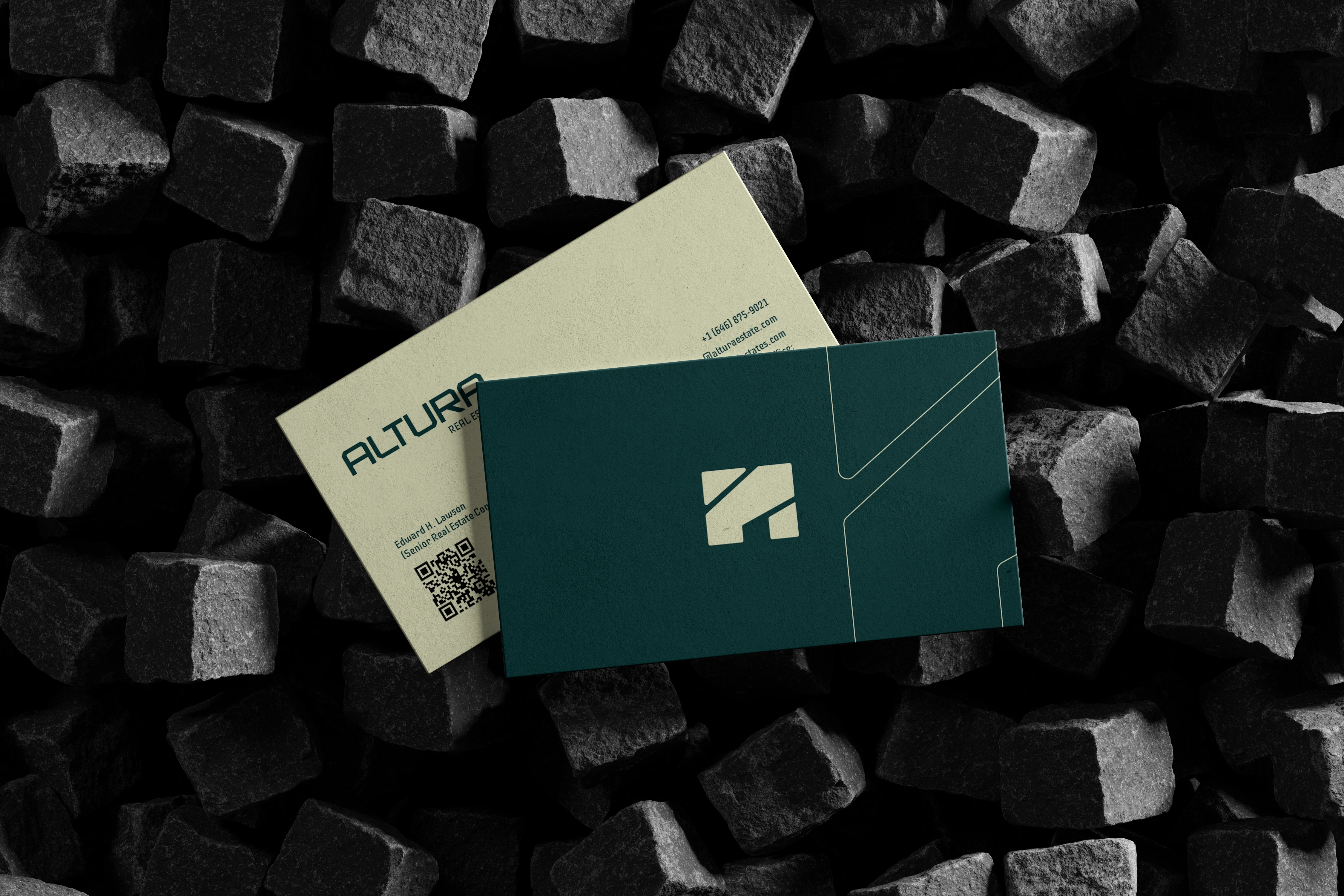
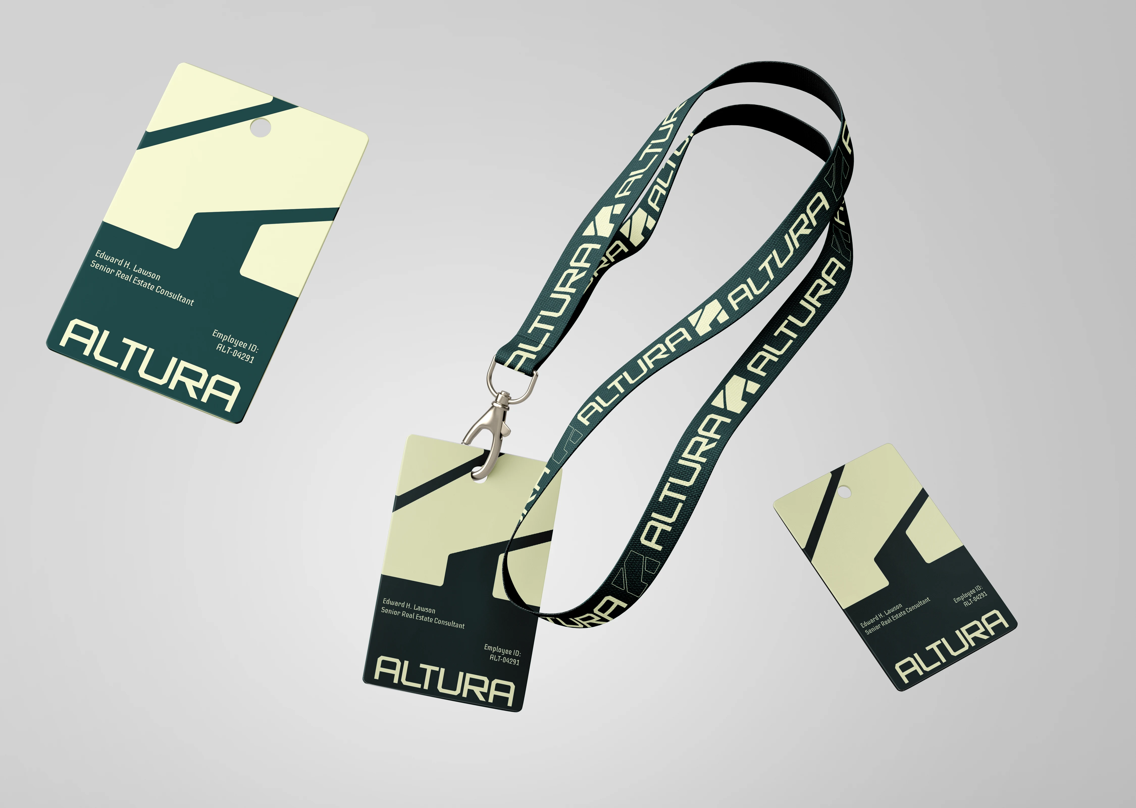
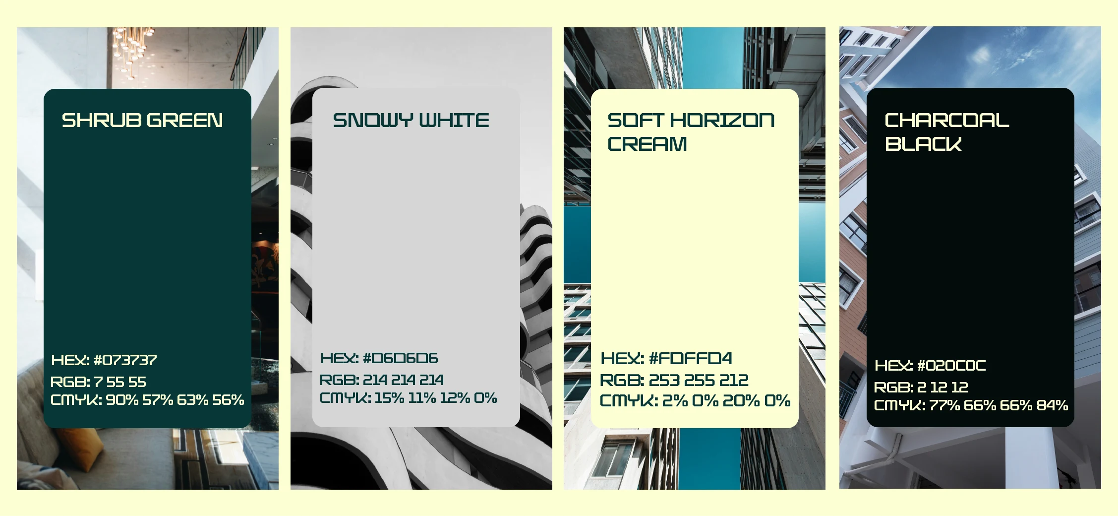
THE APPROACH
The identity was grounded in a wordmark built for permanence — precise spacing, deliberate weight, designed to work at every scale from a business card to a building façade. The color system introduced controlled warmth into a category that typically defaults to cold authority: a palette that feels premium and approachable simultaneously. Every touchpoint was considered for international legibility: the mark works without language context, the color system translates across digital and print, and the collateral system was built for a team producing materials across multiple markets

"The goal was a brand that walks into a room and doesn't have to explain itself."


Like this project
Posted Dec 1, 2025
A globally-scaled luxury brand identity built on clean geometry, refined type, and a visual system designed for international market and high-stake positioning.