Flux Energy Drink Branding
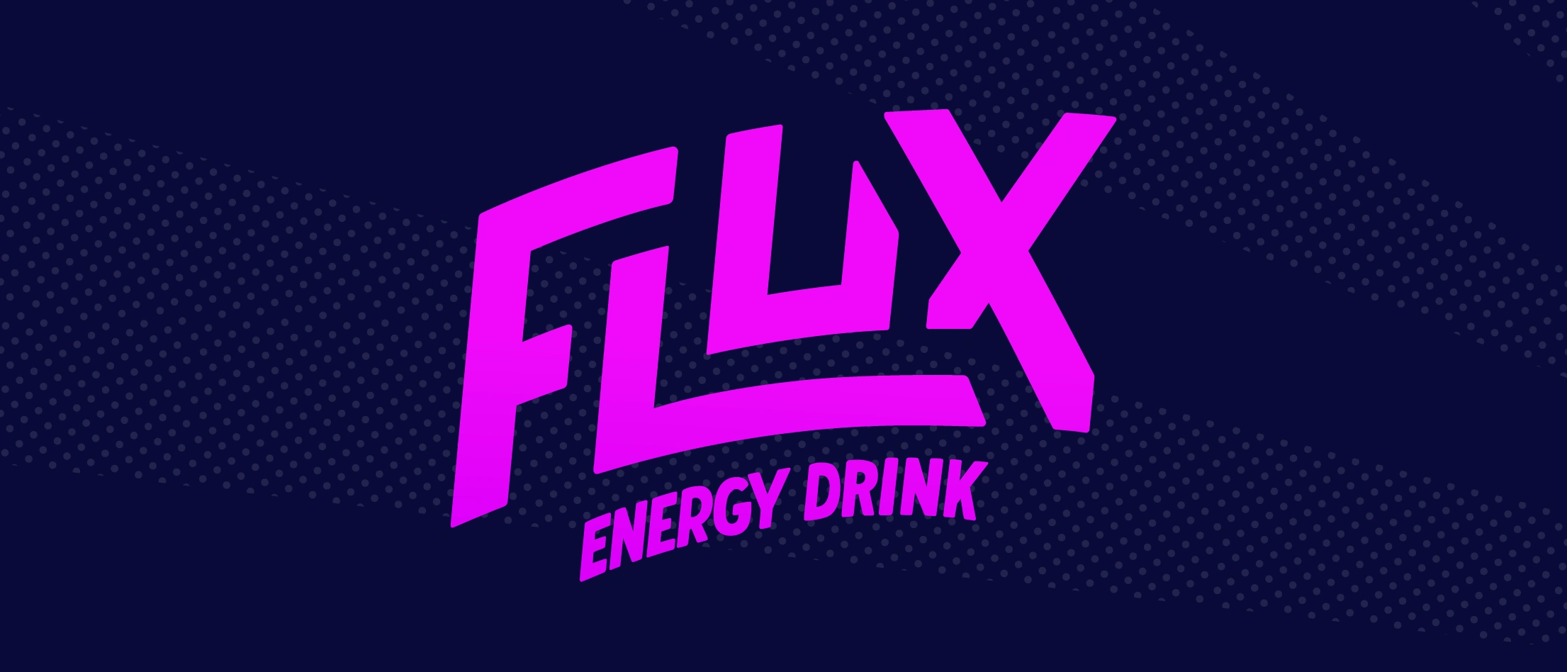
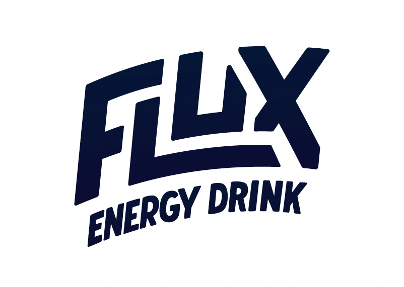
Flux is a personal project and therefore I could create a company from scratch. Here is the branding for Flux, an energy drink company that captures discover and flow in a can.
Project Type: Personal Design Exploration
Lettering & Illustration
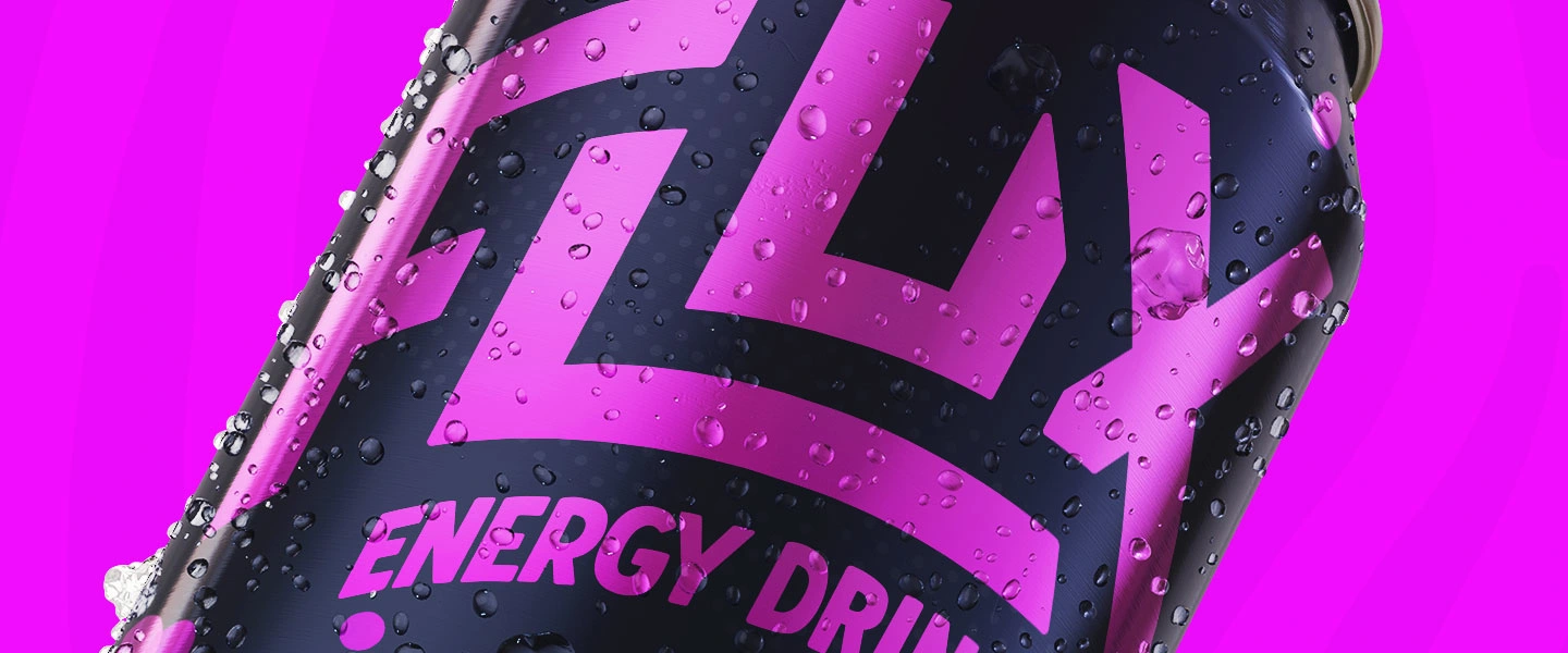
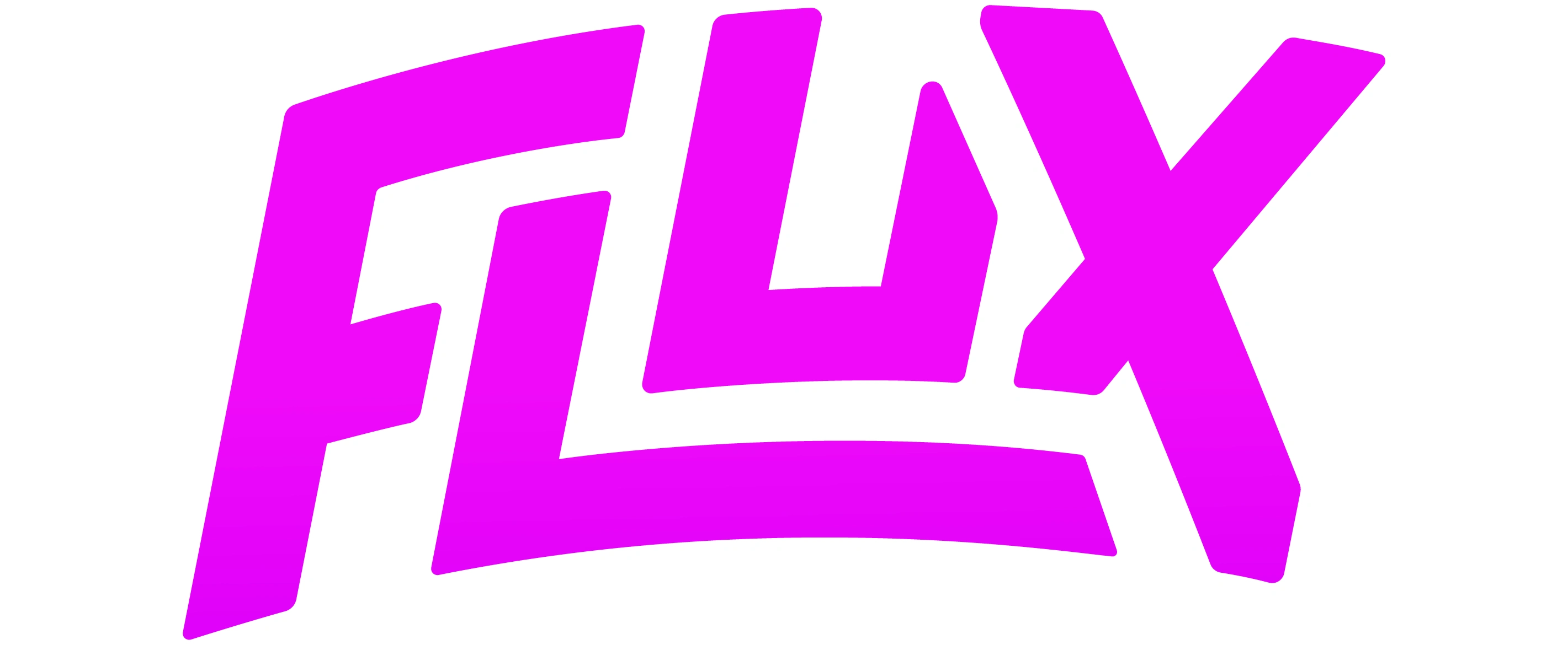
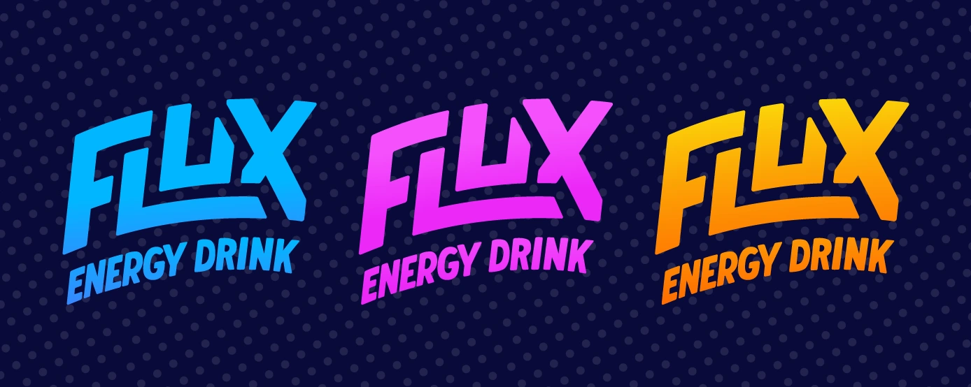
The logotype and main titles on the packaging were hand drawn to give the design a personal and tactile experience. The logotype captures the dynamic tone of movement and fun by it’s bold and angled type. And the flowing background illustrations and vibrant colour palette evoke excitement. The use of half-tone dots throughout also add a unique texture that brings the design to life.
Packaging Design
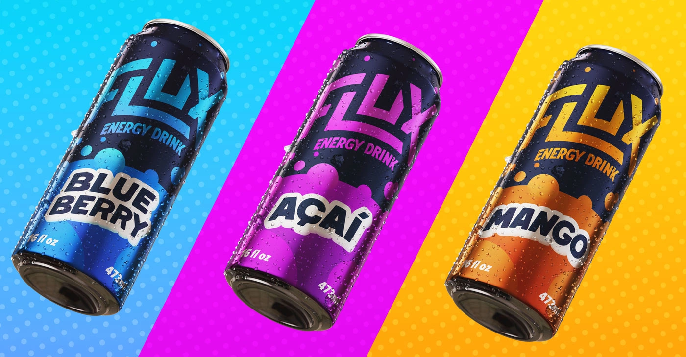
The packaging design shows movement and action through the use of the large bubble shapes and angled bold type. And the colours contrast one another to be distinct while still clearly connected.
Ad Design
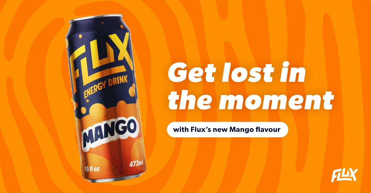
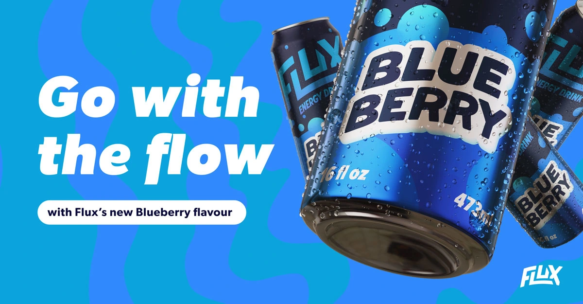
The ad designs play with the bold type used in the logo and packaging using large type and dynamic copy. And the background images continue the theme of movement and exploration.
Like this project
Posted Sep 18, 2024
Flux is an energy drink company that captures discover and flow in a can. This project was a fun exploration of hand-lettering with identity design.

