Knowledgehook Brand Refresh
Jeremy King

Logo & Brand redesign for Knowledgehook, an education tech company helping to empower math teachers and engage students in exciting math learning.
My Role: In-house Graphic Designer

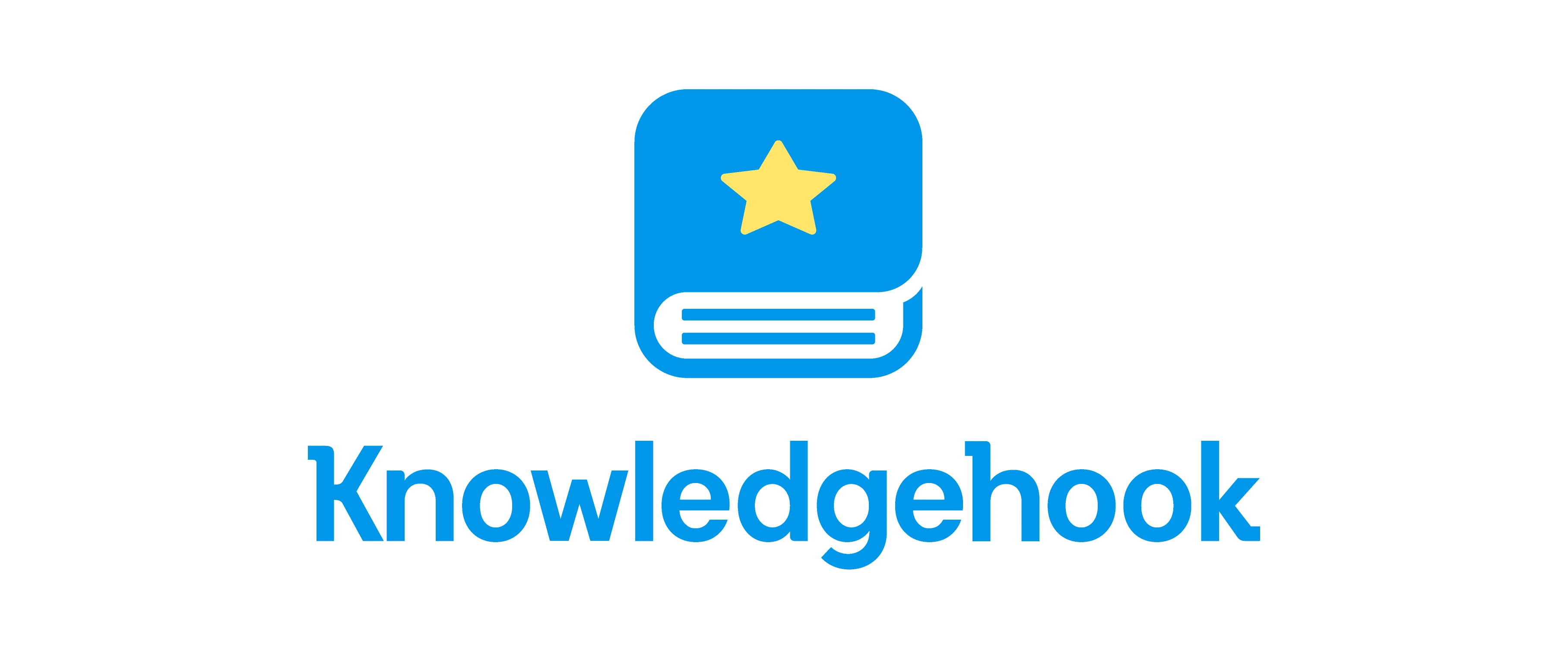
Updated Logo
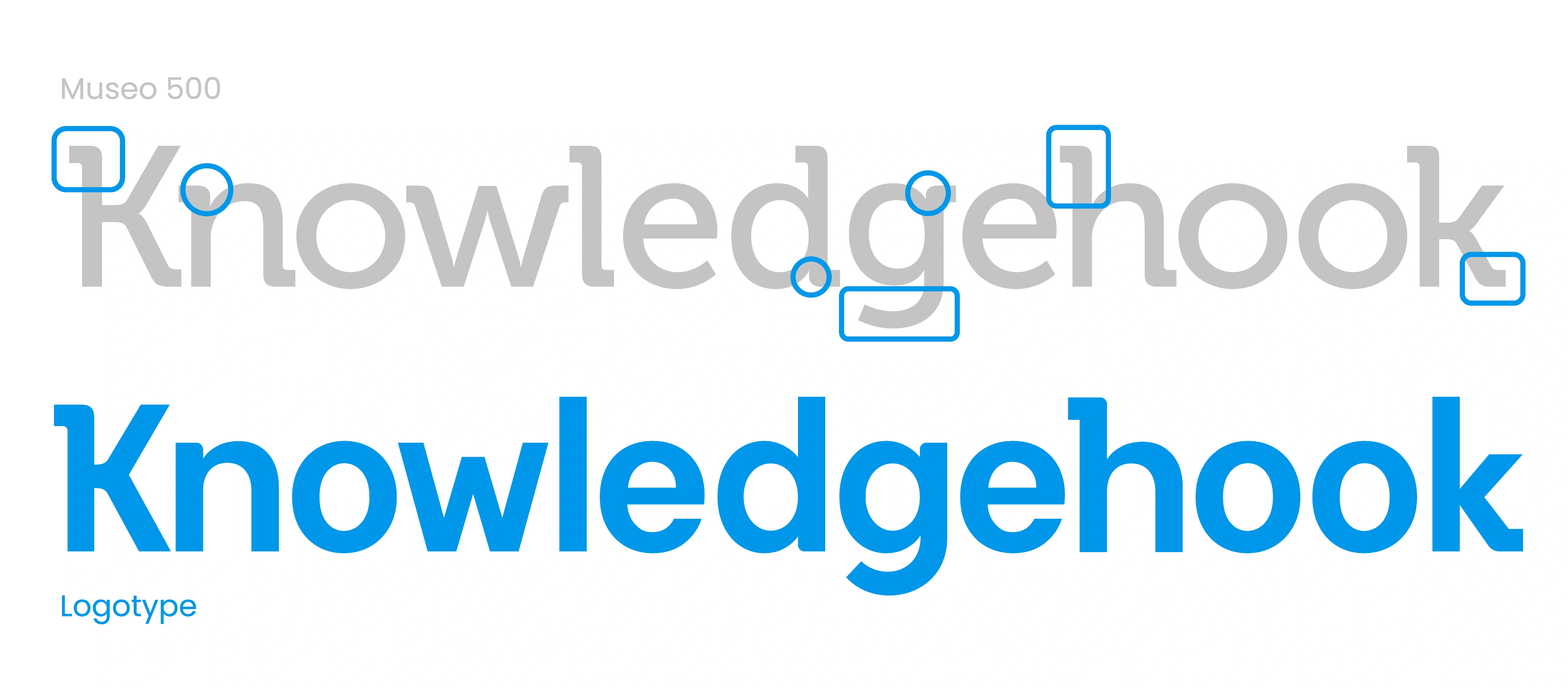
The main objectives of the logo redesign were to correct mistakes and improve versatility. Since the audience was already very familiar with the logo, we chose to make subtle improvements and opted against a full rebrand. Changes included thicker strokes, darker colours, and simplifying the book icon. These adjustments enhanced the logo's visibility across all touch-points and various scales.
Custom Type
The logotype was inspired by a combination of the original font used (Museo) and modern geometric sans serifs. The result pays homage to the previous logo, while improving the use of space and recognizability with a taller x-height and more condensed letters.
Improved Accessibility
Only minor changes were necessary for the book icon. I kept the original concept but adjusted colours for higher visibility, rounded corners on the star and book pages for added friendliness, and simplified the book pages to be recognizable at large and small scale.
Additionally, I the improved base colour palette with more accessible high contrast colours.


Personalized Illustrations
Characters were introduced and illustrated people were given more personality with bright colours, friendly shapes and expressive movements.


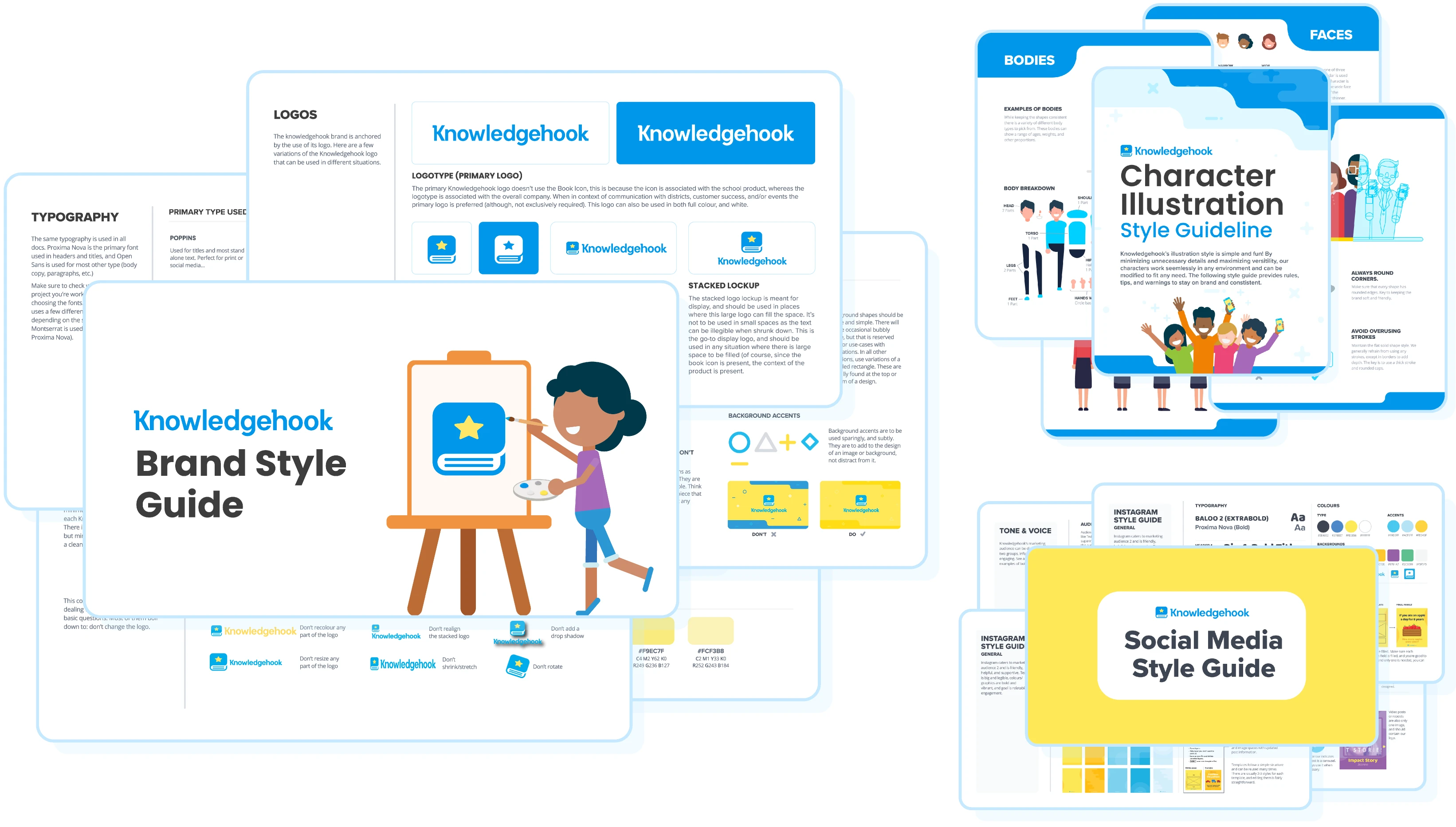
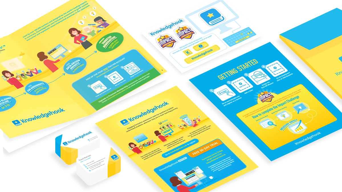
Robust Style Guides
A key part of any branding design/refresh is documenting guidelines, and with so many applications I needed to create multiple style guides. Here is brief a snapshot of all the style guides I created for Knowledgehook.
Like this project
Posted Sep 18, 2024
Logo & Brand redesign for Knowledgehook, an education tech company helping to empower math teachers and engage students in exciting math learning.
Likes
0
Views
46
Clients
Knowledgehook