Beezy
Overview
Beezy is a SaaS platform transforming shift scheduling and workforce management. I developed a full brand system - including naming, positioning, verbal and visual identity - to make the brand approachable, playful, and professional.
From the clever, memorable name to a distinctive mascot and cohesive design, Beezy now stands out in a crowded B2B market while communicating efficiency, teamwork, and personality
The Challenge
Beezy approached me with an ambitious goal: to stand out in a crowded B2B SaaS space dominated by sterile, corporate identities.
The challenge was to craft a brand that felt playful and approachable, while retaining a premium, professional presence.
The Solution
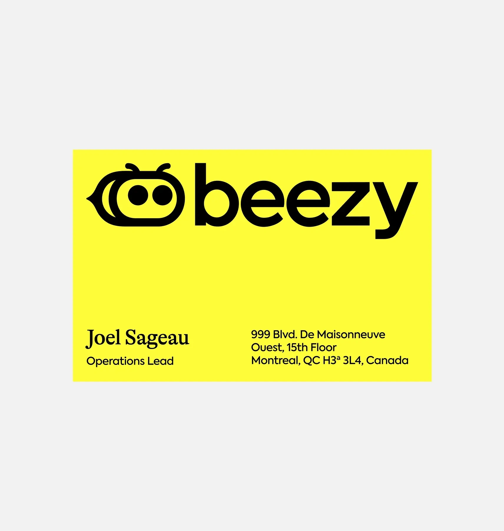
To achieve this, I developed a full brand system covering naming, positioning, storytelling, verbal identity, and visual identity, including the development of a distinctive mascot and colour system.
Naming & Positioning
The naming exploration focused on two core ideas: productivity and simplicity.
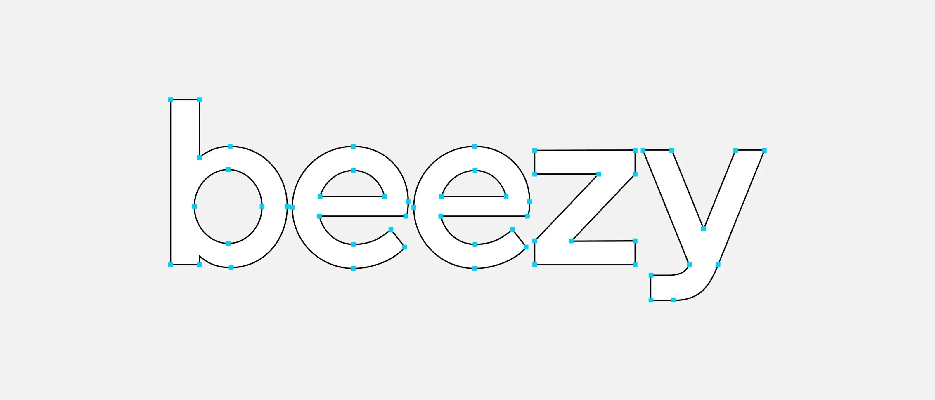
I created Beezy, a name that draws on the imagery of the busy bee and the collaborative hive, symbolising teamwork and efficiency.
At the same time, the name subtly plays on the word “Easy” reflecting the platform’s promise to simplify complex scheduling and workforce management.
With the name defined, I developed a narrative that positioned Beezy as the No.1 SaaS partner to empowers HR teams and makes their workdays easier.
Verbal Identity
I then crafted a verbal identity that is friendly, confident, and clear.
Beezy’s Brand Archetype and Tone of Voice worked together to communicate complex workforce concepts in plain, relatable language.
The verbal system includes:
A consistent brand vocabulary around movement, teamwork, and simplicity.
Copy for onboarding, emails, and in-app messaging that reinforces the brand’s promise.
As well as messaging pillars, which focused on:
Ease - Simplifying complex processes.
Productivity - Helping teams work smarter.
Team Empowerment - Fostering collaboration and clarity.
Visual Identity System
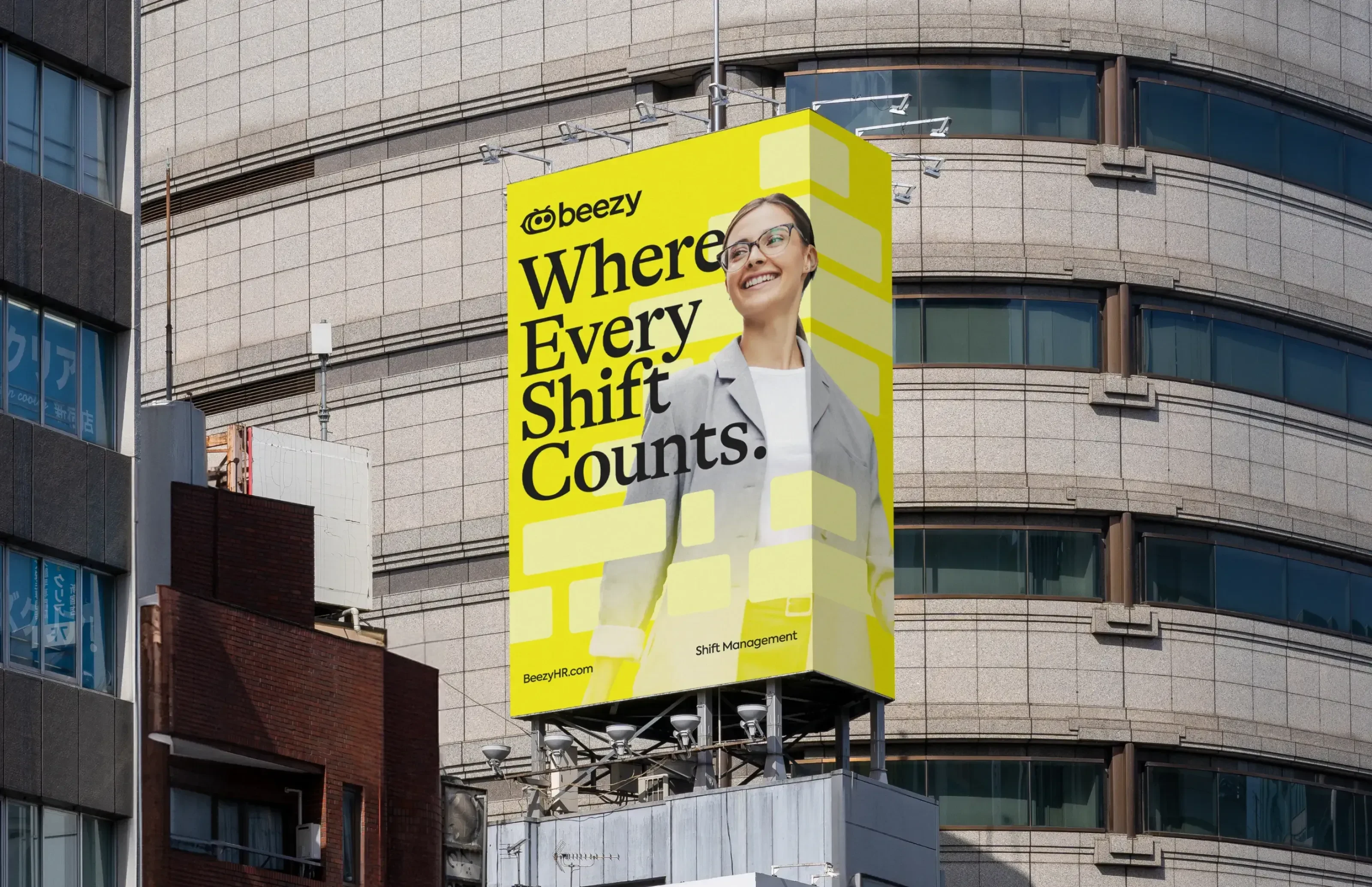
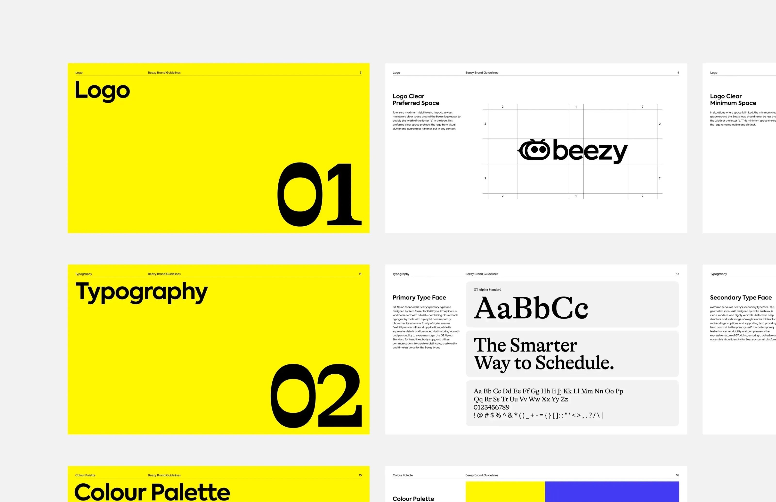
The visual identity brings Beezy to life with a modern, professional mascot - a bee character designed to feel modern and playful. Its signature stripes inform a cohesive visual language that flows across all touchpoints, from interface design to marketing materials.
Key visual elements include:
Mascot-driven system for personality and recognition.
Black-and-yellow palette that is bold, professional, and memorable.
Design rules ensuring consistency across product interfaces, digital channels, and campaigns.
The result is a distinctive and cohesive brand that stands out in a traditionally uniform SaaS market.
The Result
Beezy launched with a fully realised brand ecosystem that is playful, premium, and memorable.
The name captured energy and simplicity, the verbal identity built trust and clarity, and the mascot adds personality without compromising professionalism.
Together, these elements positioned Beezy as a SaaS platform that teams would want to use - intelligent, efficient, and friendly.
Like this project
Posted Nov 26, 2025
Developed a full brand system for Beezy, including brand naming, positioning, verbal identity & visual identity.
Likes
0
Views
2
Timeline
Mar 3, 2025 - Apr 28, 2025
Clients
DispatchDesk

