Transforming user flows & UX to accelerate goal-setting by 67%
Wangui Kariuki
⏱️ Timeline: 4 months
🖥️ Platform: Responsive Web Platform
👩🏾💻 My Role: Product Manager Product Designer
Introduction
Africa’s Pocket is a digital financial partner that helps ambitious Africans reach their goals faster through financial coaching, financial literacy & managed investing. During the goal-setting flow update we set out to improve the way new and returning users set goals on their investment platform, to give them the option on which goals to set & what order to set them in, increase personalisation & help them understand how each of their goals came together in their investment plan!
My Role
I led the design, user testing and project scoping of this project from end to end. I collaborated with 1 UX/UI Designer, to bring the hi-fidelity designs to life and managed 2 Developers (front end & back-end) to build the backend functionality according to the project scope. I also maintained open communication with the Head of Product and CEO throughout the project.
The Problem:
High dropped off rate after sign-up
🎯 All users had to set the same, big & hard to understand goal first, which led to a high drop off rate.
The initial goal setting flow ensured all users started with the Financial Freedom flow. Although implementing this aligned with business goals, it hurt the onboarding flow.
Users often experienced sticker shock on what it would take to reach their goals and would drop off the flow before setting other goals.
⛓️ Users were restricted on the number of goals they can set, based on information they gave us during onboarding.
Initially we designed the goal setting flow to restrict the number of goals users could set. This led to a frustrating flow where users had to delete and reset goals to understand what it would take to achieve all their goals.
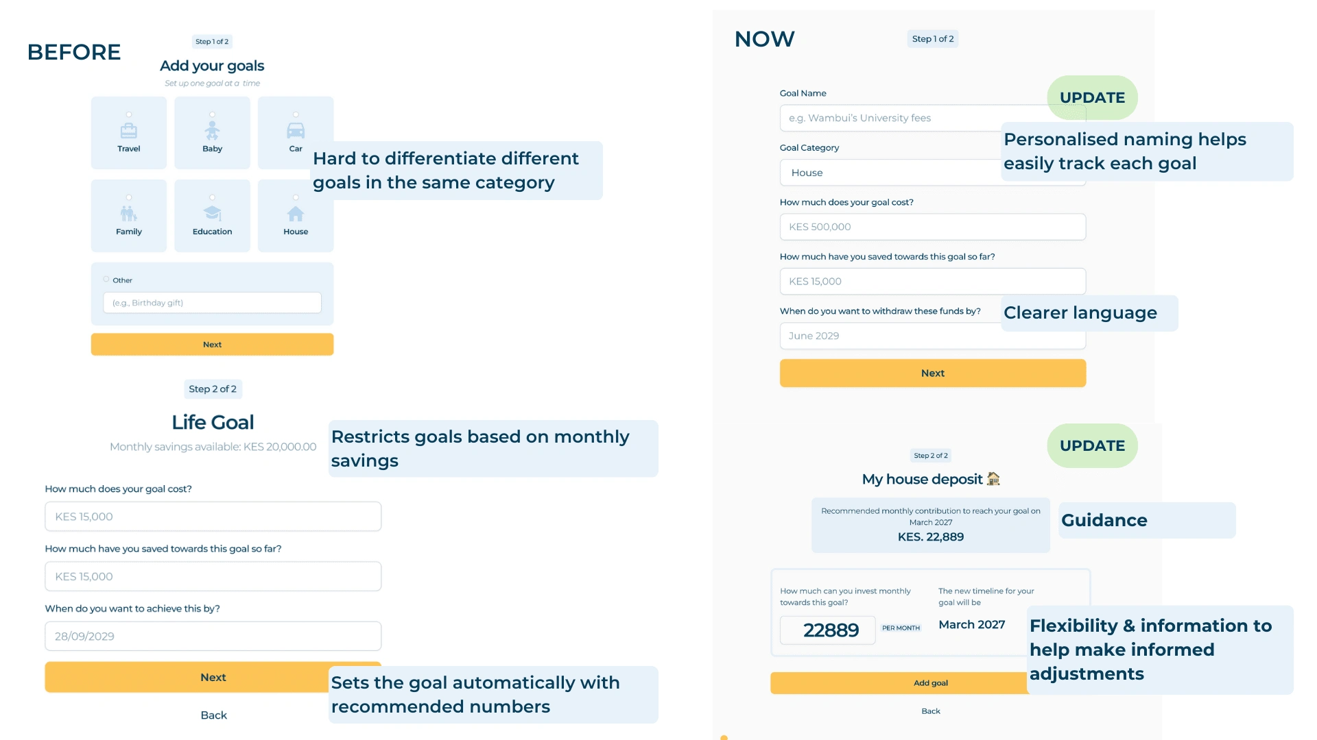
❔ Users could not personalise their goal names, which meant multiple goals in the same category were hard to differentiate.
The initial goal setting form prompted users to either pick a category or name their category. This meant that if a user had 2+ goals in the same category (for example: House for Rental Income & Family Home) they could not different which was which easily. To do so, users had to remember the target amounts for each goal, as each goal would appear as ‘House’ on their plan & dashboard pages.
Goals
BUSINESS GOALS
⭐ Increase the number of users setting 2+ goals
Through user research we discovered that users were more likely to invest if they had 2 or more goals. We believed that if more people set 2 or more goals, more people would invest (which boosts our assets under management)
⭐ Guide users on how to set their financial goals
As a financial expert, Africa’s Pocket wanted to maintain some sort of guidance to support users on how to set financial goals. They have a goal ladder framework that they wanted to communicate in an easy to understand way, to help educate users as they set goals.
USER GOALS
⭐ Allow users to set personalised goals in any order
Most of our new accounts were created after we sent our weekly newsletter, that most people wanted to come and create goals covered in that newsletter, so allowing users to chose where to start was important
⭐ Help users understand what it takes to reach their financial goals
Users generally either, don’t know what it takes to reach their goals or under-estimate what it takes. We wanted to help users understand what it takes to reach all their financial goals
Impact
🏅 We increased the number of users setting goals by 67% through a reduction in drop-off from 19% to 6%.
🏅 Set your first goal in as little as 4 clicks
Our User Persona
Shiko: A silent reader of the newsletter, ready to start planning!

JOBS-TO-BE-DONE
As a new account creator I want to set up my personalised Emergency Fund goal after reading the newsletter so that I can start building my plan and investing towards financial security.
Process
User flow audit with an external Product Manager ✍🏾
We worked with an external Product Manager to audit our product experience and used the key insights about our goal-setting process to scope this project. With experience working on high traffic products
Here are the key takeaways 👇🏾
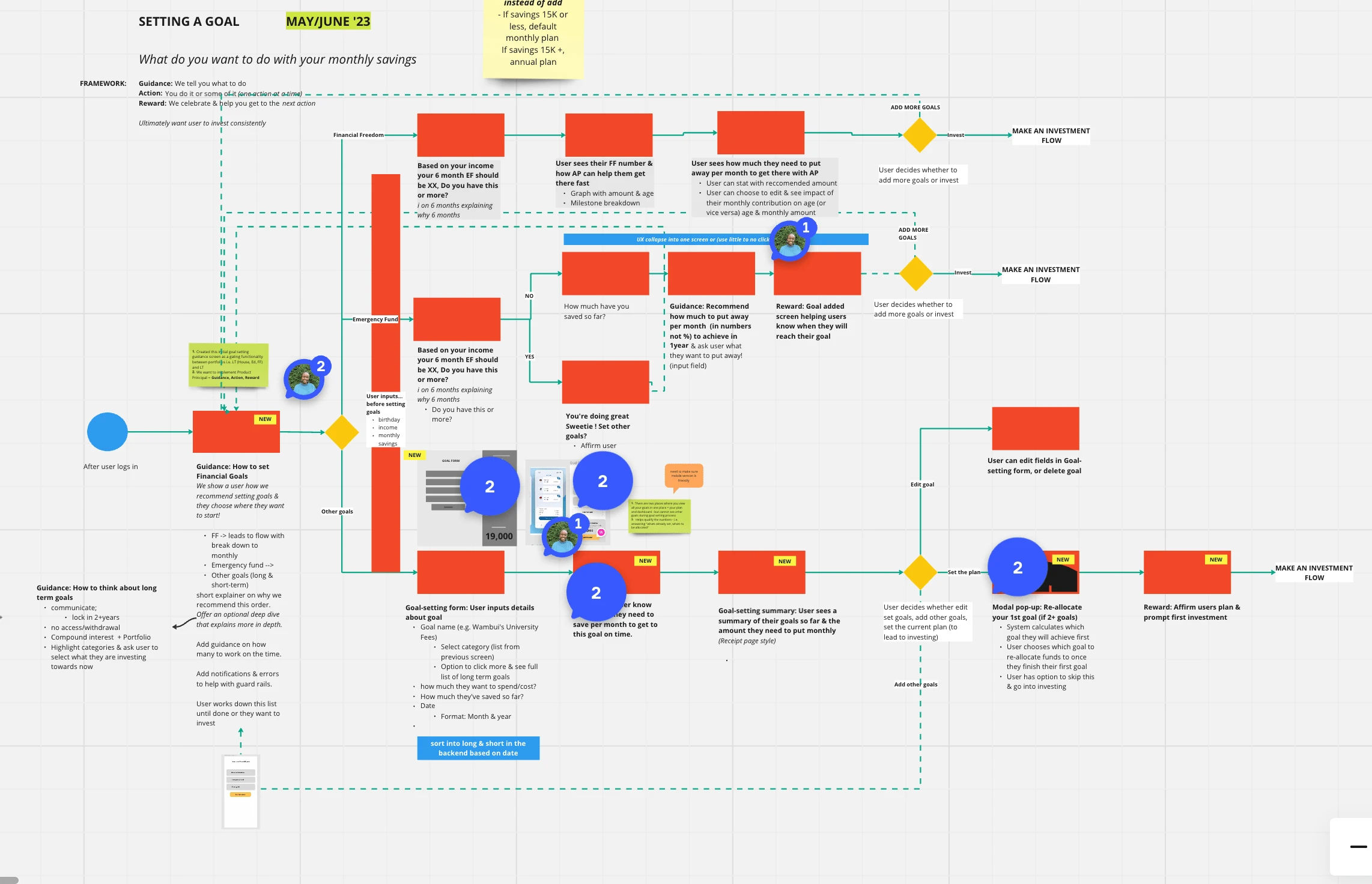
User flow re-design 🗺️
Through a few workshops we refined our goal-setting flows and found a framework that aligned with our goals. In each user flow we followed this framework, to help align business & user goals;
Guidance → Guide users on what to do based on Africa’s Pocket expert advice
Action → Give users an action to complete
Result → Reward users at the end of every flow to help boost delight along the user journey
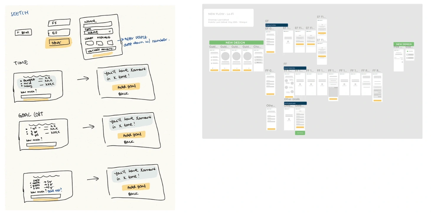
Collecting user feedback to refining sketches and build lo-fi designs 🗣️
We talked to users in groups & 1:1 via Google meets & refined our sketches before creating hi-fidelity designs. We sketched different variations of each screen & used user feedback to refine before creating fidelity designs in Figma.
Scoping feature changes for design and development 🔭
I scoped all user stories and changes of back-end functionality on Jira, prioritised each story using the RICE Framework into sprints and managed the development, testing & launch process.
We ensured that the design sprints were ahead of development sprints to ensure smooth hand over & only built functionality for designs we had tested with our users.
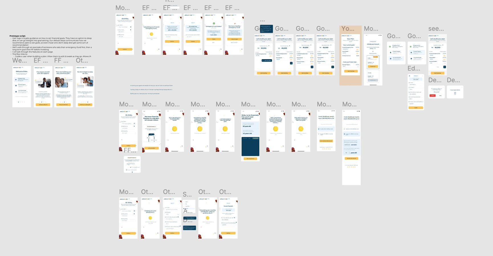
We created fidelity screens for each flow on mobile & desktop 📱🖥️
This was an iterative process where we we shared designs with users and collected feedback to help ensure all designs were intuitive and clear.
We celebrated our design improvements with the wider team, before launching 🥳
Every week we would take some time to reflect on the week & highlight wins & areas to improve. Once we launched the last goal-setting improvement, we took some time to celebrate and reflect with the wider team.
Final designs
🚀 Clean UI & better personalisation, helping users create realistic actionable financial plans
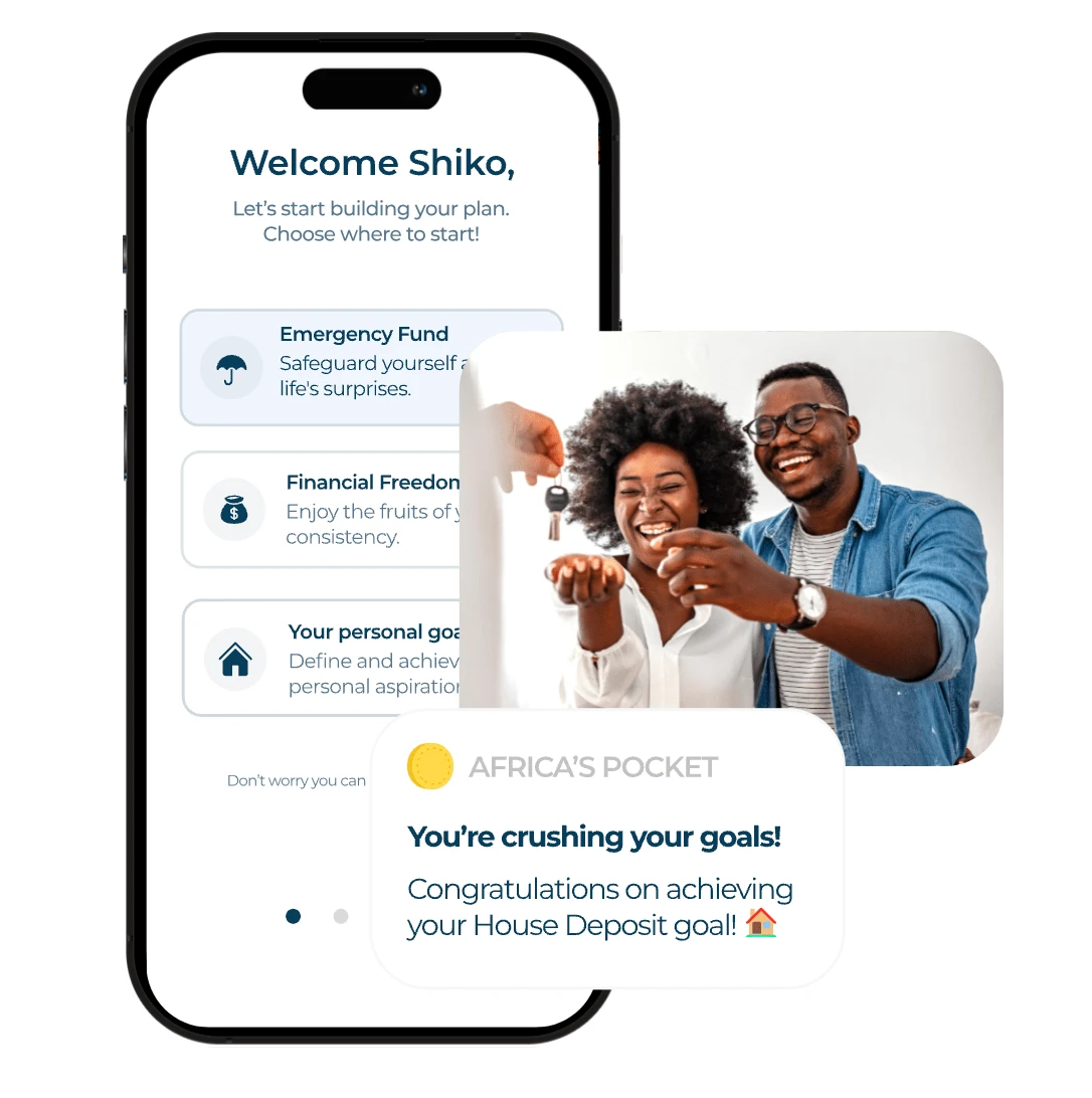
🚀 Set your personalised goals in 4 clicks.
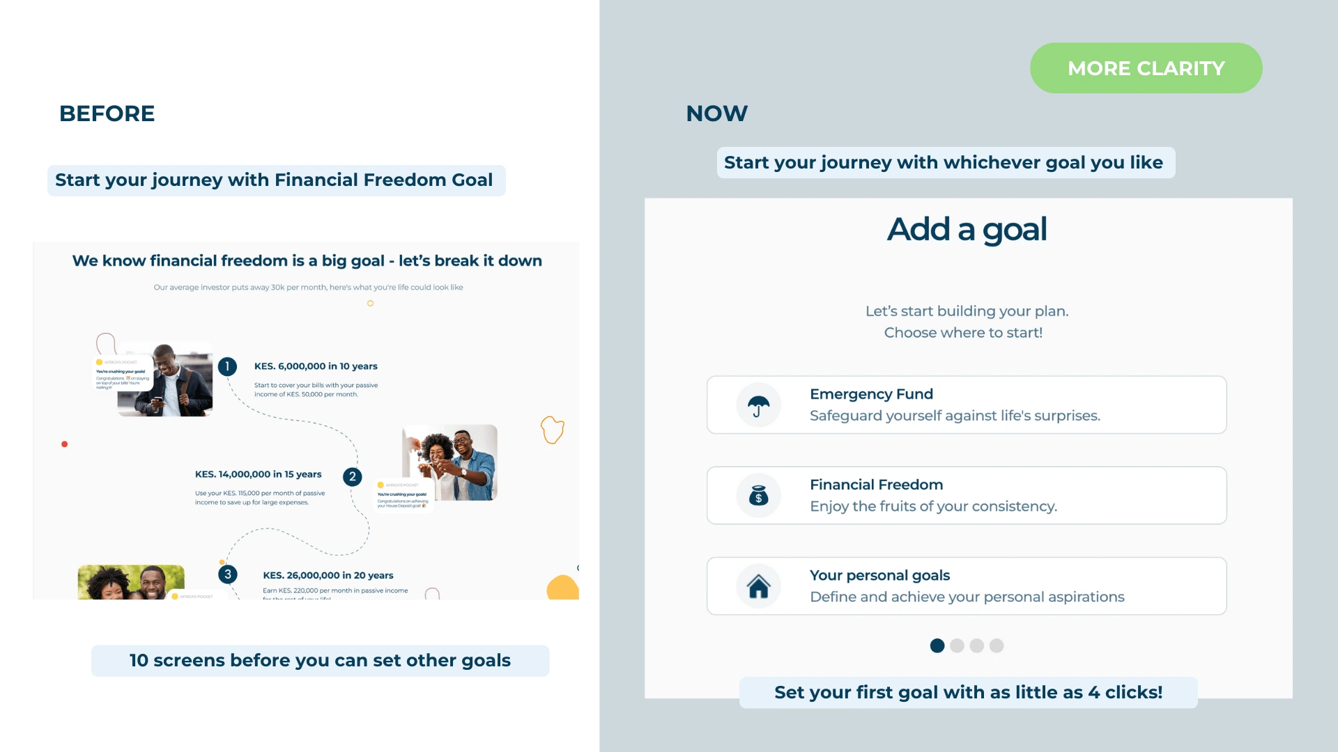
All users define their goal setting journey and start with any goal they please. As they start the goal setting journey, they are welcomed with 3 options (Emergency Fund, Financial Freedom, Your personal goals) with the option to scroll through a carousel for more details about each goal type. We reduced the number of steps taken to set users first goal, from 10 clicks to 4 clicks.
🚀 Personalise your goal name & how much you want to invest towards each goal
We updated the goal form screens to allow users to personalise their goal names (with emojis 🥳, numbers and special characters 🆕) and tested different language to understand what users understood best. We focus on guiding users to understand what it takes to reach their goals through static education sections, instead of automatically calculating for the user. Increased flexibility with clear guidance helps users feel in control of their goals and complete the goal setting flow.
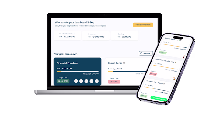
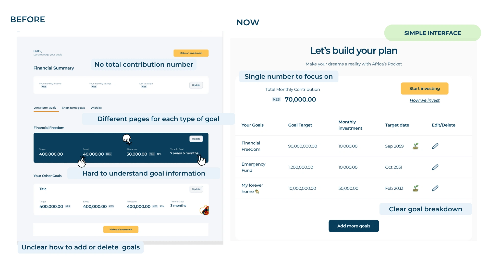
🚀 Simple interface to view all your goals in one place
We introduced a clear “Total Monthly Contribution” number to help users focus on one number & understand what it would take to reach all their goals on time. We removed tabs and introduced a table UI design to allow users to see all their goals more clearly. This increased the readability of the page & helped users make adjustments from a more informed perspective. We used a subtle coin & leaf illustration to help users understand which of their goals are long term.
Key learnings
📖 Guidance vs forced flows
We had a long debate on where to guide vs where to lead users down a mandatory flow. Through this process we thought of creative ways & design techniques to help users easily find information, while allowing them to chose their path. (e.g. carousels, information pop ups, opt out flows)
📖 Don’t over-engineer or ‘over design’ your solution
Sometimes less & simple is the way to go! We are designing a complex problem (financial goal-setting) & believed our solution needed to be sophisticated. Using external experts (Thanks Ashley 👋🏾) talking to users, & looking for inspiration from world class products helped us understand the impact of simplifying & borrowing from designs users are already familiar with.
📖 It's important to balance business goals with user needs
The initial goal-setting flow over focused on one business goal. Once we started talking to users we understood their perspective and where able to make a strong case business case for why changing the design would be better for the business in the long-run.
Thank you so much for reading through! Hope you enjoyed learning about my design and thought process 😁
Let’s work together 🤝🏾
Like this project
Posted Jan 31, 2025
User research, iterative design, and collaboration drove a flexible, user-centered goal-setting experience, resulting in a 67% increase in goal completion.
Likes
0
Views
2