Fixing Friction to Bring Users Back — Again and Again
Wangui Kariuki
⏱️ Timeline: 3 months
🖥️ Platform: Responsive Web Platform
👩🏾💻 My Role: Product Manager & Product Designer
Introduction
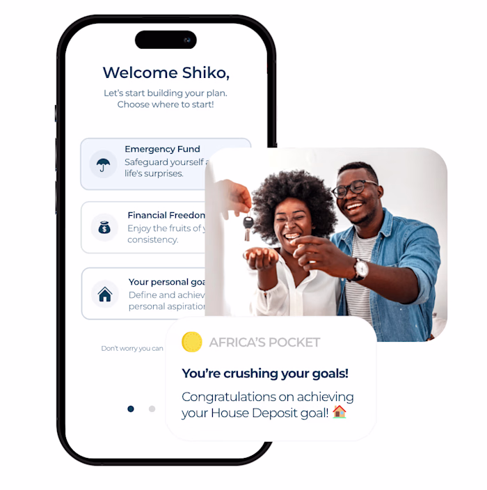
Africa’s Pocket is a digital financial partner that helps ambitious Africans reach their goals faster through financial coaching, financial literacy & managed investing. During the Investment Platform dashboard update, we set out to create an intuitive experience that allowed investors to better track their progress towards their goals and better understand how much they had invested & earned through the platform.
My Role
I led the design, user testing, and project scoping from end to end. I collaborated with 1 UX/UI Designer to bring the hi-fidelity designs to life and 1 Developer to build the backend functionality. I maintained open communication with the Head of Product and CEO throughout the project.
The Problem
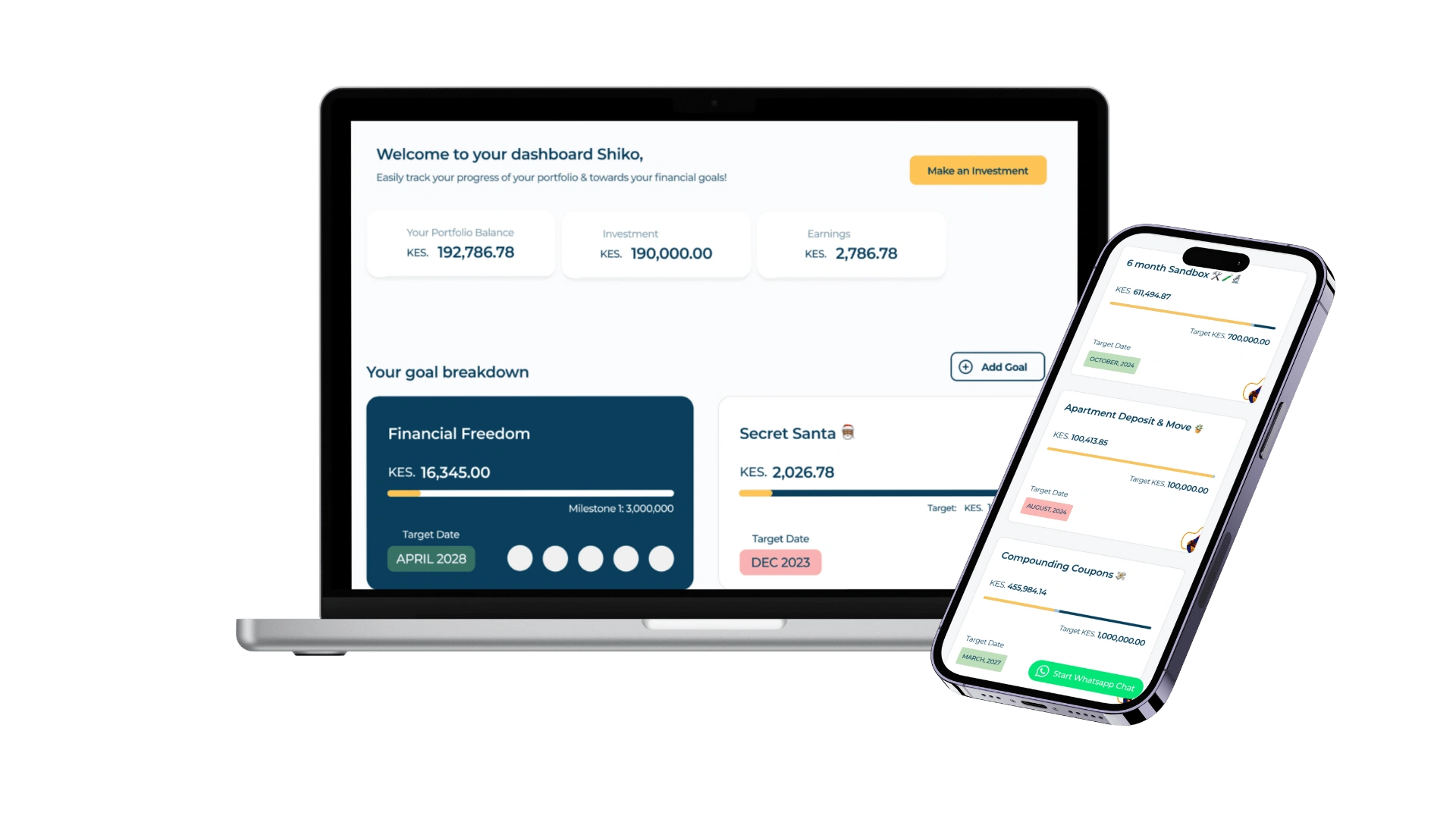
🤔 Users were unclear about their total investments, performance, and goal progress.
📊 The dashboard hero section didn’t prioritize investment data, focusing on income & goals instead.
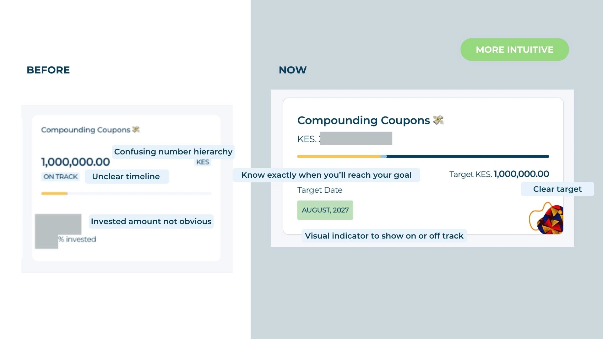
🎯 The goal cards’ information hierarchy caused confusion between investment amounts vs. goal targets.
❔ The dashboard included goals users hadn’t contributed to, adding unnecessary clutter.
Goals
BUSINESS GOALS
⭐ Reduce inquiries for offline manual statements.
⭐ Increase user retention by providing clear, accessible investment data.
USER GOALS
⭐ Enable users to quickly understand their total portfolio balance.
⭐ Highlight goals that need attention to help users stay on track.
Impact
Returning investors invested more and asked for fewer manual statements!
🥇 49.4% increase in returning investor investments within 4 weeks of launch.
🥇 50% reduction in manual statement queries.
User Persona
Serah: Early Adopter of Africa’s Pocket Investments
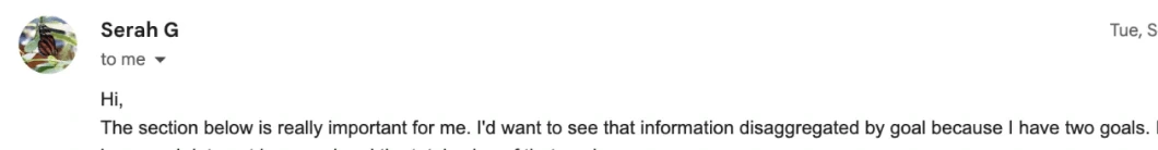
Actual user feedback highlighting key sections that are important to the user.
Jobs-To-Be-Done:
As a returning investor, when I log into my dashboard, I want to see how much I’ve invested and earned — both total and per goal — so I can track my progress accurately.
Process
Research & Alignment
We conducted user interviews to understand key pain points. Then, we aligned on the design direction through sketches and lo-fi designs, ensuring the team was unified on the dashboard’s information architecture.
Prototyping & Testing
We created three dashboard variations and validated designs through guerrilla usability tests with real investors. Internal dogfooding helped catch early issues before external testing with 7+ users.
Development & Launch
I scoped user stories and backend changes in Jira, prioritized features into sprints, and managed the development and launch process. We introduced the dashboard update to over 16,000 users via email.
Final Designs: More transparent & more intuitive design
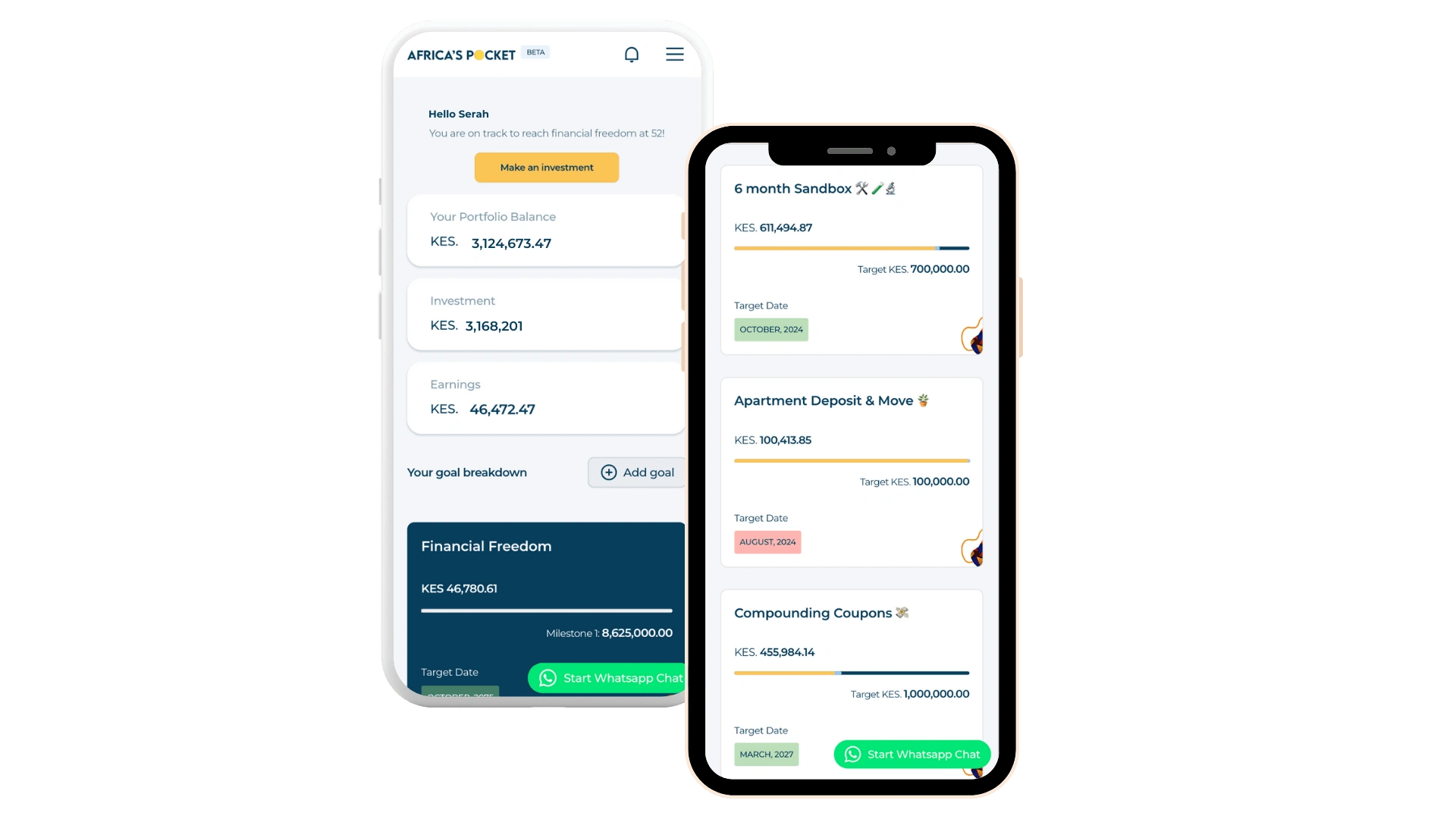
🚀 Clear portfolio overview:
The hero section now displays total portfolio balance, broken into investments & earnings, alongside the top two goal cards. Users can make quick investments confidently.
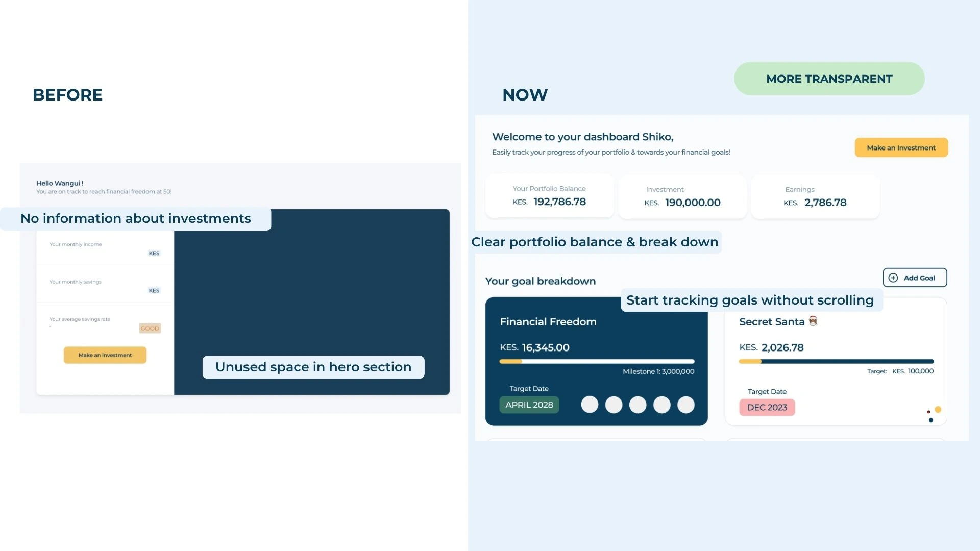
🚀 Improved goal cards:
Goal cards now feature a clearer hierarchy, personalized goal names (with emojis 🎉), and a traffic light system to signal progress: green (on track), yellow (falling behind), red (urgent attention needed).
Key Learnings
📖 Testing with real users is essential:
Internal testing alone risked bias. External testing revealed real user challenges, leading to better solutions.
📖 Simplicity wins:
Initial designs included a graph in the hero section, but user feedback showed it caused confusion. Removing it resulted in a cleaner, more effective layout.
Let’s work together 🤝🏾
Like this project
Posted Jan 31, 2025
Redesigned Africa’s Pocket dashboard to make portfolio tracking clearer, driving 49.4% more returning investments and halving support requests.