Knotty | Gift Shop | Full Brand Identity & Design System
Olena Lyshak
Owerview
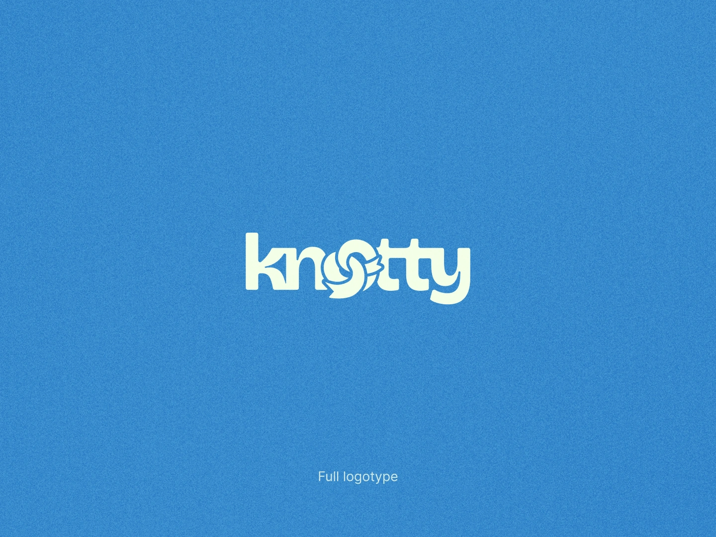
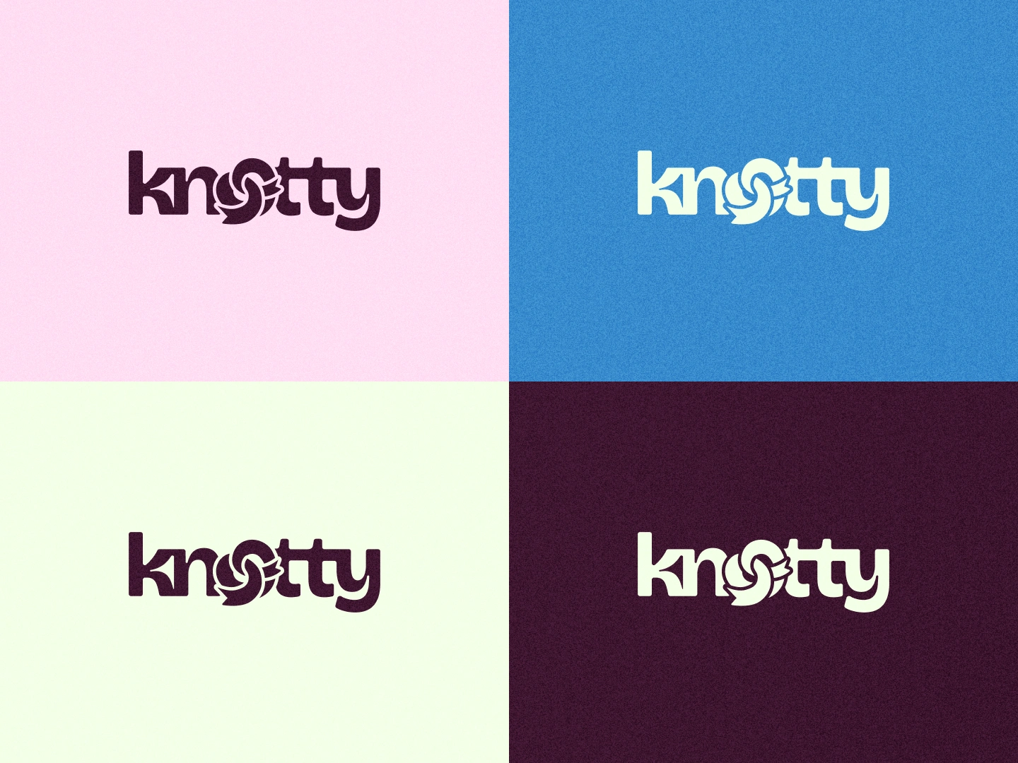
Knotty is a contemporary gift shop built around connection and thoughtfulness. The client needed a fresh visual identity that balances a modern, minimalist aesthetic with a deeply human, caring feel.
The Challenge
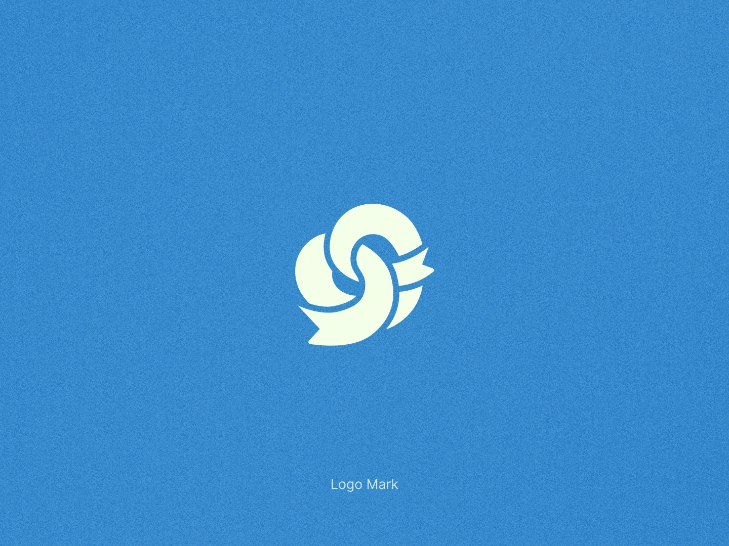
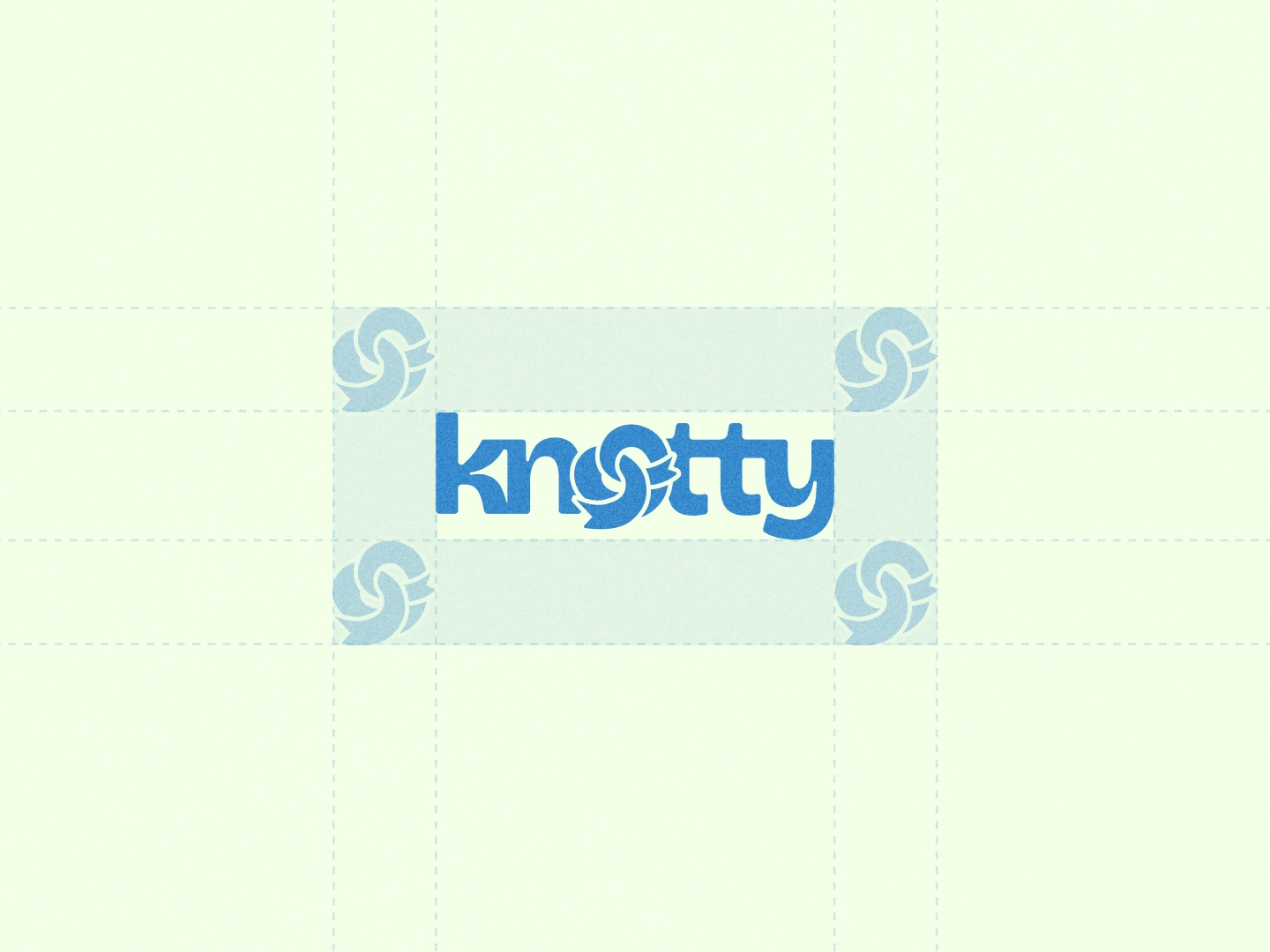
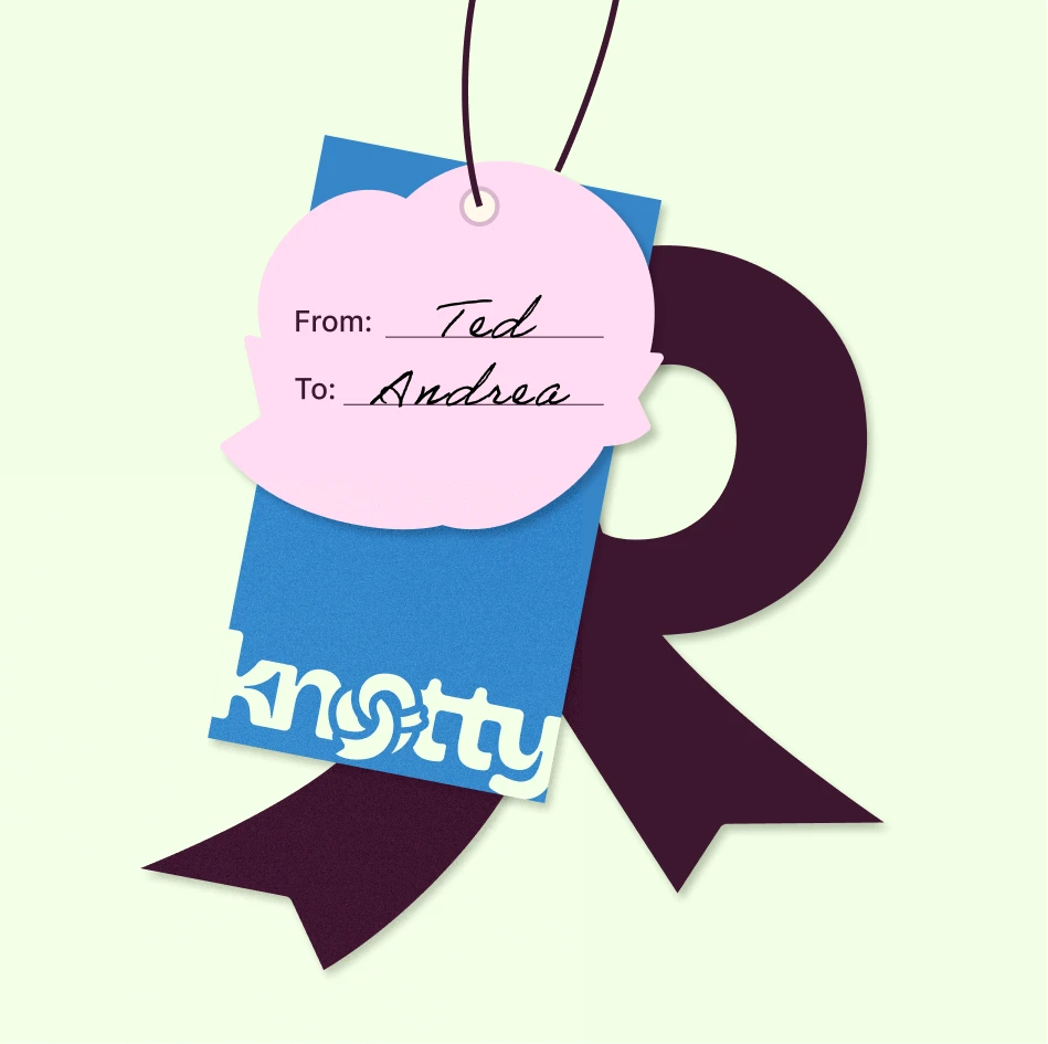
The main goal was to create a versatile and scalable identity system that represents the concept of connection (symbolized by the ribbon and the "knot") without creating visual clutter.
The branding needed to look sophisticated yet approachable, working seamlessly across physical packaging, custom illustrations, digital media, and typography.
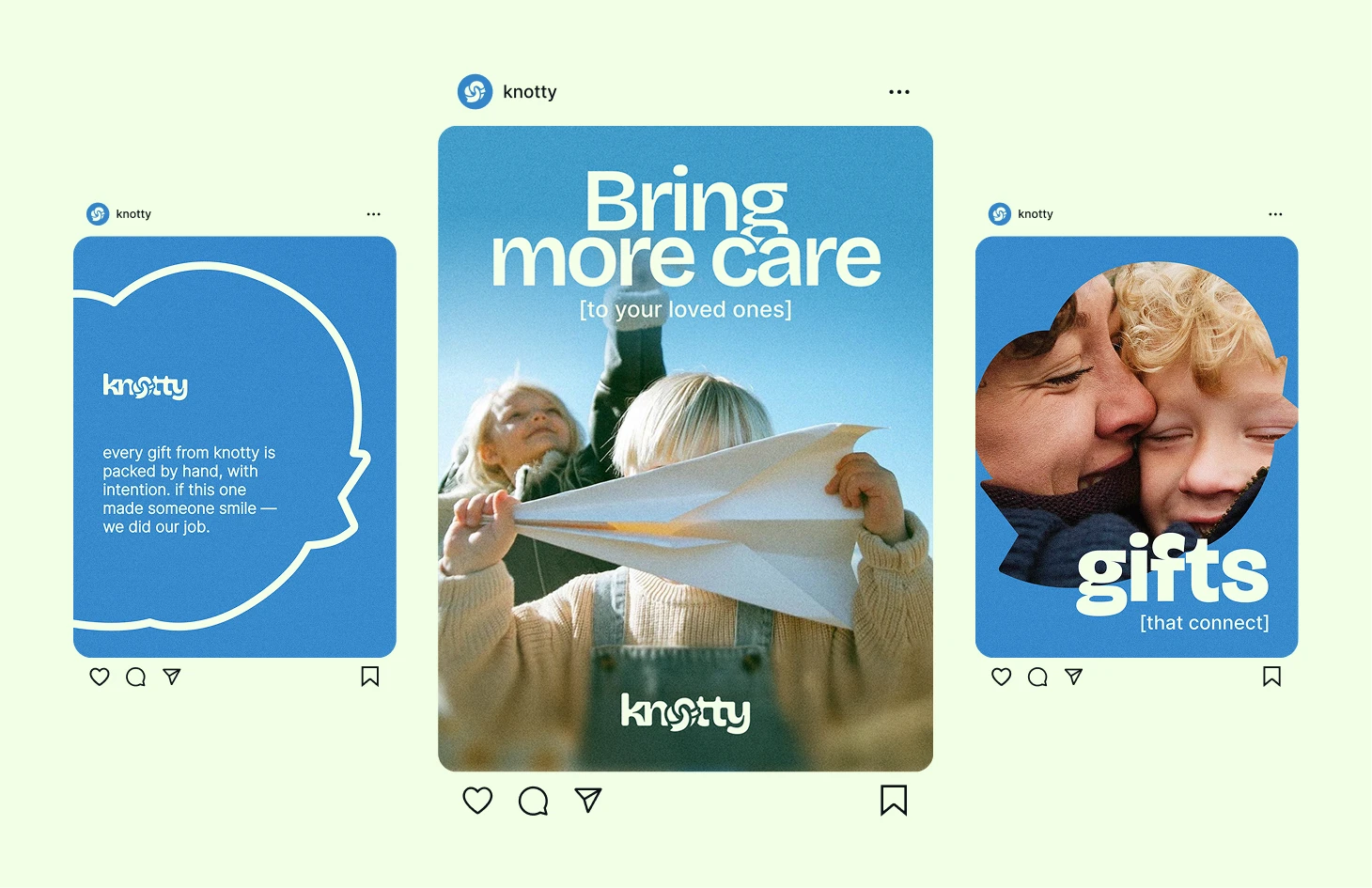
Social Media Design

Business Card
Looking to elevate your brand with a meaningful, comprehensive identity?
I help businesses tell their unique stories through clean, intentional, and high-converting design systems. Let’s collaborate on your next project!
Like this project
Posted May 16, 2026
Knotty is a gift shop built around connection and thoughtfulness.
Likes
2
Views
10
Clients
Knotty