Classic City Apparel Mini Brand Refresh

Maxlyn Jimenez
Verified


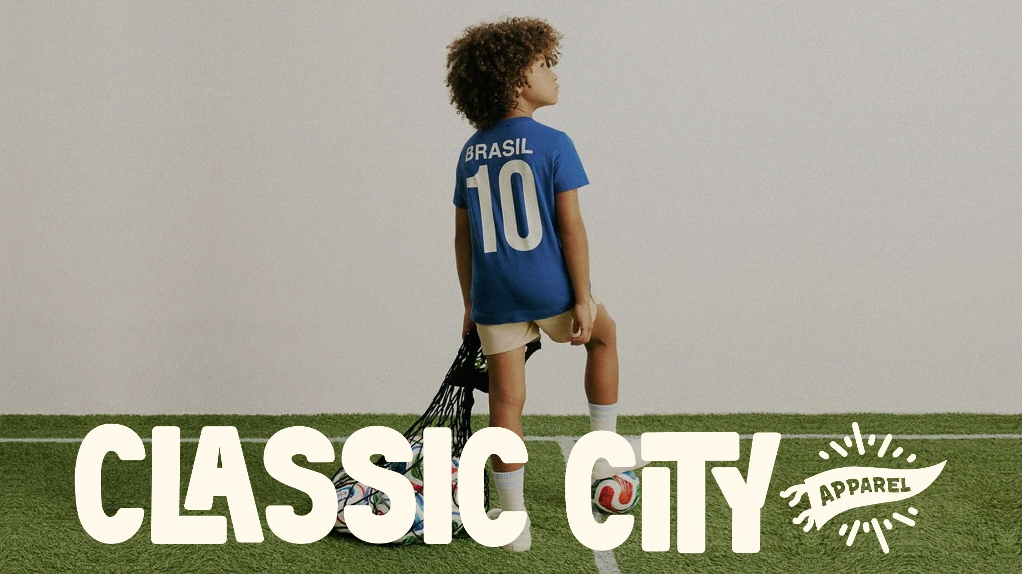
CLASSIC CITY APPAREL [MINI BRAND REFRESH]
Building a world around the feeling of game day.
Classic City Apparel is a family-focused sportswear brand inspired by football culture, childhood nostalgia, and the communities built around the game.
The goal was to move beyond the typical “future athlete” aesthetic and create a brand that feels like Saturday morning football, old sports catalogs, family photo albums, team traditions, and the excitement of being part of something bigger than yourself.
The identity turns Classic City into more than an apparel brand; it becomes a little universe of players, families, uniforms, collectibles, game days, and memories.
THE CHALLENGE
How do you make kids’ sportswear feel like a culture, not just a uniform?
A lot of children’s sports apparel leans heavily on performance, professional-team aesthetics, or overly polished athletic branding.
Classic City needed something different.
The brand was created for kids who genuinely love football and the families who experience the culture around them, whether that's playing, watching from the sidelines, supporting a hometown team, or simply living for game day.
The challenge was to build an identity that could feel:
Sporty without feeling overly technical
Nostalgic without feeling dated
Playful without feeling childish
Fashion-forward without losing its family appeal
Authentic to football culture without looking like a professional team. The bigger opportunity was to make the brand feel like a place people belong to, rather than simply another apparel label.
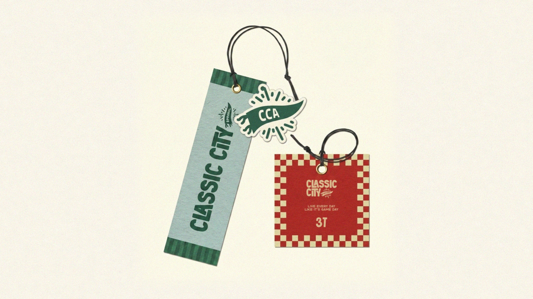
THE BRAND IDEA
LIVE EVERY DAY LIKE IT'S GAME DAY.
Classic City is built around the idea that game day is more than a day on the calendar.
It's the anticipation.
The uniform.
The family in the stands.
The inside jokes.
The team rituals.
The pride of representing where you're from.
That feeling became the foundation for the identity.
Instead of treating football as a purely competitive sport, the brand treats it as a shared cultural experience, one that connects kids, parents, teams, neighborhoods, and memories.
THE VISUAL DIRECTION
The visual identity combines the feeling of a Saturday morning football game + vintage American sports catalog
The system intentionally avoids looking too polished or corporate. Instead, it embraces:
Bold typography
Oversized, expressive lettering gives the brand the energy of vintage sports graphics.
Collectible graphics
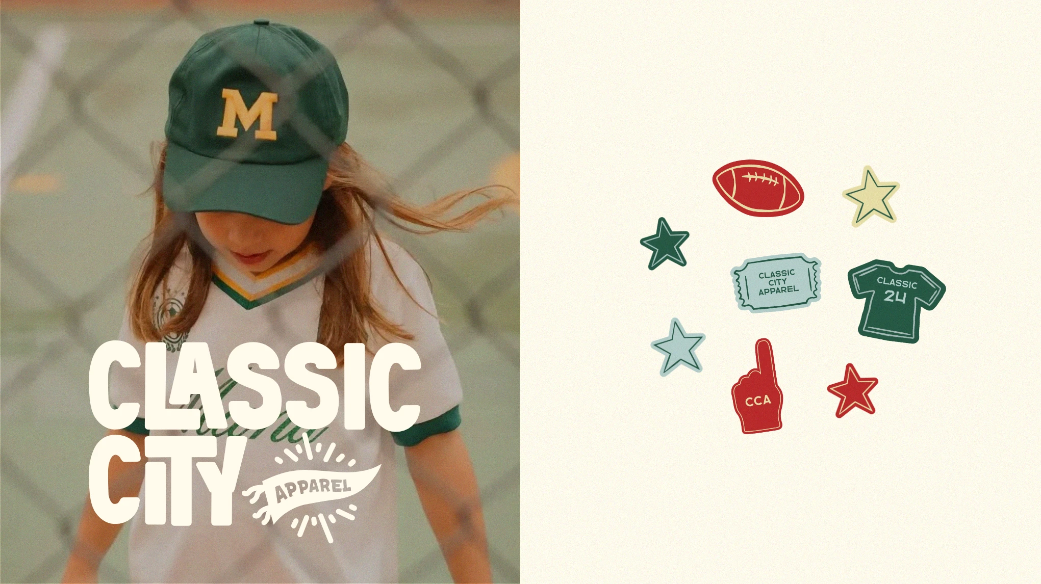
Football illustrations, tickets, jerseys, stars, foam fingers, badges, and other small graphics create the feeling of a growing visual universe.
Nostalgic color
A palette of African Turquoise, Jet Stream Blue, Frosty Gold, Tall Poppy, Bright Pearl, and Extreme Black creates a balance between classic sports culture and a more contemporary fashion sensibility.
Patterns & textures
Striped and checkerboard patterns extend the identity beyond the logo and make the brand feel recognizable across different applications.
Imperfect, editorial energy
Rather than relying on perfectly staged sports photography, the direction leans into candid moments, movement, grain, visual imperfections, and the feeling of memories captured rather than manufactured.
FROM APPAREL TO EXPERIENCE
The identity was developed with the idea that Classic City could eventually exist across an entire game-day ecosystem.
That includes:
Apparel
Jerseys, shirts, and everyday pieces designed around team culture rather than performance alone.
Packaging
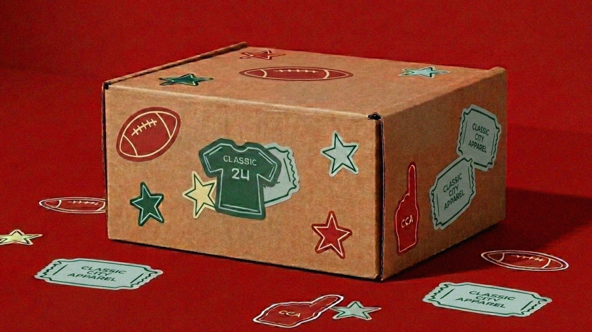
Branded boxes, wrapping, tags, and stickers turn receiving an order into part of the experience.
Collectibles
Tickets, badges, stickers, and small graphic elements reinforce the idea that Classic City is something kids can collect and interact with.
Digital & Social
The graphic system gives the brand enough flexibility to create energetic social content without having to rely on the logo in every post.
THE RESULT
Classic City Apparel becomes a brand that feels familiar, energetic, nostalgic, and distinctly its own.
Rather than competing with traditional sportswear on performance or technical credibility, the identity focuses on something harder to replicate:
the emotional culture surrounding the game.
It's about the kid wearing their favorite jersey, the parent on the sidelines, the team everyone knows, the Saturday morning routine, and the feeling of belonging to something.
Classic City isn't just about playing the game.
It's about living like every day is game day.
Like this project
What the client had to say
Amazing experience from start to finish! Maxlyn truly understood my vision and created a brand identity that feels cohesive, thoughtful, and uniquely us. She was creative, responsive, and such a joy to work with. Highly recommend ⭐️⭐️⭐️⭐️⭐️


Courtney McDonald, Classic City Apparel
Aug 14, 2026, Client
Posted Oct 15, 2026
Designed a nostalgic brand identity for Classic City Apparel's mini refresh.
Likes
0
Views
3
Timeline
Jul 9, 2026 - Aug 14, 2026
Clients
Classic City Apparel