Blucra banking
Introduction
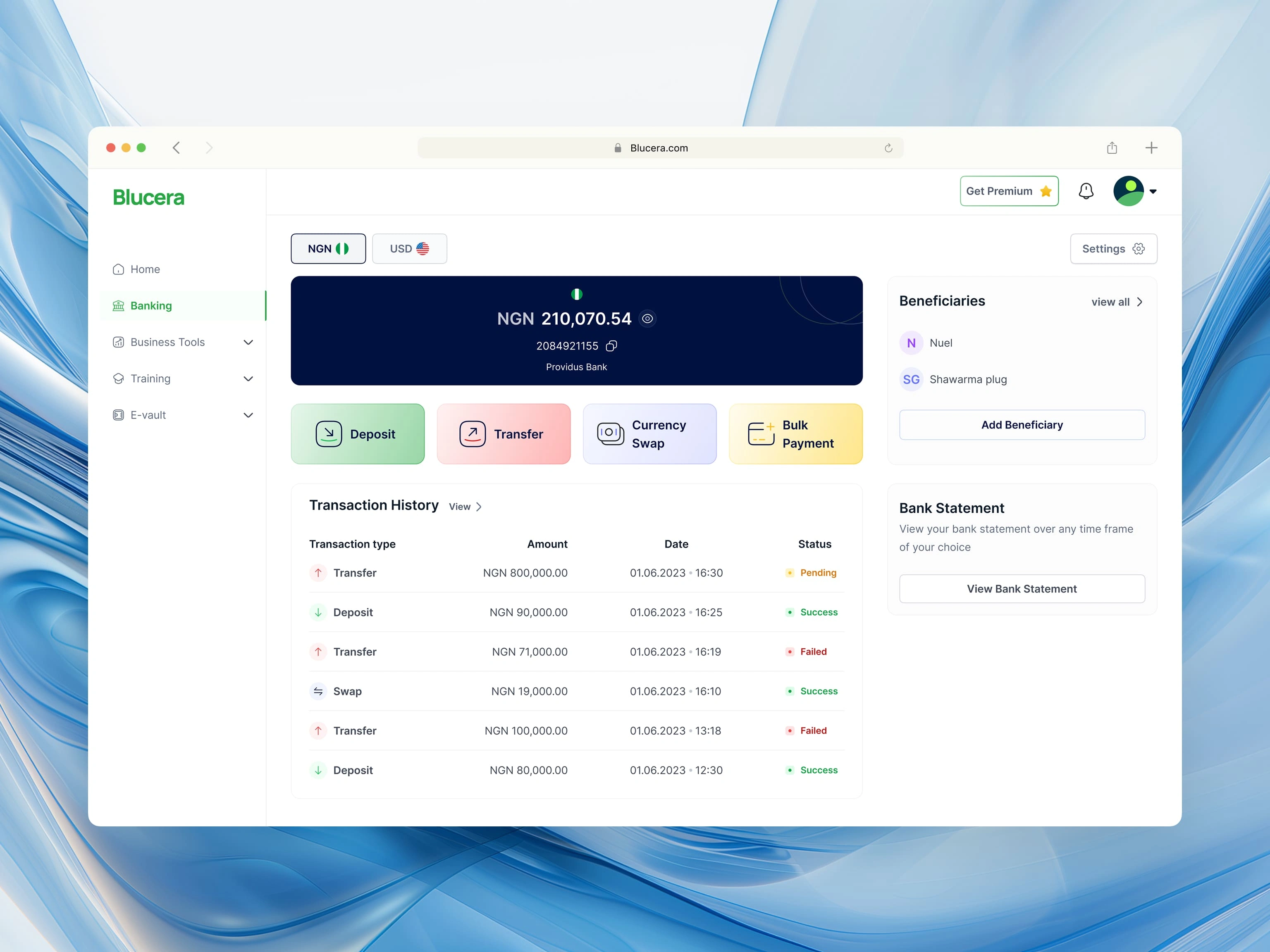
Blucera Banking is a fintech/Neo-bank product created to improve banking experience for SMEs. The product is one of four products in a suite which makes it easy to integrate actions such as Bulk payment in the banking application with Payroll in the business tools application.
I was excited to take this gig because it offered the opportunity to work on different types of products simultaneously, making it a worthy challenge that could spur growth.
Problem Statement
Many businesses struggle to seamlessly integrate their banking activities with other core business operations such as Payroll, leading to inefficiencies, data silos, and poor financial management due to human error.
The Solution
Blucera suite is a suite of products that integrates the banking app with the business management app. Making it easier to run your business and manage finances in one place.
The Project’s Challenges
I was faced with multiple challenges while working on this gig. Here are some of them:
No documentation: There was no product specification document to direct the development team on the project’s requirements. This had to be done on the go and led to several errors and discrepancies between the design deliverables and the developers’ codes.
Unrealistic timeline: The client wanted the design for the banking app to be completed in 2 weeks. What??!
No branding: No branding meant I had to spend time creating colour schemes, logo variations and other deliverables within the already limited timeframe.
Design Approach
The design process was done in 3 phases:
Creating and Analysing the Product Specification Document
I started the project by holding meetings with the Client and developers. The purpose of the meetings was to create the product requirement document and align every stakeholder’s expectations in terms of the design method, delivery timeframes and feedback process.
The features requested by the client include: Bank transfers, Bulk Bank transfers, Nigerian and USA bank account management, Currency swaps and Virtual cards.
The documentation was a continuous process throughout the project. I documented my design deliverables and held meetings with the developers to ensure that what I designed was technically feasible.
2. Competitor research: Learning from other products' processes, UX flows and customer feedback.
Fun fact: Every feature the client wanted to build had already been built by similar live products.
To deliver within the limited time frame and avoid attempting to reinvent the wheel, I signed up on different FinTech platforms and tested them to understand how these features worked from a user’s POV. Some of the platforms I analysed include Grey, Moniepoint, Uniswap, and Kuda Bank.
Customer feedback to understand pain points and reviews was obtained through social media keyword searches.
3. Information Architecture, User flow-mapping and wireframing (sketches)
Information Architecture
The number of core features that needed to be designed meant that I had to get the Information Architecture right or risk creating a frustrating experience for users. I listed out the features in different categories: Expected rate of use, and how simple/complex the feature is (for example, it’ll take more time to use the bulk transfer feature than the single transfer feature). This way, I knew what features to make easily accessible and which ones to make 2 or 3 clicks away.
User flows
Simple features like Bank transfers do not require complex ideation, but features such as bulk transfer were a headache.
I ensured that the user flows for all user activity were intuitive with active buttons, toast notifications, and form fields with alerts.
UI Design
After creating some brand deliverables, I set up a comprehensive style guide using Untitled UI styleguide and started the UI design. The results…
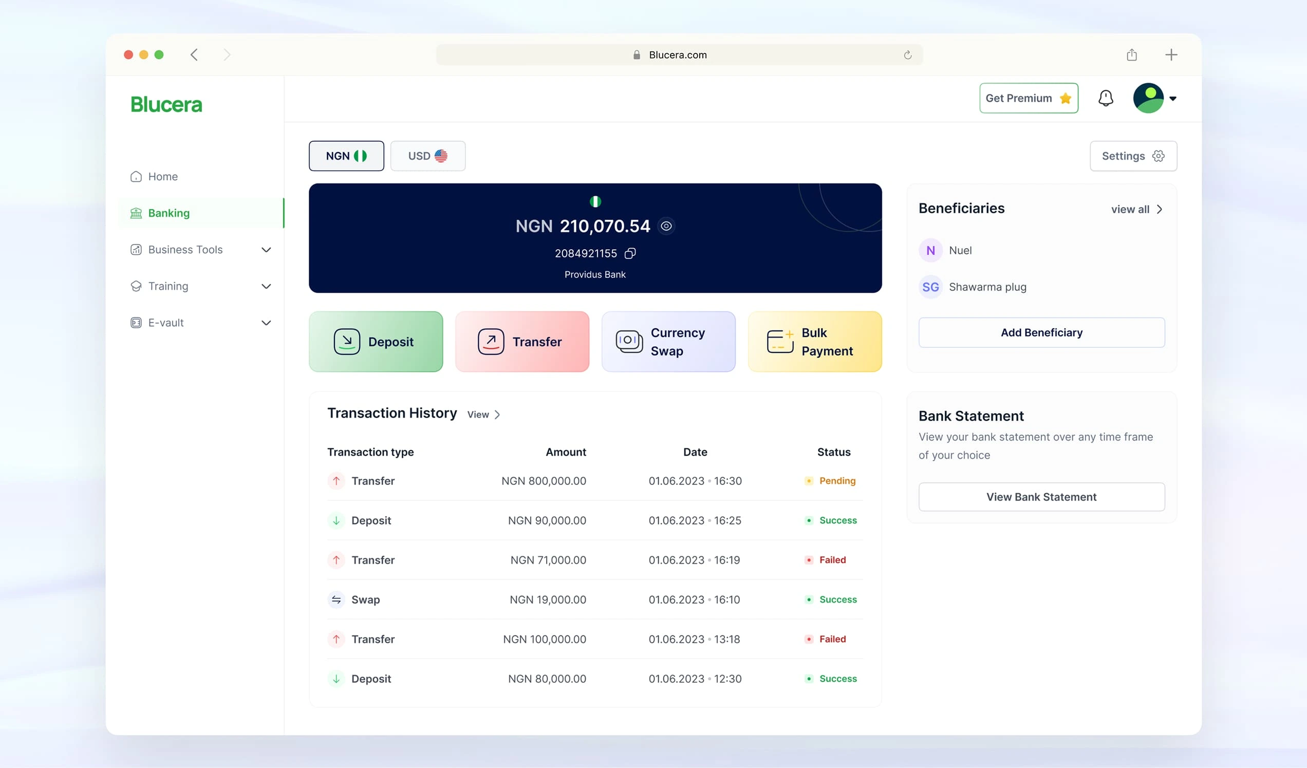
Dashboard
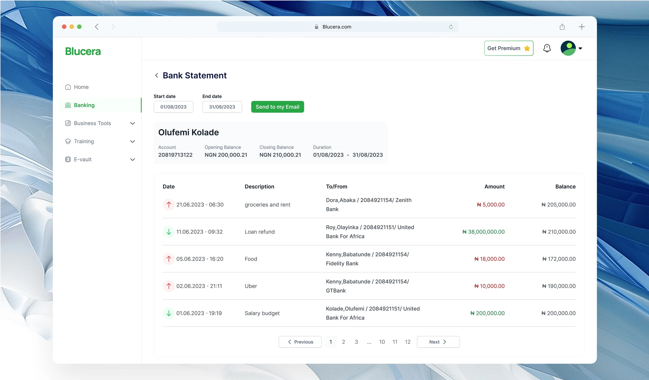
Bank statement
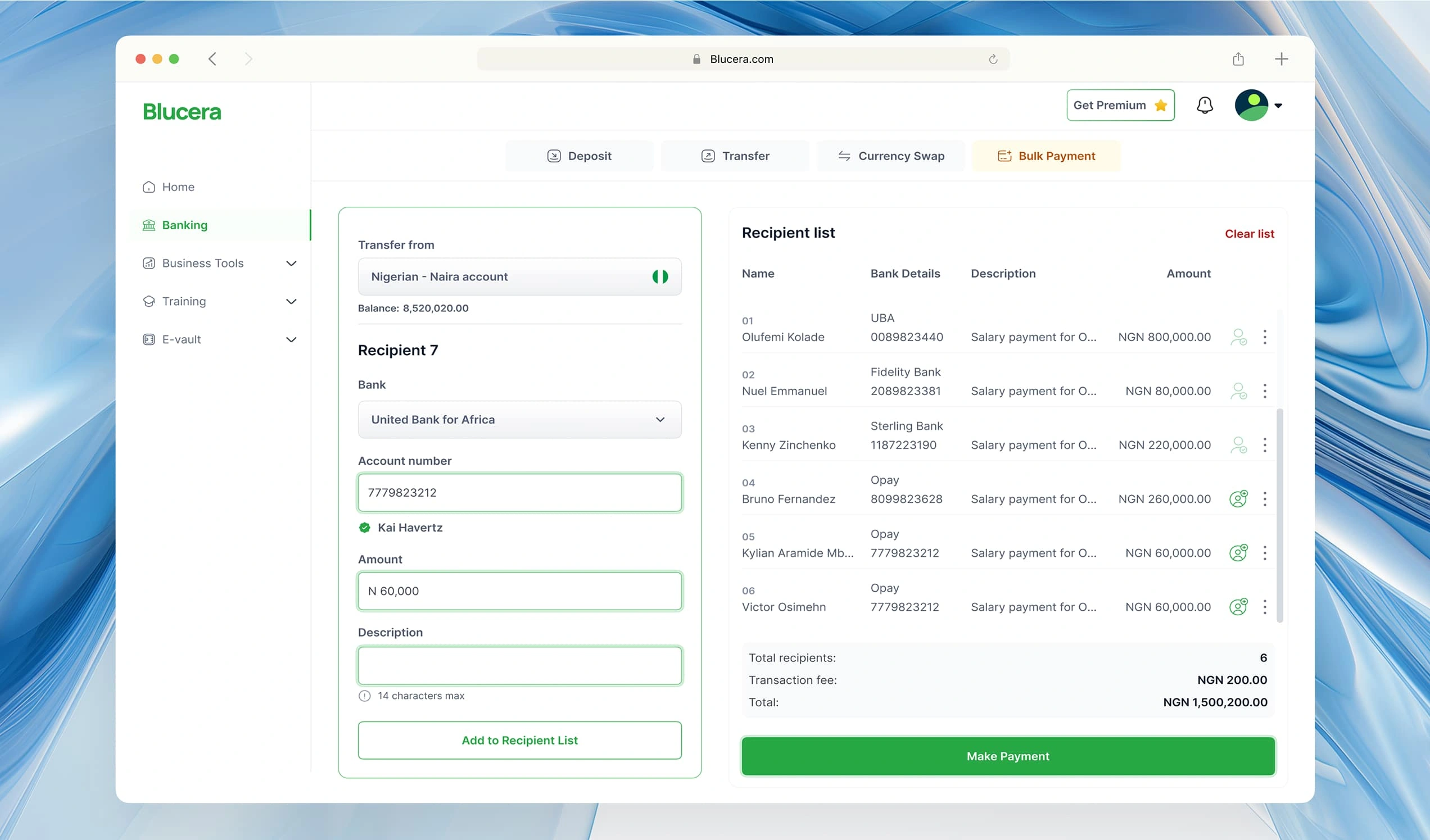
Bulk transfer
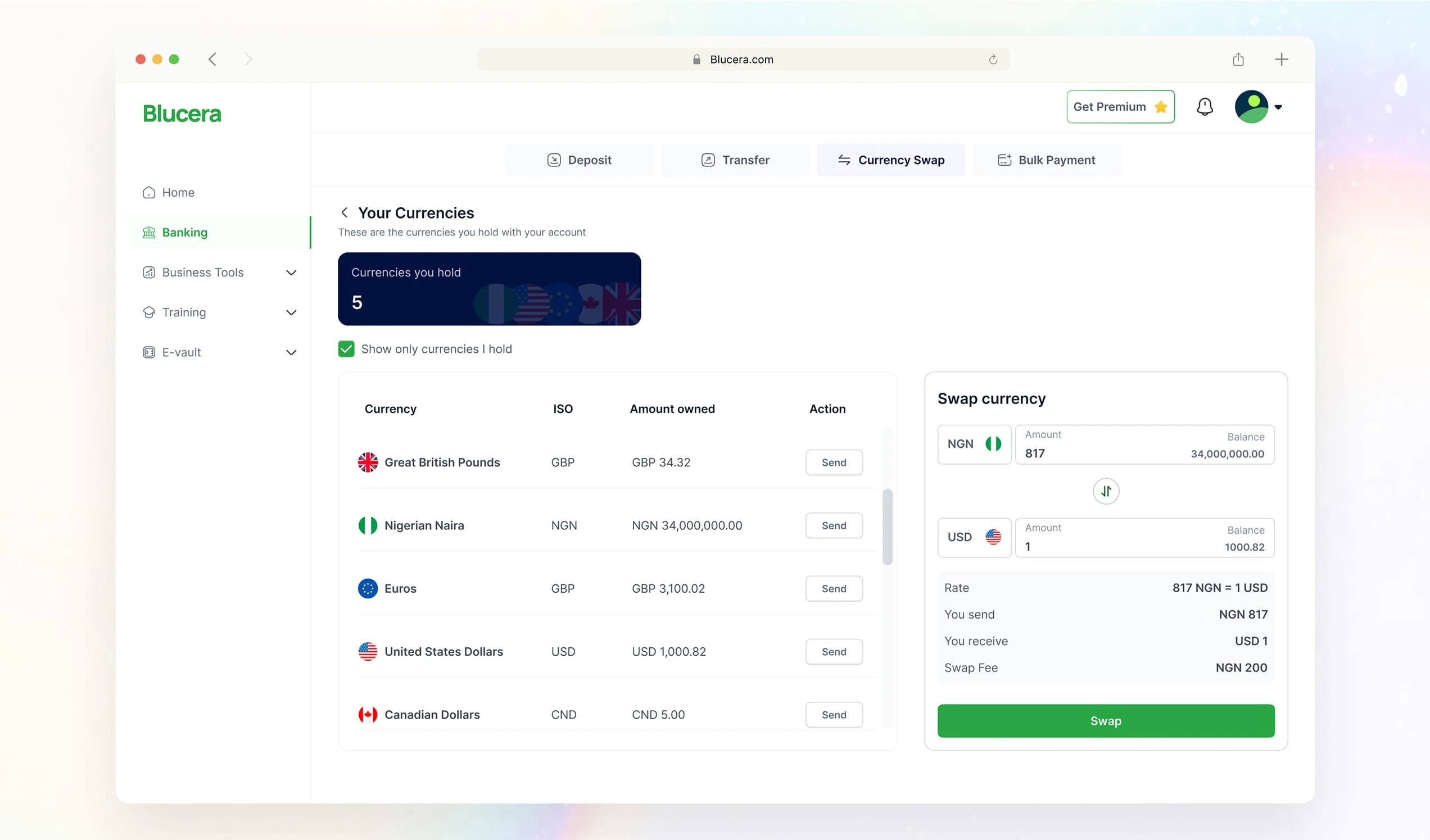
Currency swap
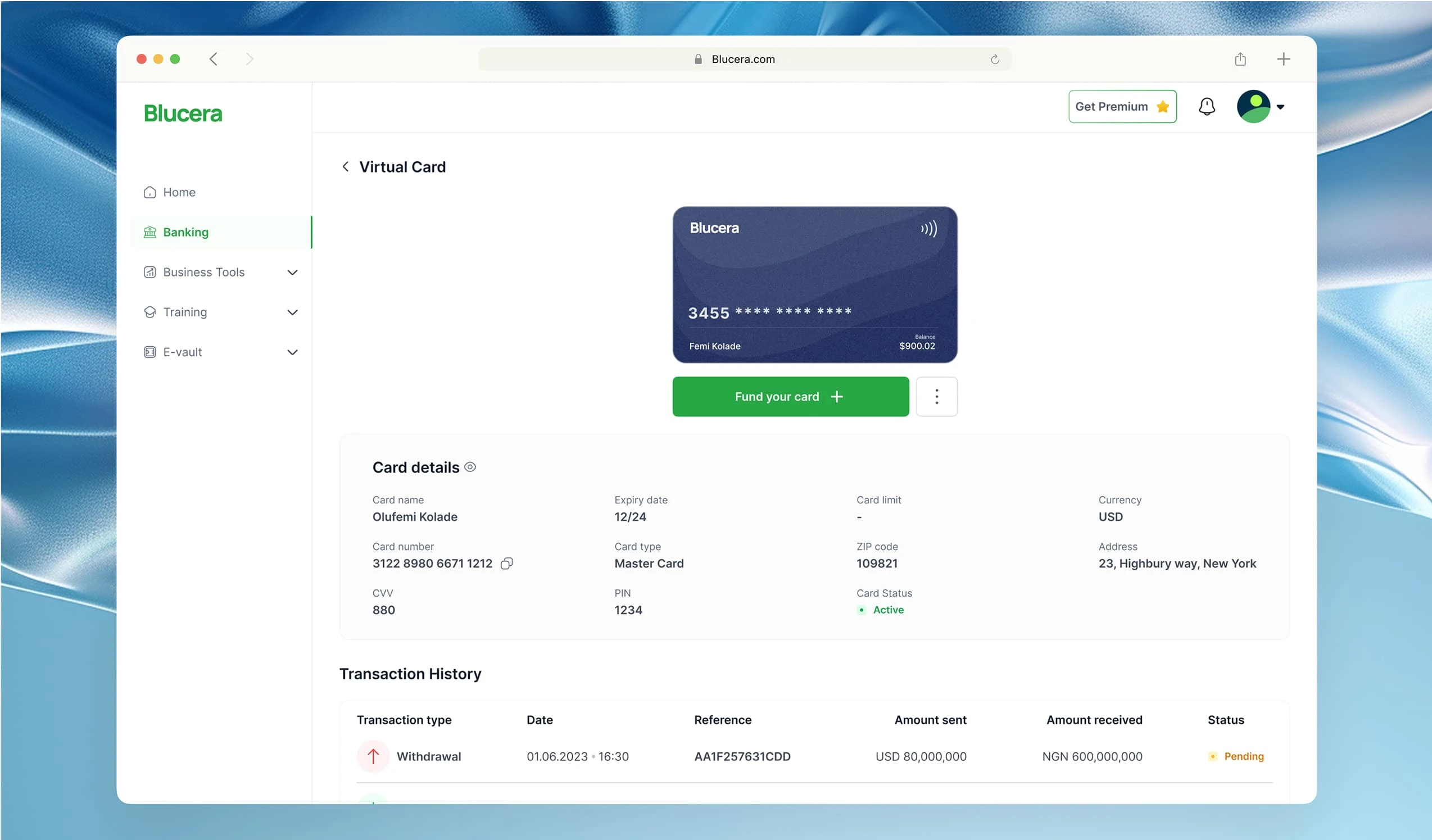
Virtual card
Edge-cases
Scenarios in which there were interruptions to the user flow, such as insufficient balance, unverified identity, etc, were designed for.
Results
Functional web-app
Despite multiple roadblocks and a limited timeframe, I delivered the design for the product within the given period, early enough for stakeholders to start testing.
Accessible product
The product's accessibility was tested with A11yTools scanner, and after a few adjustments, all the screens met the WCAG standards.
Quality feedback
Stakeholders who participated in the product testing were impressed with the design and I received positive user feedback.
Growing userbase
The Blucera suite is currently used by 20+ paying customers (businesses).
Conclusion
Working on this project made me a better professional because I learnt how to improvise, work with tight time constraints and work with limited resources (documentation etc).
I became more efficient, learnt how to evaluate projects and ultimately deliver when the odds are against me.
Like this project
Posted Mar 19, 2025
The Banking app was one product in a suite, built to improve the banking SMEs that operate in multiple African countries.
Likes
1
Views
77
Timeline
Aug 10, 2023 - Oct 20, 2023
