Case study: Creating Design System that is scalable & accessible

Theresa Lau

Design Token
Design Systems
UI Designer
Figma
LineSlip Solutions
Building a Design System and improving Data Visualization for LineSlip Solutions
👩🏻‍💻 Role: Design System Designer
🗓 Duration: October- December 2023
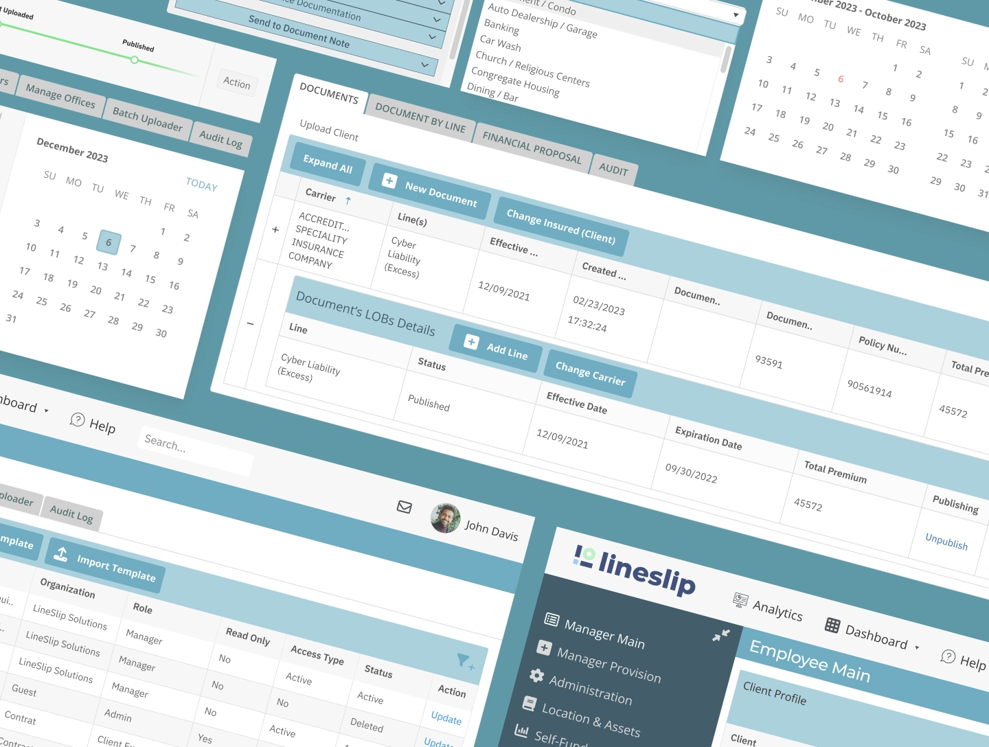
When I first met up with the Product Manager of LineSlip Solutions, I learned that the company was lacking a design system for their SaaS internal platform. The business was in the process of doing a rebranding, but still wanted to keep the design of their internal platform.

My Role

I was hired as the only designer to help their Product team build over 40 reusable components to be kept in a Figma library. I led the project by first conducting an in-depth in-depth UX/UI audit to identify any issues of the platform that were adversely impacting their both the accessible usage and branding of their internal platform.
In the two and half months of working on the project, I was able to create a design system in Figma to be single source of truth, while identifying the five overarching goals:

Goals:

🏋️‍♀️ Comprehensive (supporting branding, data visualization, and colours)
✅ Consistency (colors, icons, typography, and the molecules)
🔍 Accessibility (Color system provides sufficient contrast ratio and is aligned to WCAG guidelines)
⚖️ Scalability (the components, colors, and typography can be extended with least disruption to existing and future implementations of the SaaS platform)
🏷 Tokenization (Provide single source of truth and better understanding for designer/ developer on how and when to apply colour palette and spacing for the platform)
Overall, creating a user-friendly Design System will help all team members and stakeholders access the Figma library in an easy way and contribute further as the design system continues to grow.

🚨 Problem

I identified numerous inconsistencies when it came to the client's current platform.
The icons were not consistent with one another
There was little to no uniformity in hierarchy of text colors and consistency in color palette with typography
Buttons were inconsistent and appeared in different colors and sizes across the different pages of the platform.
Improper use of colours for data visualization (ie: mixing brand colours with data) and conflict with WCAG guidelines.

💡Solution

While, the business wanted to keep the overall style the same, we narrowed down to only creating the most important components (ie: certain calendar and tables) that were most used by the business. I helped clean out any inconsistent colours I found and made sure that when building the design file on Figma, all components would match the 5 overarching goals I identified for the client.
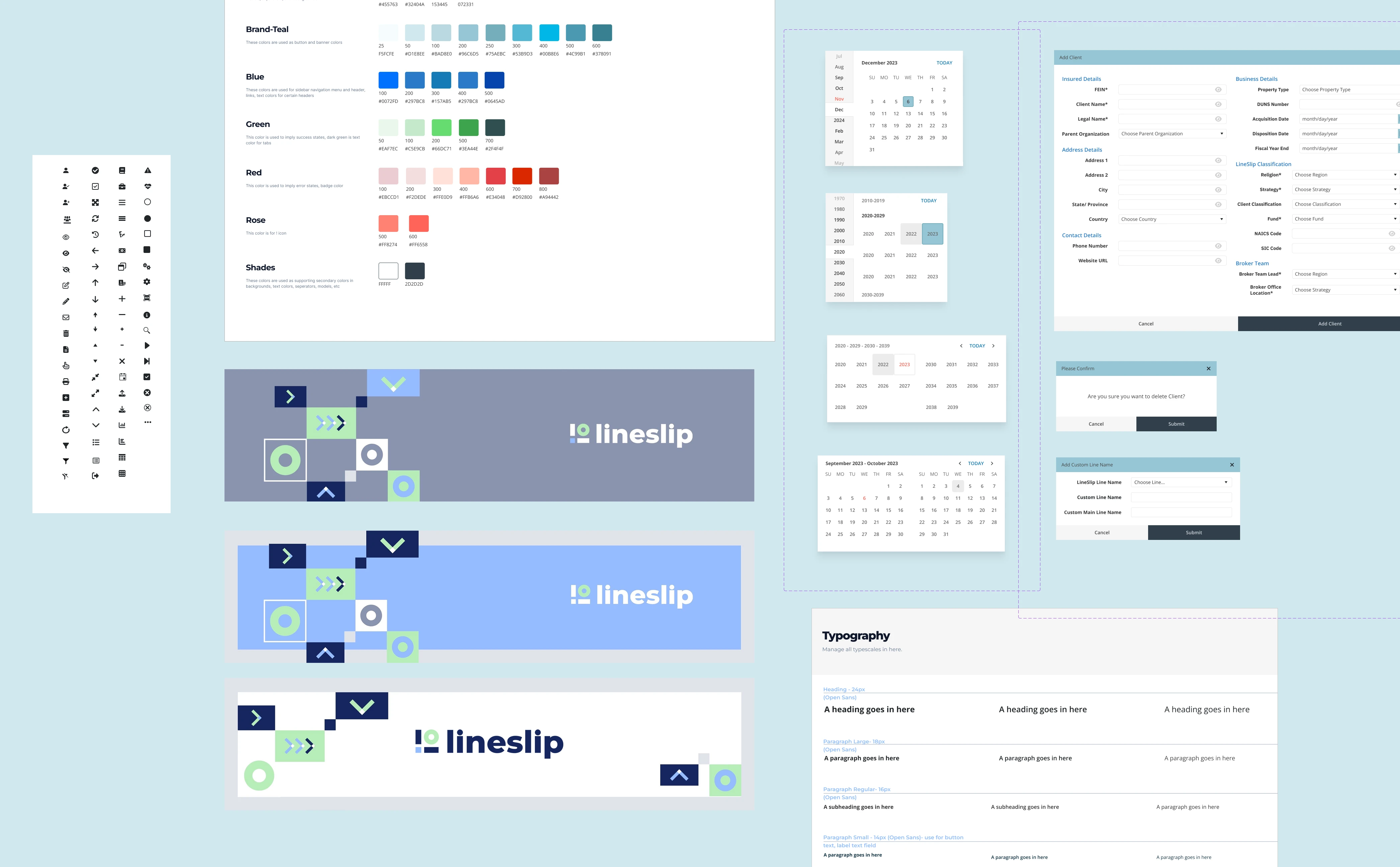
Tokenization played an important role in the project, too, as labelling and giving a purpose to the components I built in Figma gave more clarity for the correct usage of colours, spacing, and font size choice.

Turning Color palettes into Color Tokens
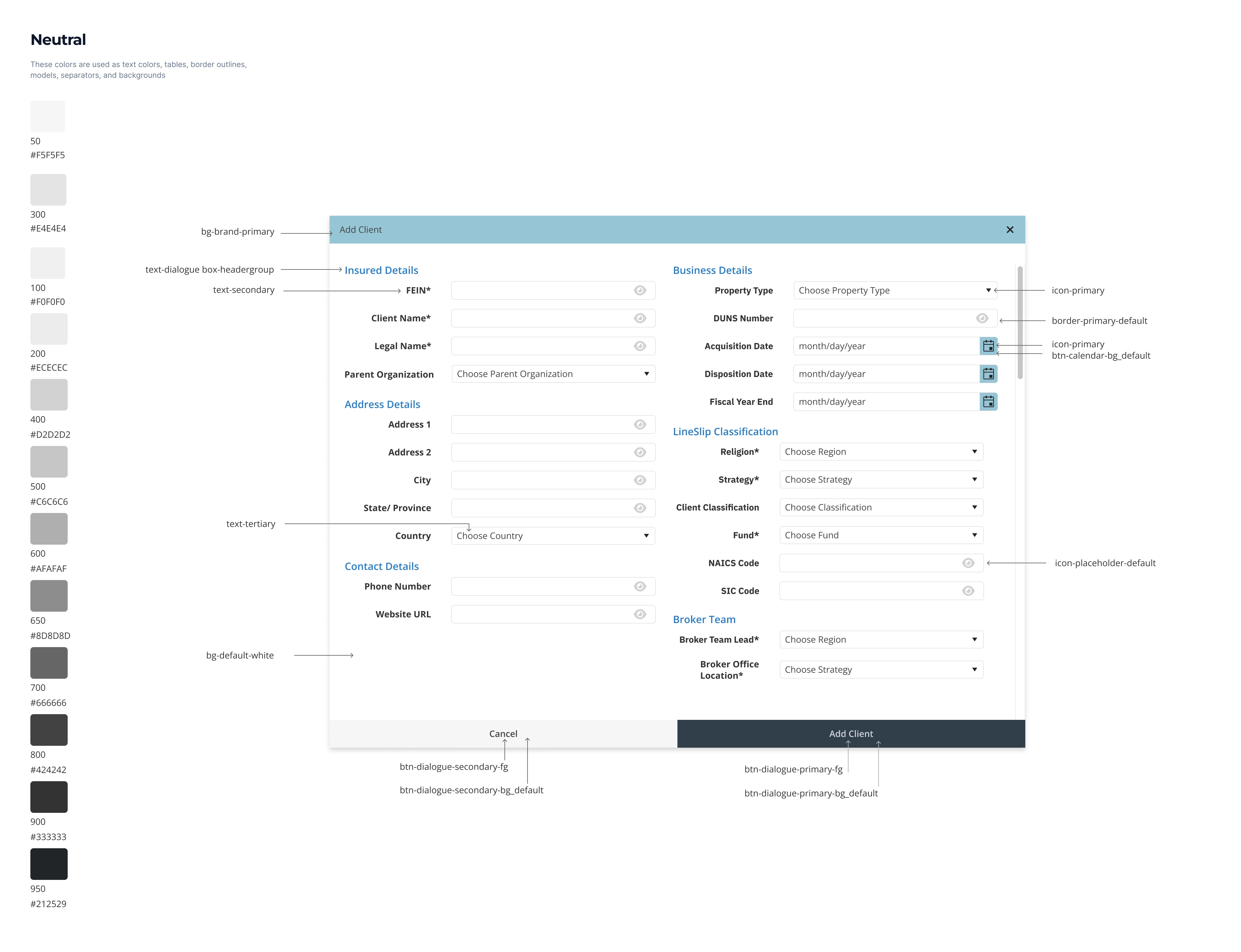
an example of a dialog box component I created

Example

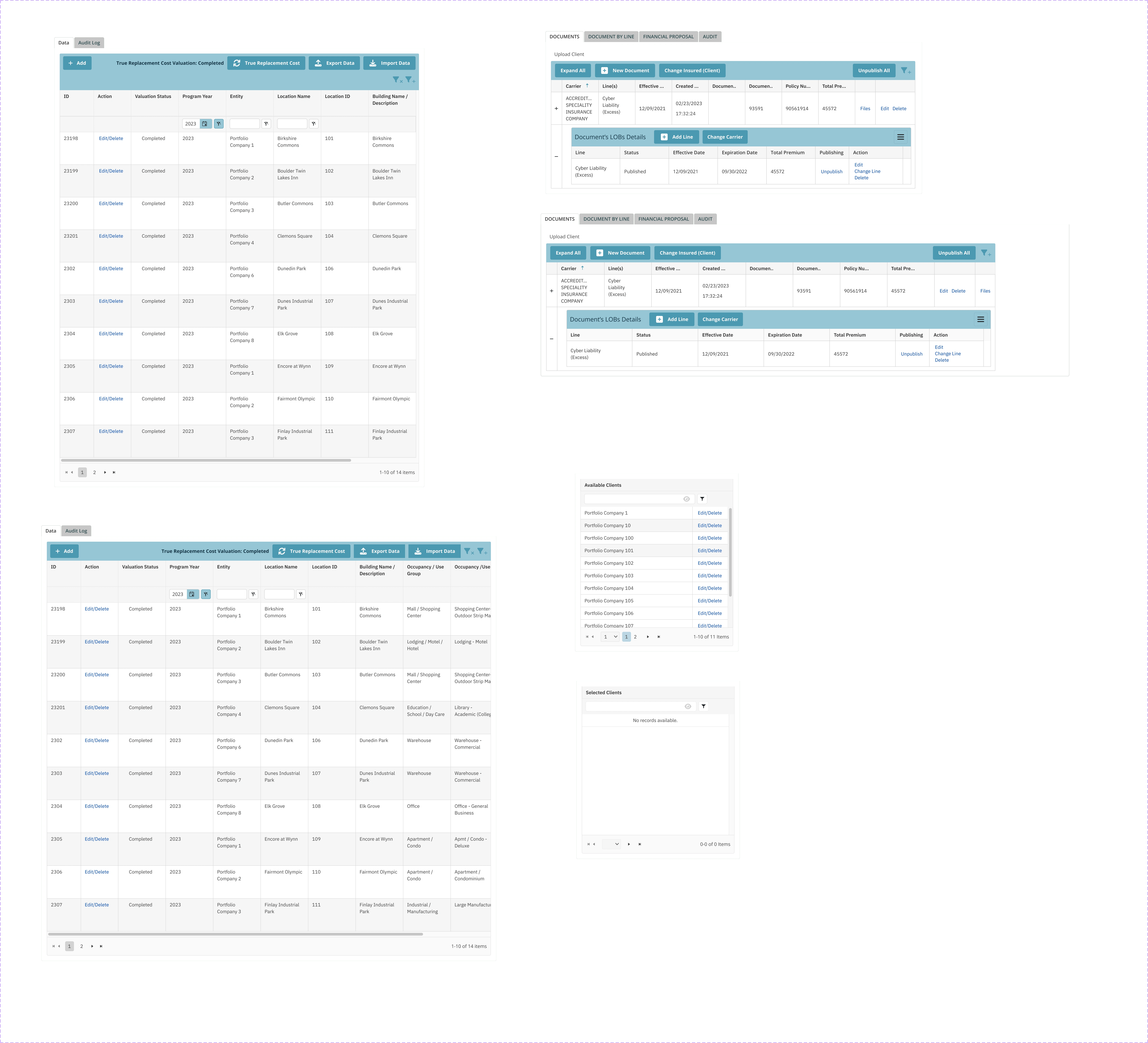
Here is a screenshot showing the application components of Data tables that the client identified as the most used tables for their platform.
For privacy, the names in the tables have been altered for this case study.
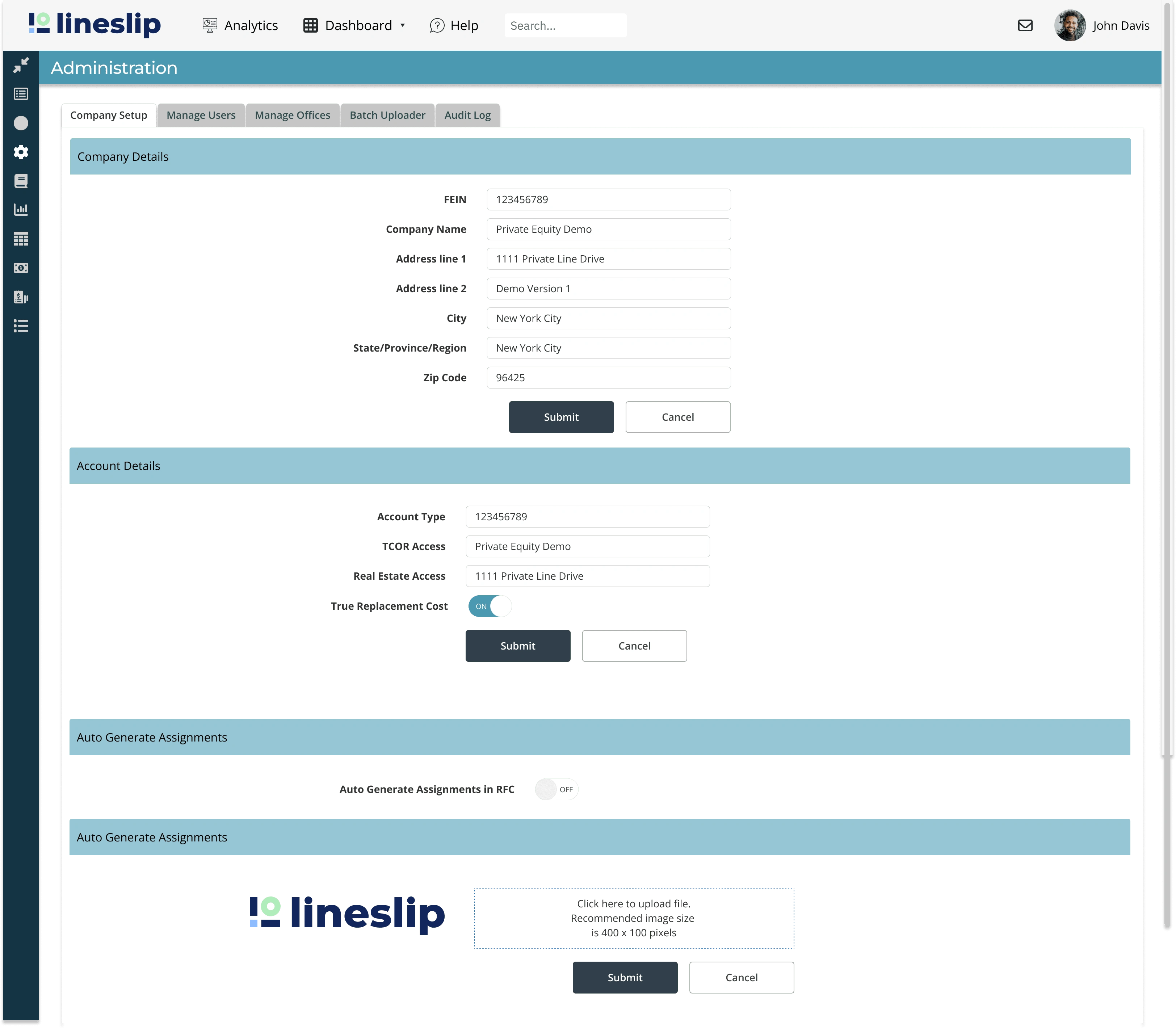

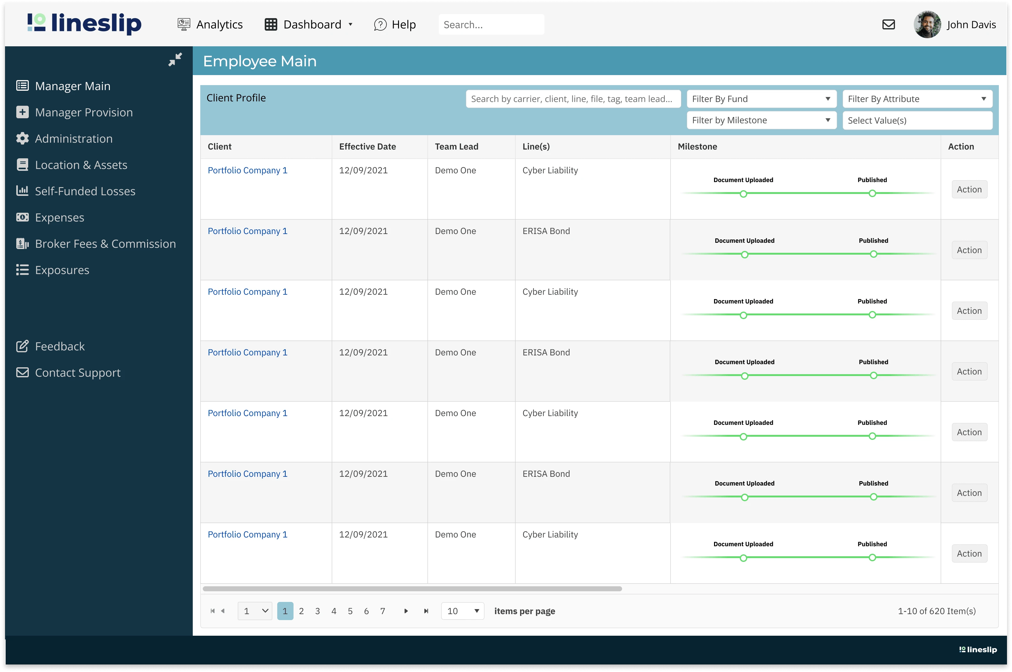
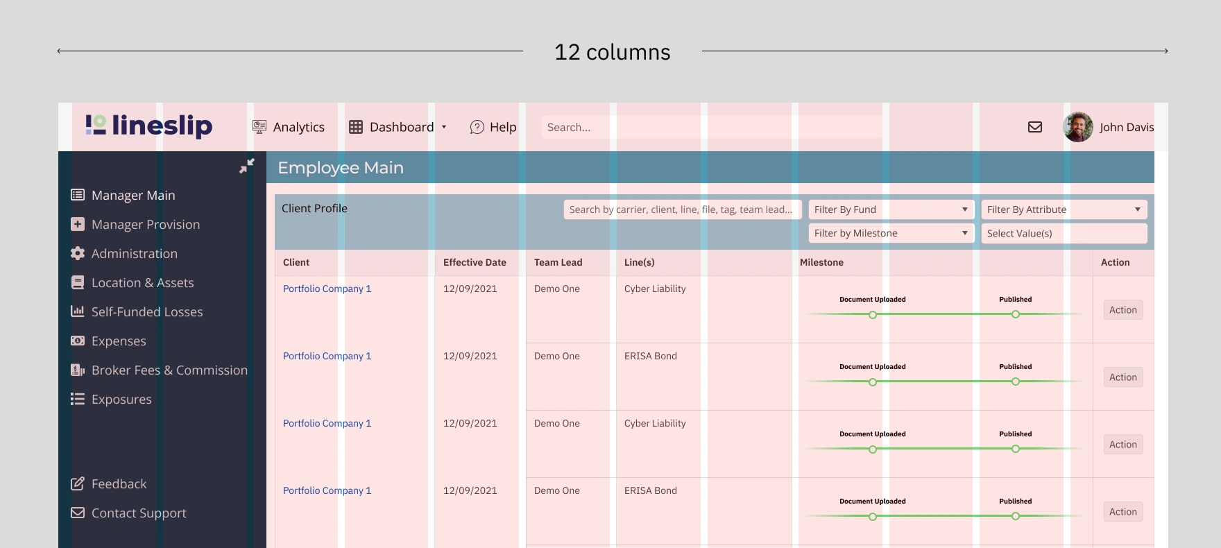
Example- Putting components together to application

Application with Administration View

Application with Client Profile view

Data Visualization

Previous Versions

Current data visualization contains clash of brand colors

Redefining Color Palette

Researching several notable design systems, such as Adobe Spectrum, Goldman Sachs, and Atlassian, I came down to choosing the following 10 data palettes that are visually equidistant and support accessibility.

Examples of Improved Versions of Data Visualization

Reducing cognitive overload of placeholders from 10 to 6.  User can hover in the "Other" category to see a popup of a detailed breakdown of the expenses.
Reducing cognitive overload of placeholders from 10 to 6. User can hover in the "Other" category to see a popup of a detailed breakdown of the expenses.

Learnings and Takeaways

Working on this design system project was a great learning experience for me. It was a big change from my previous projects, which emphasized more on visual design and creativity. This project not only gave me a big boost in working faster and more efficient on Figma but it allowed me to think of make an easy to understand design language that would be communicated effectively amongst stakeholders, developers, and future designers.
Partner With Theresa
View Services

More Projects by Theresa