Boosting donations for non-profit organization
Services Platform
UX/ UI design Responsive Website
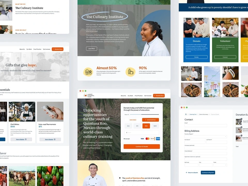
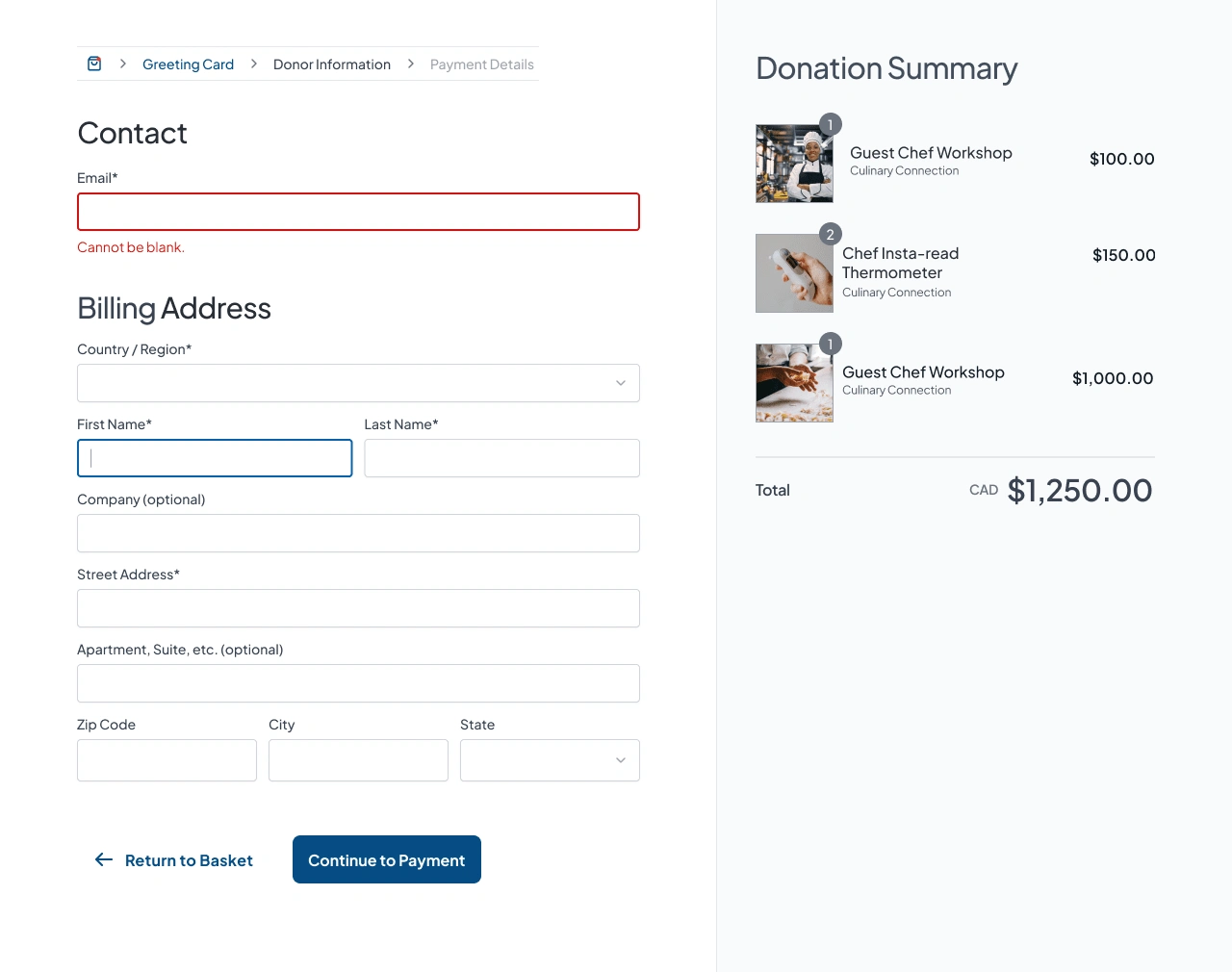
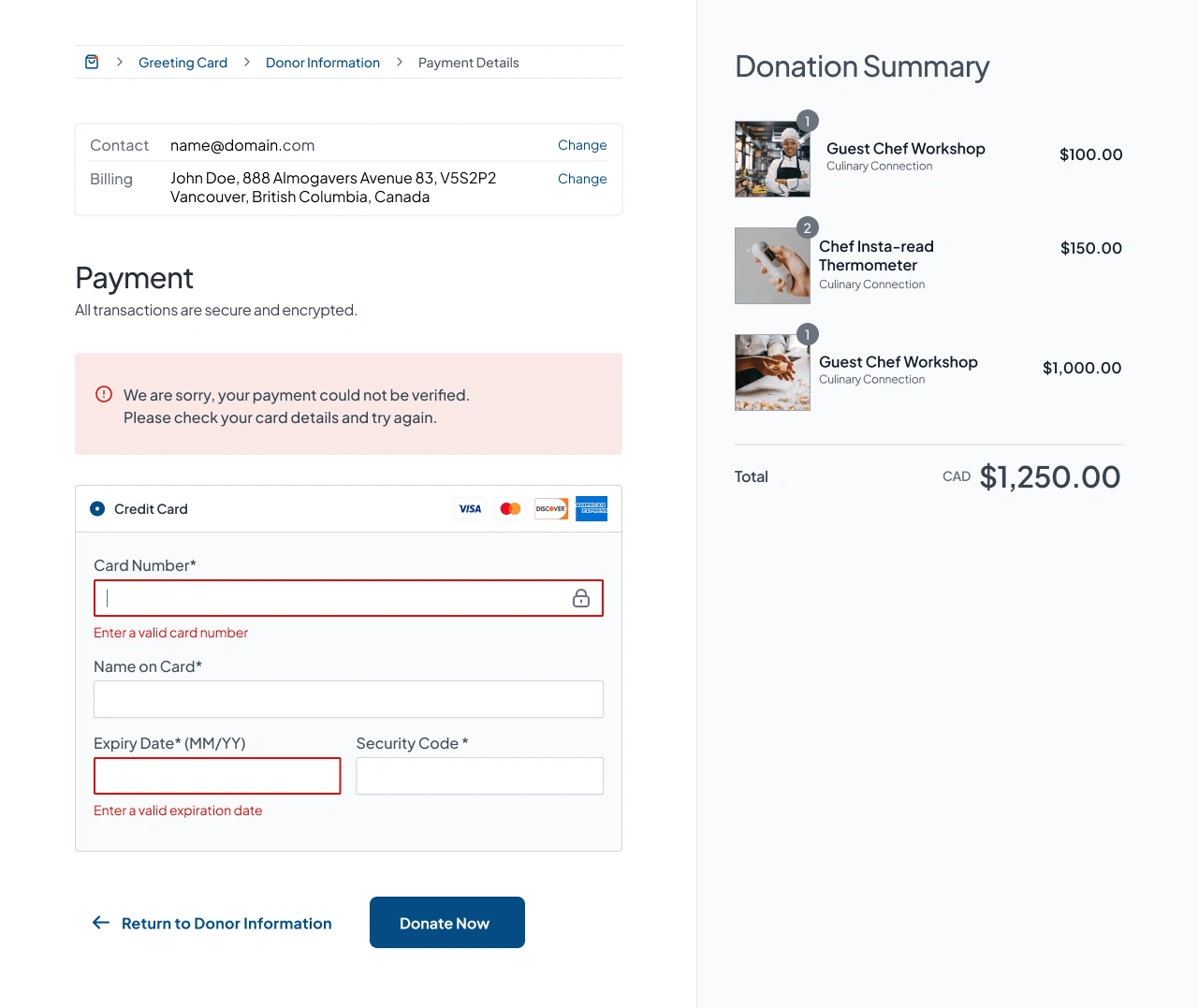
I was the only UX/UI Designer working on this project for a fundraising agency, Give.Agency to redesign a homepage, 4 additional Microsites, and a gifting catalogue (checkout flow) for their client. Hands Offering Hope is a non-profit organization that provides opportunities to youth in Mexico through culinary training.
This project lasted 3 weeks long and I was able to provide a rebranding of the site to give it a more luxury and professional feel than its current one. In addition, I submitted 4 Microsite variations for the client in which they can use to attract more donors and increase their donations as well as an improved UX flow and more visually appealing gifting checkout screens.
Brainstorming and Redefining Brand
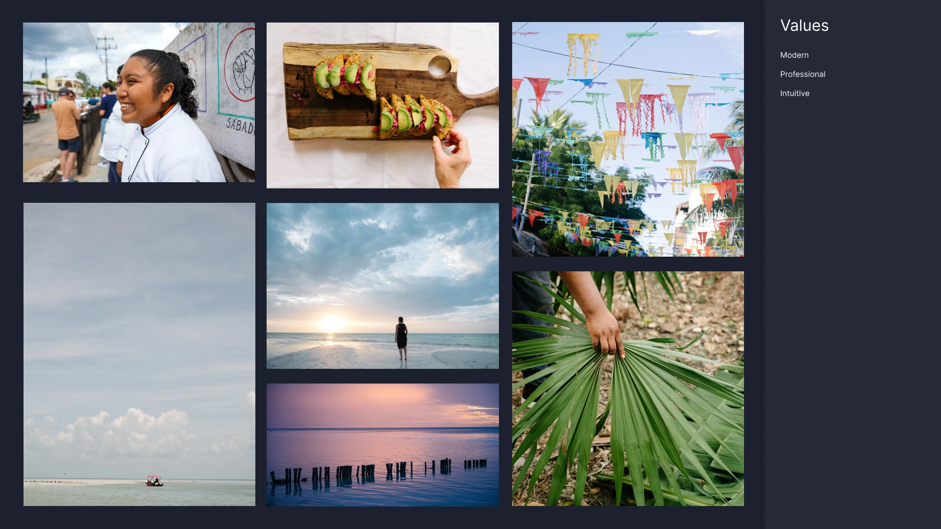
Photos used were high quality, edited in Photoshop and Lightroom to fit the branding of luxury and professional. Photos taken to fit the values that I identified for the client and charity.
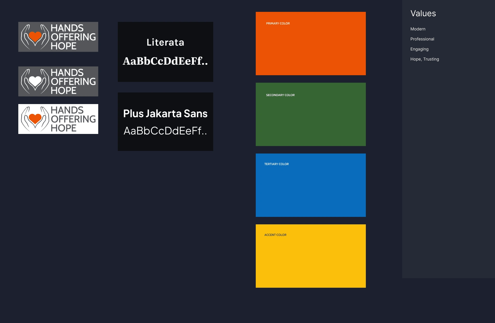
Typography changed to Literata and Plus Jakarta Sans to improve in the visual brand and make the website more luxury and professional approach. Existing colours: Red, blue, green, and yellow were kept in the redesign.
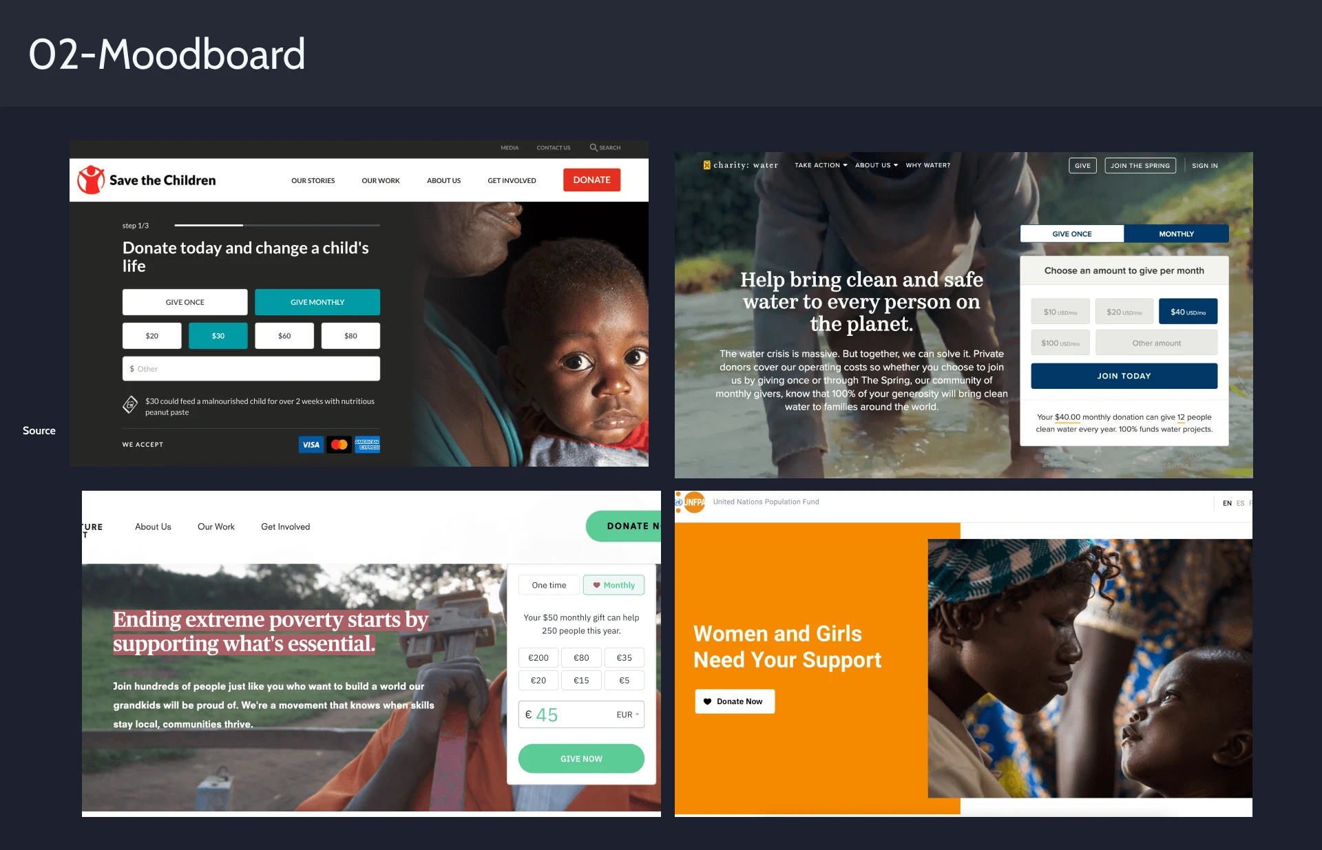
Inspirations taken from other well known charity websites
Homepage Redesign
The homepage took refining to get exactly right. I chose to stayed true to primary brand, red, which is also used in the company's logo. Rather than using this primary color excessively, I limited the color to only be used for the donation button instead. Dark blue was used as CTA buttons.

Microsite Designs...


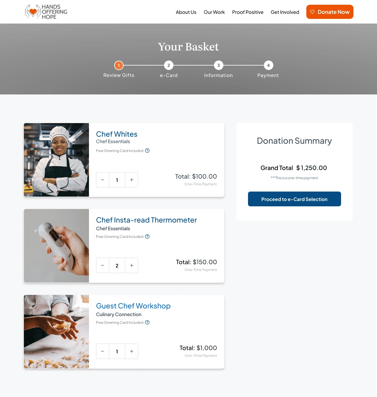
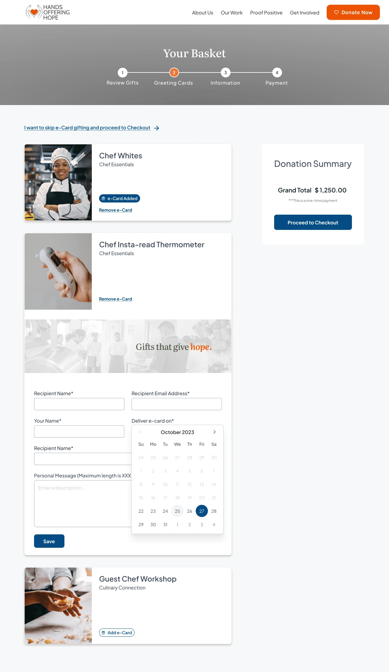
Like this project
Posted Dec 27, 2023
Homepage Redesign to boost donations as well as Microsites and a charity gifting e-catalogue
Likes
0
Views
4


