Redesigning a Forex Academy Website to Improve Performance.

Queennette Onyekachi


Website Transformation: Redesigning The Forexlyfe Website to Improve Performance.
Role: UI/UX Designer and Framer Developer
Timeline: 1 Month
Services: No-code Development & Website Design.
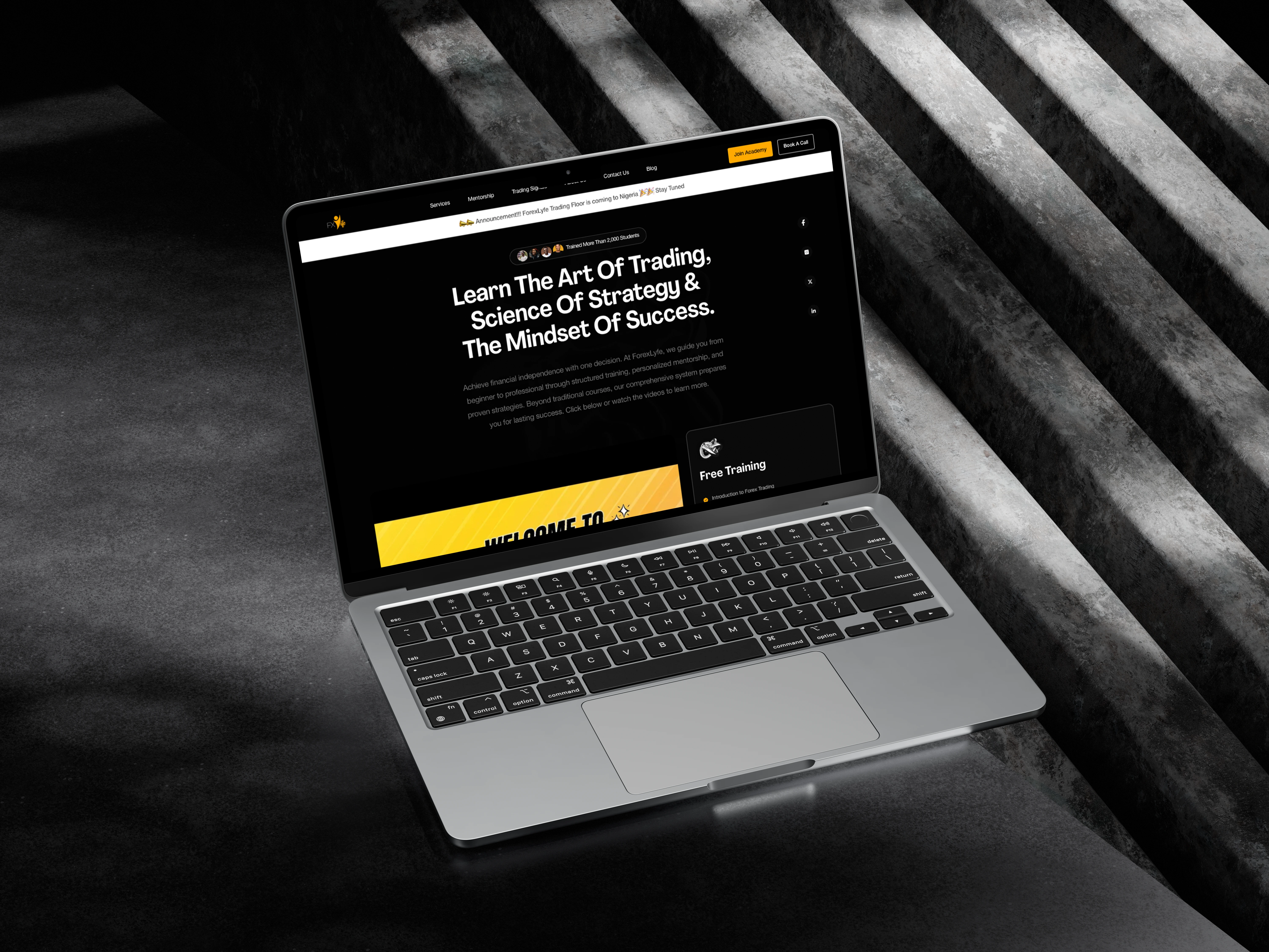
Live link: https://forexlyfe.com/
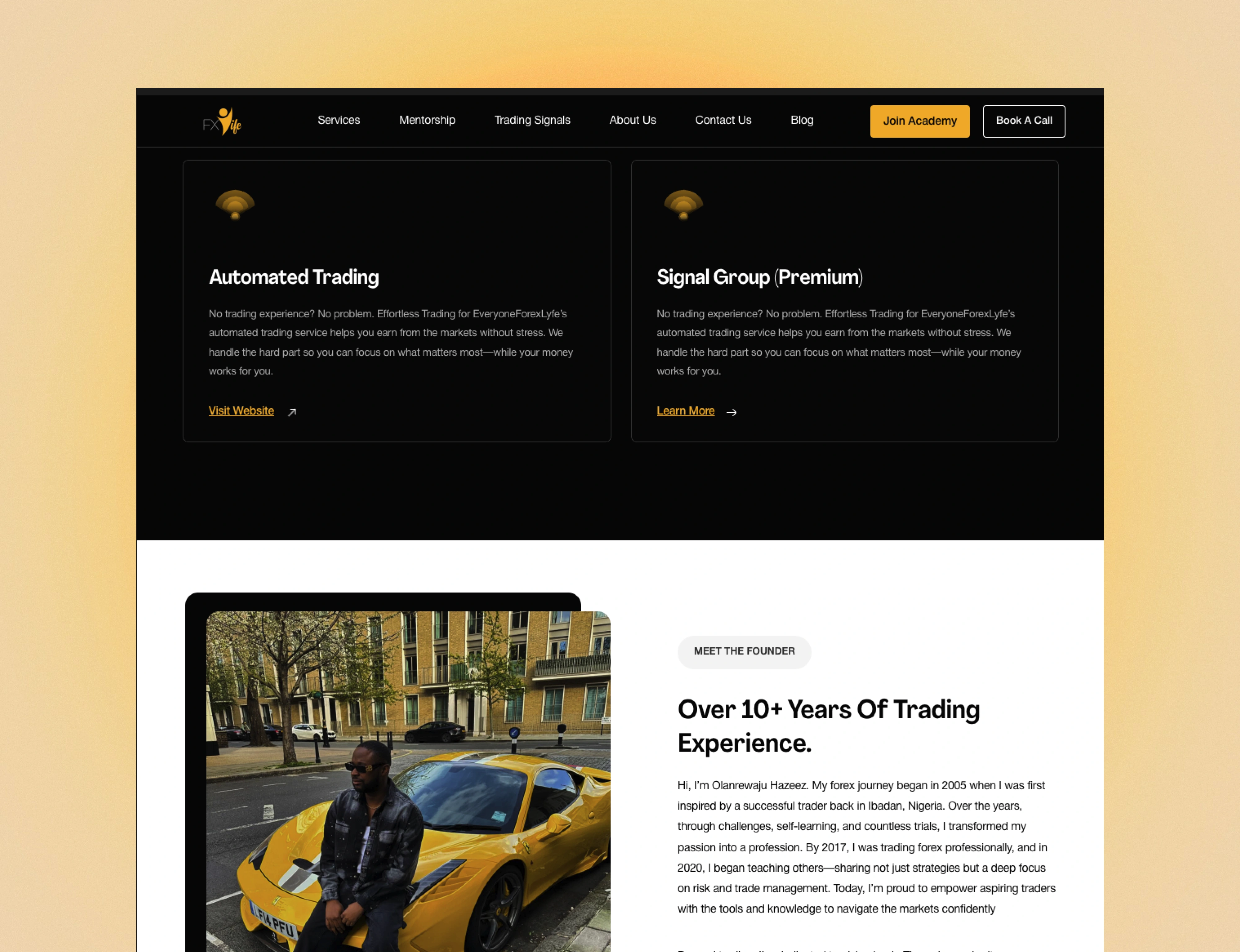
Project Overview
Forexlyfe is a forex trading company that provides forex education and other services. Through our research, we discovered several issues with their website:
It lacked key information to help students sign up easily,
had an outdated design, and included services that Forexlyfe didn’t actually offer.
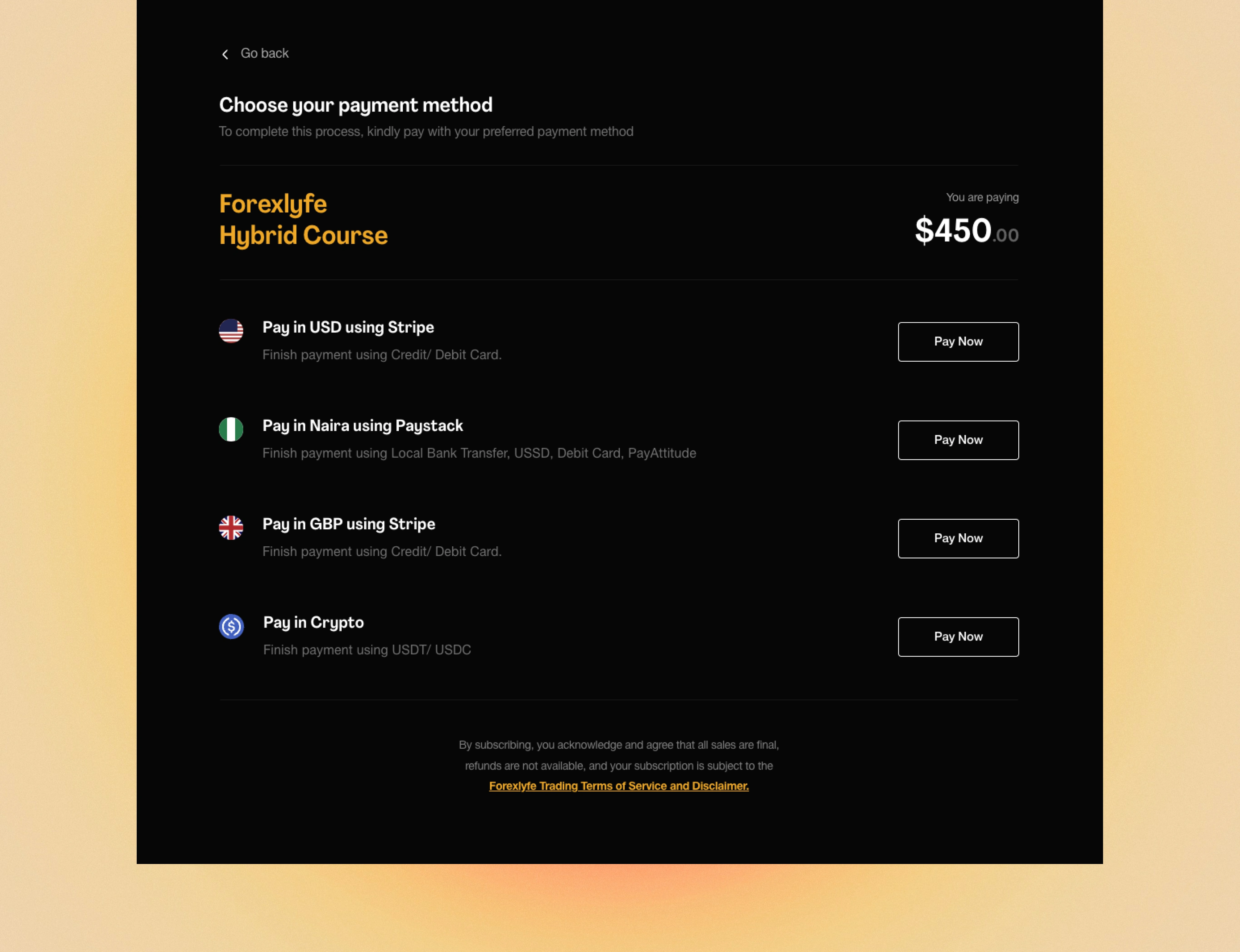
Navigation was also unclear, making it hard for users to find the services they needed. In some cases, students even paid for the wrong service instead of the education subscription.
These challenges made it difficult for users to have a smooth experience, so we set out to fix them.
Project Goals
With the problems we had identified, the goals was to:
Ensure students and clients can quickly find the information they need to sign up without confusion.
Refresh the design to look more professional, engaging, and up to date.
Remove any services that Forexlyfe doesn’t offer to avoid confusion.
Organize the website so users can easily find the services they want.
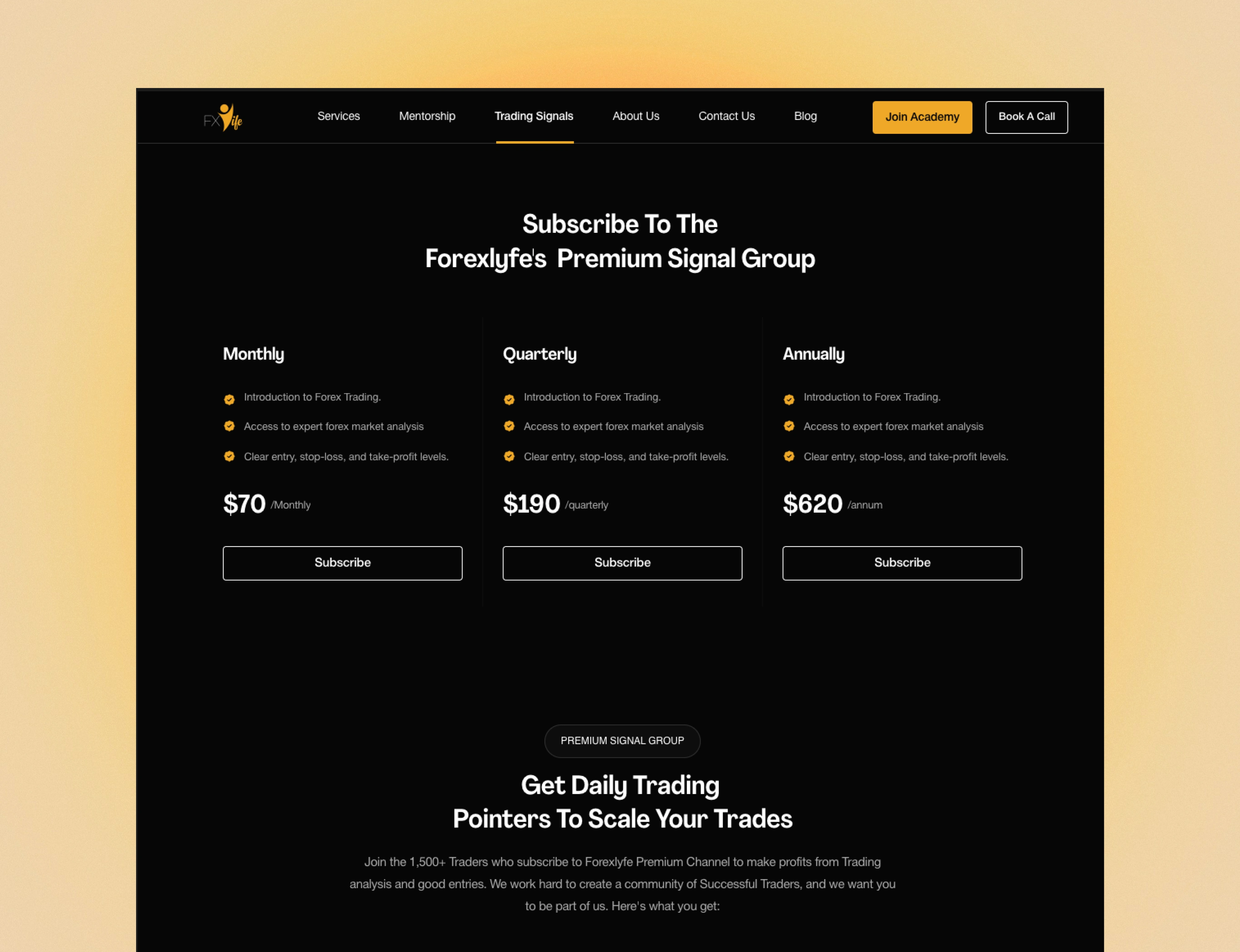
Clearly separate different services to ensure students pay for the right one.

Approach & Process
I worked closely with the client through calls to understand his vision and concerns. After reviewing the website content, I collaborated with a copywriter to refine it, keeping only what added value. Next, I created a mood board with inspiration from similar brands and competitors. I first shared a wireframe to outline the layout, and once we agreed on the direction, I designed the pages with colors in Figma.
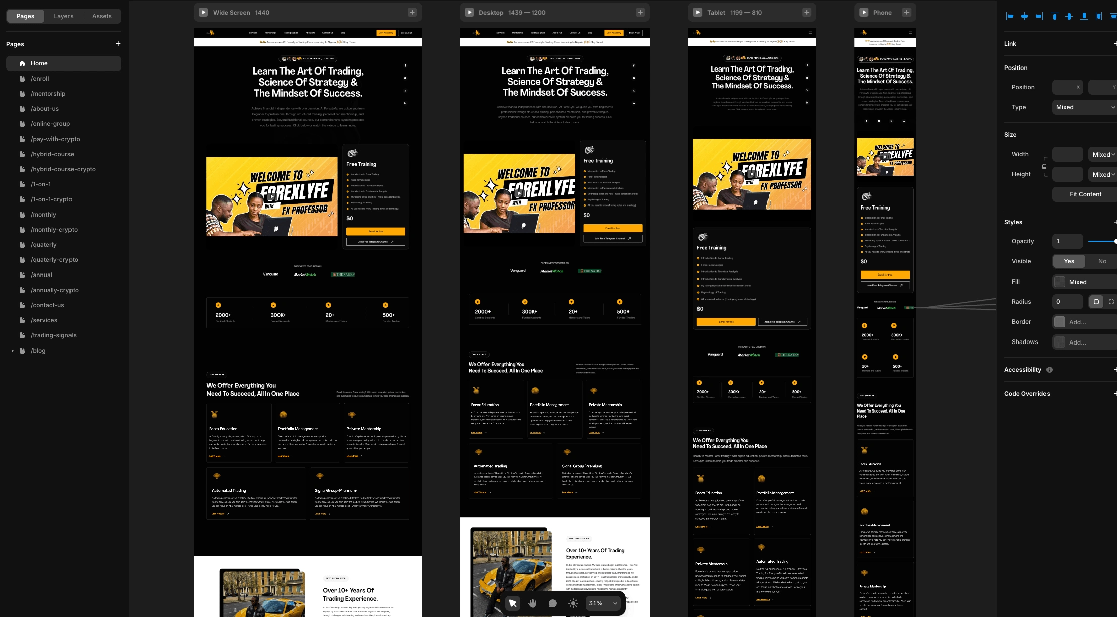
Design to Development Figma
With clear goals and a vision in place, I started designing the website in Figma. The client wanted to keep the dark theme from the previous version but was open to exploring a light theme later versions. So, I focused on a dark theme while ensuring smooth navigation, clear CTAs, and a layout that helped visitors make quick, informed decisions.
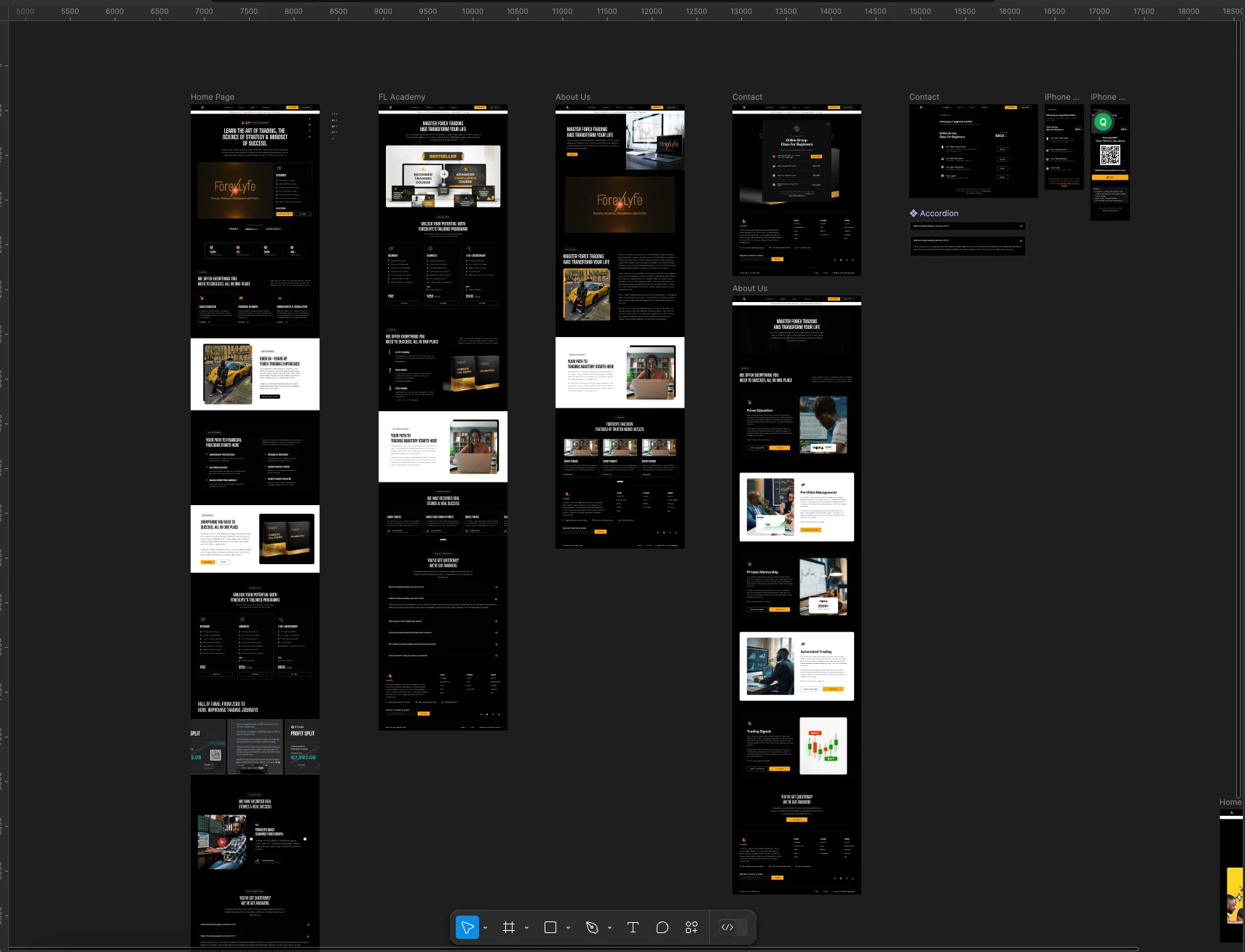
The last step was turning the design into a real, working website. I used Framer to build flexible layouts and a CMS so the ForexLyfe team could update content anytime. I focused on the little things—smooth transitions, subtle button effects, and fast loading speeds—to make sure the site felt simple, reliable, and easy to use, motivating users to carry out their desired actions.
Outcome & Feedback
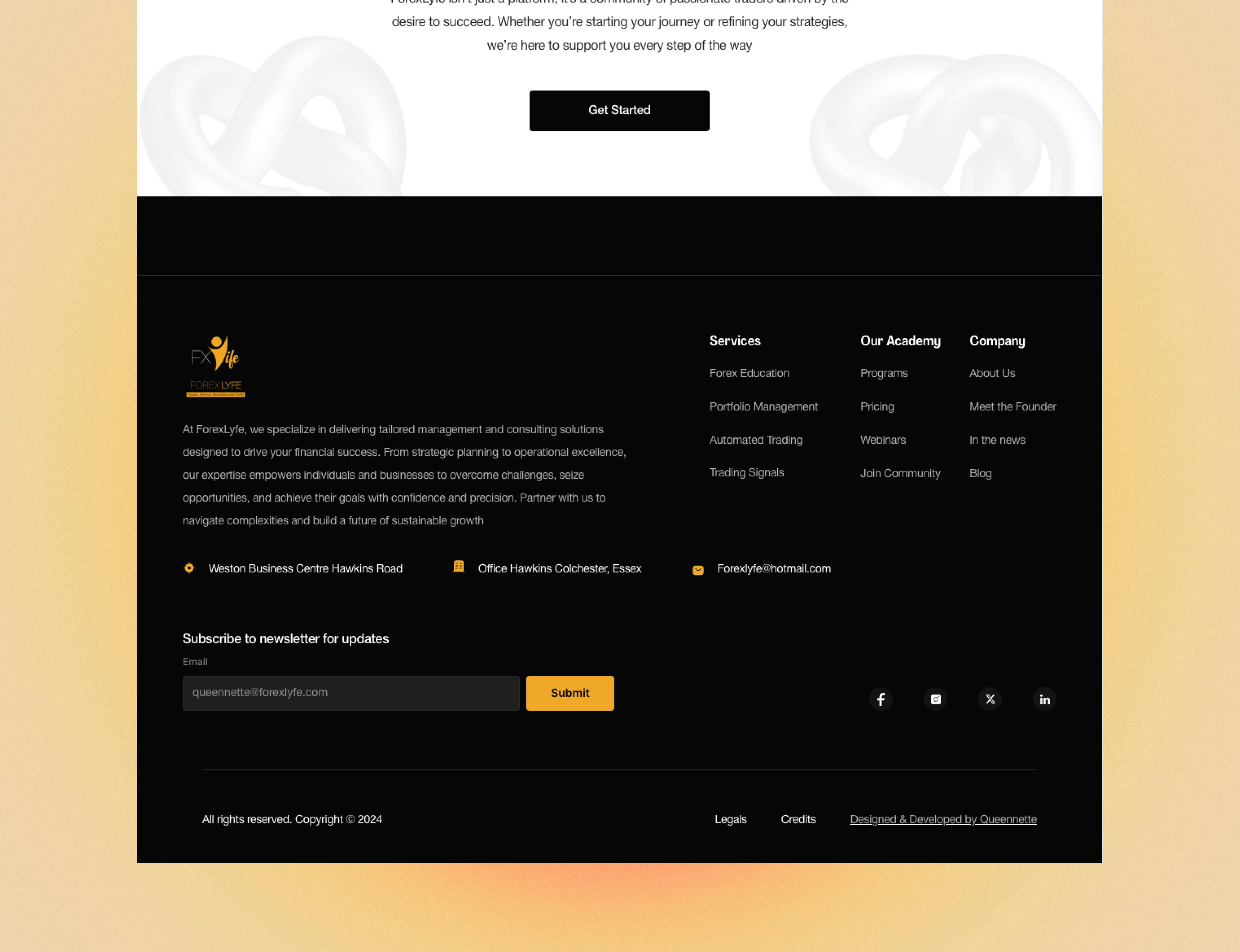
The ForexLyfe website is now live, offering a strong and simple online presence. It highlights their services, shares client testimonials, answers common questions, and makes contact easy.
So far, the team has received great feedback on its ease of use, smooth signup, and hassle-free payment. Users have praised the clean design, intuitive navigation, and how quickly they can find the information they need. Many have also noted that the seamless experience makes them feel more confident in the brand.

Like this project
Posted Mar 6, 2025
Redesigned and launched a clean, user-friendly website for ForexLyfe, giving them a strong online presence.
Likes
0
Views
0
Timeline
Dec 23, 2024 - Jan 25, 2025