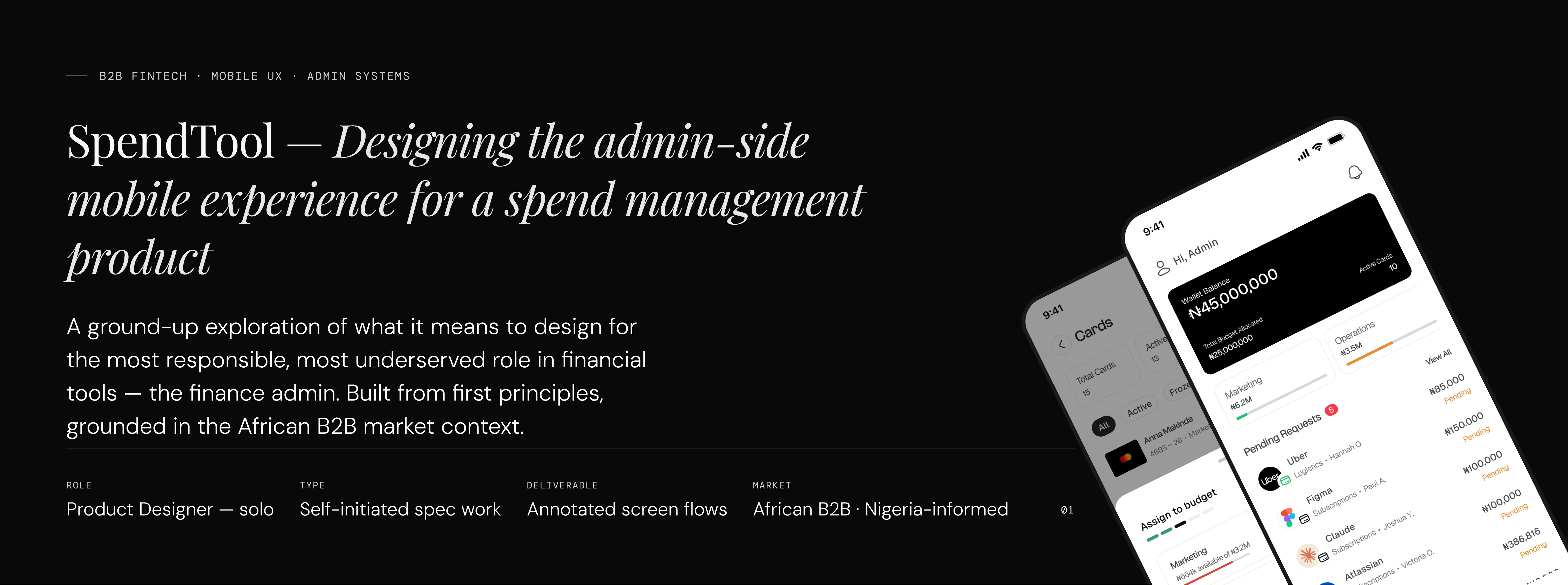
SpendTool: Designing a Mobile-First Spend Management Experience
Ashiat Abdulkadir
Context Space
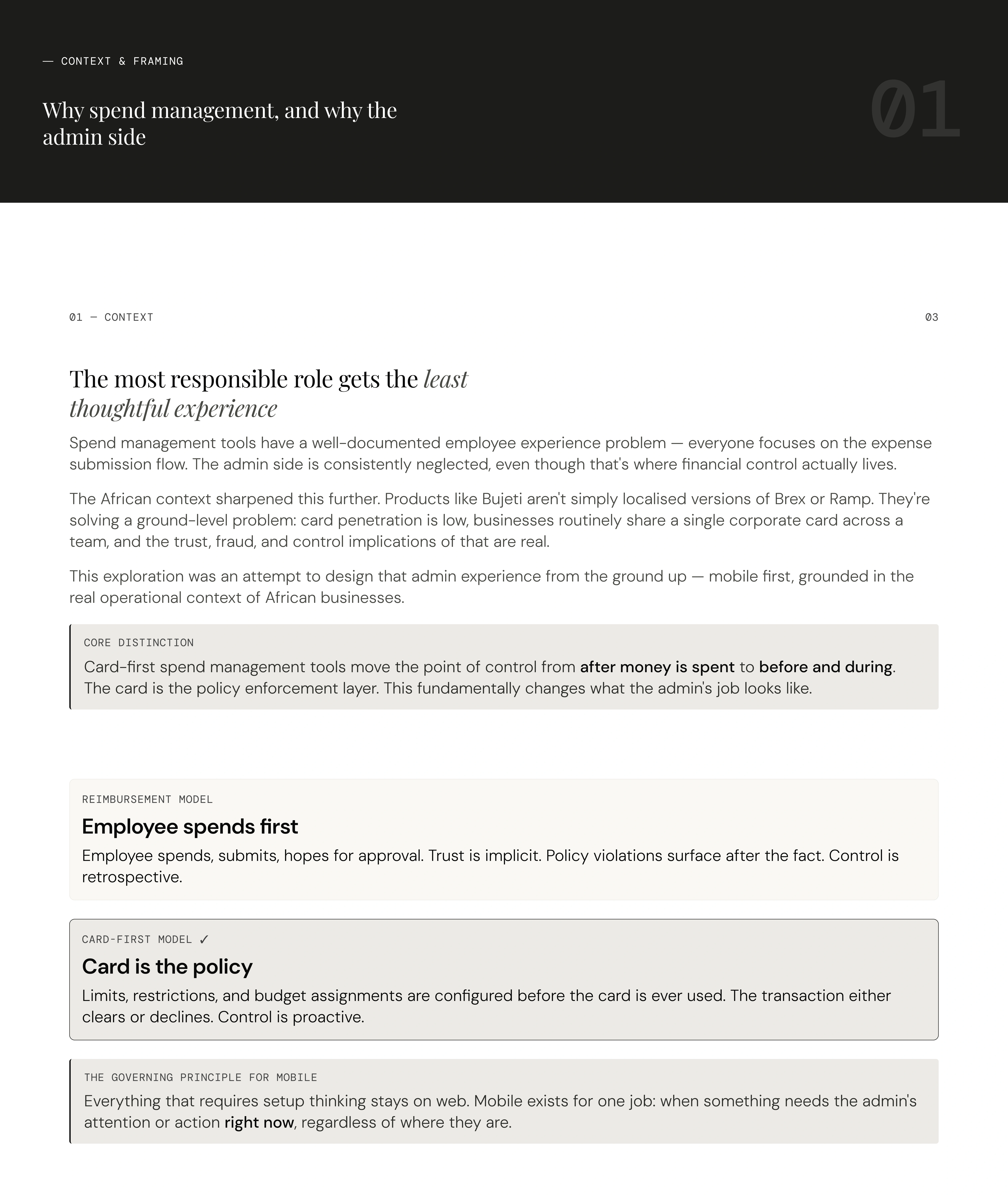
Spend management is one of those product categories that looks simple on the surface — track expenses, reimburse employees, keep receipts, until you actually sit with how money moves inside a business. Then it becomes clear that the interesting design problem isn't the expense form. It's the infrastructure of control that sits behind it.
One pattern I kept noticing is that: the people who control the money inside businesses are consistently underserved by the products built for them. There's a lot of surface area given to employees submitting expenses. Not enough to the finance admin trying to manage, control, and audit company spend in real time.
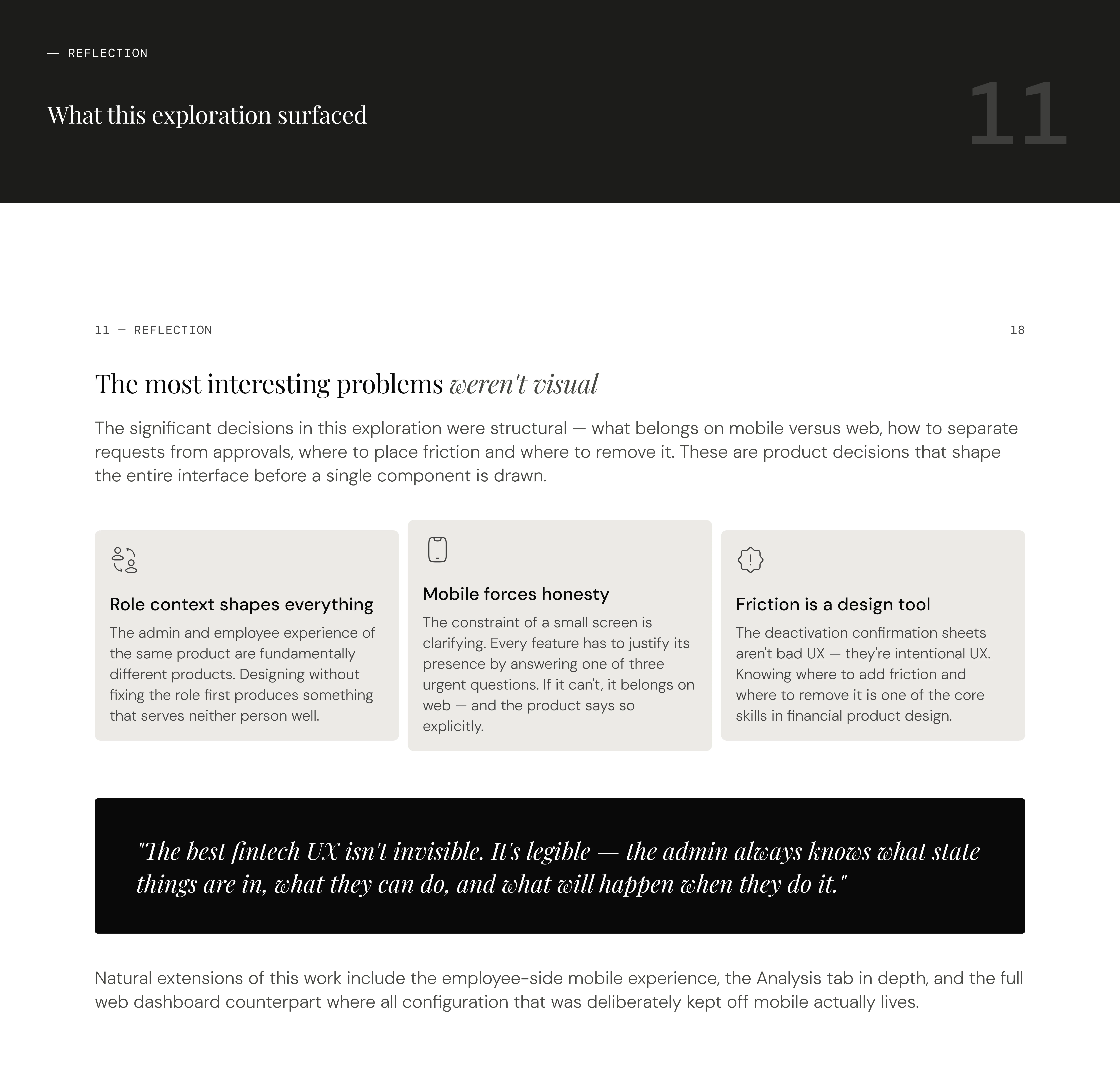
This exploration was a way to pressure-test my own understanding of the problem space — to move from knowing the domain to making real design decisions inside it.
"The goal wasn't to redesign an existing product. It was to understand a category deeply enough to make principled decisions from scratch."
Context and Framing
The choices that shaped the product
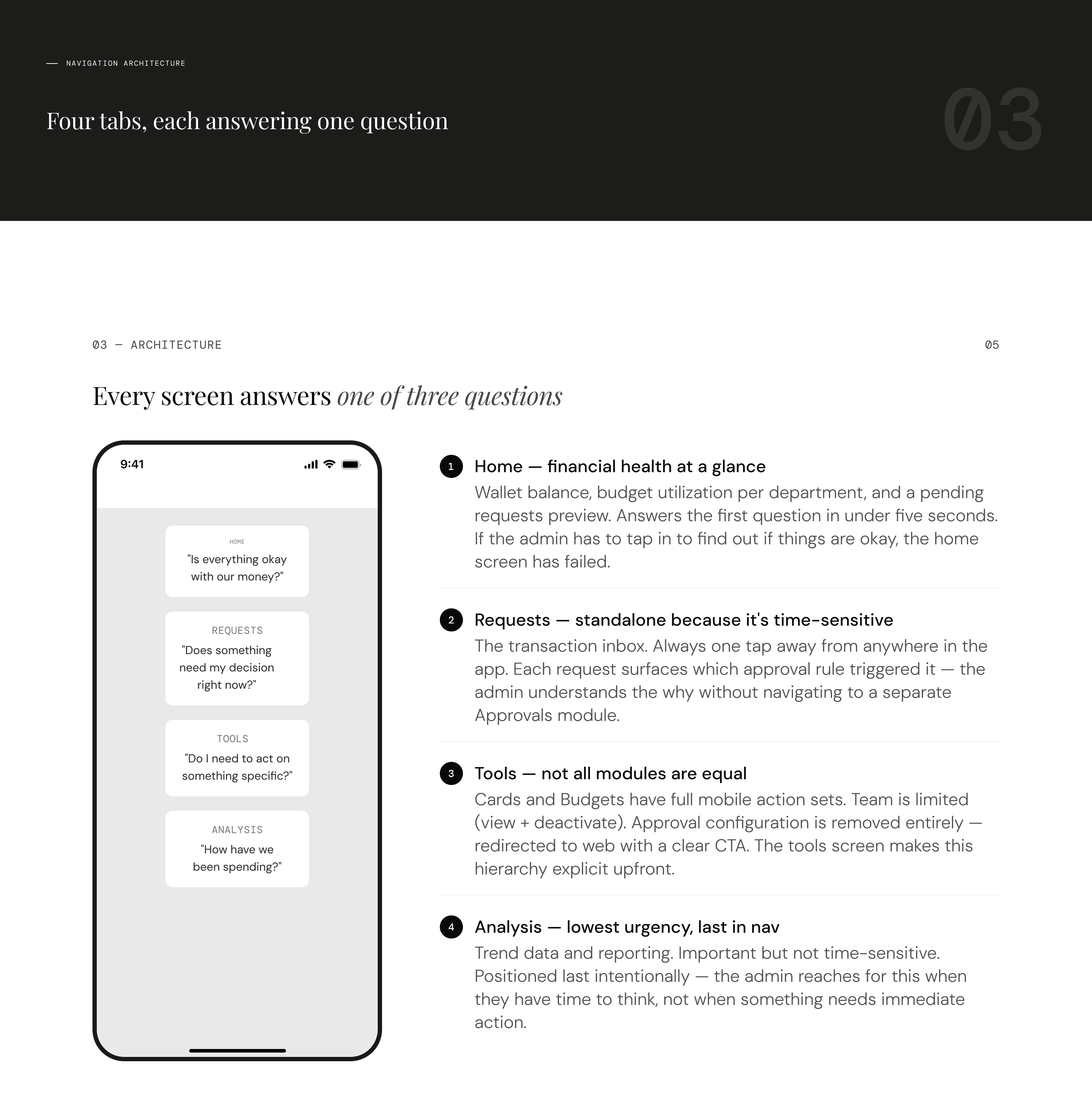
Decision 1 — What does mobile admin actually need?
The first question wasn't visual — it was structural. What does an admin genuinely need to do from their phone? The answer I kept returning to was: action, not configuration.
Everything that requires setup thinking — creating budgets, configuring approval flows, defining policy rules — stays on web. You need time and focus for that. Mobile exists for when something needs attention right now: a pending approval, a suspicious transaction, a card that needs freezing immediately. The MVP for admin mobile comes down to three capabilities.
Approval queue
The highest-value mobile use case. A pending request holds up an employee or a vendor. The admin needs to see context and act in one tap.
Spend overview
Wallet balance, budget utilization at a glance, recent transactions. Read-only is fine. The admin stays informed, not configuration-mode.
Card controls
Freeze or unfreeze a card instantly. A lost card or suspicious transaction is time-sensitive regardless of where the admin is.
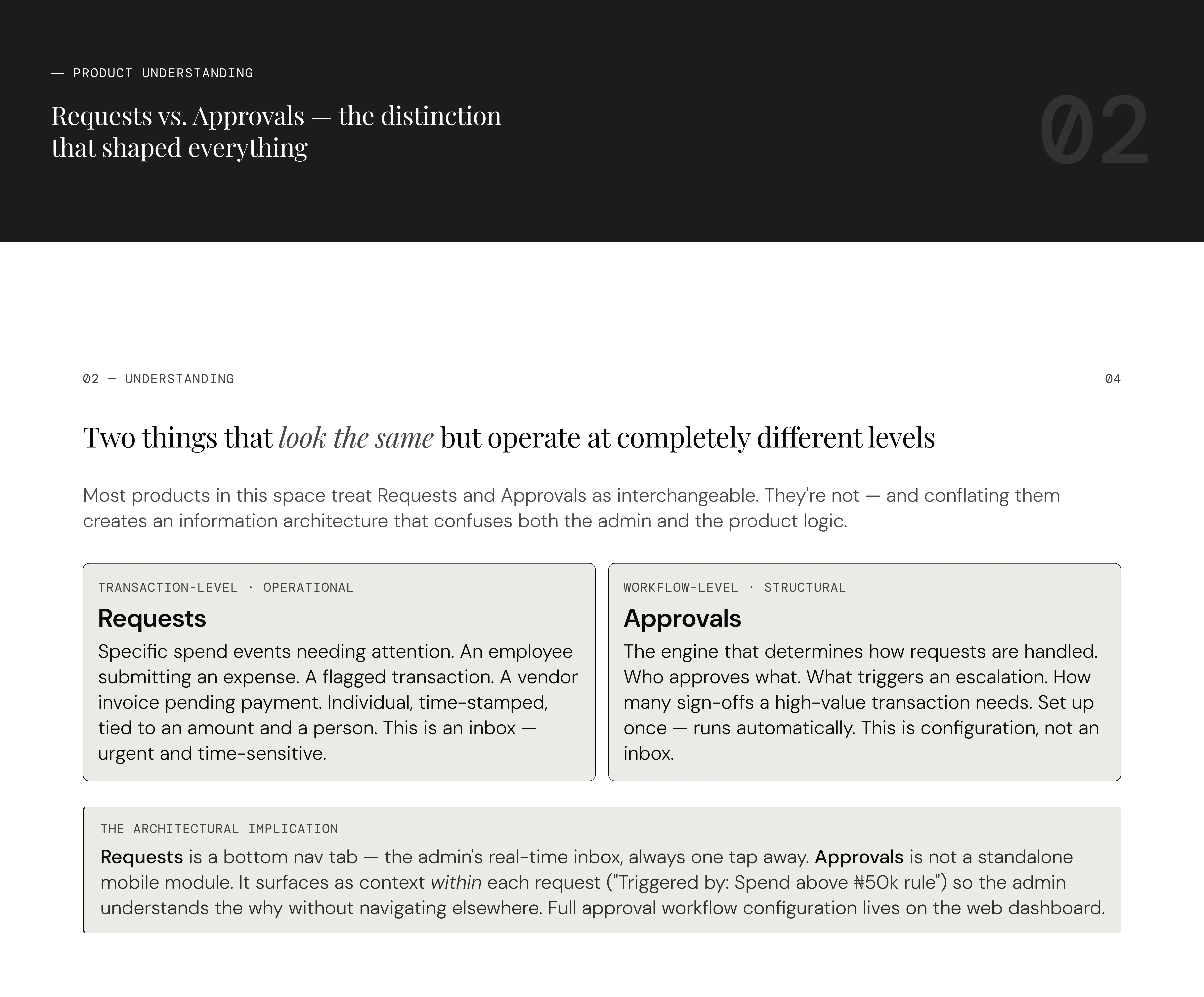
Product Understanding
Navigation Structure
Home screen framing
The home screen went through a meaningful revision. An early draft surfaced individual employee cards in a carousel as the hero element — a natural instinct, since cards are central to the product. But that's an employee mental model, not an admin's.
An admin opening the app first asks: how much money do we have, and is it under control? Not: which specific card does Anna have? That answer belongs inside the Cards module.
The final home screen leads with the wallet balance, then budget utilization tiles color-coded by health (red for near limit, amber for mid-range, green for healthy), then a pending requests preview with a count. The card carousel moved out entirely.
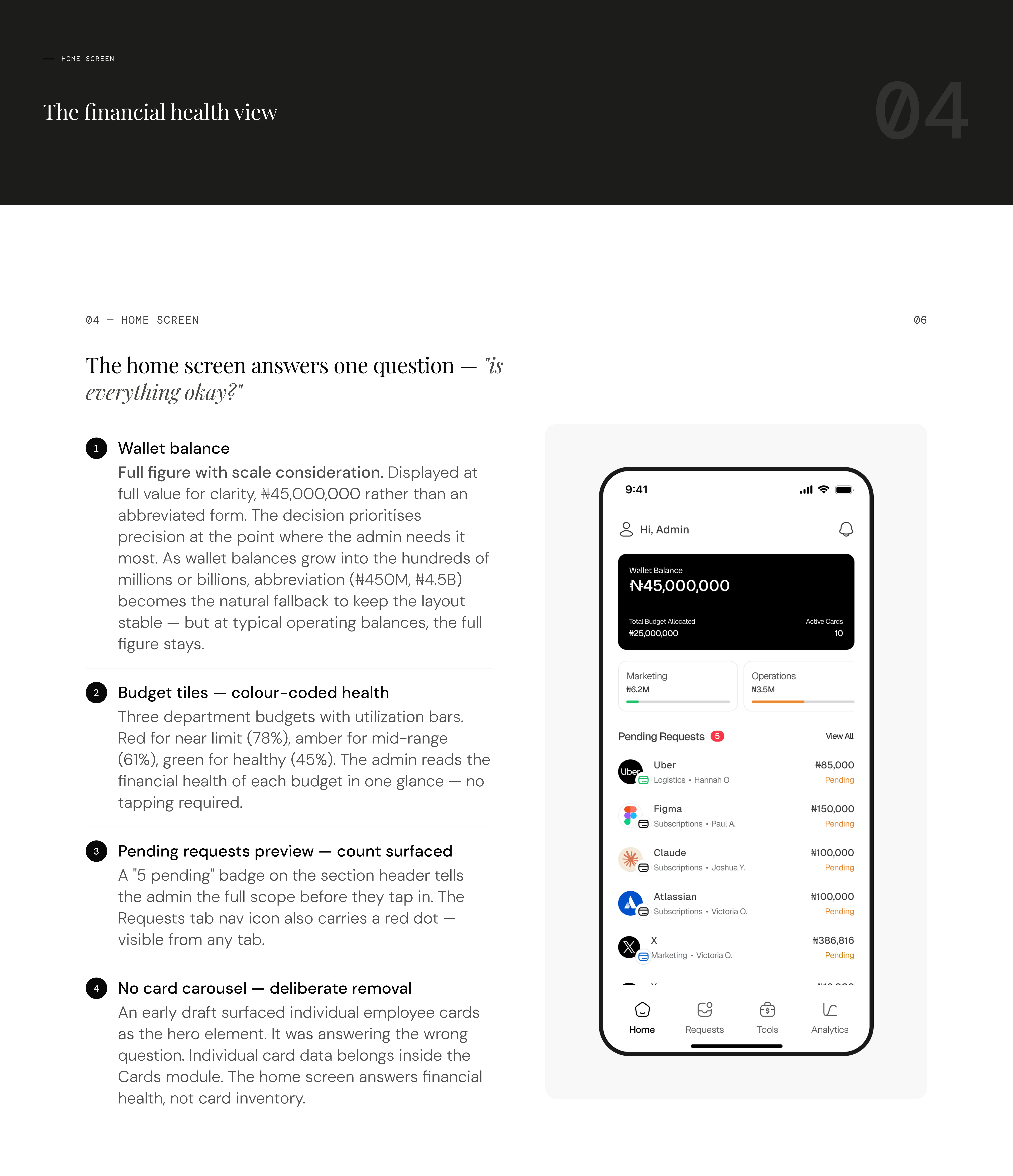
Home Screen
Requests — "Does something need my decision right now?
Requests

Mobile Access
The issue card flow
Issuing a card is not a simple action. In a single flow, the admin simultaneously creates the card, assigns it to a person, links it to a budget, sets its limits, and applies any restrictions. That's five layers of configuration happening at once.
The decision was to surface this as a stepped bottom sheet — not a single long form, not a new screen. Each step addresses one decision: who, what type, which budget, what limits, review.
Issue Card Flow
Freeze vs. Deactivate
Both actions appear on the card detail screen, but they carry fundamentally different weights. Freeze is reversible and time-sensitive, a card stops working instantly but can be turned on again. Deactivate is permanent. The design needed to make that distinction viscerally clear without burying either action.
Deactivate doesn't execute on first tap. It triggers a confirmation bottom sheet that spells out exactly what will happen, names the card and the cardholder explicitly, and flags any unsettled transactions before the admin can confirm. The confirm button label is "Yes, deactivate card" — not "Confirm" or "OK." The friction is intentional. An admin should never accidentally deactivate a card.
Card Details - States
Budget top-up — the wallet is the ceiling
When an admin tops up a budget, the money comes from the main wallet balance. The wallet is the total pool of company funds — budgets are just named envelopes carved out of it. There's no fixed budget cap; the only ceiling is the wallet itself. If the wallet is empty, the top-up input is replaced with a "Top up wallet" prompt rather than letting the admin enter an amount they can't fulfil.
The top-up sheet shows wallet available and current budget balance side by side before the admin enters anything. Quick amount chips (+₦500k, +₦1M, +₦2M, +₦5M) cover common top-up values. A live preview row shows what the new balance will be before confirming, no mental arithmetic.
Budgets
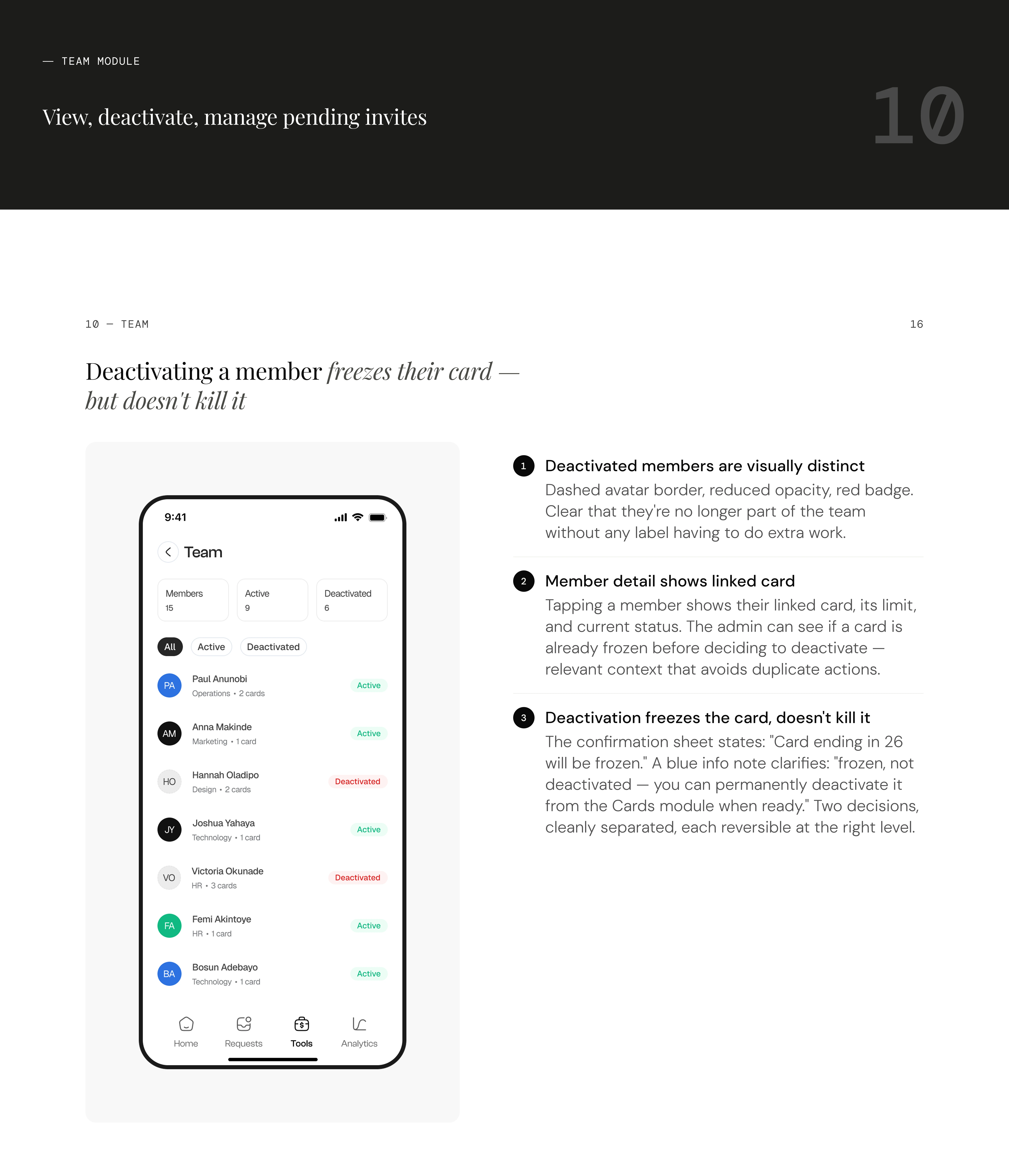
Member deactivation — freeze first, deactivate later
When a team member is deactivated, their card freezes automatically. But the card is not deactivated — it's frozen. That distinction matters: the admin may want to review the card's transaction history, check for unsettled items, or confirm there's nothing outstanding before permanently killing it. The deactivation confirmation sheet makes this explicit: "Card ending in 26 will be frozen. You can permanently deactivate it from the Cards module when ready." Two decisions, cleanly separated.
Teams
Insights
Like this project
Posted May 7, 2026
Mobile Spend Management for Finance Admins: A mobile-first admin experience covering cards, budgets, approvals, and team management for African B2B businesses
Likes
1
Views
5
Timeline
Apr 6, 2026 - May 7, 2026