Skin Secrets I Skin Care Brand I Logo & Brand Identity

Snehil


Skin Secrets
Logo & Brand Identity Design
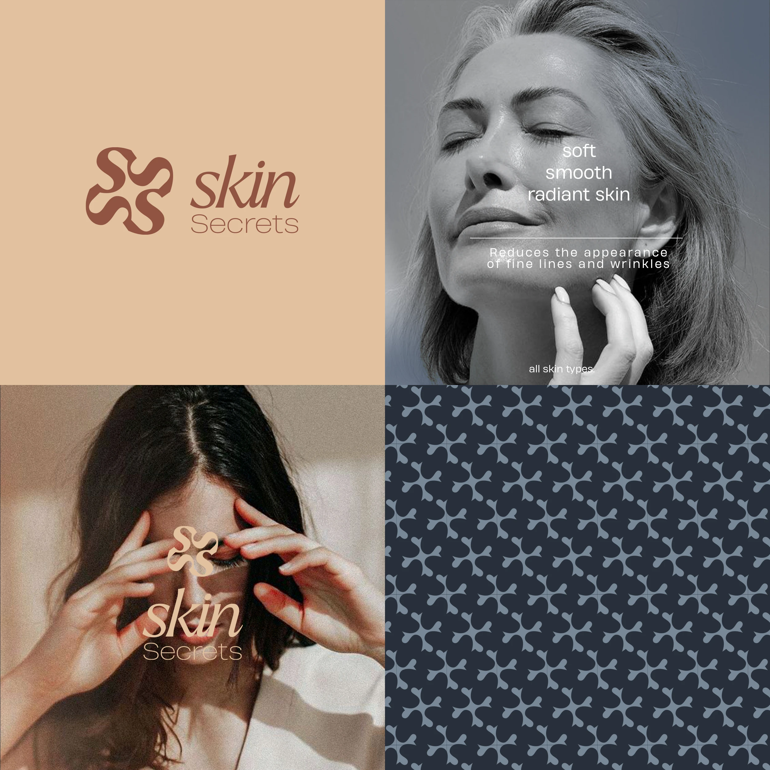
By balancing soft, human skin tones with a deep midnight blue, the visual system creates an environment of quiet confidence. This intentional contrast builds a premium, trustworthy space where a demographic that often feels overlooked by mainstream media instantly feels centered, valued, and safe.
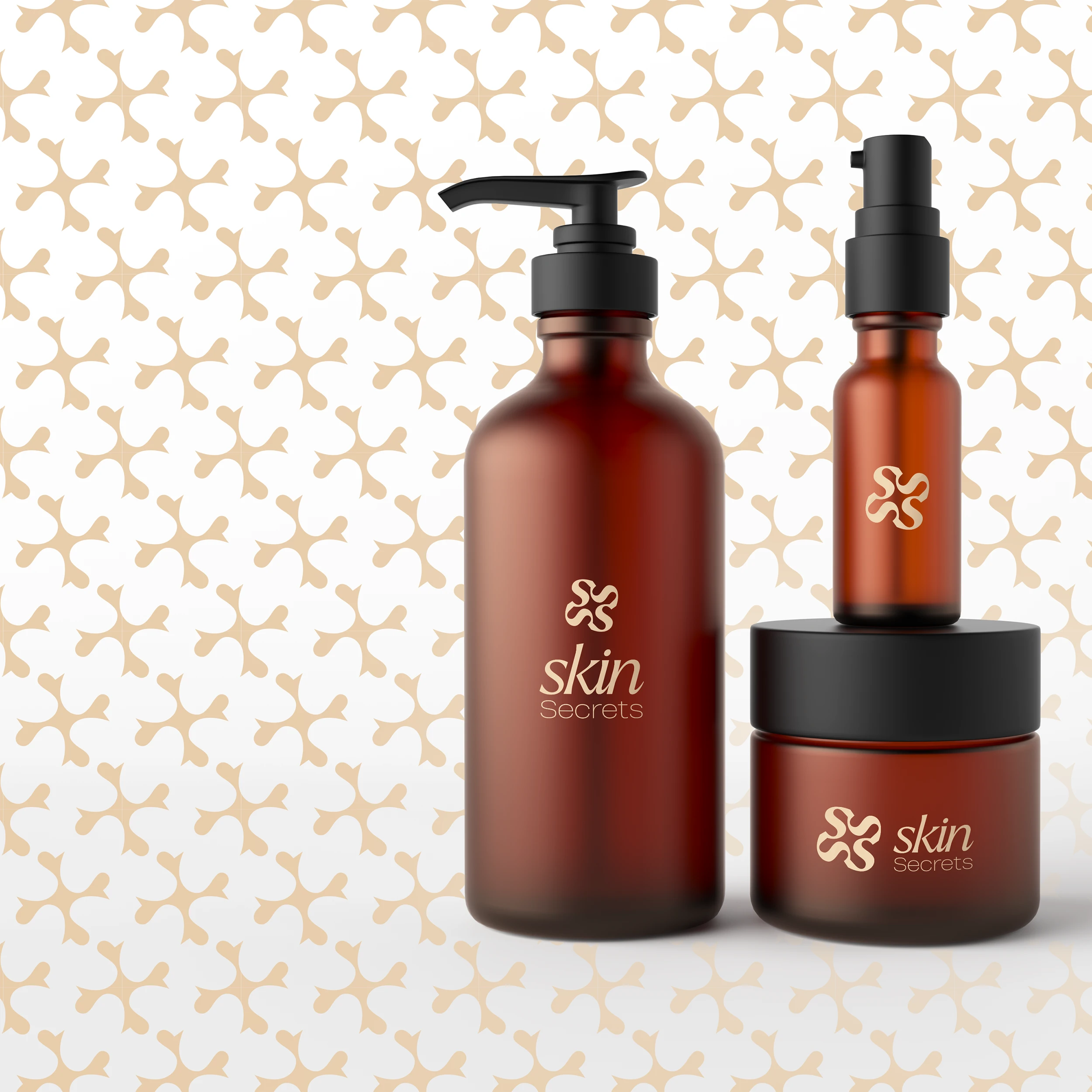
Amber glass pump bottles and jars
`The design brings this to life by pairing warm amber glass with a refined, repeating brand asset. The pattern isn't just decorative; it functions as a signature of luxury. It elevates the tactile experience, ensuring that every time a woman interacts with the physical product, the brand perception shifts from a simple purchase to a premium, deeply personal experience.
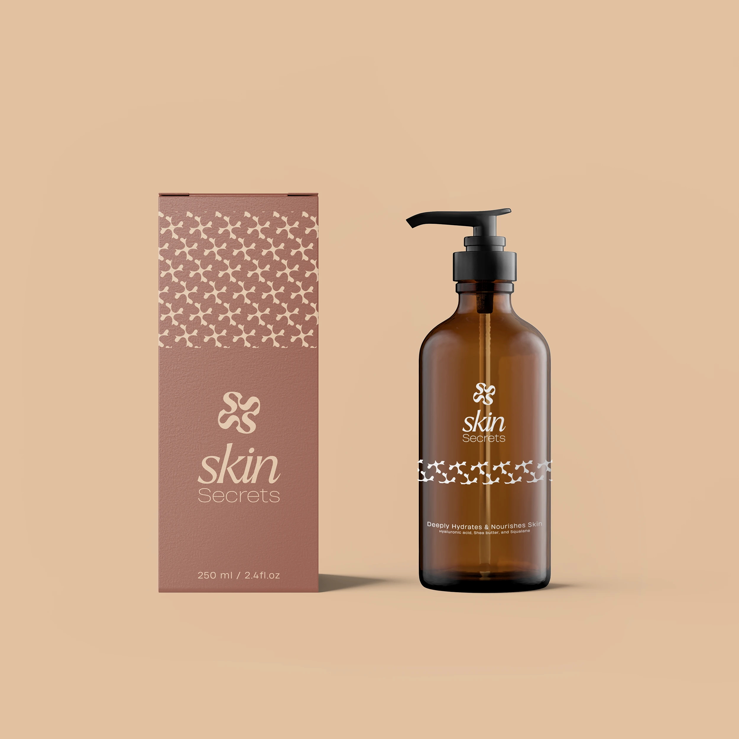
A secondary look at an outer packaging box
Delivering on the Premium Promise
The Intent
The packaging needs to command premium retail space and justify a high-end market position without needing to shout.
The Design Strategy
A sophisticated, cascading design element on the structural packaging acts as a bridge between modern minimalism and classic elegance. By keeping the typography exceptionally clean and giving the layout room to breathe, the design signals absolute purity, quality, and authority to a consumer who demands both substance and style.
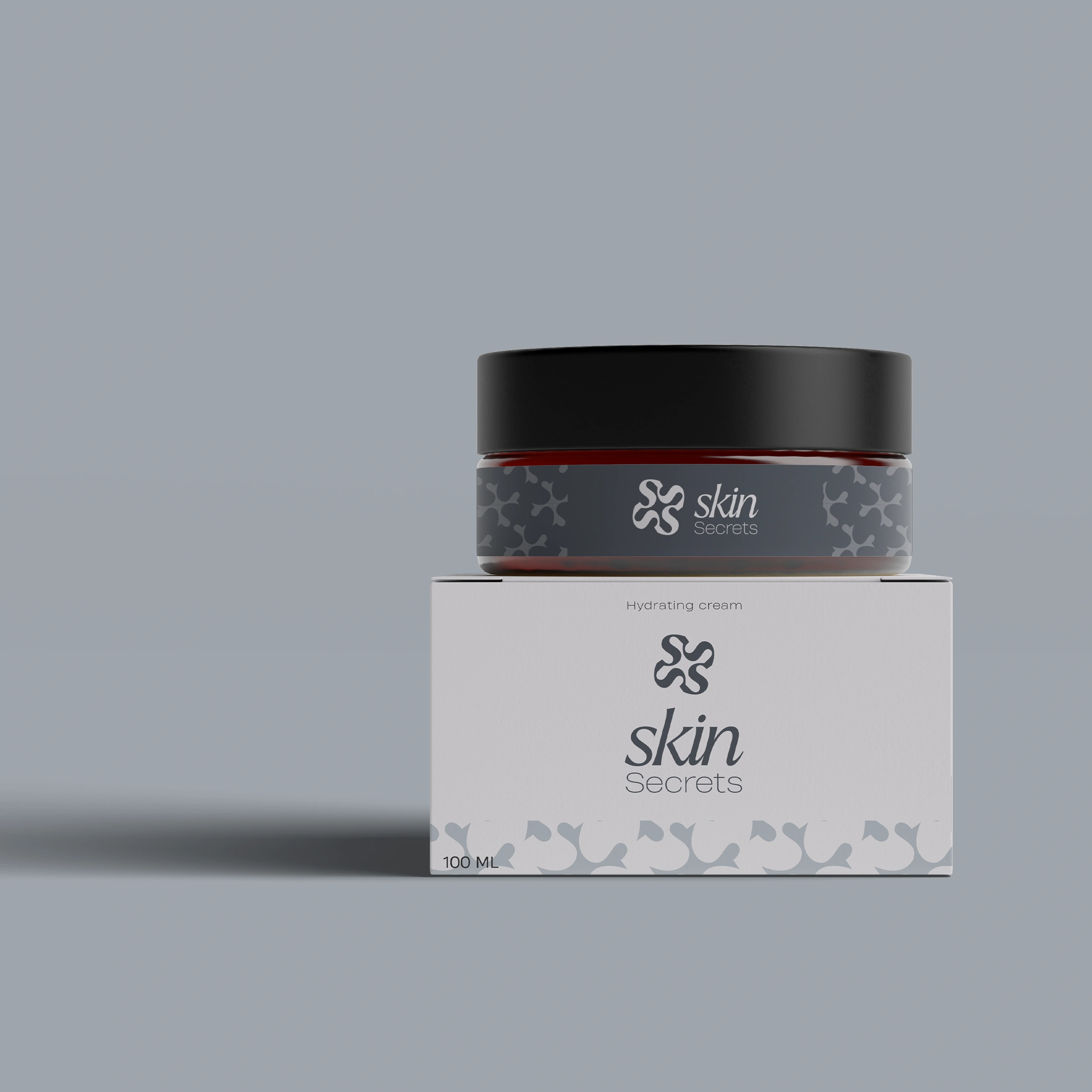
Cream jar and its structural packaging
Building Product Ecosystem Flexibility
By introducing a cooler, muted palette option for secondary product lines, the identity demonstrates true flexibility. The strict alignment and clean lines anchor the brand in clinical expertise, while the organic custom emblem keeps it grounded in warmth and humanity. It changes the perception from a single-product solution to a holistic lifestyle brand.
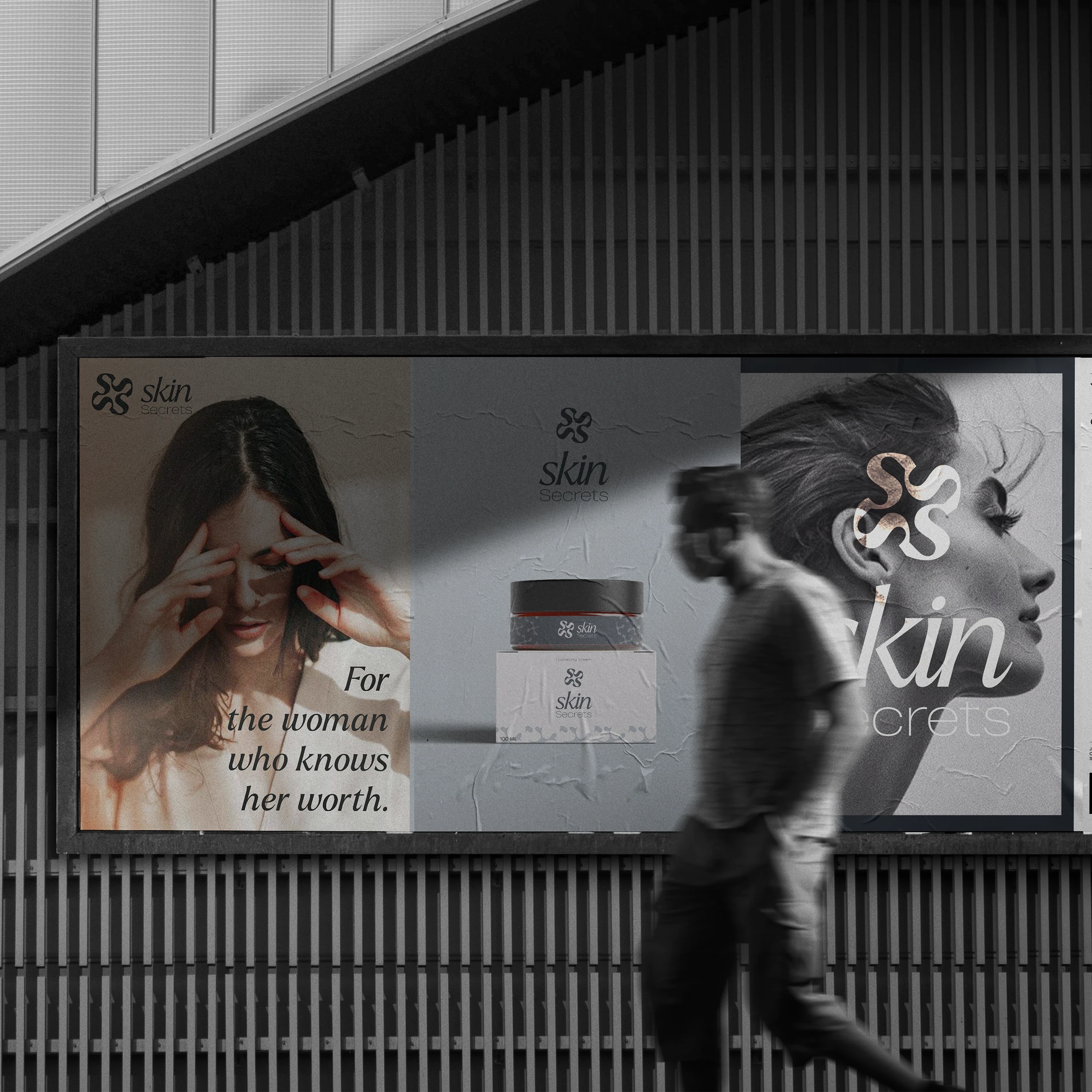
street-level billboard, real-world, urban environment
When moving into large-scale out-of-home advertising, the layout system shifts to command attention. Combining massive, unfiltered imagery of real beauty with bold, minimal branding creates an empowering street presence. The design actively disrupts the busy urban landscape, forcing passersby to stop and see a brand that mirrors their own strength and vibrancy.
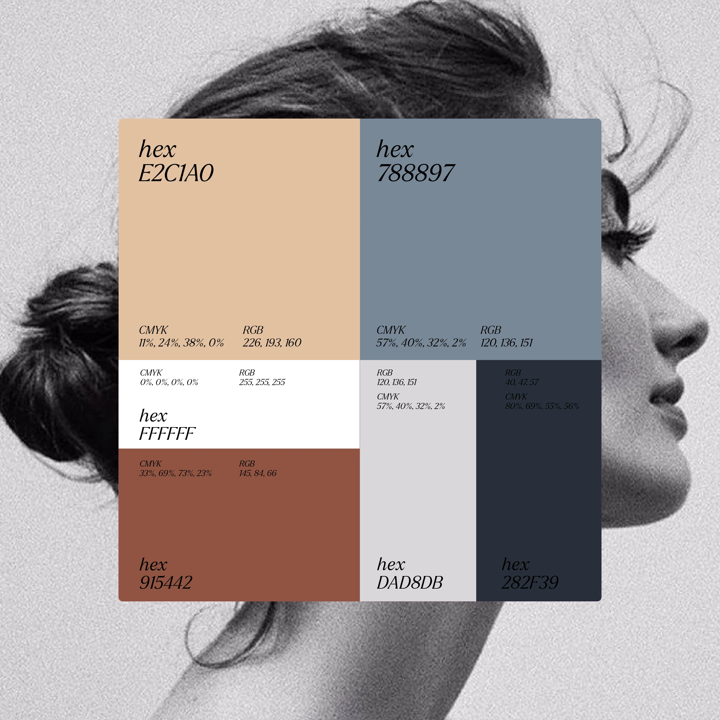
color swatches
The color and typography systems are engineered to alter customer perception deliberately. Rich terracotta and warm nudes reflect diverse, natural skin tones, while deep navy anchors the brand’s professional credibility. Pairing a high-contrast serif typeface with a clean sans-serif creates a perfect harmony of timeless heritage and modern, effortless clarity.
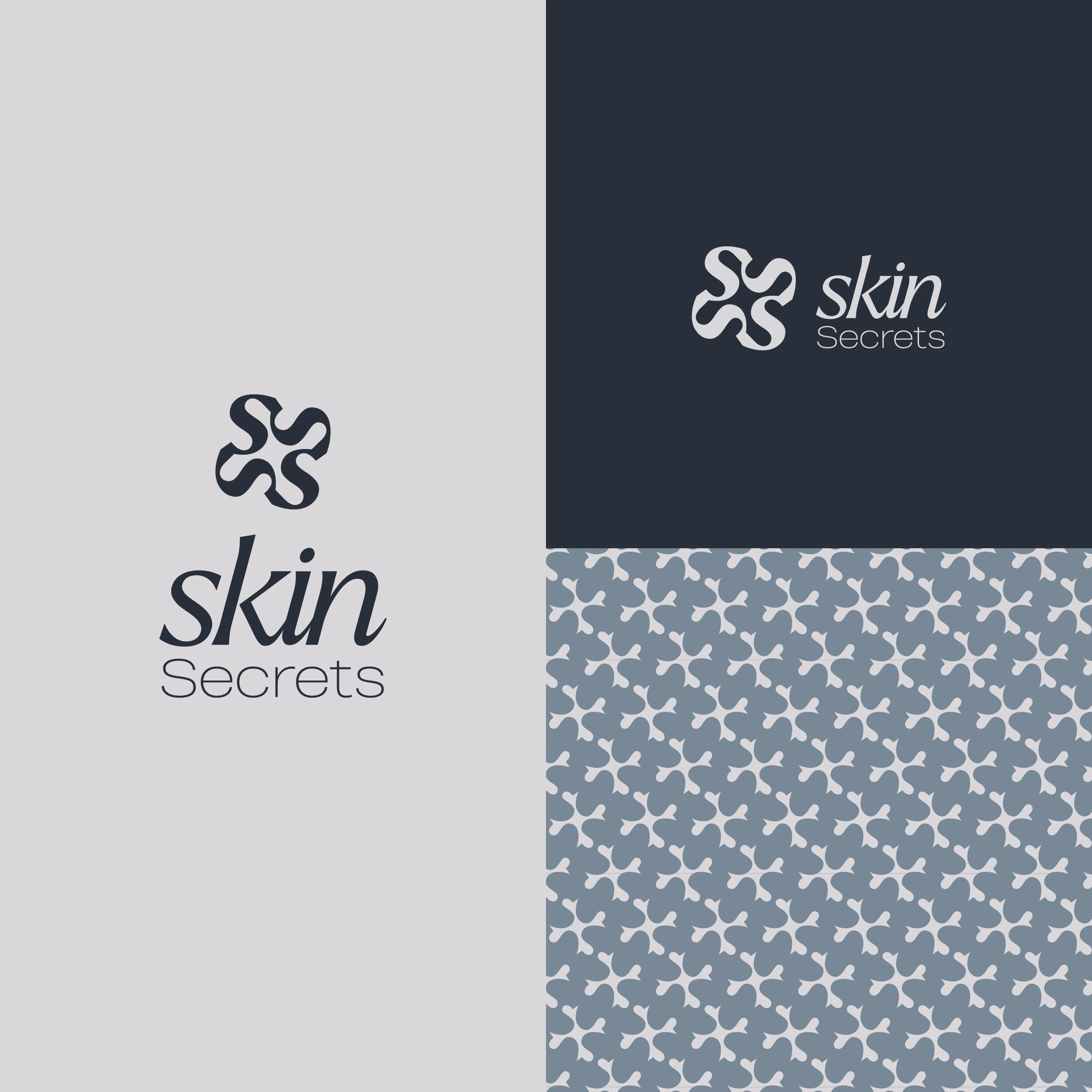
primary brand mark
The final interconnected emblem is crafted to work flawlessly at any scale, whether deeply embossed on a luxury box or shrunk down on a tiny jar lid. It ties the entire identity together, leaving the audience with a lasting perception that this is not just a company selling skincare products, but a movement that stands fiercely for their confidence and empowerment.
Like this project
Posted Apr 28, 2026
A skincare brand identity built on emotion, not trends. Helping women in their 30s & 40s feel seen, valued, and empowered through premium, minimalist design.
Likes
4
Views
6
Timeline
Sep 25, 2023 - Oct 6, 2023