Flora Miora | Skin Care | Vintage | Logo & Packaging
Snehil
Flora Miora — Vintage Skincare branding
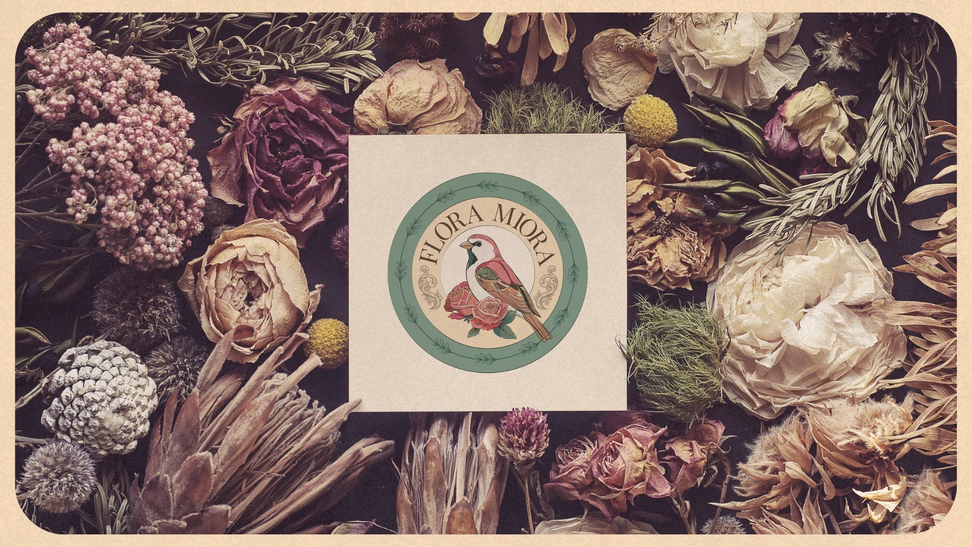
A Story of Trust and Vintage Inspiration
This project began with a powerful referral from a past client, rooted in a foundation of trust. The founder of Flora Miora sought a skincare identity that felt like a beautiful memory—one that could bridge the gap between historical elegance and modern confidence.
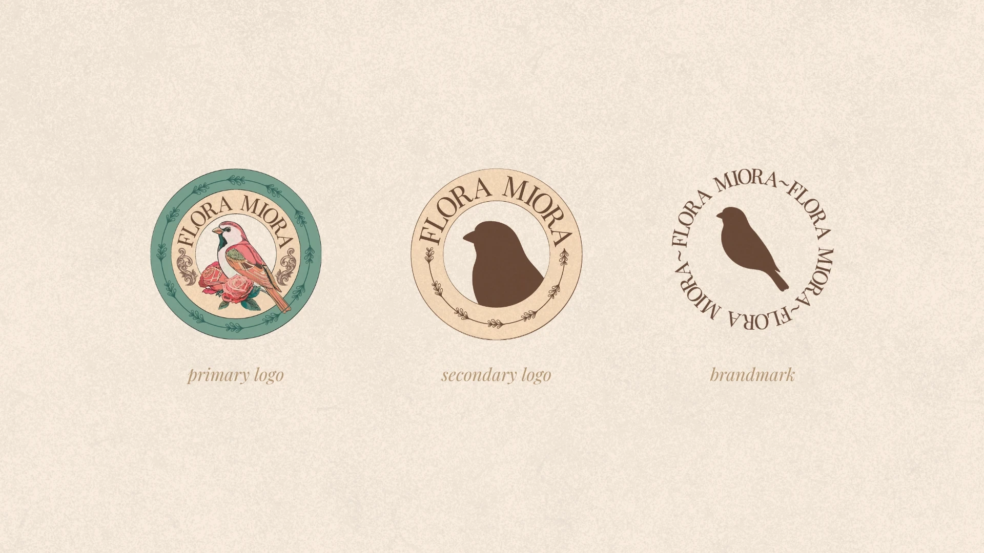
The Identity System
The Dream: An identity inspired by decorative vintage Chinese tin can packaging.
The Requirements: A design that was highly decorative, floral, and detailed, featuring a signature bird motif.
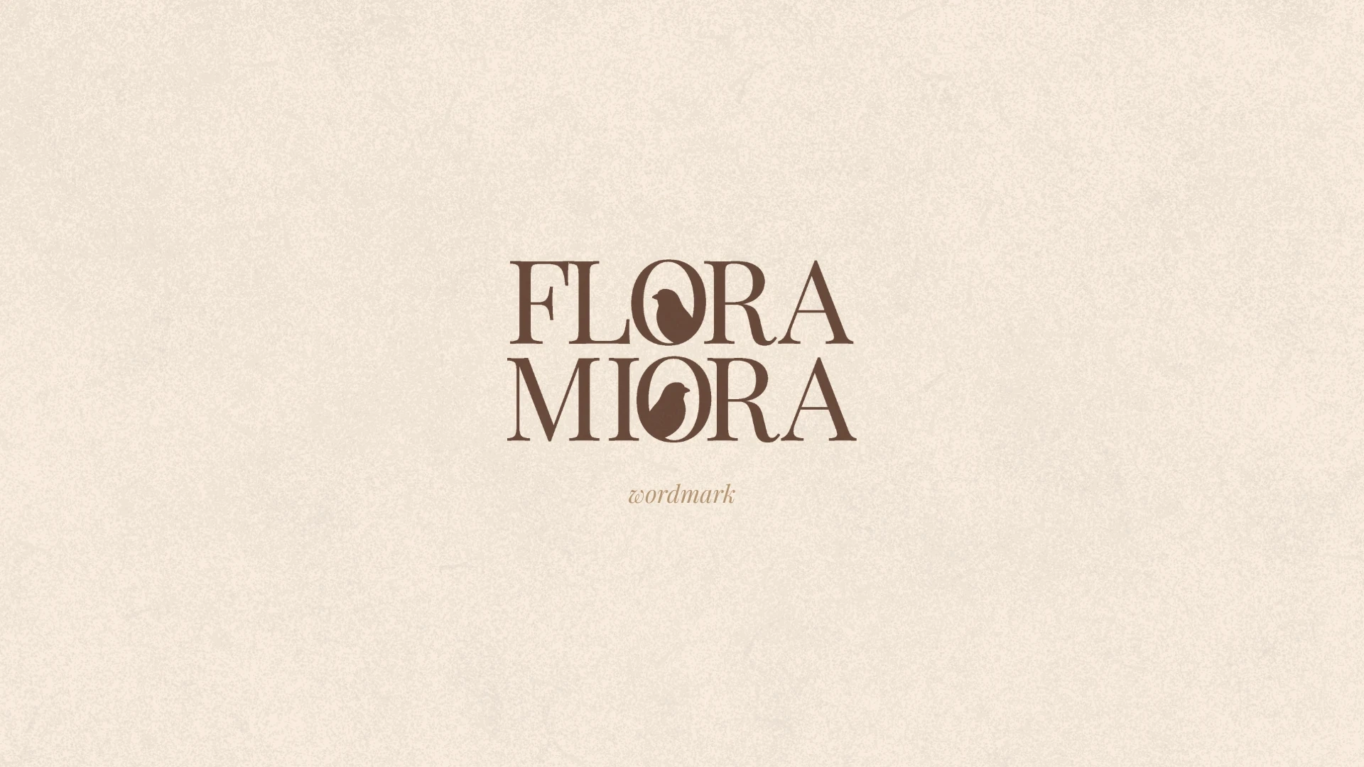
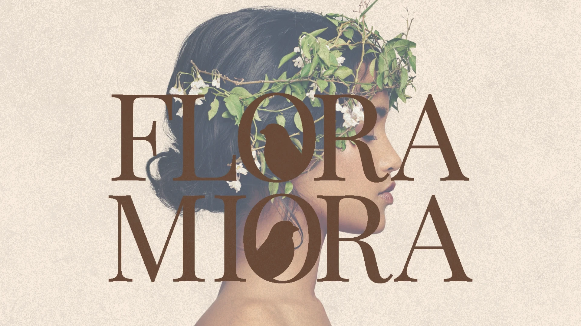
Wordmark
The Wordmark
Designed to stand confidently on storefronts and premium signage, evoking the feel of a classic apothecary.
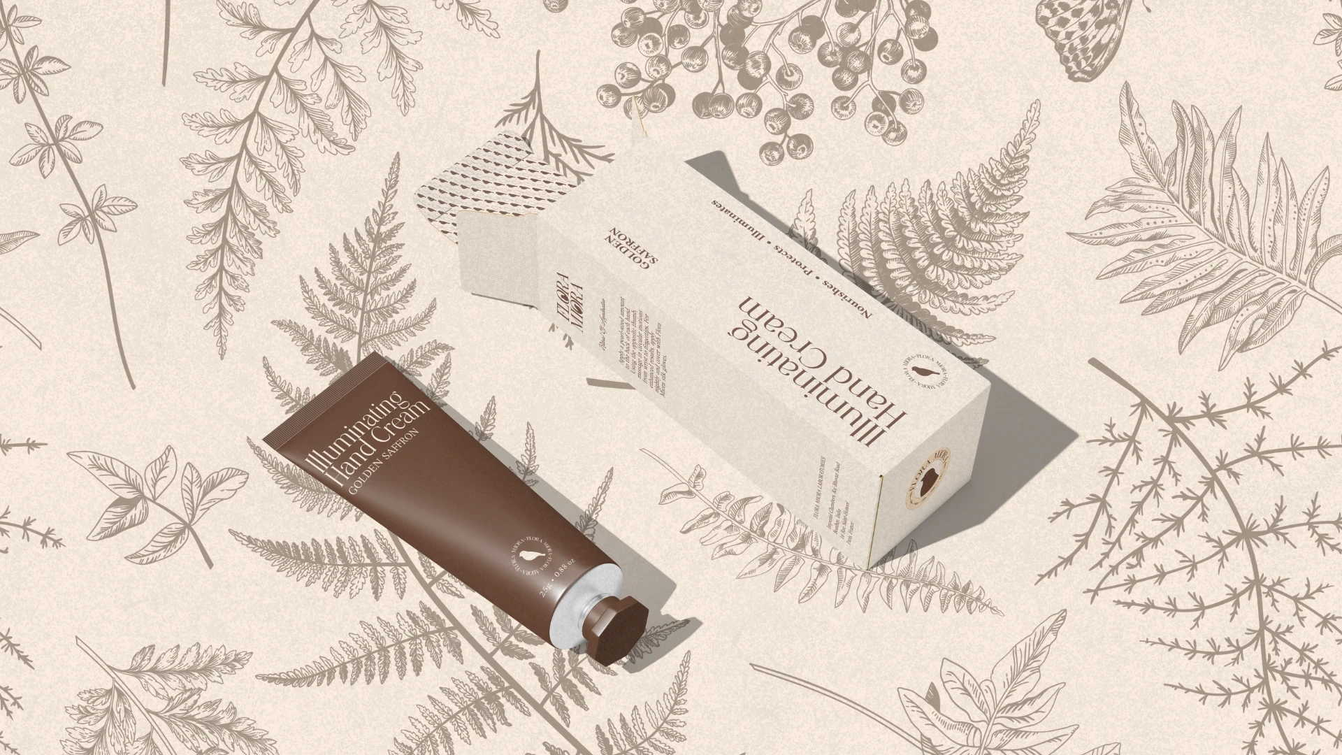
Hand Cream Packaging
Patience, Patterns, and Polished Details
I spent 25 days fully immersed in this vision, treating every element with the care of a historical artifact.
Logo Transformation
Primary & Secondary Logos
Features elegant, high-contrast serif typography with integrated bird and floral illustrations
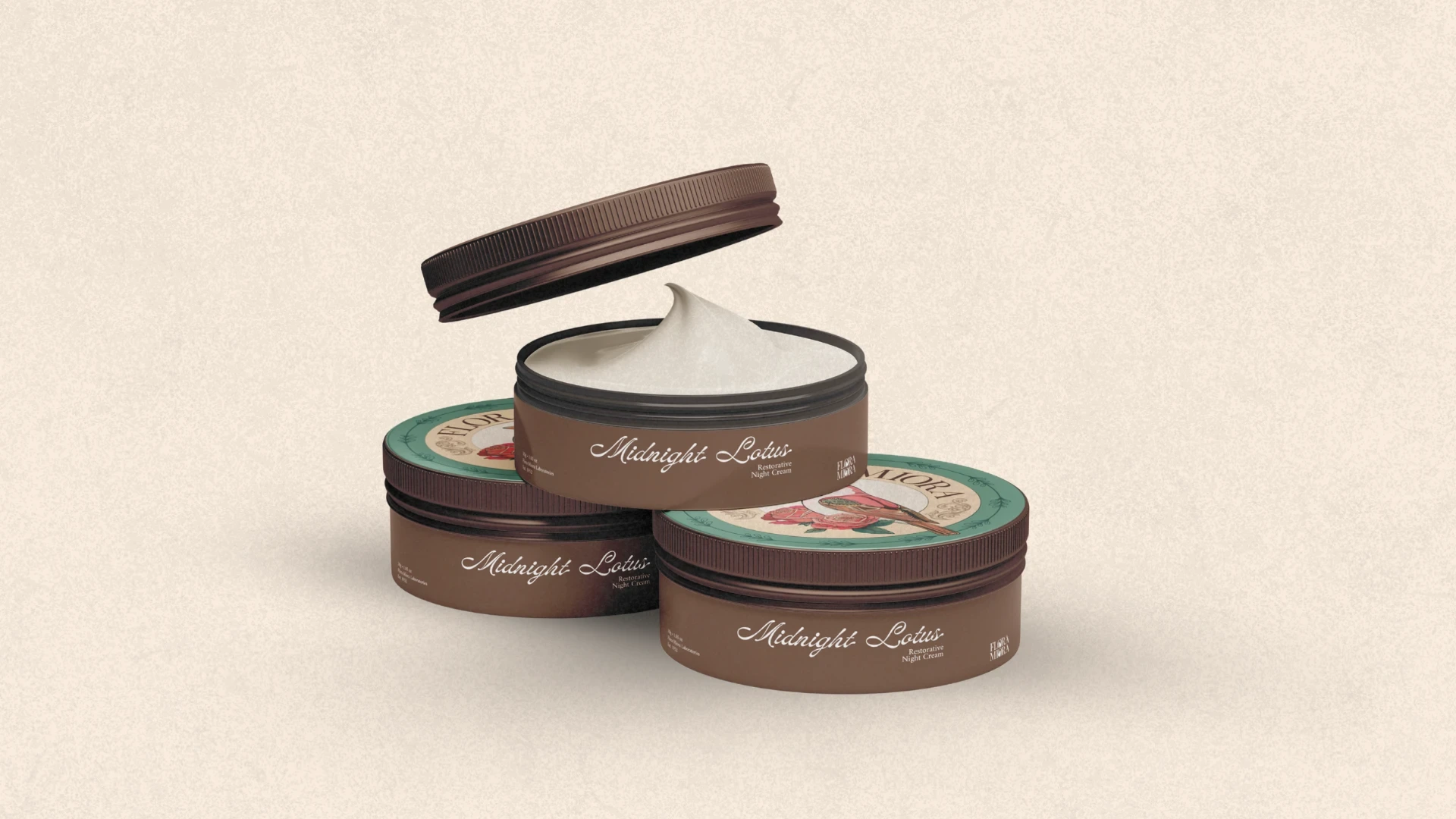
Night Cream Tin Packaging
The "Midnight Lotus" Tins
Directly inspired by the original tin can concept, featuring circular labels and detailed bird motifs.
Brand Visuals
Retail & Environmental Design
The retail identity was crafted to stand confidently in the modern world while feeling deeply rooted in history. I designed the environmental touchpoints to evoke the feeling of a classic, high-end sanctuary.
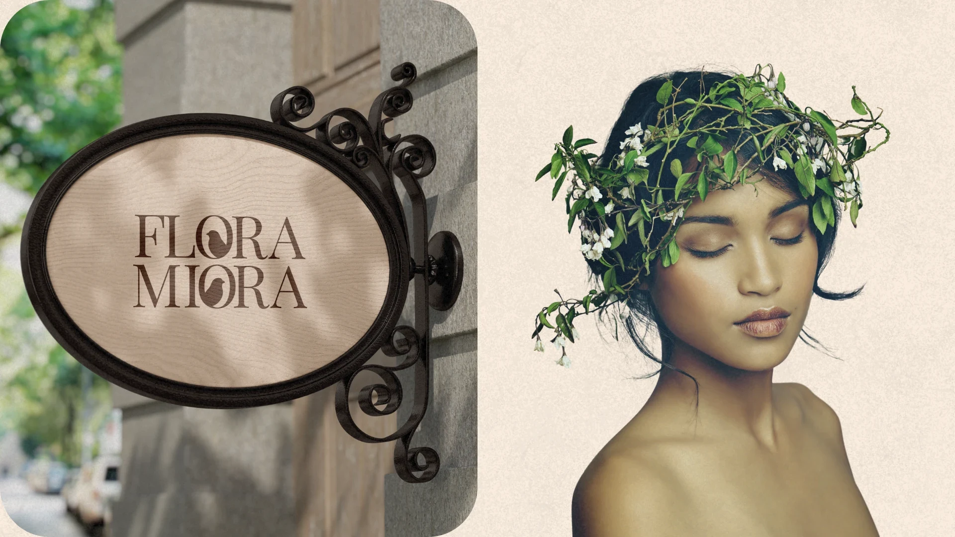
The Signature Signage: An ornate, wrought-iron oval sign featuring the high-contrast Flora Miora wordmark, designed to attract discerning patrons with its timeless aesthetic.
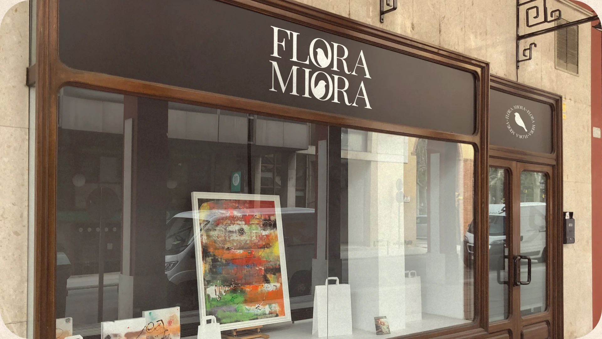
Store Front
Storefront Identity
The retail front utilizes dark wood framing and clean white typography to create a sophisticated, apothecary-inspired storefront. Smaller window decals feature the circular bird mark, ensuring consistent brand recognition from every angle.
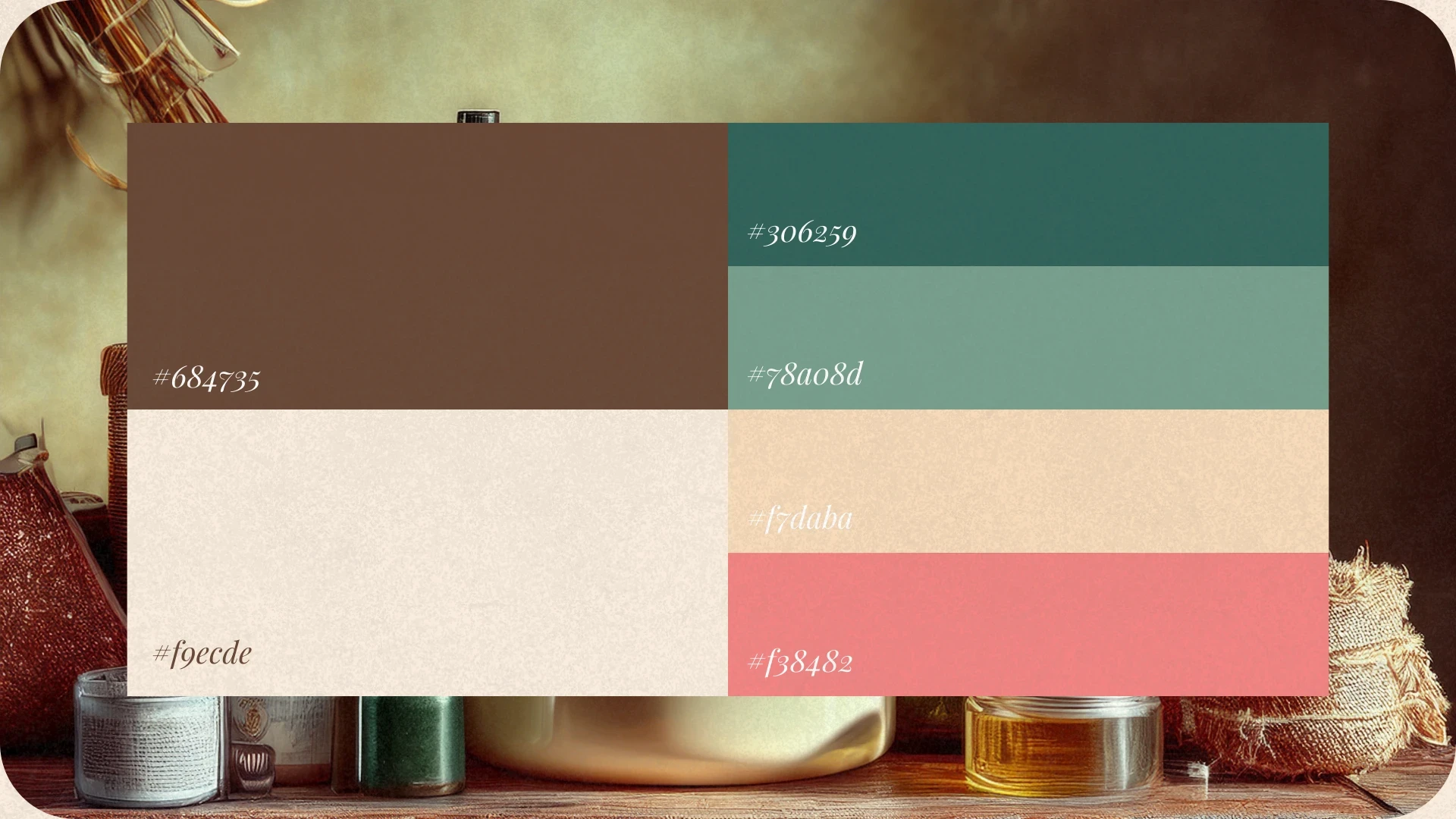
Brand Palette
The Core Palette
A sophisticated mix of deep "Midnight" tones and heritage colors:
Forest Green (#306259) and Earthy Brown (#684735).
Soft Cream (#fgecde) and Vintage Rose (#118482) for a romantic, historical feel.
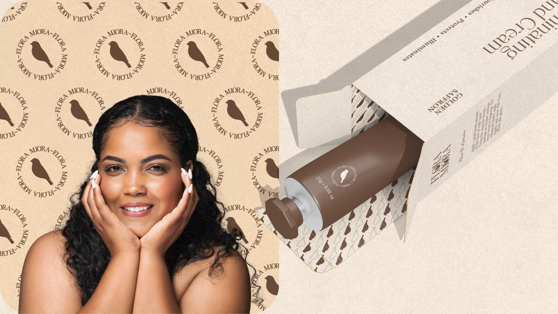
Brand pattern & Illuminating Hand Cream
Illuminating Hand Cream
Designed with a focus on typography-led luxury, using the rich brown and cream palette.
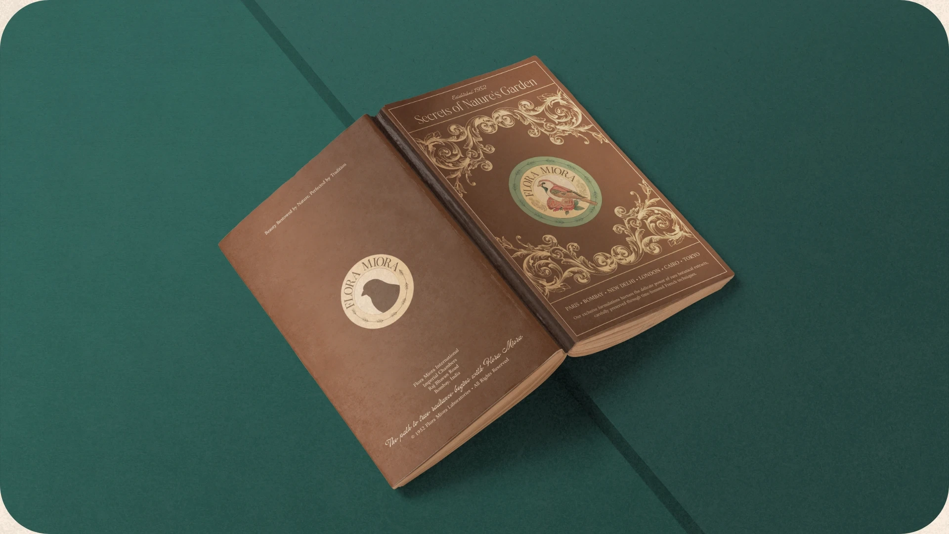
Brand Booklet
The Brand Book
The brand's stationery was designed to extend the "vintage-modern" experience to every physical interaction. Each piece serves as a tactile extension of the Flora Miora story.
A detailed brand manual bound in a deep umber cover, featuring the signature bird motif and gold-foiled floral filigree.
Brand Poster
Visual Campaign Imagery
To ground the vintage elements in today's world, the brand's visual language incorporates photography that highlights natural beauty and organic strength. We utilized portraits that emphasize a "moment of calm," with floral crowns that tie back to the brand’s botanical roots. The primary serif logo is used as a bold overlay, demonstrating the brand's ability to remain the center of attention even against complex, natural backgrounds.
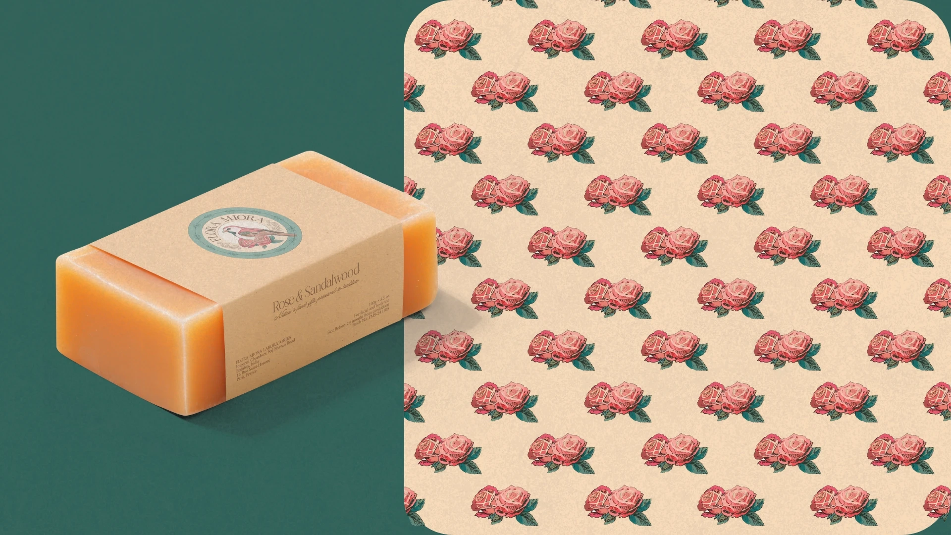
Soap Packaging & Brand pattern
Texture & Pattern
Custom-designed floral patterns wrap the packaging, reinforcing the "vintage" dream the founder imagined.
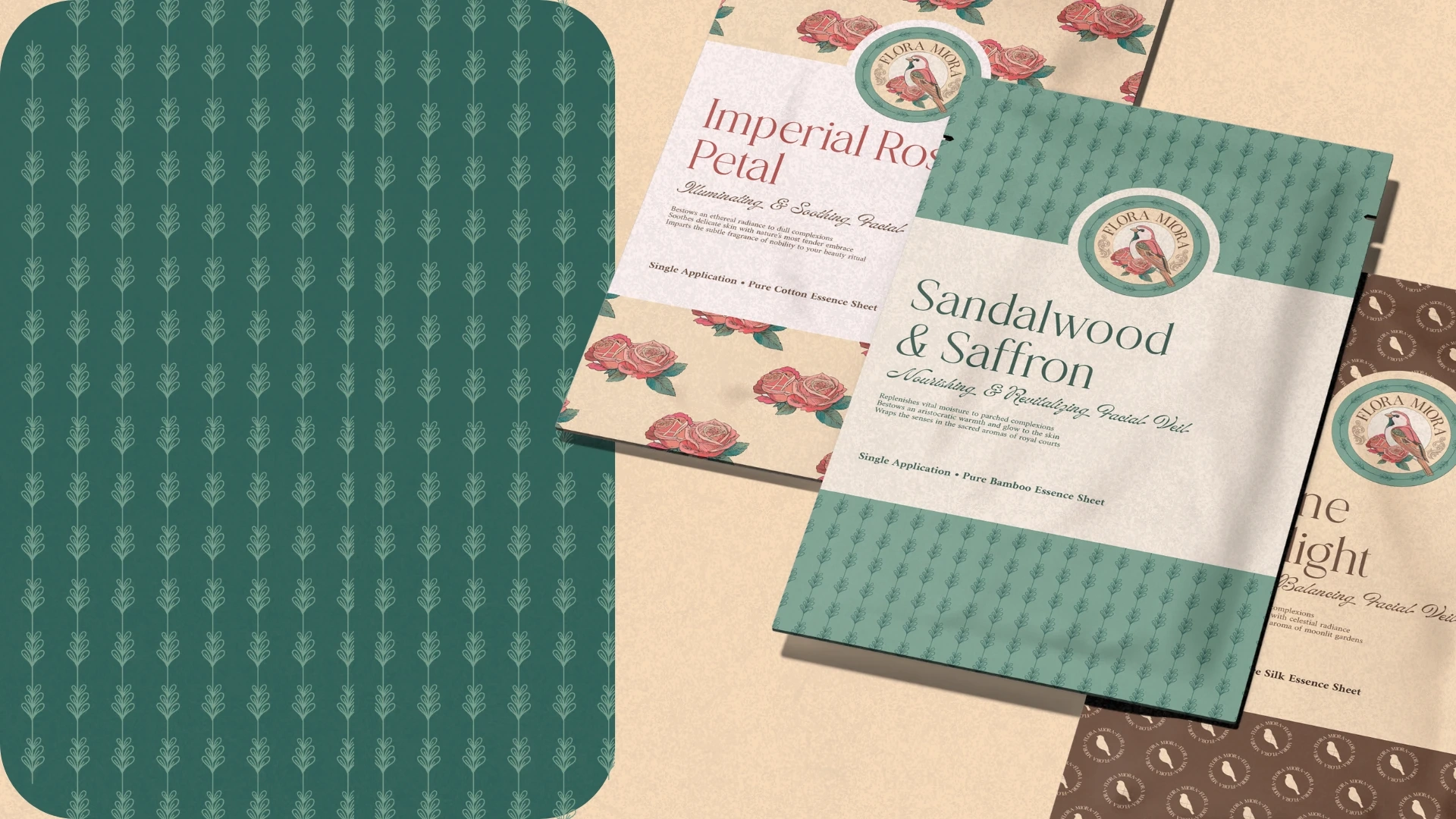
Brand Pattern & Face Mask Packaging
Packaging & Physical Touchpoints
The packaging was designed to be "the gift before the product," ensuring every unboxing feels like a special occasion.
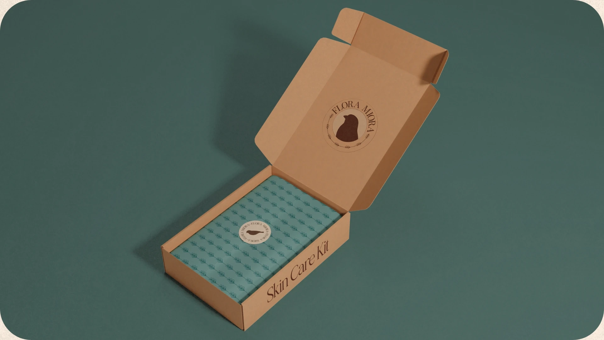
Skin Care Kit
Like this project
Posted Apr 28, 2026
Intricate vintage-inspired branding for Skin Care Brand. Fusing detailed floral motifs with modern luxury to create a timeless, apothecary-style visual system.
Likes
3
Views
5
Timeline
Apr 1, 2025 - May 8, 2025