Zoe Plant-United Kingdom | Mental Health | Logo Design
Snehil
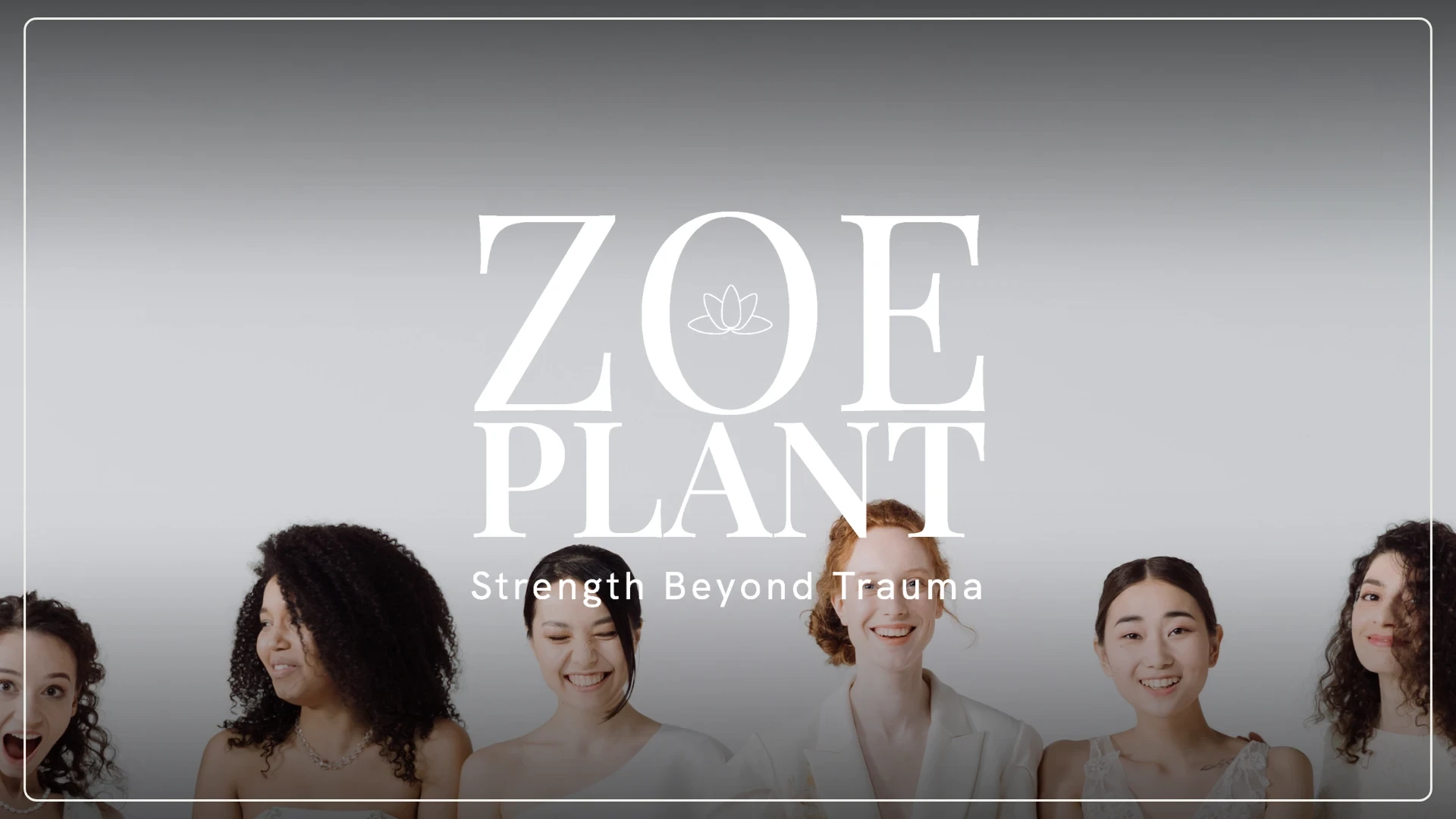
Zoe Plant — A Visual Safe Space for Healing
Empowering Strength Beyond Trauma Zoe Plant is a UK-based counselor and coach dedicated to empowering women healing from trauma, domestic abuse, and addiction. When Zoe approached me, she wasn’t just looking for a logo; she wanted a visual sanctuary - a symbol that whispers, "You’re not broken. You’re blooming".
Message
The Goal
To create branding that feels like a hand that holds, balancing elegant femininity with grounded strength.

Founder
The Message
Every curve was designed with the intention of building a safe space for growth and resilience.
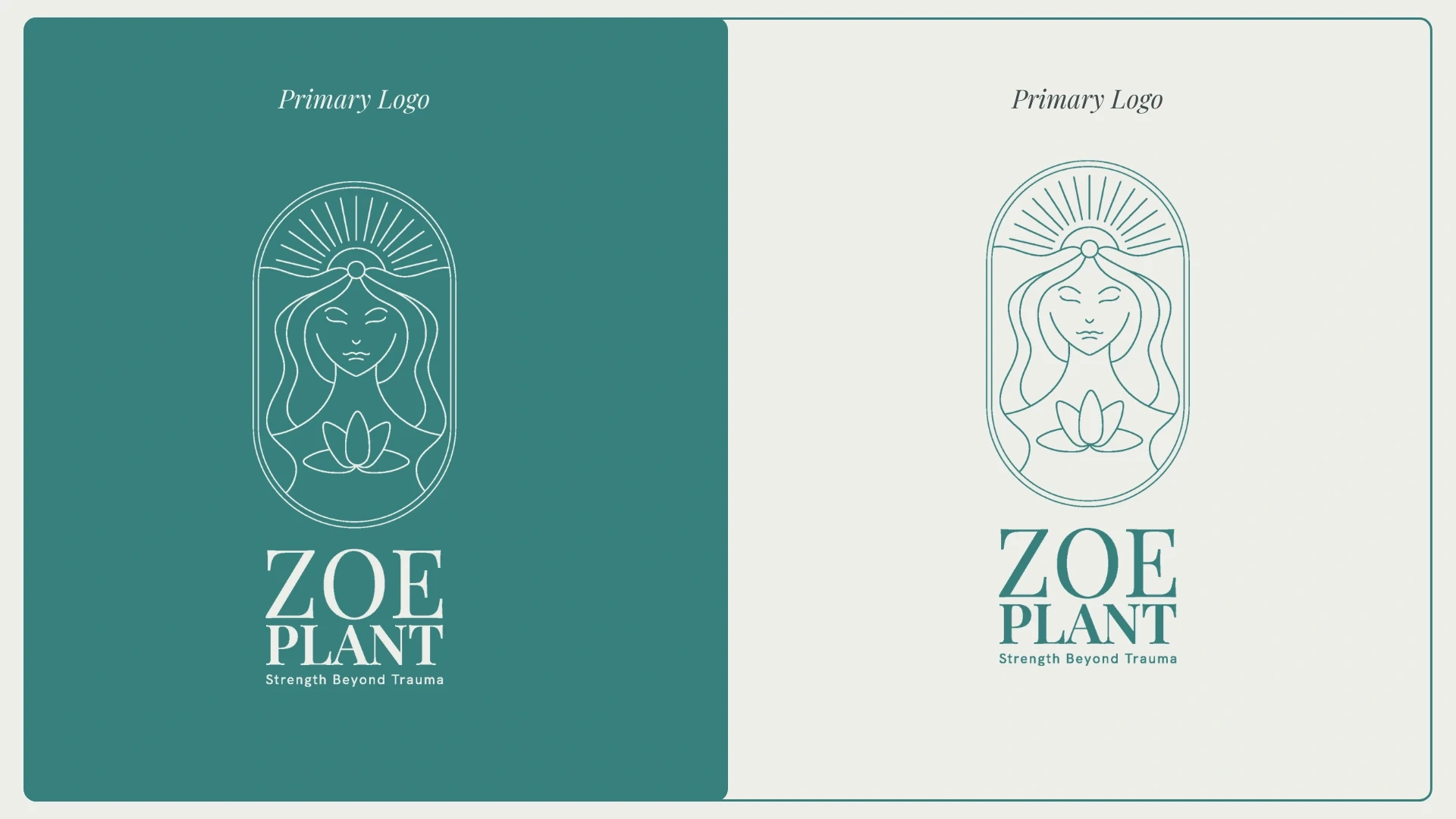
Primary Logo
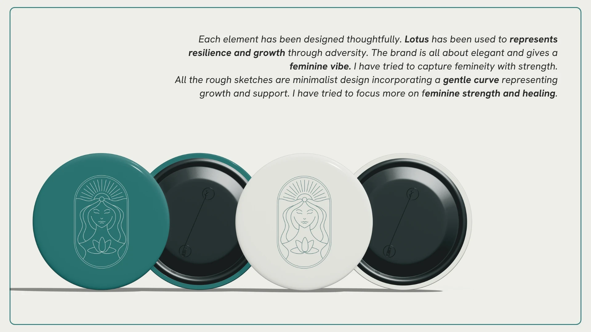
Resilience Rooted in Every Detail
The identity system was built around thoughtful symbolism to honor the journey of recovery.
The Lotus: Chosen to represent resilience and the ability to grow through adversity.
Minimalist Curves: Designed to feel soft and supportive, yet structurally strong to represent the "feminine fierce" spirit.
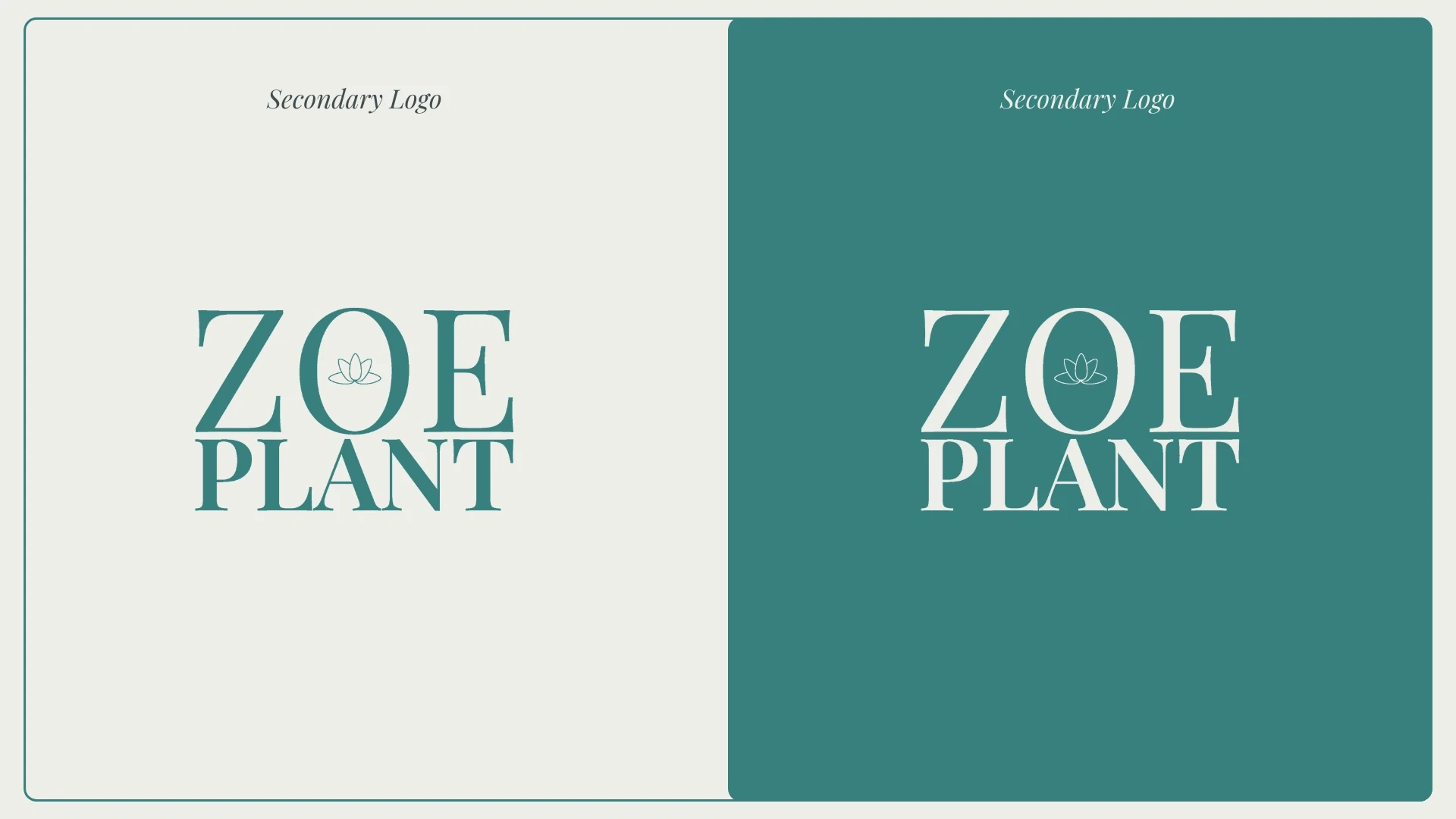
Secondary Logo
Strategic Minimalism: I focused on a "less is more" approach, ensuring the branding feels like a quiet, calm breath of fresh air rather than loud marketing.
Logo Badge
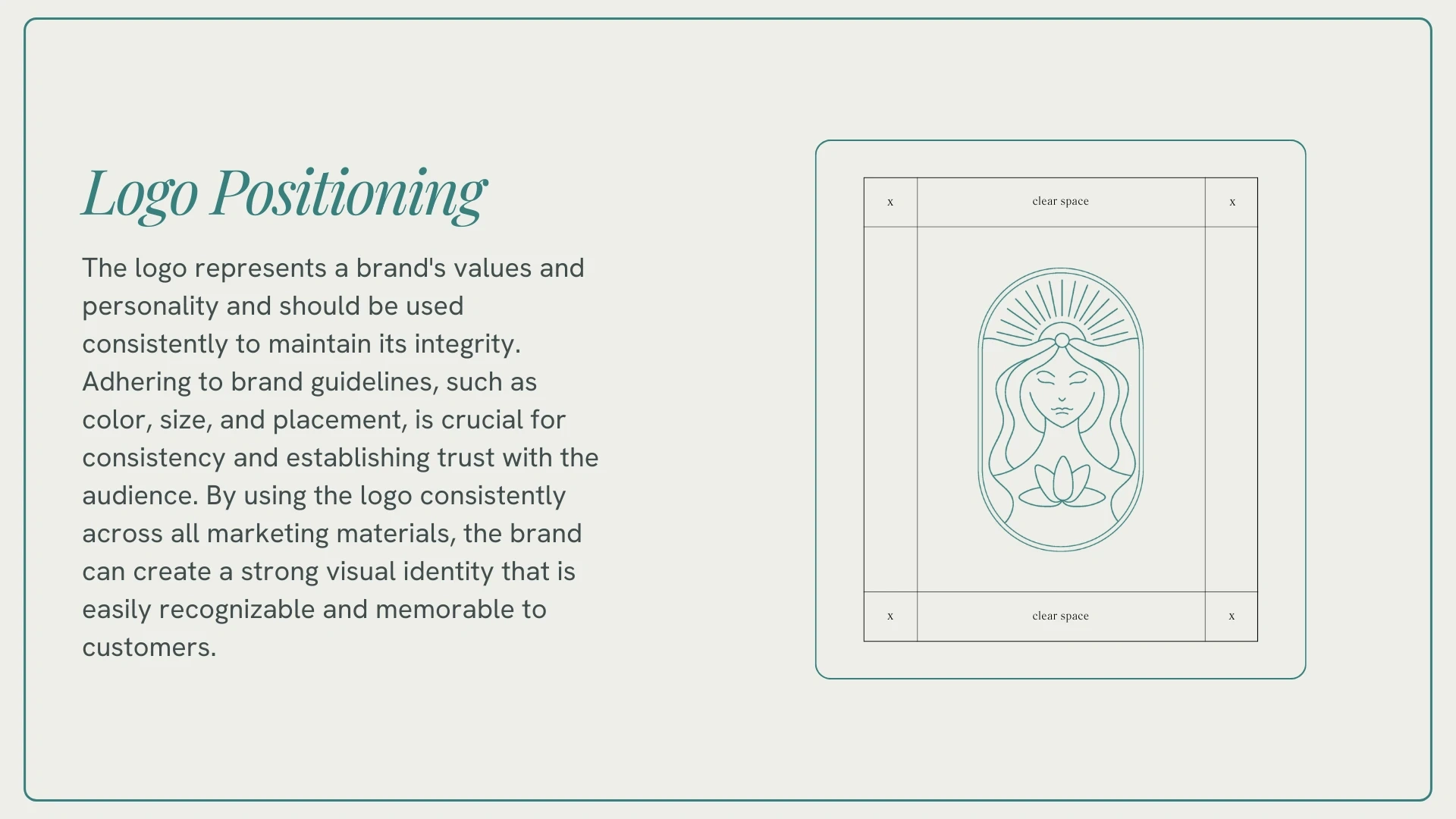
Logo Positioning
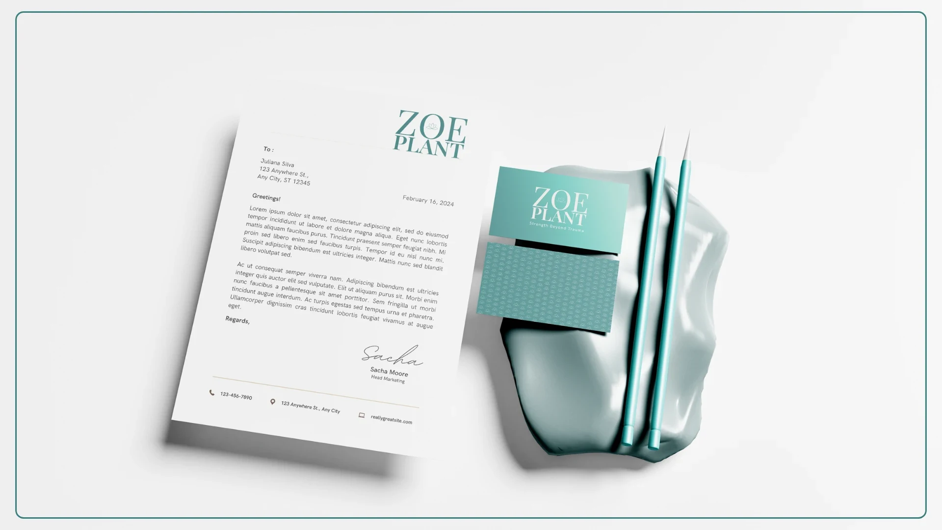
Stationary
The final identity system was designed to be used consistently across print and digital mediums to build a recognizable and trusted presence.
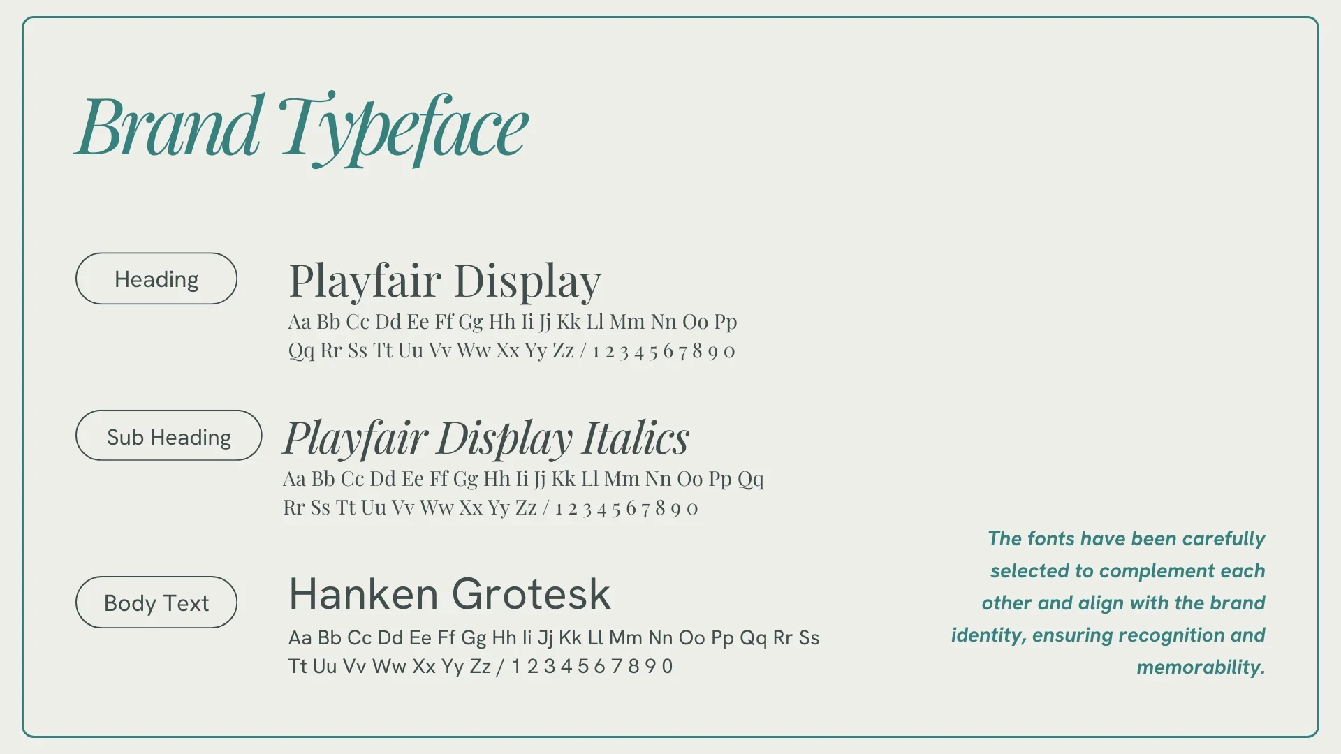
Brand Typeface
The Typeface
I paired Playfair Display (Heading) for its elegant and bold duality with Hanken Grotesk (Body Text) for modern clarity.
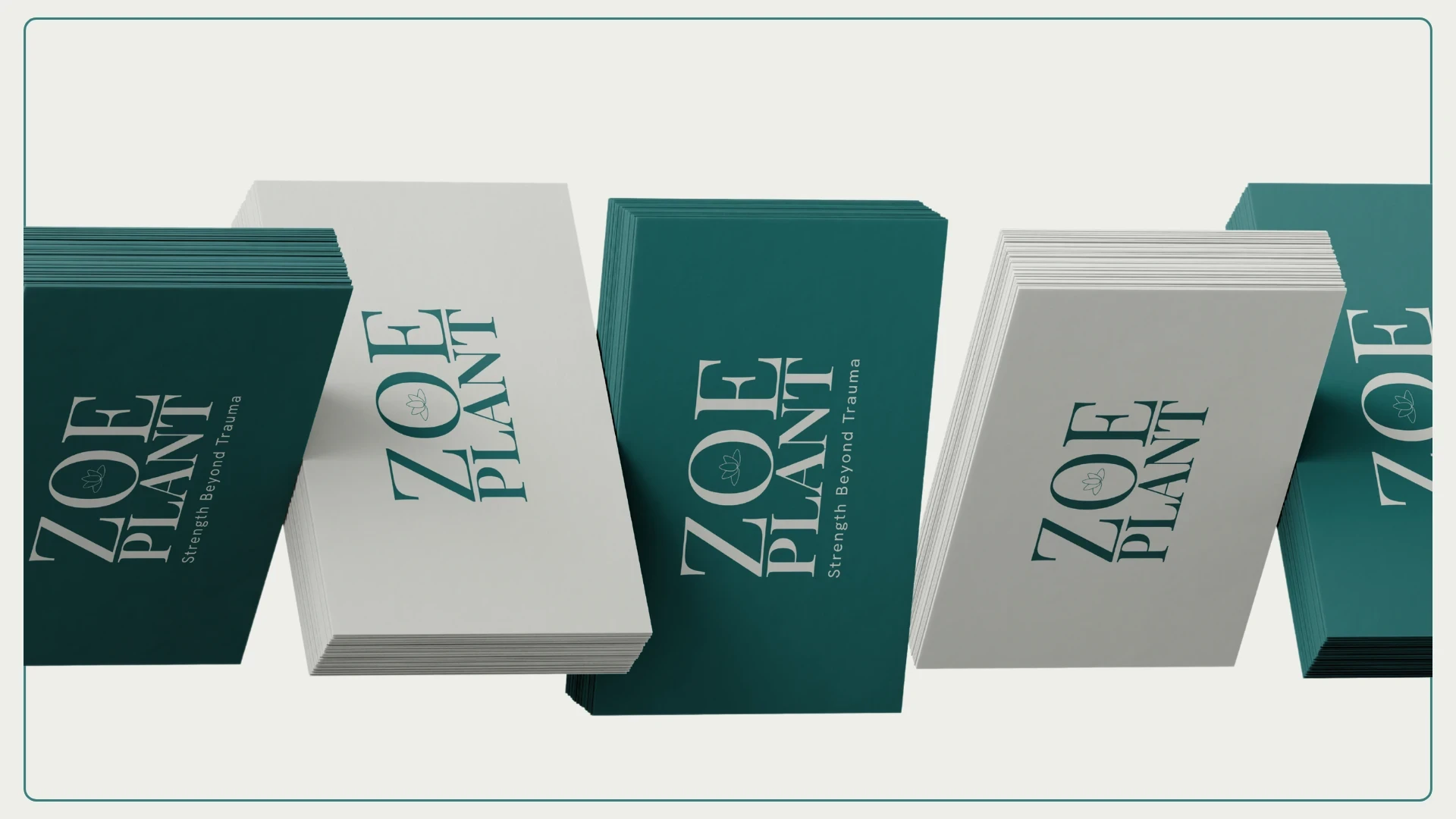
Business Card Mockup
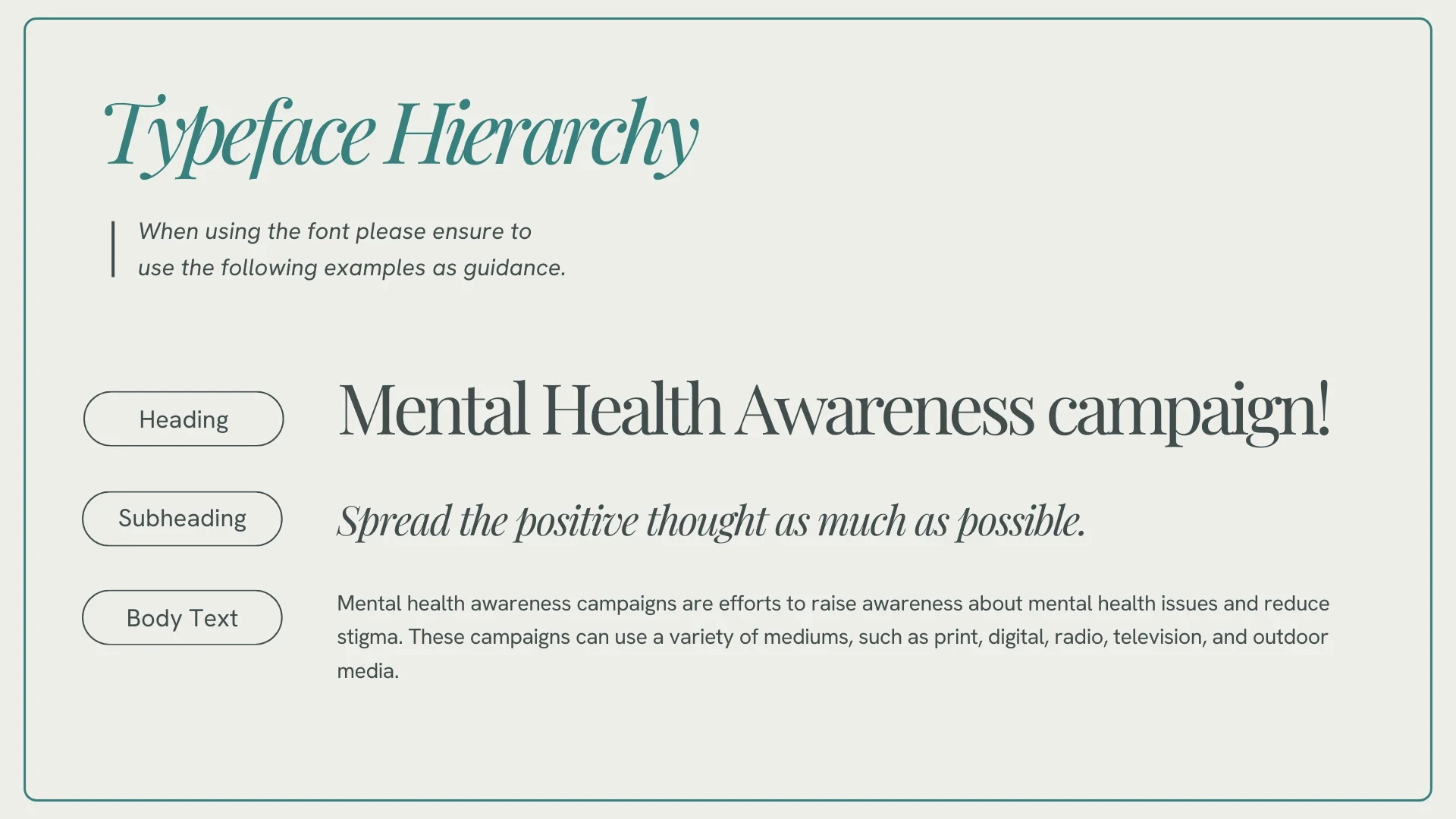
Typeface Hierarchy
Timeless Elegance Meets Healing Tones To establish trust and memorability, I selected a typeface and color story that reflects Zoe’s professional yet deeply empathetic coaching style

Book Cover Design
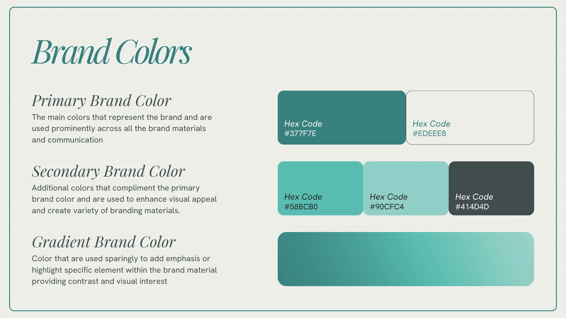
Brand Colors
The Palette
A calming, sophisticated spectrum of teals and soft neutrals.
Primary Teal (#377F7E): Representing stability and emotional healing.
Soft Neutral (#EDEEE8): Providing a clean, breathable backdrop for sensitive content.
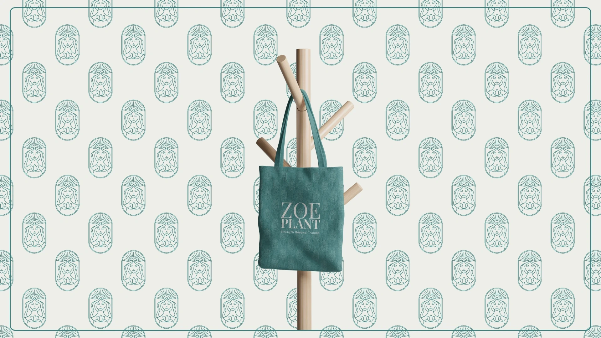
Pattern Design
The Result
A professional brand identity that doesn't just look good; it empowers the audience to find their peace and purpose.
Like this project
Posted Apr 28, 2026
Branding for a UK mental wellness coach. I designed a "visual safe space" using lotus symbolism and elegant curves to empower women healing from trauma.
Likes
3
Views
1
Timeline
May 1, 2025 - May 17, 2025