BYB | Gen-Z Fashion Brand | Logo & Brand Identity
Snehil
BYB — Fashion as a Movement of Love
Translating a Founder’s Burning Desire
The journey of BYB began with a powerful discovery call where the founder expressed a frustration with the status quo and a hope for something better. He wanted more than just a label; he wanted to turn every customer into a "messenger of kindness"
The Visual Identity
Creating a Visual Language for the brand
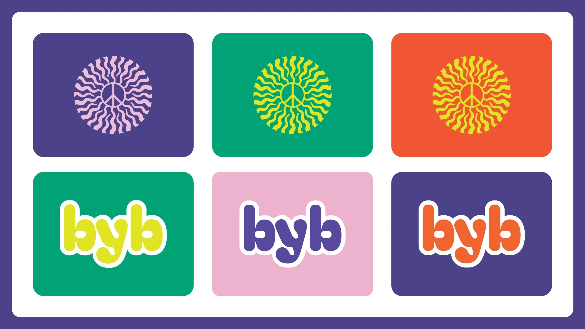
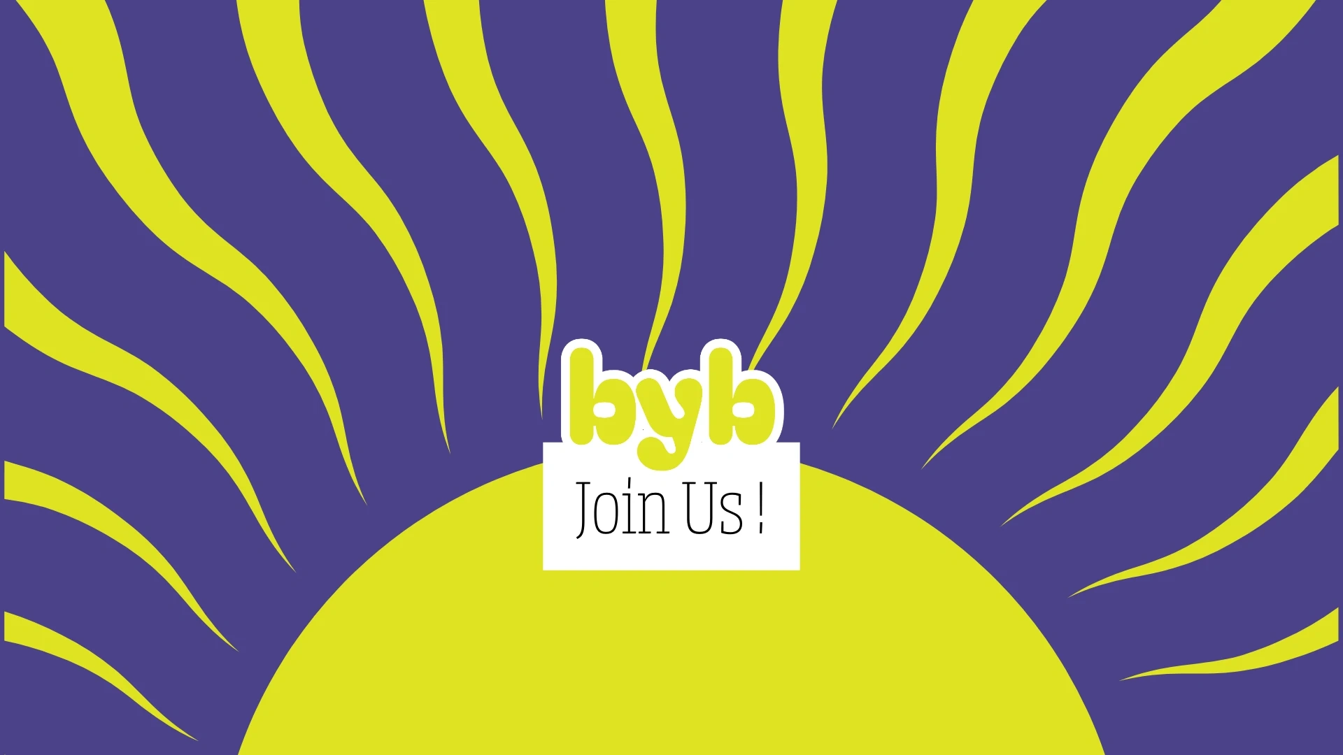
The core of BYB is a vibrant, high-contrast identity designed to stand out in a crowded Gen-Z market. A sun-ray emblem featuring a peace sign at its center, representing the energy and harmony at the heart of the brand.
Color Palette
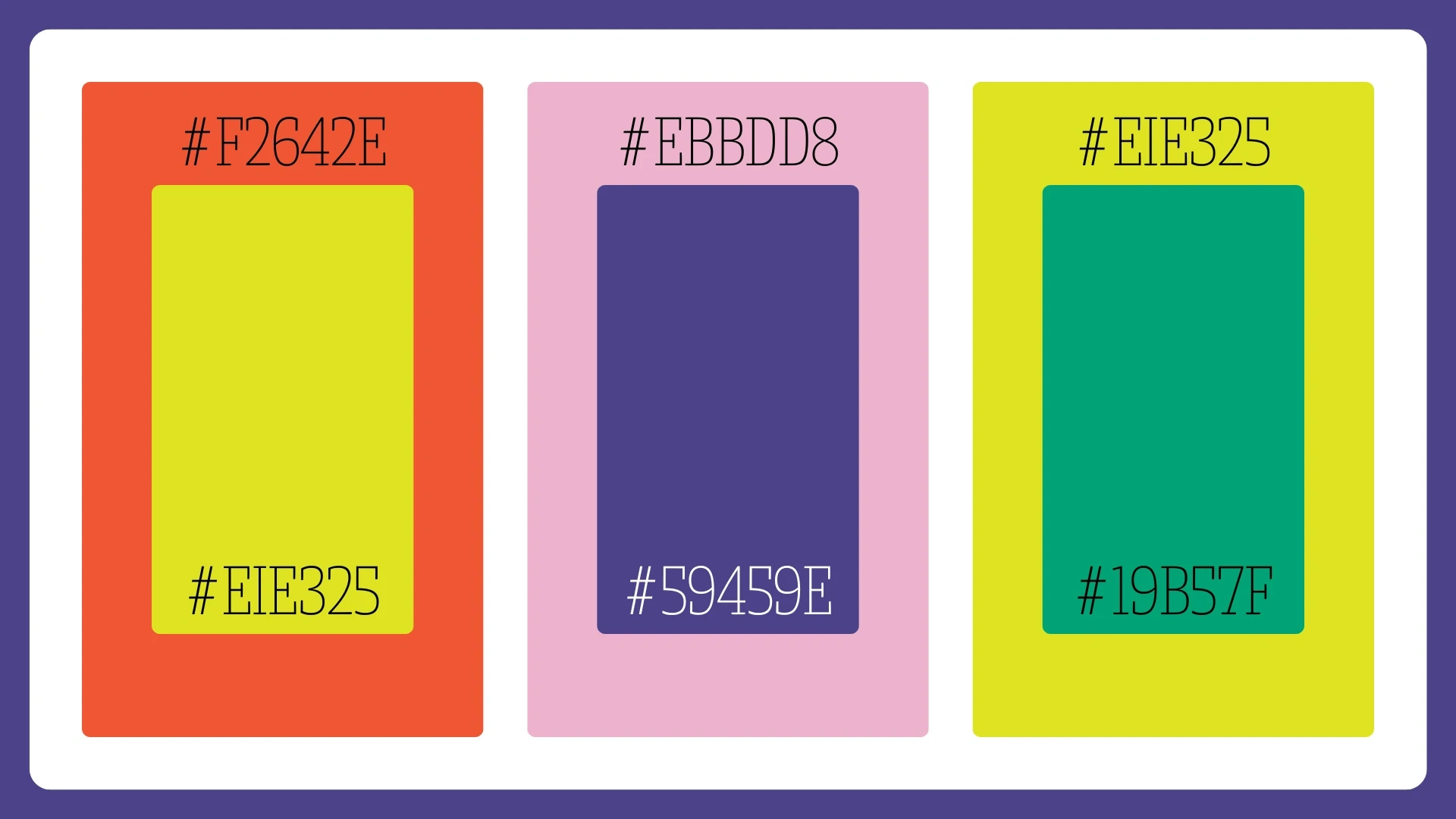
The Palette
We moved away from muted tones to a bold, expressive color story
Electric Orange (#F2642E) for passion.
Soft Rose (#EBBDD8) for empathy.
Cyber Yellow (#EIE325) for optimism.
Deep Purple (#59459E) and Vivid Teal (#19B57F) for depth and contrast.
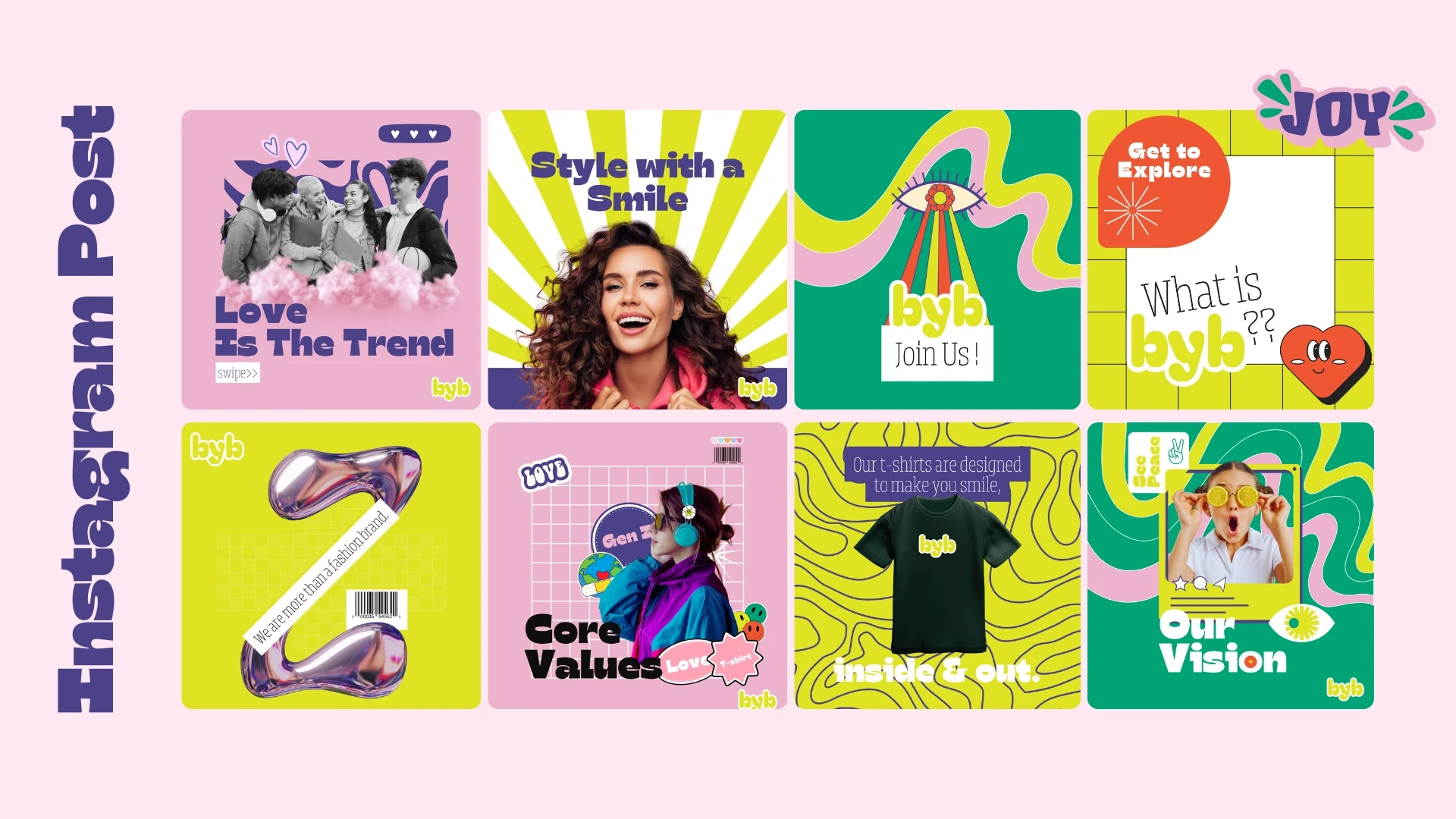
Turning Wearers into Messengers
The Goal: To create a brand that doesn't just sell t-shirts, but sells a sense of belonging.
The Mission: Establishing "Love Is The Trend" as a core brand philosophy.
The Future of Fashion in Every Detail
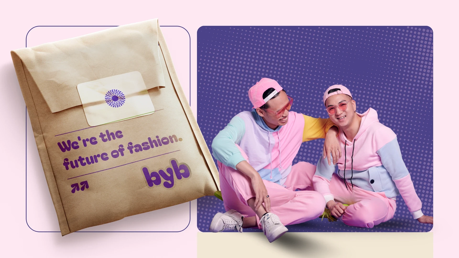
Packaging for the Future of Fashion
The branding extends to every touchpoint, ensuring the unboxing experience feels like receiving a gift of community.
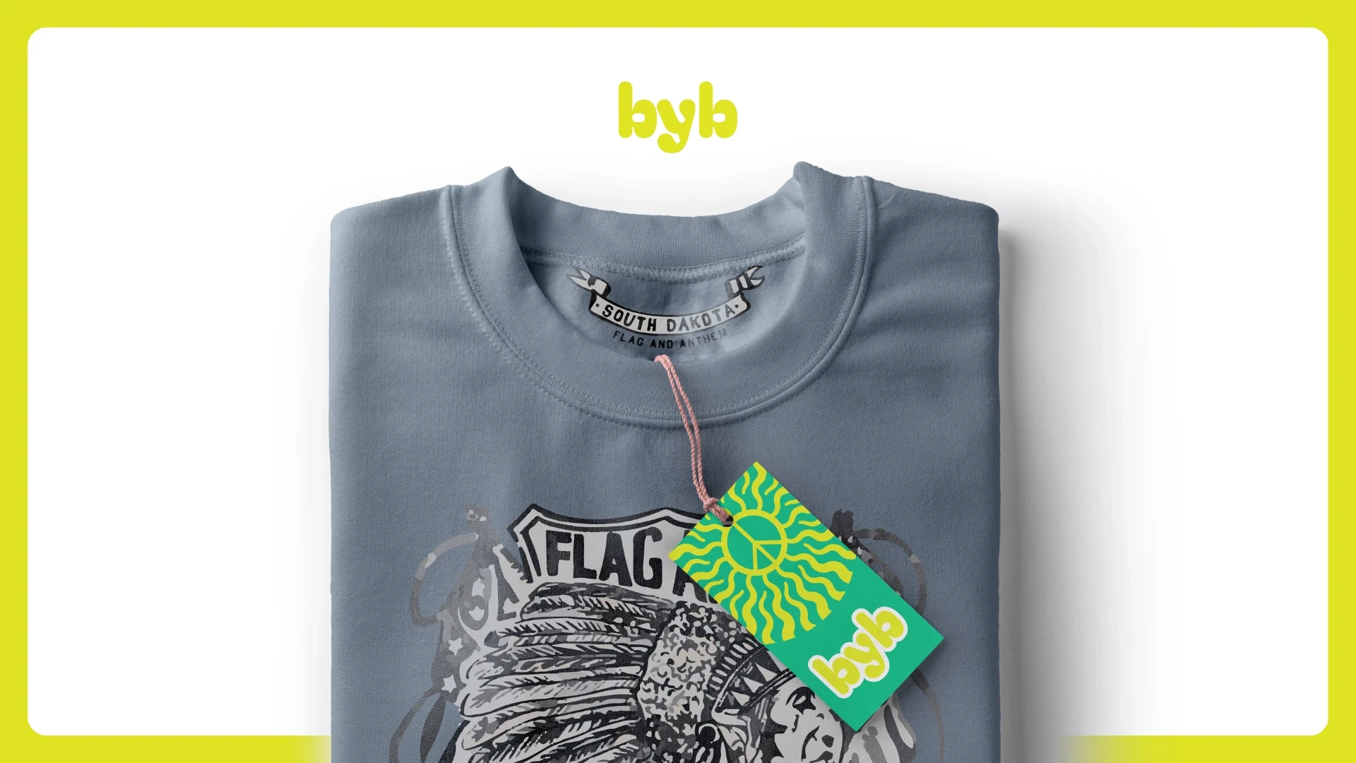
Tag Design
A comprehensive brand system that doesn't just sell t-shirts, it sells a sense of belonging.
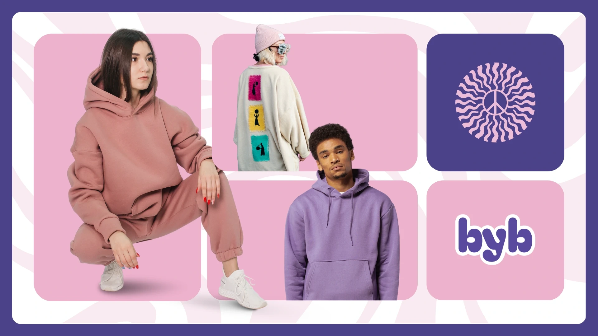
The Movement
Touchpoints
Custom apparel tags and stickers featuring words like "Kind," "Hug," and "Wow" to encourage positive interaction.
Messaging
Using physical collateral to reinforce the idea that "We're not just a generation, we're a movement".
The Impact
The true success of the project was realized when the founder saw the final brand system. He sat in silence for a moment before saying, "This... this is what I saw in my head".
The Result:
The Outcome
A comprehensive launch-ready system that empowers a new generation to wear their values on their sleeves.
Like this project
Posted Apr 28, 2026
Gen-Z fashion branding focused on "Love as a Trend." I turned a founder's vision for kindness into a vibrant, movement-led identity system that sells belonging.
Likes
2
Views
2
Timeline
Apr 1, 2024 - Apr 16, 2024