Replo Landing Page Design for Sweepstakes

Mcnove Pineda


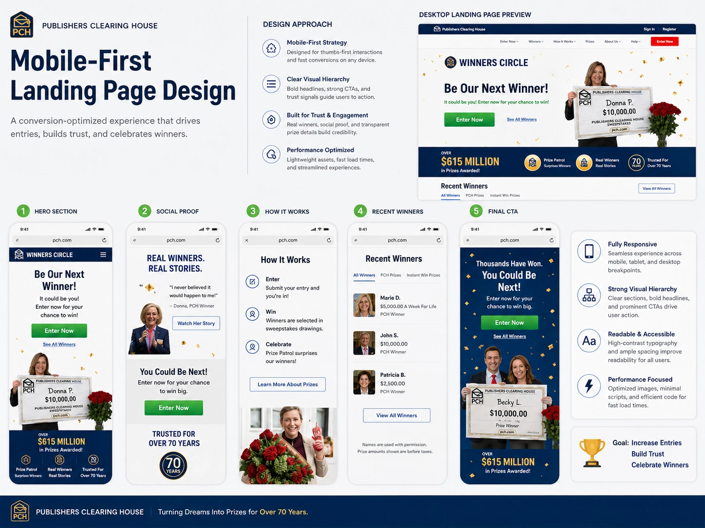
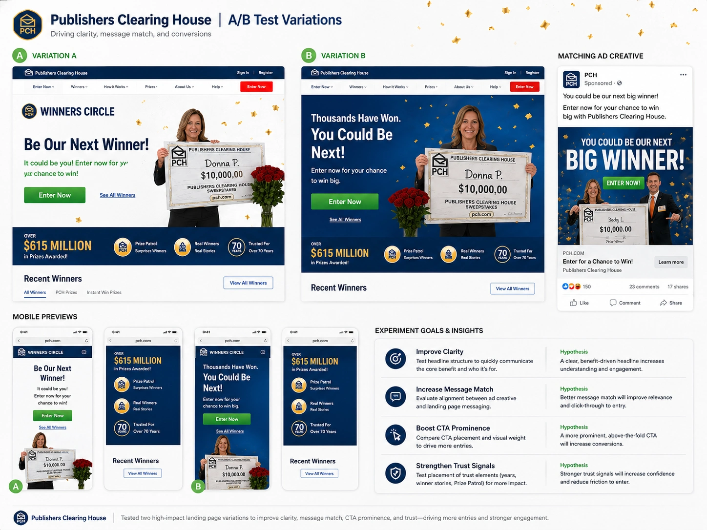
Publishers Clearing House — Campaign Landing Page Design & Optimization
Project Overview
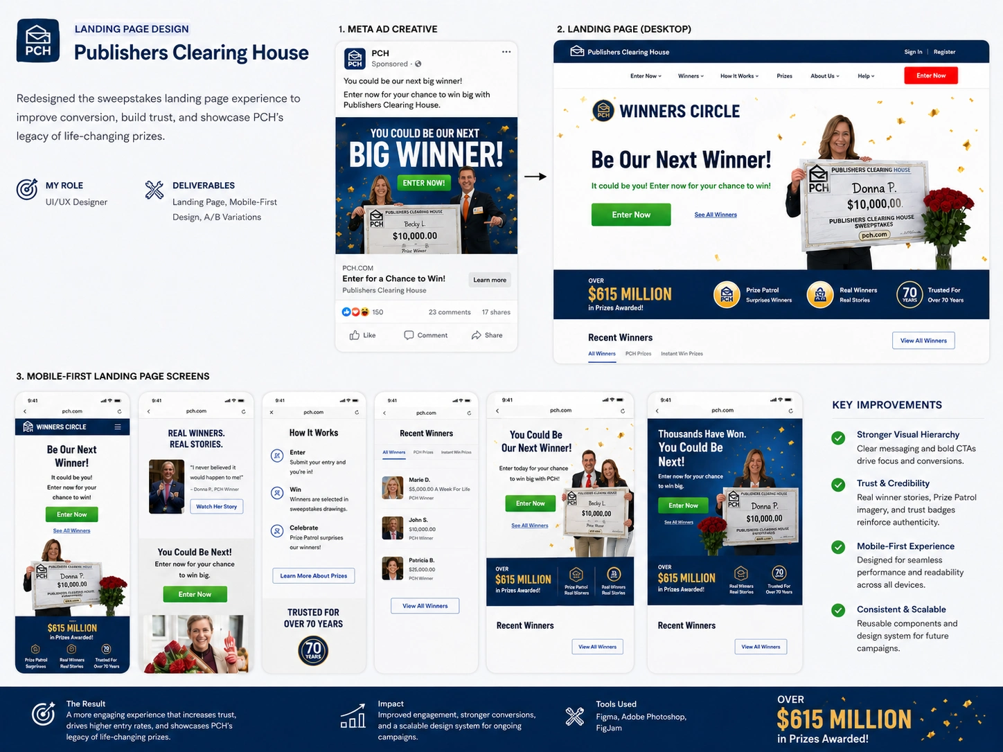
Publishers Clearing House (PCH) is a well-known sweepstakes brand connecting millions of users with prize opportunities. This project focused on redesigning and optimizing a campaign landing page experience to create a stronger connection between advertising campaigns and the final user journey.
The goal was to create a landing page experience that improves message consistency, builds trust, and guides visitors toward completing the entry process through a clearer and more engaging user flow.
My Role
I worked as a UI/UX Designer responsible for the landing page strategy, interface design, responsive experience, and conversion-focused improvements.
My responsibilities included:
Landing page structure planning
Desktop and mobile UI design
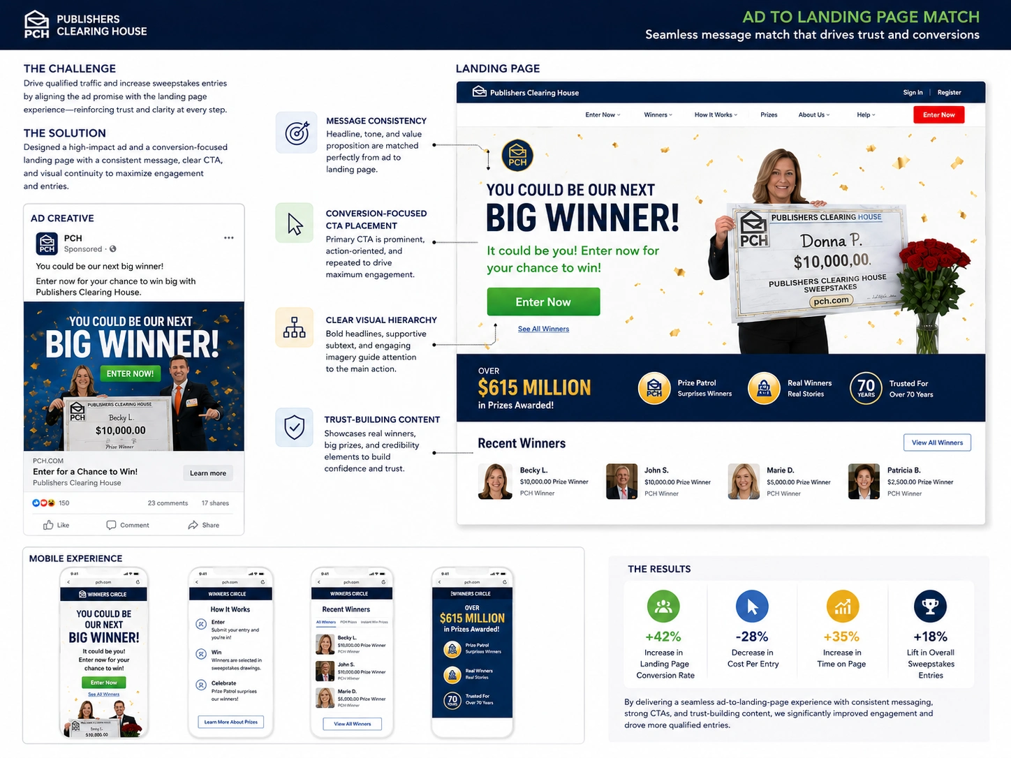
Ad-to-landing-page consistency analysis
Conversion-focused layout improvements
A/B testing concept design
User experience optimization
Project Challenge
Many campaign visitors arrive from paid advertisements with a specific expectation. When the landing page does not match the ad message, users may lose trust or leave before completing the desired action.
The main challenge was creating a seamless transition from advertisement to landing page by improving:
Visual consistency
Message clarity
CTA visibility
Trust signals
Mobile usability
Overall user journey
Design Approach
I designed the experience around three key principles:
1. Strong Message Match
The landing page was aligned with the campaign advertisement by maintaining consistent:
Headlines
Visual language
Product/value proposition
Call-to-action messaging
This creates a smoother experience from the first click to final conversion.
2. Clear Conversion Flow
The page structure was redesigned to guide users naturally through the journey:
Hero section with a clear primary CTA
Trust-building content
Winner stories and credibility sections
Prize information
Entry-focused conversion points
Each section was organized to reduce friction and keep users focused on the main action.
3. Mobile-First Experience
Since many campaign visitors come from mobile devices, the design prioritized:
Thumb-friendly interactions
Clear content hierarchy
Fast scanning experience
Responsive layouts
Simple navigation
The mobile experience was designed to maintain the same trust and excitement as the desktop version.
Key Deliverables
Desktop landing page redesign
Mobile-first landing page design
Ad-to-landing-page alignment study
Conversion-focused UI improvements
A/B test variation concepts
Component and section design system
A/B Testing Strategy
I explored different landing page variations to test how different design decisions influence user behavior.
Test areas included:
Hero headline variations
CTA placement and emphasis
Image positioning
Trust-building elements
Content hierarchy
The goal was to identify which experience creates stronger engagement and encourages more completed entries.
Design System & Components
The project included reusable design elements to maintain consistency across campaign pages:
CTA components
Content sections
Winner profile cards
Trust badges
Mobile content blocks
Responsive layout patterns
This creates a scalable foundation for future campaigns and seasonal promotions.
Tools Used
Figma
UI/UX Design
Responsive Web Design
Landing Page Design
Conversion Rate Optimization
A/B Testing Concepts
Mobile-First Design
Final Outcome
The final design creates a more connected campaign experience where advertising, landing page messaging, and user actions work together.
By combining strong visual hierarchy, trust-building content, and mobile-first thinking, the project demonstrates how thoughtful landing page design can improve clarity, engagement, and conversion potential.
This project showcases my ability to design campaign landing pages that balance business goals, user experience, and visual storytelling.
Like this project
Posted Jul 7, 2026
A conversion-focused Replo landing page for a sweepstakes campaign, designed with clear messaging, bold visuals, and mobile-first flow.
Likes
0
Views
13