M7 Modern Headwear Brand Development

Mcnove Pineda


M7 — Modern Headwear Brand Identity & Cap Design
Project Overview
M7 is a self-initiated headwear and lifestyle brand concept created to explore how a simple monogram can develop into a complete, commercially believable cap collection.
The goal was to create more than a logo placed on a cap. I wanted to build a recognizable visual identity that could work across embroidery, product variations, lifestyle campaigns, packaging, and future streetwear applications.
The final concept combines a bold M7 monogram, premium cap styling, a restrained color system, and the brand message:
Built for More.
My Role
I worked on the complete creative direction and product presentation, including:
Brand concept development
M7 monogram design
Visual identity direction
Cap graphic placement
Embroidery-focused logo adaptation
Color variation development
Front and side branding
Product presentation design
Lifestyle campaign direction
Packaging concept
Portfolio case study presentation
The focus was creating a modern headwear brand that feels confident, versatile, and ready for real-world fashion and merchandise applications.
Project Challenge
Many cap designs rely on standard initials or oversized logos without developing a clear brand personality.
The challenge was creating a simple symbol that could remain recognizable at different sizes while still feeling distinctive enough to support a complete lifestyle brand.
The identity needed to:
Look strong from a distance
Remain clear when embroidered
Work on different cap colors
Appeal to both men and women
Feel modern without following short-term trends
Support future apparel and accessory applications
Maintain consistency across product and campaign imagery
Brand Concept
M7 was developed around confidence, ambition, and forward movement.
The letter M and number 7 were combined into a single angular monogram. The geometry creates a sense of motion, while the sharp structure gives the symbol a strong and contemporary personality.
The brand message, Built for More, supports the idea that the product represents more than fashion. It communicates ambition, personal progress, and the confidence to keep moving forward.
Logo Design
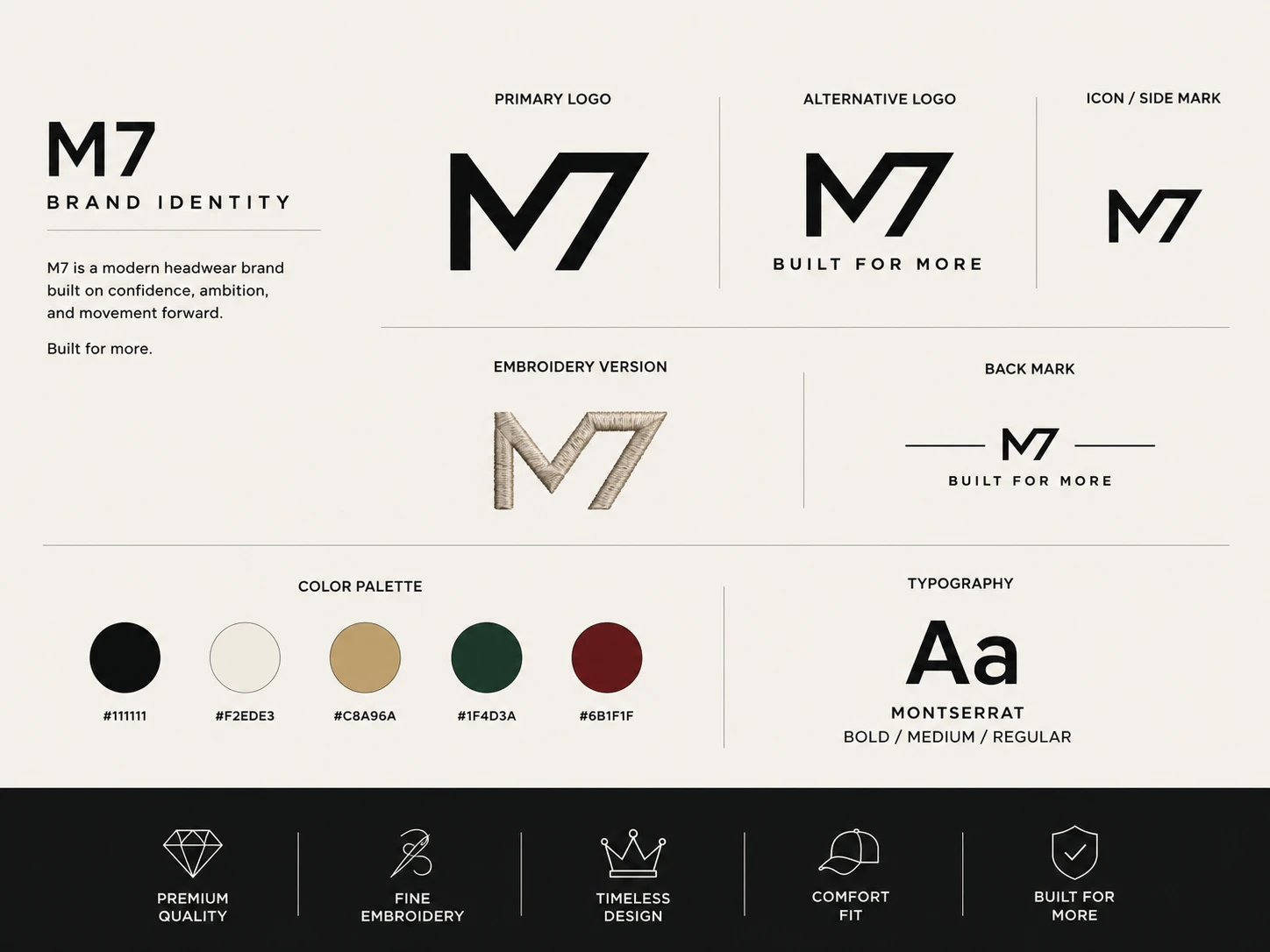
The M7 logo was designed as a compact monogram that can function independently without requiring the full brand name.
The identity includes:
Primary M7 monogram
Alternative logo lockup
Compact side mark
Embroidery-focused version
Back-cap branding treatment
Logo and tagline combination
The connected geometry allows the M and 7 to read as one unified symbol while remaining simple enough for small product applications.
Cap Design Direction
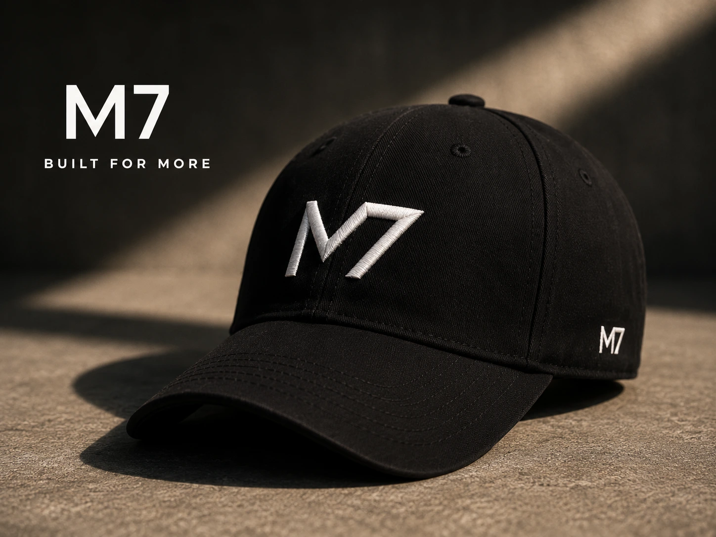
The primary cap uses a clean six-panel baseball-cap structure with the main M7 monogram positioned at the center of the front panel.
A smaller M7 symbol is placed on the side to create an additional premium detail without making the design feel overcrowded.
The product direction focuses on:
Minimal front branding
Structured visual balance
Premium raised embroidery
Subtle secondary logo placement
Clean stitching details
Versatile unisex styling
The result is a cap that can work as both a branded product and an everyday fashion accessory.
Embroidery Approach
The logo was developed with embroidery application in mind.
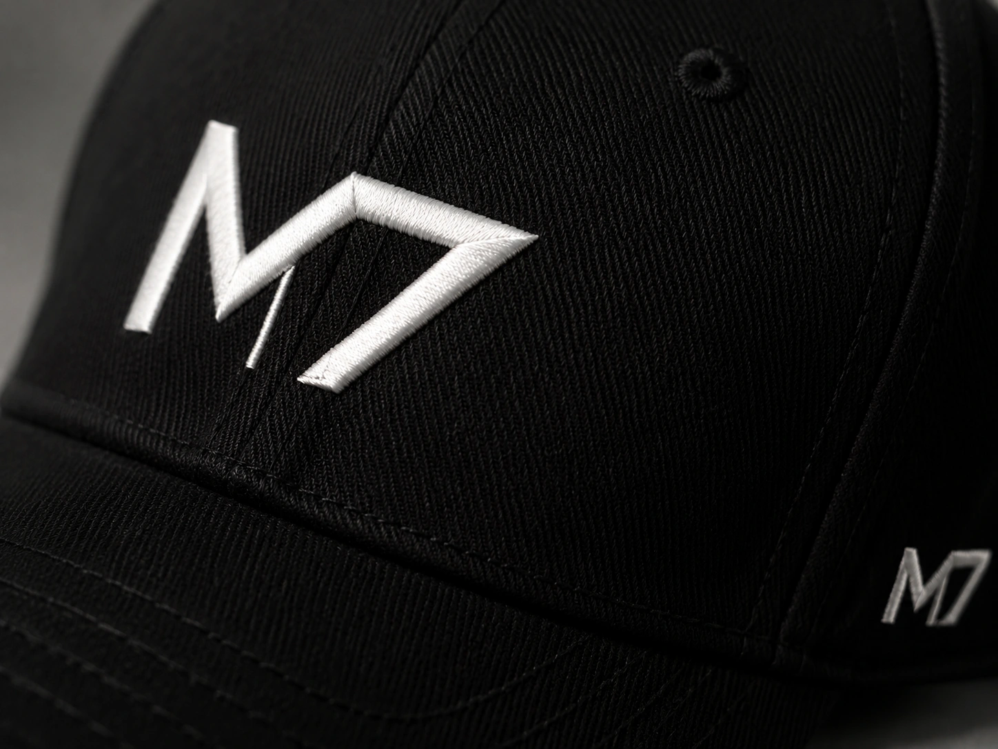
The design uses bold geometric forms and controlled spacing so the monogram remains recognizable when reproduced with thread.
The embroidery direction considers:
Clear letter construction
Practical line thickness
Strong contrast
Minimal internal detail
Small-size readability
Raised thread texture
Consistent stitching direction
The close-up product presentation highlights the thread texture, fabric weave, panel construction, and contrast between the embroidered logo and cap material.
Color System
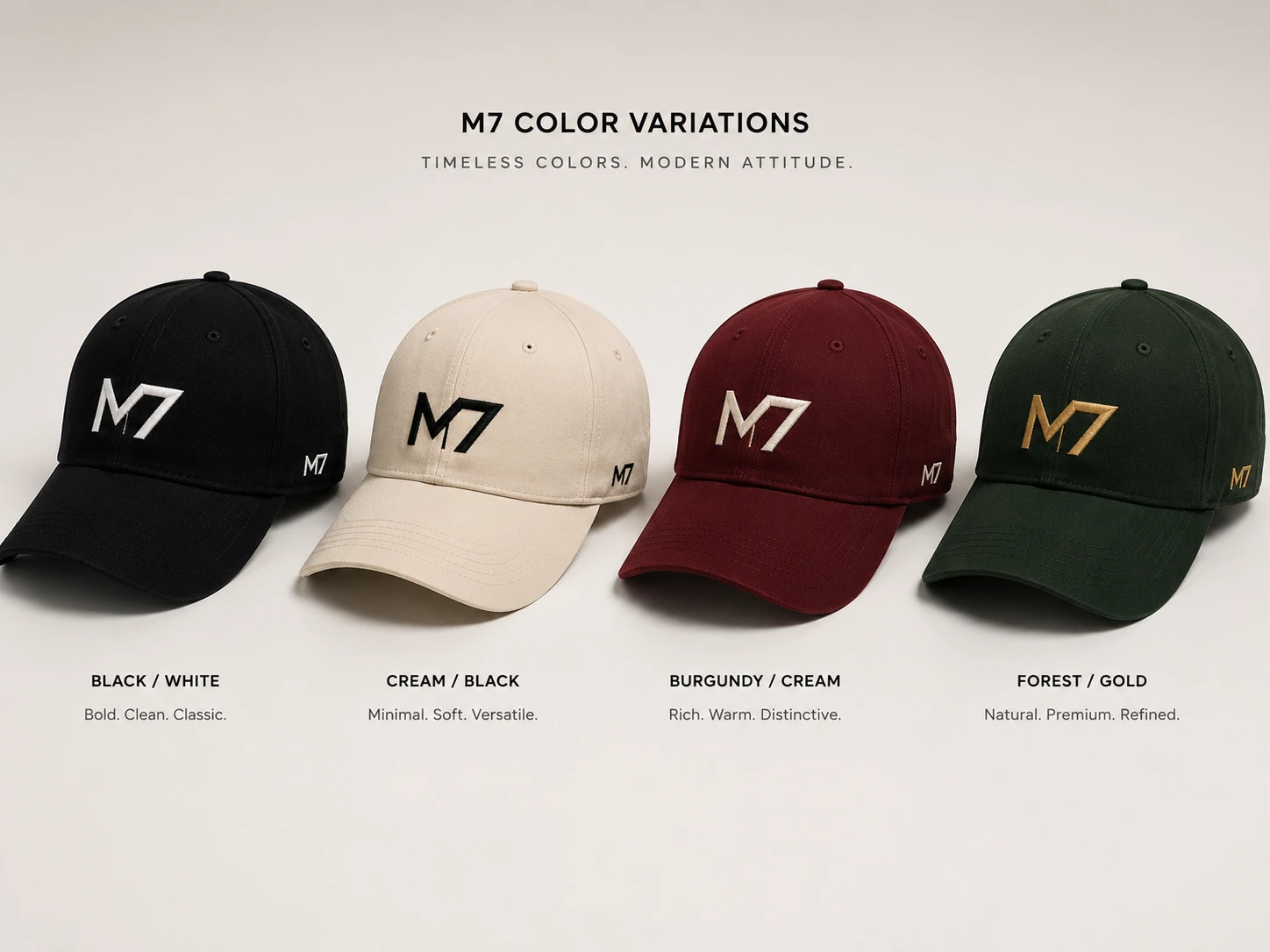
The collection was developed across four coordinated color combinations.
Black and White
A classic black cap with white embroidery.
This version feels bold, versatile, and timeless, making it the strongest core product in the collection.
Cream and Black
A soft cream cap with black embroidery.
The lighter color creates a minimal and lifestyle-focused variation suitable for neutral styling.
Burgundy and Cream
A deep burgundy cap with cream embroidery.
This version adds warmth and personality while maintaining the premium visual direction.
Forest and Gold
A dark forest-green cap with gold embroidery.
The combination creates a refined, distinctive, and elevated appearance.
Each color variation uses the same logo system, allowing the product line to expand without losing brand recognition.
Lifestyle Campaign Direction
The campaign imagery was created to show M7 as a wearable lifestyle brand rather than only a product mockup.
The visual direction uses:
Modern urban environments
Natural and cinematic lighting
Neutral architectural backgrounds
Minimal streetwear styling
Unisex product presentation
Relaxed and authentic expressions
Close product visibility
Individual female and male portraits demonstrate how the cap works across different personal styles.
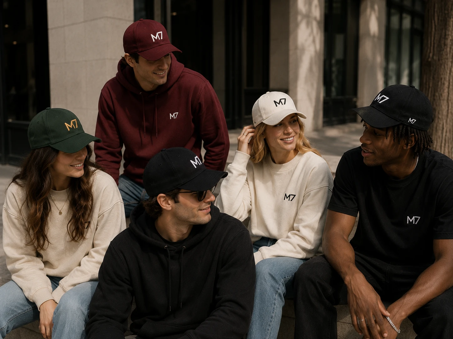
The group campaign image presents the collection as a shared identity, with different people wearing coordinated M7 color variations in a natural social environment.
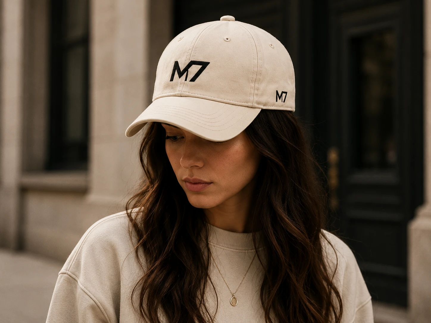
Female Lifestyle Presentation
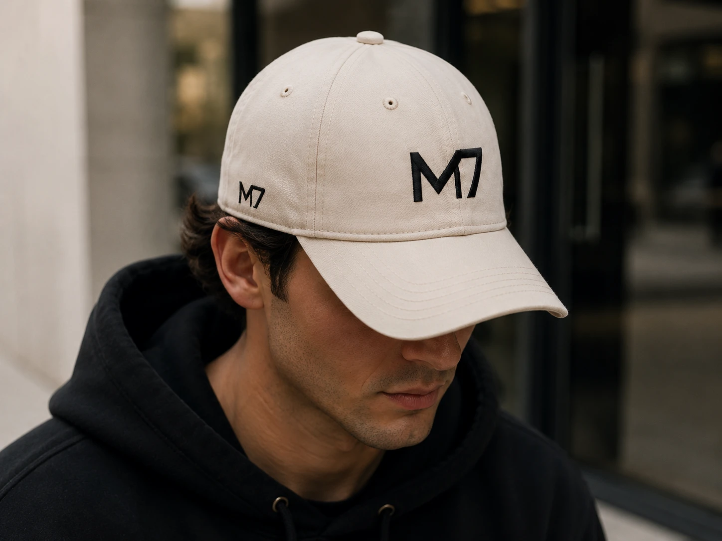
The cream M7 cap was paired with soft neutral clothing and an understated urban setting.
The light color combination creates a clean and approachable look while keeping the embroidered monogram clearly visible.
The styling demonstrates that the M7 identity can feel minimal, contemporary, and suitable for everyday womenswear.
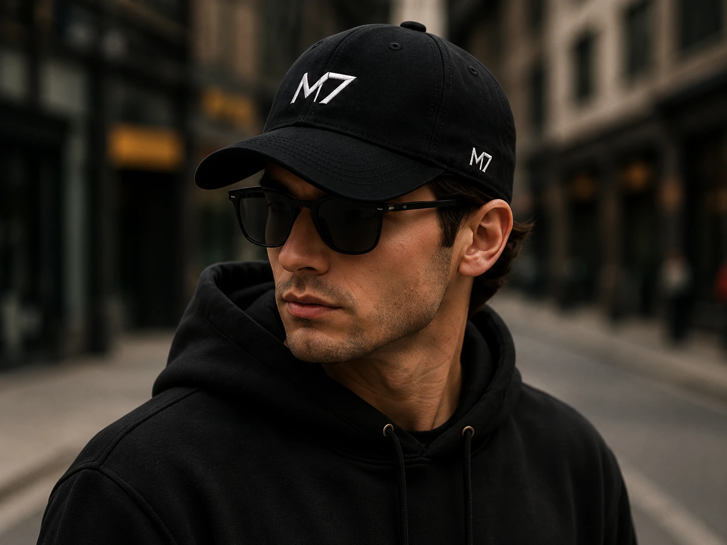
Male Lifestyle Presentation
The black and cream cap variations were presented through modern streetwear styling.
Black hoodies, sunglasses, neutral architecture, and controlled lighting create a confident visual direction without distracting from the product.
The cap remains the main focal point while the model and environment establish the lifestyle surrounding the brand.
Group Campaign
The group campaign image was designed to communicate community, diversity, and shared ambition.
Models wear different M7 cap colors and coordinated neutral clothing while interacting naturally in an outdoor urban setting.
This image helps transform the collection from an isolated product concept into a believable lifestyle campaign.
It also demonstrates how the four color variations can work together as one cohesive product family.
Product Presentation
The complete case study presents the M7 brand through a structured sequence:
Hero black cap
Brand identity system
Logo variations
Color palette
Four cap colorways
Female lifestyle image
Male lifestyle image
Group campaign image
Embroidery close-up
Additional product-focused imagery
This presentation allows viewers to understand both the visual identity and the commercial potential of the product.
Packaging Direction
The packaging concept extends the M7 identity beyond the cap itself.
The proposed system includes:
Premium branded box
Product hang tag
Thank-you card
Circular brand sticker
Minimal black and gold presentation
The packaging maintains the same confident and refined visual language used throughout the product collection.
This creates a more complete customer experience and makes the product suitable for ecommerce, gifting, and premium retail presentation.
Key Features
Custom M7 monogram identity
Modern unisex cap design
Embroidery-friendly logo construction
Primary and secondary branding placements
Four coordinated product colorways
Premium product photography direction
Female and male lifestyle campaign visuals
Natural group campaign presentation
Detailed embroidery close-up
Packaging and accessory concept
Consistent brand application
Scalable streetwear identity
Tools & Technologies
Adobe Illustrator
Adobe Photoshop
Figma
Logo Design
Brand Identity Design
Apparel Graphic Design
Embroidery Design Direction
Product Mockup Design
Campaign Art Direction
Packaging Design
Final Outcome
The final result is a complete headwear brand concept that combines a recognizable monogram with a strong product and lifestyle identity.
M7 demonstrates how a simple logo can grow into a cohesive visual system across embroidery, product colors, campaign photography, and packaging.
The project moves beyond a basic cap mockup by presenting the product as part of a believable modern fashion brand.
The restrained visual direction, unisex styling, and adaptable monogram create a foundation that could expand into additional caps, hoodies, T-shirts, accessories, and future seasonal collections.
M7 is more than a cap concept—it is a brand built around confidence, movement, and the ambition to become more.
This is a self-initiated portfolio project created to demonstrate my capabilities in brand identity, apparel design, merchandise presentation, and lifestyle campaign direction.
Like this project
Posted Jul 15, 2026
A modern headwear brand developed from concept to launch, including visual identity, product direction, and a cohesive brand system.