Chess for All Fundraiser T-Shirt Design

Mcnove Pineda


Chess for All — Nonprofit Fundraiser T-Shirt Design
Project Overview
Chess for All is a modern fundraiser T-shirt concept created for a nonprofit chess organization.
The objective was to design a shirt that supporters would genuinely enjoy wearing in everyday life—not something that feels like temporary event merchandise.
The design needed to combine a bold chess-inspired identity, the organization’s logo and messaging, and a clean apparel aesthetic while remaining fully optimized for single-color screen printing.
The final concept includes a large front hero graphic, a subtle back-nape treatment, and coordinated applications across white, coral, and teal shirts.
My Role
I worked on the complete apparel design concept, including:
Creative direction
Chess-themed illustration
Front graphic composition
Typography selection and hierarchy
Tagline integration
Back-nape artwork
Single-color print preparation
Shirt color adaptation
Print placement recommendations
Front and back mockup presentation
The focus was creating a visually distinctive fundraiser shirt that balances nonprofit messaging, modern apparel design, and practical production requirements.
Project Challenge
Many fundraiser shirts feel overly promotional, crowded, or closely connected to a single event. This often makes them less appealing to wear after the fundraiser ends.
The challenge was creating a shirt that could represent the organization while still feeling like a polished lifestyle product.
The design needed to:
Create a strong first impression
Communicate the chess theme immediately
Incorporate the organization’s identity naturally
Present the three-word tagline clearly
Remain clean and wearable
Work across three different shirt colors
Maintain strong contrast with only one ink color
Stay practical for screen-print production
Design Direction
The visual concept was built around the chess knight—a recognizable symbol of intelligence, strategy, movement, and unconventional thinking.
The knight became the central hero element of the design, supported by a structured badge composition containing:
A bold knight silhouette
An arched geometric frame
A crown symbol
Subtle diamond detailing
Establishment-date elements
Strong condensed typography
A pointed lower badge structure
The vertical composition gives the graphic a confident presence on the shirt while keeping the artwork balanced and easy to read.
Instead of creating a busy illustration filled with multiple chess pieces, the concept focuses on one memorable symbol and a clear visual hierarchy.
Typography and Messaging
The organization name, Chess for All, is positioned as the main typographic anchor beneath the knight illustration.
A bold condensed type style was selected to make the design feel modern, confident, and suitable for apparel.
The three-word tagline—
Think. Play. Grow.
—communicates the educational and developmental value of chess in a simple and memorable way.
The messaging supports the nonprofit mission without making the shirt feel overly corporate or promotional.
Front Hero Graphic
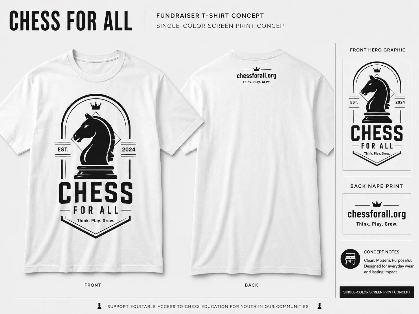
The front of the shirt features the complete chess badge composition.
The knight acts as the primary focal point, while the surrounding geometric details create structure and help guide attention toward the organization name and tagline.
The design was intentionally developed as a large centered chest graphic to maximize visibility and give the shirt a strong visual identity.
The front artwork combines:
Chess knight illustration
Organization name
Three-word campaign tagline
Geometric badge framework
Crown detail
Establishment date
Strong typographic hierarchy
The result is bold enough to attract attention while remaining clean enough for regular everyday wear.
Back-Nape Design
The back of the shirt uses a small centered print positioned below the collar.
This secondary treatment includes:
The organization’s website
A small crown symbol
Minimal horizontal detailing
The three-word tagline
The nape placement keeps the back of the shirt clean while providing an additional branded detail.
This approach makes the shirt feel more like modern apparel and less like traditional event merchandise with oversized graphics on both sides.
Single-Color Printing Approach
The complete design was developed specifically for one-color screen printing.
The artwork uses:
Solid graphic shapes
Clean outlines
Strong negative space
Practical line thicknesses
High-contrast typography
Simplified production-friendly details
Gradients, shadows, photographic effects, and excessively thin lines were avoided within the printable artwork.
This helps ensure the graphic remains clear and recognizable when transferred from the digital design to the final garment.
Using one ink color also keeps production more efficient and cost-effective for a nonprofit fundraising campaign.
Shirt Color Adaptations
The concept was adapted across three shirt colors while maintaining one consistent design system.
White Shirt
The white shirt uses black ink for a classic, high-contrast appearance.
This version feels timeless, versatile, and easy to combine with everyday clothing.
Coral Shirt
The coral shirt uses white ink to create a fresh, energetic, and highly visible result.
The lighter artwork contrasts strongly against the warm shirt color while preserving the same graphic identity.
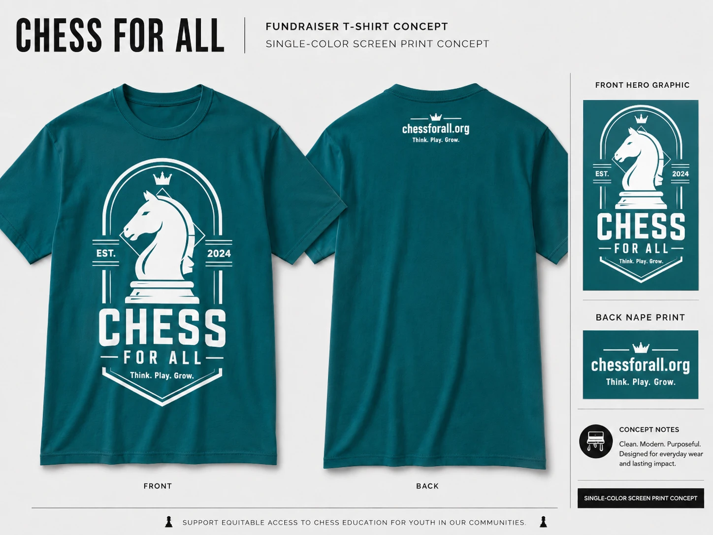
Teal Shirt
The teal shirt also uses white ink, creating a confident and premium appearance.
The deeper shirt color helps the knight illustration and typography feel especially bold and recognizable.
Each version uses the same artwork, allowing the organization to produce multiple shirt colors without developing separate designs.
Layout and Placement
The front artwork is designed to be centered across the chest.
A recommended print width of approximately 11–12 inches would create strong visual impact while remaining balanced across common adult shirt sizes.
The top of the graphic should begin approximately 2.5–3 inches below the collar.
The back-nape artwork should remain small and centered approximately 1.5–2 inches below the back collar.
This placement provides brand visibility without making the back design feel distracting or oversized.
Mockup Presentation
The concept was presented through coordinated front and back apparel mockups.
The presentation demonstrates:
Overall shirt appearance
Front graphic scale
Back-nape positioning
Contrast across different shirt colors
Single-color ink application
Artwork consistency
Realistic garment placement
Separate close-up views were also created to show the front hero artwork and back-nape treatment more clearly.
Key Features
Original chess-themed apparel concept
Bold knight hero illustration
Modern badge-style composition
Three-word campaign tagline
Large centered front print
Minimal back-nape branding
Single-color screen-print optimization
White, coral, and teal shirt variations
High-contrast ink applications
Production-focused graphic construction
Front and back mockups
Placement and layout recommendations
Tools & Deliverables
Adobe Illustrator
Adobe Photoshop
Apparel Graphic Design
Vector Illustration
Typography Design
Screen-Print Preparation
Mockup Design
Print Placement Planning
Final deliverables for production would include:
Editable AI artwork
EPS vector files
Print-ready PDF files
Separated one-color artwork
Front hero graphic
Back-nape artwork
Shirt color mockups
Placement reference sheets
Final Outcome
The final result is a bold nonprofit fundraiser T-shirt concept that combines modern apparel design with practical single-color production.
The shirt communicates the chess theme immediately, presents the organization’s mission clearly, and maintains a strong visual identity across all three garment colors.
Rather than feeling like temporary event merchandise, the concept is designed to feel like something supporters could continue wearing regularly.
This allows each shirt to serve both as a fundraising product and as an ongoing source of visibility for the organization—turning supporters into natural ambassadors whenever they wear it.
This was developed as a self-initiated portfolio concept. The organization name, website, date, and tagline are presentation placeholders that can be replaced with the client’s official brand assets.
Like this project
Posted Jul 15, 2026
A fundraiser T-shirt design for Chess for All, created to support its nonprofit mission through a bold, accessible visual concept.