Making Pipedrive's app panels actionable

Rock Gomes

Pipedrive - Interactive panels
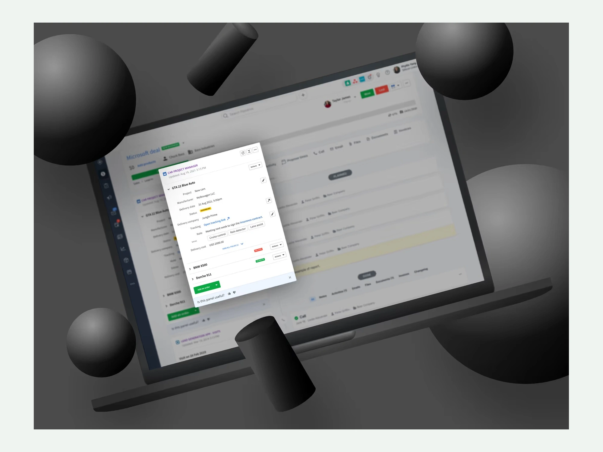
App panels show data from third-party integrations inside Pipedrive. Before this project they only showed it. If you wanted to act on what you were looking at, you left. I redesigned them to be interactive, and defined patterns any Marketplace partner could adopt.
The problem
Panels were useful context and nothing more:
Mostly read-only and passive
Actions were hard to discover, or not visible at all
Simple tasks meant leaving the panel
Integrations felt bolted on rather than part of the workflow
Internal data made it concrete: only around 30% of users found the available actions before release. An integration nobody can act on is an integration nobody values, which made this a Marketplace problem rather than a UI one.
Exploration
The question wasn't what a button should look like. It was where an action belongs relative to the data it acts on, and whether one answer could serve every partner in the Marketplace. I worked through panels, detached modals, and collapsed object states, weighing each against the technical constraints of app schemas.
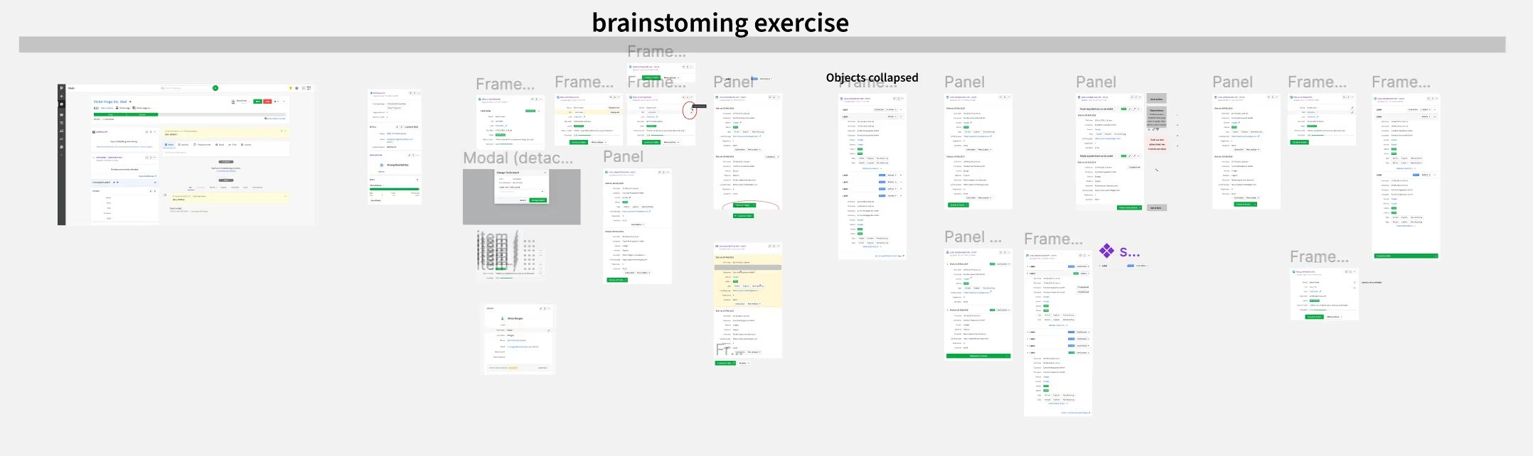
Exploration: panels, detached modals, and collapsed object states, testing where an action could live in each.
The principles
Action close to data: actions live where people already look
Progressive disclosure: key actions first, secondary ones on request
Consistency across apps: the same interaction regardless of integration
Scalability: it has to hold for many partners and use cases
Three levels of action
Object-level actions in the panel header. Field-level actions next to individual fields. Global actions grouped under one main button. Three levels, so a partner can expose a lot of functionality without the panel becoming a wall of buttons.
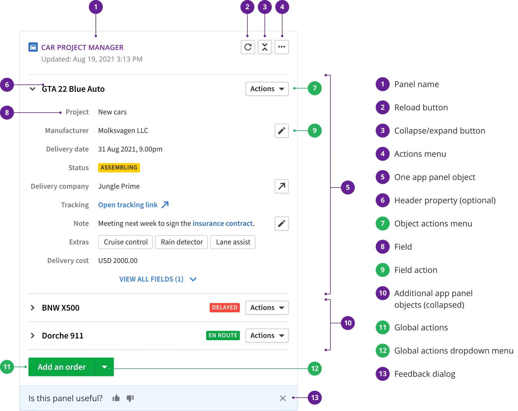
The interaction model: object actions in the header, field actions beside individual fields, and global actions under one button.
Prototyping the motion
I built animated prototypes in Figma to show how the interactions behave, align designers, product managers and engineers, and surface edge cases before development. Most of these changes are small, and motion is how you tell whether small still reads as clear.
Animated prototype built in Figma, used to align design, product and engineering before development.
Outcome
Action discovery rose from roughly 30% to around 50% within the first month
Integrations that adopted the new patterns saw action usage above 68%
Panels became an active part of the workflow rather than a display surface
The patterns then fed into the guidelines given to Marketplace partners, so the model kept spreading after release.
Like this project
Posted Aug 3, 2026
Turned Pipedrive's read-only integration panels into interactive ones. Action discovery went from ~30% to ~50%; adopting integrations saw 68%+ usage.