Rebuilding Inbank's customer service back-office

Rock Gomes


Inbank - Customer Service Back-office
The tool Inbank's support agents used all day had been built up incrementally for years, without a design system or a shared structure. In 2024 the company restructured and added products, and the back-office couldn't absorb them. I rebuilt it as the company's first in-house designer.
The problem
The existing back-office had grown one feature at a time, each added by whoever needed it:
Navigation and UI patterns differed from screen to screen
Workflows were hard to learn and easy to misuse
Nothing was reusable, so every new feature was built from scratch
Growing product complexity made each addition riskier than the last
This is a tool people sit in all day. The cost showed up as slower resolutions and longer onboarding for new agents.
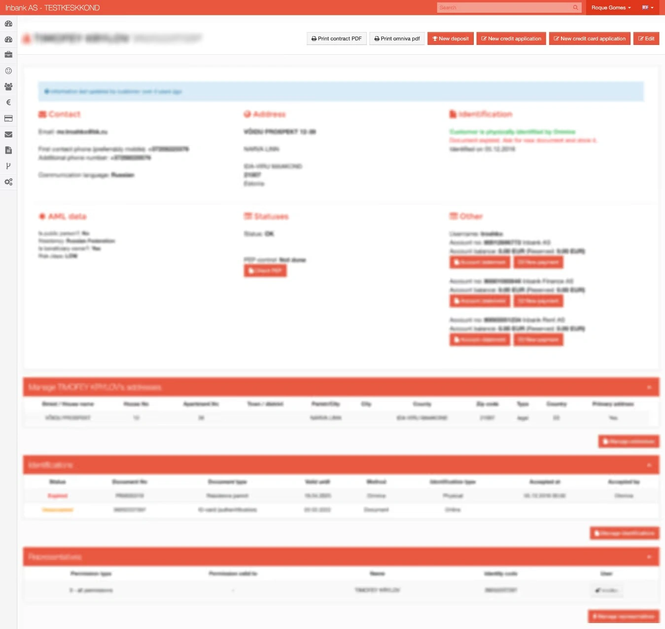
The back-office as it was. Every section shouts at the same volume, and nothing tells an agent where to look first.
Auditing what was already there
I mapped every screen, table, state and interaction in the existing system, colour-coded by what each element actually is - action, table, pop-up, state, filter. Seeing the whole thing at once is what made the repetition countable rather than anecdotal.
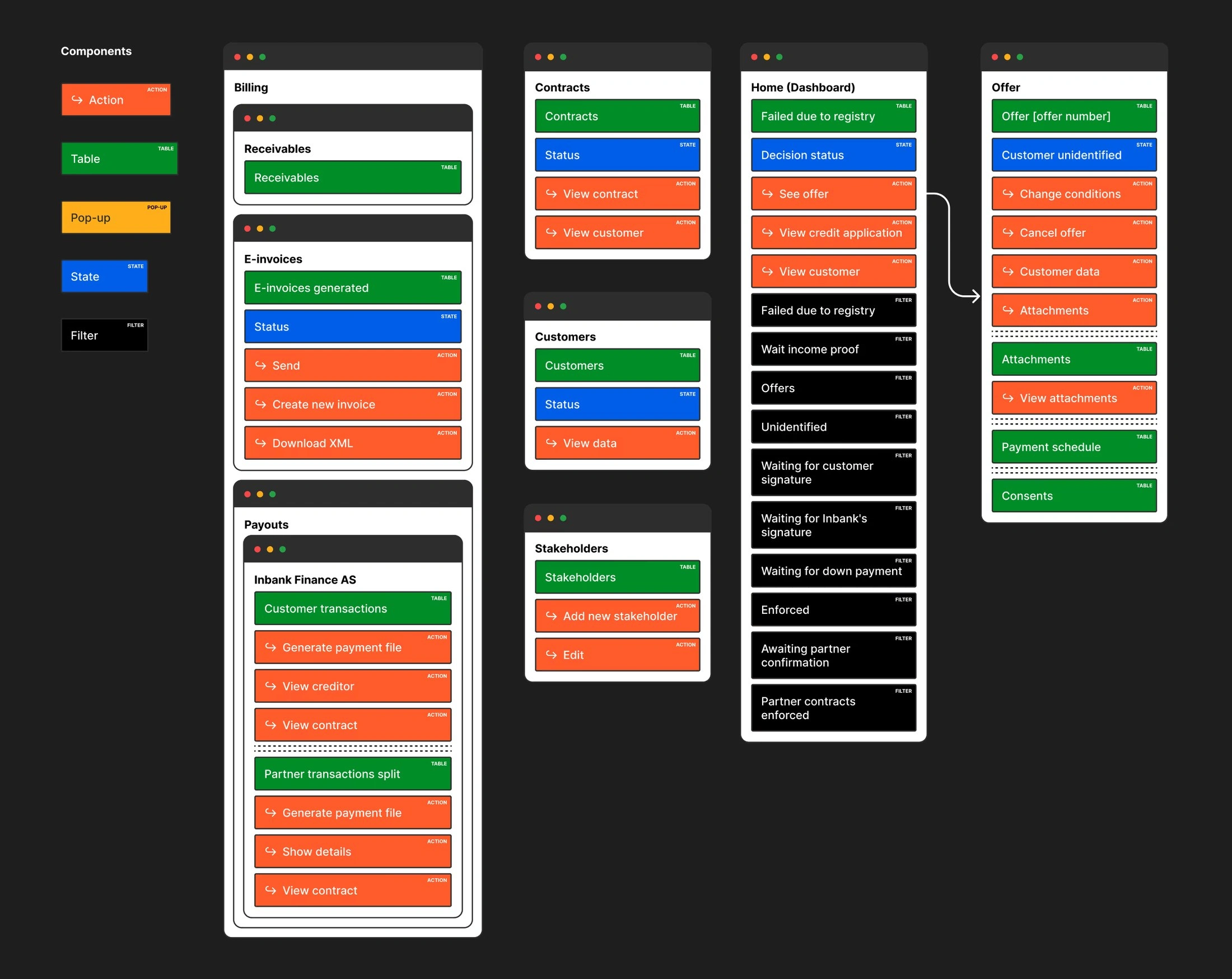
The full system audit. Every element classified by type - action, table, pop-up, state, filter - which is how the duplication became countable.
Talking to the people in it
Then interviews with the agents using it daily, the team leads monitoring performance, the product managers defining requirements, and the developers maintaining it. Mixpanel data showed which screens and actions actually get used. The interviews told me what hurt; the data told me what to fix first.
Setting the visual direction
Before designing screens I set the tone - hierarchy, density, and how much the interface should assert itself in a tool someone stares at for eight hours - aligned to Inbank's new visual identity.
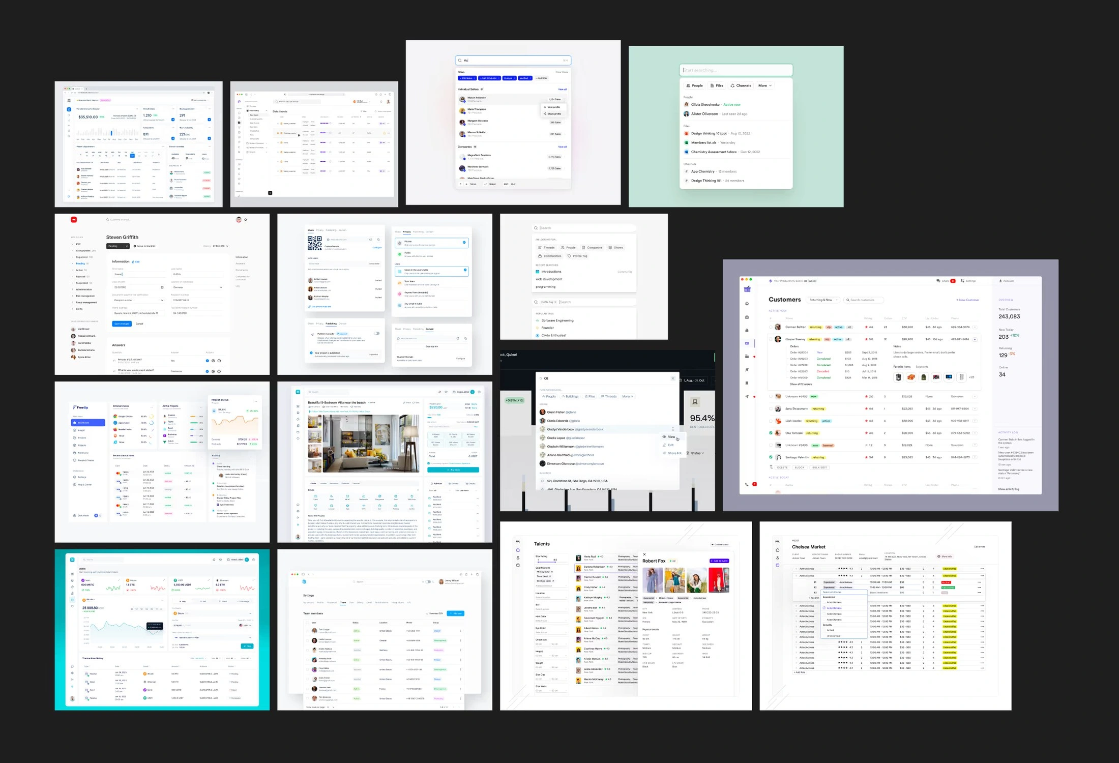
The reference moodboard I used to agree tone and density before any screens existed. These are external products, collected as direction.
A modular system
I explored the most critical screens against clear data hierarchy, table scanability, error prevention, and speed for daily use, reviewing early versions with agents to check the layouts matched how they actually think. What came out was a set of reusable blocks: customer data blocks, status indicators and badges, action panels and sidebars, and consistent search, filter and sort patterns.
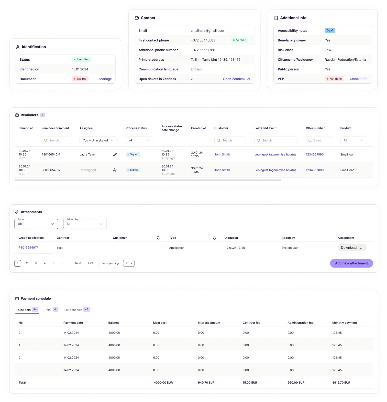
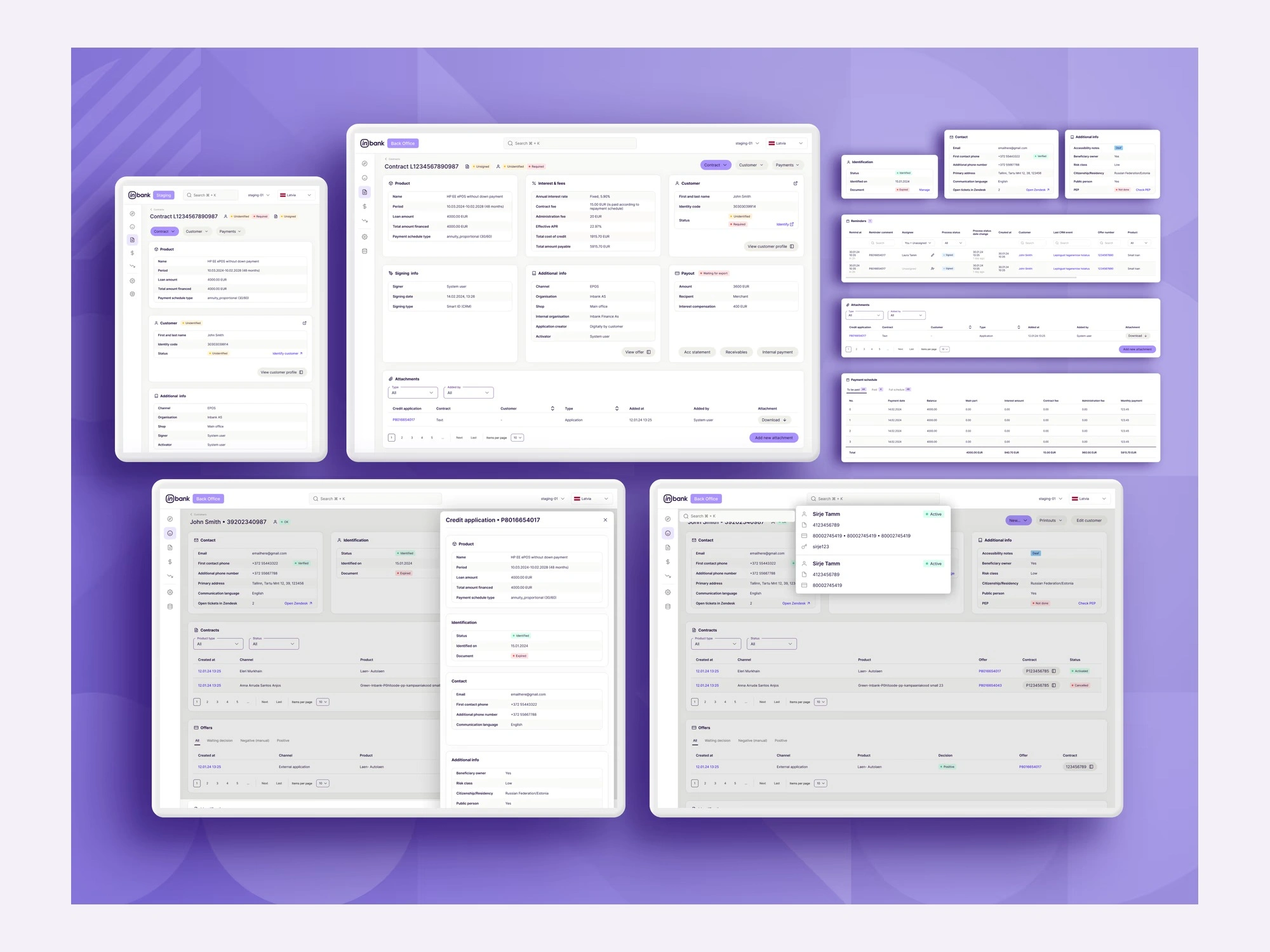
Modular blocks - detail cards, reminders, attachments, payment schedules - that recombine per product instead of being rebuilt each time.
Outcome
Faster workflows through predictable layouts and patterns
Easier onboarding for new support agents
A shared design system that speeds up everything built after it
Better visibility for managers and operational teams
Several key screens shipped, including flows built for newly launched product lines
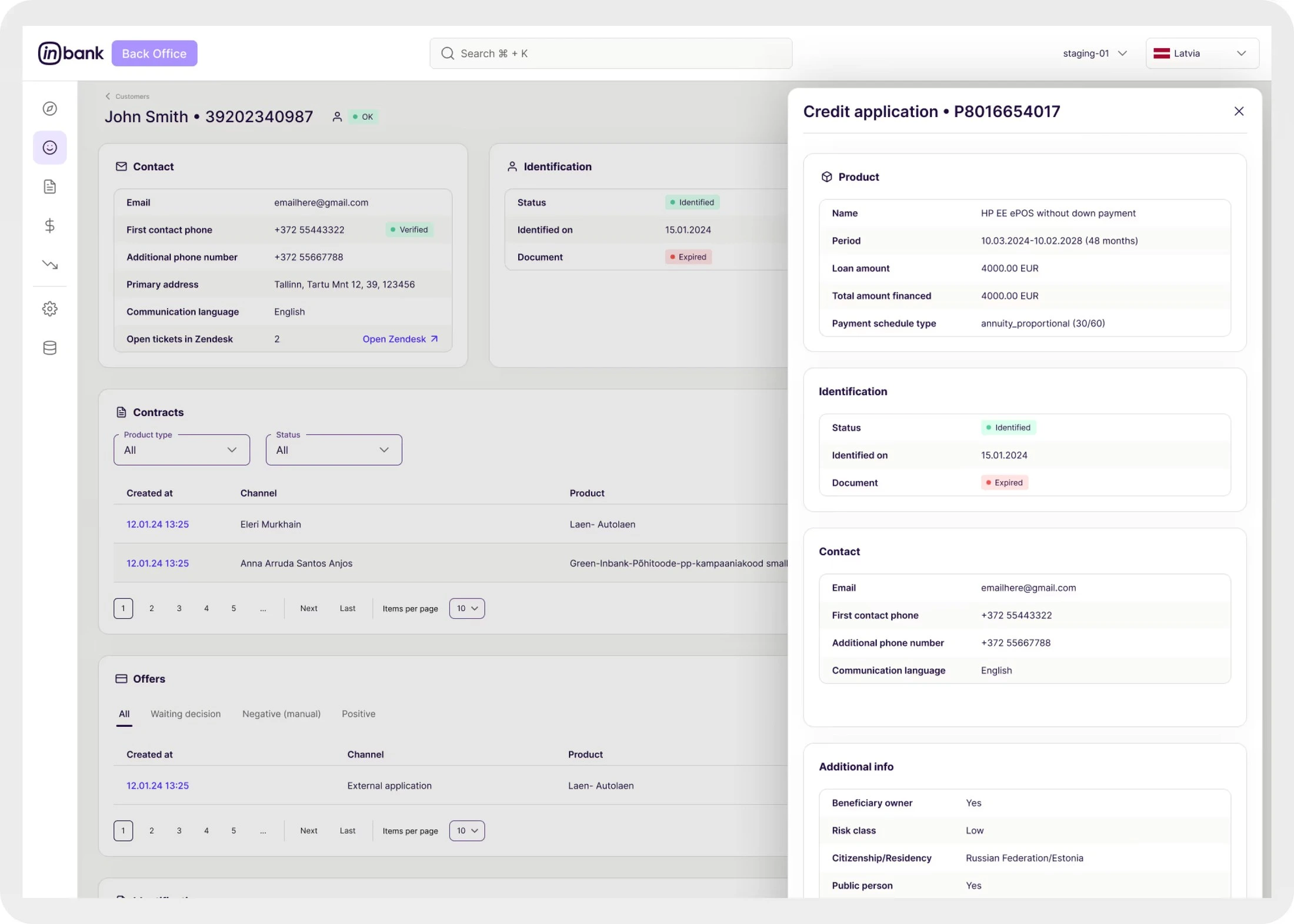
The rebuilt customer view, with a credit application opening in a side panel instead of a separate page.
Like this project
Posted Aug 3, 2026
Rebuilt Inbank's internal customer service back-office from the ground up to support new hire-purchase products and scale agent and manager workflows.
Likes
0
Views
2
Clients
Inbank