Rebuilding Inbank's Hire Purchase flow across four markets

Rock Gomes

Inbank - Hire-purchase flow
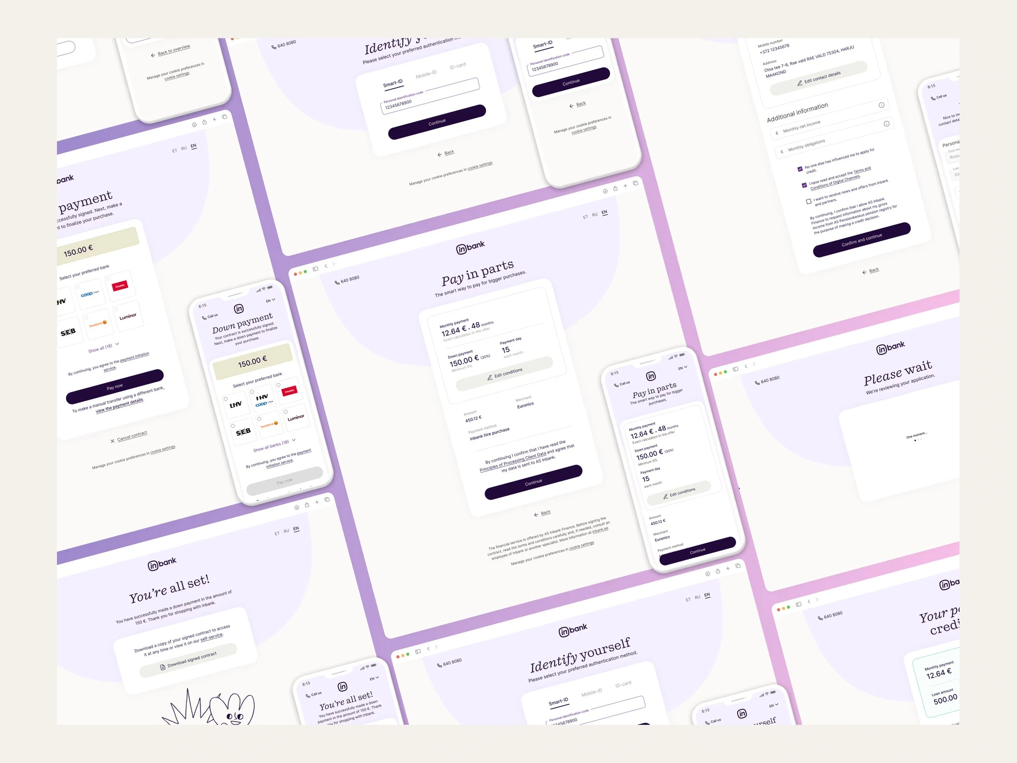
Inbank's Hire Purchase lets someone buy now and pay over time. When I joined as their first in-house designer, the same product looked and behaved differently in every market and on every device. I rebuilt the flow mobile-first, on patterns that hold across four countries and their separate legal requirements.
The problem
The flow wasn't one product, it was a chain. A customer starts on a merchant's site, identifies themselves with a country-specific method, gets an offer, signs, and pays a deposit - while partner portals and back-office systems react at each step. Each link had been built at a different time by a different team.
Layouts and components differed between markets, and between mobile and desktop
The financial figures people actually decide on competed with everything else on the screen
Each country's legal requirement had been solved locally, so one idea existed in four incompatible versions
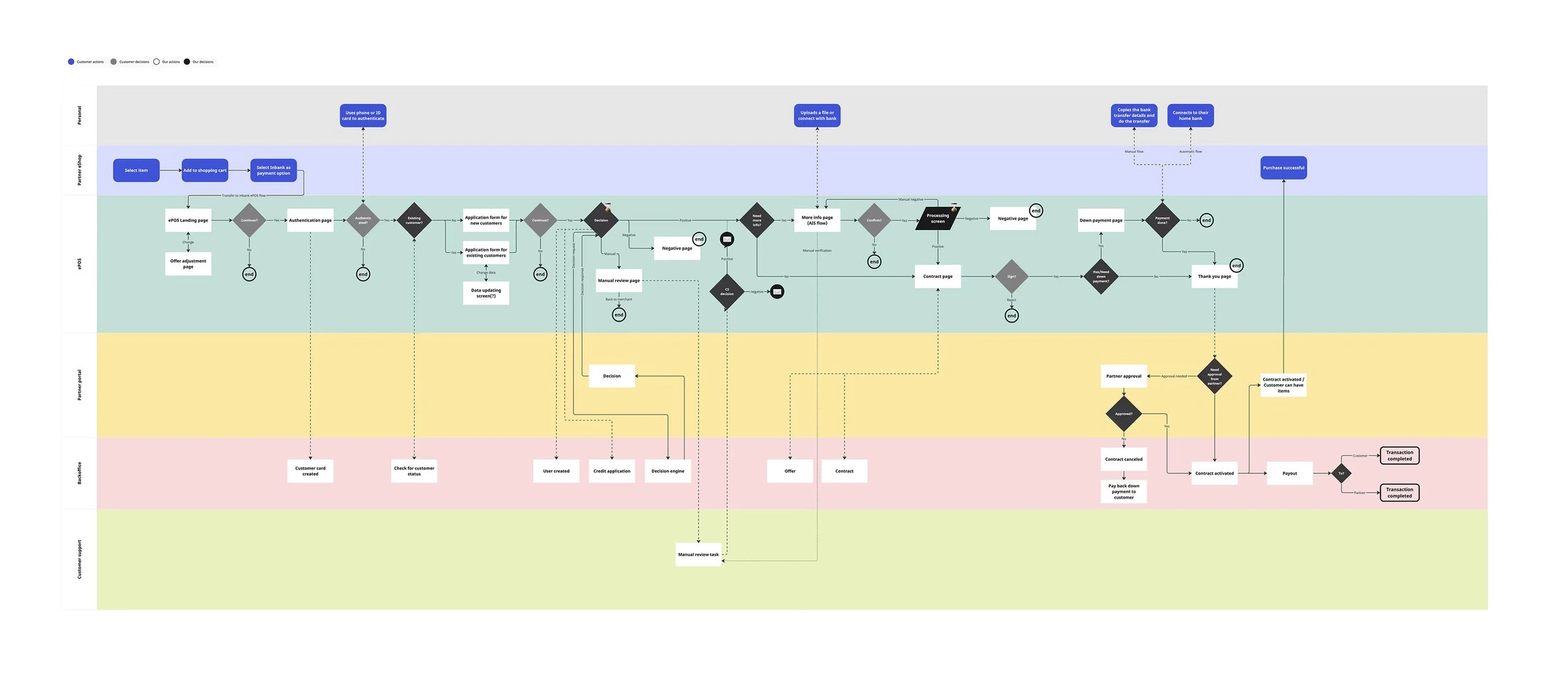
The full ePOS flow mapped across every actor, from merchant checkout to payout. Seeing it end to end is what made the duplication arguable.
Mapping before designing
I mapped the whole application flow across devices, systems and actors before touching a screen, then worked through it with product managers and analysts: country-specific legal constraints, data dependencies and edge cases, and the points where new and returning customers diverge. Fragmentation is easy to dismiss in the abstract and impossible to ignore on a wall.
Putting the numbers first
On the landing and summary screens the decision is financial: how much per month, for how long, how much down. I rebuilt the hierarchy around that. The payment figures lead, related information is grouped, and colour is reserved for the action that moves someone forward instead of being spread across the page.
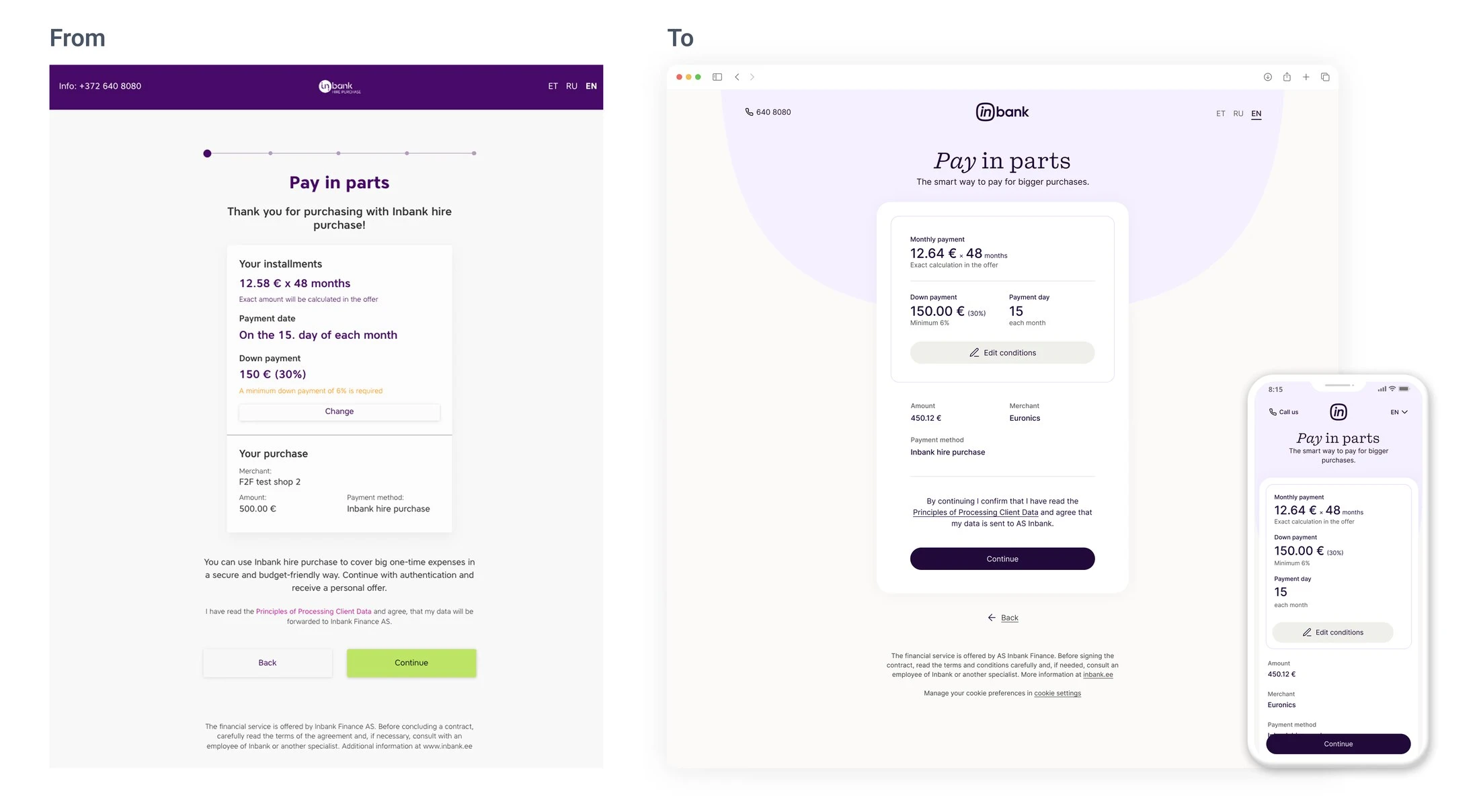
Before and after on the summary screen. The same information, reordered around the decision the customer is actually making.
Patterns, not screens
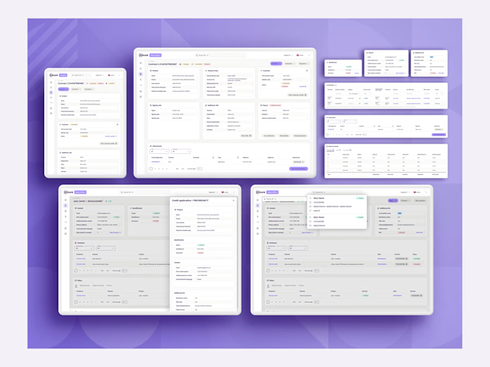
Instead of designing each screen, I designed the blocks the flow is assembled from. One summary card absorbs a down payment, a rental period, a changed amount, or none of them. One contact block covers its own variants. The product logic can vary without fragmenting the interface.
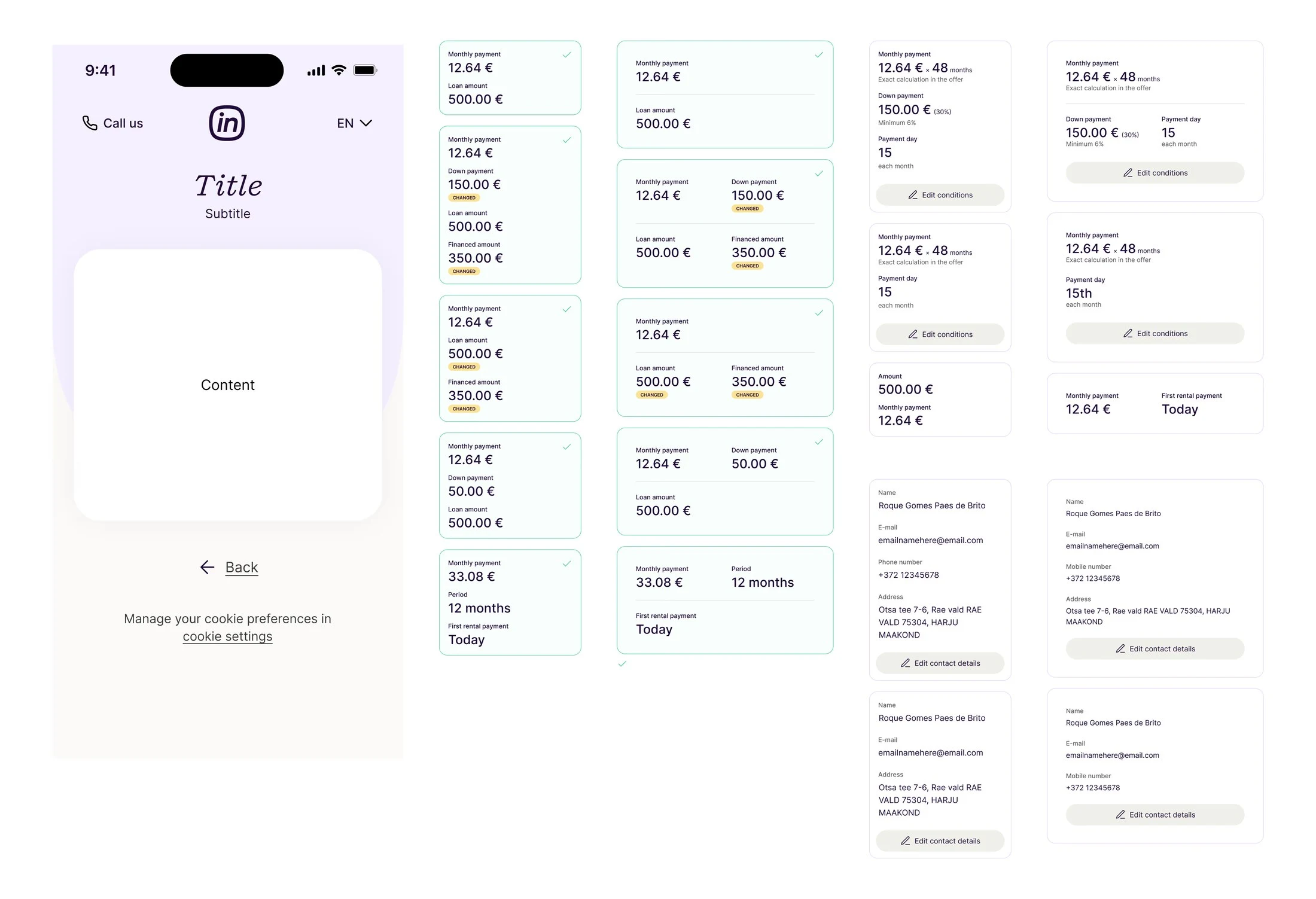
Variants of the summary and contact blocks. One component handles different offer types, changed values, and edge cases.
Where the markets differ
Legal and compliance requirements differ by country, so the flow branches - Estonia's AIS route, different identification methods, different rejection reasons. I designed those as variations inside one shared structure rather than as separate flows, which cut duplication for engineering and kept the experience coherent across markets.
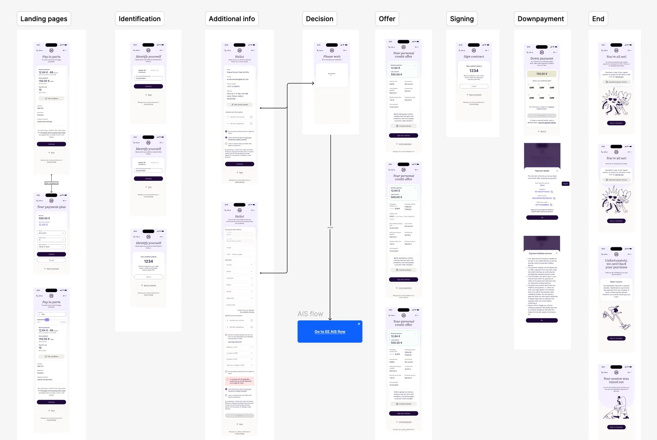
The flow by stage - landing, identification, additional info, decision, offer, signing, down payment, end - including the branches for AIS, rejection and timeout.
Outcome
A consistent, accessible journey across devices and all four markets
Notably clearer on mobile, which is where most of this traffic lives
Less friction for returning customers
Patterns that hold up for future products and markets
Components and principles that became part of Inbank's design system
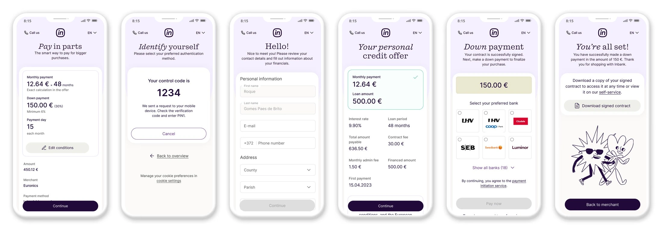
The shipped mobile flow, from offer through identification and signing to confirmation.
Like this project
Posted Aug 3, 2026
Rebuilt Inbank's buy-now-pay-later checkout across 4 markets. Mobile-first, regulation-ready, and built on a design system I created and shipped.