Cognito Education | Empowering EdTech
I worked briefly with Cognito to help them understand possible pain points intro acquiring new users on their EdTech platform. Cognito is aimed at UK students aged 11-18, but primarily focuses on helping those studying for their GCSEs. I utilised my experience and insights attained during previous work for James May Theory Test app as well as my time in the loyalty and growth team at Dermatica, as my proposed solutions for them was to deliver a new onboarding experience that would capture and engage potential new users during sign up, in a way that felt organic and personalised to their individual needs.
UX review
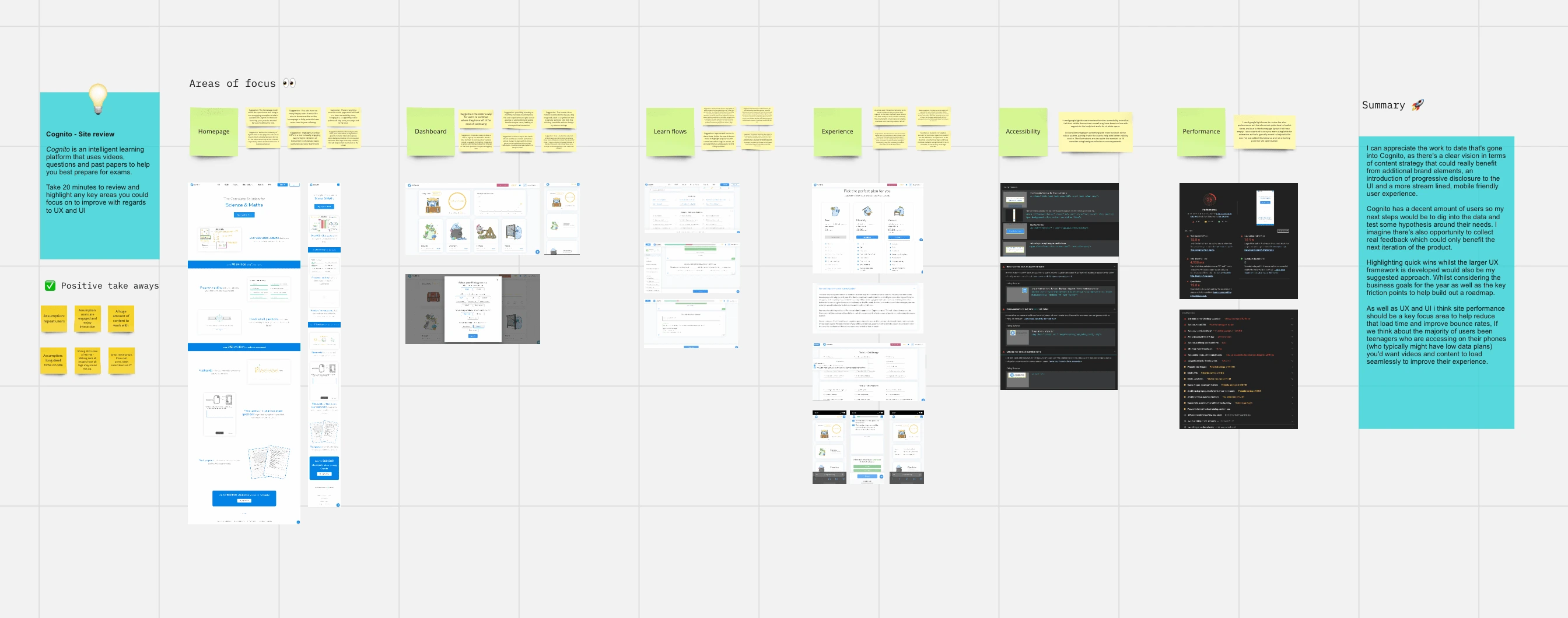
As this project was focusing around flow and friction of users i conducted an audit of the key points of the website, such as homepage, sign up/login, dashboards and some of the lesson plans themselves as these were all likely important areas when considering first impressions of Cognito and their offering. It was worth noting during this review that the majority of content scored poorly when it came to accessibility and there was also a number of performance issues due to the wealth of content available at a page level. I summaried this review by providing quick wins as well as potential longer term pieces of work to help optimise the experience overall.
The ask from Cognito based on the above was to focus more on the Sign up and dashboard flow as they felt this is where the main issues were for them. I ran a whiteboarding session in figjam where we talked through top level ideas and had chance to talk through things as they come up during quick ideation. It was clear that they were basing a lot of their solutions on guesswork as there was nothing set up in order to track customers throughout the site let alone measure the success of the users. I strongly suggested implementing some sort of tracking on the current site in order to give us a strong base to work with, or even adding a user survey after a lesson or quiz to capture quick insights.
Wireframe iteration
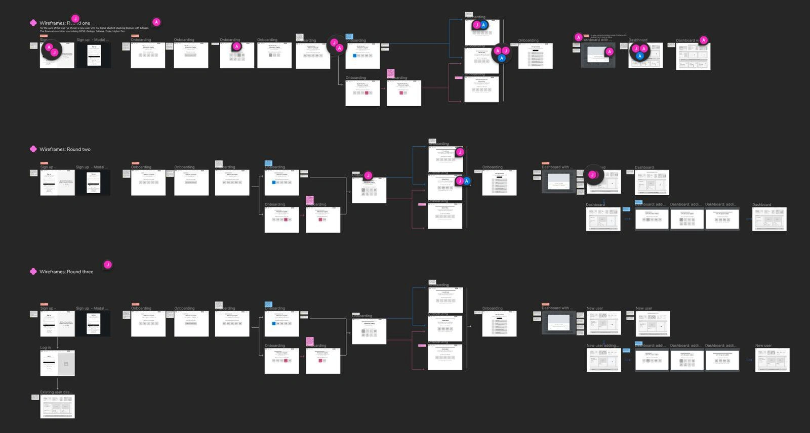
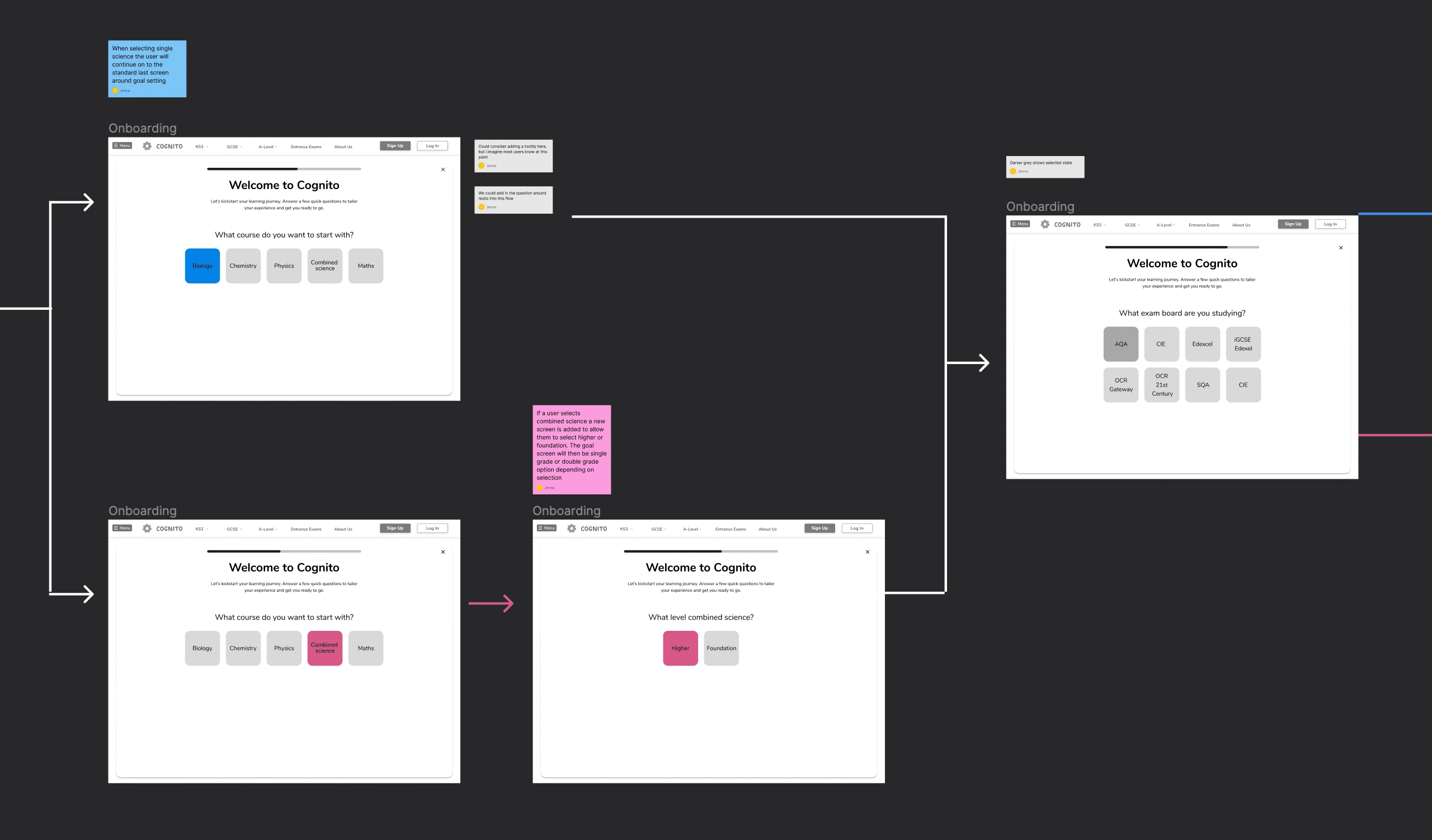
I then created a series of wireframes proposing a new onboarding flow to new users. Currently there's a really convoluted way of signing up and hitting a dashboard with no clear way-finding that then requires you to select from a number of options around exam board, level, subject and award type before you can start. It's overwhelming, not considerate of time and doesn't really explain anything as it goes. With this onboarding you select all this before you are dropped into a dashboard with your current subject all ready for you get started with the correct award type, exam board and level.
There was also an introduction of a how it works modal so once they land on the dashboard it should feel familiar to them. My goal here was to protect the users from cognitive overload as much as possible, as this period of time is already intense when it comes to recalling information and gearing up for exams. The intention was to make it feel natural, friendly and supportive.
Example of branches in user flow
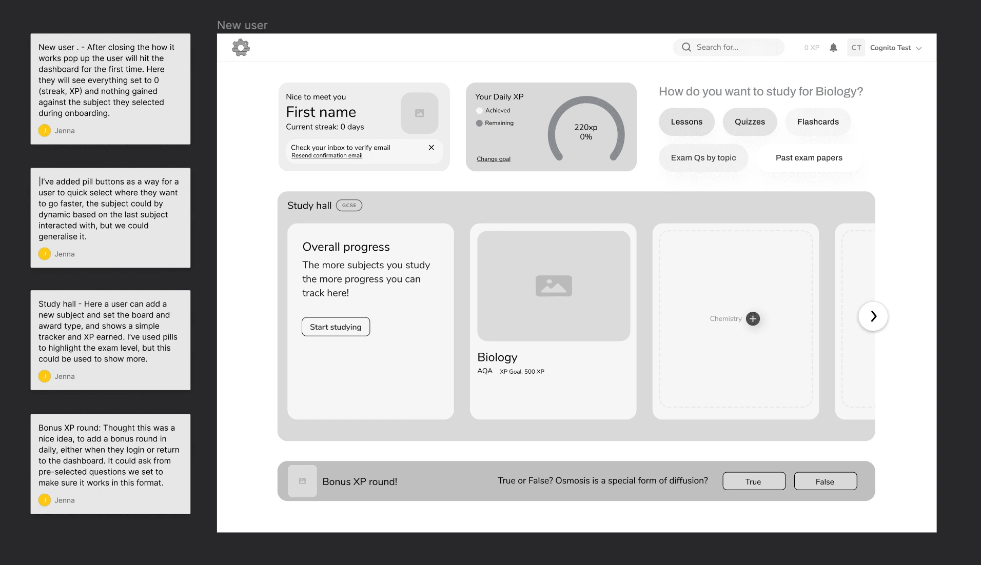
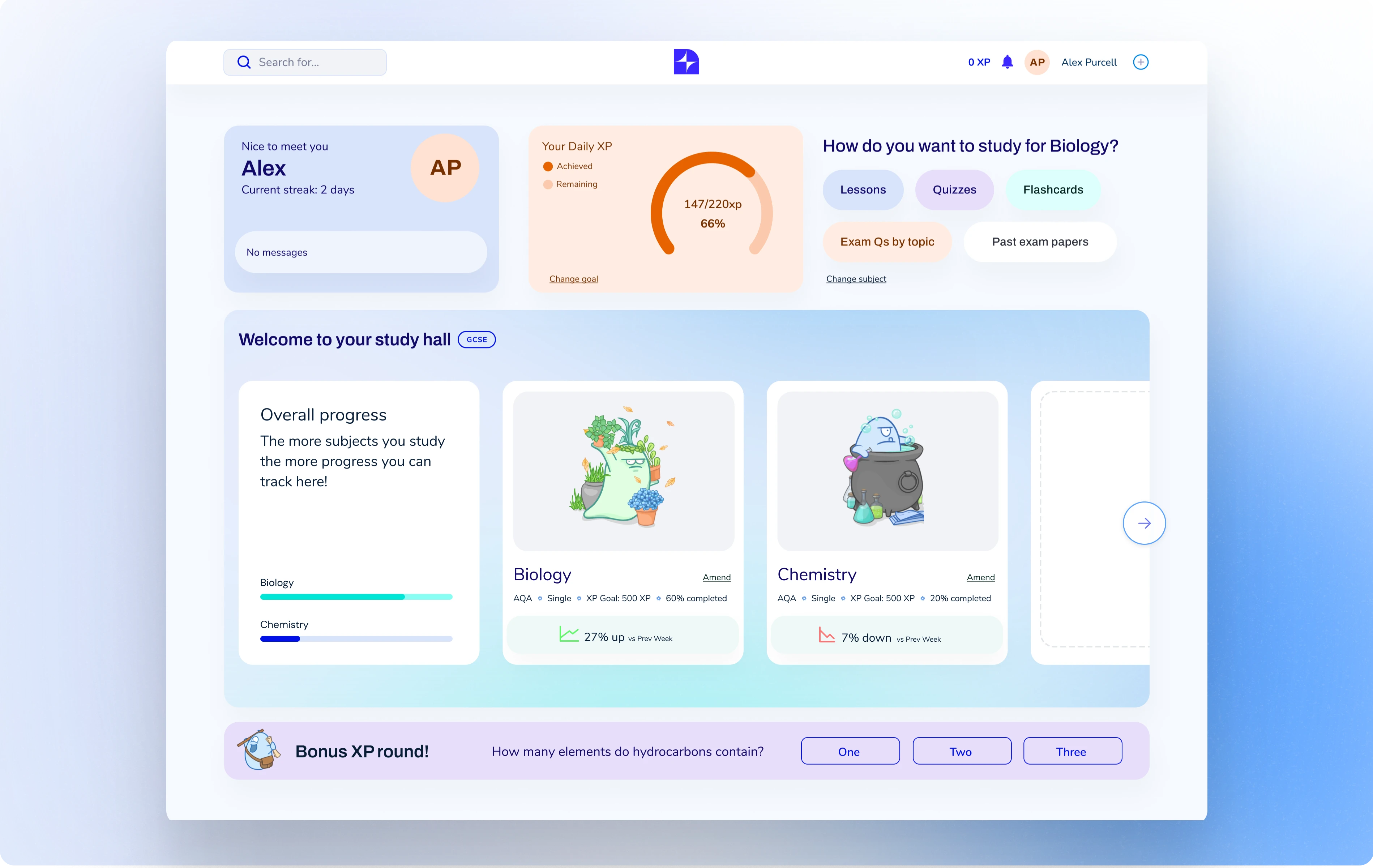
New dashboard with annotation
Once i felt the wireframes were in a good place i moved into design. Cognito shared a variety of inspiration for where they wanted the brand to go, they were looking to the clean tech websites with gradients or SAAS brands that used shapes and colour within the UI. Essentially they wanted to modernise the offering, whilst remaining to true to the illustrative elements of the current brand.
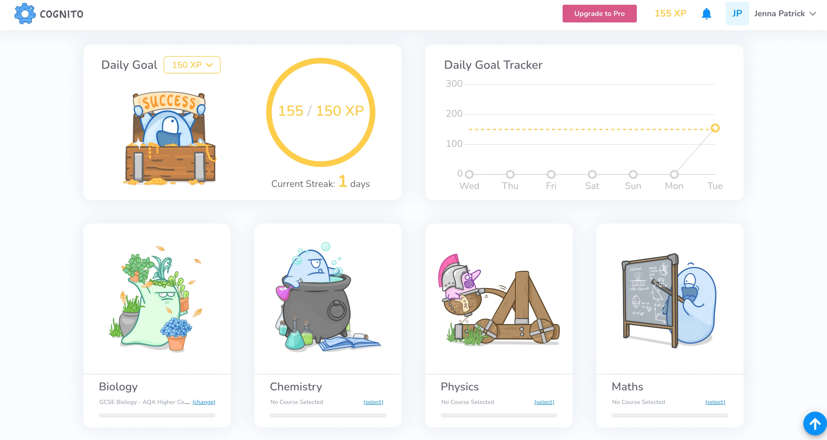
The current Cognito dashboard
I provided three visual routes as a starter that felt aligned to the desired influences Cognito shared, they were of course only what i would describe as a first pass with much more discovery and ideation yet to come. To tackle the issues around accessibility and visual hierarchy i introduced new colours into the palette and a secondary font option for the brand typography.
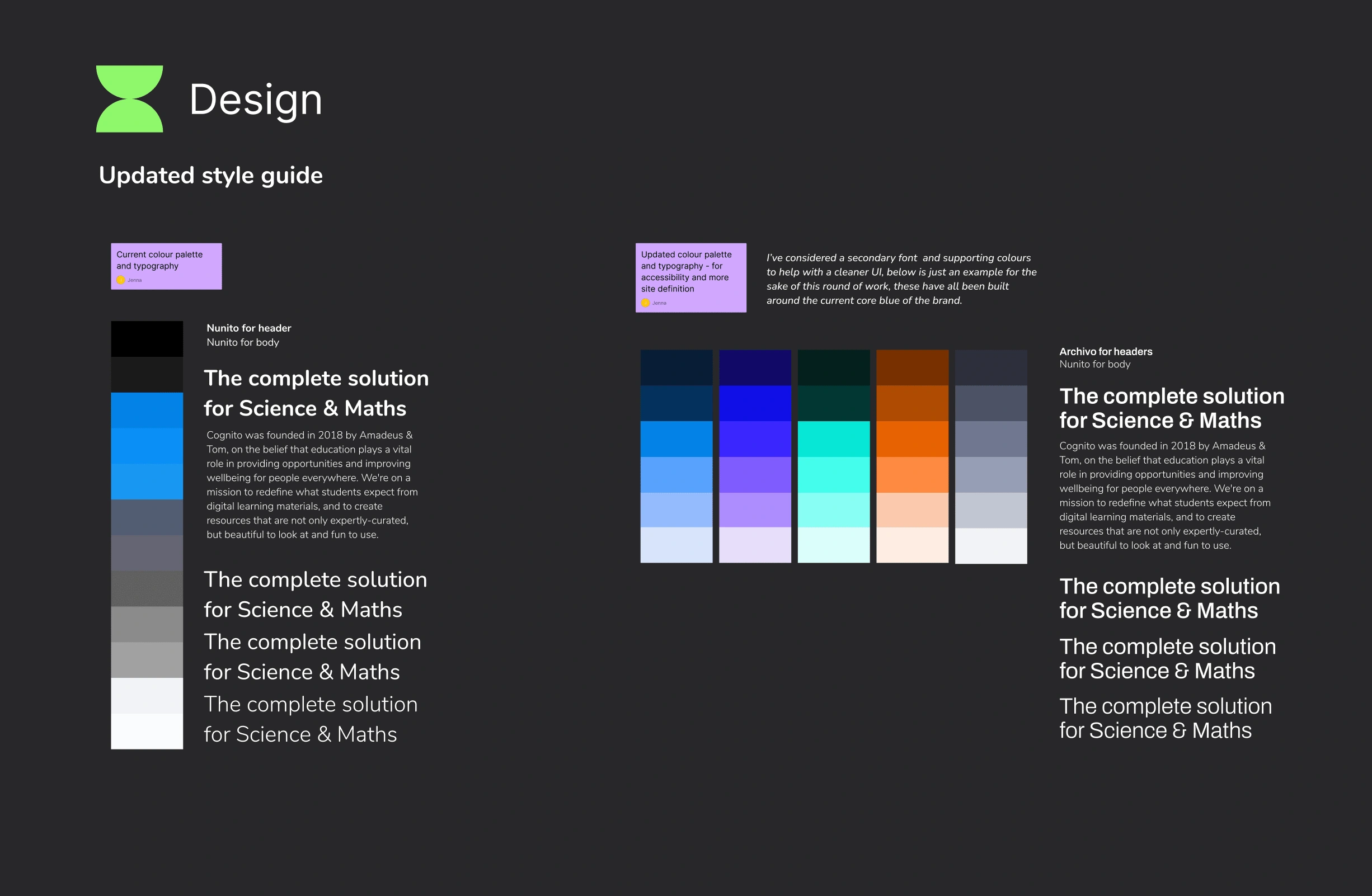
Updated colour palette and typography
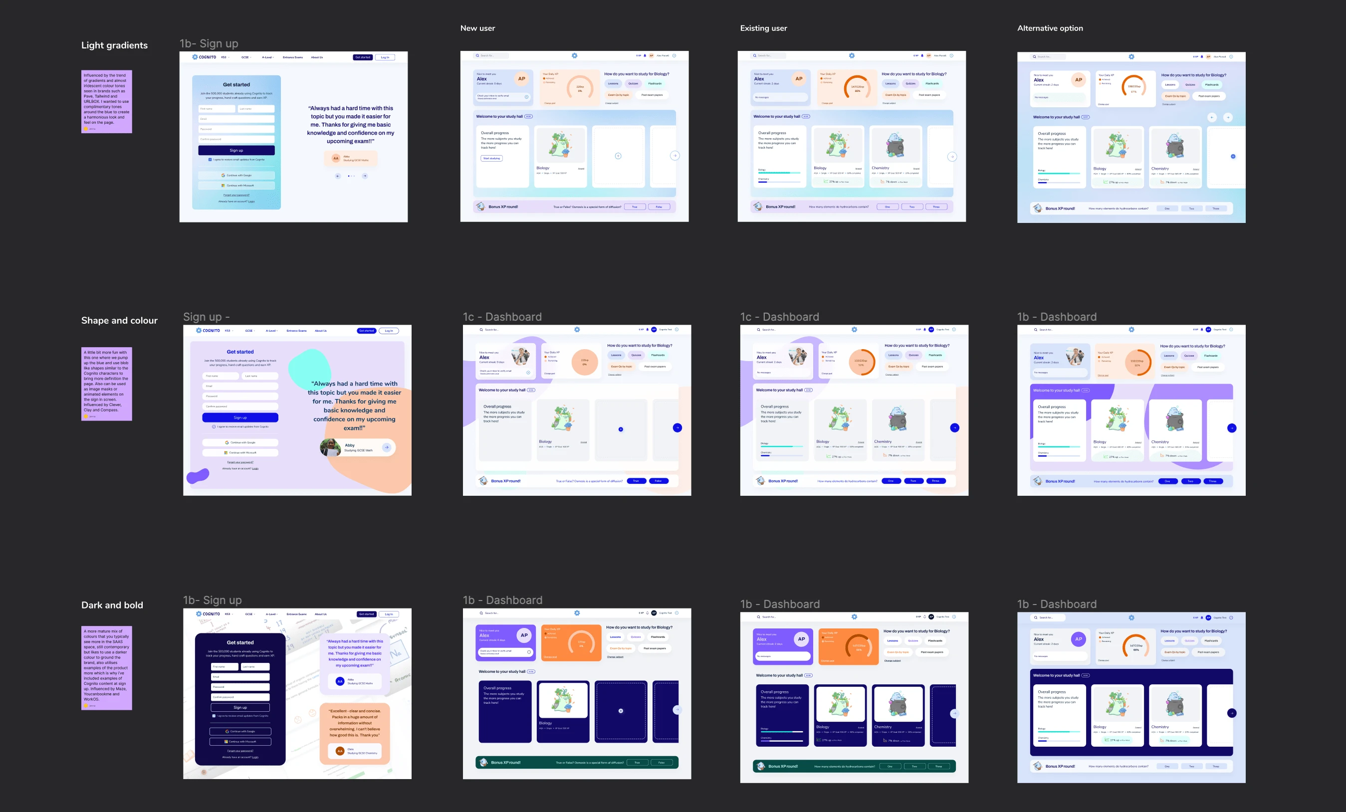
Different design routes
Below i've included my preference for the brand, i feel it is aligned with the space they want to move into as well as works quite harmoniously with existing illustrations and cooler tones of the brand.
Like this project
Posted Feb 12, 2024
Role: Product designer // Outcomes: UXR, UX/UI Design, Brand design
