NOMA | Kombucha Branding, Label, Logo, Illustration

Daria Musiienko


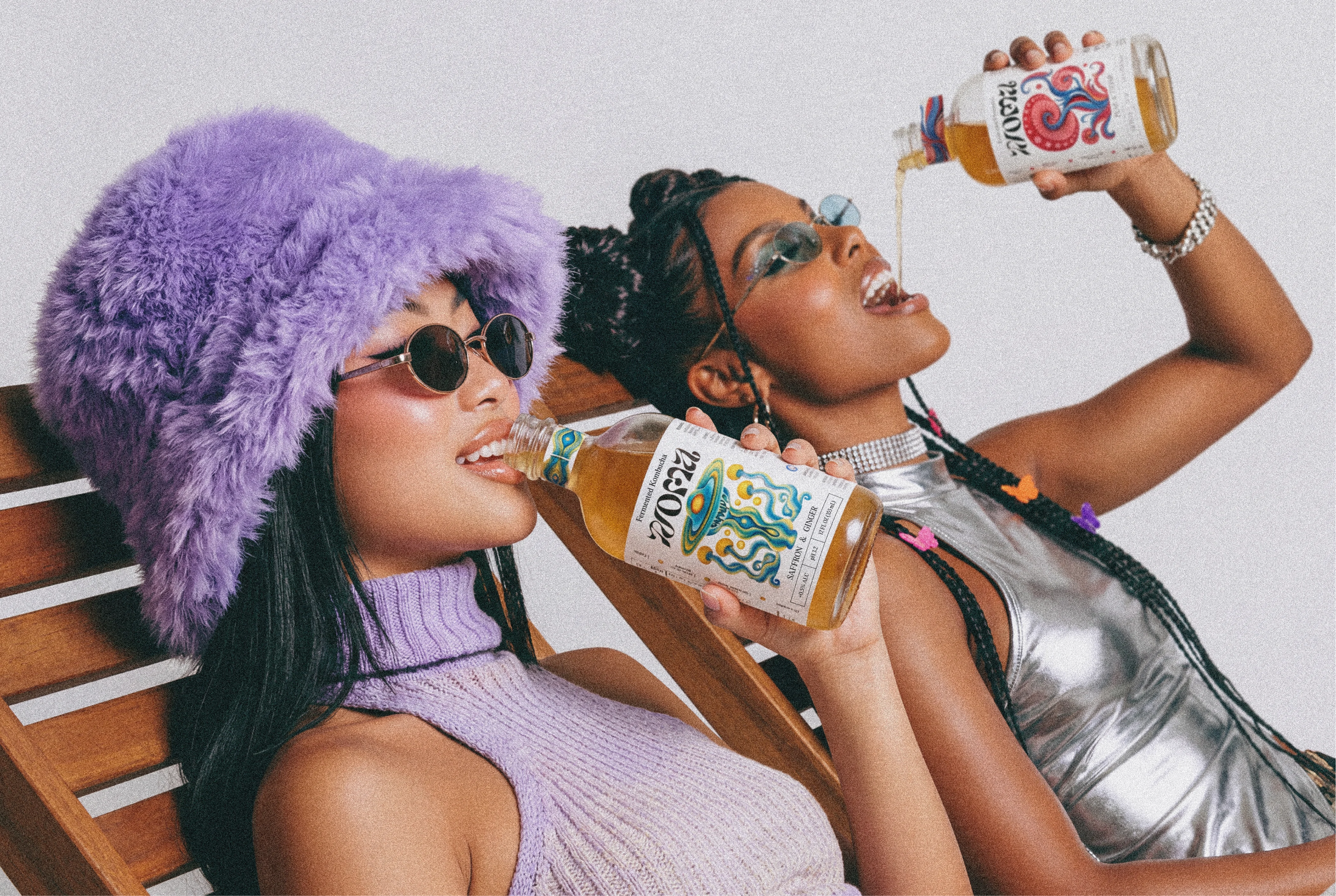
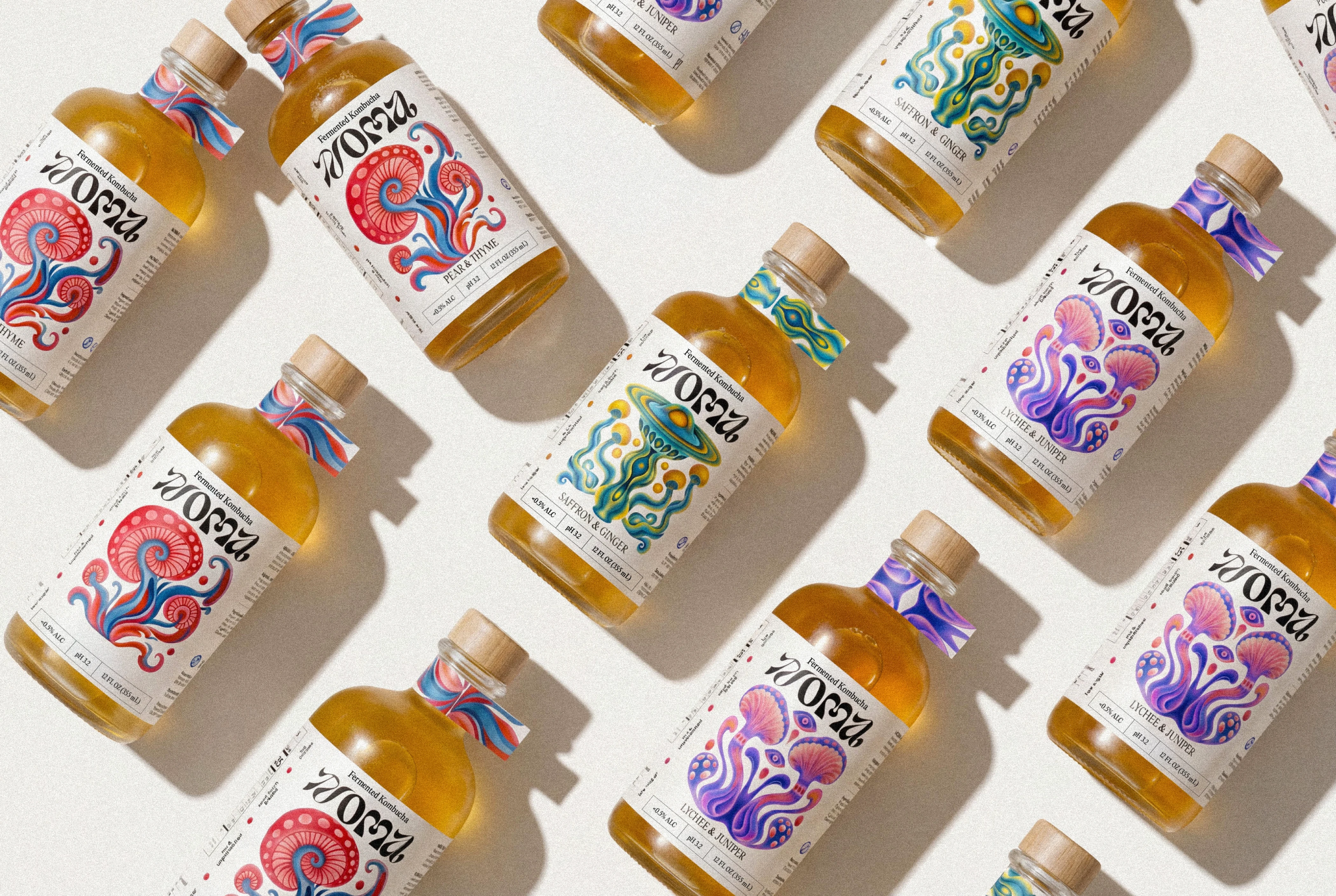
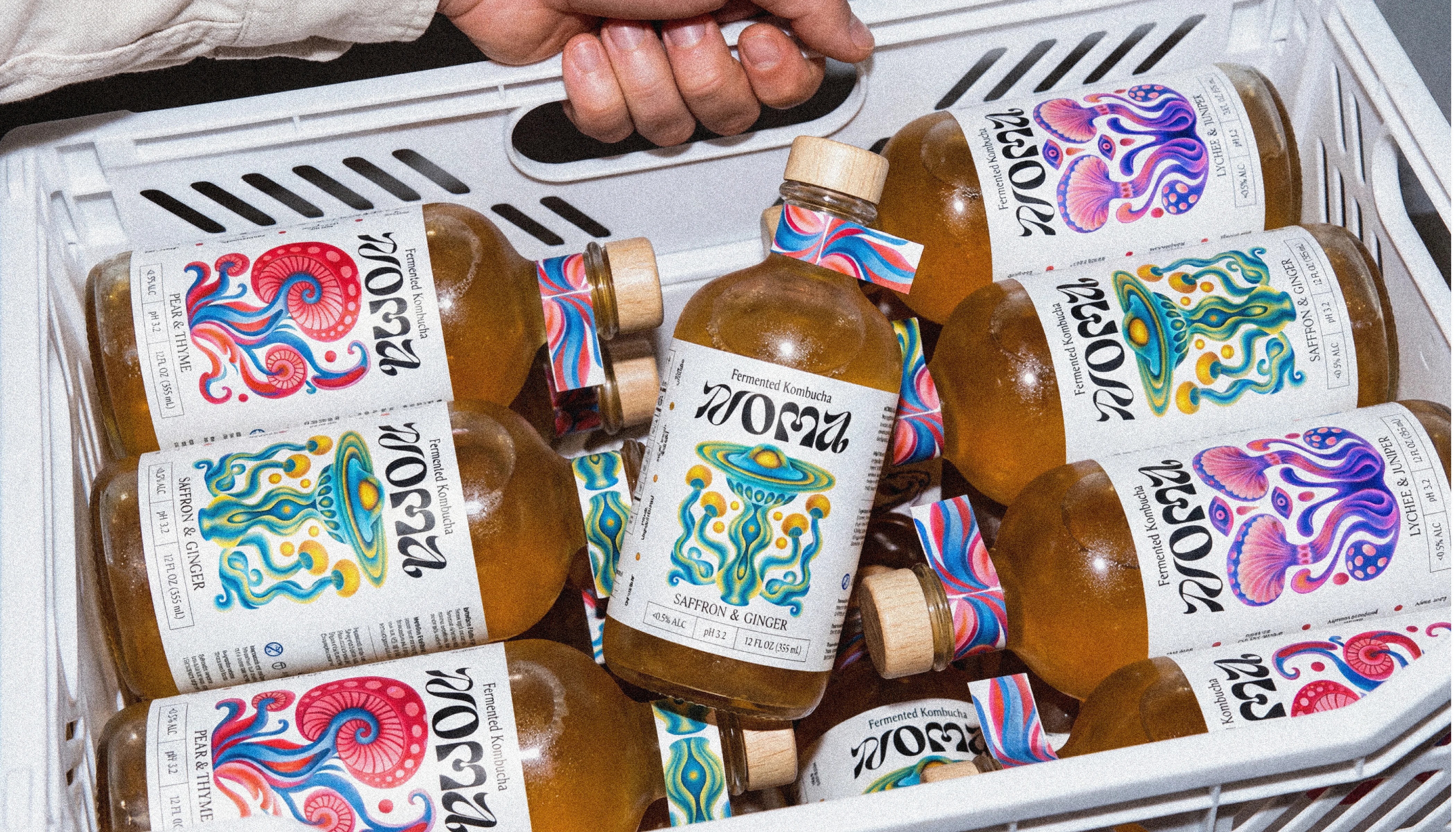
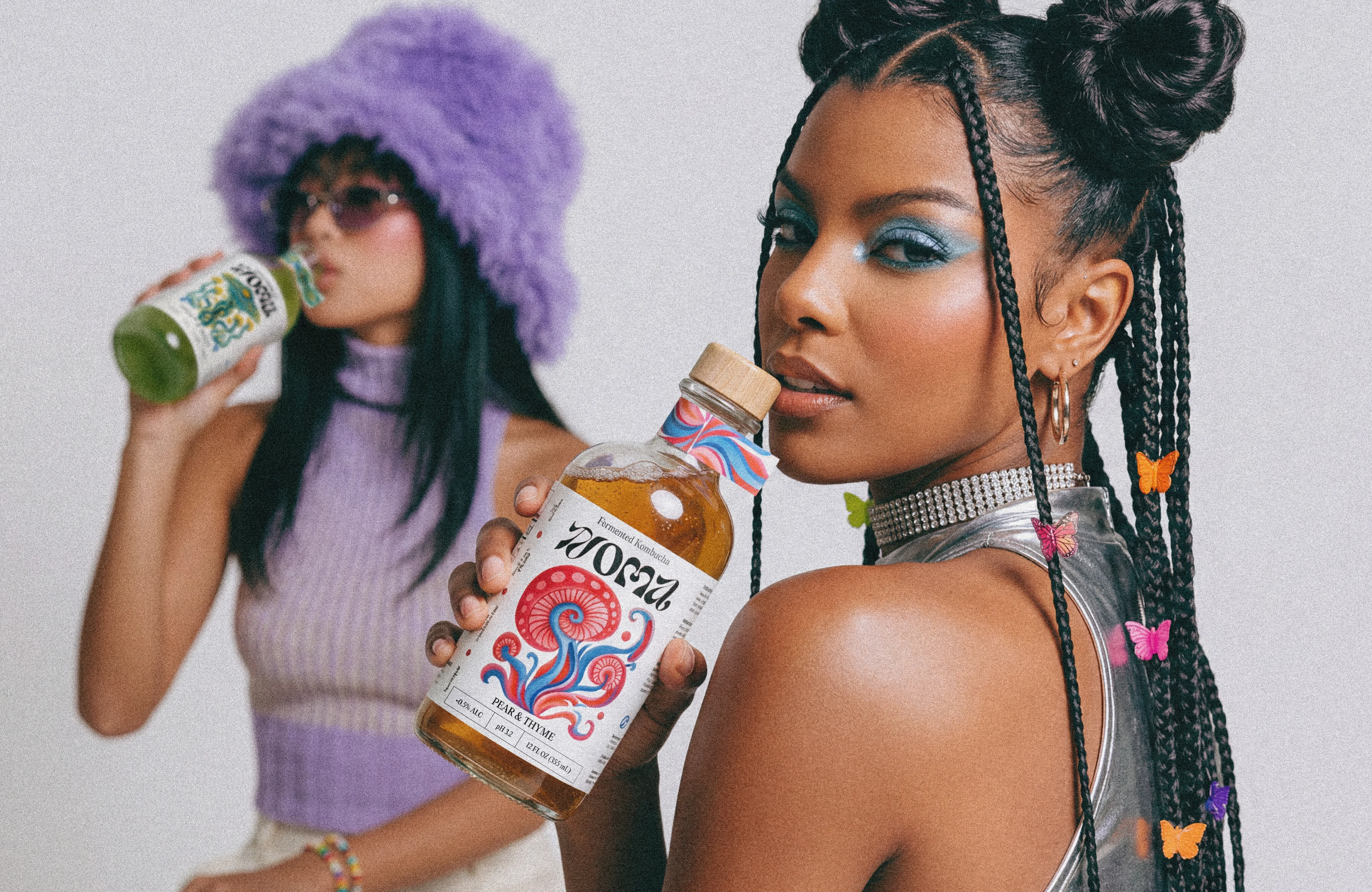
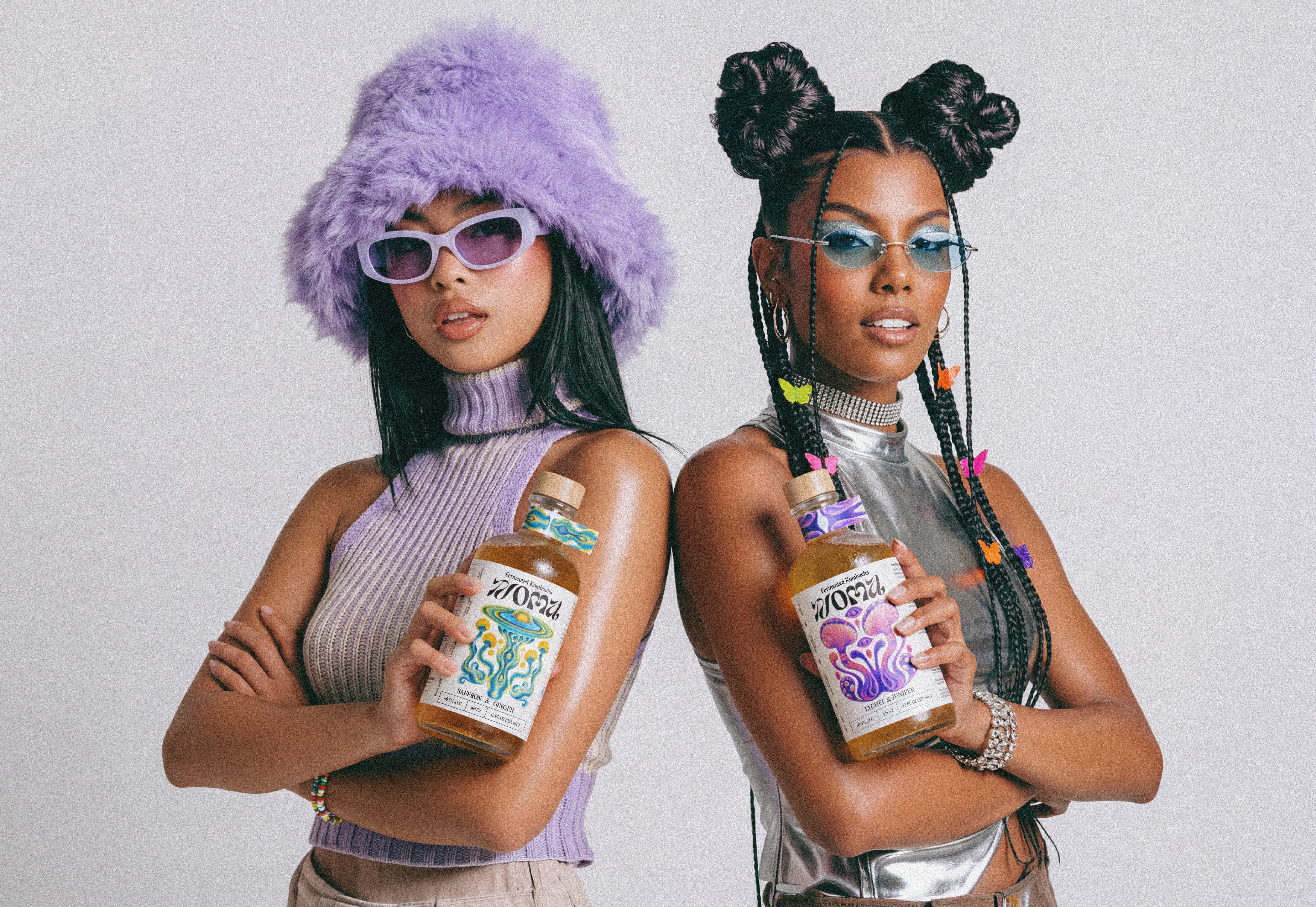
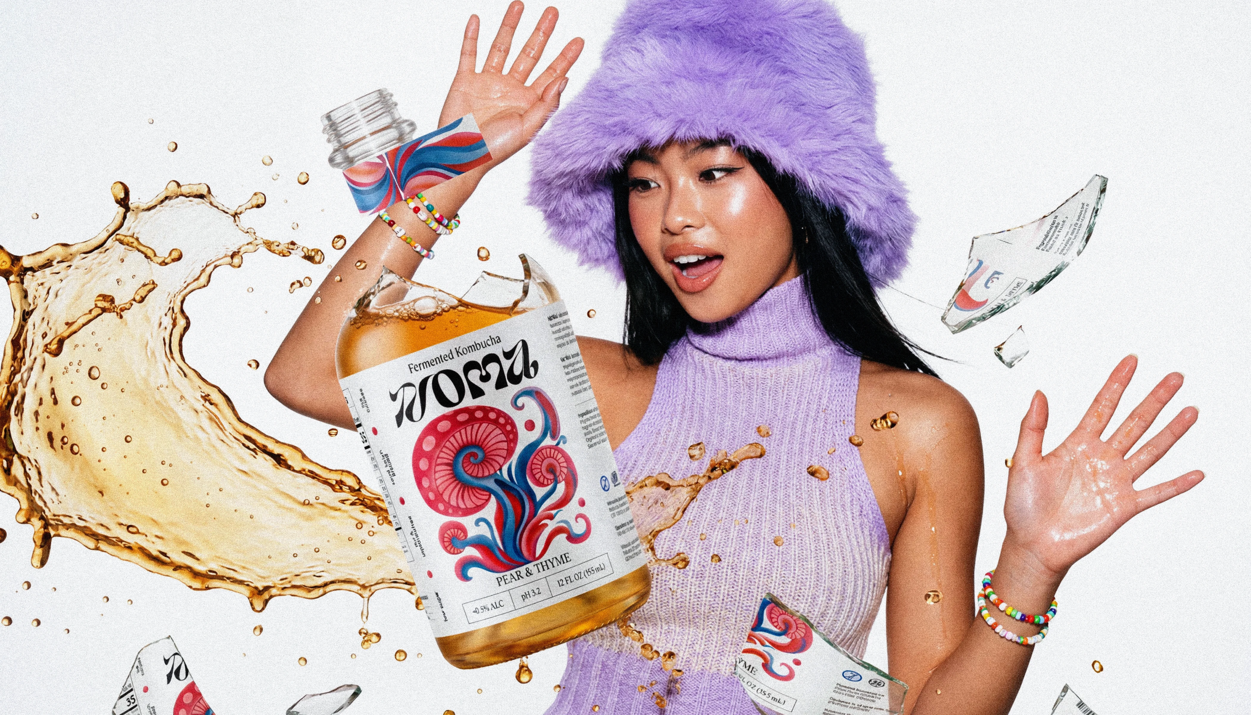
NOMA is a kombucha brand where every bottle works like a living ecosystem. Hand-drawn, collectible, built to stop the scroll.
GOAL
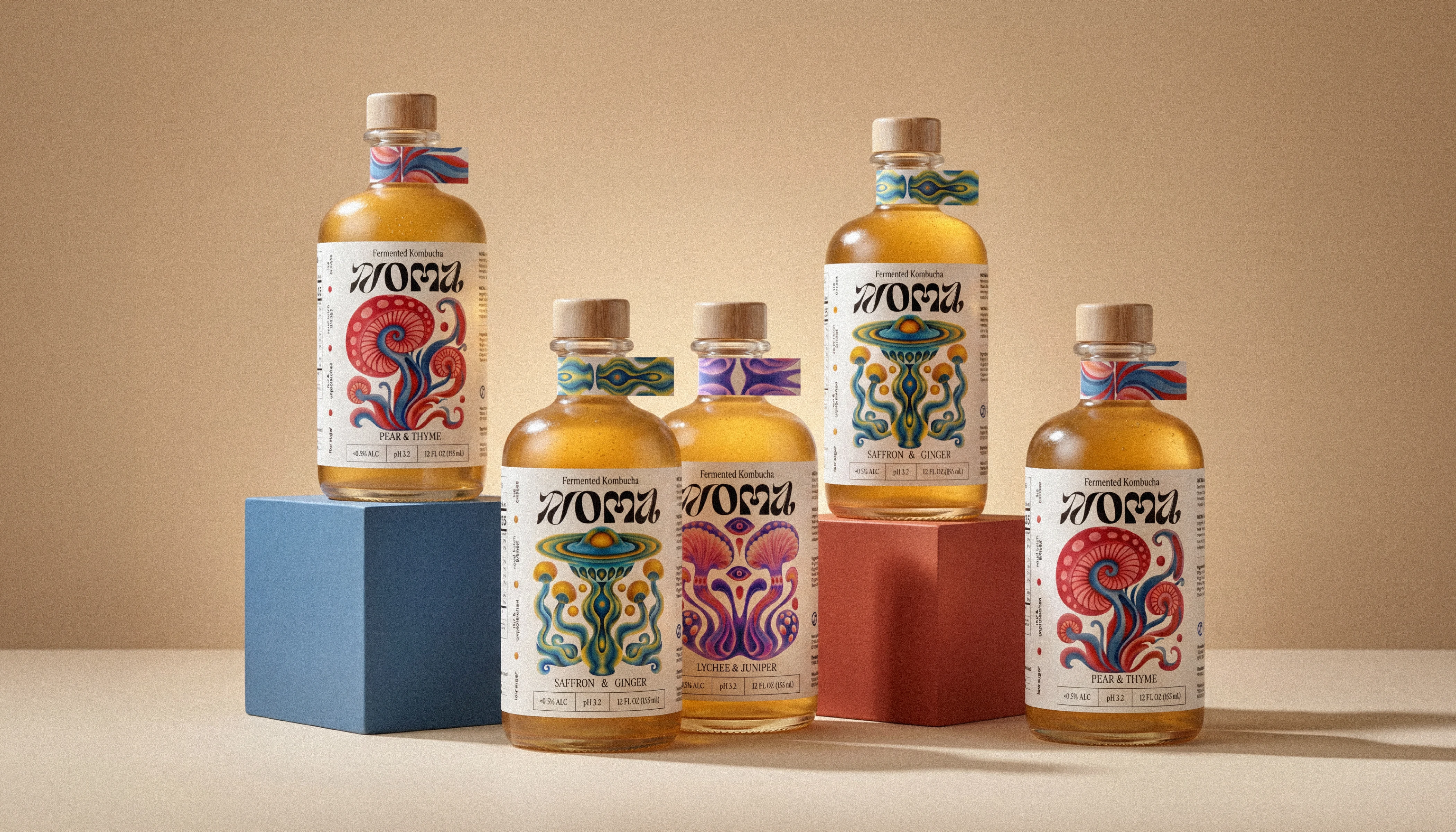
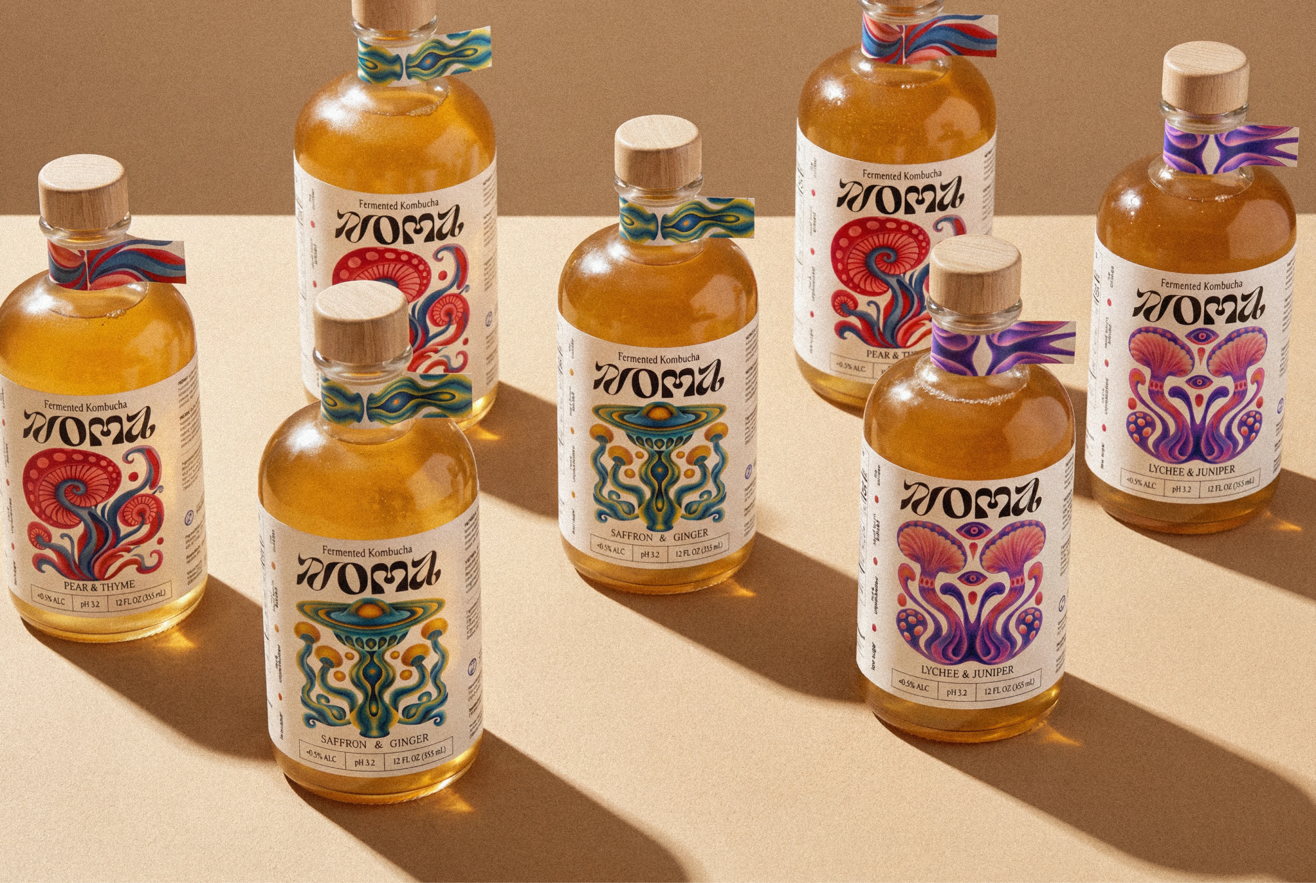
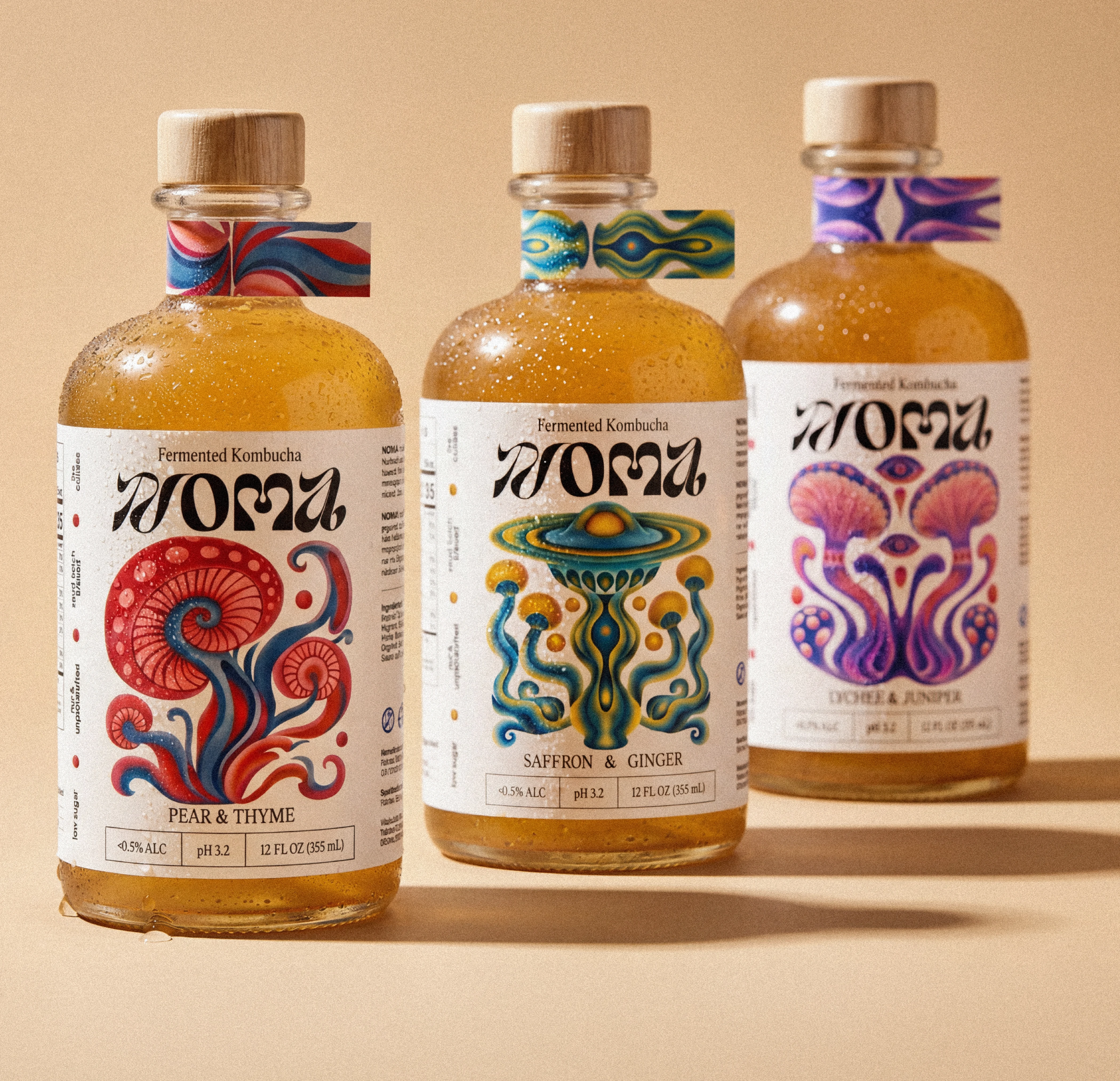
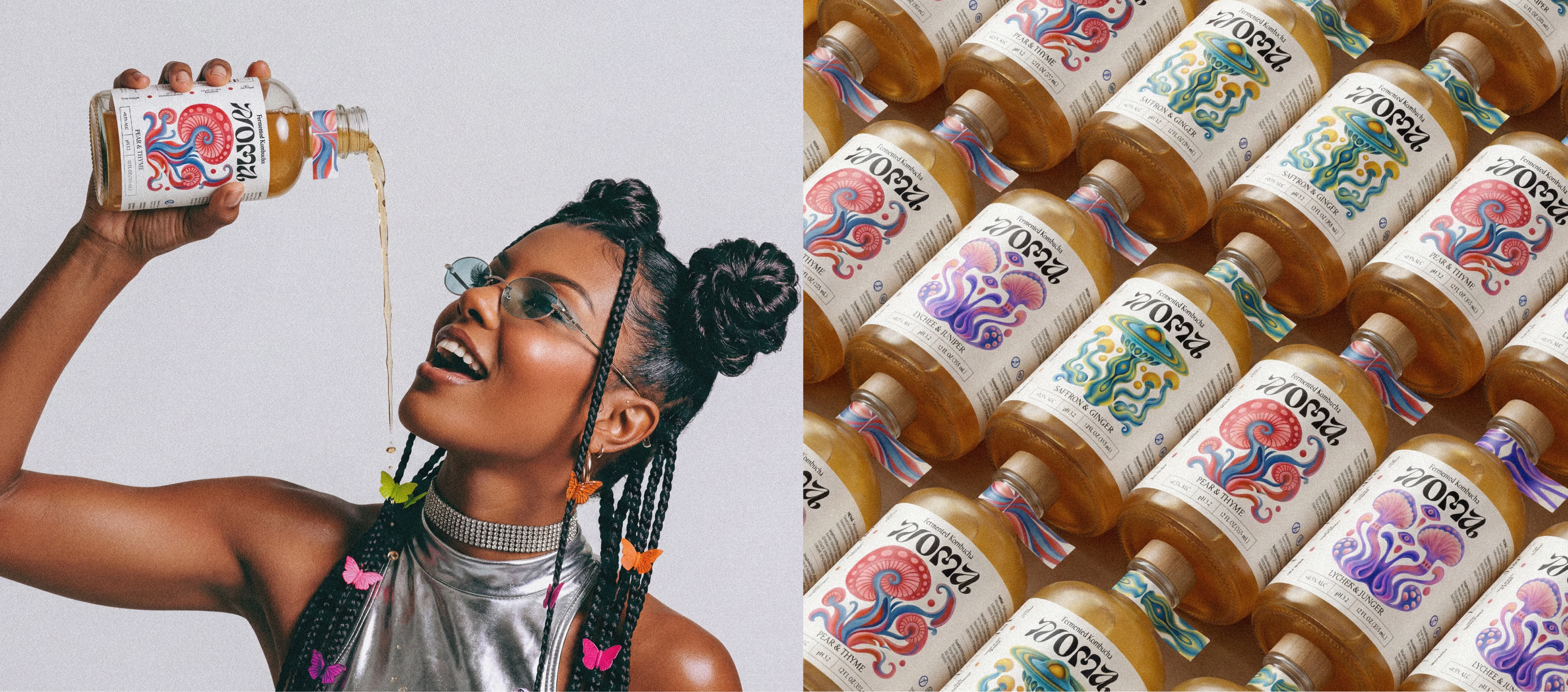
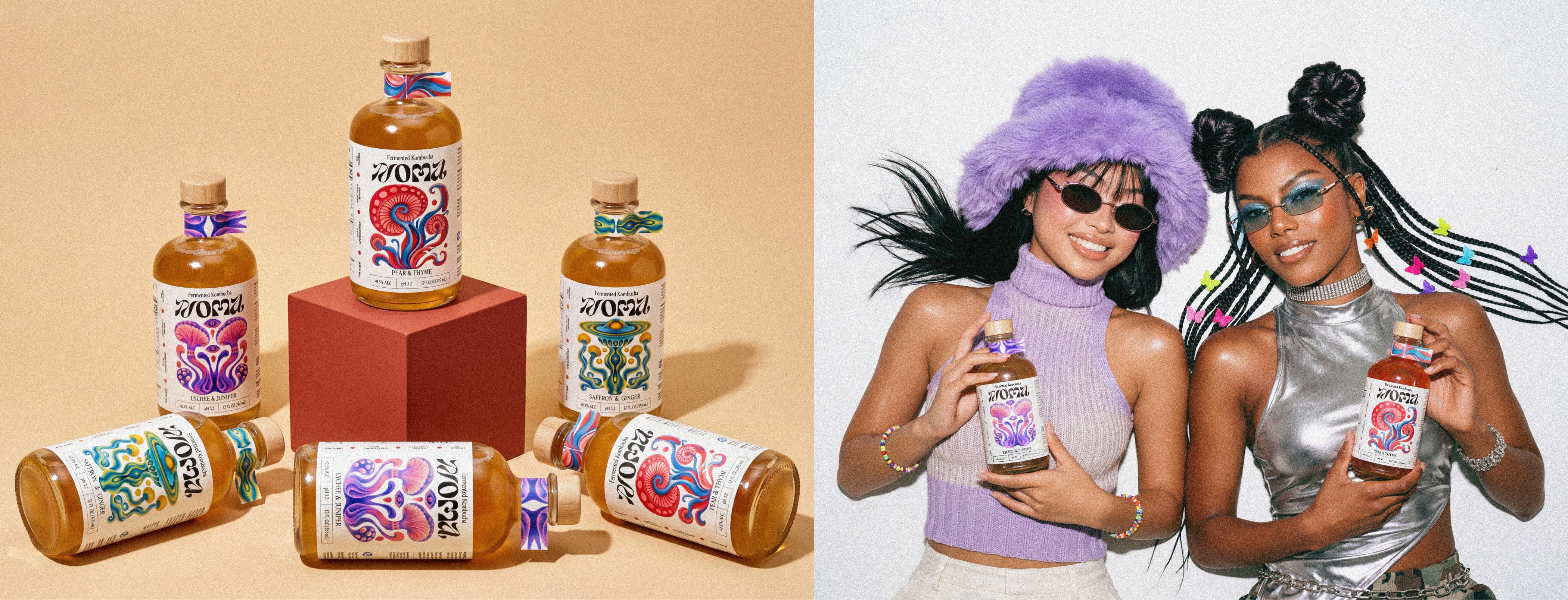
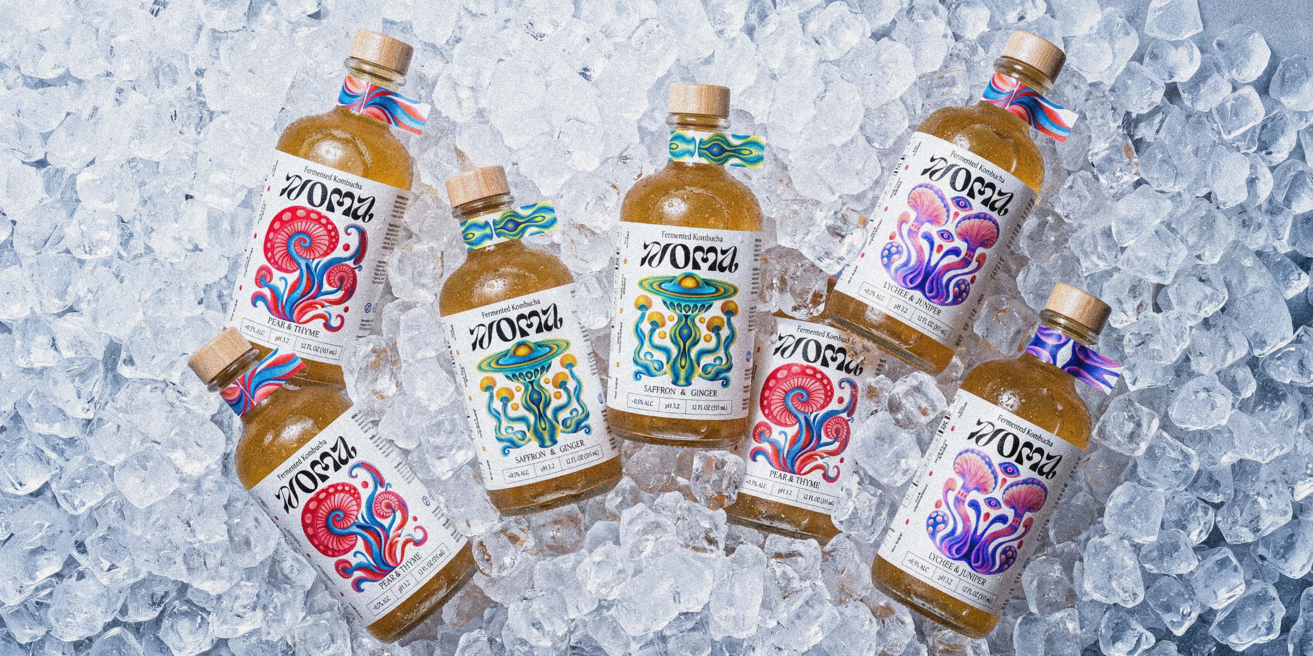
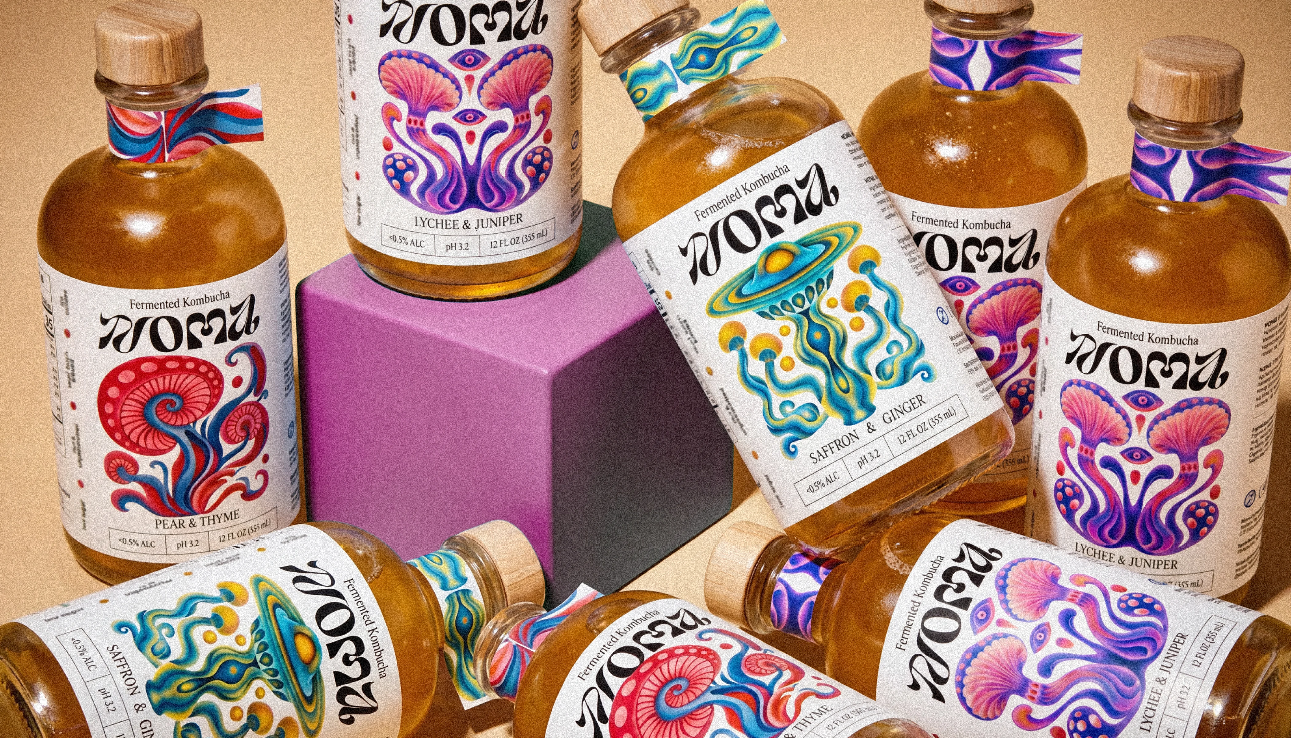
Build a full brand identity and packaging design for a small-batch kombucha line with three flavors: Saffron & Ginger, Pear & Thyme, Lychee & Juniper. The brief was simple. Make each bottle feel like a collectible object, not just another drink. One system, three psychedelic worlds.
PROCESS
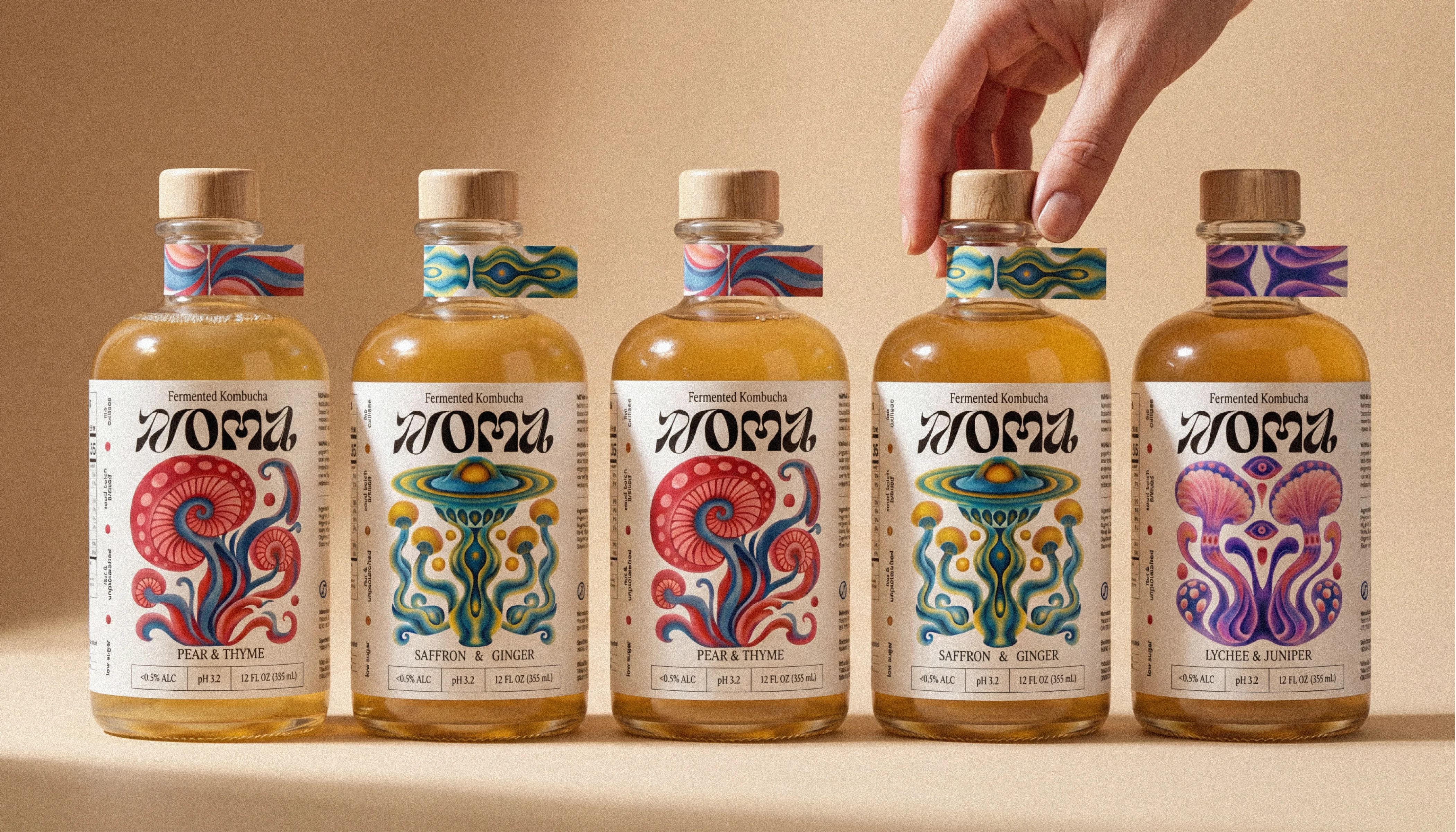
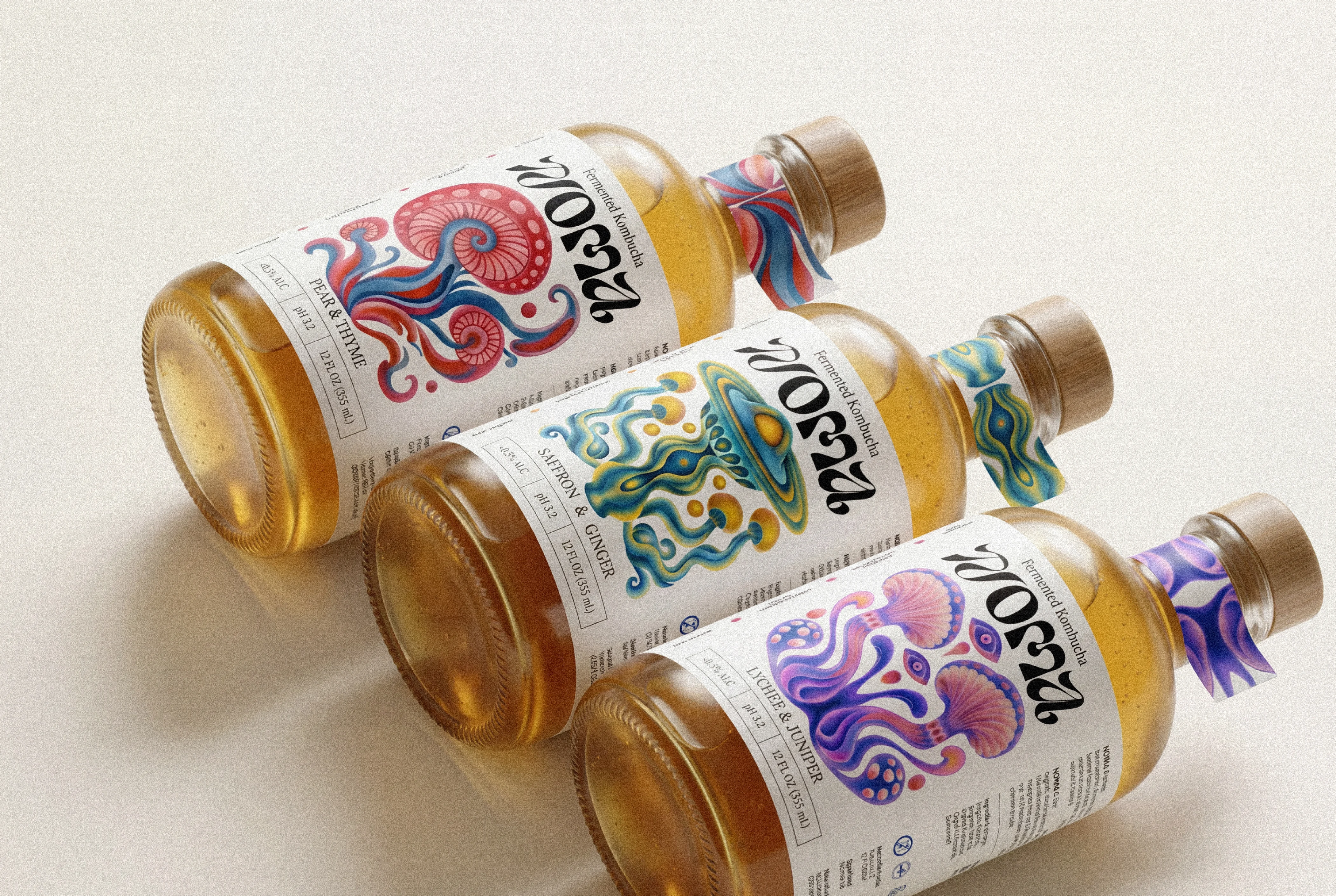
I painted every label by hand in Procreate, layer by layer. The illustrations mix mushroom, jellyfish and UFO shapes into organic forms you can't quite name. Soft airbrushed gradients, mirrored symmetry, a groovy logotype, and a custom hangtag pattern for each flavor.
RESULT
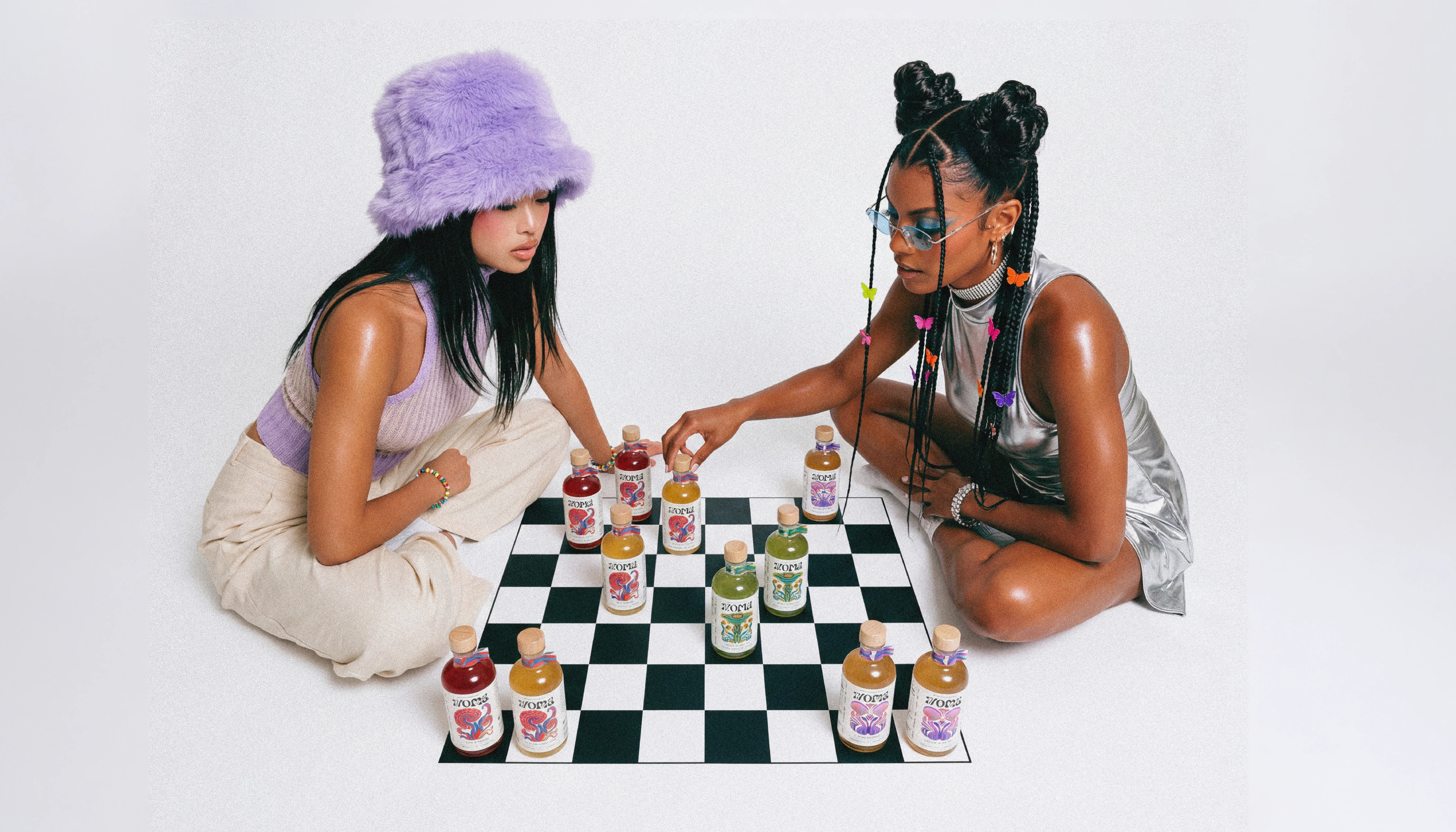
A cohesive visual identity that runs across packaging, illustration, motion design and editorial photography. Each flavor owns its own palette, and the whole system still reads as NOMA from studio shot to street to shelf.
THE CONCEPT
The idea starts inside the jar. Kombucha ferments thanks to a SCOBY, the living culture that feeds the brew. It's a weird, beautiful thing, half mushroom and half creature, layered and gelatinous. Most brands hide it. I made it the hero of the label. Every illustration grows out of that SCOBY logic, where mushroom caps, jellyfish bodies and tentacle-like roots melt into each other and never settle into one clean shape.
The color does the same job. I pushed the palette away from the clean clinical green that almost every kombucha brand defaults to, and built three saturated psychedelic worlds instead: warm gold on teal, red on deep blue, pink on violet.
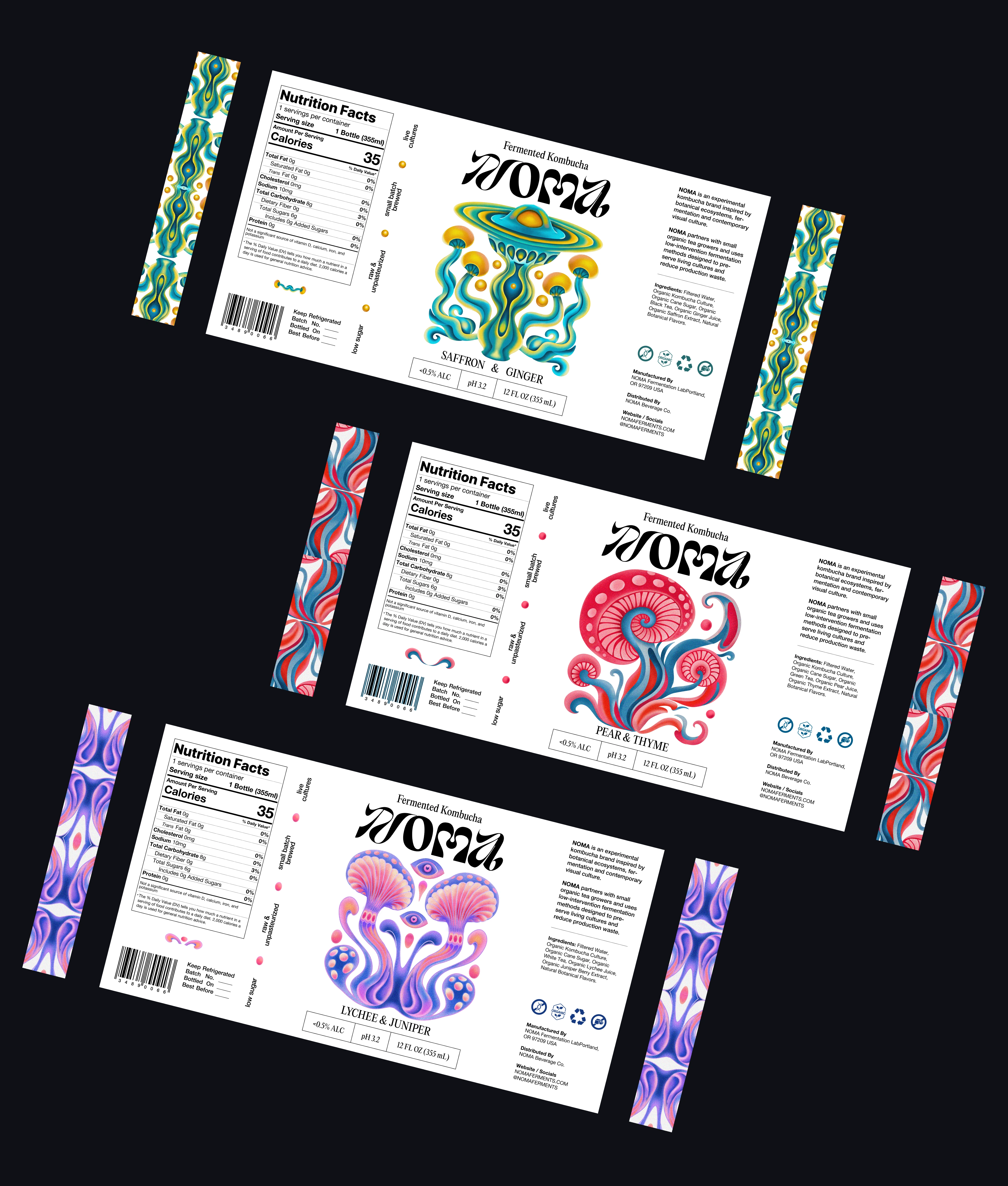
THE LABEL
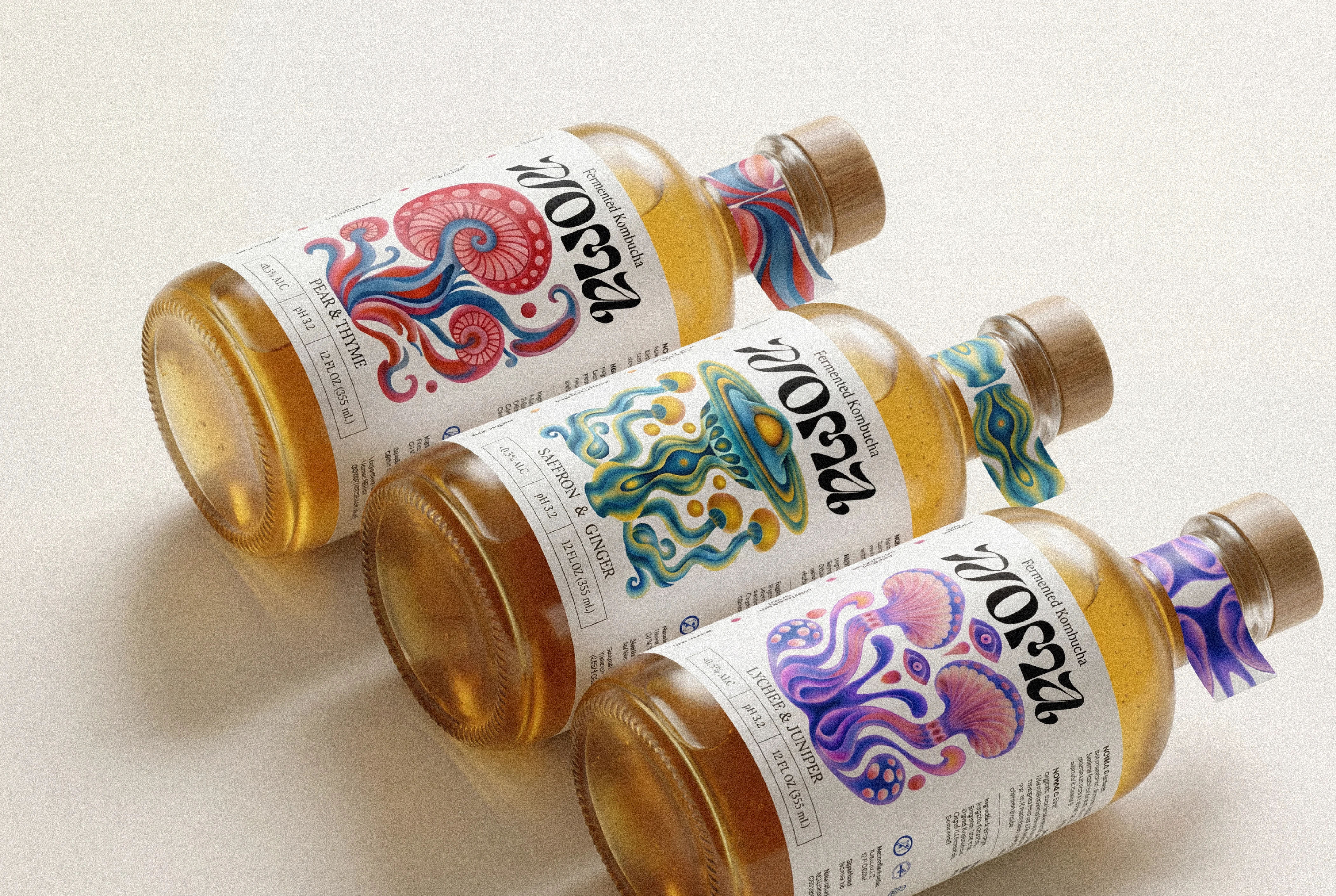
The artwork can go as wild as it wants, but the label still had to work as a real US retail product. The packaging design follows FDA label standards: a clear Nutrition Facts panel, full ingredient list, net quantity in fl oz and mL, pH and alcohol content at less than 0.5% ALC, manufacturer and distributor info, and a barcode.
Around that compliance core runs the quieter brand voice. Vertical side notes wrap the bottle: small batch brewed, raw & unpasteurized, low sugar, live cultures. The legal layer and the psychedelic layer share one grid, so nothing looks bolted on. The label is regulation-ready and shelf-ready, and it still feels unmistakably like NOMA.
Thank you for watching!
I’m open to interesting projects, collaborations and creative opportunities in branding, visual identity and design.
For inquiries and collaborations: musiienkodesign@gmail.com
Like this project
Posted Jun 22, 2026
NOMA is a small-batch kombucha brand built around hand-drawn, psychedelic packaging where every label turns the living SCOBY culture into a surreal mushroom-meets-jellyfish creature. I designed the full visual identity: logotype, label system, and illustrations.