KOMO MOCHI | Food Brand, Branding, Packaging, Logo

Daria Musiienko
Brand Designer
Packaging Designer
Visual Designer
Logo Designer
Graphic Designer
Brand Designer
Packaging Designer
Visual Designer
Logo Designer
Graphic Designer

Adobe Illustrator

Adobe Photoshop

Adobe InDesign

Adobe Firefly

Adobe Lightroom
Adobe Illustrator
Adobe Photoshop
Adobe InDesign
Adobe Firefly
Adobe Lightroom
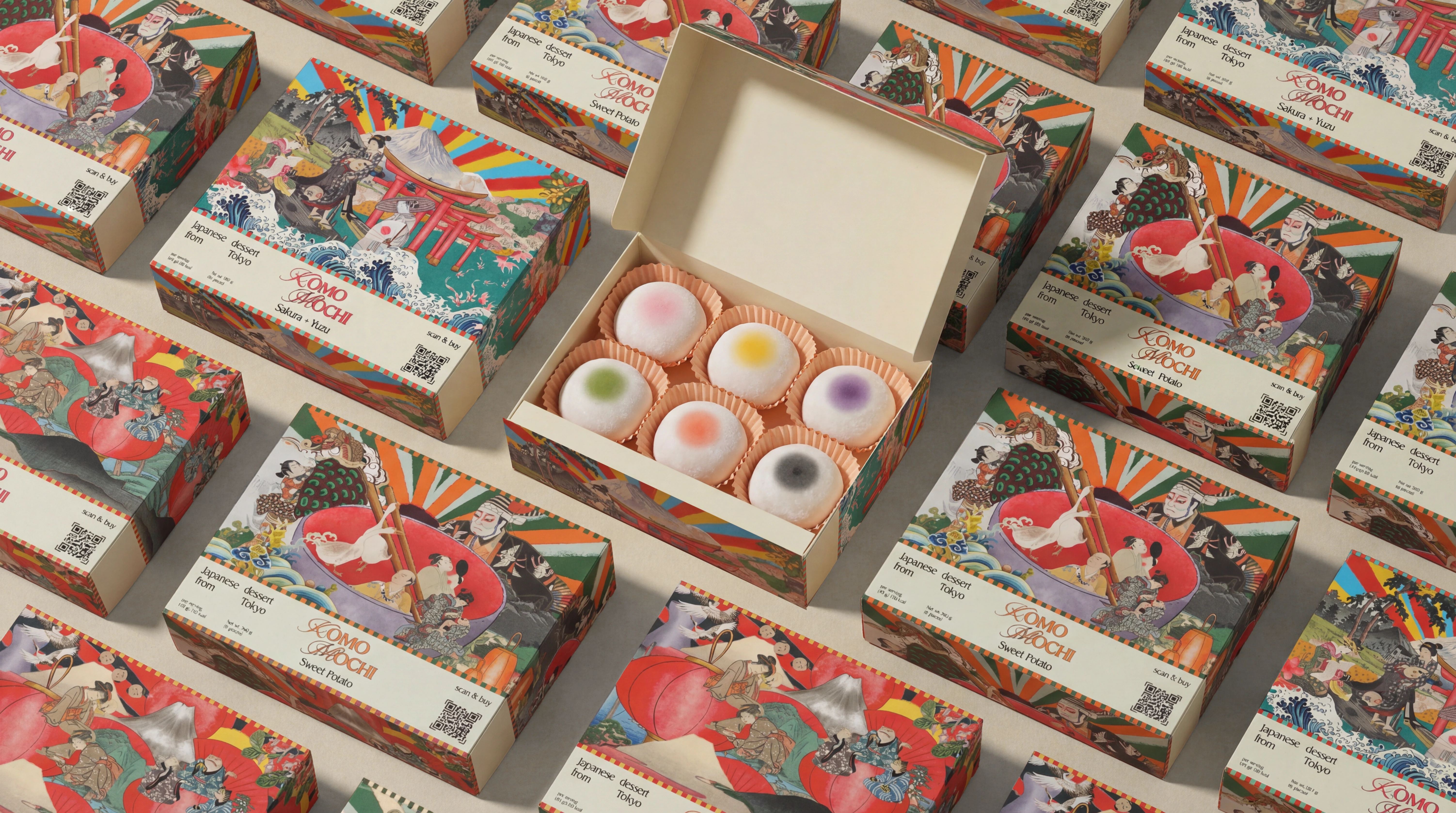
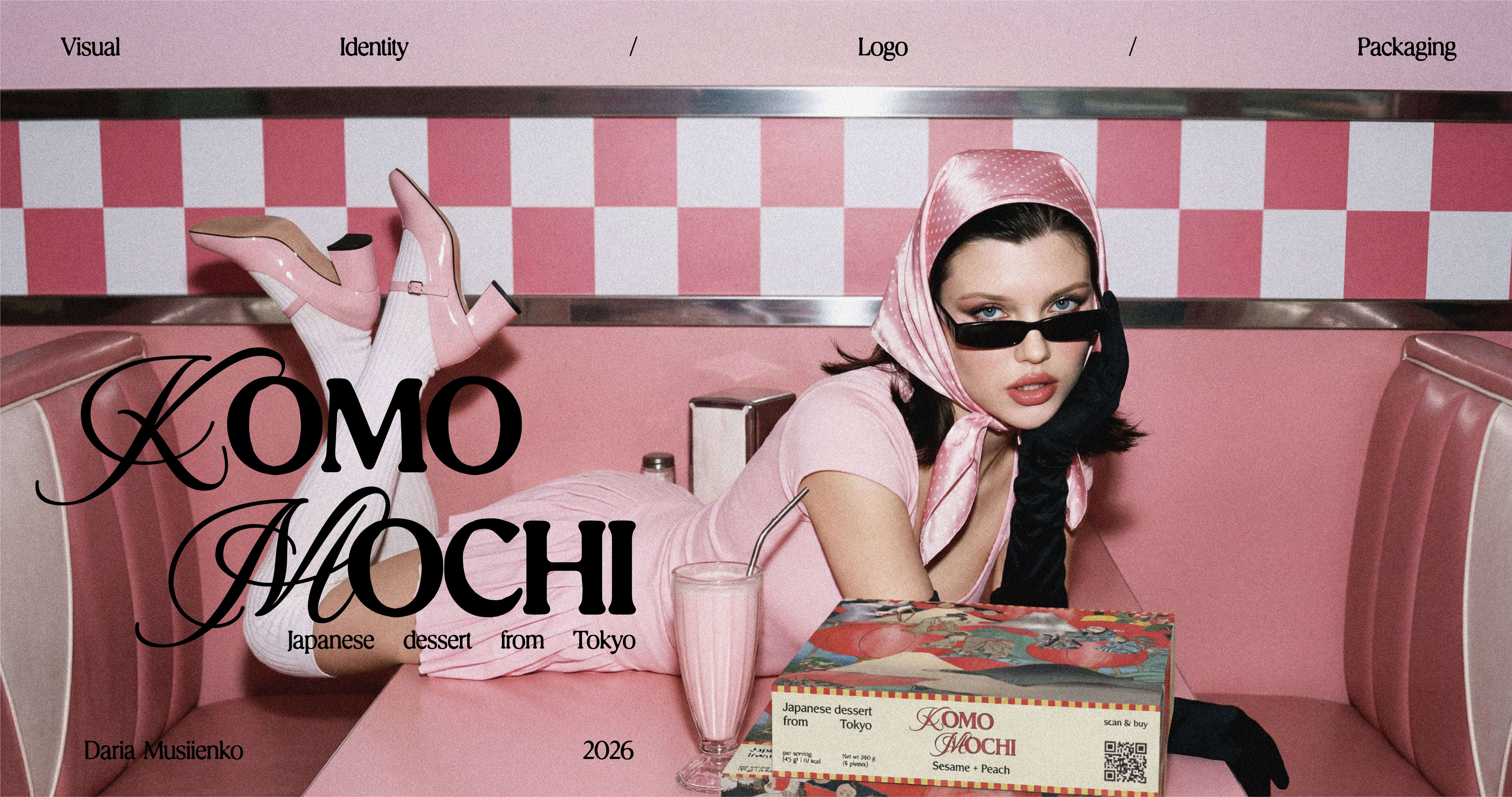
KOMO MOCHI — a Japanese mochi dessert brand from Tokyo, reimagined through a maximalist ukiyo-e collage.
Goal
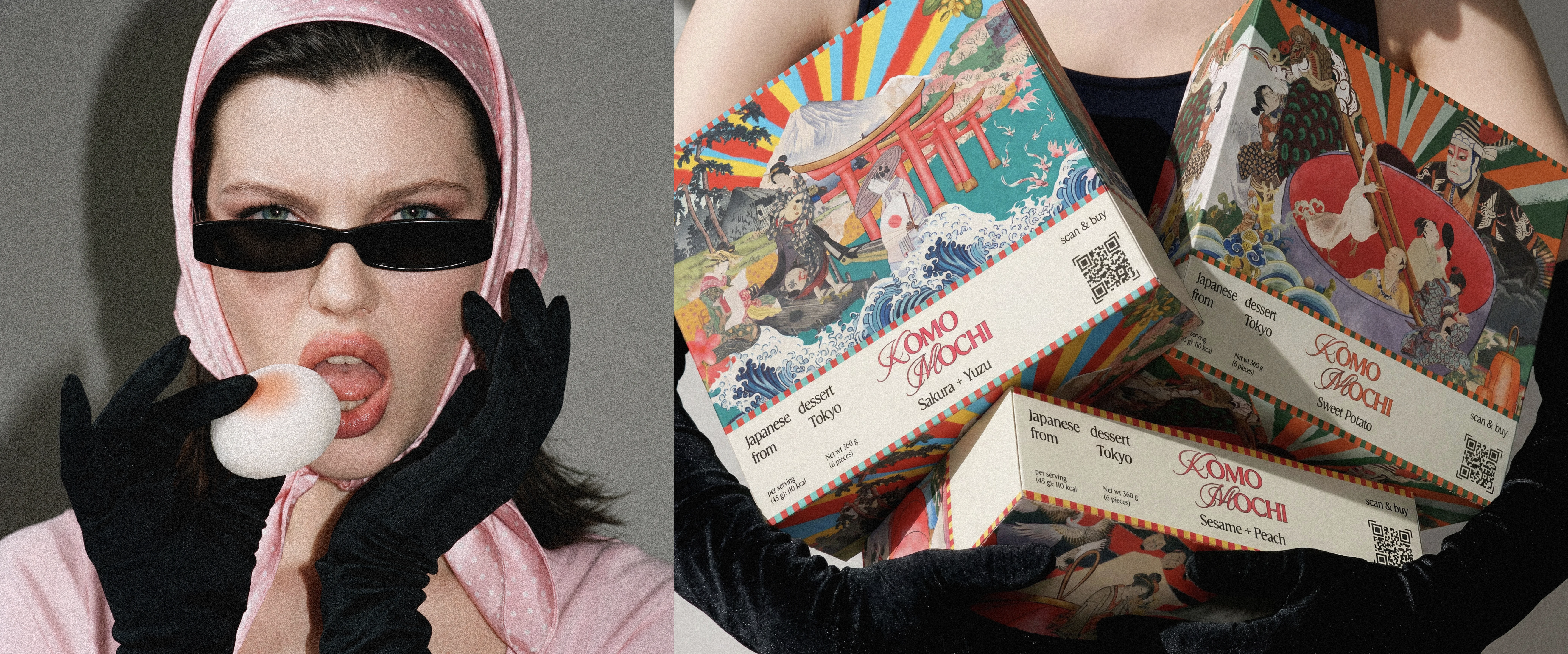
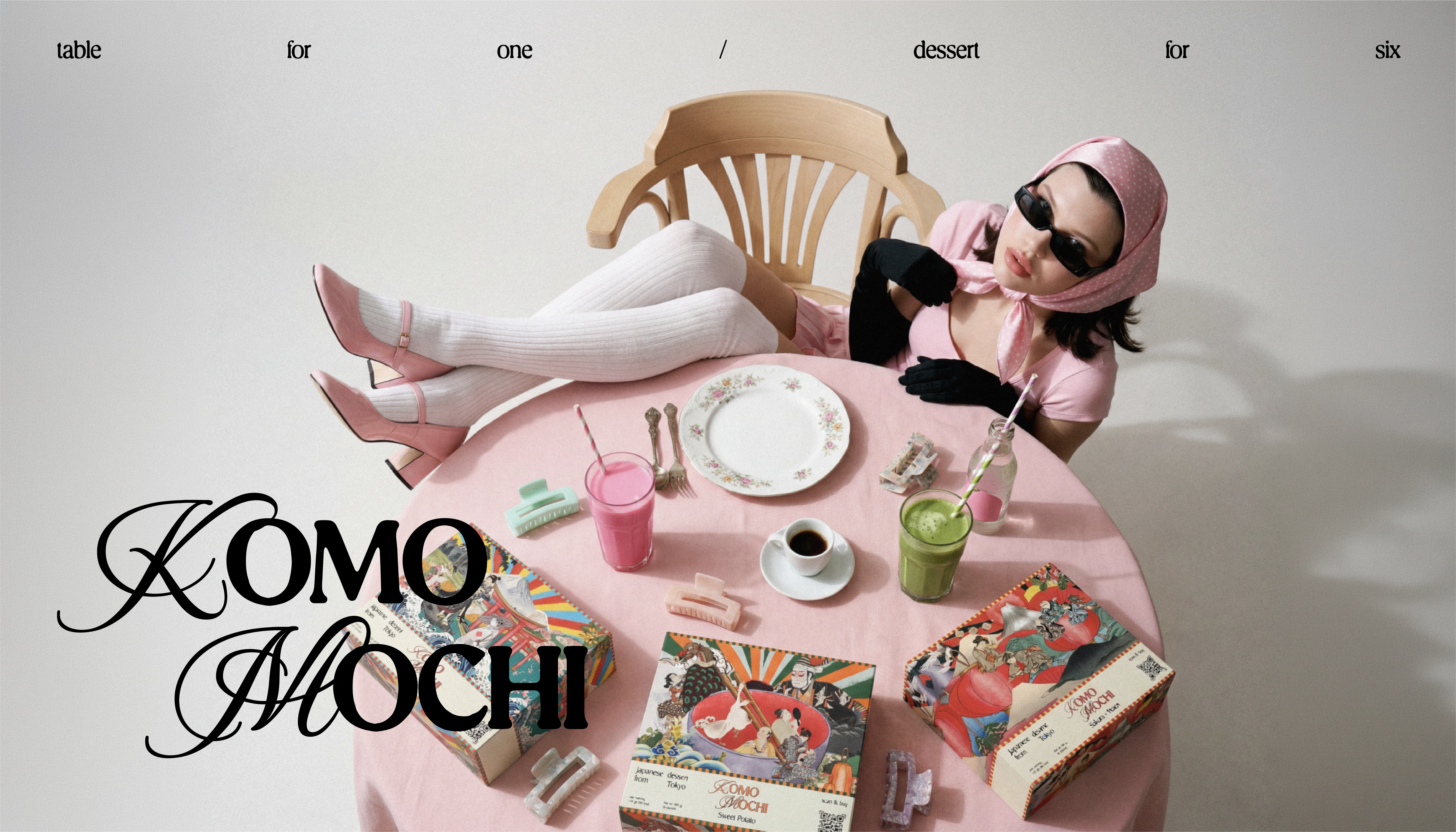
Create a packaging system for a premium mochi dessert that feels unmistakably Japanese yet bold and a gift-worthy box that stands out on the shelf and turns a simple sweet into a small ritual. Three flavours, one recognisable world.
Research
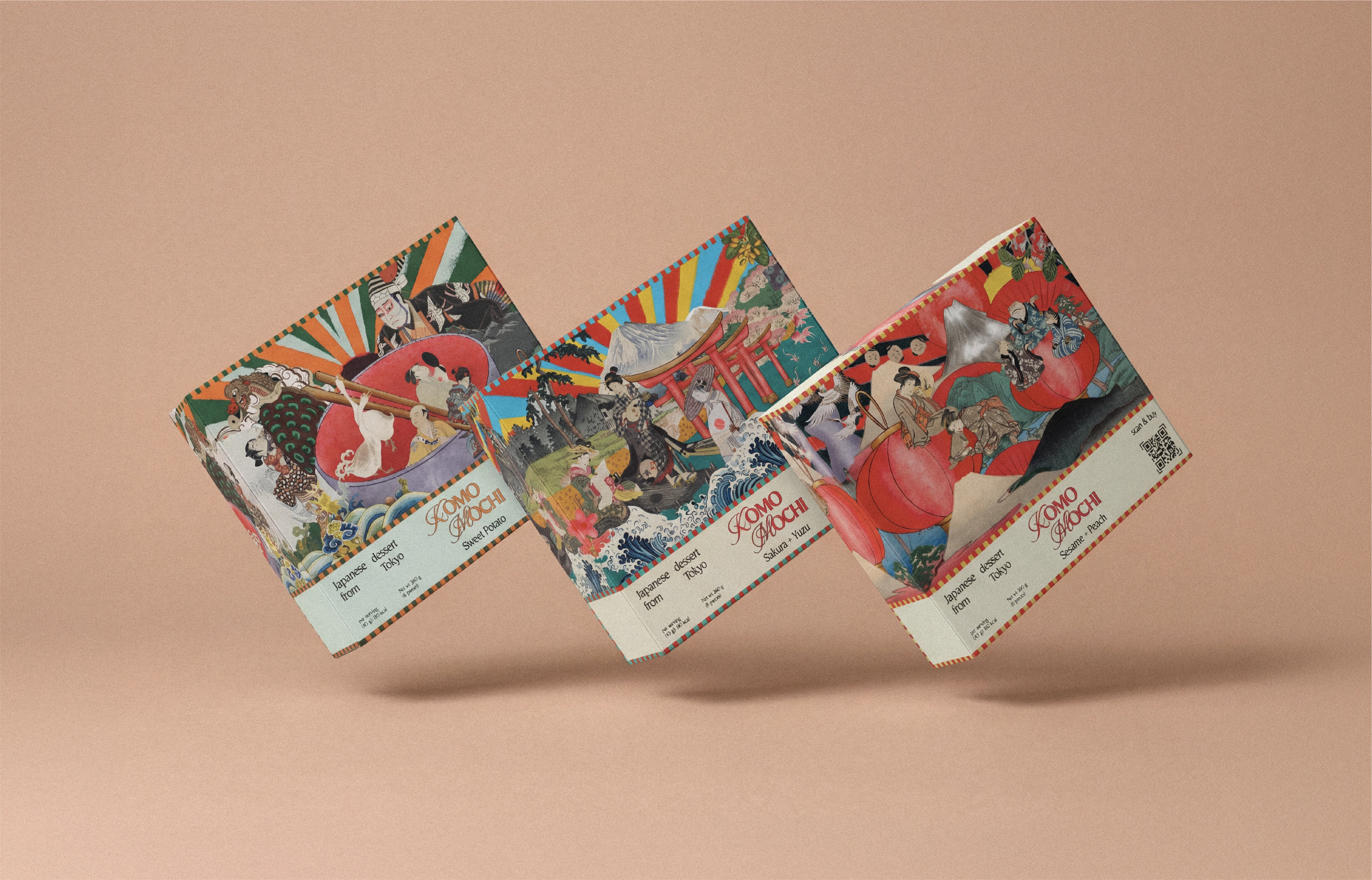
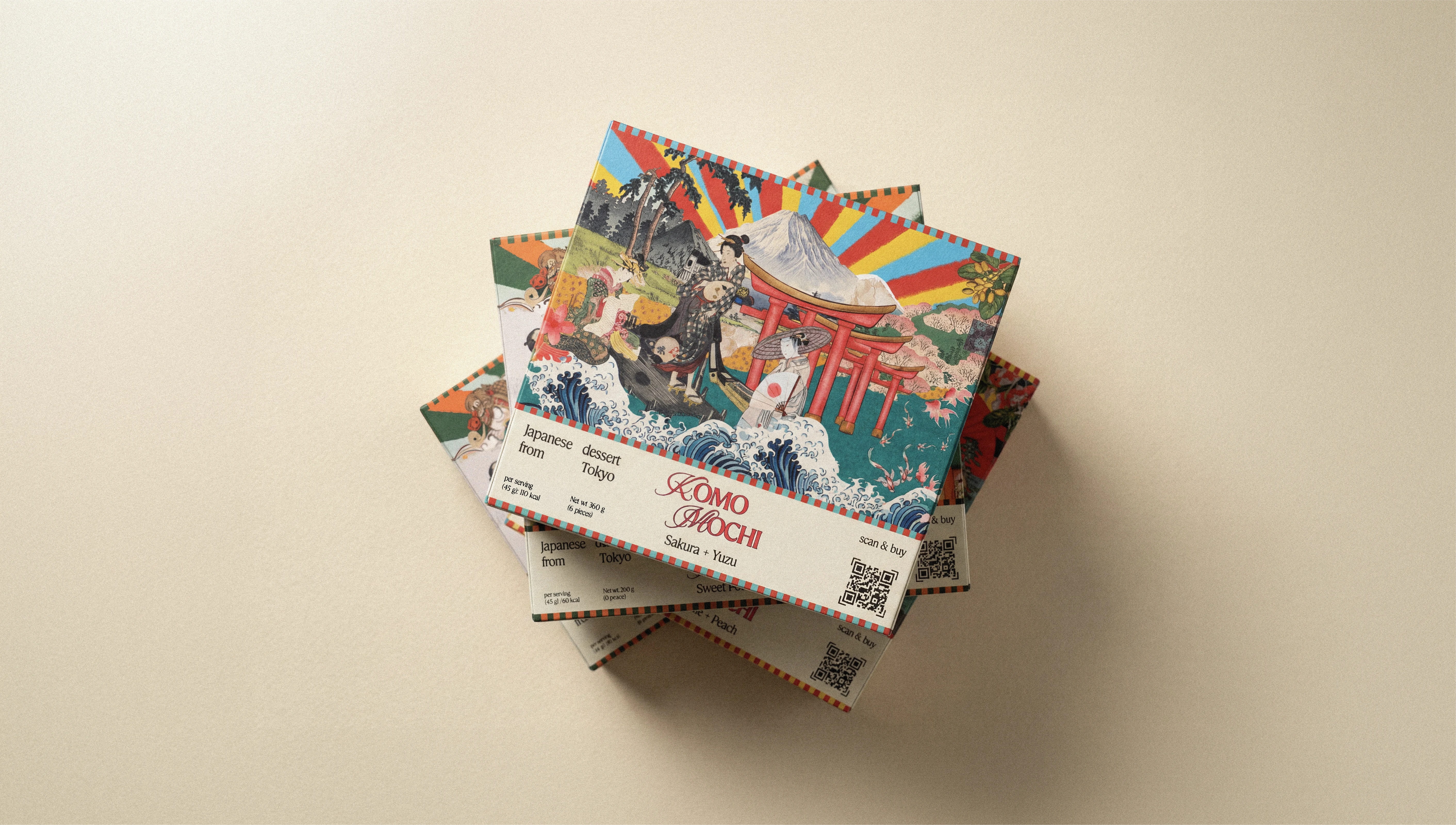
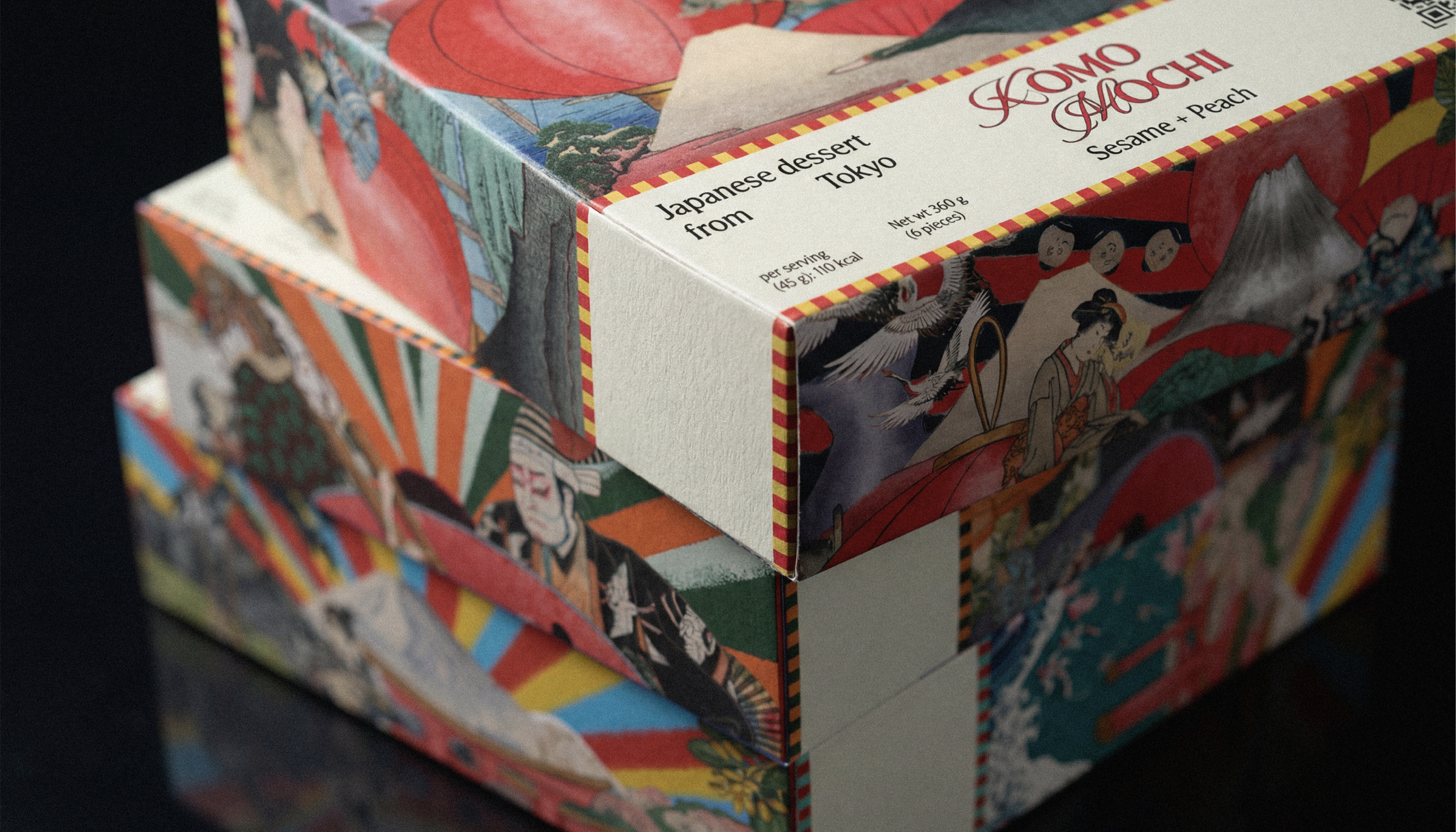
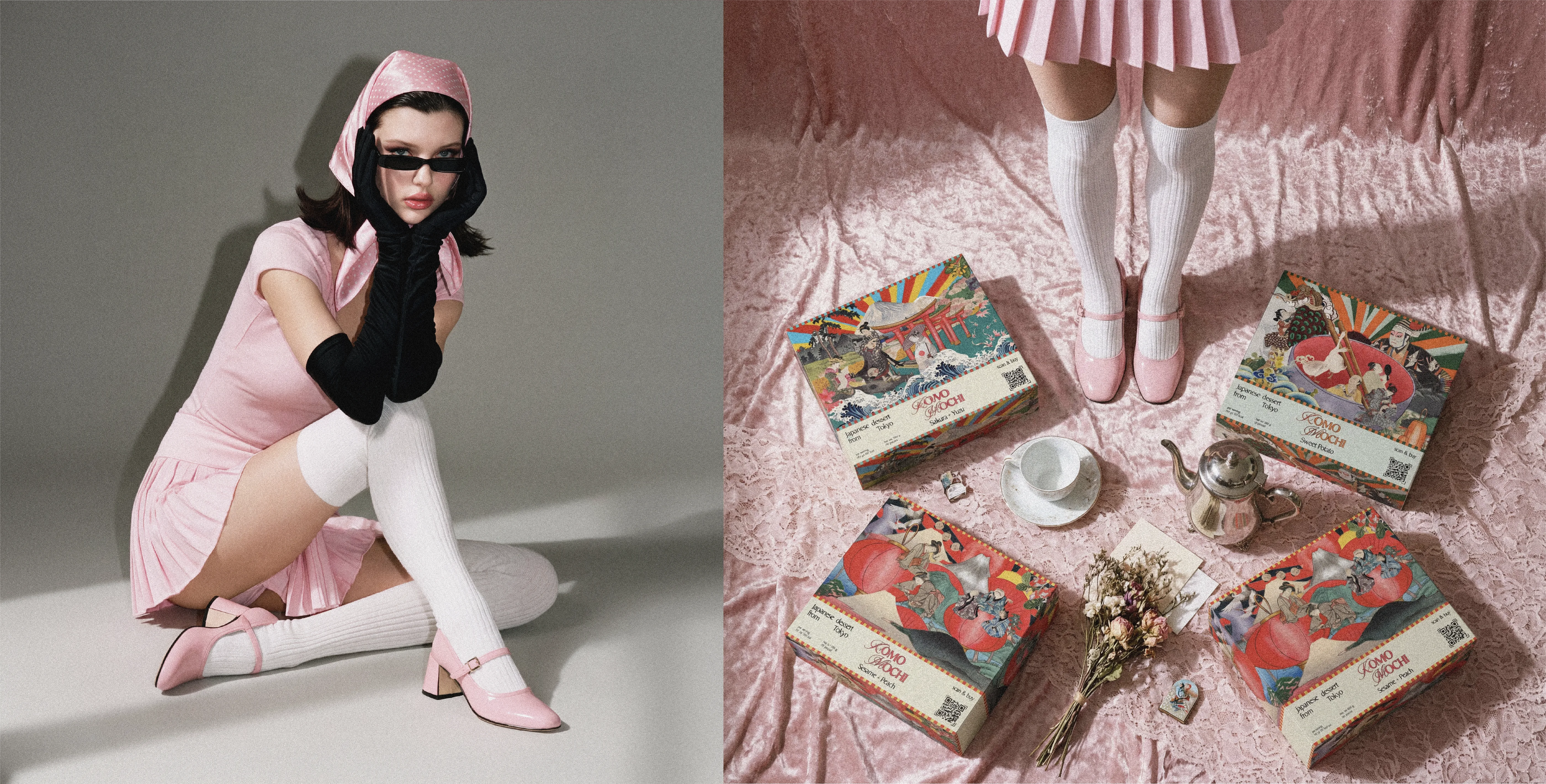
The visual language grew out of ukiyo-e — traditional Japanese woodblock prints of the Edo period, known for their flat planes, expressive linework and scenes of everyday life. I drew on its recurring motifs — Mount Fuji, Hokusai waves, red torii gates, cranes, koi and paper lanterns — and recomposed them as a dense, saturated collage, pairing historical imagery with a loud modern palette to bridge old Japan and now.
Result
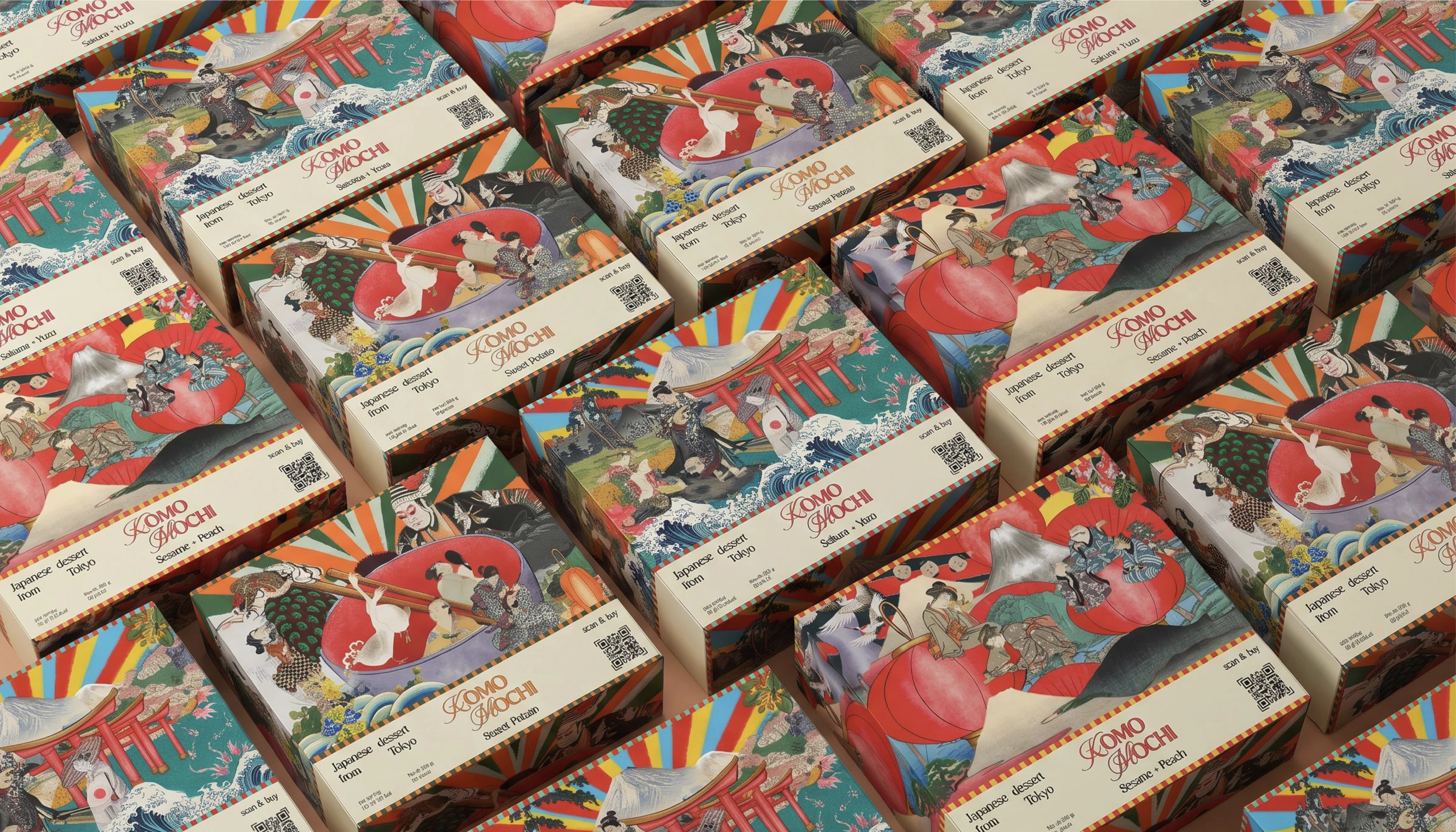
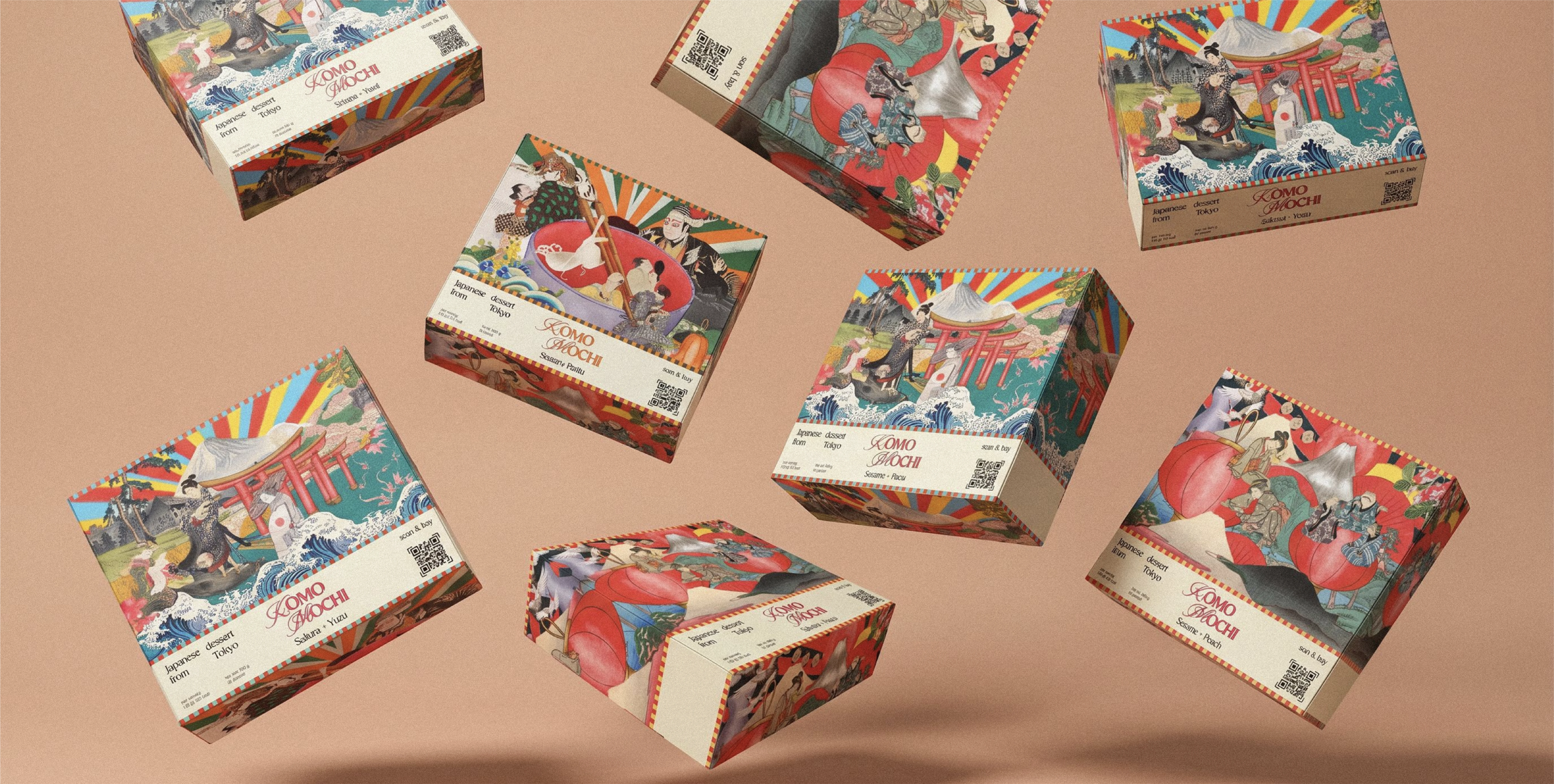
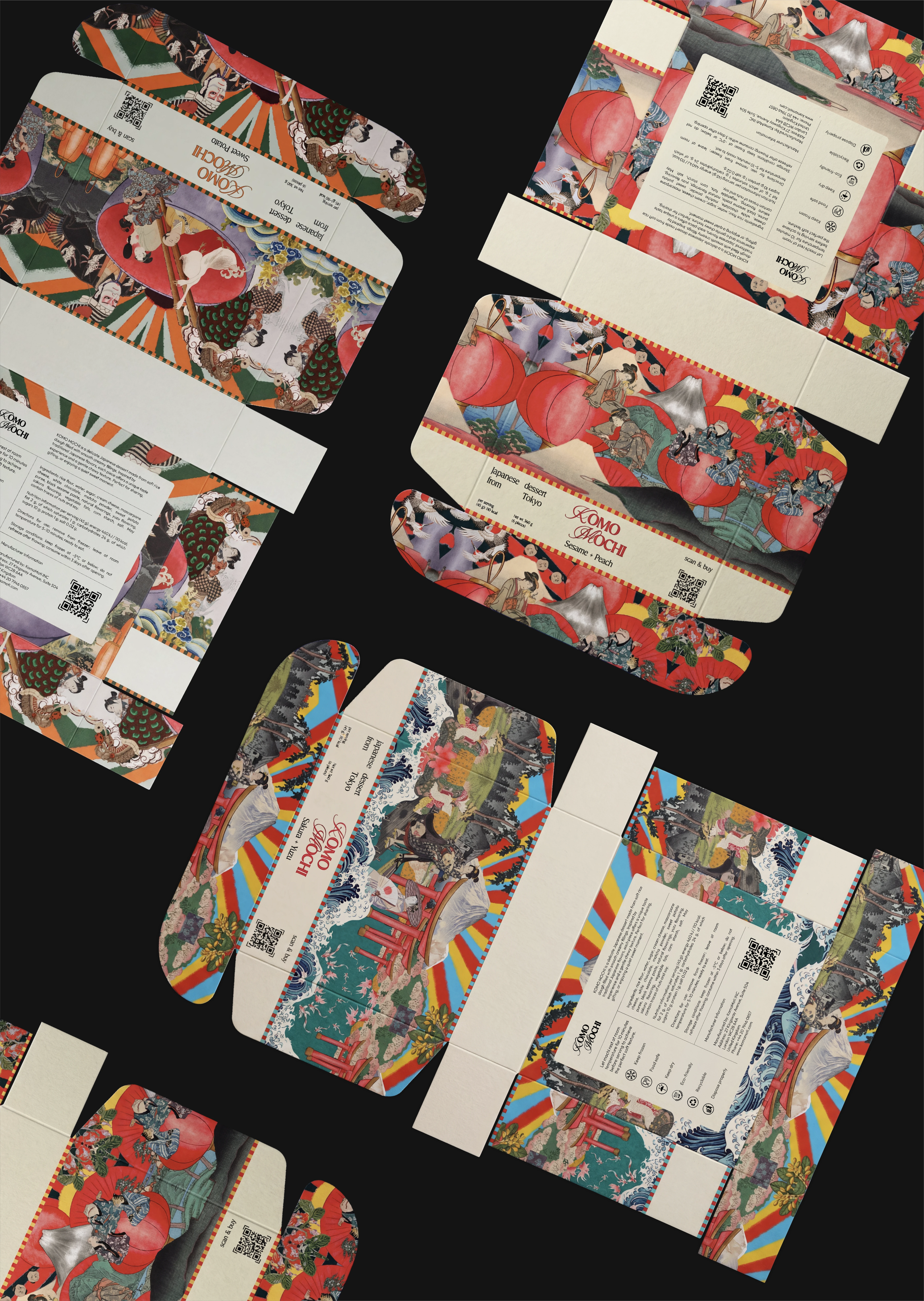
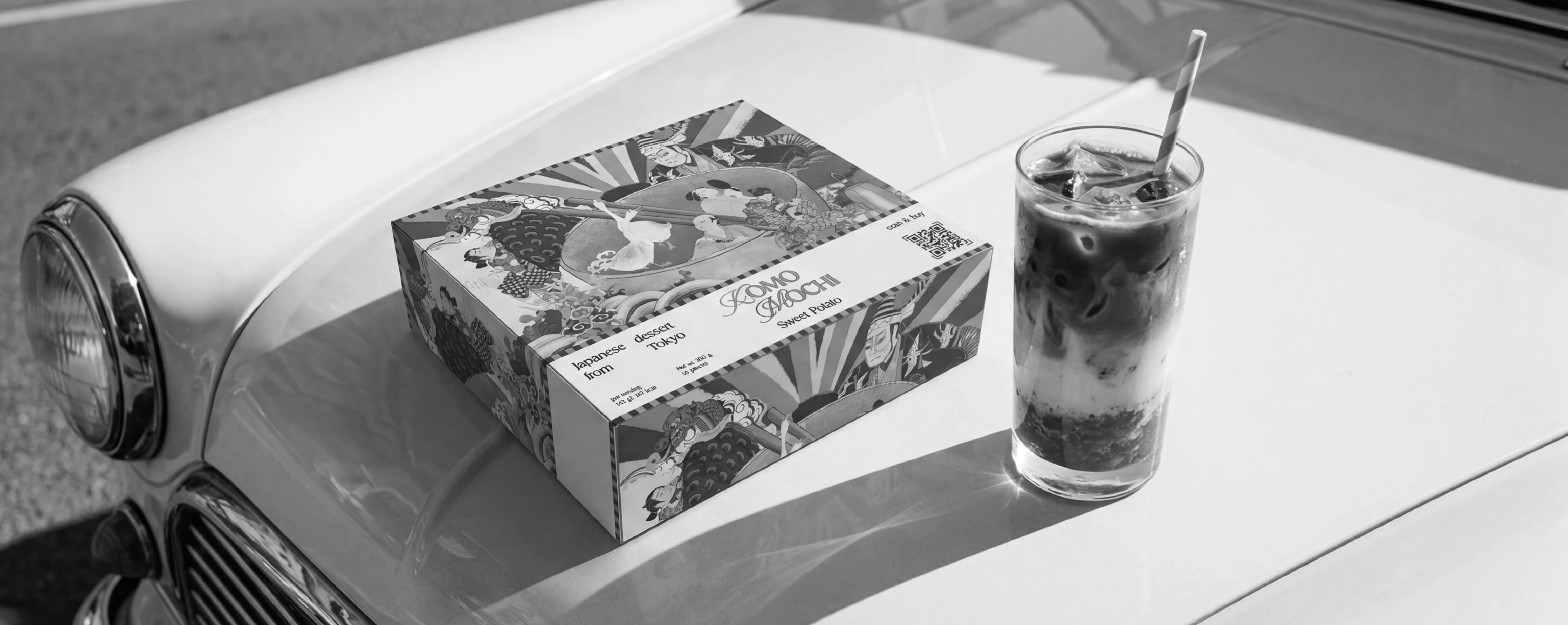
A three-flavour identity (Sakura + Yuzu, Sweet Potato, Sesame + Peach) each with its own colour system and collage scene, unified by one logotype, striped borders and a consistent layout. The result is a vivid, collectible packaging line that reads as a single brand while giving every flavour its own character.
Daria Musiienko | Graphic Designer, Illustrator
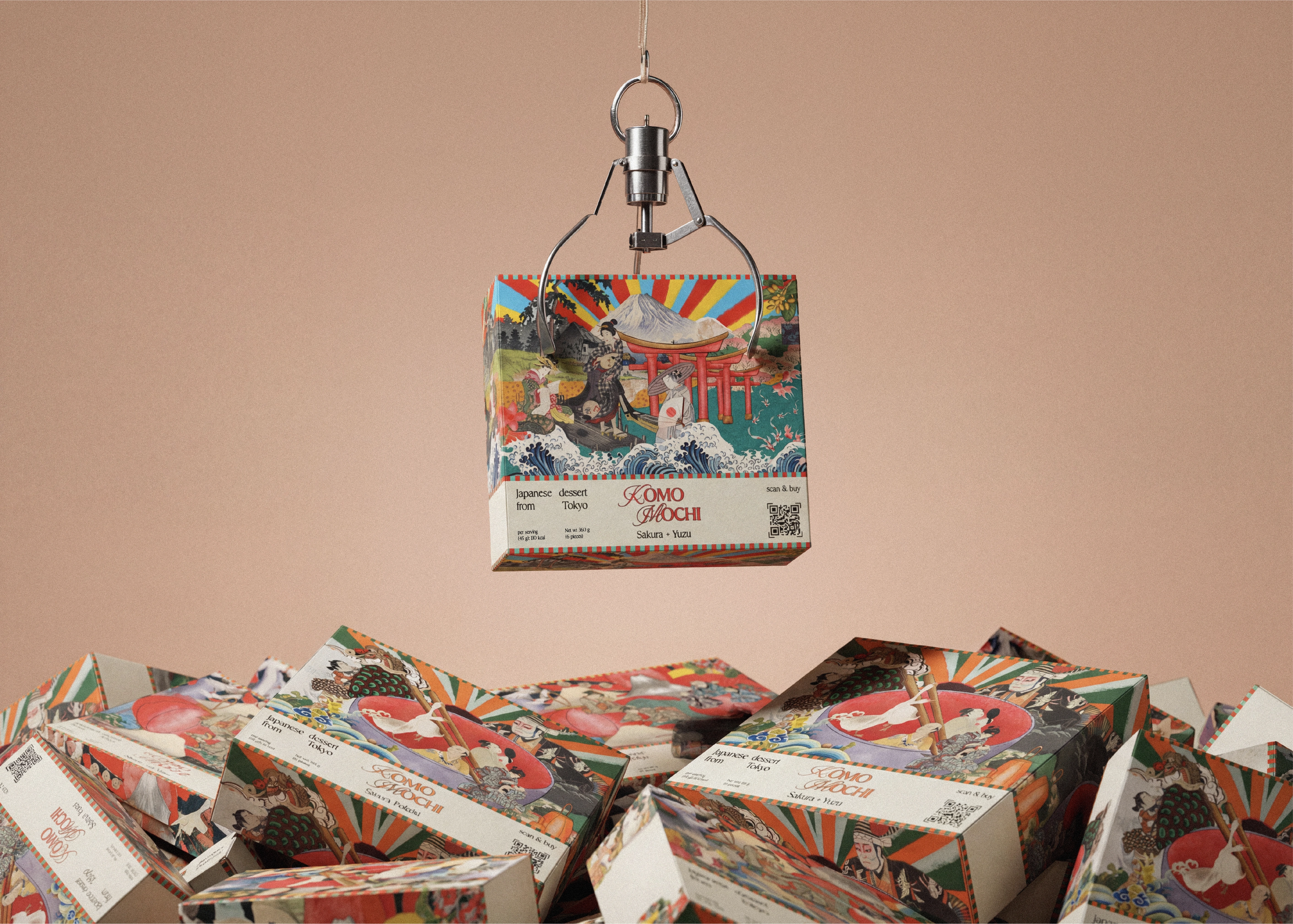
Why Ukiyo-e fits KOMO MOCHI
Ukiyo-e was popular art, printed in volume and made to be enjoyed by everyone, much like a sweet shared among friends. That accessible, joyful quality is exactly what a mochi brand should feel like. Its motifs also carry quiet meaning that suits a dessert meant to be savoured slowly: Mount Fuji for endurance, cranes for longevity and luck, koi for perseverance, cherry blossoms for the beauty of a passing moment.
How it was reinterpreted
Rather than copy a single print, I broke the tradition into fragments and rebuilt it as a maximalist collage. Classic woodblock elements were layered with a vivid modern palette and a sunburst of rays, turning a centuries old visual language into something loud, contemporary and unmistakably KOMO MOCHI.
The logotype
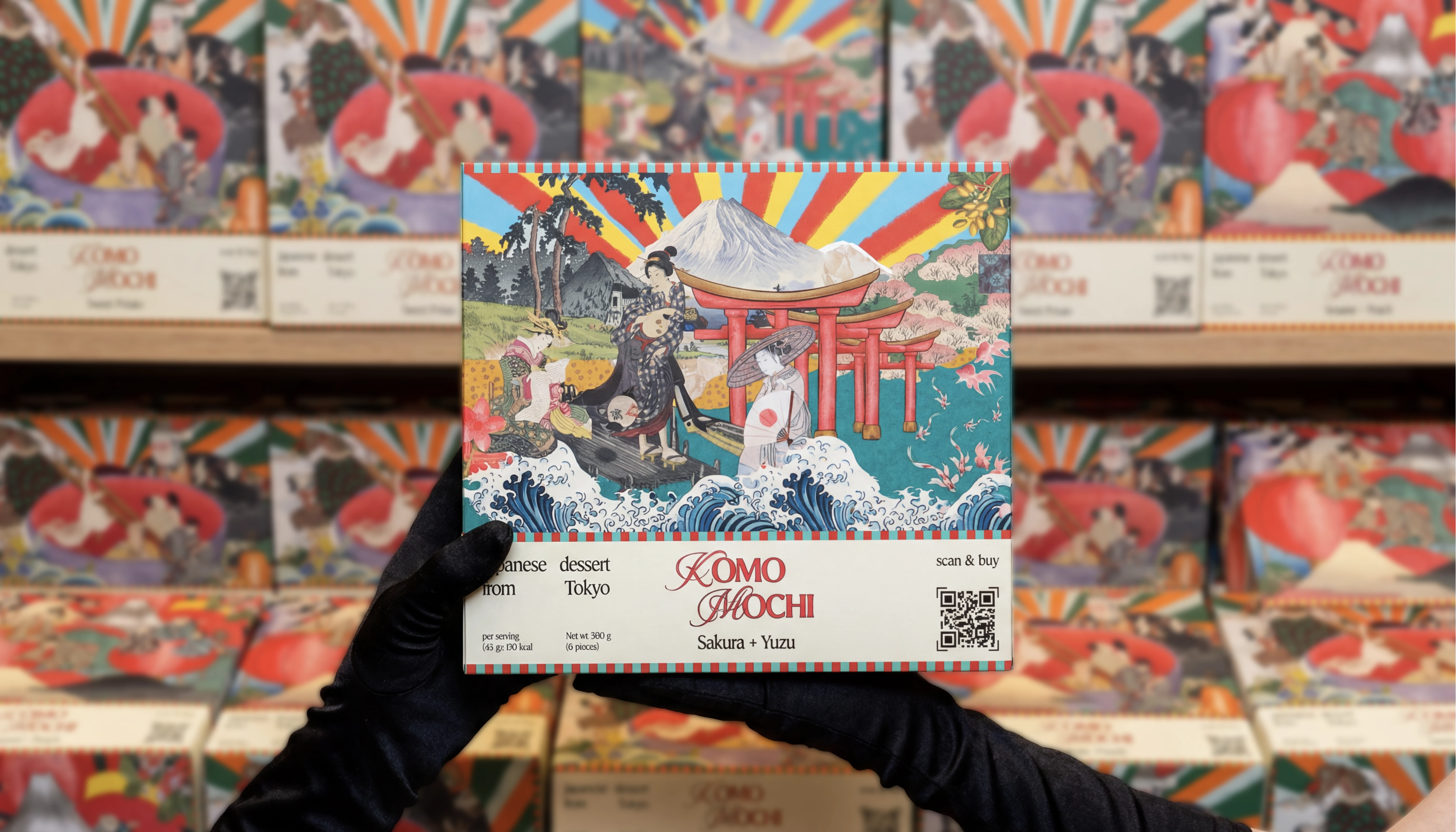
The KOMO MOCHI wordmark is built on a calligraphic script with soft, looping flourishes that echo traditional Japanese brushwork. The forms feel hand drawn and a little playful, balancing the boldness of the packaging with a sense of craft and warmth.
Type pairing
The script logotype is balanced by a clean, neutral sans serif used for all supporting copy: flavour names, "Japanese dessert from Tokyo," weight, serving size and the scan and buy line. The contrast does the work.
Behaviour and scale
The logotype is designed to hold up everywhere. At large sizes the flourishes read as a confident brand signature on the lid. At small sizes, on the side band or a single sticker, it stays clear and balanced thanks to its even weight and open letterforms. The same mark also animates cleanly, drawing itself on or assembling from its parts, which lets the brand carry its handmade feel from the box into motion and social.
Thank you for watching!
I’m open to interesting projects, collaborations and creative opportunities in branding, visual identity and design.
For inquiries and collaborations: musiienkodesign@gmail.com
Like this project
Posted Jun 15, 2026
Likes
1
Views
3
Tags
Brand Designer
Packaging Designer
Visual Designer
Logo Designer
Graphic Designer
Brand Designer
Packaging Designer
Visual Designer
Logo Designer
Graphic Designer
Adobe Illustrator
Adobe Photoshop
Adobe InDesign
Adobe Firefly
Adobe Lightroom
Adobe Illustrator
Adobe Photoshop
Adobe InDesign
Adobe Firefly
Adobe Lightroom