SkillNest App Redesign

Pragati

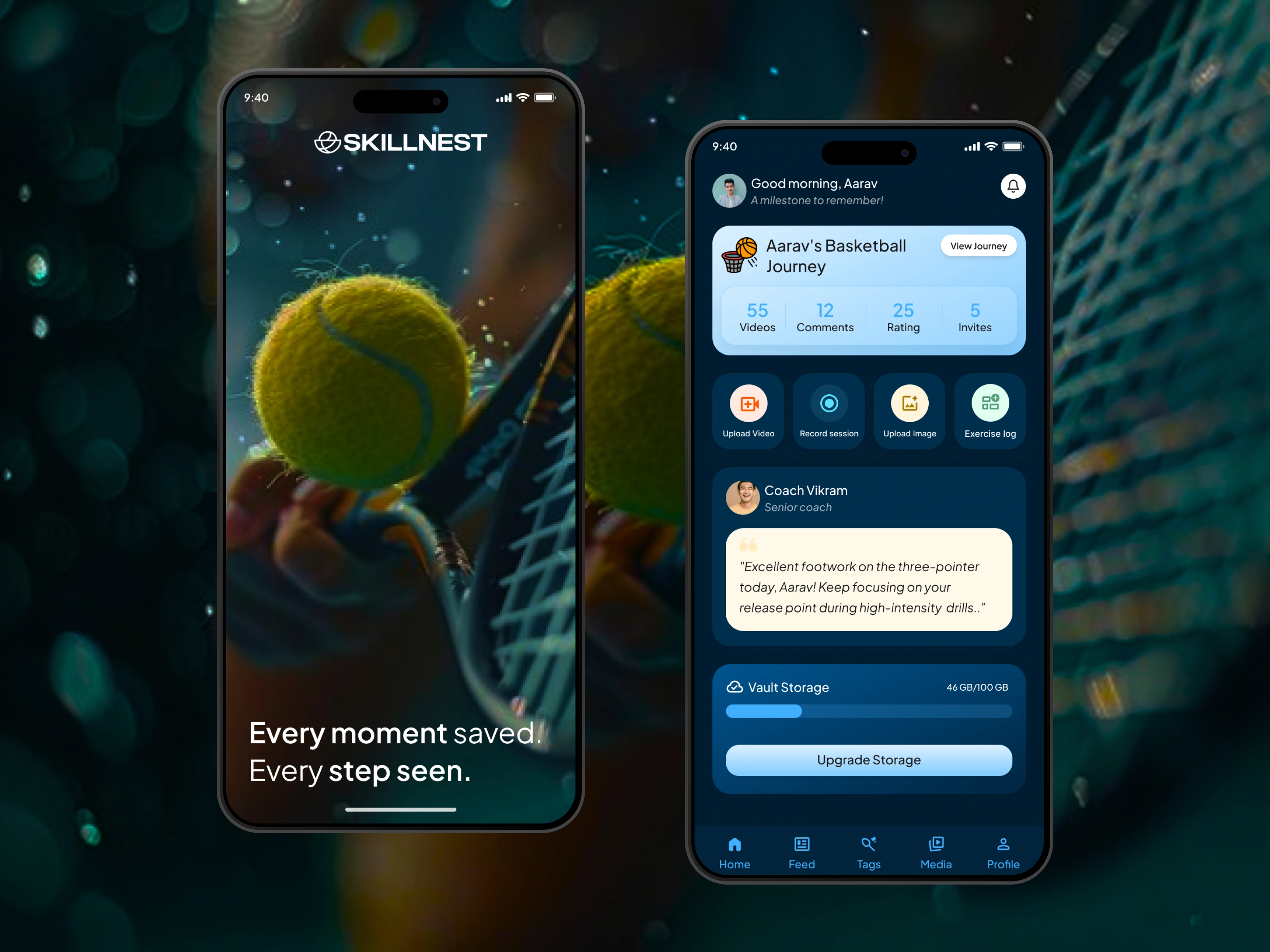
SkillNest: Redesigned for Better Skill Tracking
SkillNest is a video storage and analysis platform designed to help parents and students capture, organize, and track skill development across sports, music, dance, and martial arts.
I redesigned the entire mobile application, creating a more structured content experience, introducing a new visual system, simplifying navigation, and designing new product experiences that were not part of the original application.
01 — Overview
The Product
SkillNest helps families turn scattered training videos into an organized, searchable record of a student's development.
Parents can upload training videos, organize their child's progress, compare footage over time, and selectively share access with coaches.
For coaches, SkillNest provides contextual access to a student's training history and enables them to provide feedback directly on video.
My Role
Product Designer
I worked across the end-to-end mobile experience, including UX structure, navigation, visual design, design system, and new screen creation.
02 — Understanding the Product
SkillNest connects three important parts of the skill-development journey:
Capture
Parents record and upload training sessions directly to SkillNest rather than relying on an unorganized camera roll.
Organize
Videos can be indexed by date, sport, and session type, making previous training footage easier to find.
Analyze
Parents and students can compare historical footage to understand progress, while coaches can provide contextual feedback directly on videos.
Connect
Parents remain in control of sharing and can invite coaches to access a student's training history.
This creates a product that is not simply a video-storage platform, but a record of a student's development over time.
03 — The Challenge
The original application contained the core functionality needed to manage training content, but the overall experience had an opportunity to become more structured, consistent, and engaging.
Rather than limiting the redesign to visual improvements, I looked at the application as a complete product experience and introduced new screens and structures where they could improve the overall journey.
04 — A New Visual Direction
The visual language was completely refreshed to create a cohesive product experience.
Color
I used a dark blue foundation supported by bright blue and highlight colors.
Primary background
#001D31
The dark foundation gives the interface a focused and creates strong contrast with content and interactive elements.
Highlight
#41B0FF
Used across interactive elements, navigation, buttons, icons, and visual emphasis.
Gradient
#DBF0FF → #81CAFF
Used to introduce visual depth and create a more distinctive brand expression.
I also developed multiple shades of #41B0FF to create a more flexible color system across different UI states and components.
Typography
I used Plus Jakarta Sans as the primary typeface throughout the redesigned app.
05 — Designed a New Home Experience
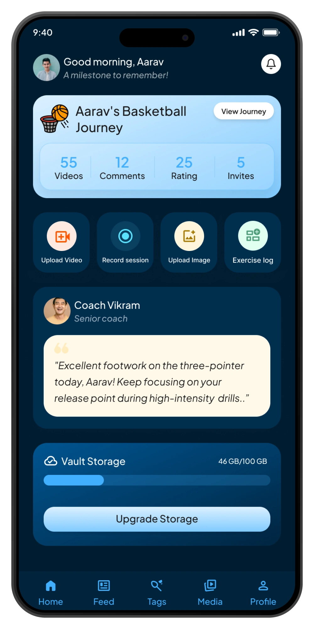
Home Page
The original SkillNest app did not have a Home page. Users primarily interacted with individual content areas.
I designed the new Home screen as a personalized dashboard for the student's skill journey — bringing progress, actions, coach feedback, storage, and navigation into one place.
The goal was not simply to create a new screen, but to give users an immediate understanding of where they are in their journey and what they can do next.
06 — Before & After
The redesign transformed the visual and structural experience.
The goal was to make newly designed screens feel like part of the same product.
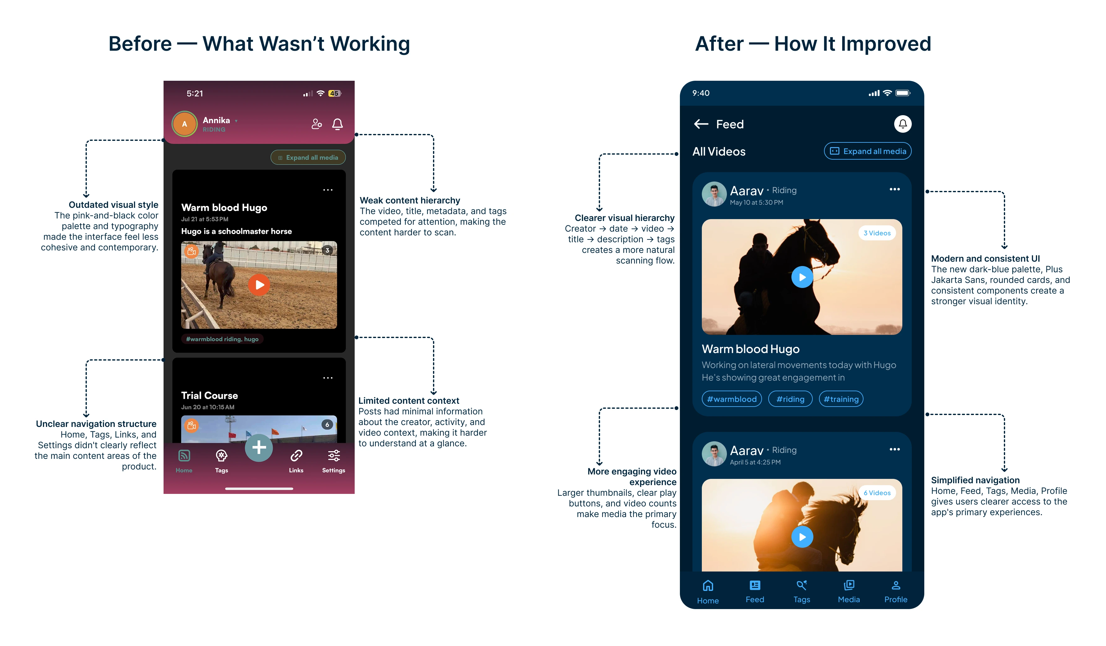
Feed Page Transformation
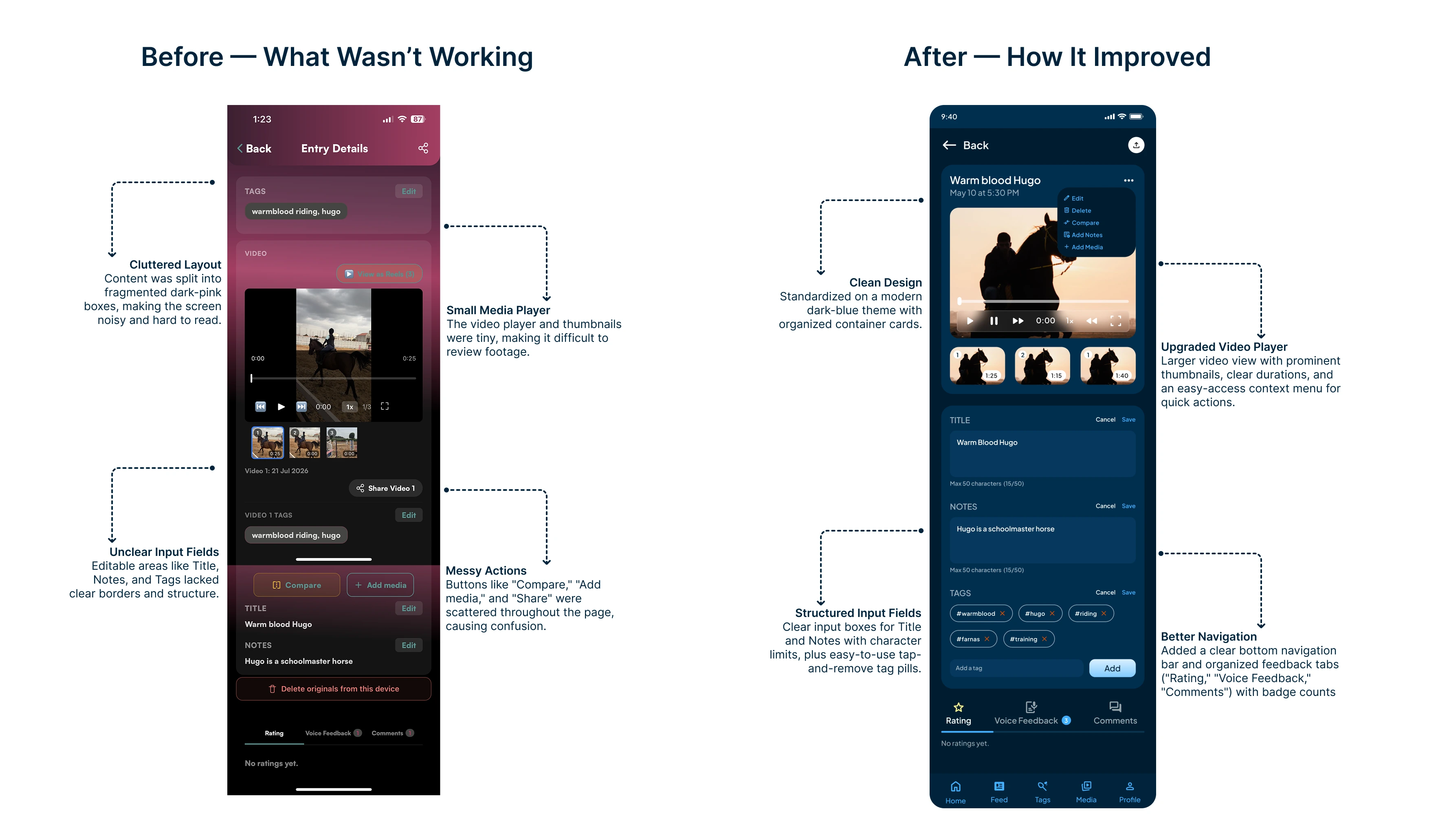
Feed Edit Page Transformation
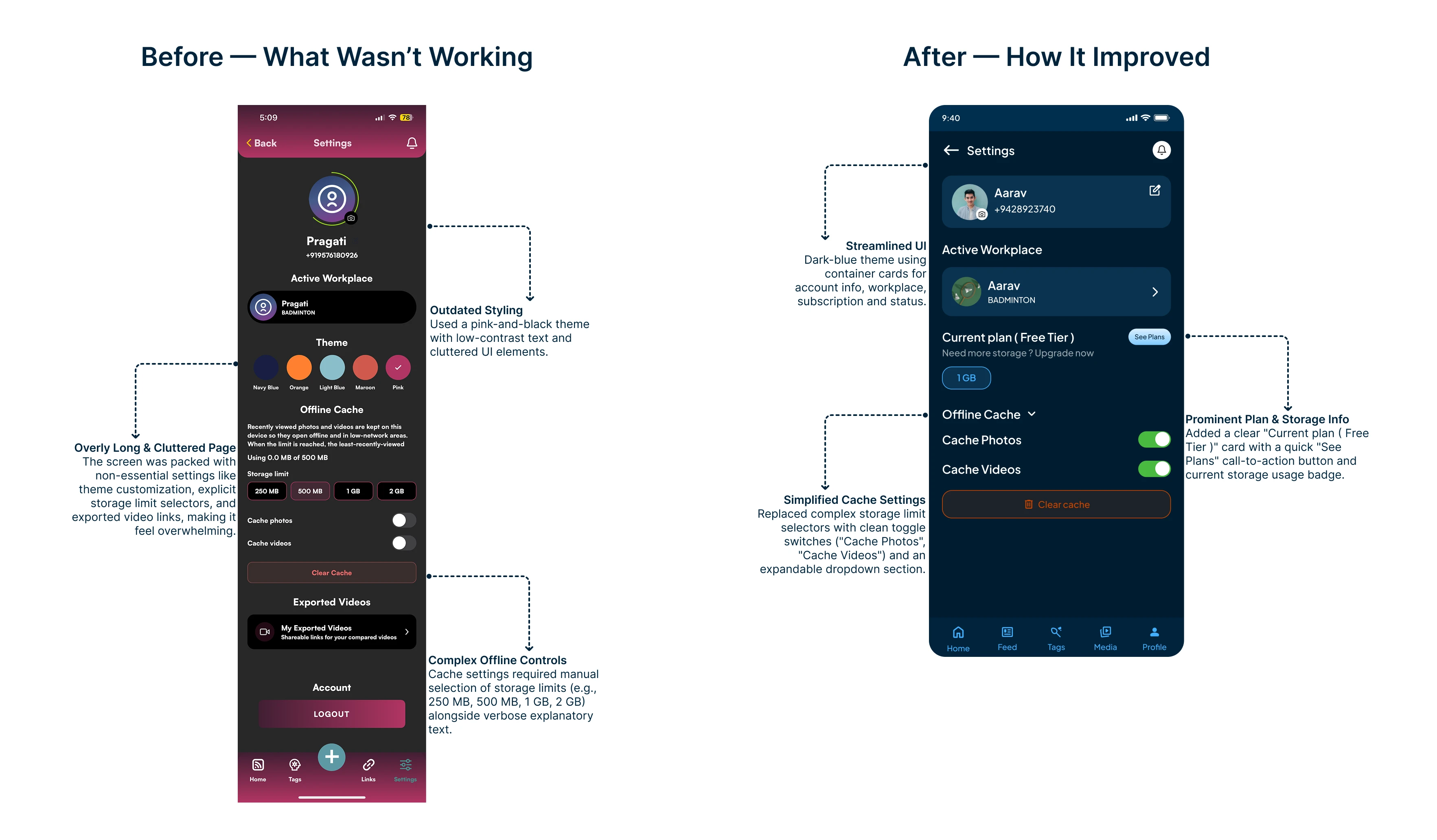
Settings Page Transformation
07 — The Result
This project reinforced the difference between redesigning screens and redesigning a product
Updating the color palette and typography establish a stronger visual identity, but the larger opportunity came from reconsidering how the product is structured.
Designing a new Home experience, restructuring navigation, improving the Feed, and creating new screens pushed me to think beyond individual interfaces and consider how the different parts of SkillNest work together as one ecosystem.
The biggest takeaway was that a successful redesign should not only make an existing interface look better — it should make the product easier to understand and give it a foundation for what's next.
Like this project
Posted Sep 1, 2026
Redesigned SkillNest app to enhance structure, navigation, and visual design.
Likes
0
Views
6