Real Estate App
Pragati
🏡 LuxeEstate
A Premium Property Discovery Experience
The Vision
Finding a home should feel exciting.
Not overwhelming.
Most real estate apps feel crowded, information-heavy, and transactional.
I wanted to design an experience that feels:
• Minimal • Premium • Conversion-focused
The project explores how minimal design and strong visual hierarchy can improve the home-buying experience. And created to demonstrate end-to-end product thinking from research to final UI.
The Problem
Modern property apps overload users with:
Too many filters
Too much text
Cluttered interfaces
Long booking forms
Users want to:
Browse quickly
Compare easily
Book seamlessly
The Goal
Design a visually immersive, minimal mobile experience that:
✔ Simplifies browsing
✔ Reduces cognitive load
✔ Encourages saving properties
✔ Increases booking conversions
Research Phase
Before designing, I studied:
What I Found
✔ Strong filtering systems
✔ Large property imagery increases engagement
But…
✖ Cluttered layouts
✖ Information overload
✖ High-friction booking
✖ Poor visual hierarchy
There was space for a cleaner, premium alternative.
User Insights
I conducted informal interviews with 5 users.
Key Behavioral Patterns
• Users scan images first
• Price visibility is critical
• They save 3–5 properties before deciding
• Long forms reduce booking completion
Core Insight
Real estate decisions are emotional first, logical second.
So the design needed to lead with emotion and support logic second.
Key Screens
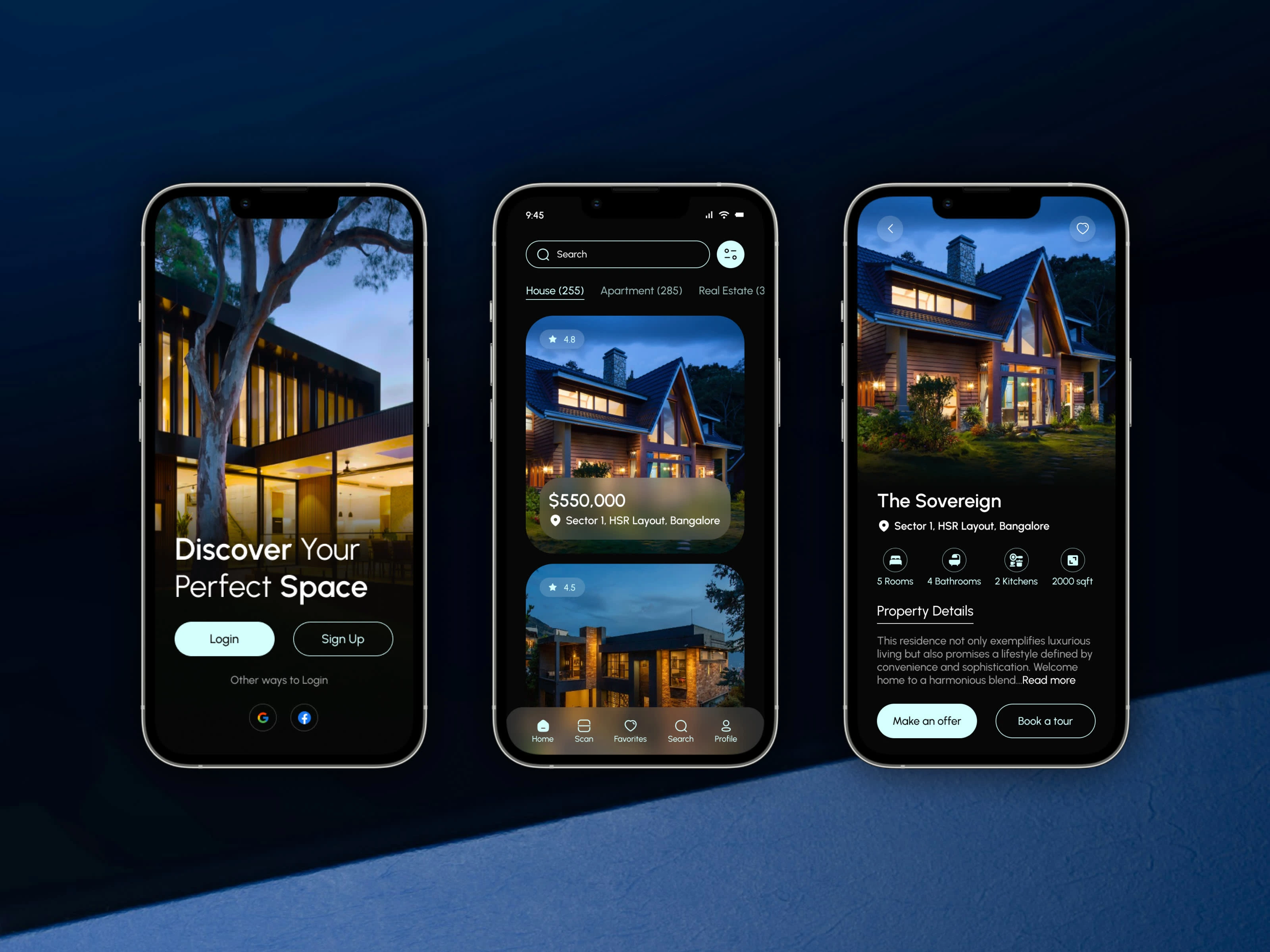
01 — Onboarding
Purpose:
Aspirational entry
Immediate brand tone setting
Design Choice:
Hero image to emotionally engage users from first interaction.
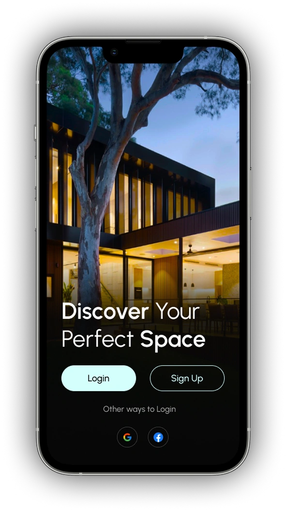
Onboarding Screen
02 — Home
Purpose:
Property discovery
Category filtering
Design Choice:
Large cards
Clear price visibility
Location hierarchy
Rating badge for trust
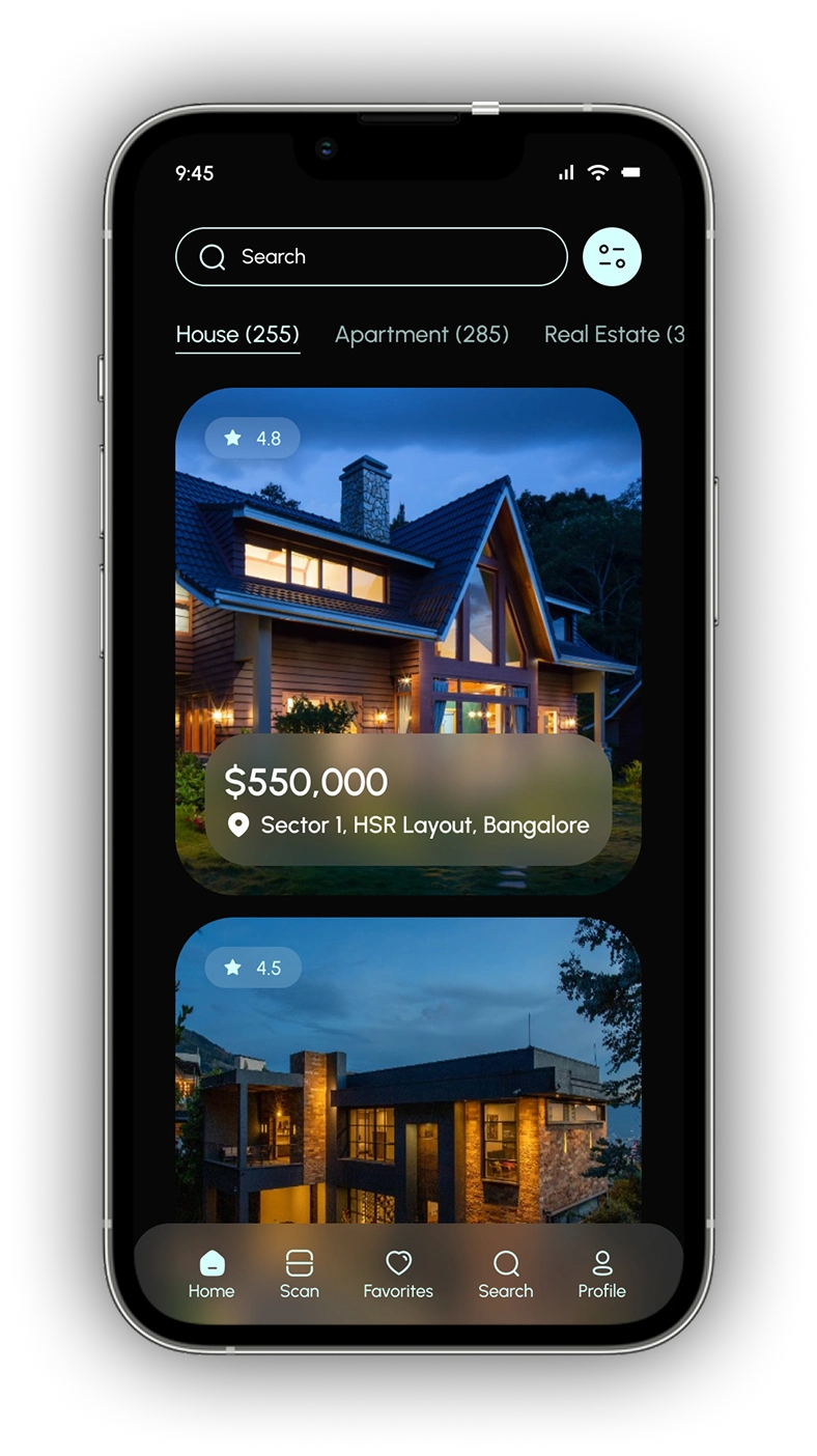
Home Screen
03 — Property Detail Screen
Purpose:
Provide essential decision-making information
Design Choice:
Immersive header image
Icon-based property specs
Property description
Strong primary CTAs
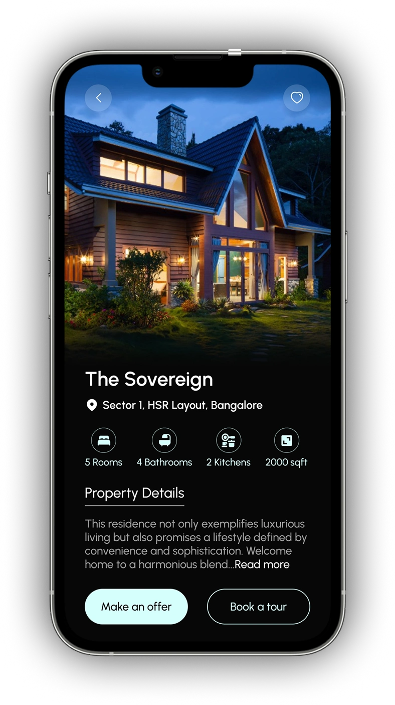
Property Detail Screen
04 — Favorites Screen
Purpose:
Support comparison behavior
Design Choice:
Clean list layout
Quick unsave interaction
Price visibility maintained
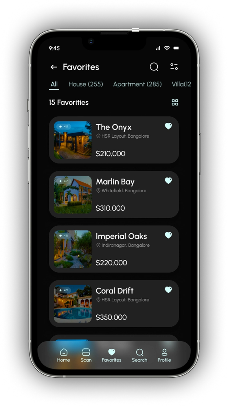
Favorites Screen
05 — Book a Tour Screen
Purpose:
Convert browsing into real-world action
Design Choice:
Calendar-based date picker
Minimal required inputs
Strong bottom CTA
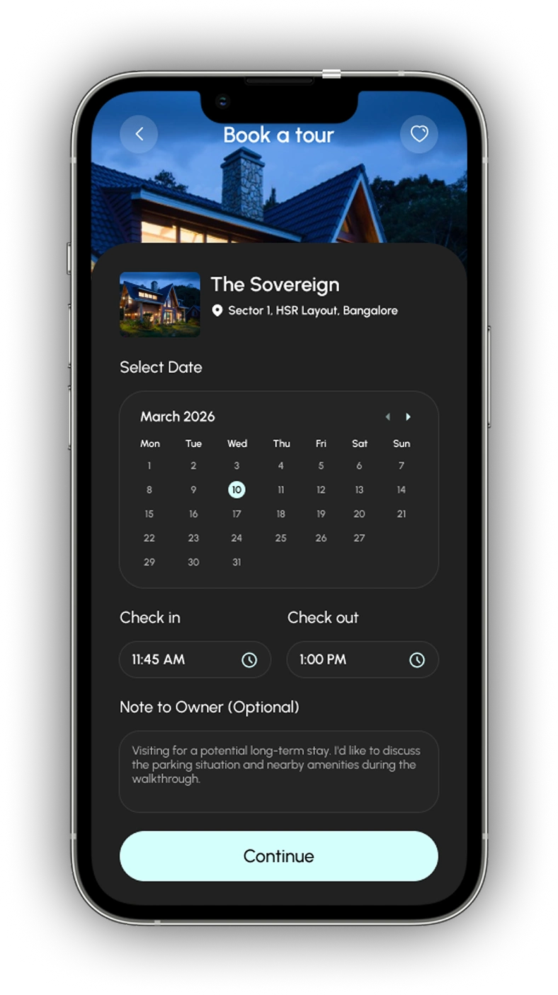
Book a Tour Screen
Final Outcome
This project demonstrates:
Research design decisions
Strong visual hierarchy
Conversion-focused product strategy
Consistent design system
LuxeEstate is not just a UI concept, it’s a complete mobile product experience.
Like this project
Posted Mar 1, 2026
LuxeEstate is a real estate mobile application designed to simplify property discovery, comparison, and booking.
Likes
0
Views
12