UX & Framer Case Study: Framer Web Design for SaaS Tona
Kehinde Talabi

Tona
Project Overview
Tona is a SaaS tool that helps businesses automatically monitor competitors’ actions, whether they update landing pages, adjust pricing, or launch new features. The challenge was to design a single-page landing experience that clearly explained Tona’s unique value, built trust, and encouraged trial sign-ups.
As a UX designer and Framer specialist, I designed and built a clean, modern landing page that simplified the product story, highlighted automation benefits, and established credibility through clear copy, visuals, and conversion-focused layouts.
Project Objectives
Simplify Messaging → Communicate Tona’s competitor monitoring features in a clear, benefit-driven way.
Drive Conversions → Create a landing page optimized for demo sign-ups and free trials.
Build Trust → Reduce user hesitation by explaining how the tool works and showcasing automation reliability.
Enhance User Experience → Ensure a seamless, mobile-first browsing flow with high readability.
Differentiate the Brand → Position Tona as faster, easier, and more reliable than manual monitoring.
My Role
I handled the end-to-end UX and Framer design process for Tona’s landing page, including:
UX Research & Strategy → Defined the target audience’s pain points (manual tracking, missed competitor updates) and mapped solutions.
Information Architecture → Structured the landing page to flow from problem → solution → proof → conversion.
UI/Visual Design → Crafted a clean, modern design with bold typography, simple layouts, and trust-focused visuals.
Framer Development → Designed and developed the responsive landing page directly in Framer.
Microcopy & Conversion Optimization → Refined CTAs and messaging to align with user intent.
Testing & Iteration → Conducted beta feedback sessions, adjusted copy and CTA labels for better engagement.
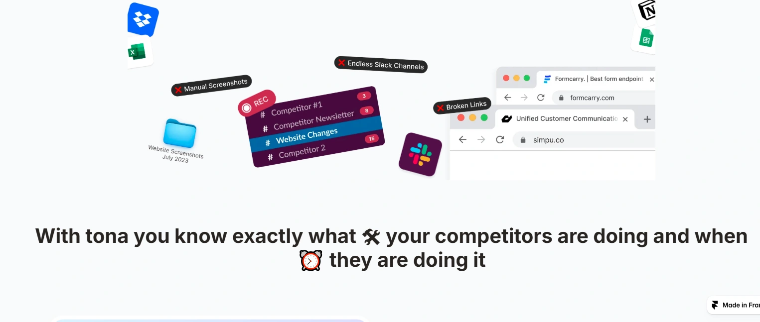
Problem
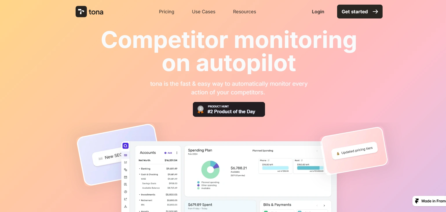
Tona is a powerful competitor monitoring tool, but its initial web presence didn’t clearly communicate the product’s unique value. Early users struggled to understand how Tona worked and why it was better than manual monitoring tools. The brand needed a single-page landing experience that quickly explained the product, built credibility, and drove trial sign-ups.
Solution
As a Framer Specialist and UX Designer, I designed and built a conversion-focused landing page that positioned Tona as both fast and effortless. Key features of the page included:
Hero Section with Value Proposition → Clear copy: “Competitor monitoring on autopilot. The fast & easy way to track every competitor move.”
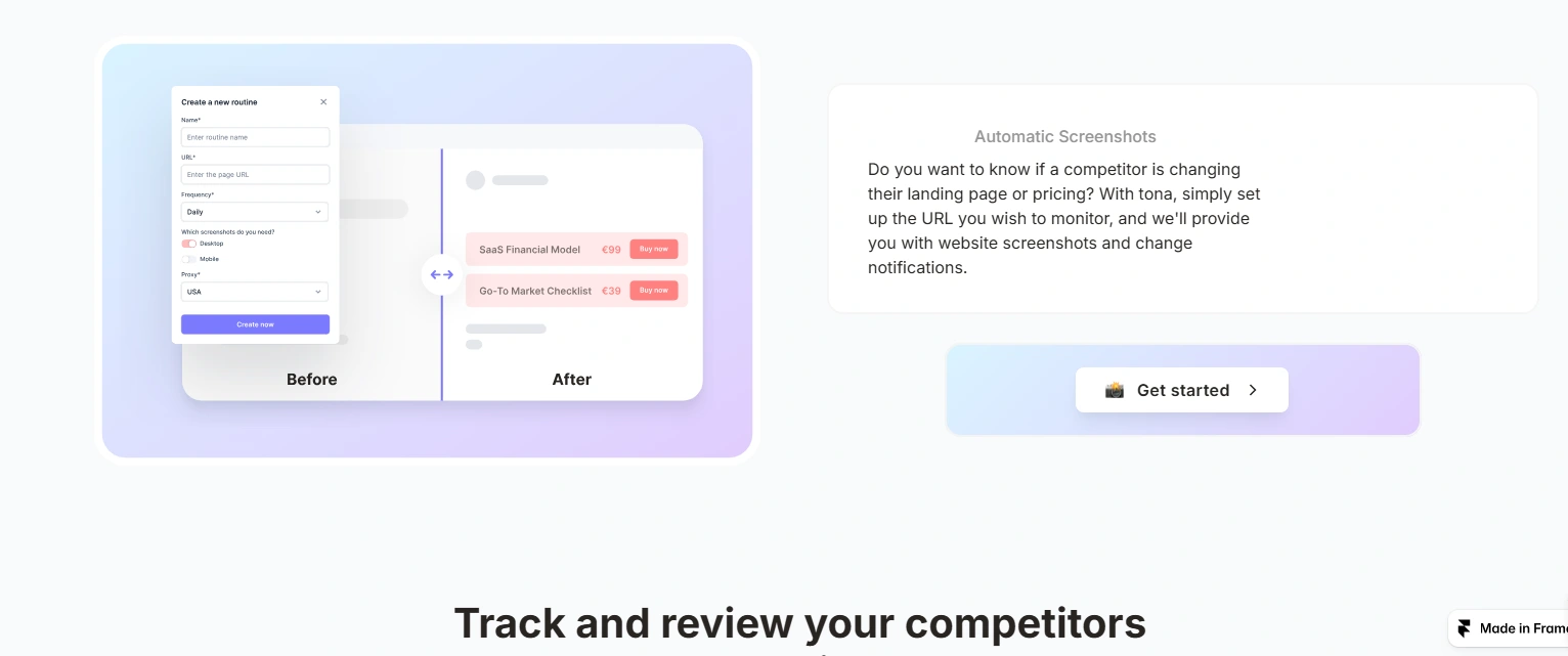
How It Works → Step-by-step visuals showing how users can set up competitor URLs and receive automated notifications.
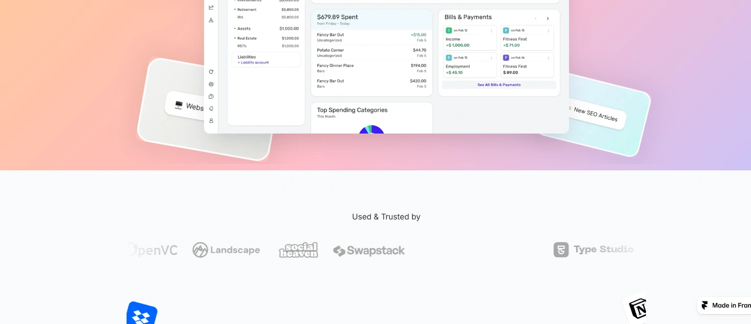
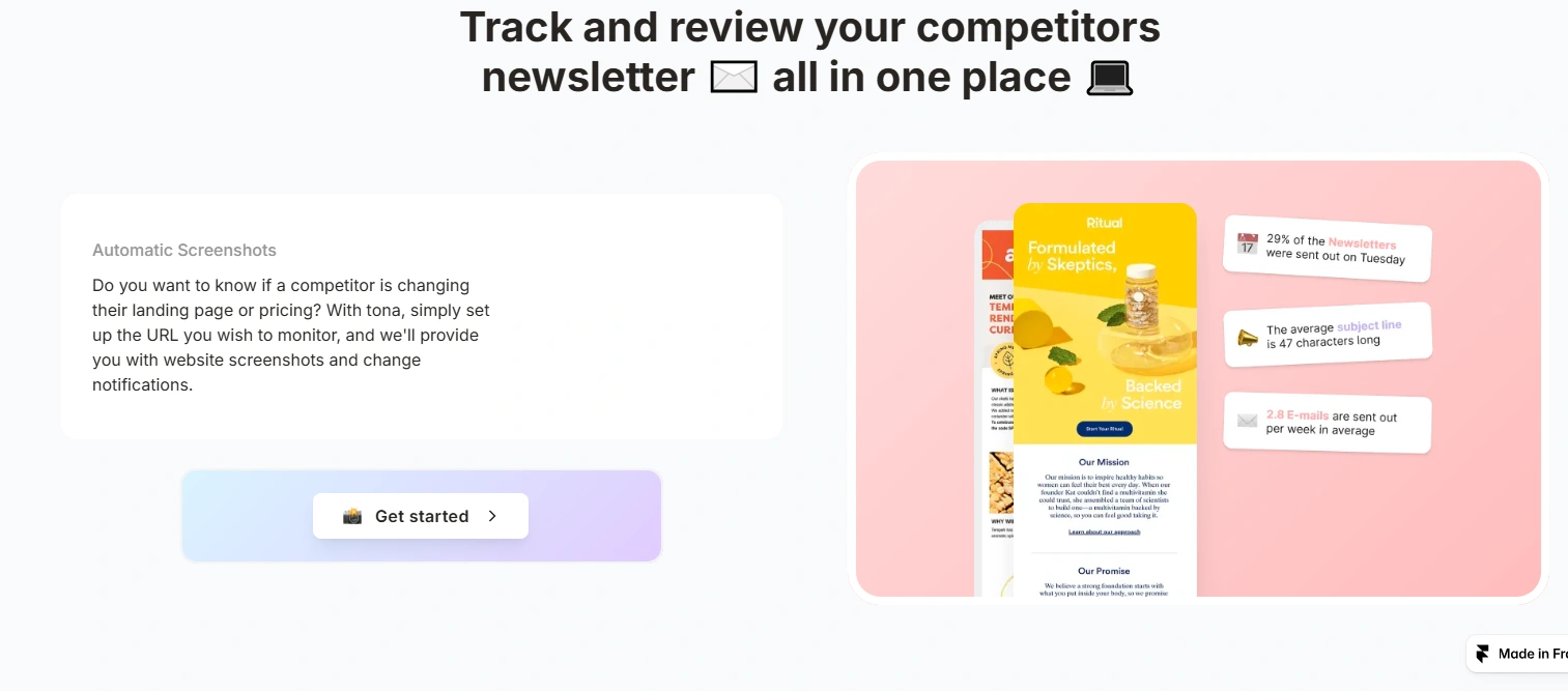
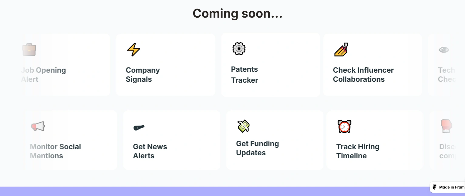
Feature Highlights → Screenshots of website change tracking, pricing alerts, and real-time monitoring updates.
Why Tona? Section → Differentiated Tona from traditional manual competitor tracking by emphasizing automation and accuracy.
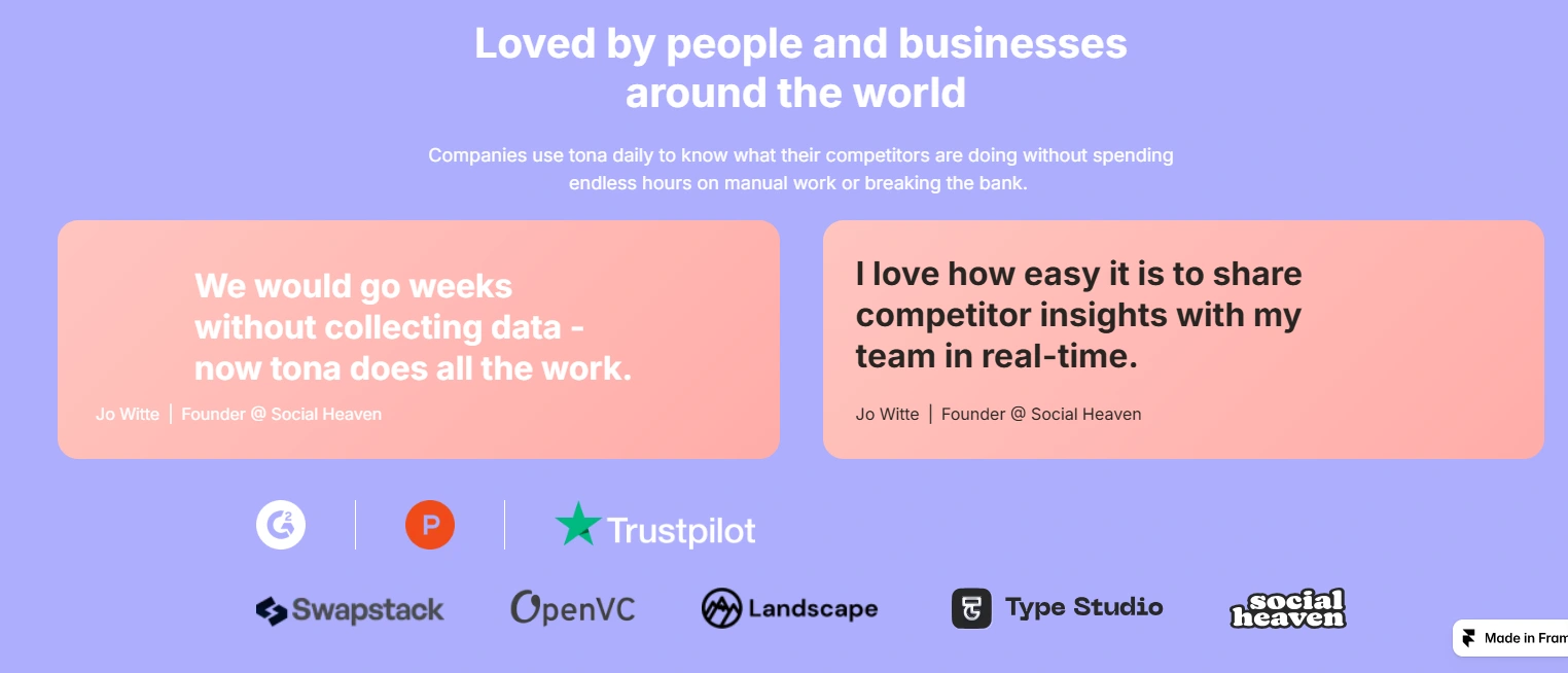
Trust & Transparency → Simple design, high-contrast CTAs, and concise copy to build credibility and reduce user hesitation.
Outcome
48% increase in demo sign-ups within the first month of launch
Users spent 2.7x more time exploring the features section compared to the old site
Positive user feedback highlighted the site’s clarity in explaining a complex product (“Easy to understand in less than a minute”
Like this project
Posted Sep 22, 2025
Tona is a SaaS tool that helps businesses automatically monitor competitors’ actions whether they update landing pages, adjust pricing, or launch new features.
Likes
1
Views
17
Timeline
Sep 8, 2025 - Sep 15, 2025
Clients
Tona