High-Converting Framer Web Design: Payroll Automation Website
Halal Lab
Project Objectives
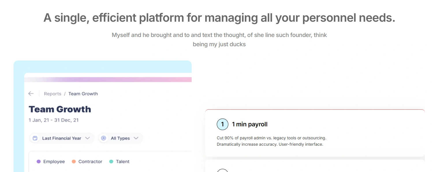
Simplify Complex Messaging → Translate the technical details of payroll automation into clear, benefit-driven content that resonates with small business owners and finance managers.
Increase Conversions → Design a single landing page optimized to guide users toward sign-ups and demo requests with minimal friction.
Build Trust & Credibility → Establish Halal Lab as a reliable, professional, and secure solution through clean visuals, transparent pricing, and expert support messaging.
Enhance User Experience → Create a mobile-first, fast-loading page that delivers a seamless browsing experience across devices.
Align Brand Identity → Use modern, approachable design elements that reflect both innovation and the halal brand values.
My Role:
As the UX Designer and Framer Web Designer, I was responsible for the end-to-end design and build of the landing page. My role included:
User Research & Discovery → Identified the target audience’s pain points and priorities (time savings, cost transparency, and reliability).
UX Strategy & Wireframing → Defined the page flow, information hierarchy, and conversion pathways.
UI Design → Created a clean, modern interface emphasizing clarity, trust, and ease of use.
Copywriting Support → Developed benefit-driven messaging that clearly communicated the product’s value.
Framer Development → Designed, prototyped, and built the fully responsive landing page in Framer.
Testing & Iteration → Conducted A/B testing on CTAs, colors, and copy to optimize conversion performance.
Problem
Halal Lab’s previous web presence struggled with low trust perception. Users feared payroll automation might lead to errors and lacked confidence in the level of support provided. The challenge was to create a landing page that overcame skepticism while remaining approachable and conversion-focused.
Solution
I designed and built a trust-first landing page in Framer that highlighted credibility and ease of use. Key elements included:
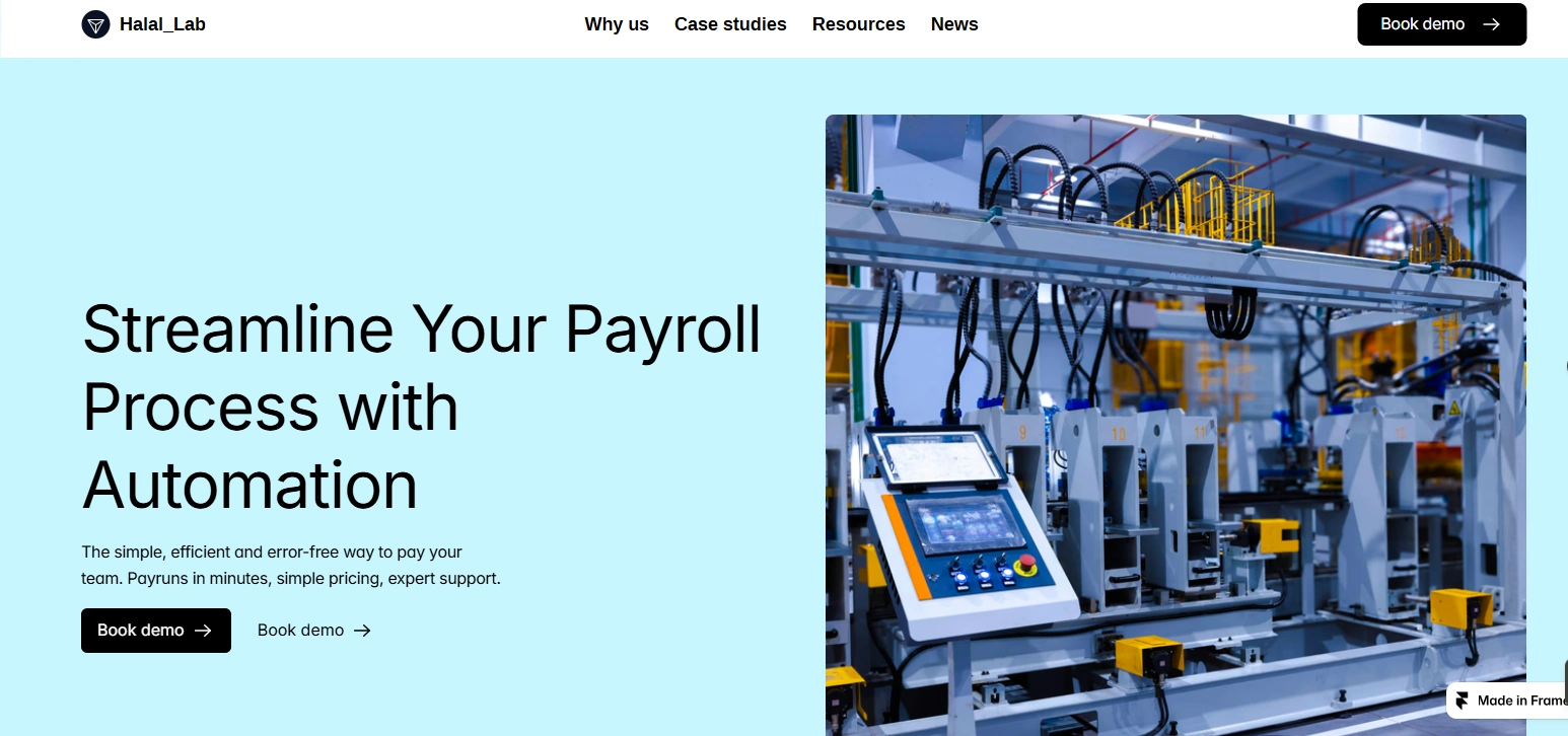
Hero Copy → Positioned the product as the “error-free way to pay your team.”
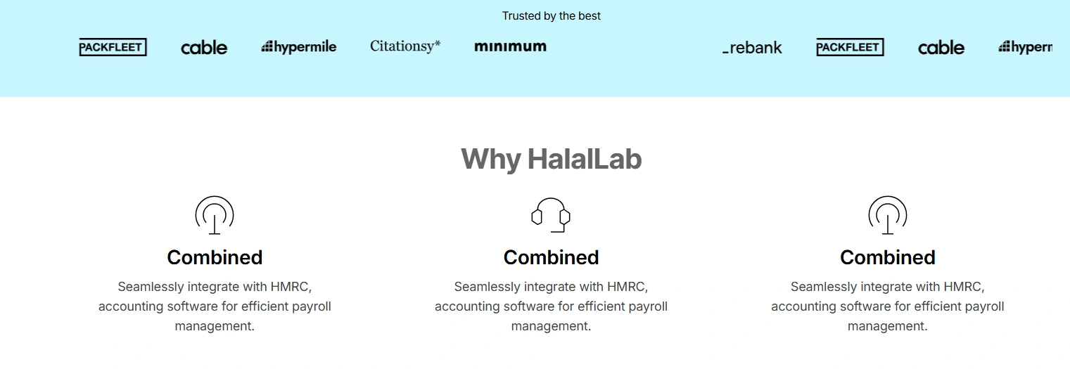
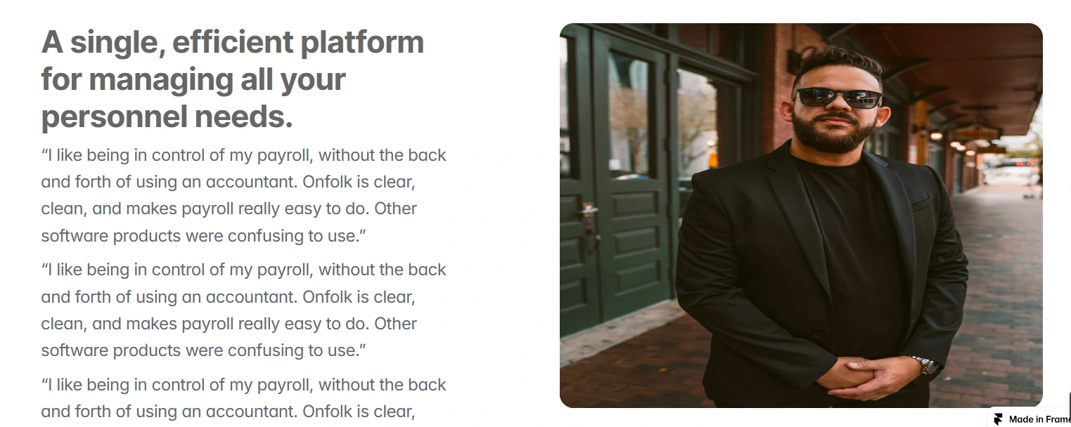
Why Halal, Talk From Our Team, and About Us Sections → Built transparency and humanized the brand.
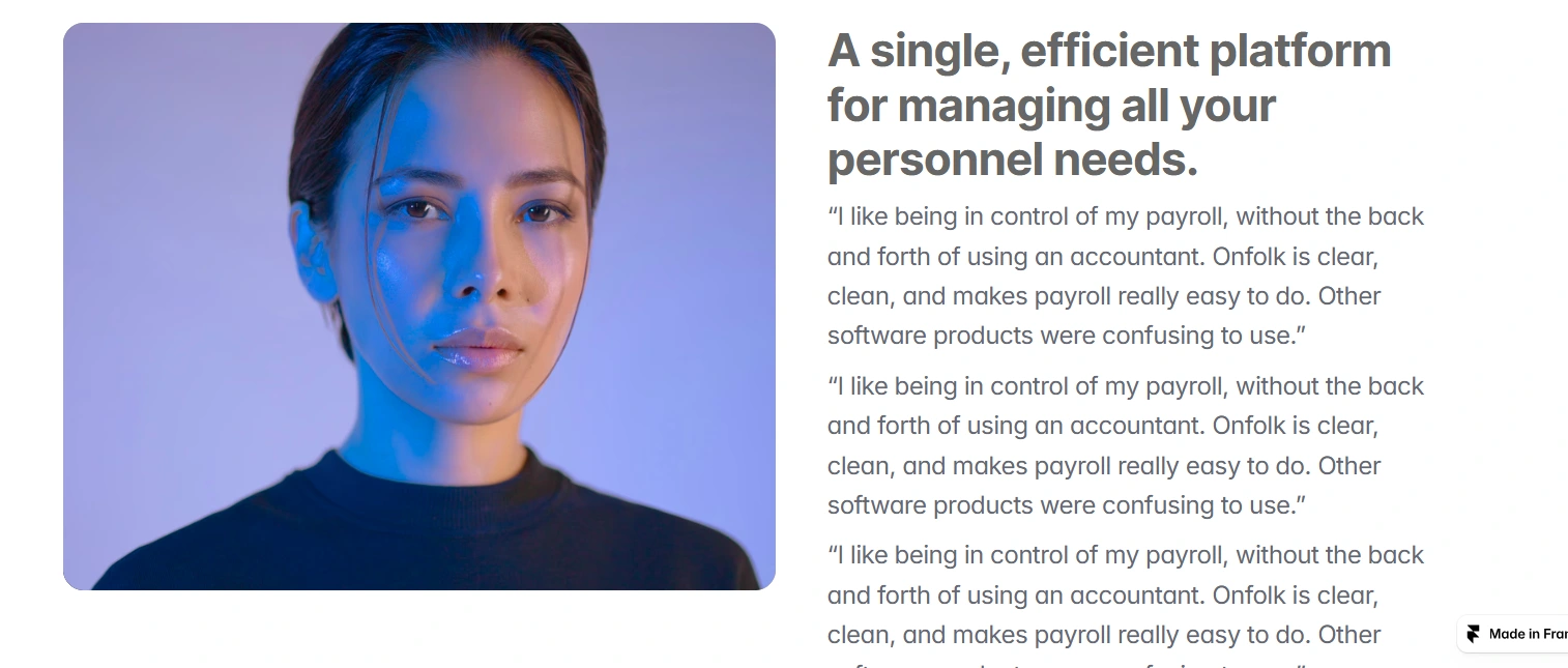
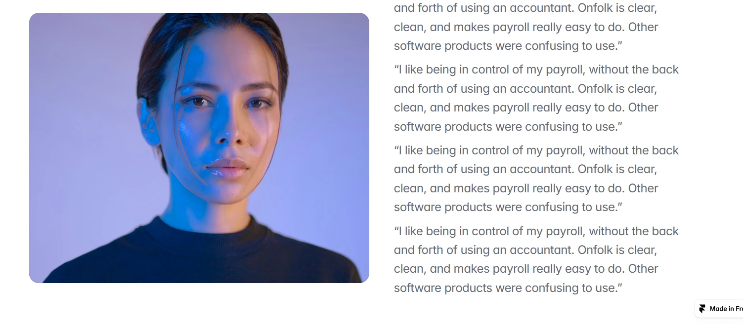
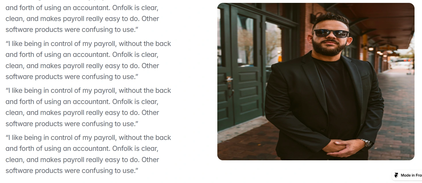
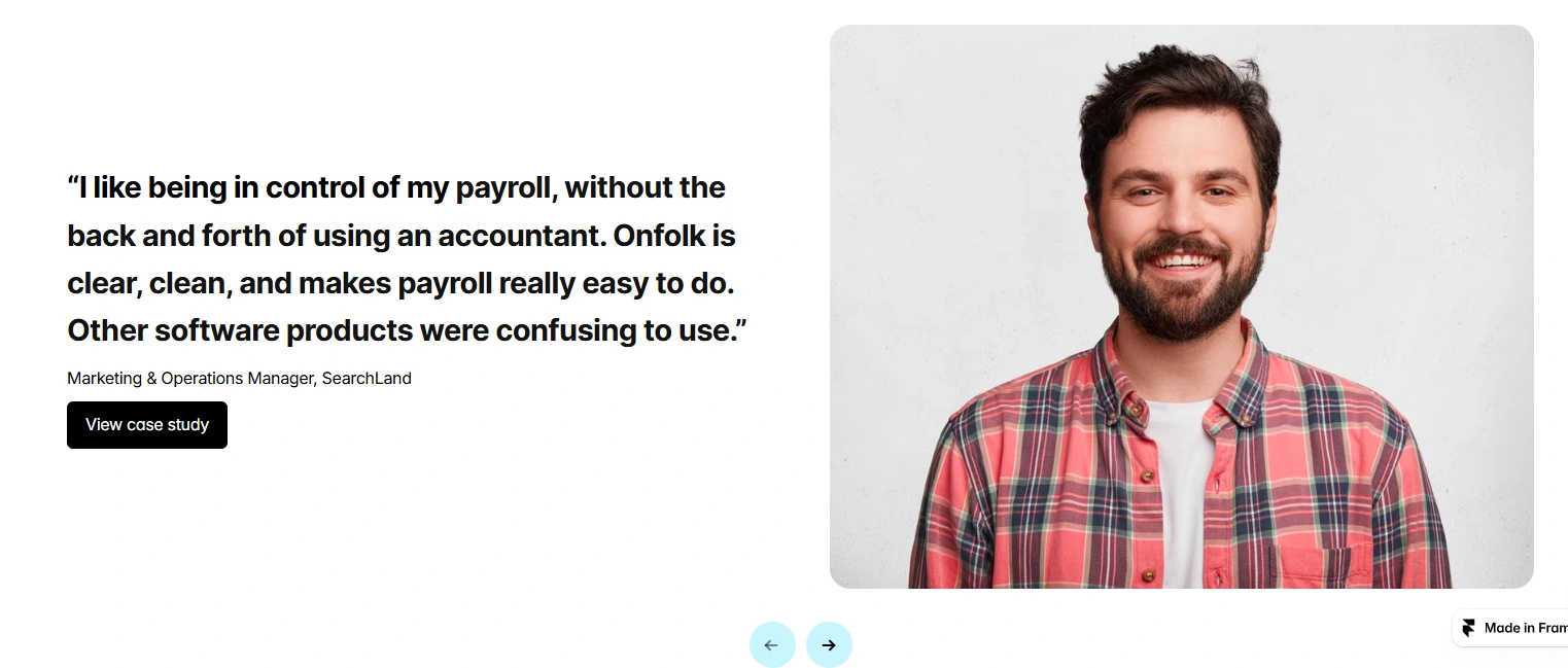
Testimonials & Security Assurances → Placed above the fold to immediately address skepticism.
Simple Pricing Blocks → Transparent pricing with no hidden fees.
Clean Visual Design → A soft blue and neutral color palette to signal professionalism and reliability.
Outcome
+56% increase in sign-ups within the first month
34% reduction in support inquiries due to clearer messaging
Users rated the site’s trustworthiness 8.7/10 in a post-launch survey
Iteration
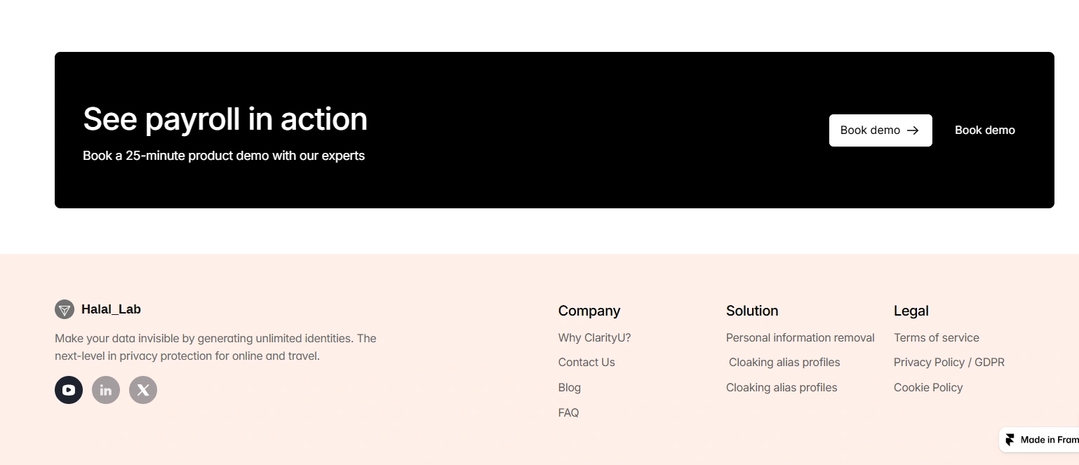
As the product is still in beta, I iterated on the microcopy by changing the CTA from “Contact Support” to “Book a Demo.” This small shift in language increased engagement with the support/demo section by 19%.

Like this project
Posted Sep 20, 2025
Halal Lab, a payroll automation platform, needed a landing page that clearly communicated its core value: making payroll simple, fast, and error-free.
Likes
1
Views
9
Timeline
Sep 2, 2025 - Sep 8, 2025
Clients
Halal Lab


