Designing Ideal Bank: Enhancing Online Banking User Experience
Kehinde Talabi
Designing Ideal Bank: Enhancing Online Banking User Experience Through UI/UX, SEO-Driven Web Copy, and Conversion-Focused Content
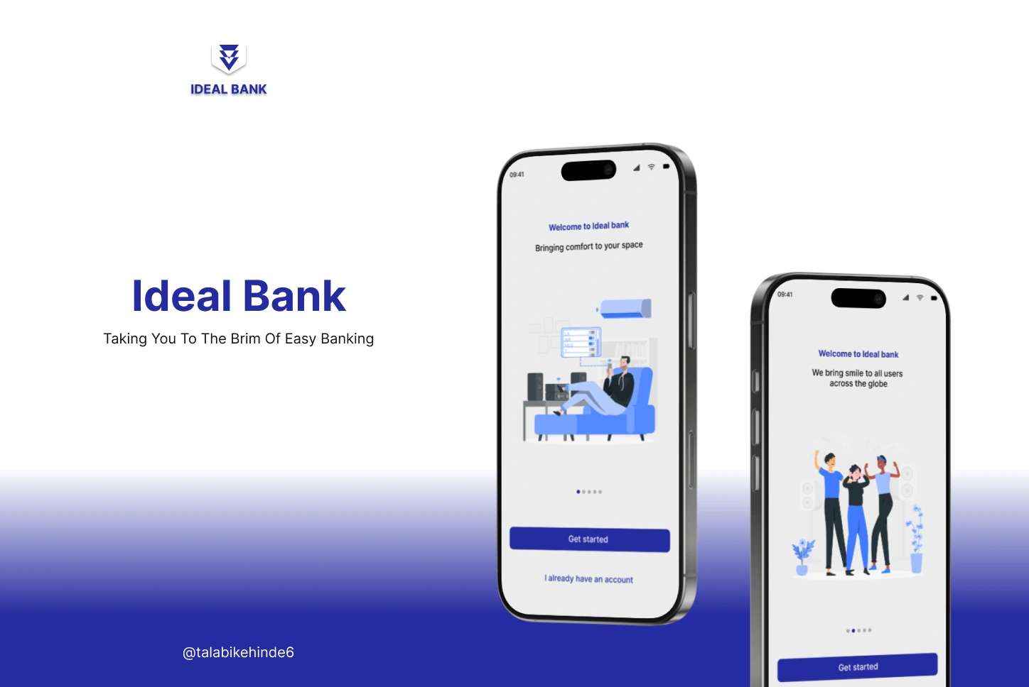
Ideal Bank
Project Overview:
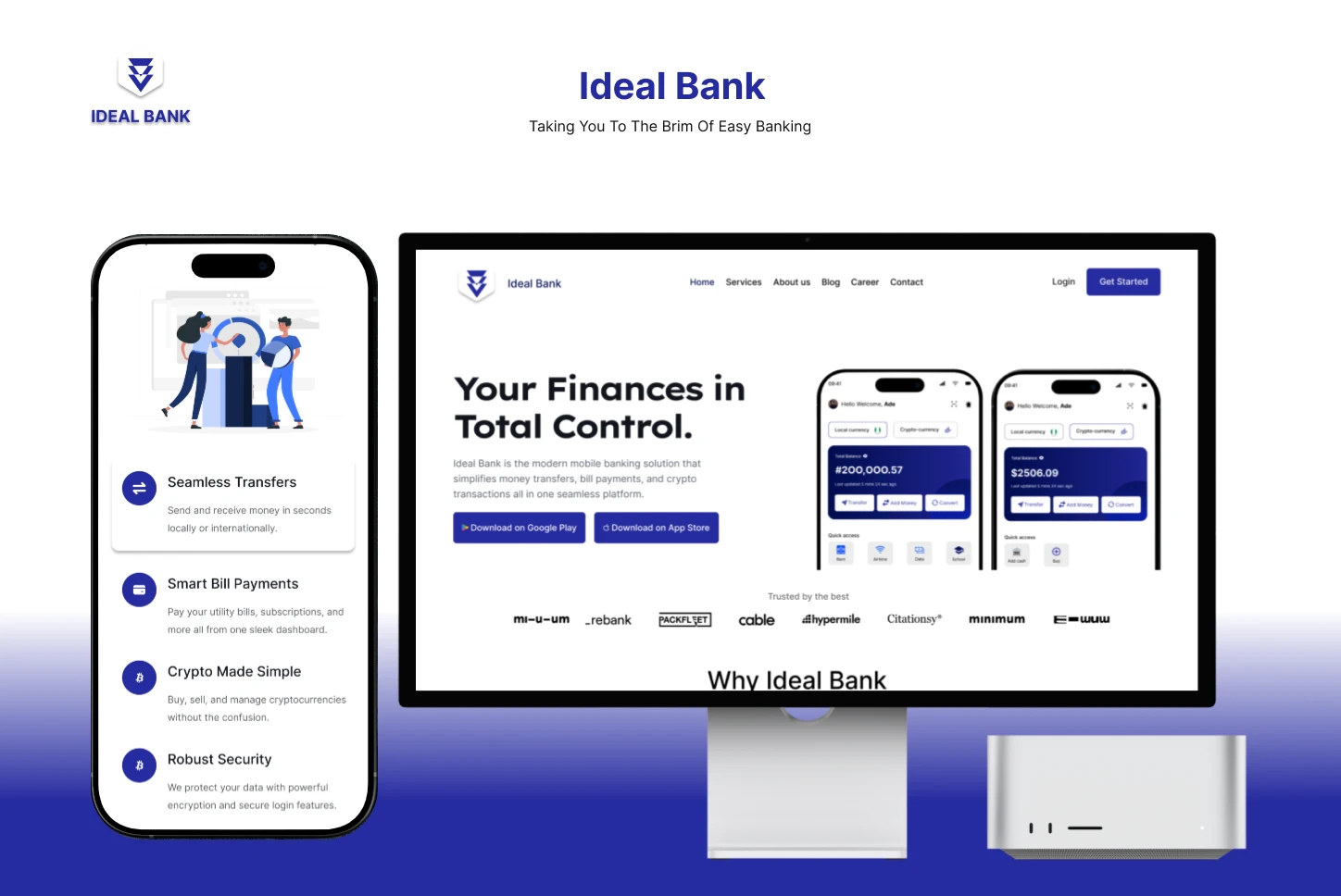
Ideal Bank is a cutting-edge mobile fintech platform designed to simplify and streamline the way users handle online transfers, bill payments, and cryptocurrency transactions. With the goal of creating an accessible, easy-to-use platform, Ideal Bank strives to make digital banking services less complex and more efficient for all users. As part of their mission, Ideal Bank wanted to enhance their mobile app’s user experience and drive greater user engagement and conversions through optimized digital marketing strategies.
Objectives:
Increase brand visibility and awareness for Ideal Bank as a reliable fintech solution.
Drive user acquisition by attracting potential customers to download and use the Ideal Bank app.
Boost app usage and engagement by encouraging existing users to utilize more features such as online transfers, bill payments, and cryptocurrency transactions.
Optimize the user journey by increasing the app's retention rate and minimizing churn.
Promote key features including ease of transactions and enhanced security features.
Leverage paid media for targeted acquisition and conversion optimization.
Strategy:
To achieve these objectives, I implemented a holistic UX Design approach that covered research, strategy development, execution, and optimization across multiple digital channels, including the development and optimization of the website and mobile app:
Market Research and Target Audience Analysis
Conducted extensive market research to understand the target audience, including their demographics, behaviors, and pain points with existing banking apps.
Created detailed user personas to guide targeted marketing campaigns.
Analyzed competitors to identify Ideal Bank’s unique value proposition and areas for innovation.
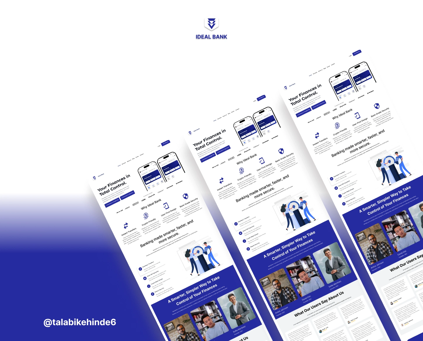
App & Website Requirements Gathering: Engaged with stakeholders to define clear app and website goals based on user needs, competitive analysis, and user personas. This informed the design and development of the user interface (UI) and user experience (UX).
Content Marketing Strategy
Developed a comprehensive content strategy that highlighted Ideal Bank’s commitment to user accessibility, security, and ease of use.
Created blog articles, customer success stories, and explainer videos about the app’s features, focusing on how it simplifies online banking tasks such as transfers, bill payments, and cryptocurrency management.
Optimized on-page content for SEO to ensure maximum visibility for key search terms related to online banking and fintech solutions.
App and Website Content Creation: Collaborated with the design and development teams to ensure that the website and app content was aligned with the brand’s voice, values, and messaging. This involved writing clear, concise copy for both onboarding and key app features.
App Development:
App and Website Content Creation: Collaborated with the design and development teams to ensure that the website and app content was aligned with the brand’s voice, values, and messaging. This involved writing clear, concise copy for both onboarding and key app features.
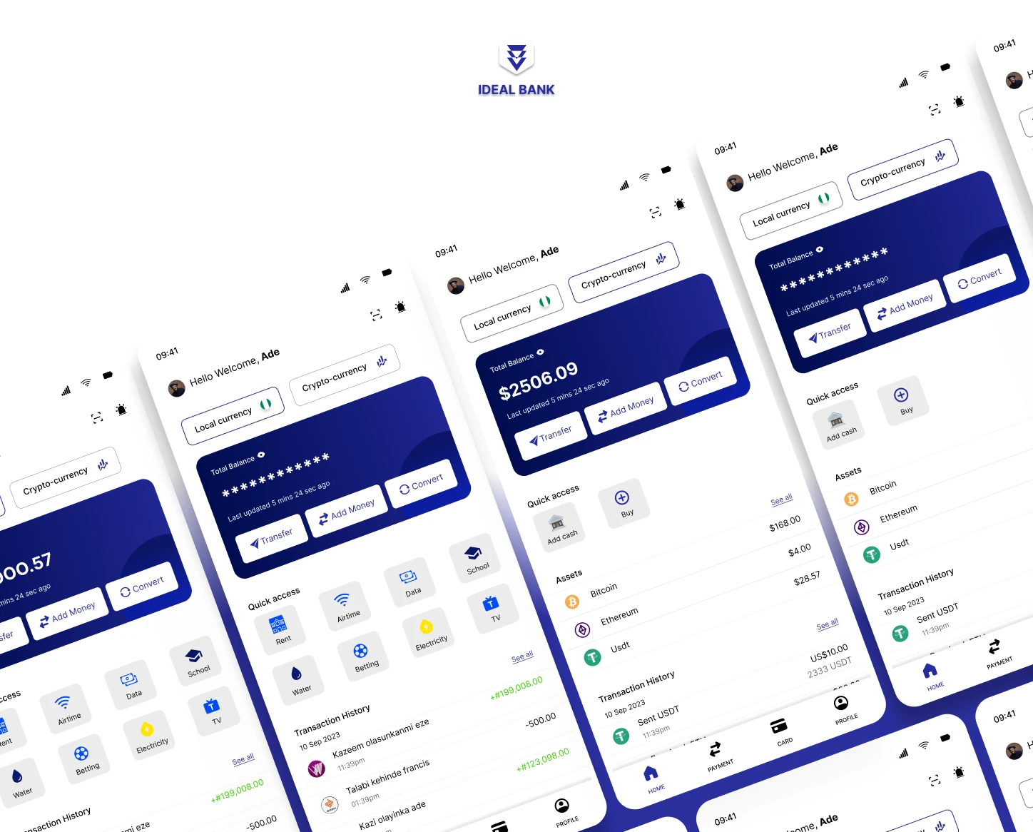
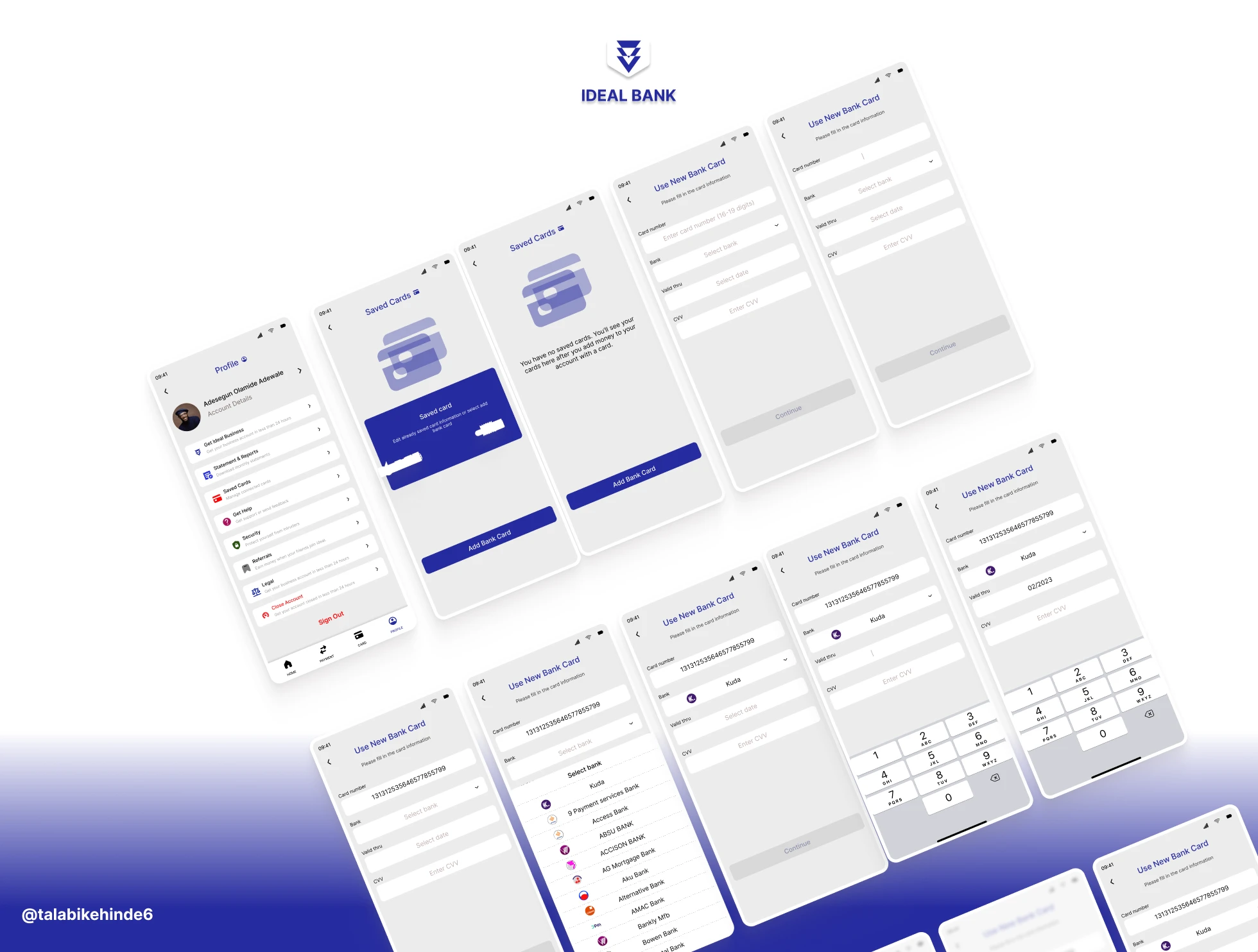
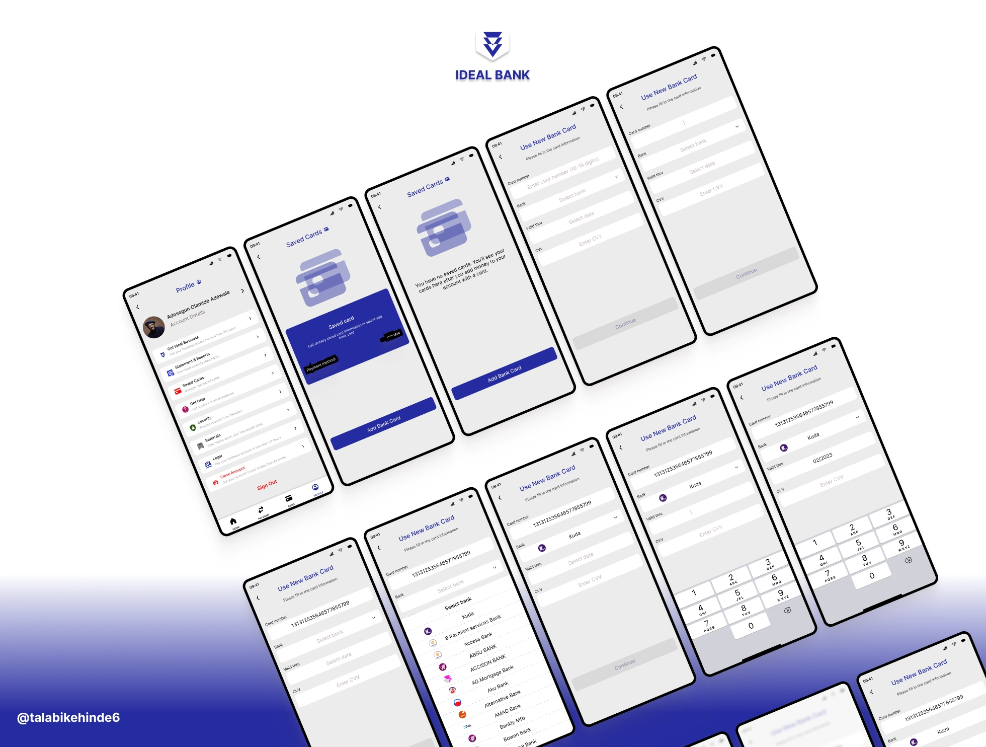
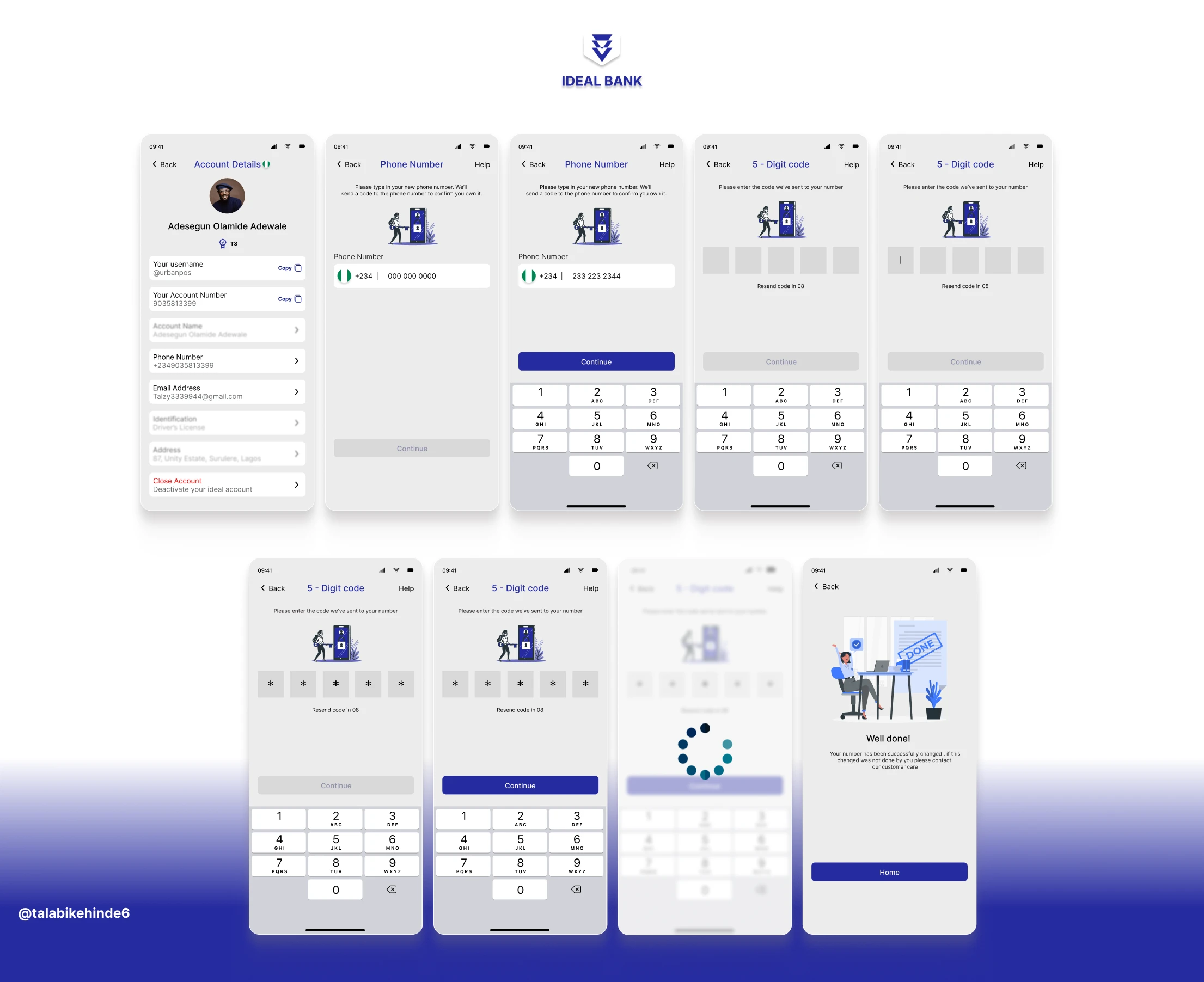
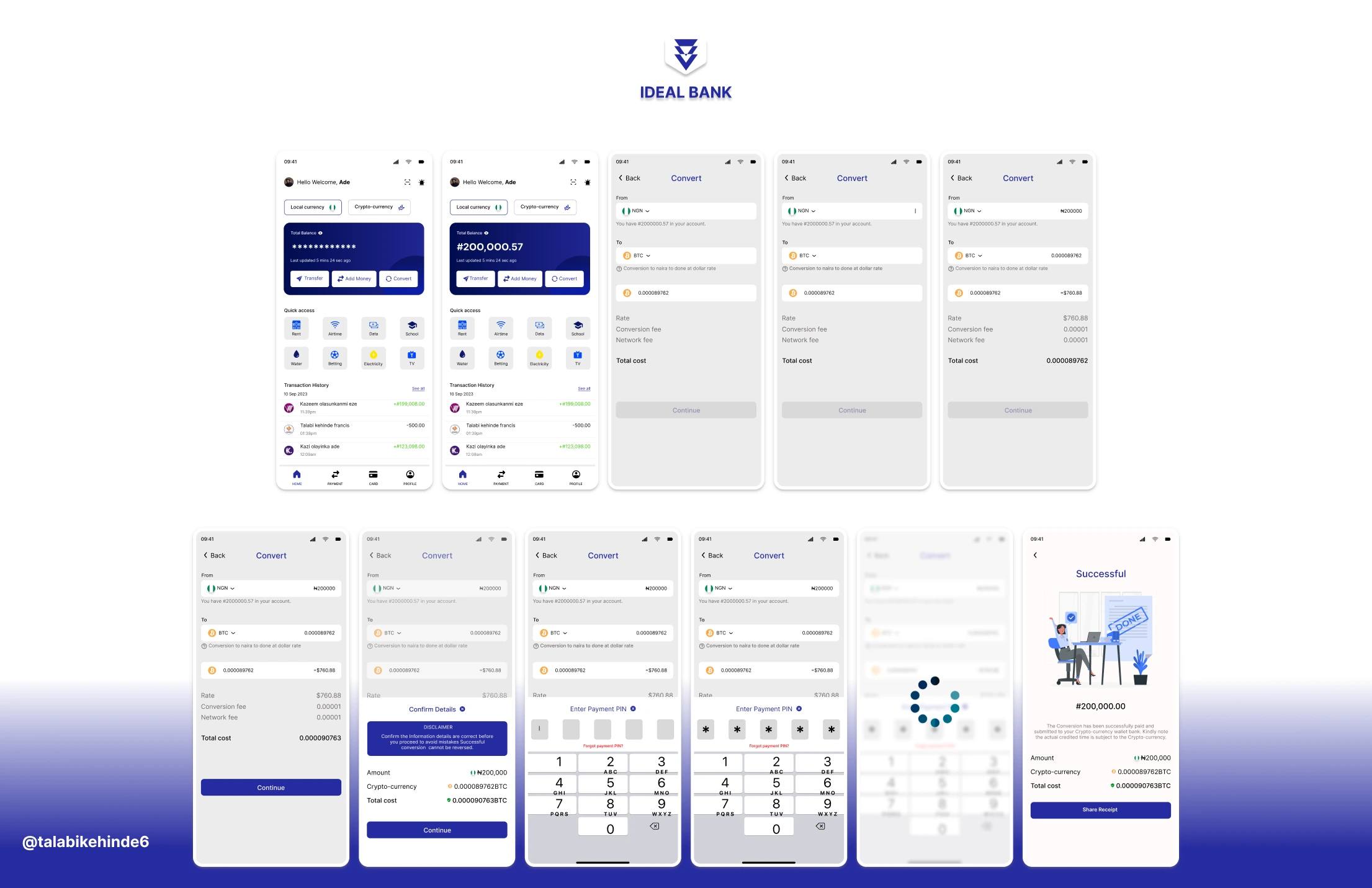
To complement the digital marketing strategy, a seamless and user-centric mobile app was developed to enhance the user experience for Ideal Bank’s customers.
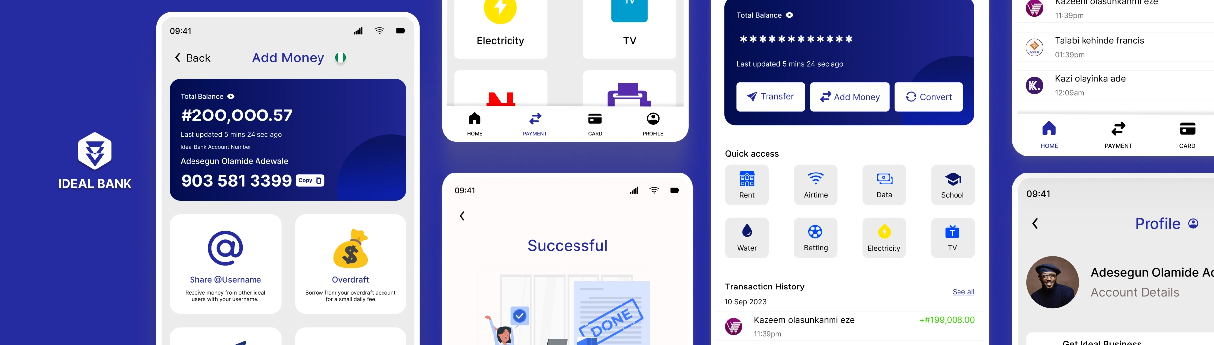
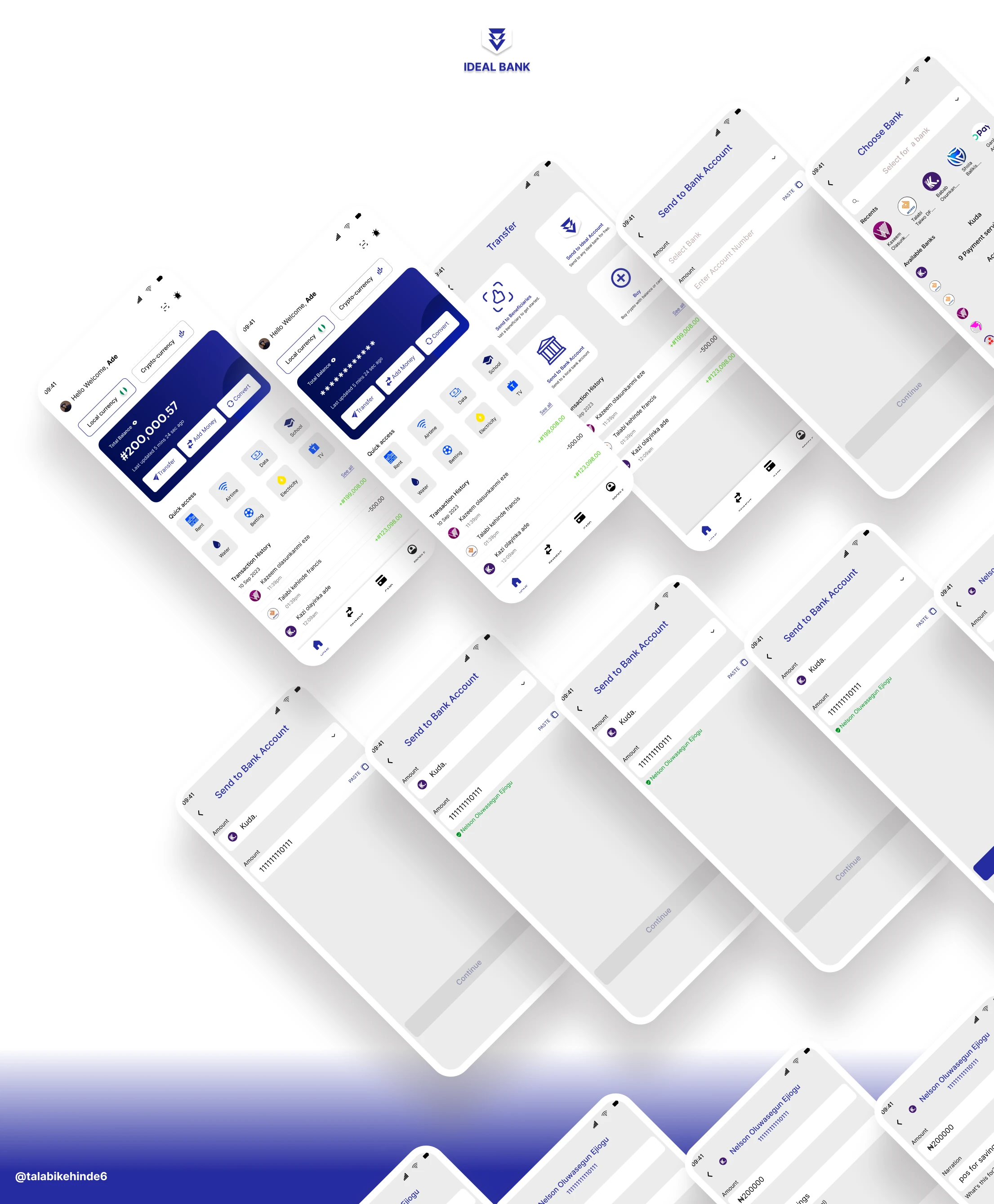
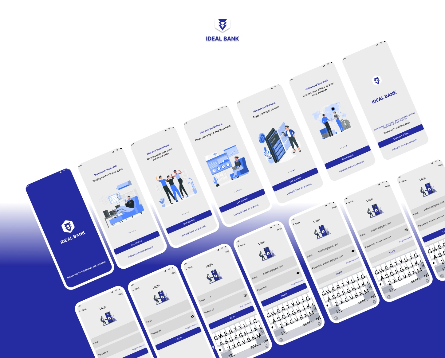
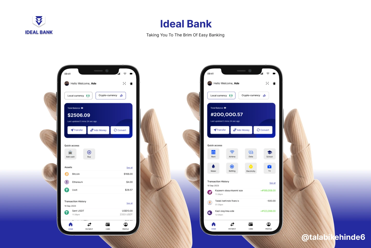
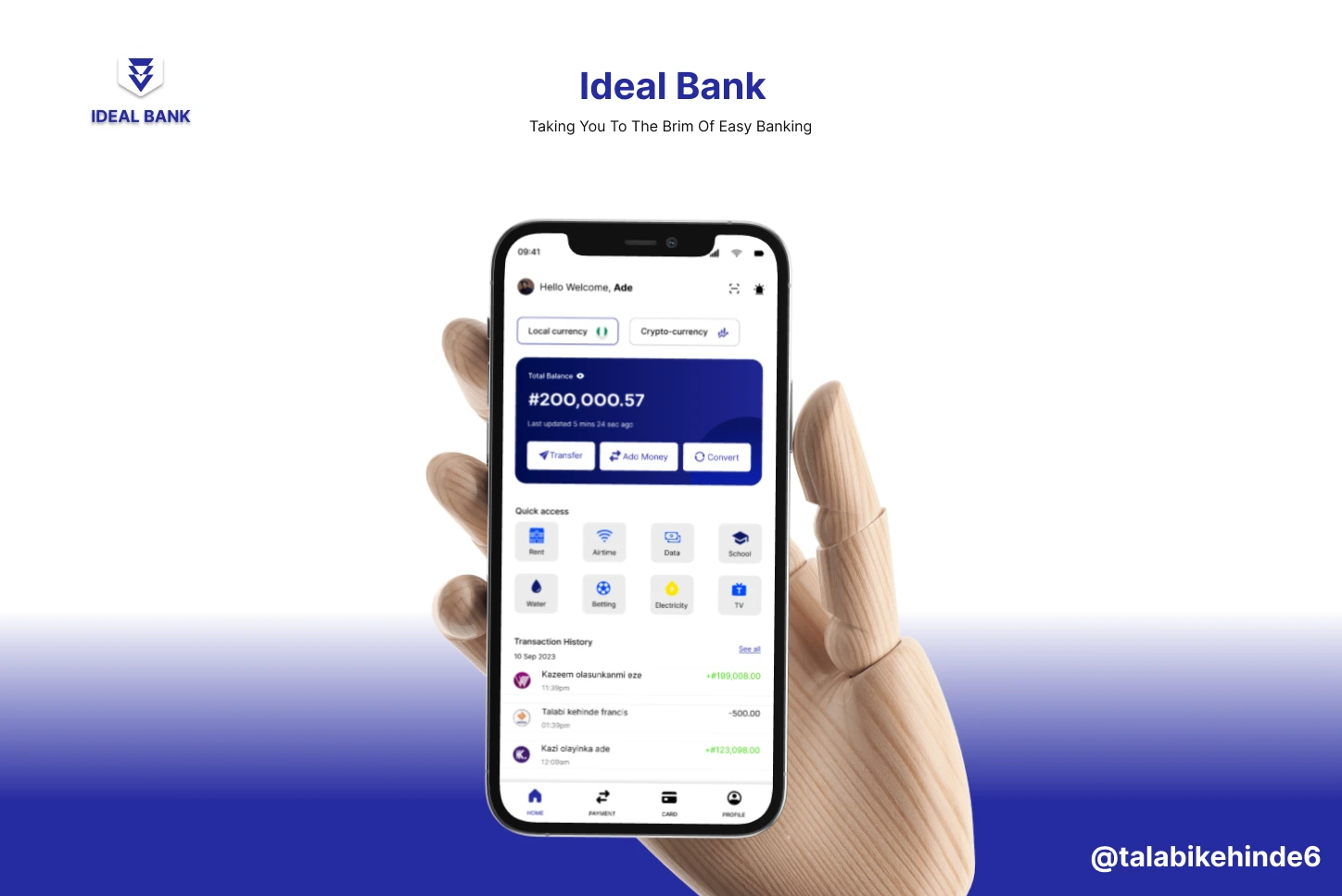
User-Centric Design: Designed a clean, intuitive, and user-friendly interface with a focus on ease of use and accessibility. The goal was to ensure users could navigate the app with minimal friction and complete tasks such as transfers, bill payments, and cryptocurrency transactions efficiently.
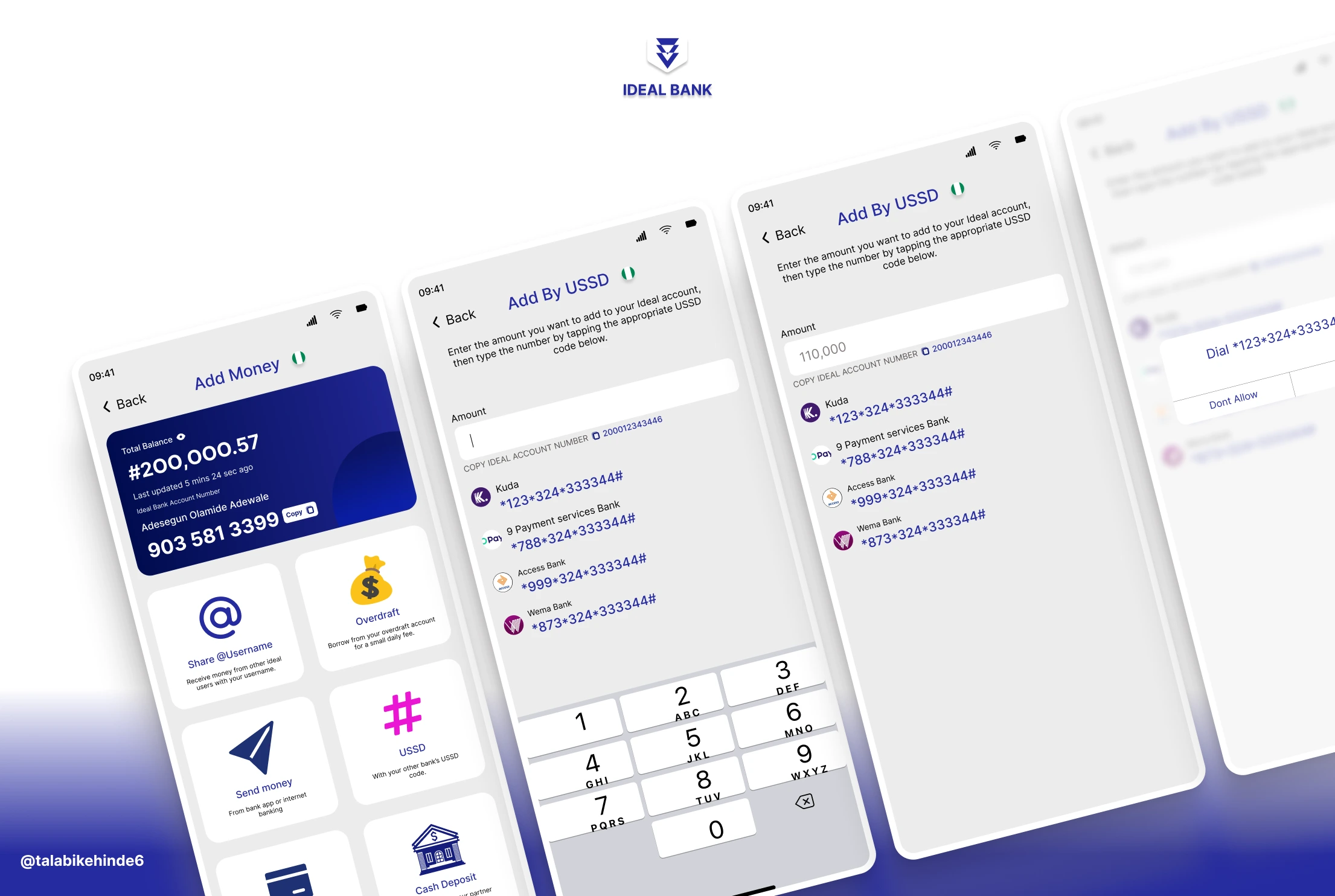
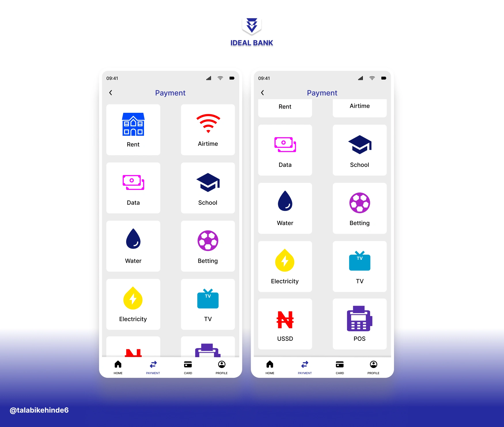
Smooth Navigation & User Flow: Implemented an intuitive navigation structure, ensuring that users could easily access core features such as money transfers, bill payments, and crypto transactions. The design focused on keeping the user journey smooth, minimizing steps required for key actions.
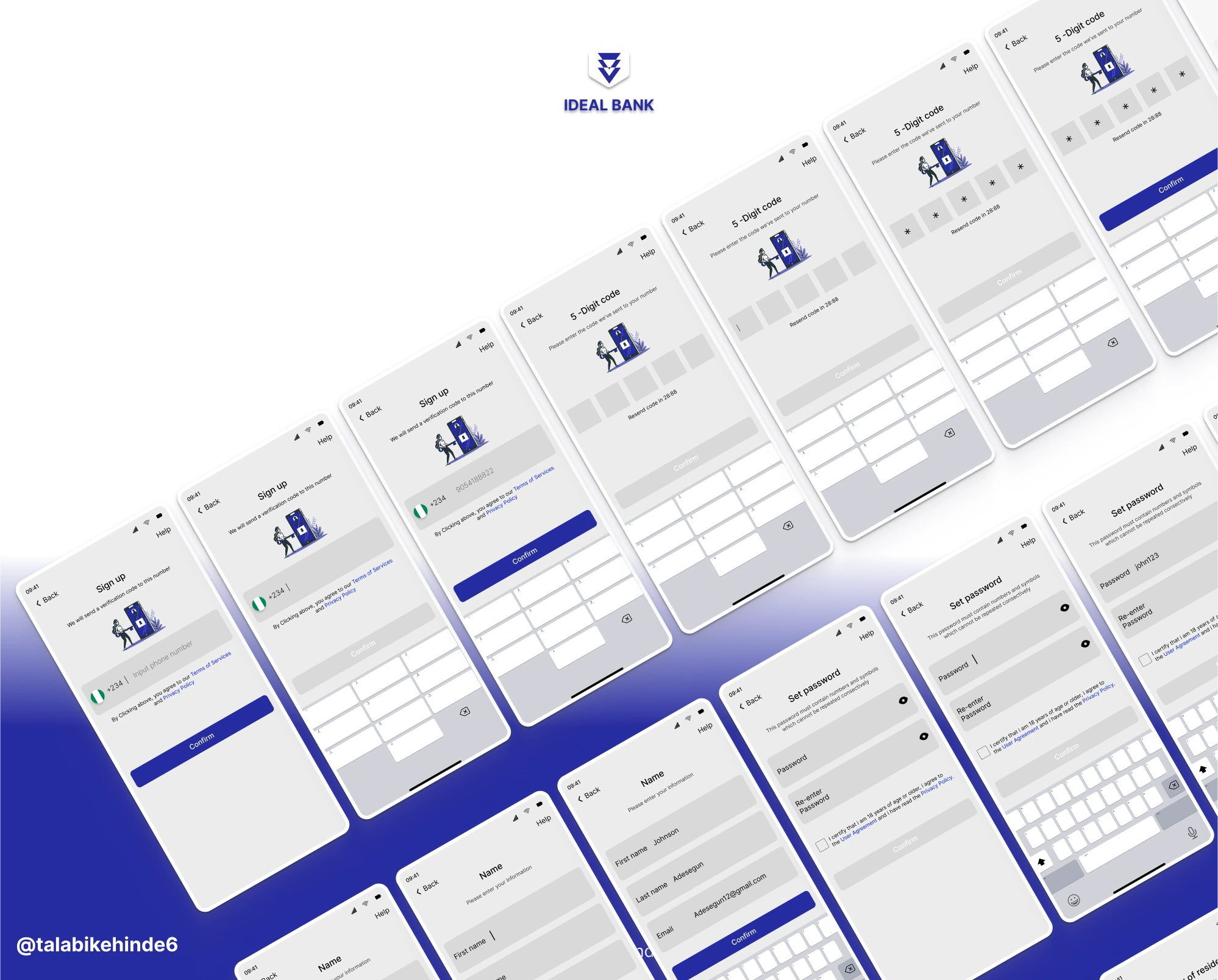
Secure Transactions & Privacy: Integrated advanced security features, such as two-factor authentication (2FA), biometric logins (fingerprint and face recognition), and end-to-end encryption for all transactions, ensuring that users could trust the app for secure banking activities.
Seamless Integrations: The app was designed to seamlessly integrate online banking features such as bill payments, money transfers, and cryptocurrency management. The integration ensured a smooth transaction process for users, regardless of the service they were using.
Push Notifications: Incorporated push notifications to keep users informed of real-time updates, such as completed transactions, bill payment reminders, new features, and security alerts, driving continued user engagement.
Optimized for iOS & Android: Ensured that the app was optimized for both Android and iOS platforms, offering users a consistent experience across devices. The app was designed to be responsive to different screen sizes and operating systems.
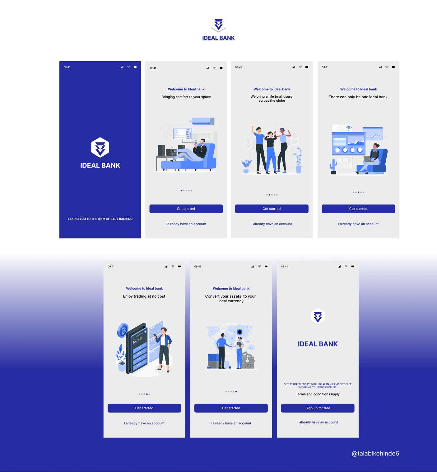
Onboarding Process: Streamlined the user onboarding process, offering a quick tutorial on how to use the app’s features. This helped users understand the app’s core functionalities and start using it immediately.
Continuous Testing & Refinement: Applied continuous testing and gathered user feedback to iterate on the app’s design and functionality, ensuring it met user needs and exceeded expectations.
Design Process:
Discover Phase:
User Research (Usability testing)
User research focuses on understanding user behaviors, needs, and motivations through interviews, surveys, usability evaluations, and other forms of feedback methodologies. I used the usability testing methodology to understand how people interact with products and evaluate if design solutions meet their needs.
Research Objectives
Research objective is a statement of what you want to learn about your customers (or users) from carrying out the research. The research objectives on this project is stated below;
To understand the demographics of customers that make use of a Fintech application.
To understand the challenges users faces on any Fintech application.
To understand users perspective on an ideal payment and transfer experience.
To determine factors that influence online consumer behavior when using a fintech application.
To identify customers needs as regards using the application.
Competitive Analysis:
Competitive analysis is the process of identifying competitors in your industry and researching their different marketing strategies. I conducted competitive research that included both direct and indirect competitors (Kuda, Vbank, Opay, Palmpay, Nomba). I analyzed the brands based on the following criteria:
Information Delivery: To determine how the contents of the websites were organized. You test the navigation, information architecture, and interaction to know if items are findable, easy to use, and consistent.
Appearance: To investigate the visual aesthetics and what category of color a product should have.
Learning: We are observing the error messages, recommendation tips, help and support methods, etc.
Design Implications
After a comparative study on rival designs, which the target audience are mostly youth between the ages of 22-45 who are technologically inclined and wants to make payment via transfer and also receive money on their mobile applications.
I discovered that opay, Vbank, Kuda and Nomba did well in terms of consistency, findability, aesthetics, and as of visual tidiness Vbank, Kuda, Nomba did well too, Vbank and Kuda are the best in terms of information delivery and Opay is the best in terms of appearance.
Usability Testing:
After performing my research using usability testing methodology on both direct and indirect competitors, the study came to the conclusion that Kuda outperformed the other brands in terms of UX standards. Consequently, Kuda was the subject of usability testing.
Usability testing refers to evaluating a product or service by testing it with representative users. Typically, the test is conducted with a group of potential users either in a usability lab, remotely (using e-meeting software and a telephone connection), or on-site with portable equipment.
The test identified a few minor problems, including:
A few buttons were mislabeled and had varying meanings for various users.
The apps lacks consistency with alignments.
Too many things are happening at the same thing on the app home app and most were very unnecessary.
Evaluation Task
Test participants attempted to complete the following tasks:
Download and install the following app kuda.
Sign up or register.
Make Transfer to same bank.
pay electricity bill from bank app account balance .
Locate icon for data and airtime on the home page
Navigate setting icon.
Log out and sign in back to the APP.
Made a mistake in your name spelling interact with the app to make correction
Results (task completion Success Rate)
All participants completed tasks 1, 2, 6, and 7. 1 out of 5 participants (20%) completed task 3 2 couldn't complete the task due to poor bank network and the other 2 was unable to complete the task within the stipulated time. Participants 1 and 4 completed task 4 at 60%. only 40% of the participants were able to complete task 5 within the stipulated time which was 4mins . Approximately 60% of the participants completed task 8 within a stipulated time which was 4mins.
Design Implications After doing research usability testing on (Kuda), we realized that:

After the quantitative research, I discovered that certain clients will not pay attention if you ask them how to enhance an undeveloped application.
Some users had issues with navigation doing the research.
Some consumers have difficulty understanding what you want them to accomplish when they participate in the research.
Customers want to be able to pay via transfer without having their payment declined, according to the research.
According to the research, some employees prefer to pay bills online due to their hectic work schedule.
According to the research, the consumers prefer an accessible and easy online platform with user friendly.
Tips and Recommendation
The tips and recommendations section provides recommended changes and justifications driven by the participants success rate, behavior's, and comments. Each recommendation includes a severity rating; they will improve the overall ease of use and address the areas where participants experienced problems or found the interface or information architecture unclear.
Change Justification Severity App complexity will be decreased by rearranging app icons to make them simpler to recognize. Task 5 was completed by 2 out of 5 participants, indicating that most participants had trouble finding the icons on the app. High There is a need for the transfer button to be feasible, and to keep the payment from declining, there should be an indicator button or icon alerting the user if the bank's network is down at the time of the transfer. The third task was only completed by one participant, indicating that most participants struggled to finish the exercise. Bad Bank network was the cause of this. High
Define Phase:
Personas are fictional characters that you create based on your research to represent the different user types that might use your service, product, site, or brand in a similar way. Creating personas will help you understand your users needs, experiences, behaviors , and goals. This will help designers understand their target audience.
PERSONA FOR BOLA
Journey Mapping
Journey mapping is a visual representation technique used to Journey mapping is a visual representation technique used to analyze users' experiences as they interact with a product. The purpose of customer journey mapping is to understand what customers go through and the quality of their experience, ensuring consistency and a seamless experience at all touchpoints and across all channels. It helps you visualize how customers experience your product or service and how they feel along the way.
JOURNEY MAPPING FOR BOLA
Based on the journey mapping above, a few things demand attention and must be worked on and corrected in the app that I am designing:
An indicator or notification button on the app should inform the user of the network status.
The application ought to focus on enabling users to easily access key icons. The home screen ought to have these icons.
The application must be uncomplicated and simple, and it should be devoid of any complications to facilitate seamless user interaction.
PERSONA FOR ABIODUN ABIOLA
Journey Mapping
Journey mapping is a visual representation technique used to analyse users' experiences as they interact with a product. The purpose of customer journey mapping is to understand what customers go through and the quality of their experience, ensuring consistency and a seamless experience at all touchpoints and across all channels. It helps you visualise how customers experience your product or service and how they feel along the way.
JOURNEY MAPPING FOR ABIODUN ABIOLA USING 3 SCENARIOS
Based on the journey mapping above, a few things demand attention and must be worked on and corrected in the app that I am designing:
The app should have a feature for cryptocurrency transactions.
The application ought to focus on enabling users to easily access key icons. The home screen ought to have these icons.
To avoid user confusion, the app should limit the bill provider's brand name from being abbreviated.
Design implications
To match design choices with user behaviour, task flows were created, an ecosystem was created to learn more about the domain, and an information architecture was created to grasp the domain, which acts as the basis for the app. It aids in problem identification and offers the ideal resolution.
Ideation Phase:
Ideation is the process where I generate ideas and solutions through sessions such as sketching, prototyping. It is a stage that potentially inspire newer and better ideas for effective designing.
Design Phase:
Paper Sketches
Final Design
Paper Sketches
UI and Visual Design
The mobile app and landing page interface focused on the content that was essential to customers’ tasks to help them get the right products effectively. I designed a logo, and primary colors that served as a starting point for the mobile app color palettes and style guide, maintaining the brand’s look and feel.
Colors:
Considering the usage of colors , I set up a color palette and application with high visual contrast for accessibility, color vision deficiency, and legibility that work in conjunction with the brand colors. Ideal's logo largely uses the blue as the brand color scheme, Blue radiates trust, honesty and reliability. This color thus contributes to building customer loyalty. The professionalism that is often associated with blue is because it is an objective, calm and analytical color and it also incorporates the brand into a high visual contrast application for accessibility, color vision impairment, and legibility.
Typography:
I focused on ease-of-read and skimmability. Which made me use the typeface ‘INTER’. A meticulously developed and designed INTER typeface is used in the creation of the mobile app to facilitate easy reading. i made sure to include detailed information with appropriate line height and length.
View style guide


Conclusion:
Through a data-driven, multi-channel digital marketing strategy, I successfully helped Ideal Bank enhance its brand visibility, user acquisition, and overall app engagement. By leveraging content writing, and conversion optimization techniques, Ideal Bank now offers a seamless and engaging online banking experience for its growing customer base. The strategies implemented not only contributed to increased brand awareness but also supported Ideal Bank's mission of making online transactions simpler, more accessible, and less complex for all users.
Next Steps for Ideal Bank’s
As Ideal Bank continues to grow and evolve, it’s essential to stay ahead of the curve in the ever-changing digital landscape. Here are some next steps and ongoing strategies to ensure continued success and sustained growth:
Like this project
Posted Jun 20, 2025
Ideal Bank is a fintech platform designed to simplify and streamline the way users handle online transfers, bill payments, and cryptocurrency transactions.
Likes
0
Views
18
Timeline
May 1, 2025 - Jun 16, 2025
Clients
Idea Bank