Notion – The all-in-one workspace for your notes, tasks, wikis,…
Kehinde Talabi
WellCare Medical Center - Website Portfolio
WellCare Medical Center
Project Objectives
Showcase Excellence in Healthcare: Highlight WellCare Medical Center’s commitment to providing high-quality medical services, advanced treatments, and patient-centered care.
User-Friendly Navigation: Ensure an intuitive browsing experience for all users, including patients, caregivers, and healthcare professionals, making it easy to find essential information.
Responsive Design: Develop a fully optimized, mobile-friendly website that performs seamlessly across all devices, ensuring accessibility for everyone.
Patient Engagement & Lead Generation: Implement clear calls-to-action, online appointment booking, and contact forms to streamline communication and convert website visitors into patients.
My Role
As the Web Designer for this project, I:
Conducted research and competitor analysis to understand the healthcare industry’s digital landscape and patient needs.
Designed wireframes and prototypes to map out the site’s layout, ensuring an intuitive and seamless user experience.
Developed a fully responsive WordPress website with custom integrations to showcase WellCare Medical Center’s services, expertise, and patient resources.
Worked closely with the client to ensure the website design aligned with their brand identity, mission, and values.
Implemented SEO best practices to enhance search engine visibility and drive organic traffic, making WellCare Medical Center more accessible to potential patients.
Design & Development Process
Research & Planning
Before development began, extensive research was conducted to understand the target audience and industry best practices. We analyzed:
Competitor websites to identify strengths and gaps.
User behavior to determine the most intuitive navigation structure.
SEO best practices to optimize the site for search engines and increase visibility.
A wireframe was then created to outline the website's structure, ensuring an intuitive layout that prioritizes accessibility and ease of use.
UI/UX Design
The website was designed with a clean, modern, and professional aesthetic. Key design elements included:
A calming color scheme representing trust, wellness, and professionalism.
Easy-to-read typography to enhance readability and accessibility.
High-quality visuals, including medical imagery, to build trust and engagement.
A mobile-first approach, ensuring an optimal experience on all devices.
Development & Functionality
The website was built using WordPress, leveraging its flexibility and scalability. Key functionalities included:
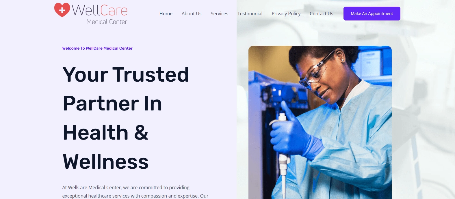
Homepage
A welcoming banner with a clear call-to-action (CTA) to book an appointment.
Highlights of the medical center’s services, expertise, and facilities.
Patient testimonials to establish credibility and trust.
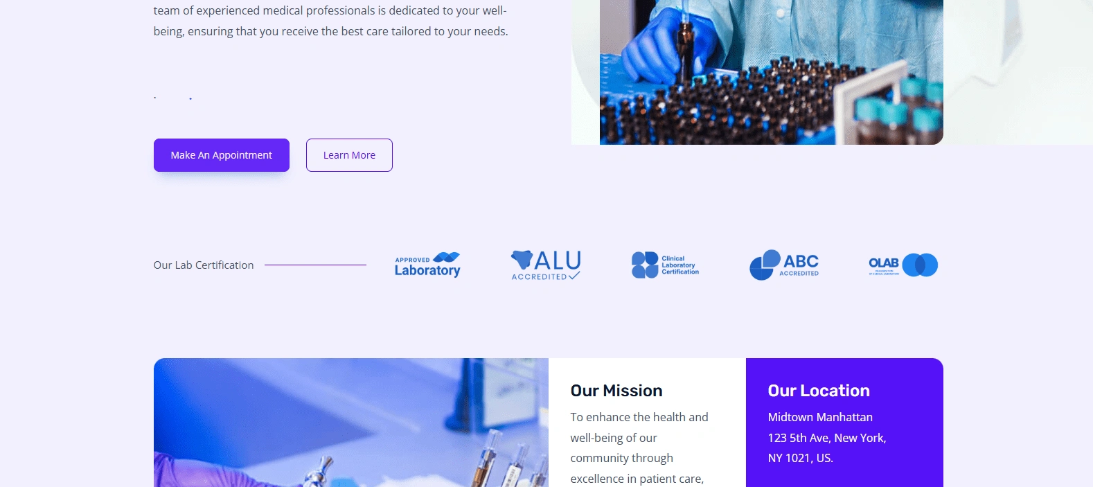
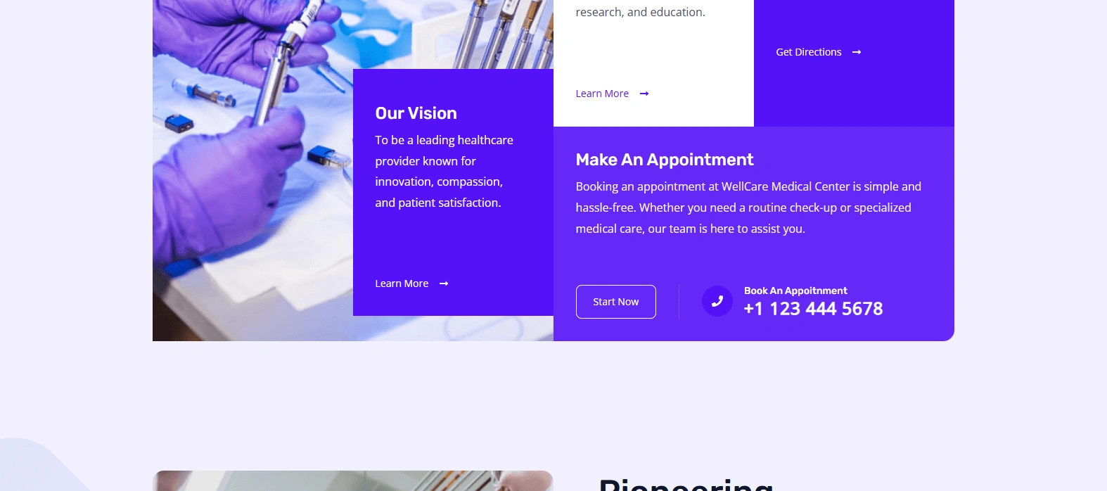
About Us Page
A detailed overview of the medical center’s mission, vision, and values.
Information about the healthcare team and their expertise.
A CTA encouraging patients to learn more about the team.
Services Page
A comprehensive list of medical services offered, categorized for easy navigation.
Detailed explanations of each specialty, including primary care, cardiology, dermatology, orthopedics, mental health, and more.
A CTA directing users to schedule a consultation.
Testimonials Page
Authentic patient testimonials sharing positive experiences and quality of care received.
A CTA inviting new patients to leave their own reviews.
Appointments & Contact Page
An easy-to-use appointment booking form integrated with the center’s scheduling system.
Contact details, including phone, email, and physical address.
Google Maps integration for easy navigation.
SEO & Performance Optimization
To ensure high search engine rankings and fast loading speeds, the website was optimized using:
Keyword research to improve searchability for healthcare services.
Meta tags, alt texts, and structured data to enhance visibility.
Image compression and caching techniques for faster page loading.
Security & Compliance
Given the sensitive nature of healthcare, security was a priority. The website included:
SSL certification for secure browsing and data encryption.
GDPR compliance features, including data privacy policies.
Secure patient appointment booking to protect user information.
Testing & Deployment
Before launch, the website underwent rigorous testing to ensure:
Cross-browser compatibility (Chrome, Firefox, Safari, Edge, etc.).
Mobile responsiveness across all screen sizes.
Bug fixes and performance enhancements for smooth user experience.
Once testing was complete, the website was successfully deployed with continuous monitoring to ensure stability.
Challenges I Faced While Working on This Project and Solutions
Challenge 1: Ensuring a smooth and fast user experience despite handling extensive healthcare information and media content.
Solution: Optimized images, videos, and other media using compression tools to reduce file sizes without compromising quality. Implemented lazy loading to ensure that only visible content loads initially, enhancing speed. Additionally, I integrated a Content Delivery Network (CDN) to distribute content efficiently and reduce load times.
Challenge 2: Maintaining a professional and trustworthy brand identity across the website.
Solution: Collaborated closely with WellCare Medical Center to align the design with their brand identity, mission, and values. Carefully selected a consistent color palette, typography, and imagery that reflect trust, reliability, and compassion. Ensured that all design elements reinforced a cohesive and welcoming digital experience.
Would you like me to expand on any technical aspects or include additional challenges? 🚀
Tools and Technologies Used
Design Tools: Figma, Adobe Photoshop, Adobe Illustrator
Development Tools: WordPress, Elementor, CSS, JavaScript
Optimization Tools: Google PageSpeed Insights, Smush, and WP Rocket
Project Management: Notion, Google Workspace
Results & Impact
The WellCare Medical Center website now serves as an essential digital touchpoint for patients. Key achievements include:
Increased Patient Engagement: A user-friendly interface encourages more online appointment bookings.
Enhanced Brand Credibility: Professional design and testimonials establish trust with new and returning patients.
Improved Accessibility: Mobile responsiveness ensures accessibility for all users, regardless of device.
SEO-Optimized Performance: Higher search rankings drive more organic traffic to the site.
Colors:
For WellCare Medical Center, I carefully selected a color palette that enhances visual clarity, accessibility, and brand identity. The primary color, blue, symbolizes trust, reliability, and professionalism, reinforcing the center’s commitment to quality healthcare. This calming and analytical color fosters a sense of reassurance for patients. Complementary tones, such as white and soft grays, create a clean, modern aesthetic, enhancing readability and promoting a sense of comfort. The high visual contrast ensures accessibility for individuals with color vision impairments while maintaining a sleek and professional look.
Typography:
To ensure easy readability and a smooth user experience, I chose the Inter typeface, known for its clarity and legibility across different screen sizes. The typography is structured to enhance skimmability, allowing users to quickly find the information they need. Thoughtful spacing, appropriate line height, and balanced text length ensure that both desktop and mobile users can navigate the website effortlessly. The combination of a professional color scheme and a well-structured font choice elevates the overall user experience, making healthcare information more accessible and engaging.
Takeaway
The WellCare Medical Center website successfully combines modern design with functional excellence to provide a seamless digital healthcare experience. By focusing on user-friendly navigation, high-quality content, and technical optimization, we created a platform that enhances patient trust and accessibility.
Like this project
Posted Feb 10, 2025
A new tool that blends your everyday work apps into one. It’s the all-in-one workspace for you and your team