Elysian 🌴 Egyptian-Inspired Wellness Luxury
Elysian: Retro-Modern Luxury for Wellness Brand
Project Scope
Logo design • Complete brand identity • Product label design • Brand pattern system • Color palette strategy • Typography system
The Challenge
Elysian sought to position itself in the competitive wellness market with Egyptian cotton bath products and artisan candles. The challenge wasn't just creating another spa brand, it required developing a visual identity that communicated luxury and tranquillity while standing out against minimalist wellness trends.
The core issue: differentiate in a crowded market where most wellness brands default to soft neutrals and generic "calm" aesthetics.
The Approach
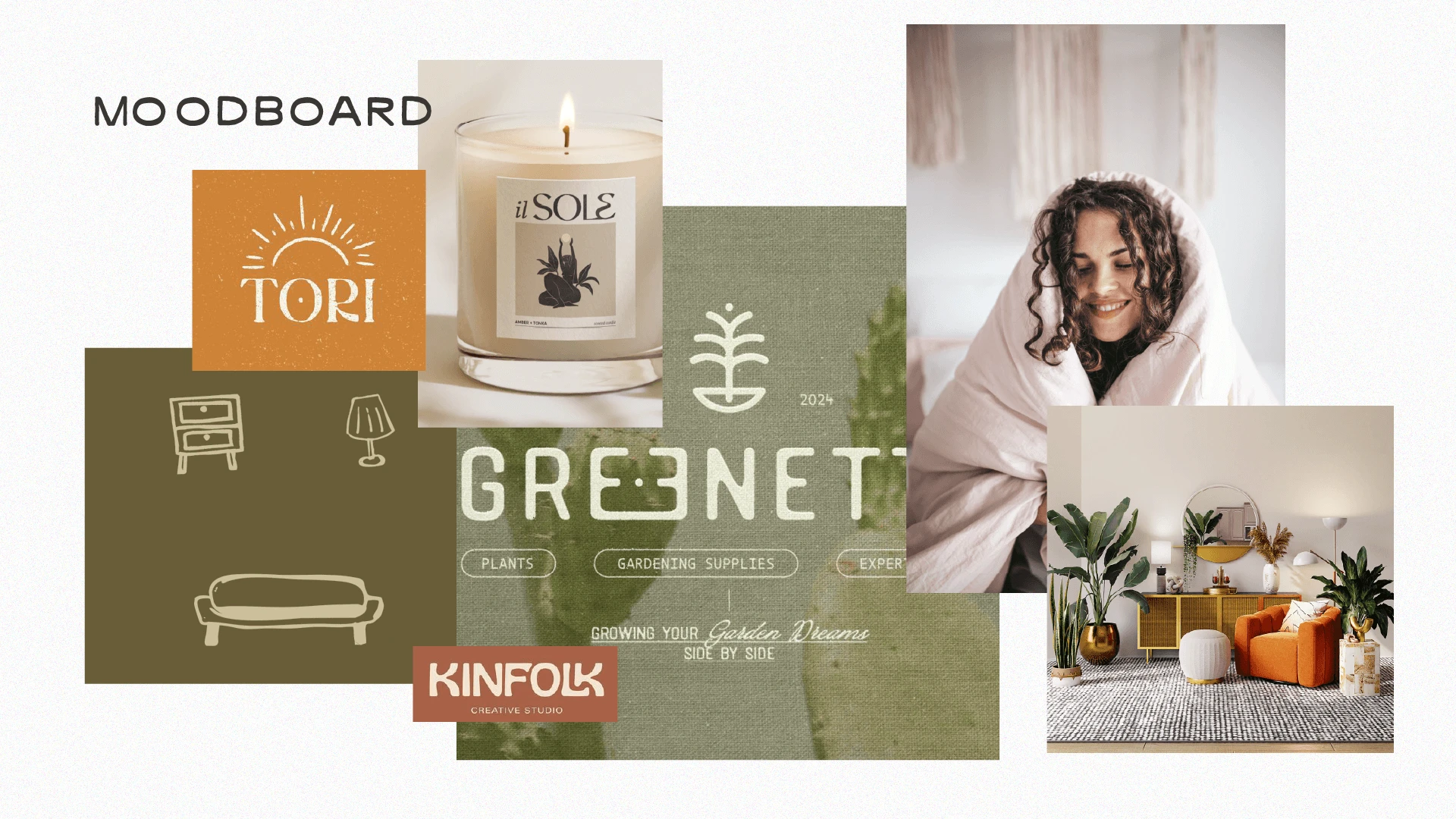
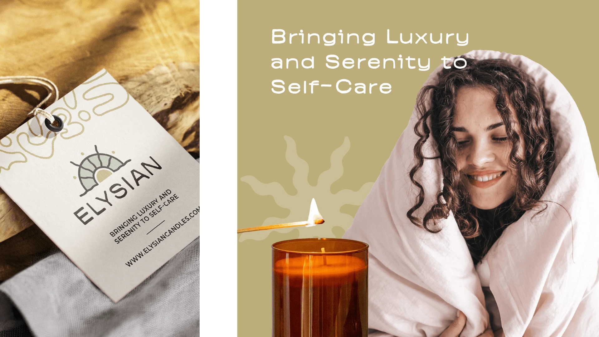
Rather than following conventional wellness branding, I developed a retro-modern identity rooted in Egyptian symbolism and bold visual confidence. The strategy balanced sophistication with distinctive personality - creating a brand that feels luxurious without being sterile.
Strategic priorities:
1. Symbolic brand narrative
Egyptian-inspired sun iconography that communicated paradise and transformation.
2. Visual distinction through color
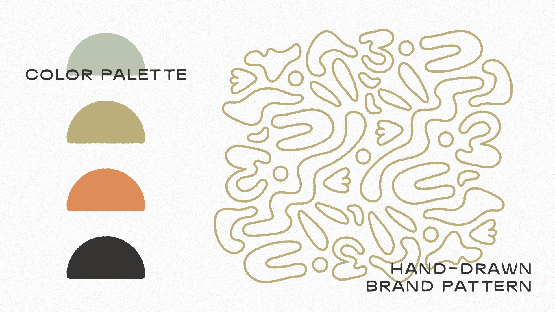
Warm, earthy palette (sage green, golden olive, terracotta, charcoal) that stood apart from typical spa whites and blues.
3. Pattern as brand asset
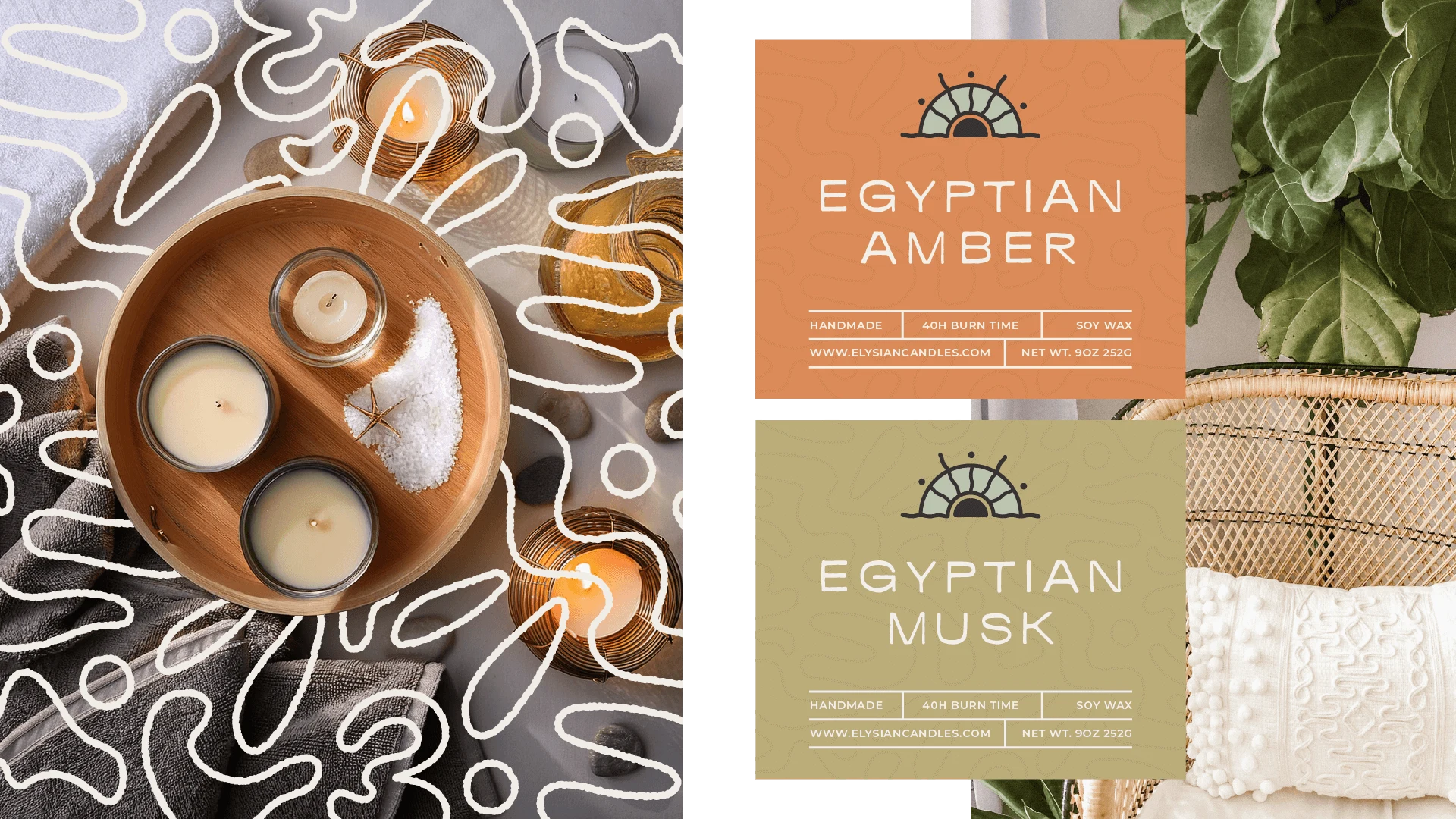
Hand-drawn topographic pattern that added texture, personality, and premium tactile appeal.
The Solution
Logo & Brand Identity
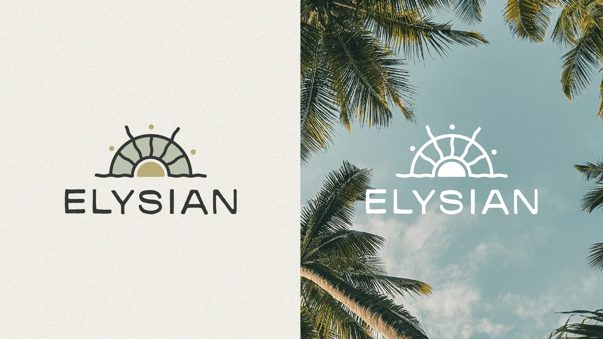
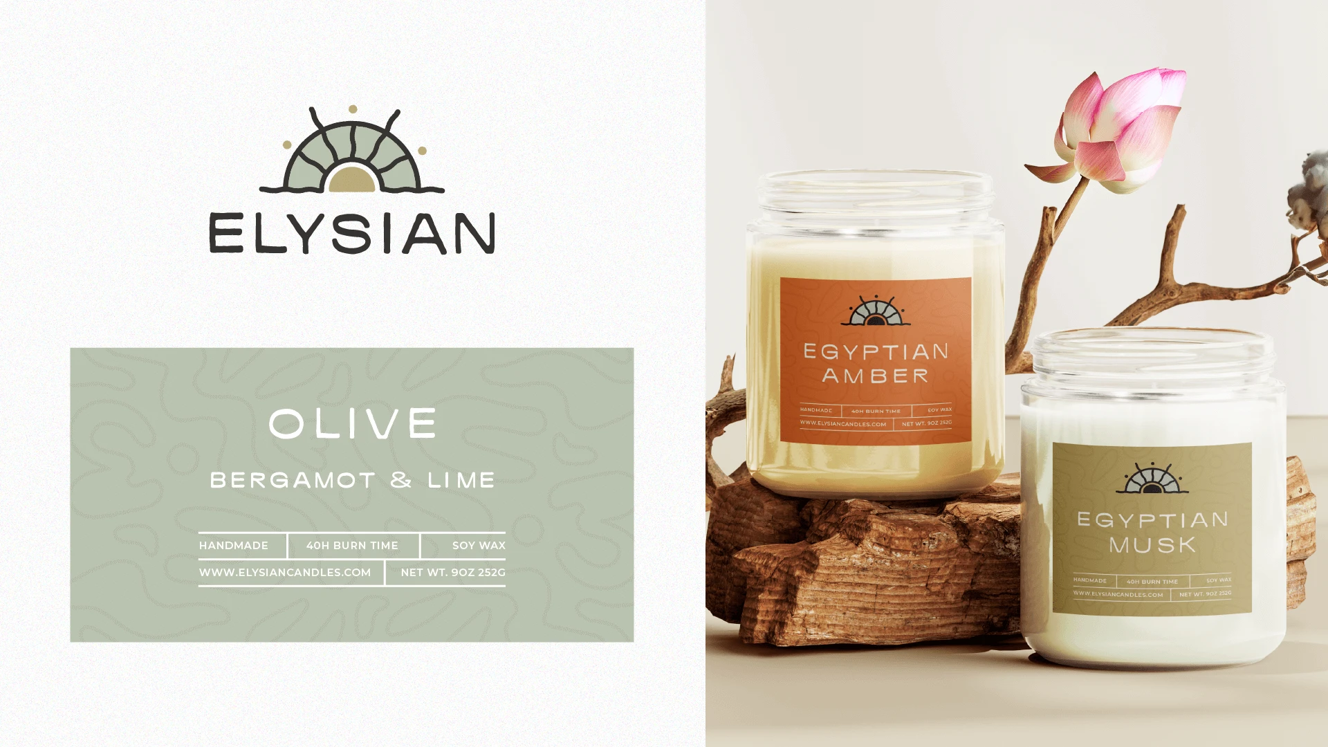
Sun-on-horizon symbol with geometric rays balanced boldness with refinement, Egyptian-inspired yet modern, memorable yet sophisticated.
Strategic Color Palette
Warm, earthy tones (sage green, golden olive, terracotta) differentiated Elysian from competitor brands using predictable whites and pastels. Each variant received distinct color treatment while maintaining brand cohesion.
Hand-Drawn Brand Pattern
Organic topographic pattern added artisanal texture and functioned as secondary branding across packaging - reinforcing premium positioning through distinctive design detail.
Product Label Design
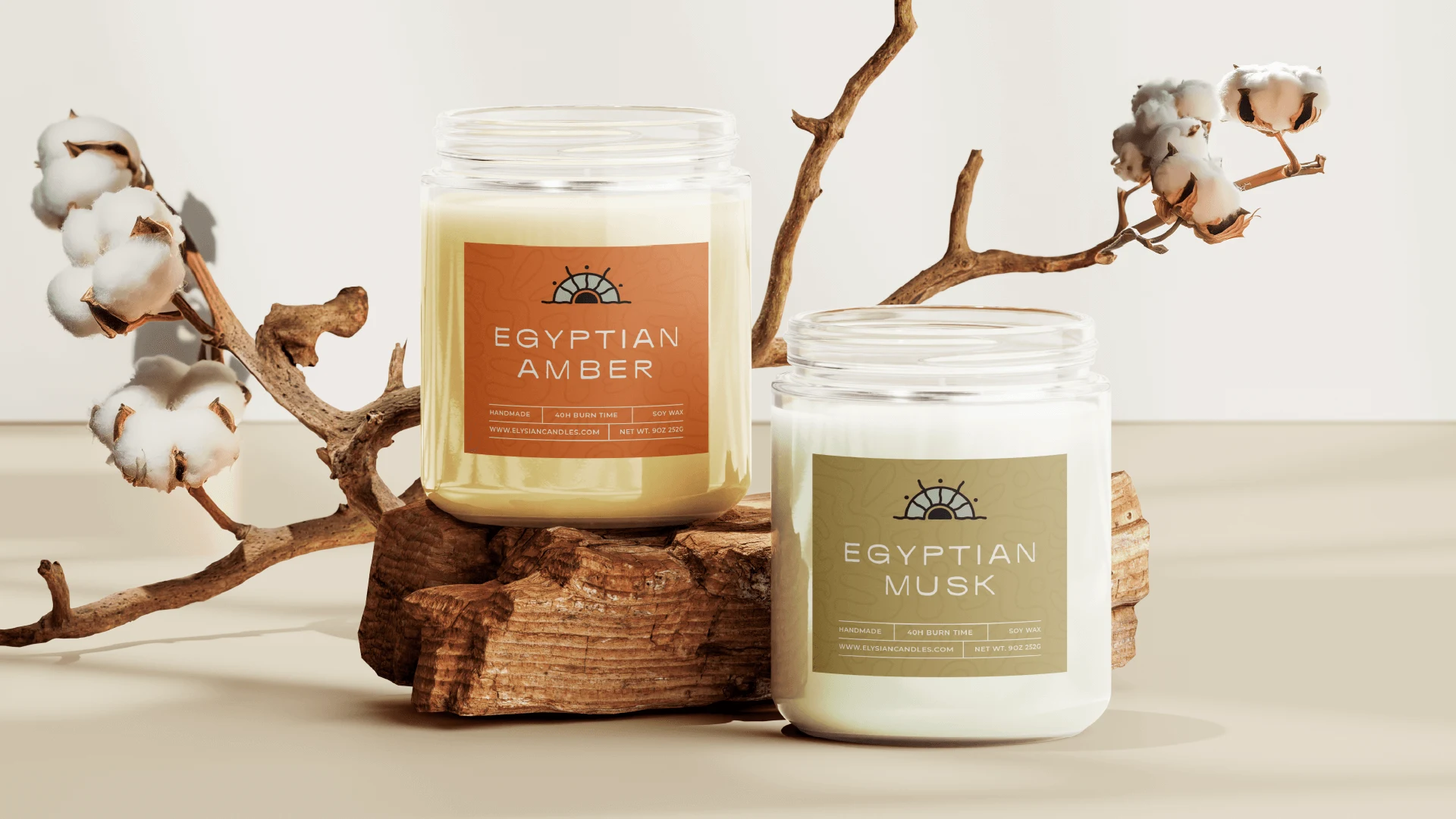
Bold color blocks with clean hierarchy created immediate shelf impact. Labels combined sun symbol, variant color, and product information in balanced composition for instant recognition.
Results
Visual differentiation in the crowded wellness category through distinctive color and pattern strategy
Premium positioning established through sophisticated brand system and Egyptian-inspired narrative
Scalable brand architecture with flexible color and pattern system supporting product line expansion
Cohesive brand experience across all touchpoints through consistent visual language
Why This Matters
In wellness markets saturated with similar aesthetics, strategic visual differentiation drives shelf visibility and brand recognition. Bold color choices and distinctive pattern work create memorable brand presence that justifies premium pricing while maintaining luxury credibility.
Like this project
Posted Nov 14, 2023
Brand identity and packaging for luxury wellness products. Bold color strategy and Egyptian symbolism created distinctive shelf presence in a saturated market.


