Ascension Logo Refresh
fred o
Project Scope
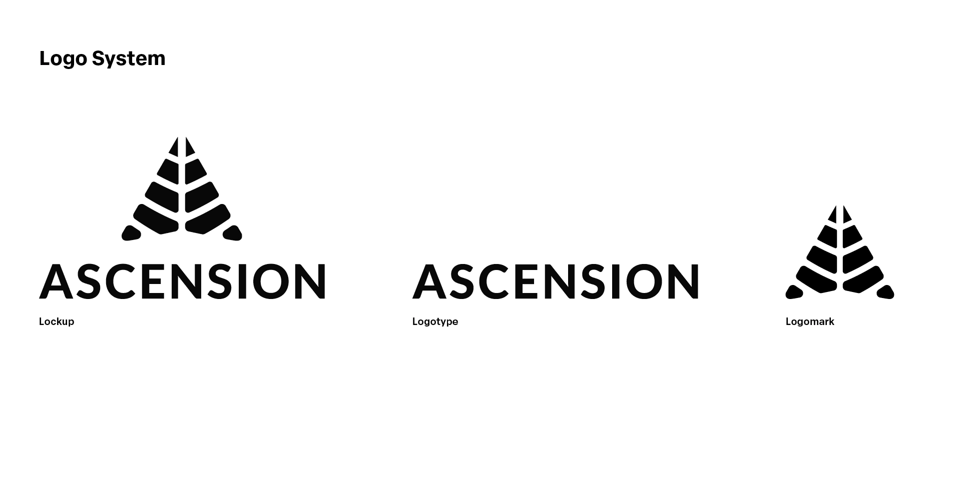
Ascension was ready for a logo refresh but deeply attached to their original mark. The goal was to improve versatility while honoring the familiar look the client loved. Key details from the previous logo iteration needed to be implemented into the update while solving the problem of usability and scale across different environments. The task was to develop a flexible logo system which included a lockup, logomark, and logotype.
Outcome
The refresh sharpened readability while preserving signature elements of the original. This new system introduces a flexible toolkit designed for seamless application across a wide range of brand environments. The logo evolution process helped the client come to a decision with a more critical eye when a visual story was used as a guide.
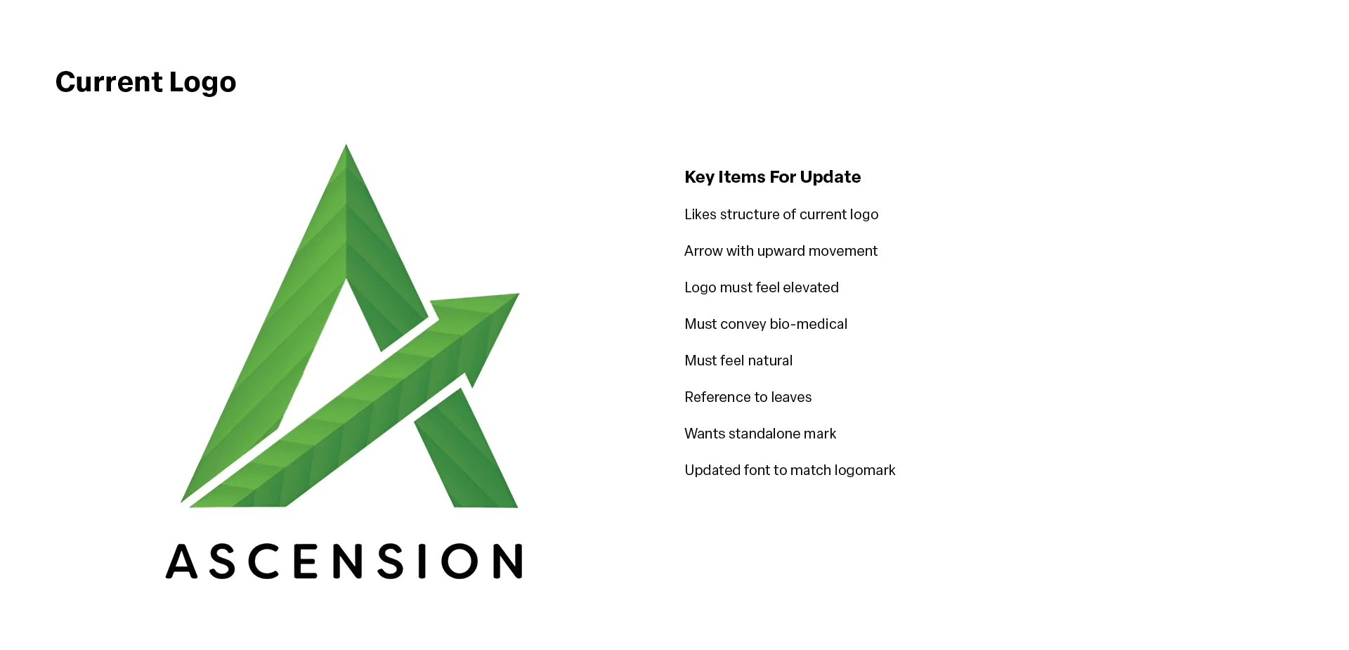
Ascension's existing version struggles with contrast and spatial balance, and the current lockup poses challenges at smaller scales. By developing a flexible logo system with variations tailored to different contexts, the brand can maintain clarity and impact regardless of size or setting.
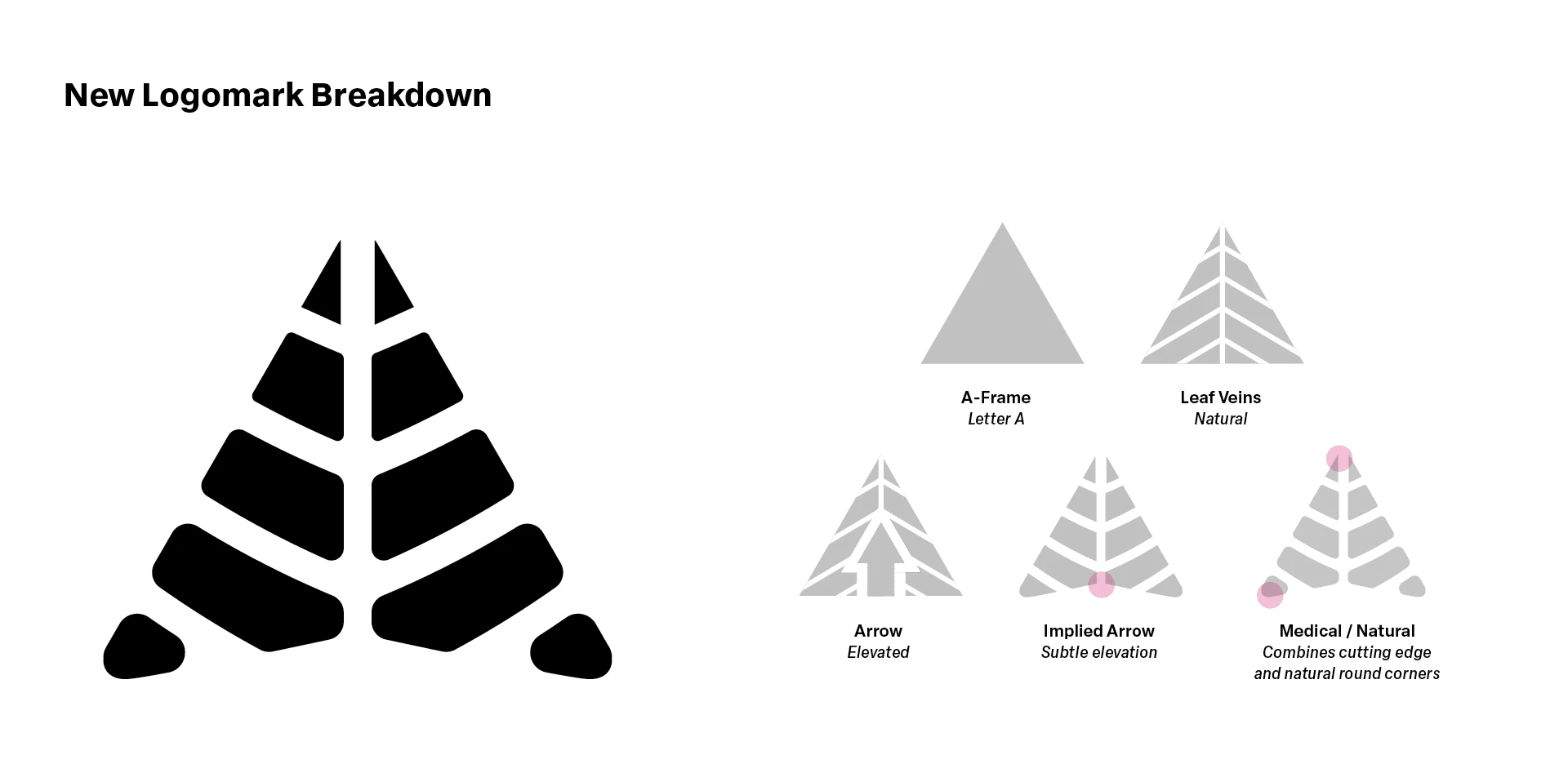
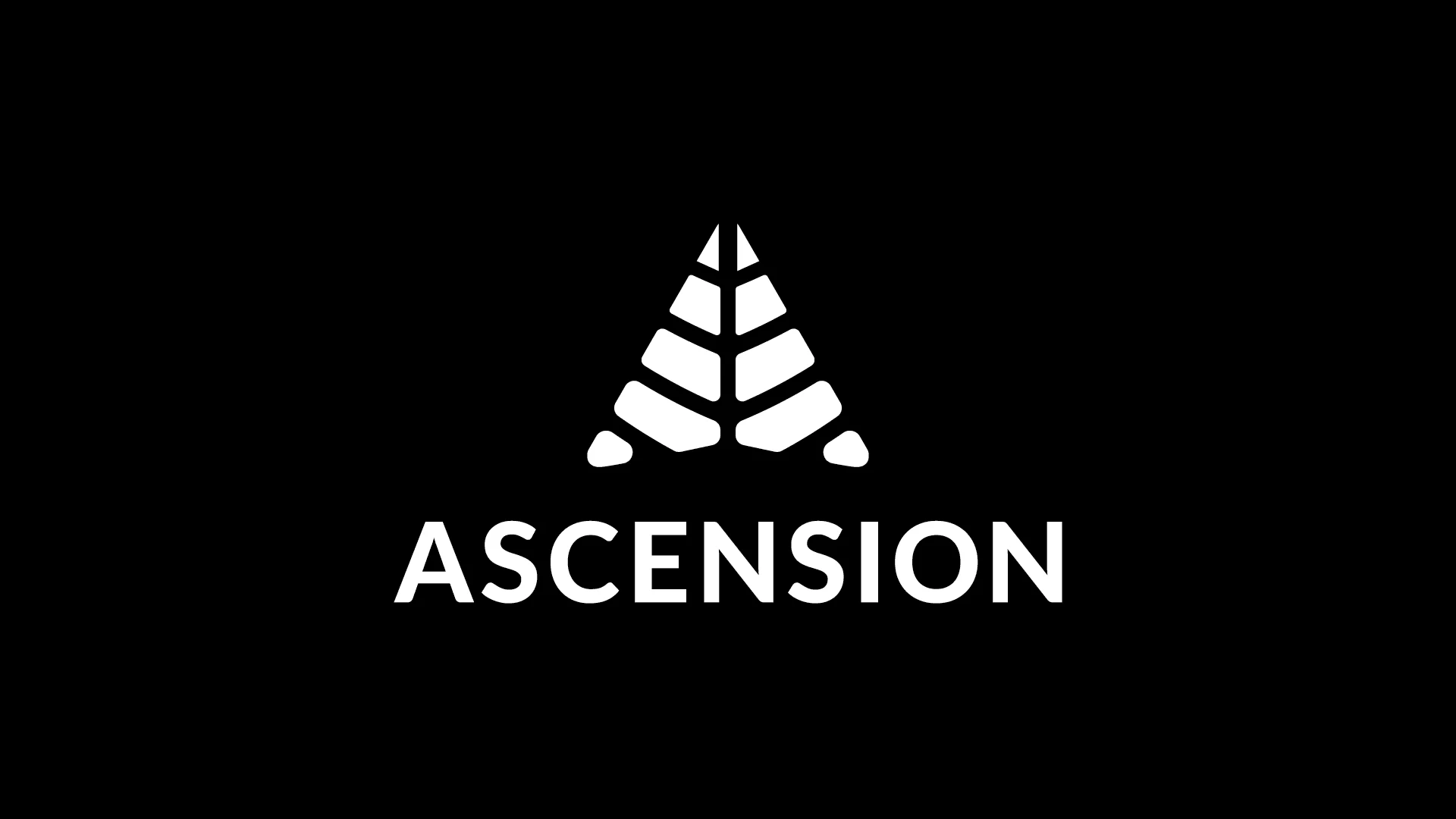
The logomark integrates four core themes aligned with Ascension's brand: the letter “A,” a natural essence, an upward arrow symbolizing product elevation, and a subtle medical influence. The visual breakdown above details how each concept is embedded within the design.
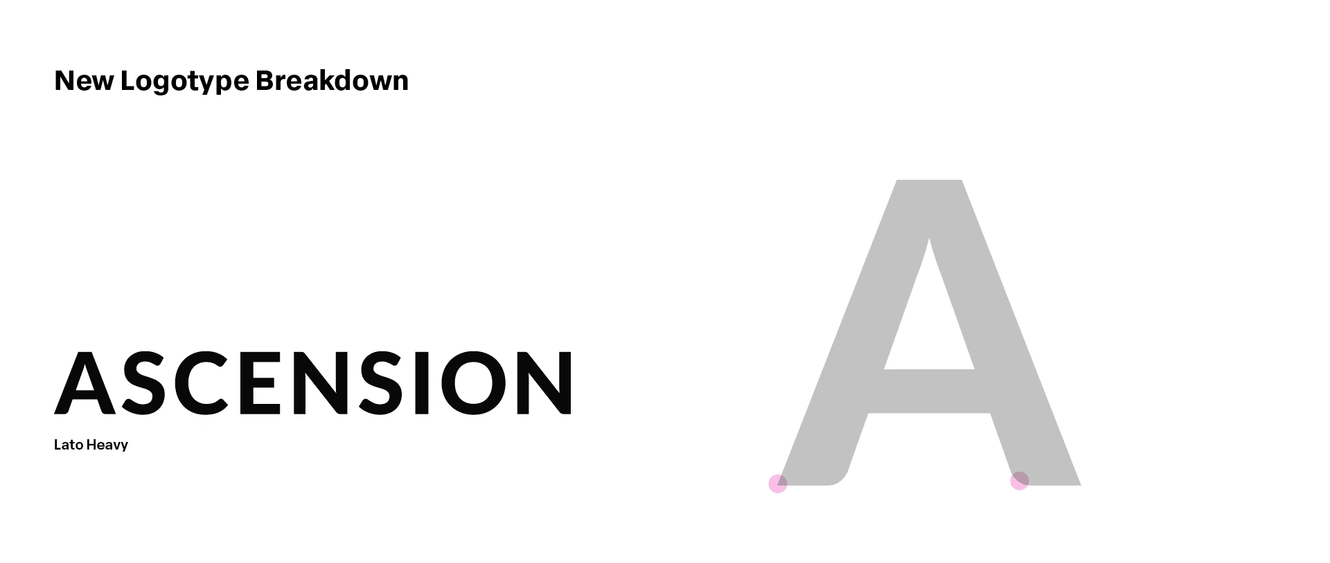
The logotype set in Lato Heavy, blends rounded and sharp corners, which are also characteristics found in the logomark. This shared visual language brings cohesion and character to the full logo system.
The refresh sharpens readability while preserving signature elements of the original. This new system introduces a flexible toolkit designed for seamless application across a wide range of brand environments.
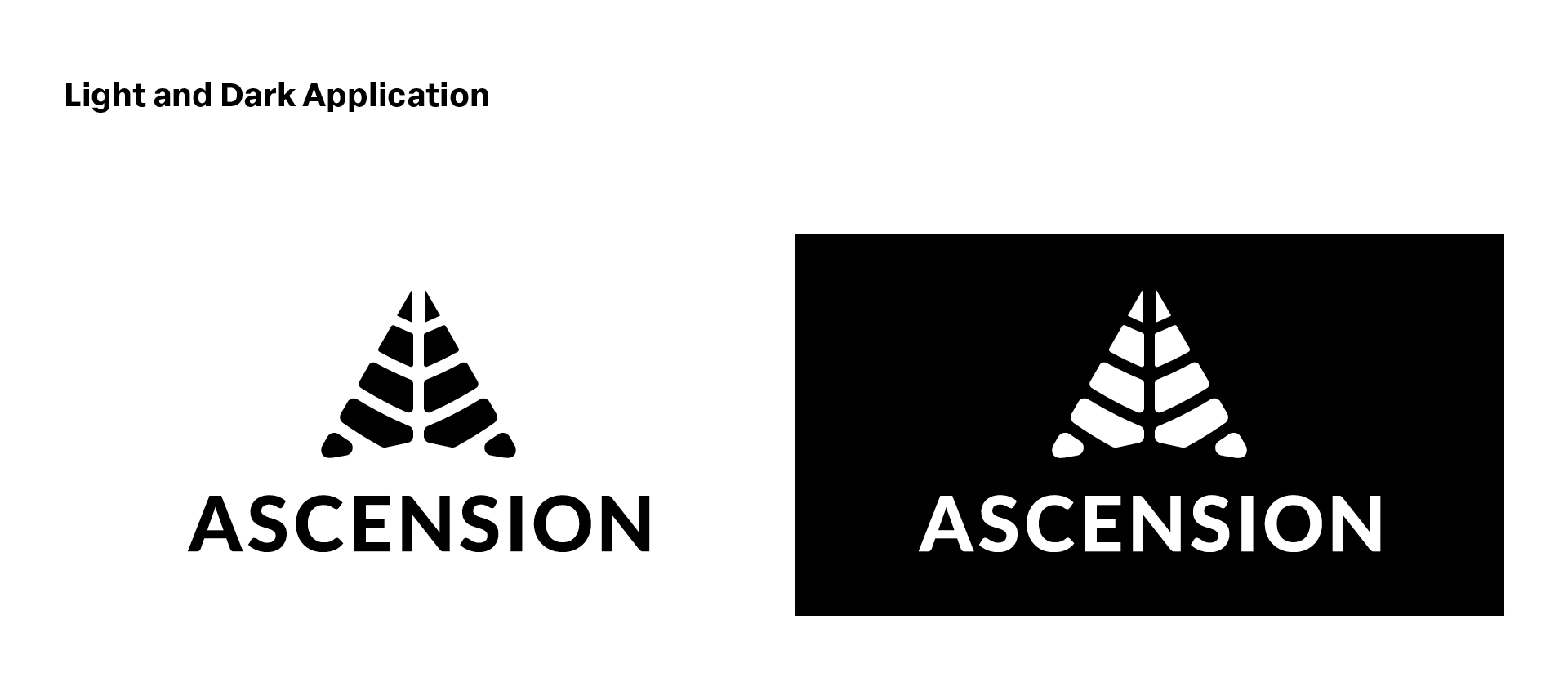
The updates are based on the idea that the logos should work on both light and dark backgrounds, which was a significant challenge the original logo struggled with across various use cases. The logo set offers versatility that the original lacked.

The update carries forward key elements of the original, serving as an evolution of the logomark and logotype rather than a complete overhaul, which could potentially confuse loyal brand followers.
Like this project
Posted Apr 24, 2025
Developed a flexible logo system for Ascension, enhancing versatility while preserving original elements.