Kuća 357, Brand identity


KUĆA 357
Showcasing a Distinctive Wooden Toy Workshop, blending sustainability with educational innovation
Industry
Toy Manufacturing, Education
Market
Serbia
The brief
Kuća 357 is the result of Tanja’s lifelong passion for working with children and her desire to create something meaningful. After many years in her field, she decided to start a new chapter by founding this unique workshop. In an industry where toys are often created with a focus on entertainment alone, Kuća 357 stands out by introducing innovative, educational toys that contribute to children's development.
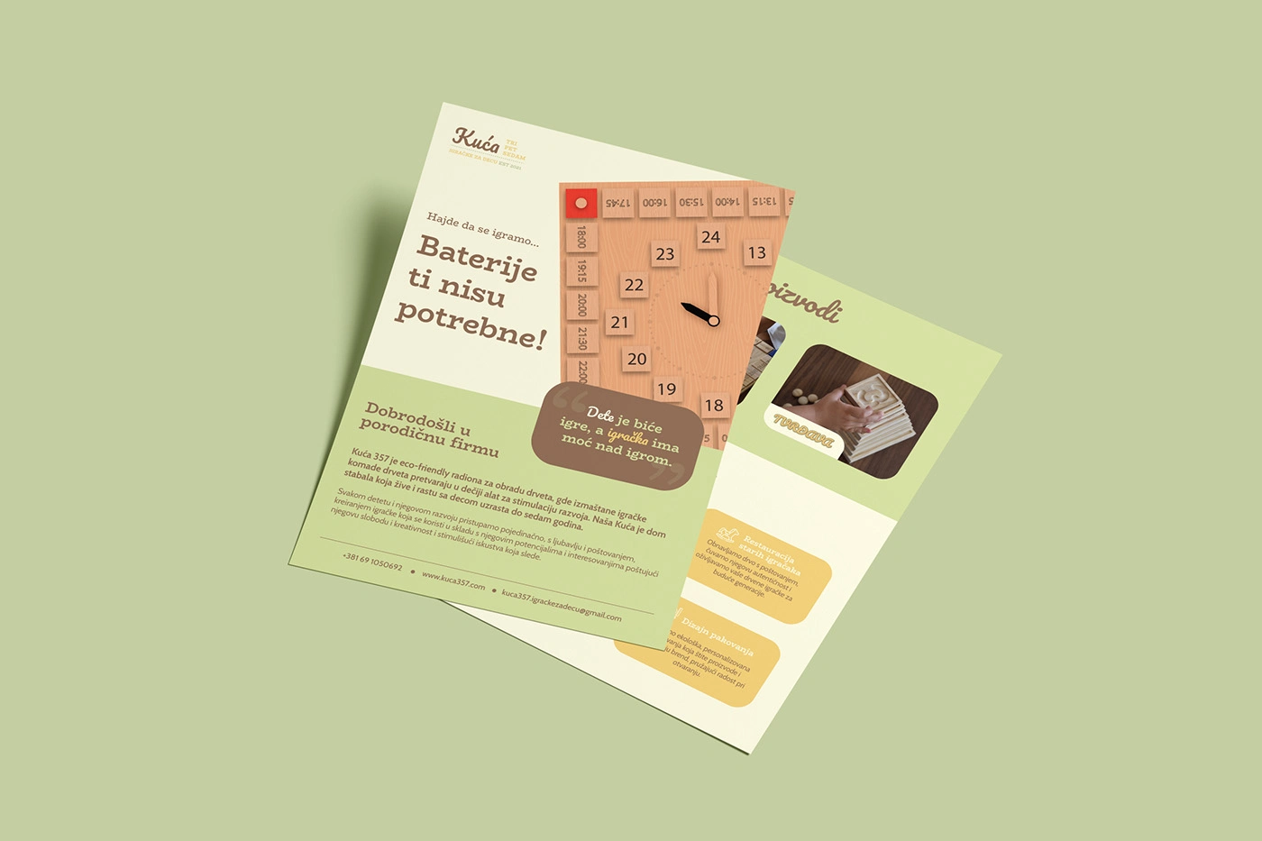
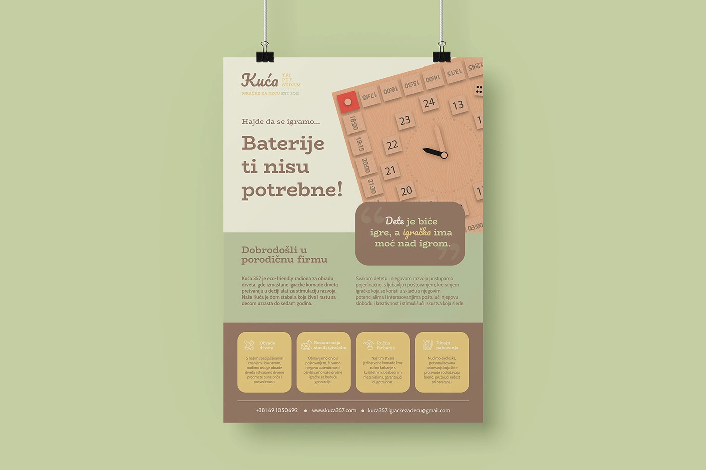
One of the key challenges was to design a brand identity that felt both playful and trustworthy – something that would appeal to children and reassure parents. Tanja wanted the brand to feel warm and handmade, but also visually polished and intentional.
The Process
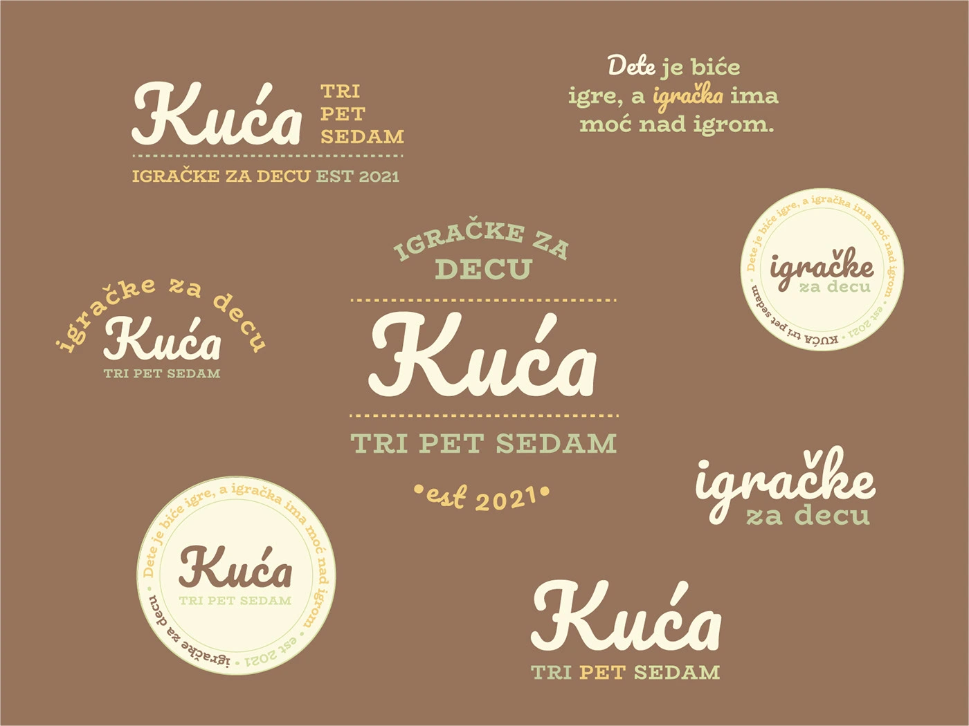
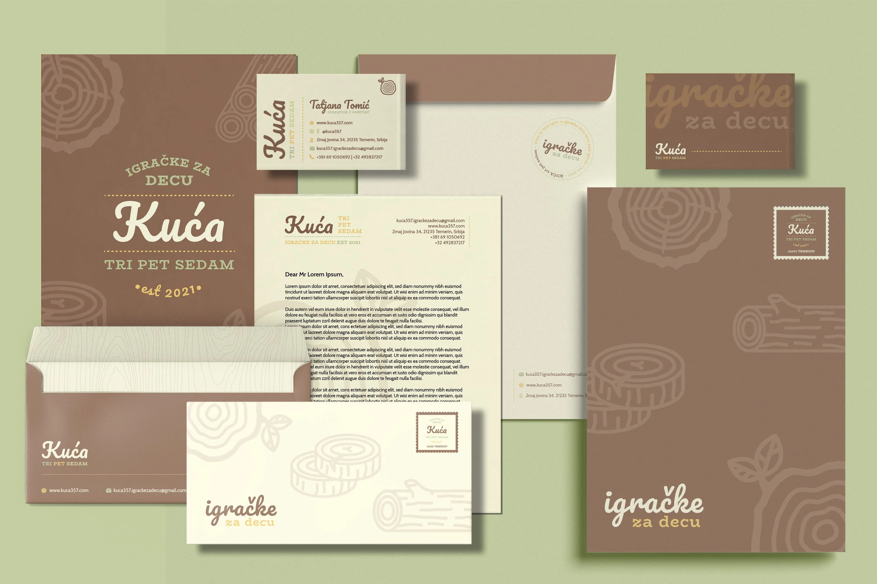
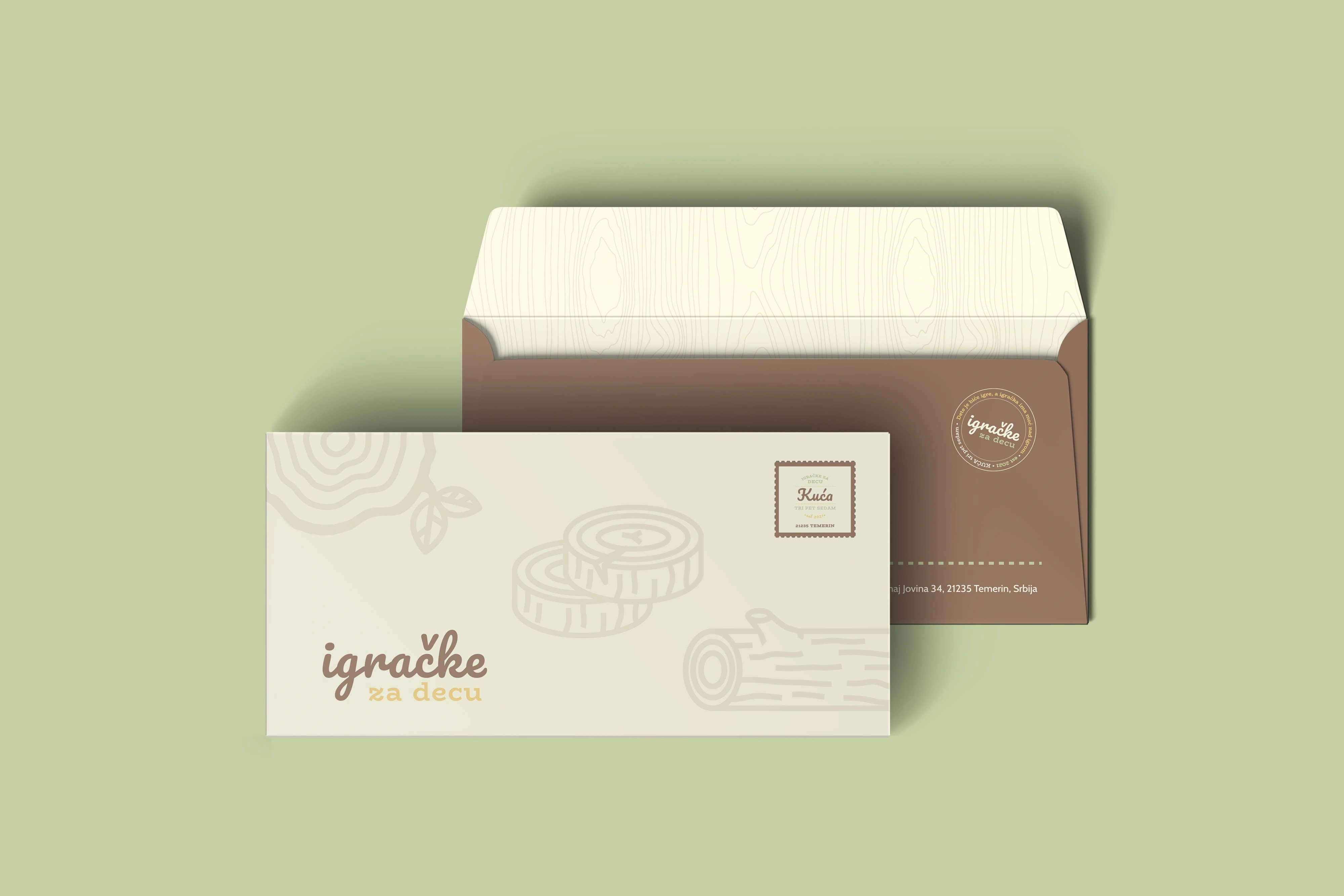
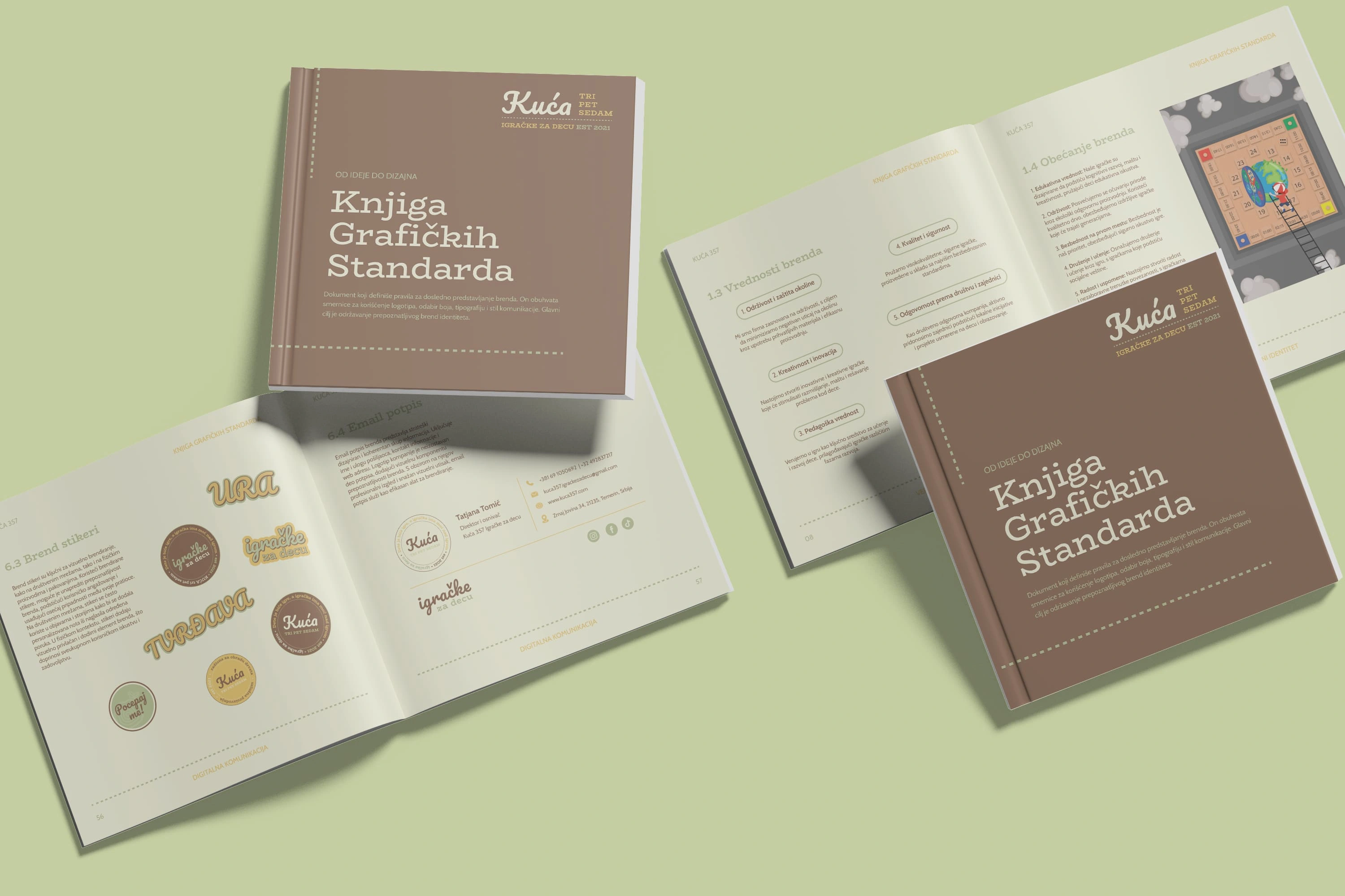
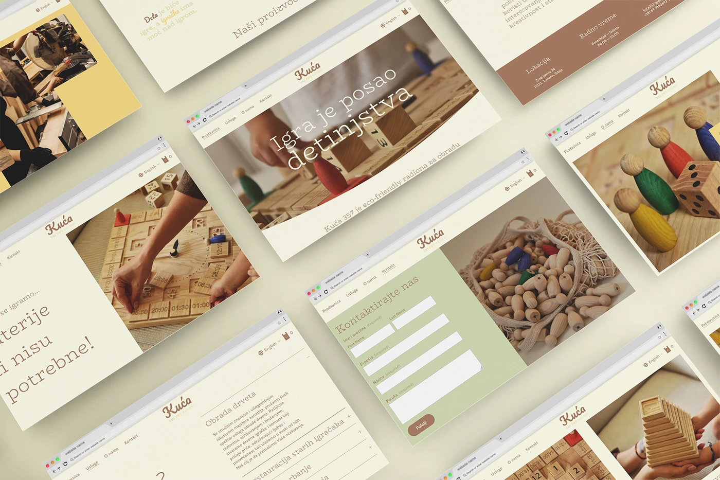
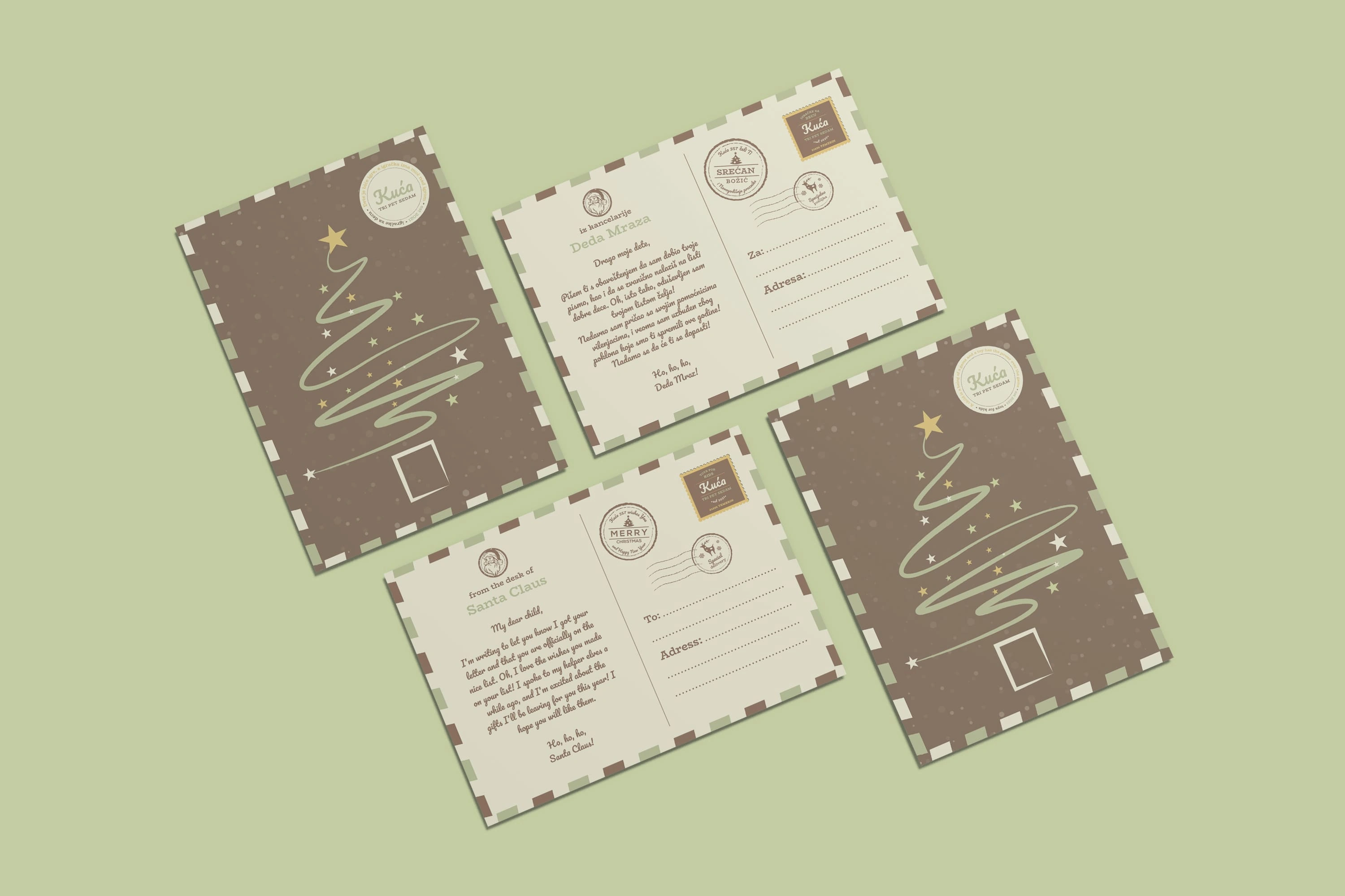
We began by discussing the emotional associations she wanted to evoke: nostalgia, learning, gentleness, nature. Based on that, I proposed we draw inspiration from retro carpentry signage and classic workshop aesthetics to bring out a sense of heritage and craftsmanship. I explored several directions, but we ultimately leaned into a logotype-driven solution that allowed for subtle texture and detail without becoming overcomplicated.
I also helped define the tonality of the brand: minimal but kind, focused but inviting. Every element – from colors to type hierarchy – was designed to support this balance.
The design
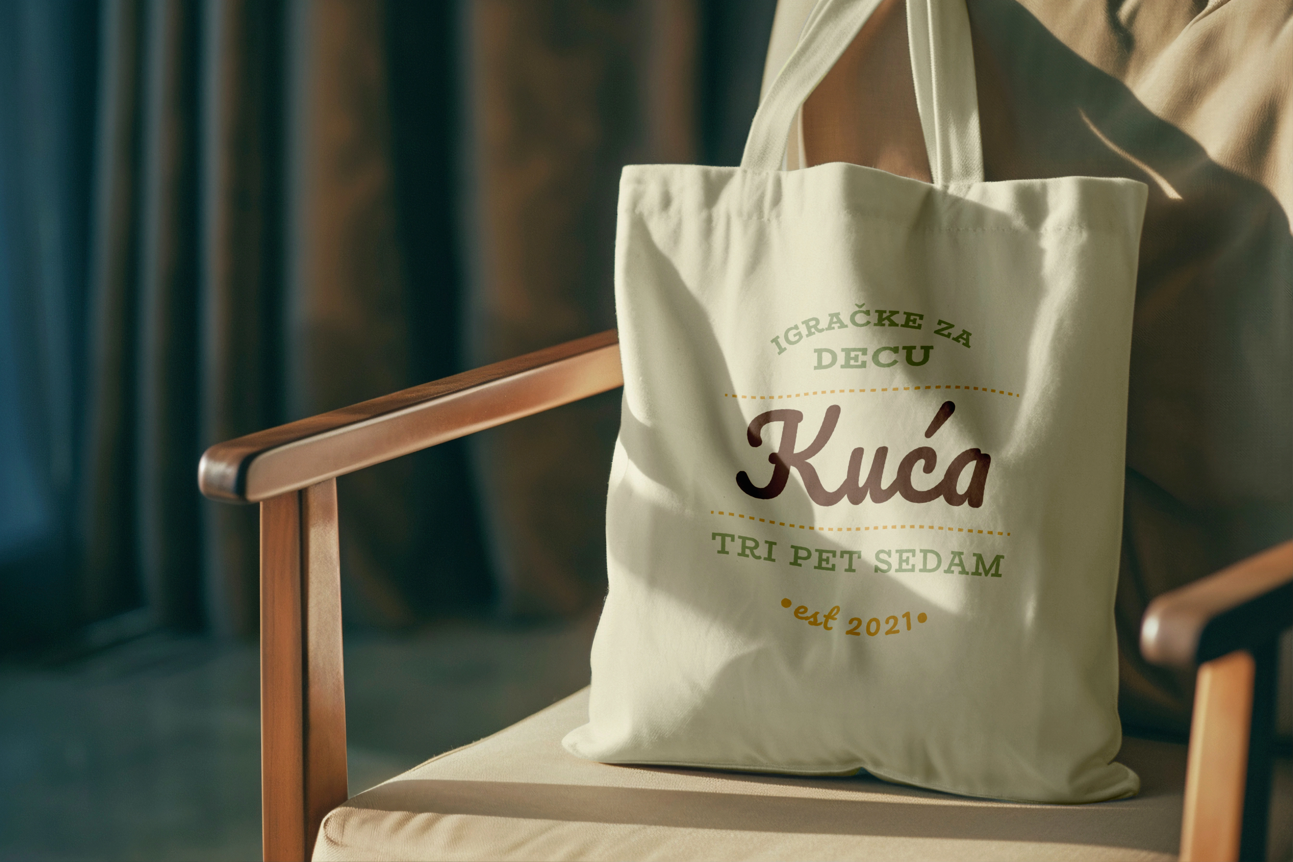
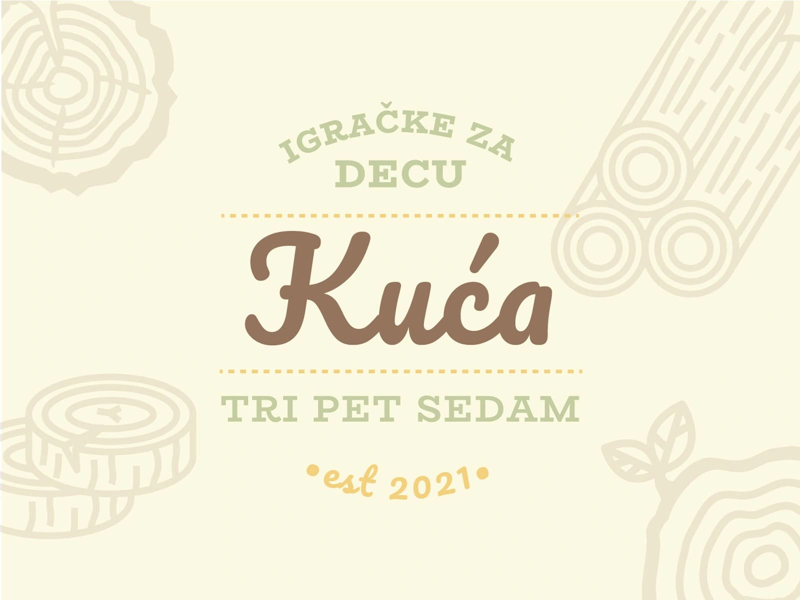
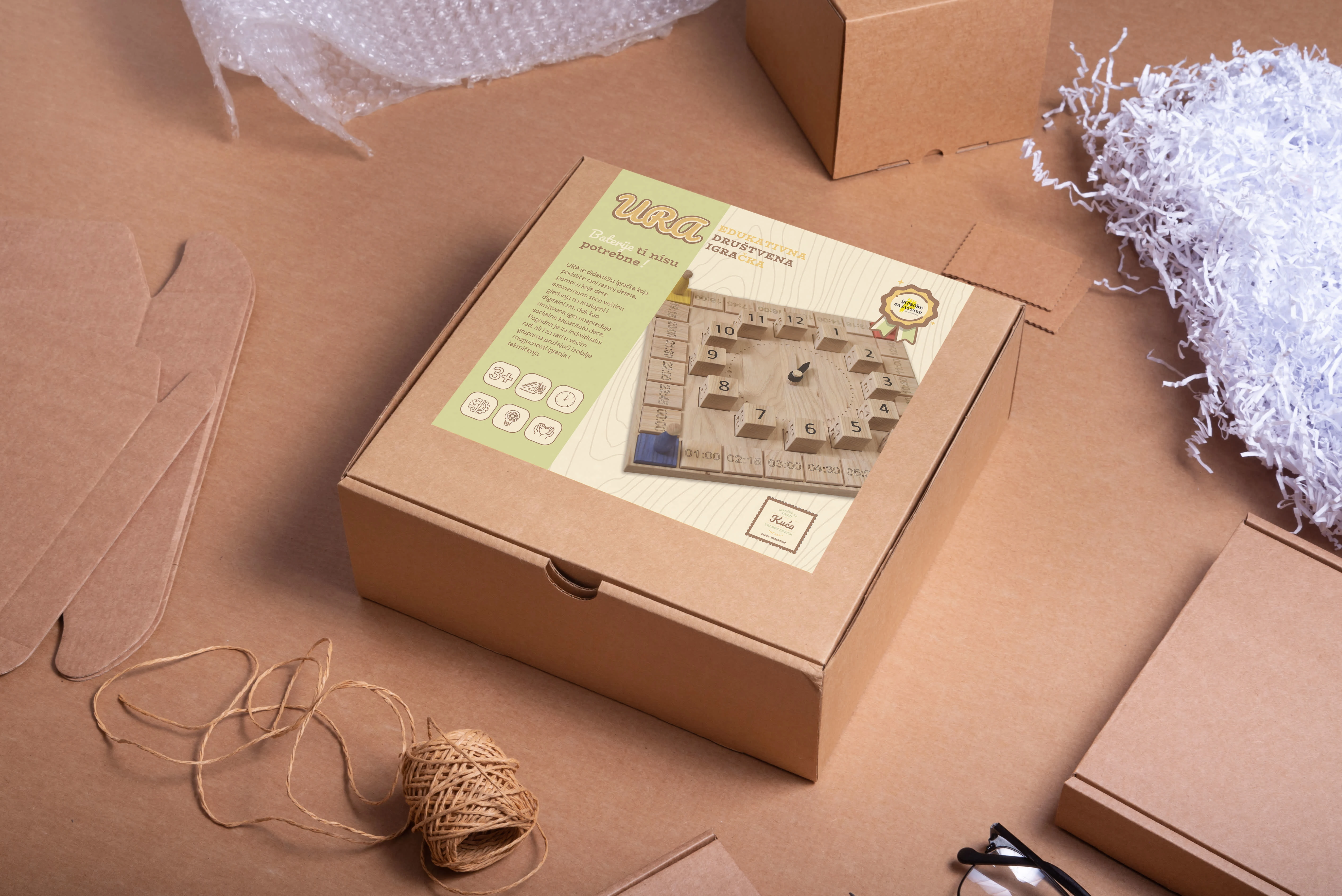
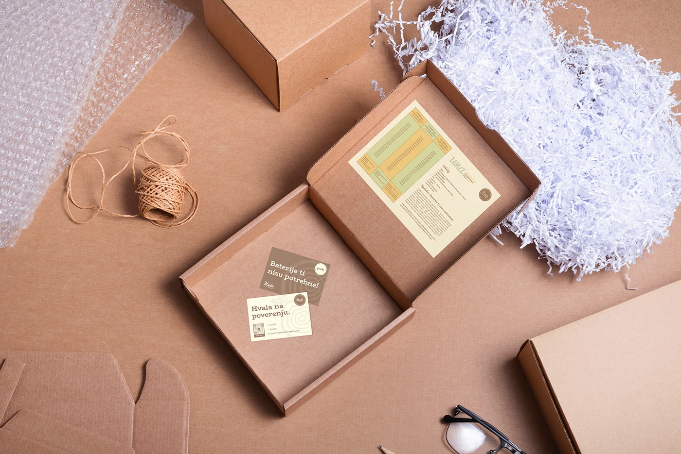
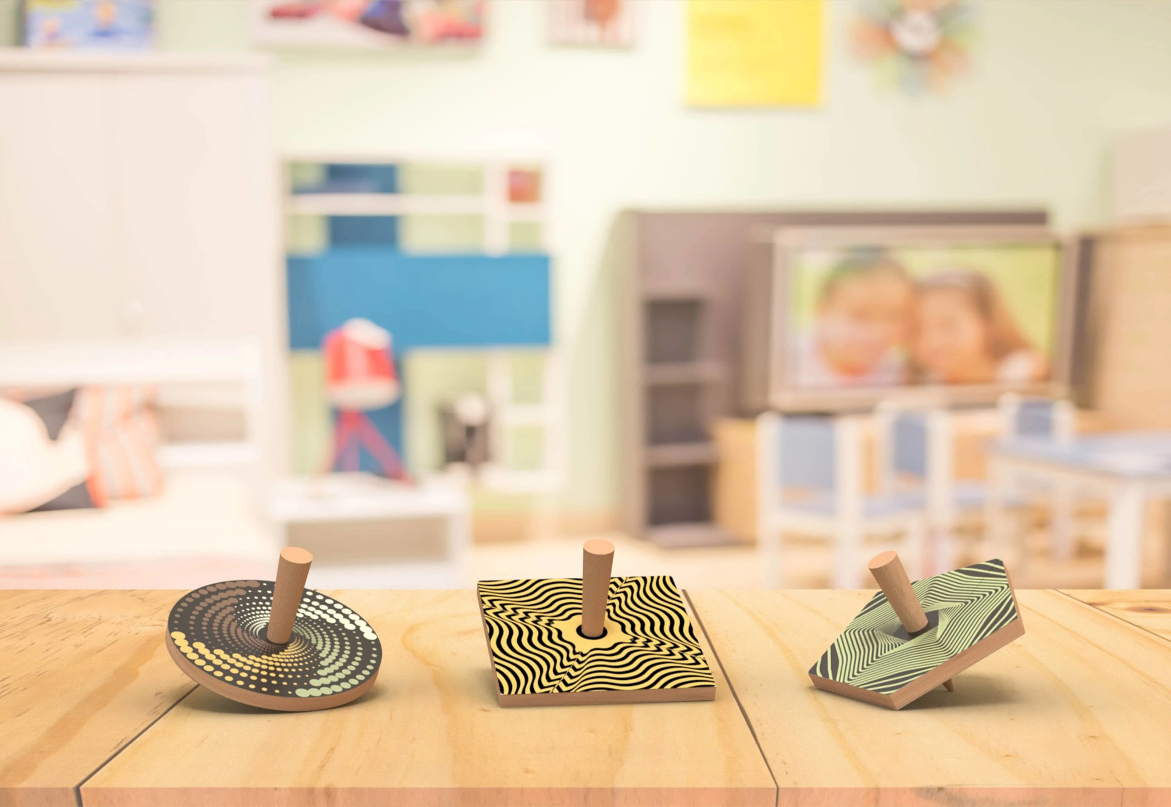
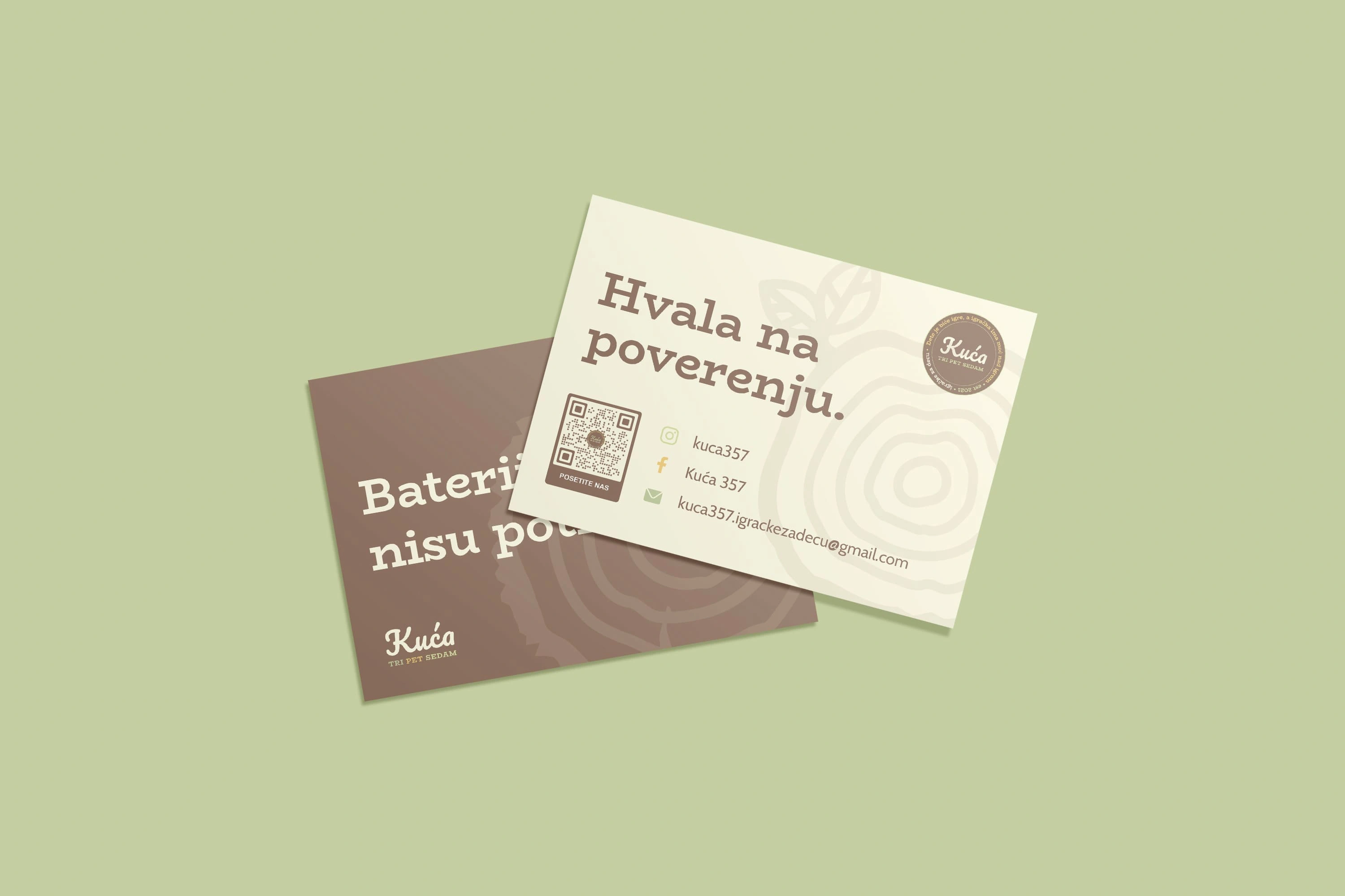
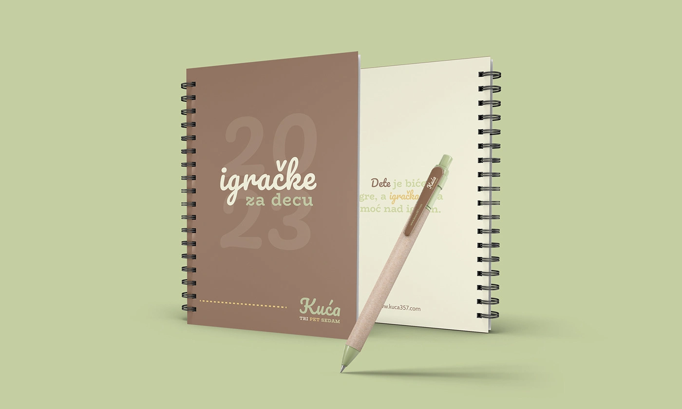
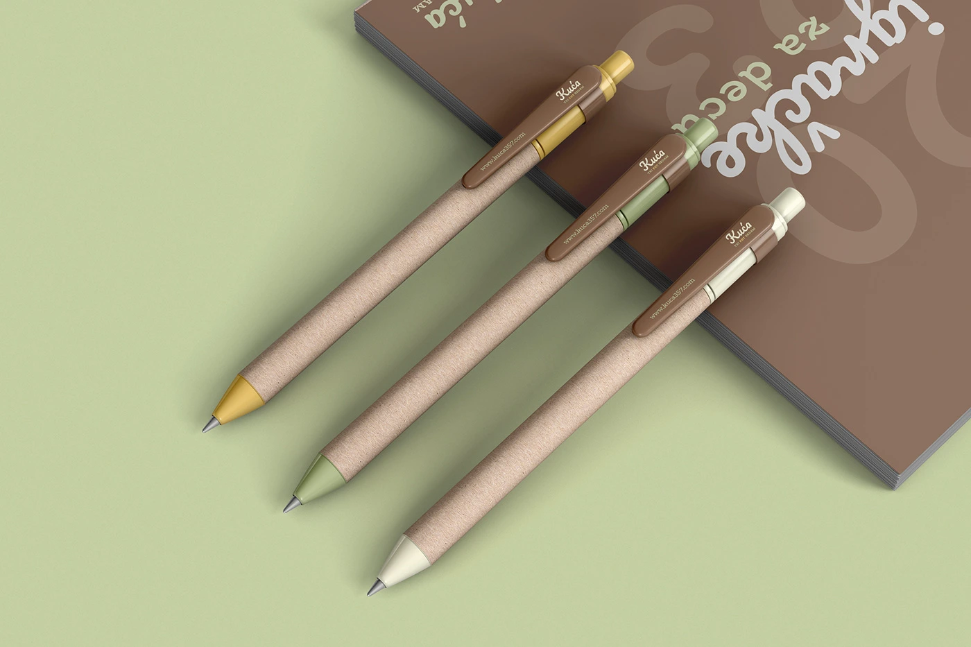
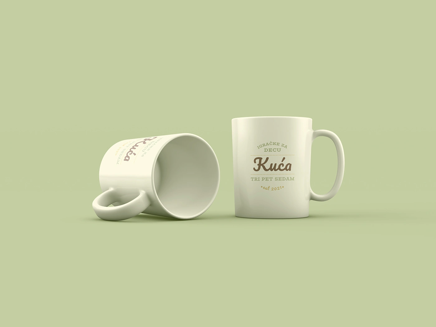
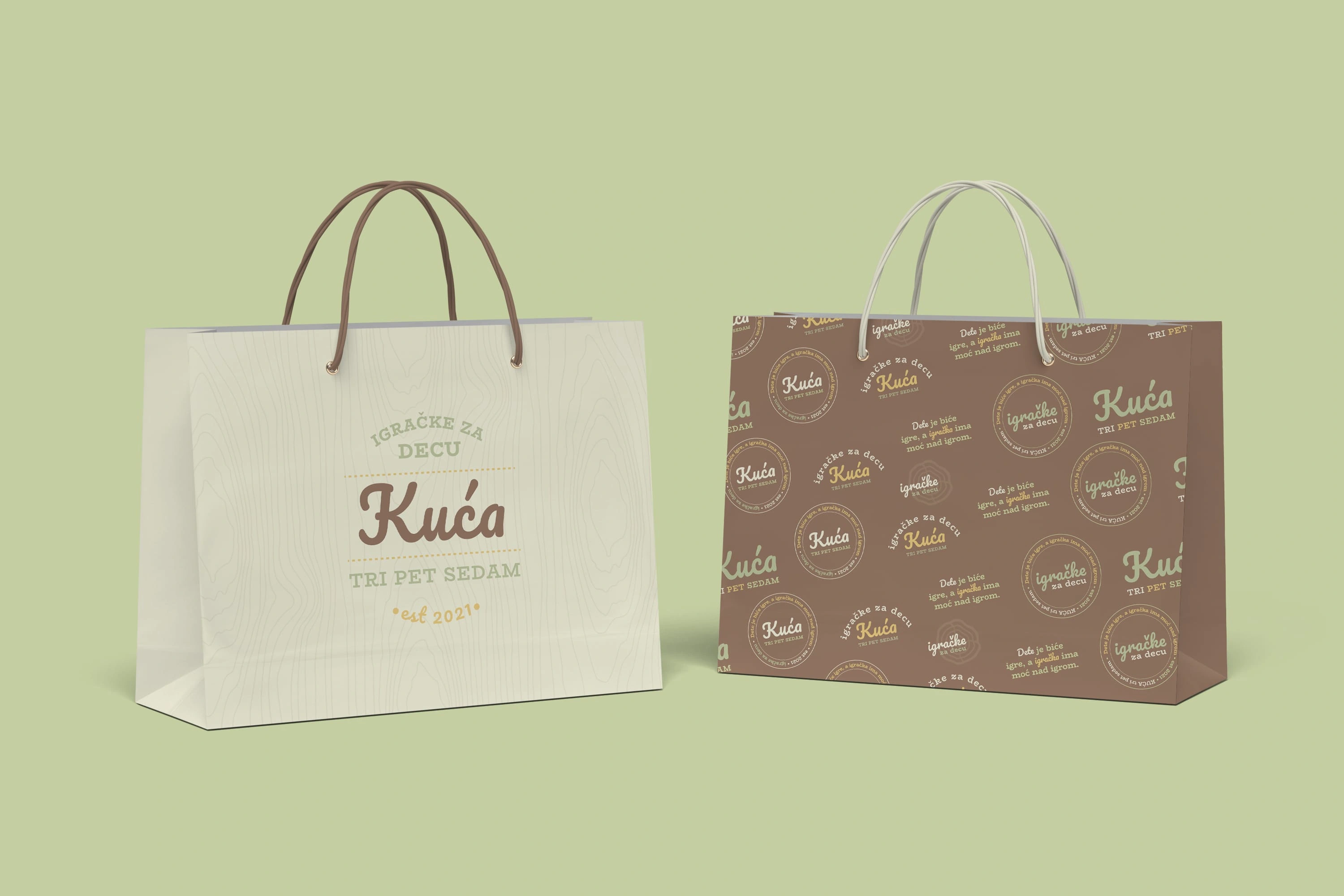
The identity revolves around a palette of pastel earth tones, soft wood hues, and green. These colors were chosen for their calming and grounding qualities, ideal for focus and concentration – something essential in educational play.
The green tone serves a dual purpose: it speaks to nature and ecology but also subtly connects the brand to safe, toxin-free materials. The typography is slightly rounded and open, suggesting approachability while still being clean and legible across materials.
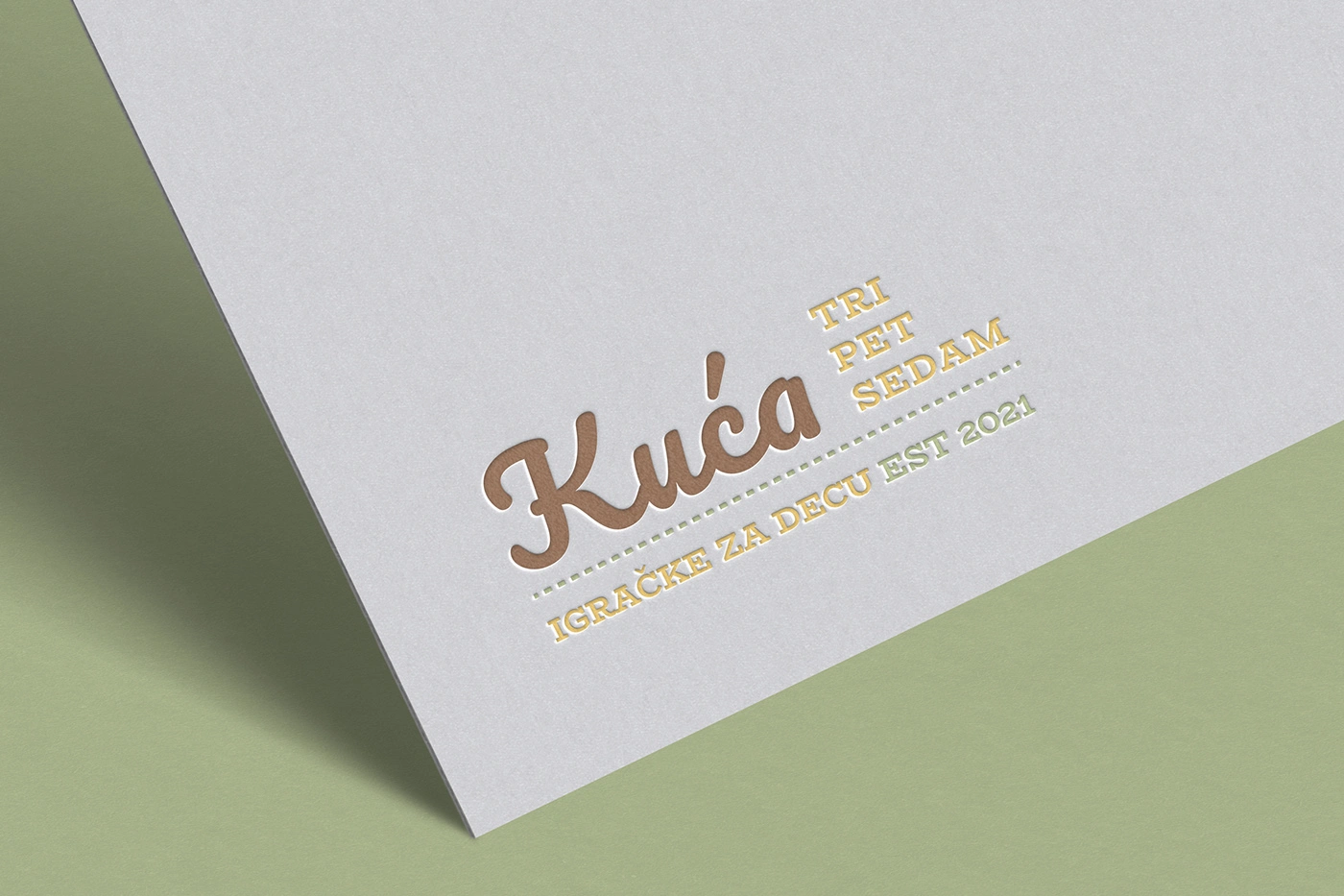
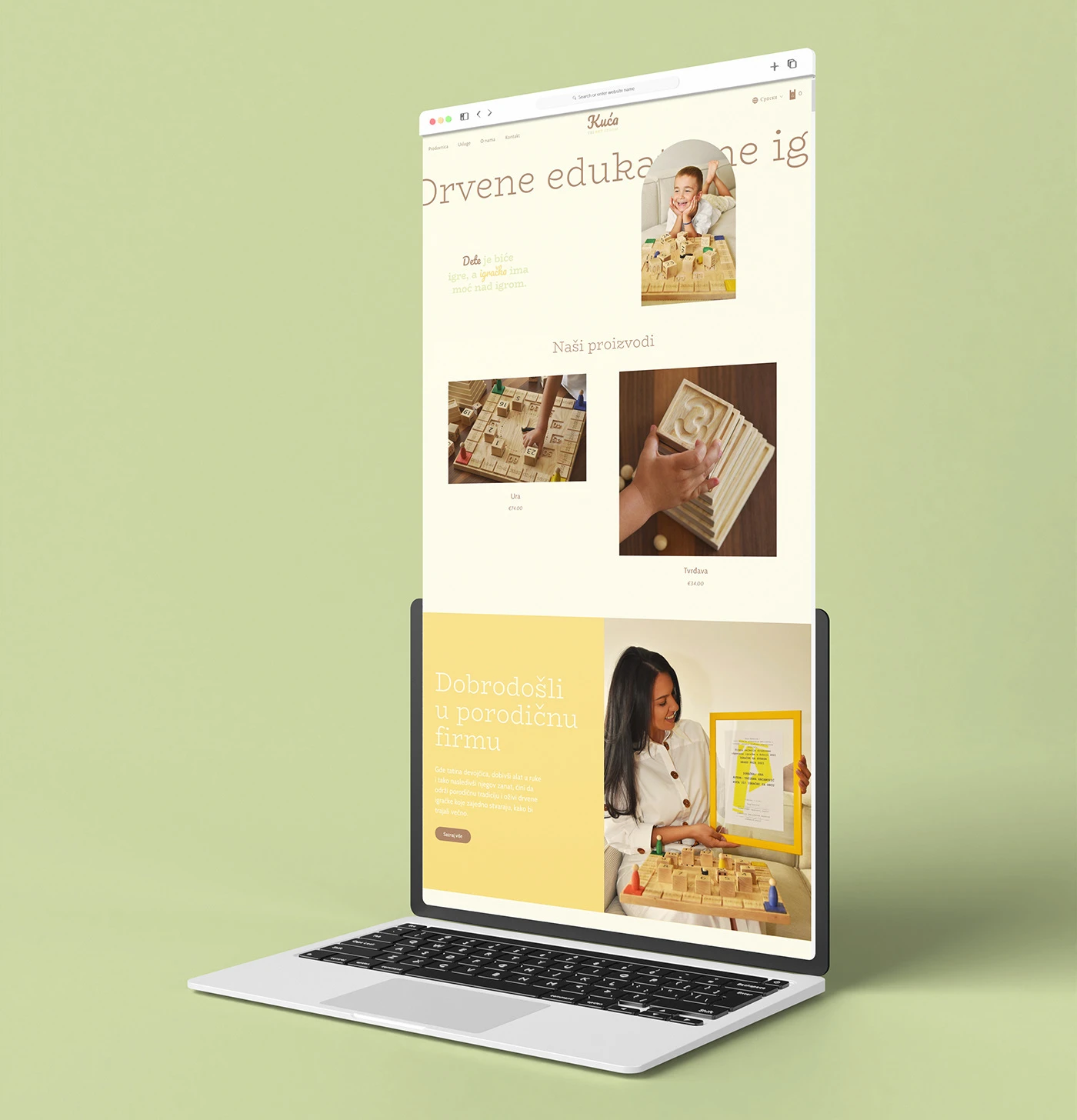
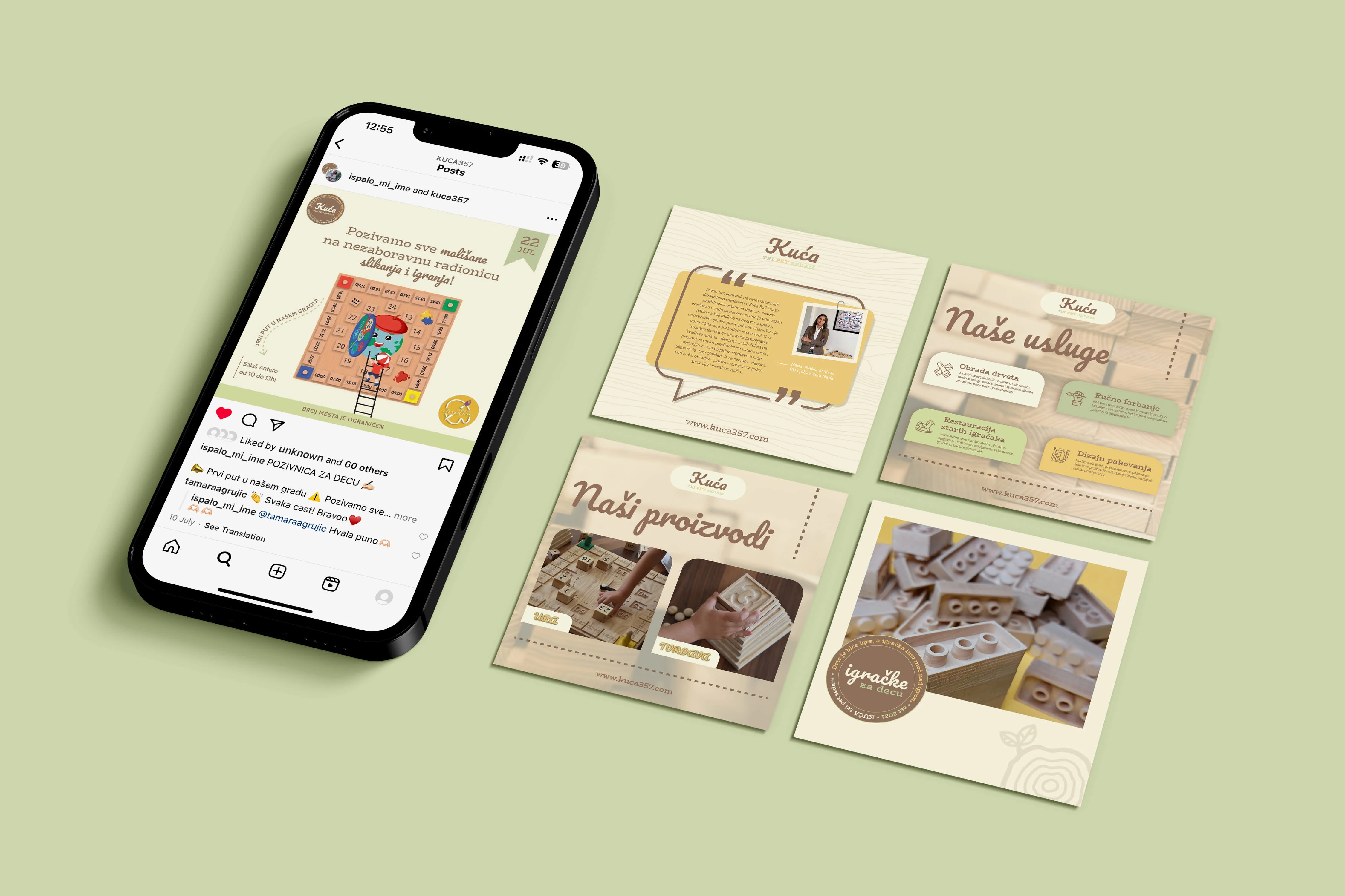
We created a full suite of printed materials (flyers, tags, and packaging mockups) to showcase how the brand lives in both physical and digital space.
Results
Kuća 357 now stands out as a modern toy workshop rooted in educational value and sustainability. The identity gives the brand a unique voice in a saturated market of over-colored, noisy packaging and has helped establish trust with early customers.


"From the moment my first toy got into a child's hands, I knew I wanted to give children a sense of Absolute pleasure. When I say Absolute pleasure, I mean every feeling a wooden educational toy can provide, from the Magical tactile feel to its purpose to the original packaging designed with love and respect. That's why, with Absolute trust, I entrusted the design of my entire brand to Ivana. She made my toys even more unique, so I will always be grateful to her for that."
Tatjana, Founder of Kuća 357
Let's Connect!
If you're inspired by my work on Kuća 357, I'd love to hear from you! Whether you have a project in mind or just want to share your thoughts, don’t hesitate to get in touch.
Like this project
0
Posted Apr 1, 2025
Designed a warm, sustainable identity for an educational toy brand, blending heritage, nature, and child development into one visual language.
Likes
0
Views
2
Timeline
Mar 15, 2021 - Aug 27, 2023


Pretz'd, Visual identity
Helios, Brand identity
Knötra, Visual identity

Formade, Visual identity