Formade, Visual Identity
Ivana Tomisic
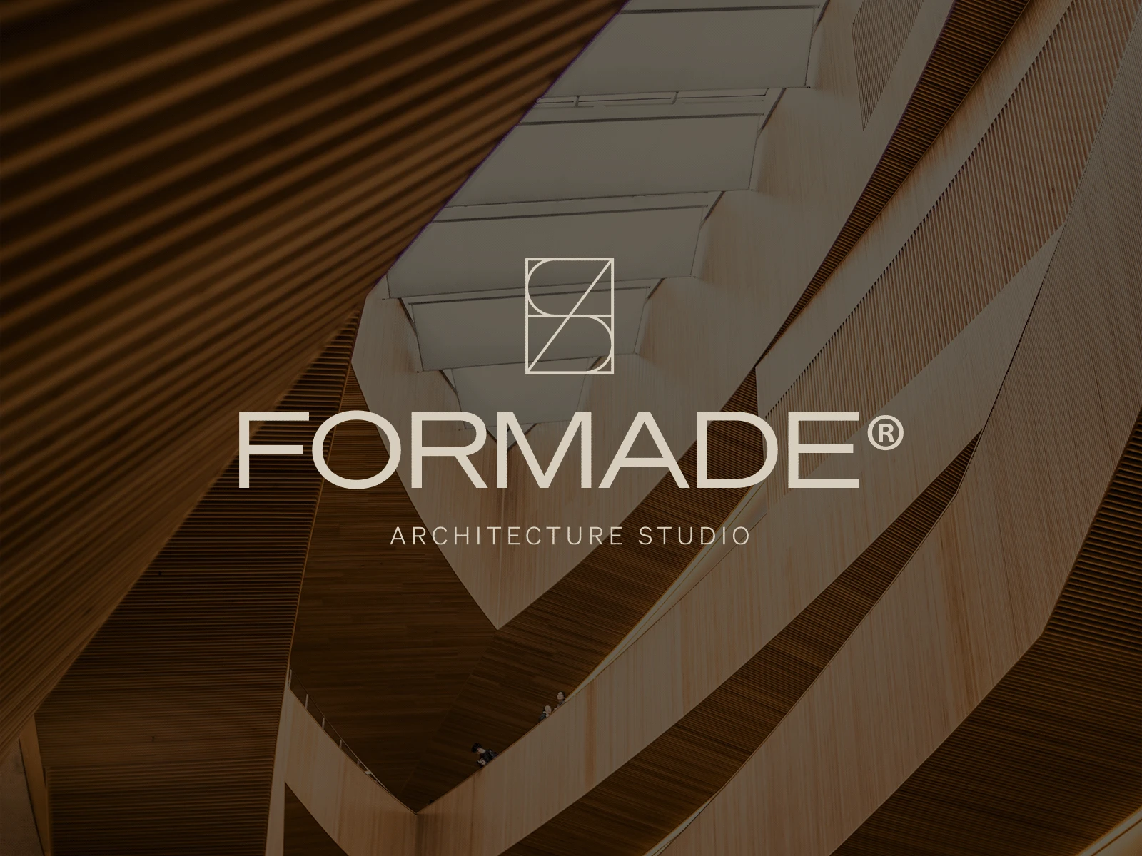
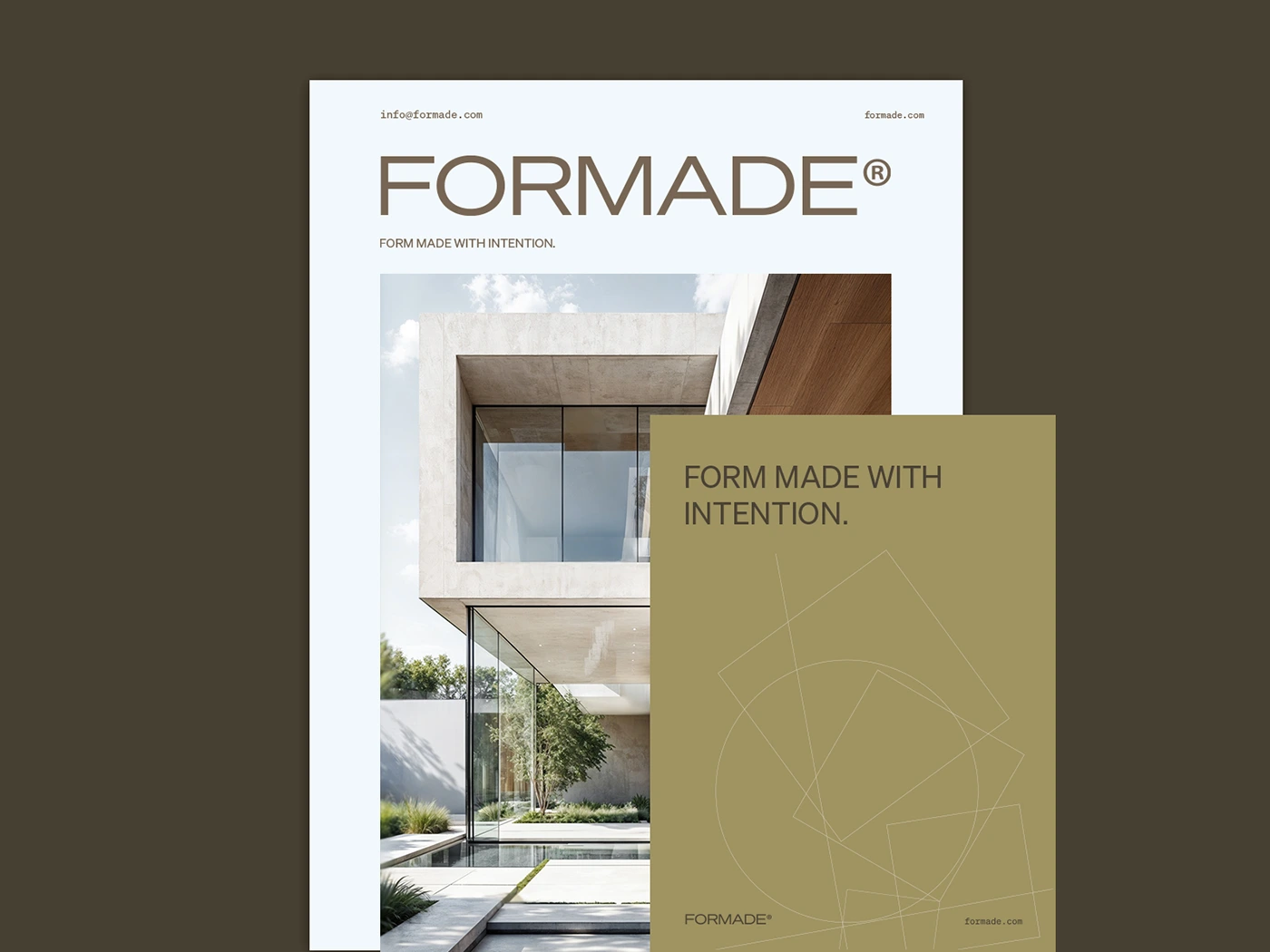
FORMADE
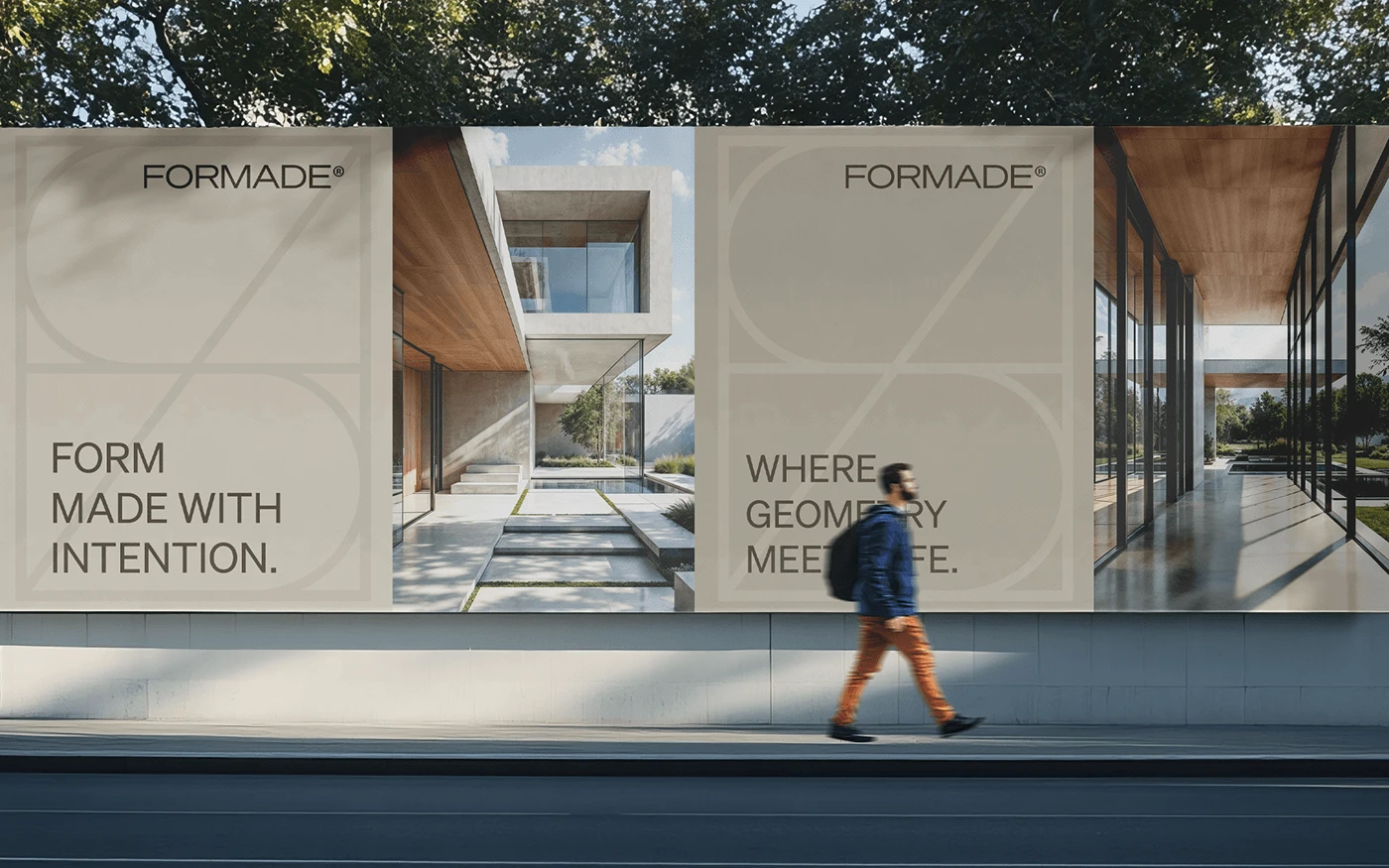
Form made with intention.
Industry
Architecture & Interior Design
Market
London, UK
The brief
Formade is a fictional architecture studio rooted in intentional design and quiet sophistication. The challenge was to create a visual identity that reflected the studio’s core values: precision, balance, and thoughtful simplicity. The brand needed to feel architectural but not cold: minimalist, yet human.
This project explores how visual identity can echo the language of architecture itself through structure, materiality, and subtle detail. The goal was to develop a brand that feels grounded, premium, and emotionally resonant, one that speaks through calm confidence rather than noise.
The design
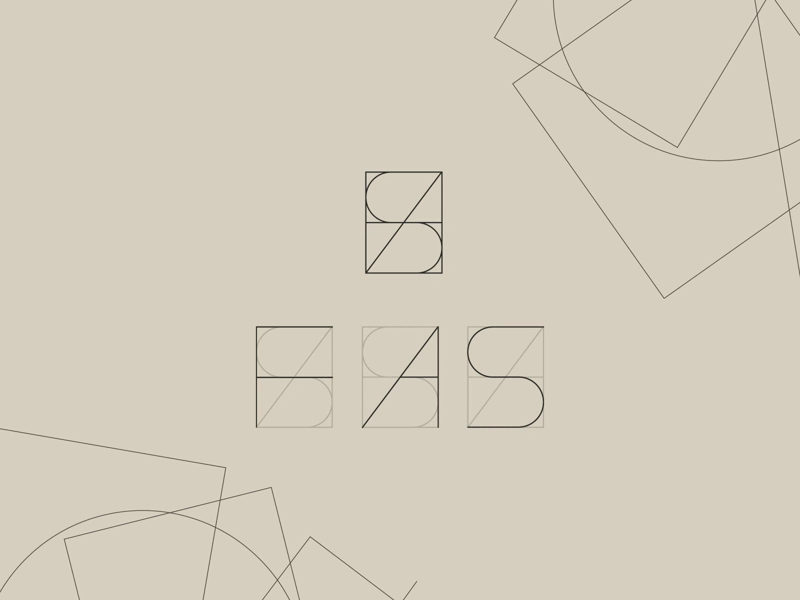
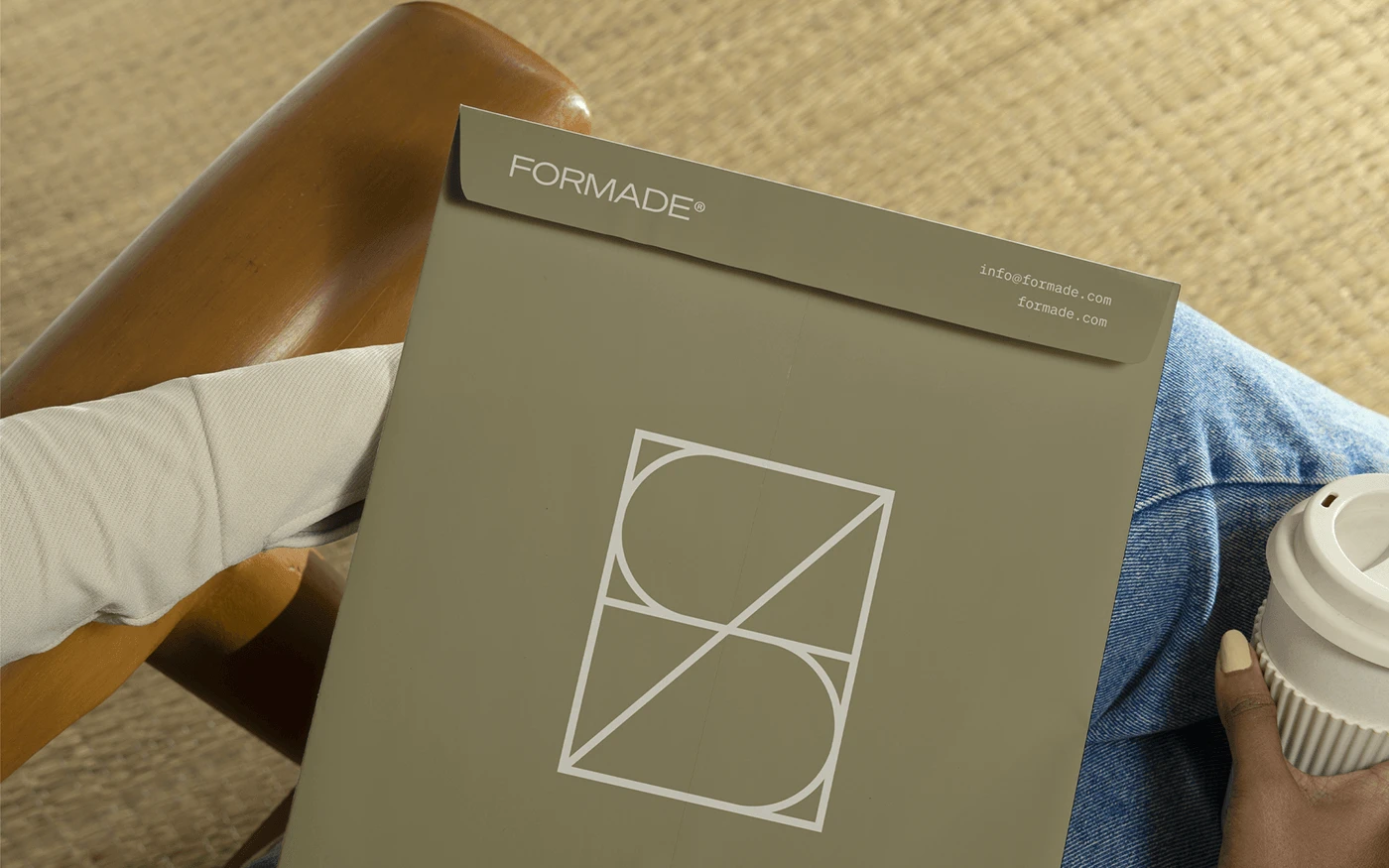
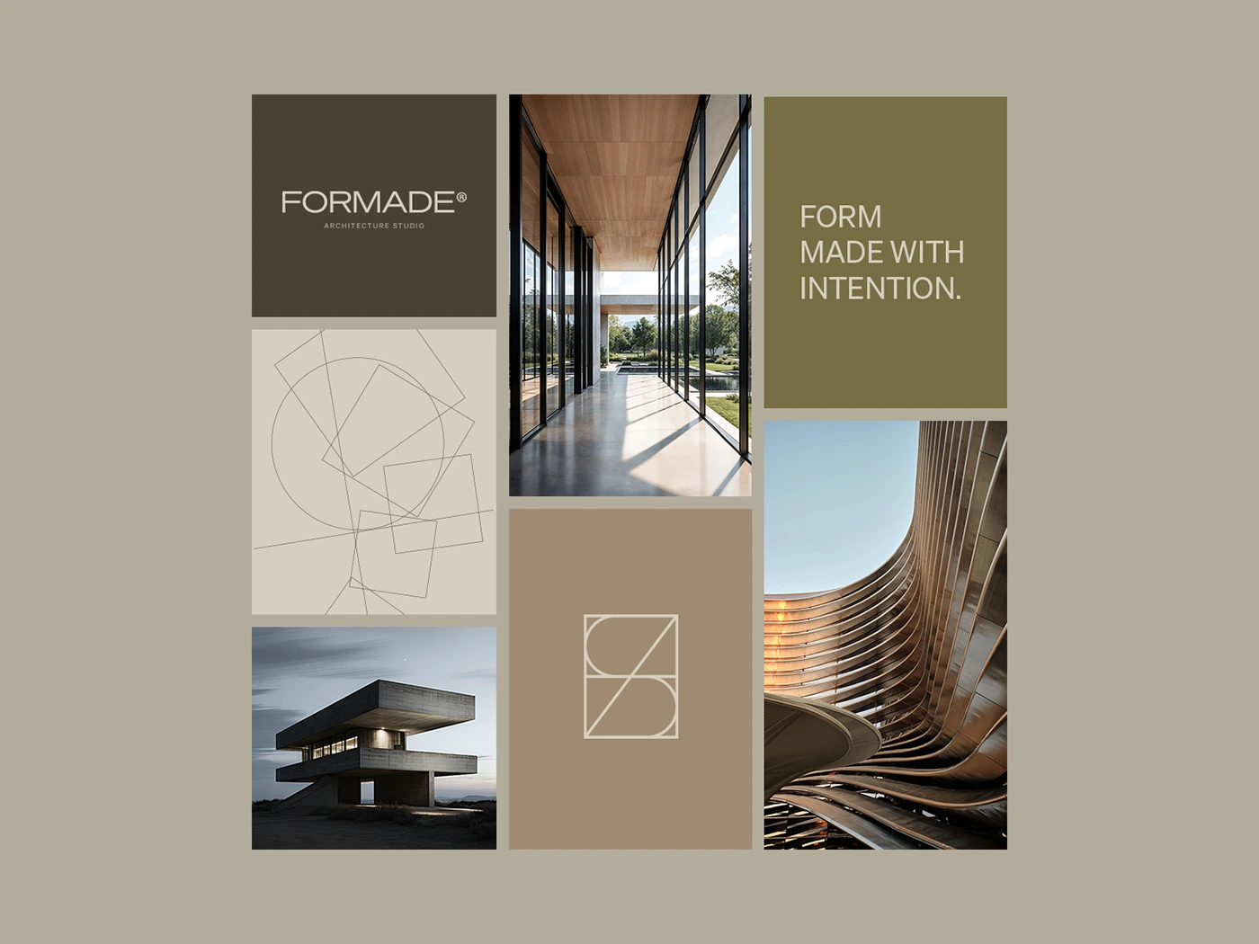
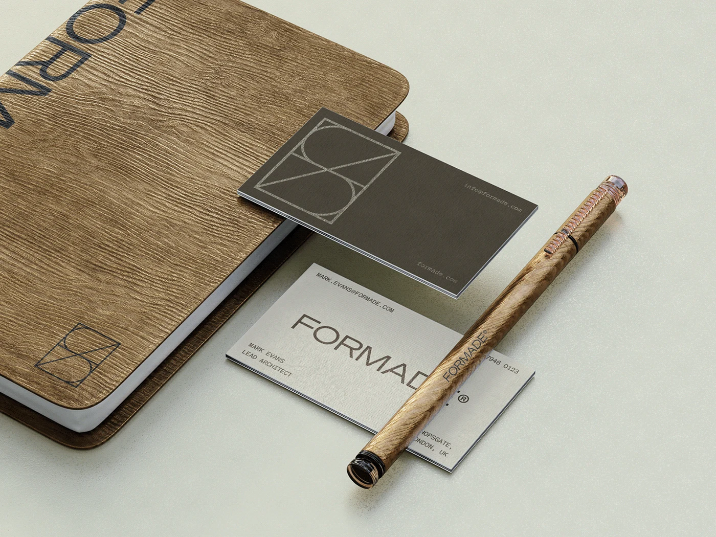
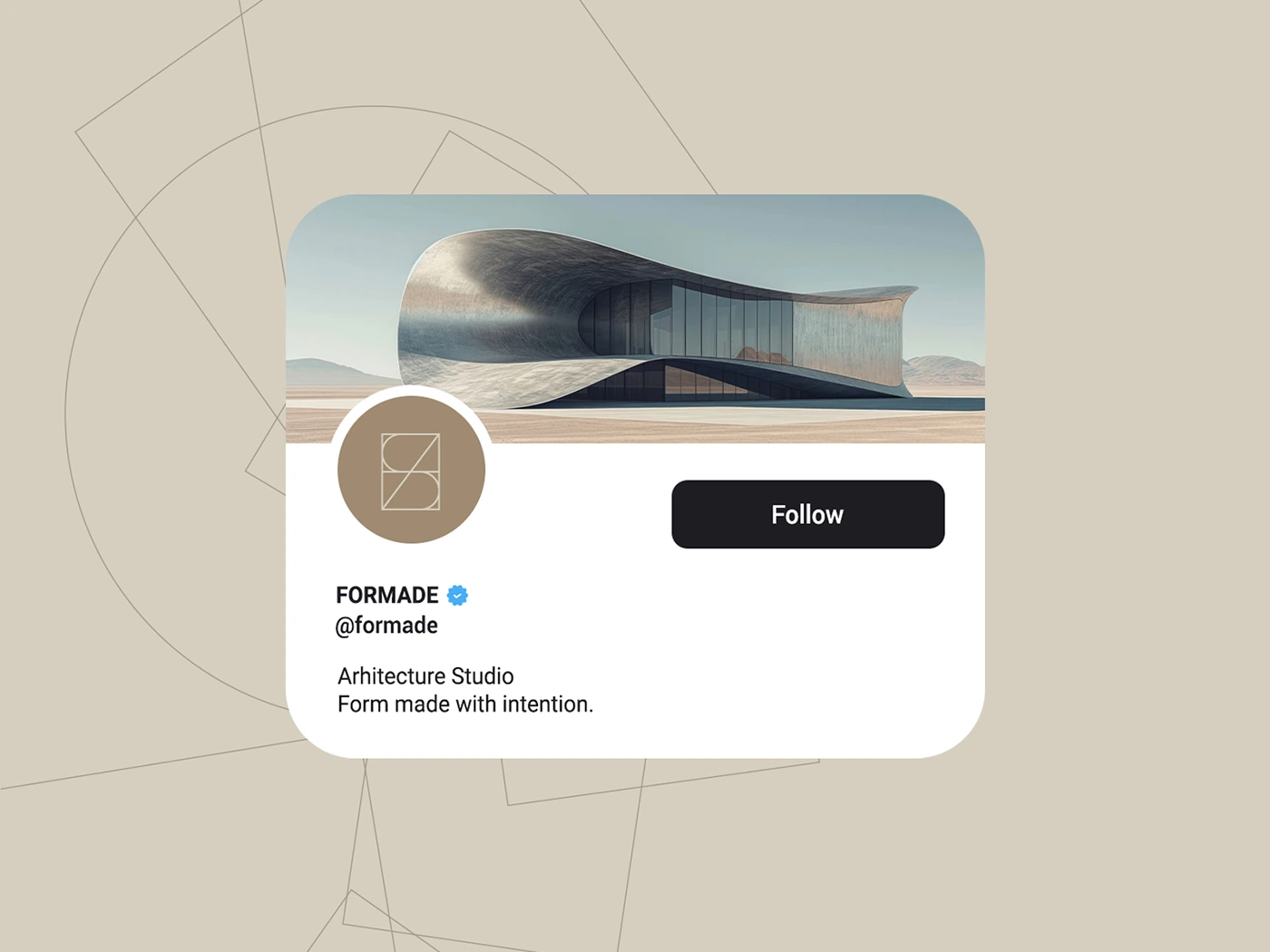
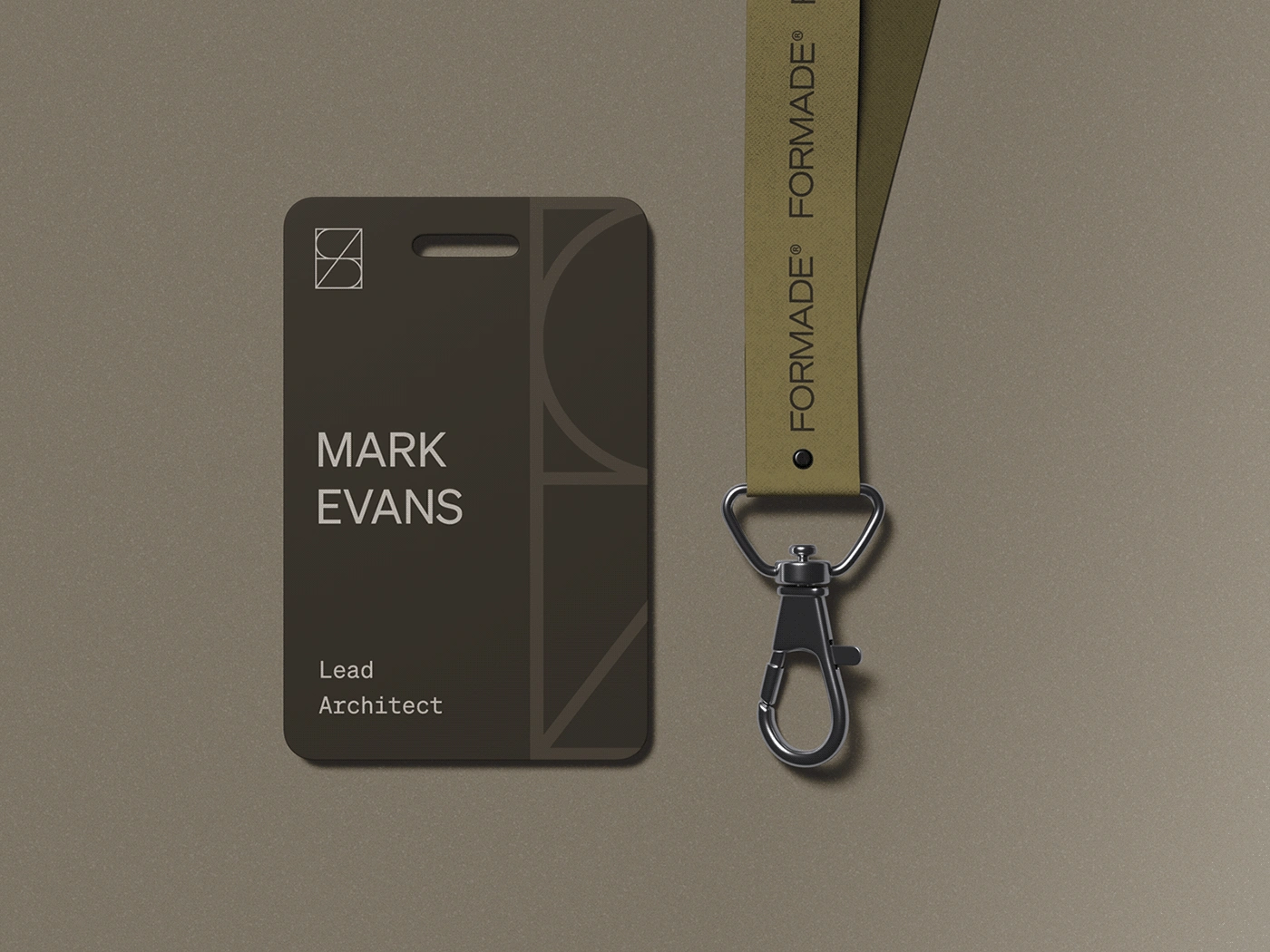
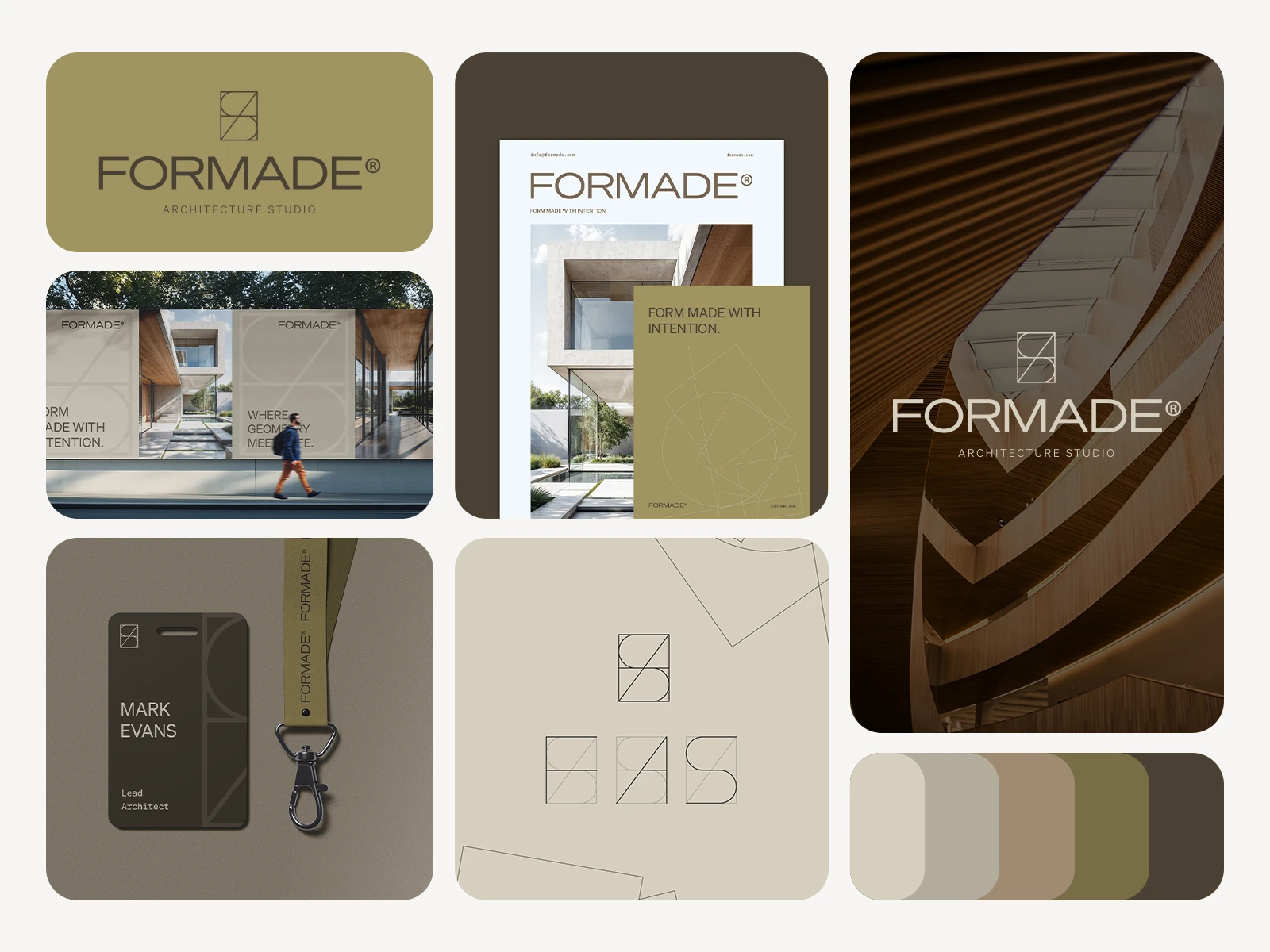
The identity is built around a custom monogram combining the letters F, A, and S, constructed with architectural logic and a sense of spatial rhythm. Typography is understated and modern, with clean sans-serif choices that support clarity and sophistication.
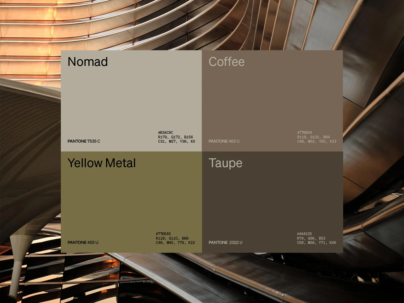
The color palette blends earthy neutrals, warm olive, and soft graphite tones, evoking natural materials and architectural surfaces. These muted shades allow the design to breathe, reinforcing the brand’s minimal and intentional tone.
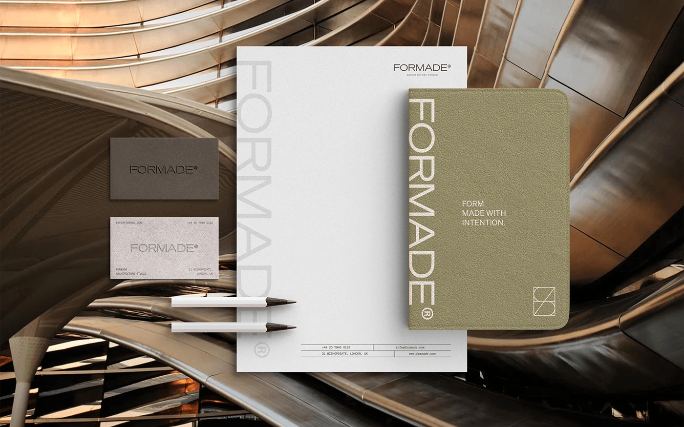
Supporting assets include stationery design, print collateral, and tactile brand elements that extend the identity across key touchpoints. From business cards to branded notebooks, every detail reinforces Formade’s philosophy: form made with care.
Let's Connect!
If you're inspired by my work on Formade, I'd love to hear from you! Whether you have a project in mind or just want to share your thoughts, don’t hesitate to get in touch.
Like this project
Posted Apr 1, 2025
Explored the intersection of branding and architecture through a calm, structured identity defined by precision and subtle detail.