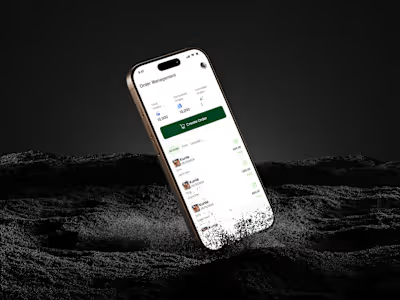
Nile’s Evolution: 6-Month UX of an E-commerce Dashboard
The Evolution of Nile: A 6-Month UX Transformation Of An E-commerce Inventory Dashboard
Project Overview
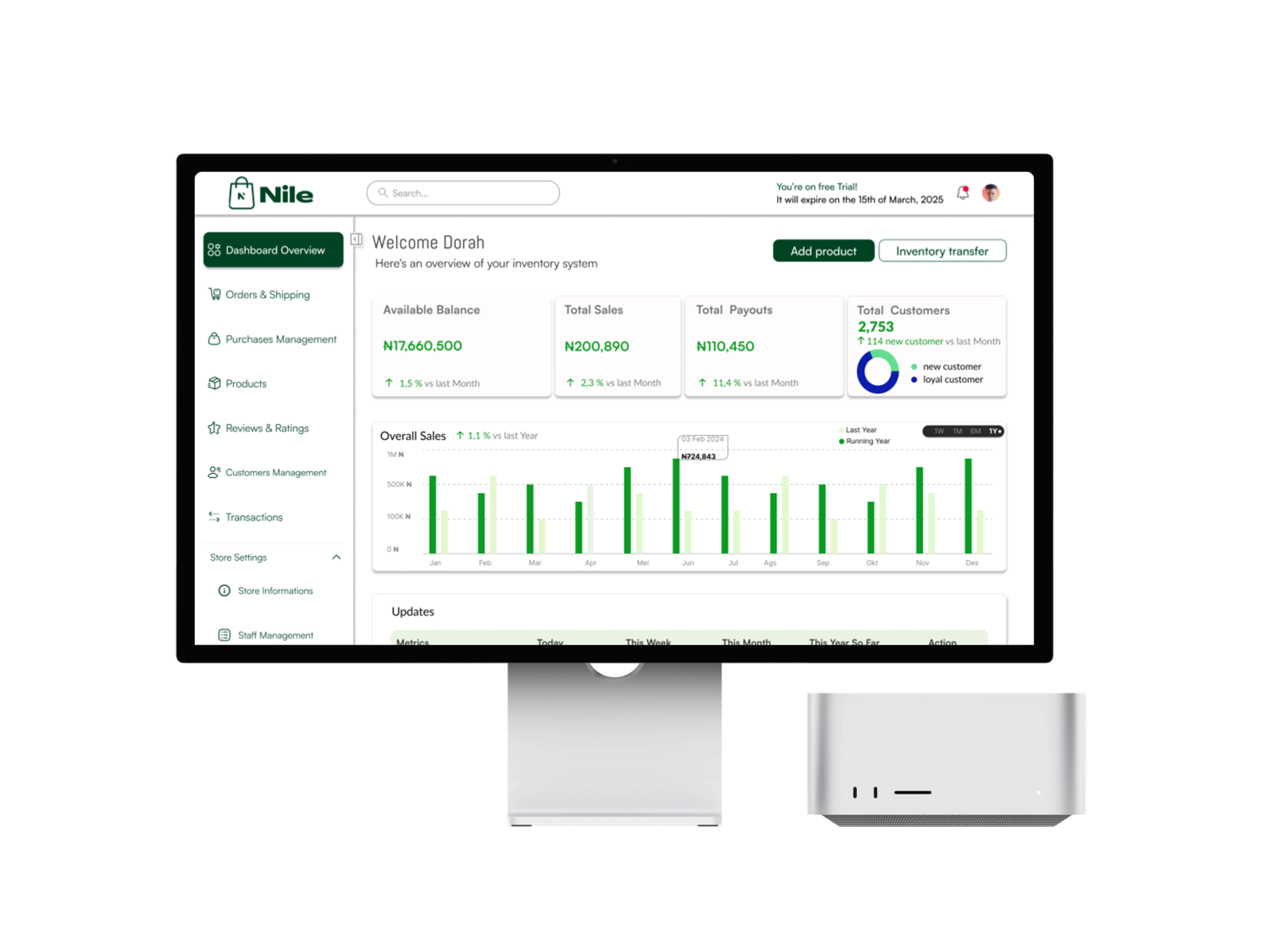
Nile is a smart dashboard made for people who run online stores. It helps them track sales, manage products, and understand customers easily.
Over six months, we improved Nile to make it:
✔️ Easier to use
✔️ Faster to navigate
✔️ More helpful with smart insights
👉 This is the story of how Nile became a powerful tool for store owners!
The Problem
Before we redesigned Nile, store owners had a hard time using it because:
🔴 Too much text – It was hard to read and understand.
🔴 Complicated menus – People couldn’t find what they needed quickly.
🔴 No clear insights – The dashboard showed numbers, but not what they meant.
Our Goal:
Make Nile simple, clear, and helpful so store owners can manage their business easily!
📌 How Nile Improved (3 Versions!)
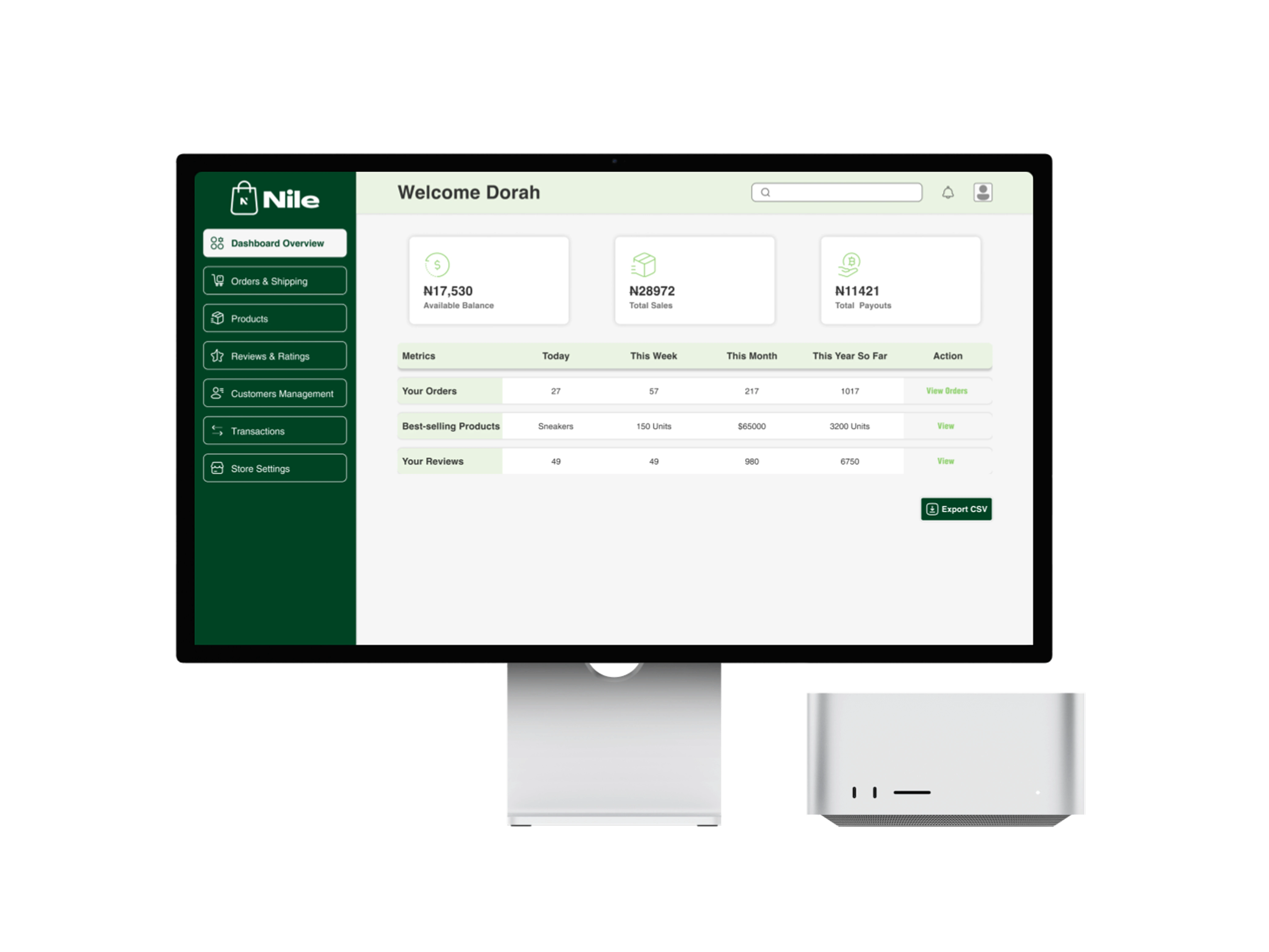
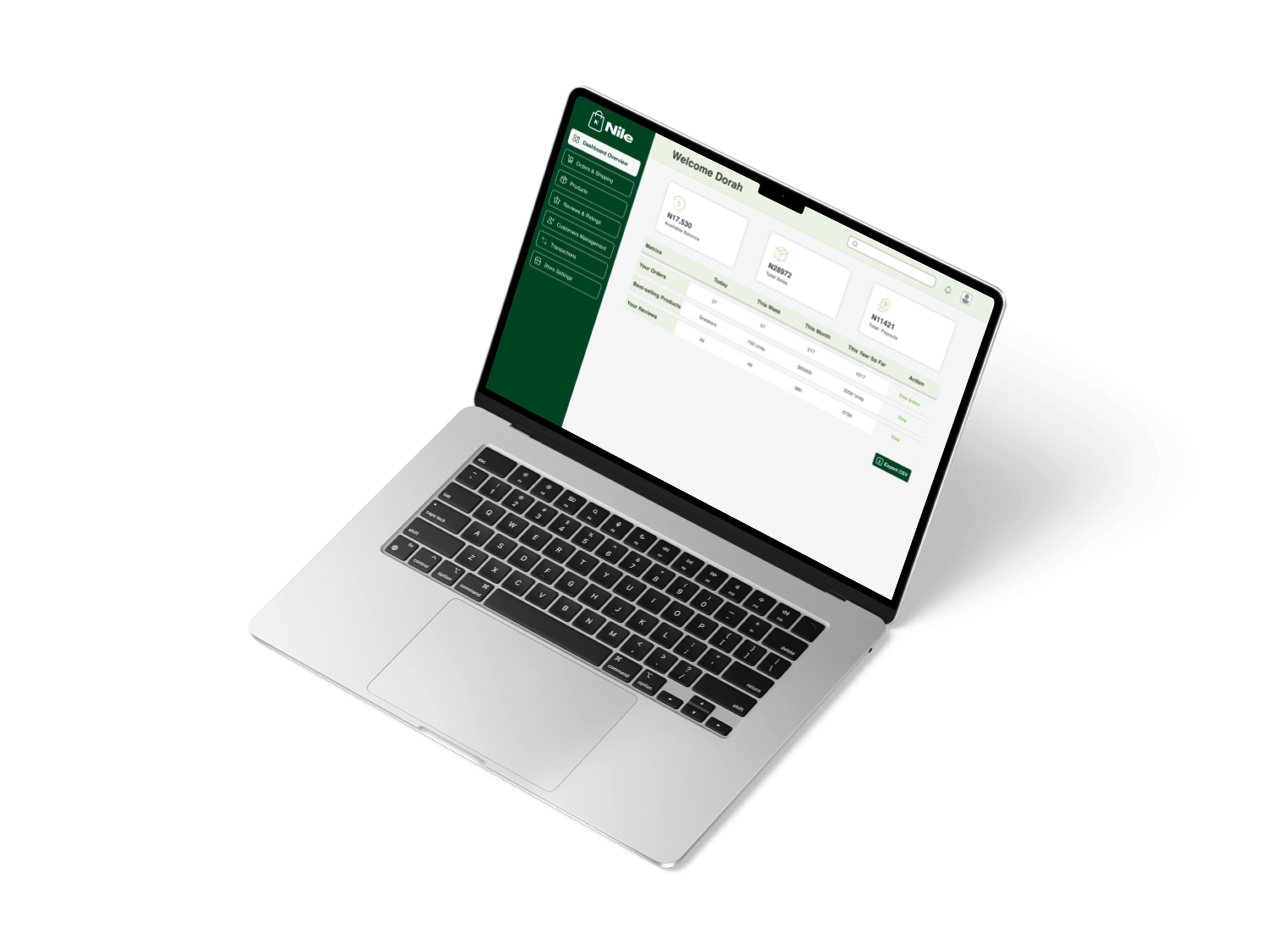
🔹 Version 1: The Beginning
In the first version, Nile had:
✔️ A table to track orders
✔️ A sidebar to navigate different pages
✔️ A section for sales numbers
But there were problems:
❌ It looked too plain – not exciting or easy to use.
❌ It lacked smart insights – store owners couldn’t see trends.
📌 Lesson: We needed to make data more visual and interactive!
🔹 Version 2: A Big Step Forward
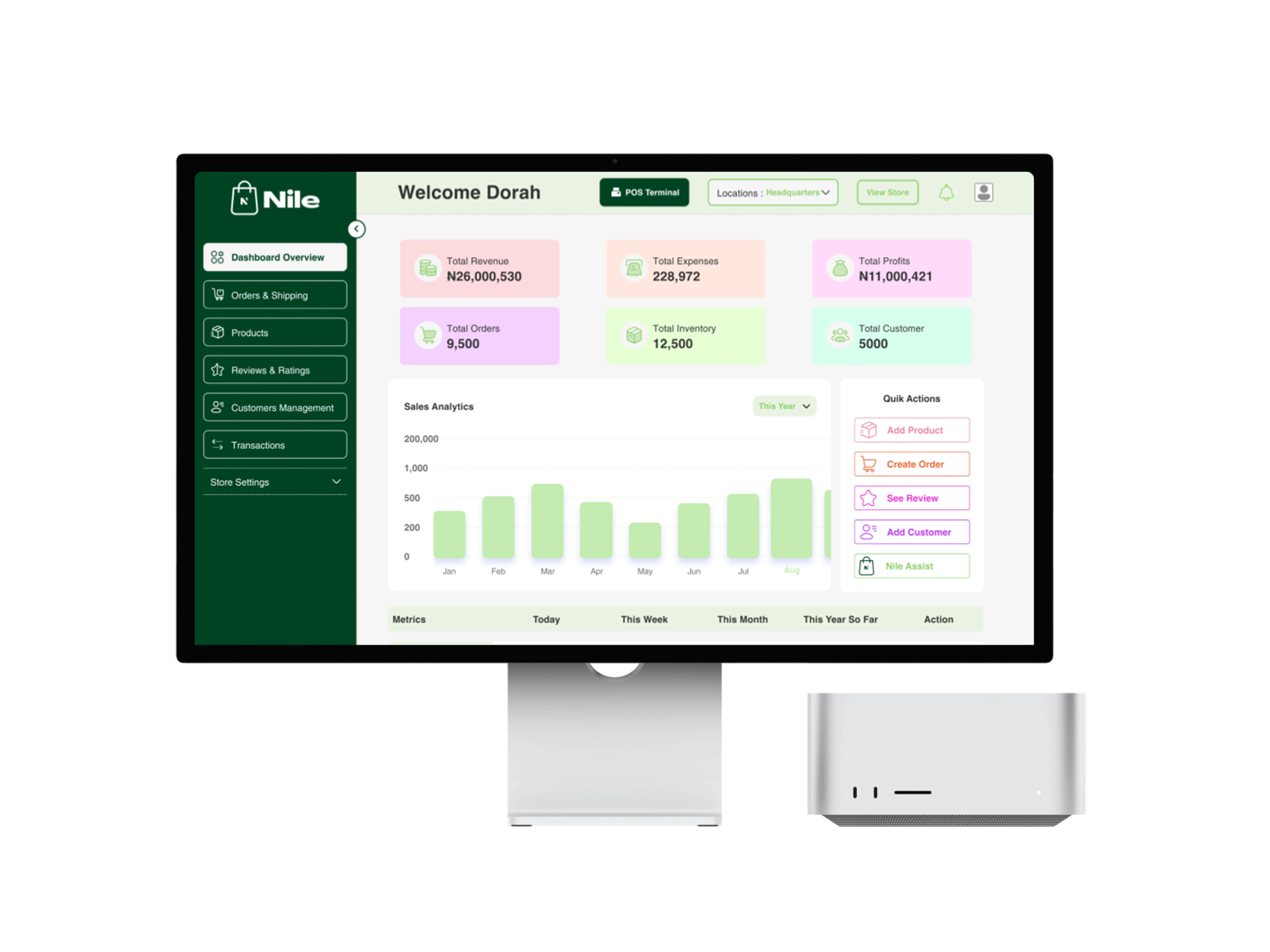
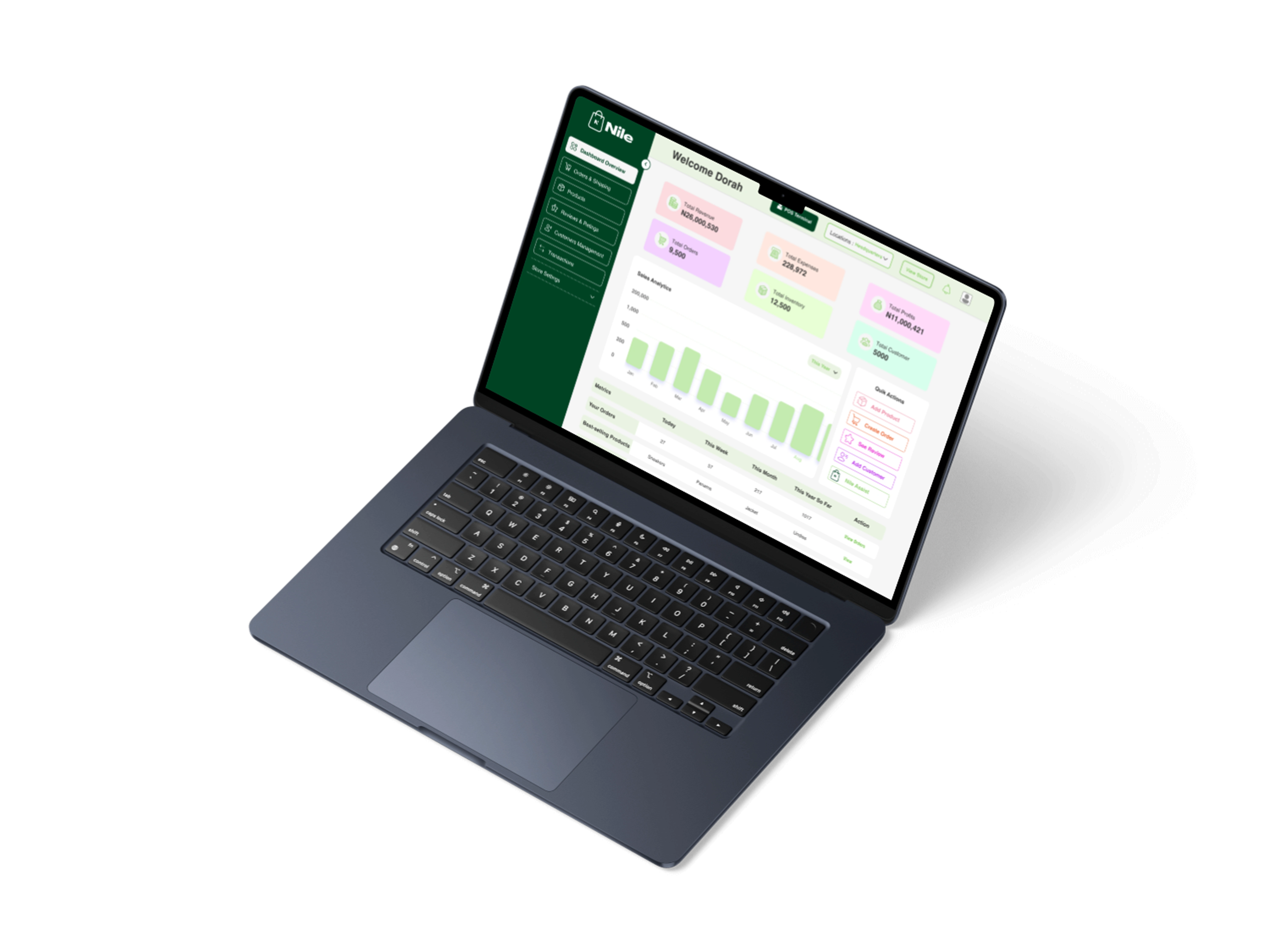
We made Nile better by adding:
✔️ Colorful bar charts – now users could see sales trends easily.
✔️ Quick action buttons – for adding products and managing orders faster.
✔️ Better navigation – so people could find what they needed quickly.
Impact:
✅ Store owners spent less time searching for information.
✅ The dashboard became easier to read and use.
📌 Lesson: Visual data and quick actions made a huge difference!
🔹 Version 3: The Best Version Yet!
Finally, we made Nile even better by adding:
✔️ Sales growth tracking – users could see if sales were improving.
�✔️ Customer insights – showing new vs. returning buyers.
✔️ A cleaner, modern design – making everything easy on the eyes.
🔥 The Result:
✅ A powerful, easy-to-use dashboard
✅ Faster decision-making for store owners
✅ A smooth and beautiful user experience

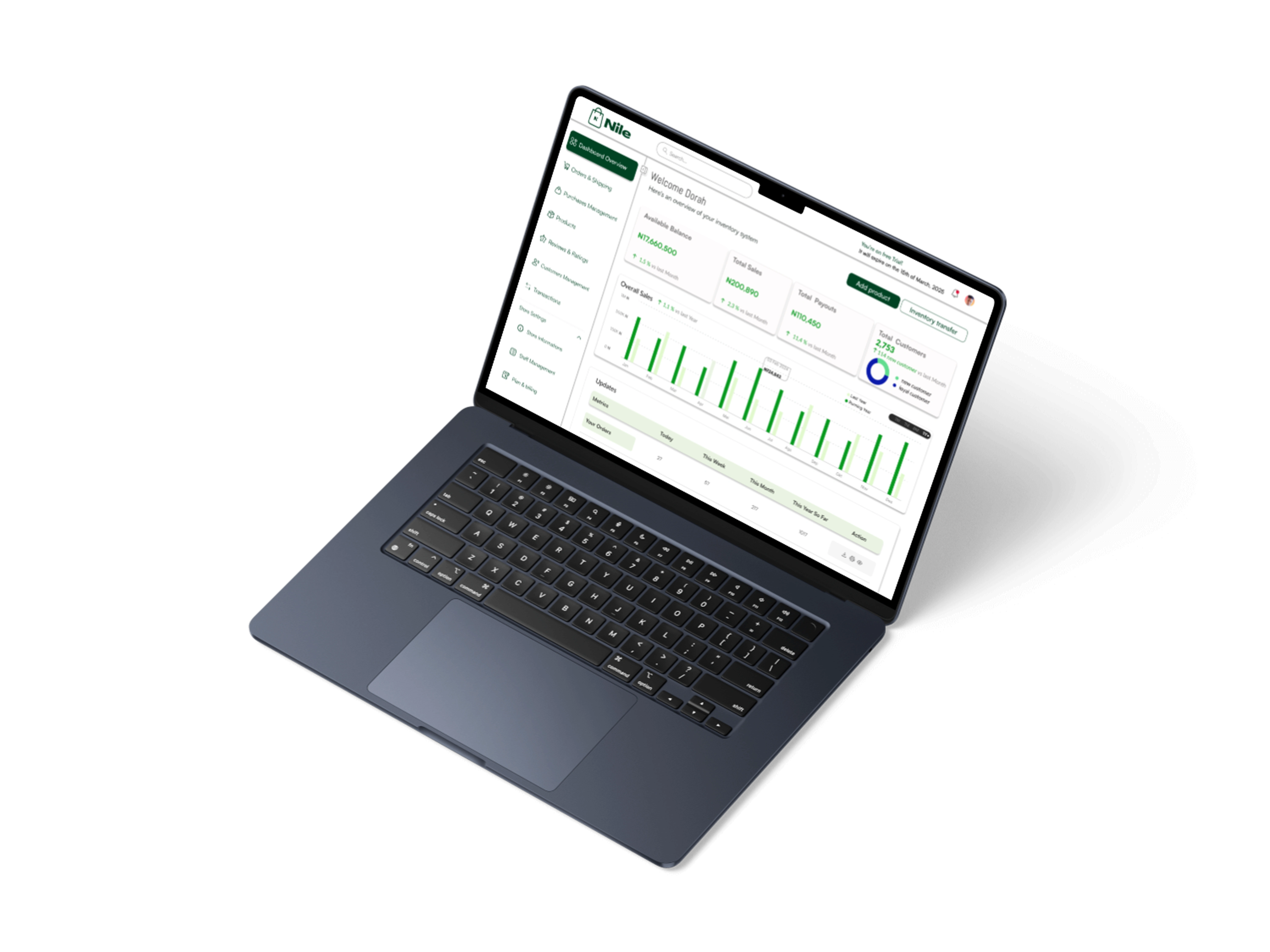
📊 The Impact: Real Improvements
Before: ❌ Users found it hard to understand their store’s data.
After: ✅ A simple, smart dashboard that makes business decisions easy!
✨ Key Wins:
✔️ Clear and simple design
✔️ Faster navigation
✔️ Helpful insights at a glance
🎓 Lessons Learned
📌 Listen to users – We made changes based on feedback!
📌 Make data visual – Charts help people understand numbers better.
📌 Keep it simple – A clean design makes everything easier.
Final Thought: This project showed us that a great design isn’t just pretty, it should help people work faster and smarter!
Let’s Connect!
Want to create amazing digital experiences like this? Let’s talk! 📩
Like this project
Posted Sep 7, 2025
A clean, data-driven e-commerce dashboard that simplifies inventory management, boosts usability, and empowers store owners with smart insights
Likes
1
Views
0


