Virgin Atlantic Drinks Mockup
Destiny Moore
For this project, I created advertisements for a hypothetical drinks range produced by Virgin Atlantic. These were intended to be social media posts; I envisioned them being image posts with more detailed text alongside them. I am planning to do more of these, perhaps as brochures, meaning I am going to do a double-sided mockup. I think this will be useful in showing a different form of copy.
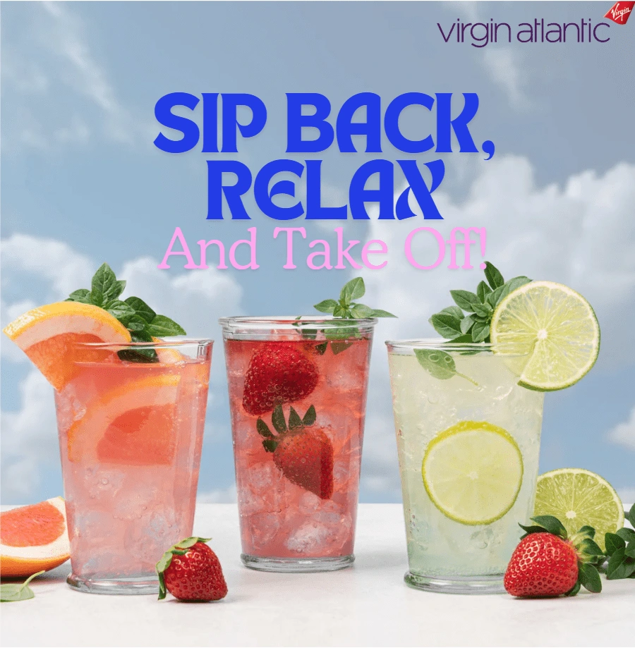
Below is my first creation. The background is a copyright-free image that I sourced. I wanted this one to look summery, and I feel that the blue sky achieves this alongside all of the displayed fruit. In this instance, I had the slogan in mind first, so I had to look for a related accompanying image; I think I chose well here.
The slogan choice stems from connotations of holidays. Using the phrase "Sip back, relax" is obviously a play on "sit back and relax," which people say when they want to chill out. I wanted this advertisement to convey the idea that the drinks onboard the flight are going to be as relaxing of an experience as your holiday will be. Obviously "Take off" refers to the plane, reflecting the idea that these drinks are exclusive to flights, but is also reminiscent of phrases like "take off a load" and "take off your shoes," which also suggest relaxation.
The font I have selected was found on Canva, and I decided it was suitable because it looks playful and fun while still seeming professional. I associate the Virgin brand with sleek and professional looks, so I didn't want to depart too much from this. I did want to create a fun and summery vibe here because I feel like this is something that appeals to people.
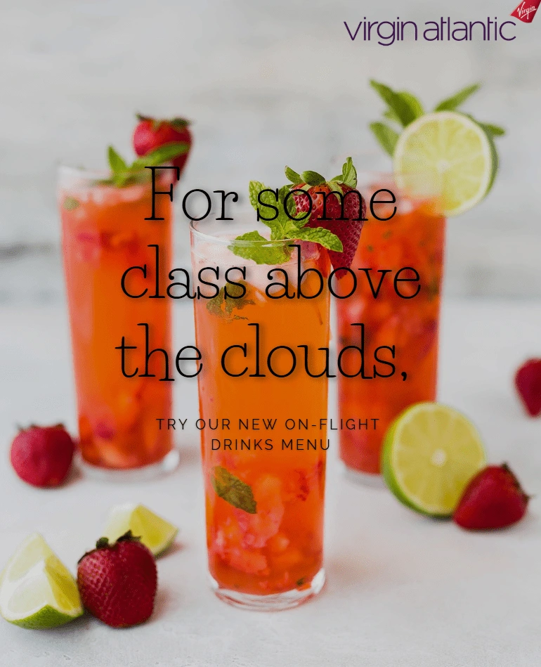
With this mockup, I decided to stick with a classy vibe. As previously stated, this is the impression I get from Virgin, so I thought it would be interesting to lean into this. My goal for this one was slightly different than the first one; I wanted to design a poster/flyer that could be displayed on flights.
Again, the image was sourced from a copyright-free site. This time, I saw the image first and observed how it looked classy, prompting me to create some copy in this style. I thought this style would be a wise one to pursue because I am aiming to give my portfolio some versatility. Not only this, but I imagine that clients sometimes will specify multiple styles, so I want to get into the habit of being able to do this.
I like the two fonts together—these were again on Canva. However, I think the image could be more readable, so I might revisit this one in the future once I have learnt more design principles. I do like the copy I have written; it is simple, but I think it pulls you in. If you're flying Virgin, you're probably expecting something refined onboard, so I think the wording is going to appeal to clientele. I think the idea that a classy experience is not limited to the ground is actually quite appealing—why can't flying be elegant? Additionally, I feel like it might be a way for people outside of First Class to feel like they're part of an upmarket experience too; they can get 'classy' drinks just like those in First Class.
Like this project
Posted Jan 20, 2025
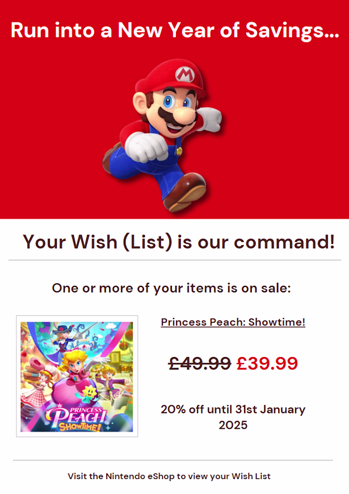
I designed ads for a hypothetical Virgin Atlantic drinks range as social media posts, creating mockups in different styles to showcase versatility.
Likes
0
Views
9