Ibloov Platform Redesign and Growth Acceleration

Chike Ezeiru


Driving Growth from 3,000 to 11,000+ Users for an event/lifestyle startup
How I transformed Ibloov's user experience to accelerate user acquisition and unify a multi-sided marketplace.
My role
Product Designer
Tech Stack
Figma • Photoshop
Problem
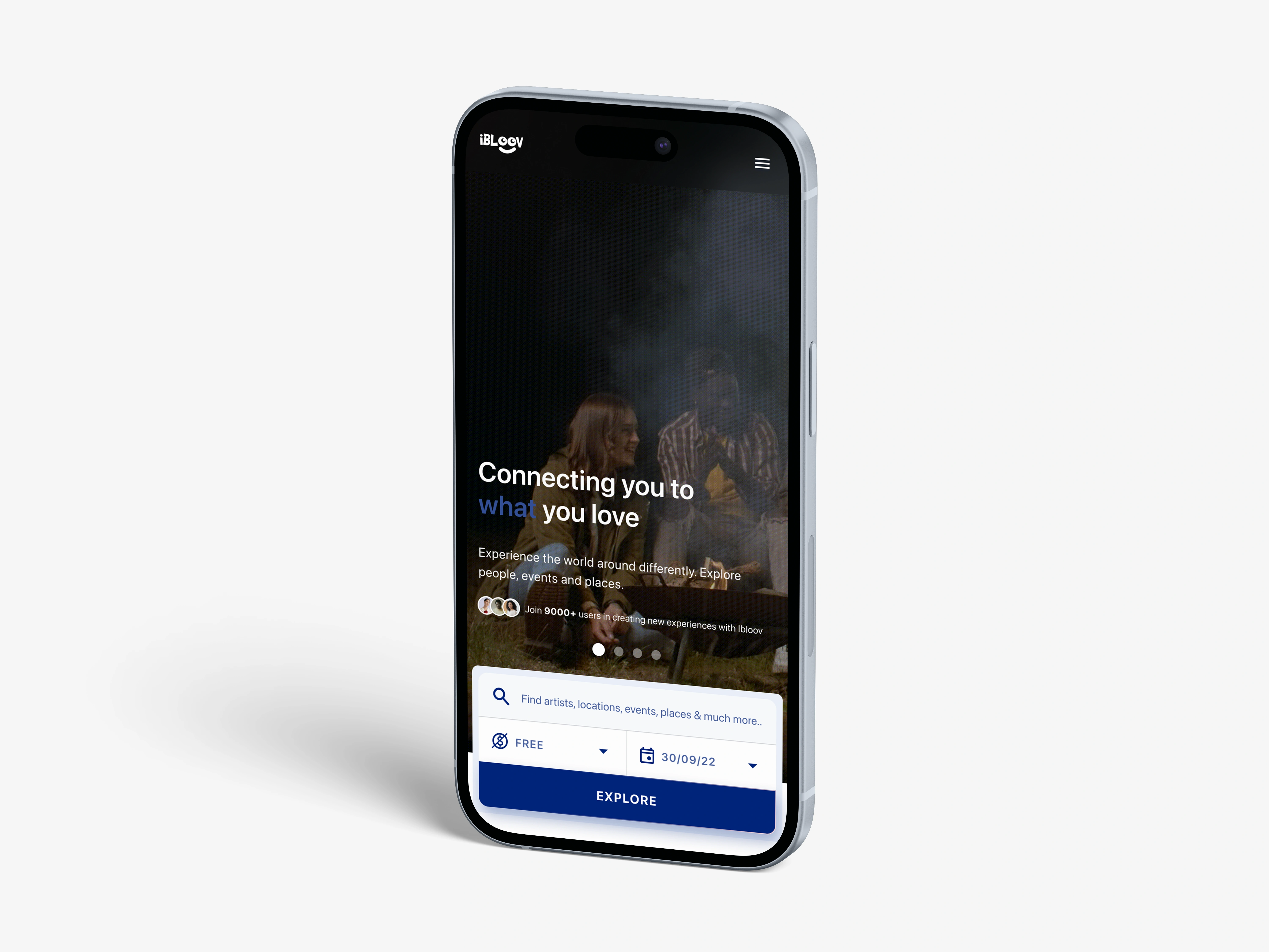
Ibloov's MVP was struggling to convert visitors, stalling growth at 3,000 users. The platform needed a complete redesign to reduce friction, build trust, and unlock scalability.
Upon validating existing research with new user interviews, I uncovered the core issues preventing growth:
Trust Deficit: An outdated interface made the site feel "low quality," causing users to doubt the validity of the experiences.
Fragmented Identity: The platform felt like three separate products, creating a confusing and disjointed journey for multi-role users.
Unclear Value: The landing page was too generic, failing to express the specific value Ibloov offered to each unique user type.
Strategy
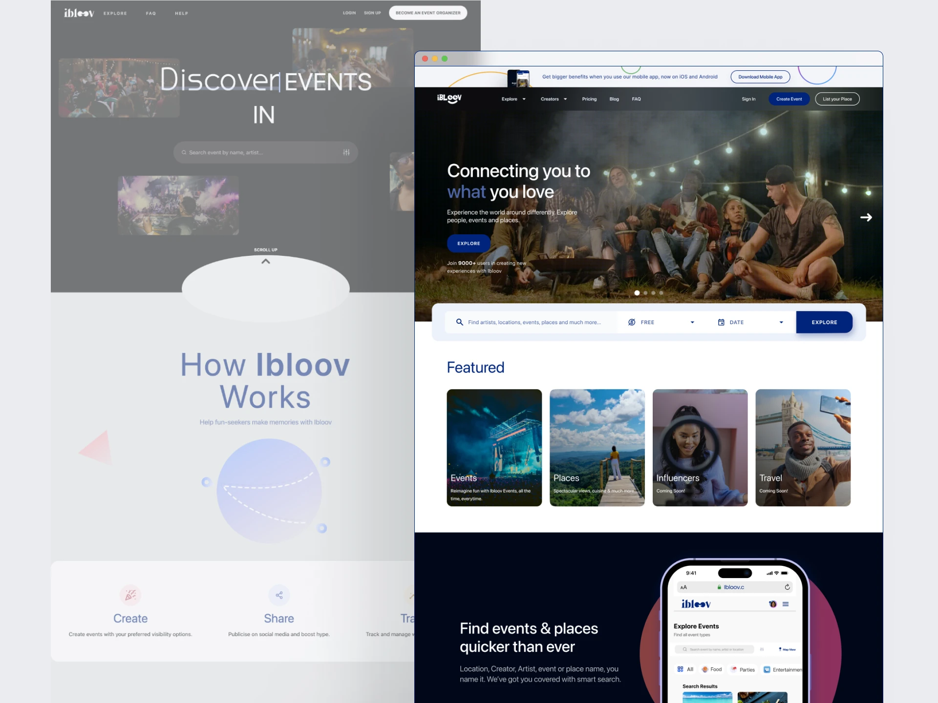
I had a unique opportunity to design a unified yet personalized experience that builds trust, clearly articulates value, and makes account management effortless to fuel acquisition.
This led to a 3 pronged approach to revamping the full website:
Designing specific landing page for event attendees (general users)
Designing creator landing pages for creators (event organisers and Place owners)
Designing an intuitive Single Sign-On system that allows users to seamlessly switch between or add new roles, reducing friction and increasing user lifetime value.
Solution
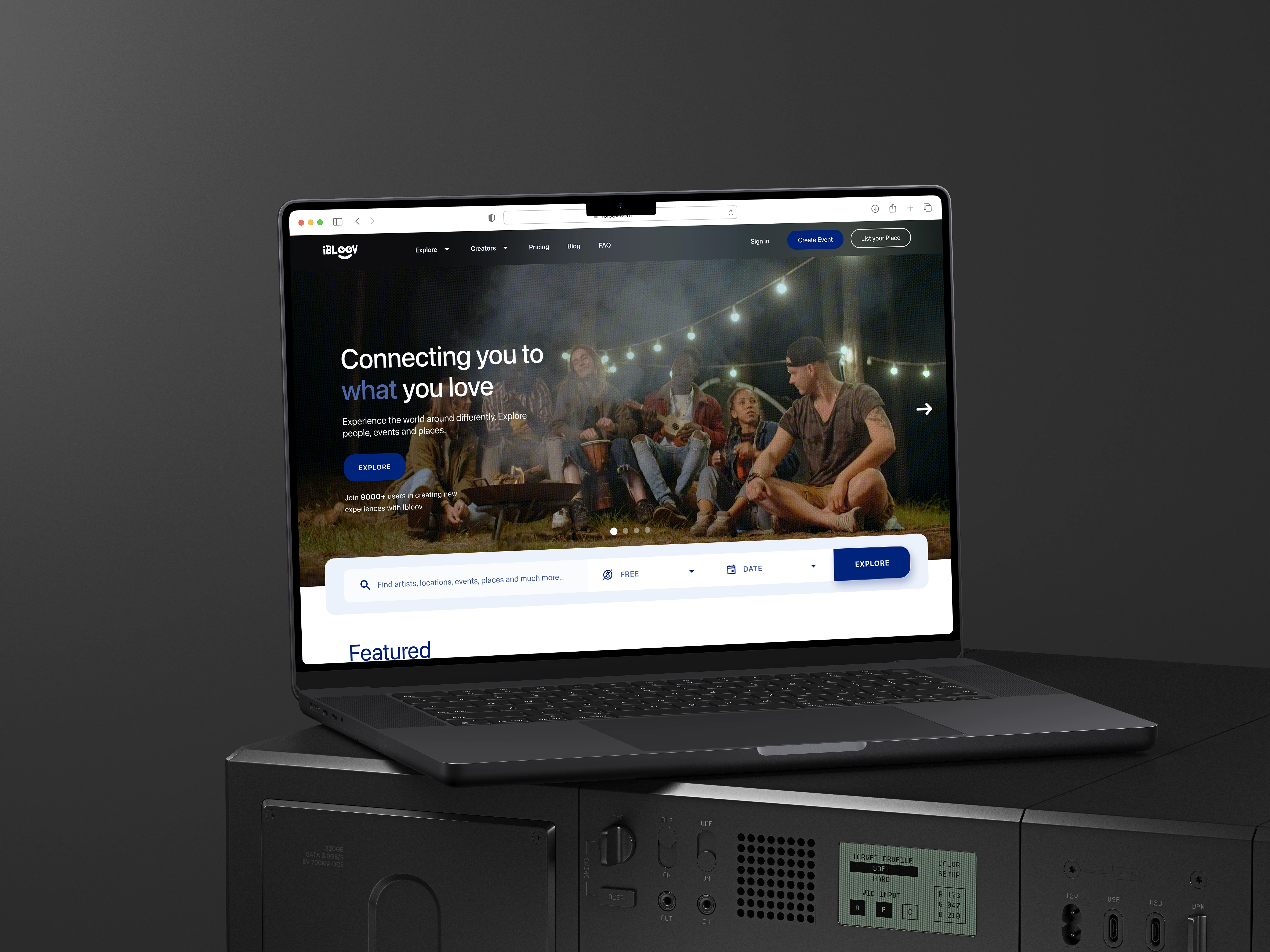
1. Designing for conversion and clarity (Regular Users)
I worked on a targeted experience to speak directly to the "attendee" user type
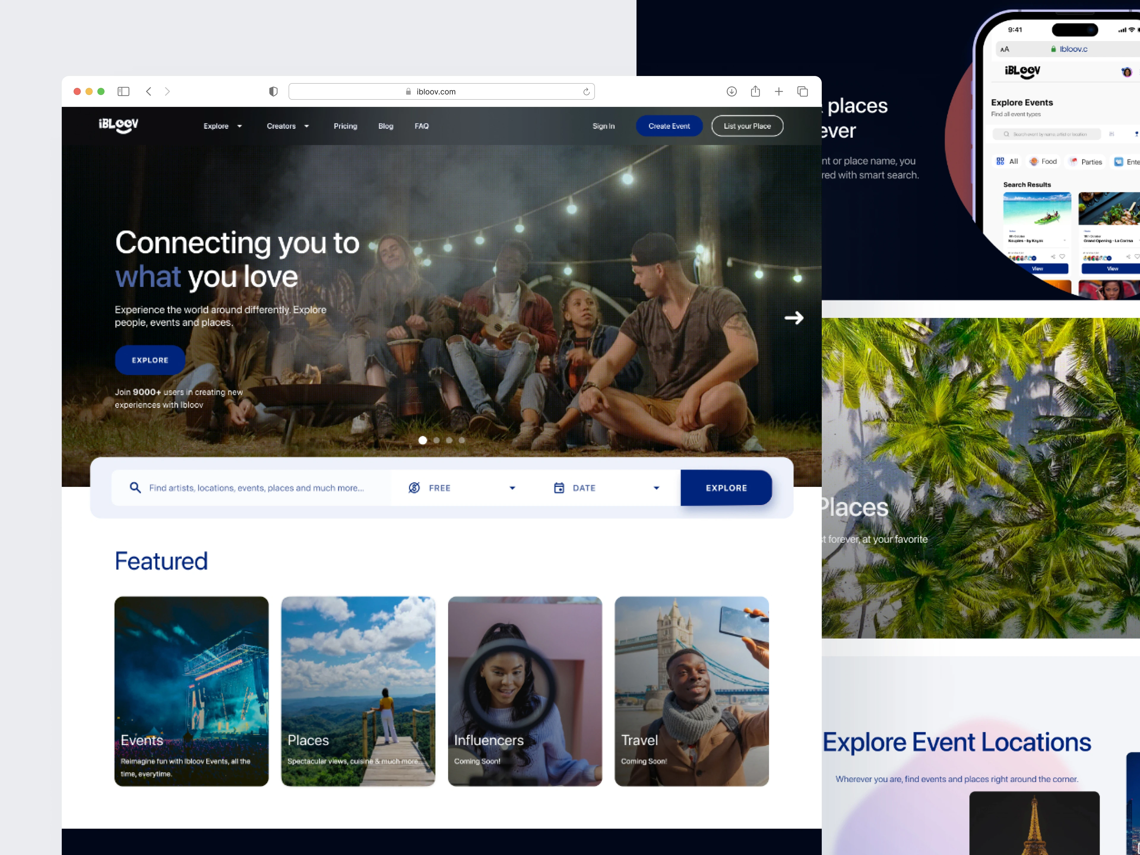
Hero with Integrated search: A carousel of featured events and a prominent, filter-rich search bar placed "at the fold" empowered users to immediately find value.
Benefit driven sections: A dedicated benefits carousel used a dark-mode toggle to visually segment and highlight Ibloov's value, increasing dwell time on key messaging.
Visual Storytelling: A "Showcase" section used video/GIFs to bring event venues and experiences to life, building excitement and trust that addressed the initial "low quality" perception.
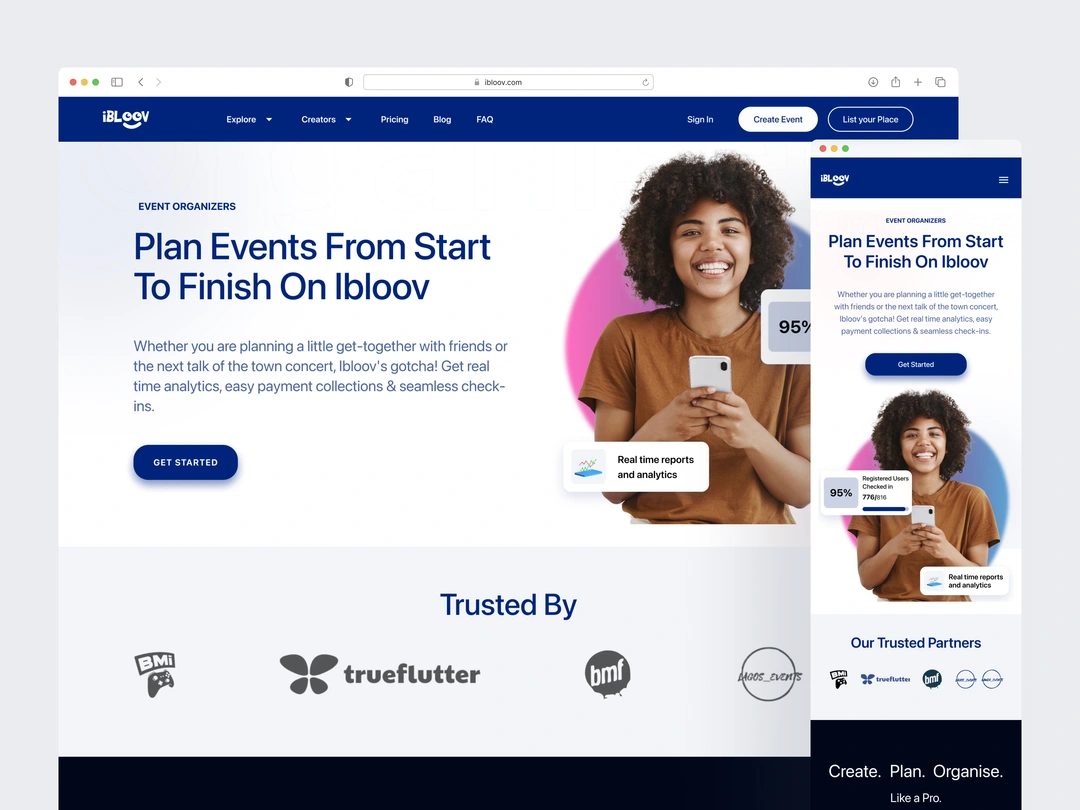
2. Designing for Trust and conversion (Creators)
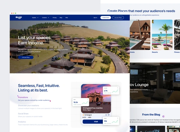
I worked on designing pages to sell the tools and benefits of using Ibloov as a business platform.
Social Proof: A "Trusted Partners" section built immediate credibility for Organizers.
Clarity and Transparency: A clear pricing section helped Organizers make informed decisions quickly.
Aspirational imagery: The Place Owner page used high-quality visuals to showcase spaces, attracting high-quality listings
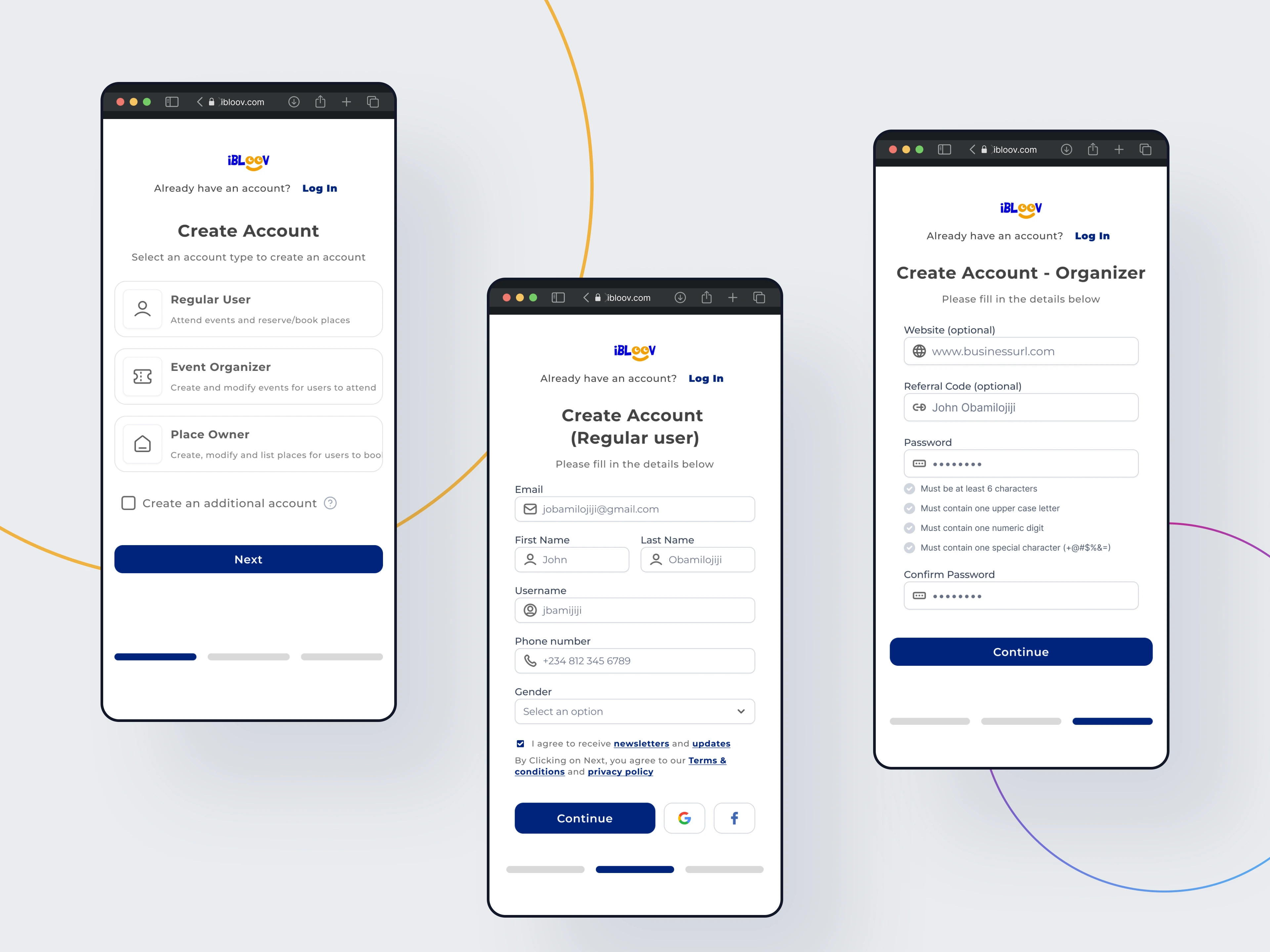
3. Unifying the Experience with Frictionless SSO
The old flow forced users into a single-role silo, creating a dead-end. My new system made identity fluid and expanded user value.
Simplified Initial Sign up: Users could create a base account without committing to a permanent role, lowering the barrier to entry.
Intuitive Role Management: An “Account Switch” feature let users easily add new roles or switch between existing ones from their avatar.
Iterative Improvement based on Testing: Clearer microcopy (“Switch/Create Account”) helped users discover role creation and fully use the feature.
Results
The redesign was a strategic investment that delivered clear results for Ibloov's growth goals.
Scaled to support 11,000+ users by optimizing the user journey and removing friction.
Facilitated a 200% surge in signups (~6,000 new users) within 2 months of launch.
Streamlined the experience by consolidating a complex multi-role platform into one unified journey.
Established a scalable design system to speed up future development cycles.
Like this project
Posted Aug 5, 2026
Revamped Ibloov's platform, increasing users from 3,000 to 11,000+ through improved UX and design.