Hudsons Canada’s Pub Website UX Overhaul
Nicole Buloran
Discover how this UX overhaul streamlined internal operations and elevated the customer experience across multiple locations.
Project Background
In 2021, Hudsons Canada’s Pub marketing director reached out to me about some difficulties the team and the customers are experiencing with using the website. Mainly:
Team: Lack of control on the website and requires a lot of help from the engineers to adjust the content, make pages, messy backend; challenges in identifying which reservation requests are for each location.
Customers: The customers are having a hard time using the company’s virtual menu and using the website’s booking form
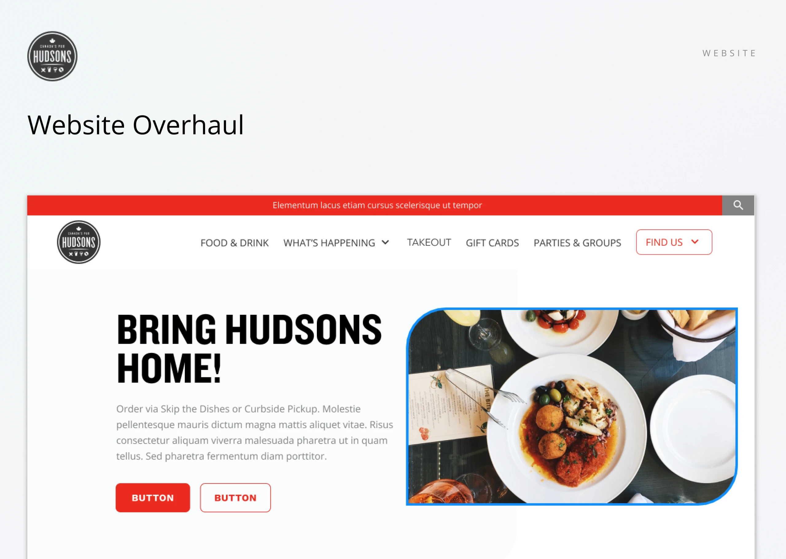
The Approach
To provide context, I’ve included the original website to highlight the starting point of this project. After a thorough analysis and collaborative sessions with the team at Hudsons Canada’s Pub, we uncovered several critical pain points:
The site’s visual design felt outdated and lacked the modern appeal needed to drive engagement.
Messaging was unclear and inconsistent, falling short in communicating the brand’s identity, offerings, and ongoing promotions.
Key usability issues—particularly with the reservation form—created friction for both customers and in-restaurant staff.
The content management system was inflexible, requiring developer support for basic updates and slowing down marketing efforts.
On the backend, reservations from all locations were funneled into a single list, creating operational confusion and inefficiencies for the front-of-house team.
With a strategic, detail-driven approach, we tackled each of these issues—improving both the user experience and internal workflows to better serve customers and streamline operations across locations.
Requirements Gathering
To kick off the redesign, we used Miro to facilitate a collaborative discovery process—gathering insights from both internal teams and customers. This ensured a well-rounded, structured foundation for defining the new website’s direction.
We organized the requirements into two clear categories to align functionality with real-world needs:
Team-Focused: Internal requests aimed at streamlining workflows, improving content management, and enhancing operational efficiency.
Customer-Focused: Experience-driven enhancements that prioritized intuitive navigation, clearer information architecture, and a smoother browsing journey.
This intentional framework helped us balance business objectives with user expectations, guiding a redesign that was both practical and people-first.
Design Priorities
To drive a consistent and user-centered redesign, we defined clear primary goals tailored to each audience:
For Customers: Simplifying Navigation & Enhancing Experience. The focus was on elevating the experience for both new and returning users by making it easy to:
Browse the menu intuitively
Book or contact a location without friction
Quickly find current deals and promotions
For the Team: Creating a Scalable & Easy-to-Manage System Internally, the goal was to give the team greater control and flexibility by:
Building a modular, component-based system for streamlined content updates
Empowering both the corporate and front-office staff with tools to manage pages and guide customers more efficiently
Empowering both the corporate and front-office staff with tools to manage pages and guide customers more efficiently
Understanding Users
Hudsons Canada’s Pub serves two core audiences—customers and internal teams—each with distinct behaviors, goals, and challenges.
Customers: Prioritizing Convenience & Mobile Experience. The primary customer base consists of Millennials (ages 26–41) who frequently visit the pub. Their key behaviors and needs include:
Often browsing while hungry, excited, or in a hurry—requiring a fast, intuitive experience.
Predominantly accessing the site via mobile devices, with Google Chrome and Safari as their go-to browsers.
Internal Team: Empowering Efficiency & Digital Control
The internal team is also made up largely of Millennials, spanning front-line staff and corporate roles:
Restaurant managers and front-of-house staff face high customer volumes and need simplified tools to keep service running smoothly.
Corporate teams seek a website that can support agile content updates, marketing campaigns, and location-specific messaging—all without technical bottlenecks.
By recognizing the specific needs of both user groups, the redesign was strategically tailored to boost customer satisfaction while increasing internal efficiency and business agility.
Restructuring the Experience
To lay the groundwork for a smoother user journey, we conducted a comprehensive audit of the existing website. The goal was to pinpoint areas of friction while preserving high-value features that users already relied on.
A key insight from this process was the need for a clearer, more intuitive information architecture. By refining the site structure, we were able to:
Improve navigation and content discoverability
Reduce user friction across key touchpoints
Better support both customer journeys and internal workflows
This strategic restructuring created a foundation that aligned more closely with user behavior, business needs, and long-term scalability.
Concept Exploration
We kicked off the design process with a collaborative ideation session, pulling inspiration from within the restaurant industry and beyond. By studying competitor sites and standout digital experiences, we uncovered best practices and design opportunities that helped shape a creative and strategic direction for the redesign.
Design System Foundations
While Hudsons Canada’s Pub already had an established brand identity, we created a clear and scalable design system to bring consistency across all components. This included:
A naming convention for colors, spacing, and grid systems
Guidelines to support development and collaboration
A structure that ensured smooth handoff to engineers and internal teams
This system not only reinforced visual coherence but also streamlined communication and implementation.
Wireframing
With our design blocks and structure in place, we moved into wireframing to define the page layout and core functionality. This phase focused on usability, content hierarchy, and flexibility.
We also introduced configurable design blocks—components that could adapt to different content or marketing needs. A guided walkthrough with the Hudsons team allowed for early feedback and refinements, ensuring the solution aligned with both user expectations and business requirements.
Visual Design
Once the wireframes were approved, we applied the brand’s visual language to bring the interface to life. The high-fidelity designs translated our strategy into an engaging, accessible, and scalable experience—one that felt distinctly Hudsons while solving for both operational and user needs.
The result is a modern, user-centered website that balances aesthetics with functionality. By improving backend processes and streamlining the customer journey, the new site empowers the Hudsons team while delivering a more intuitive, mobile-first experience for guests across all locations.
Like this project
Posted Oct 14, 2025
UX overhaul for Hudsons Canada’s Pub to improve operations and customer experience.
Likes
0
Views
2
Timeline
Dec 31, 2020 - Ongoing